


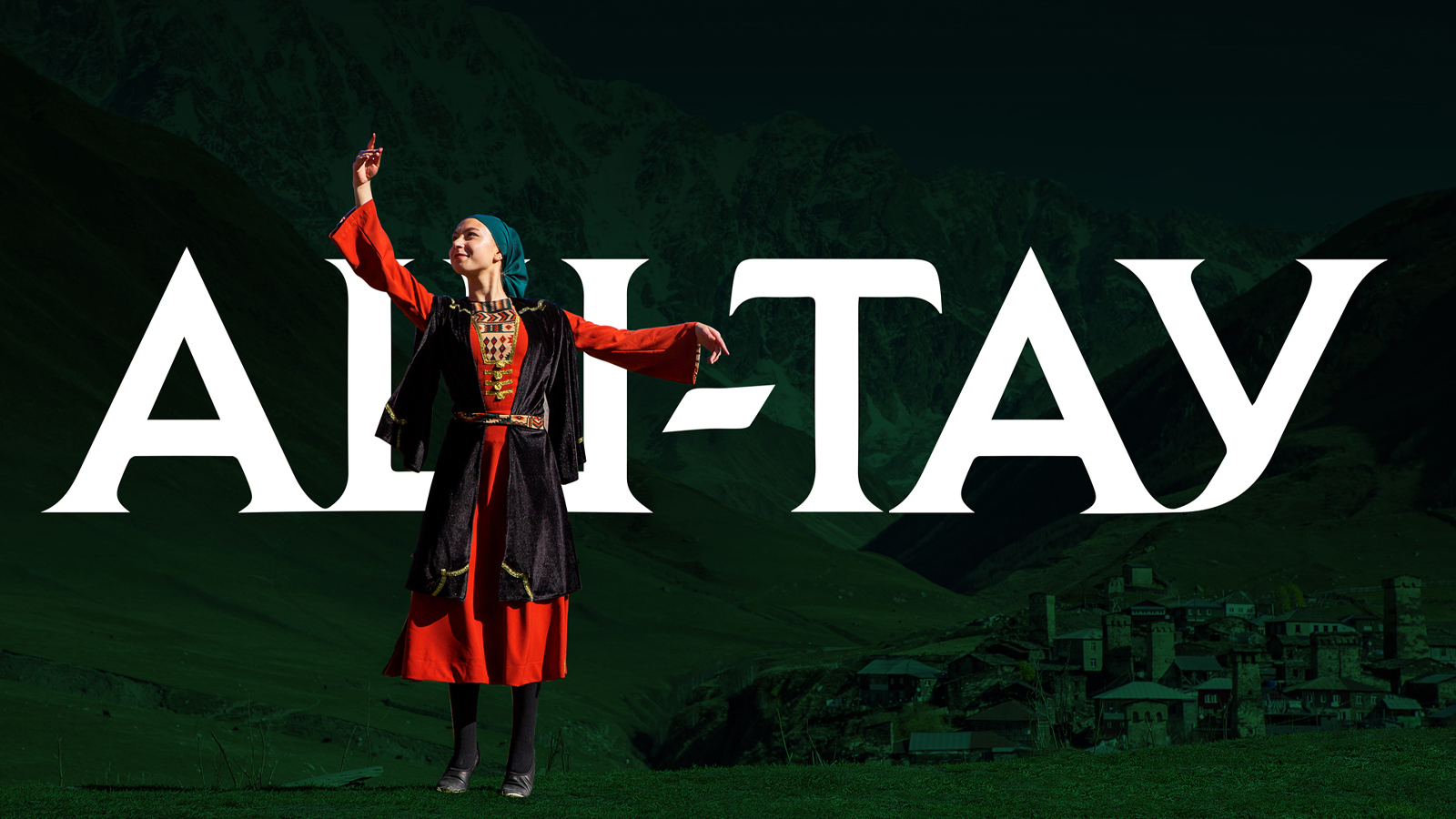
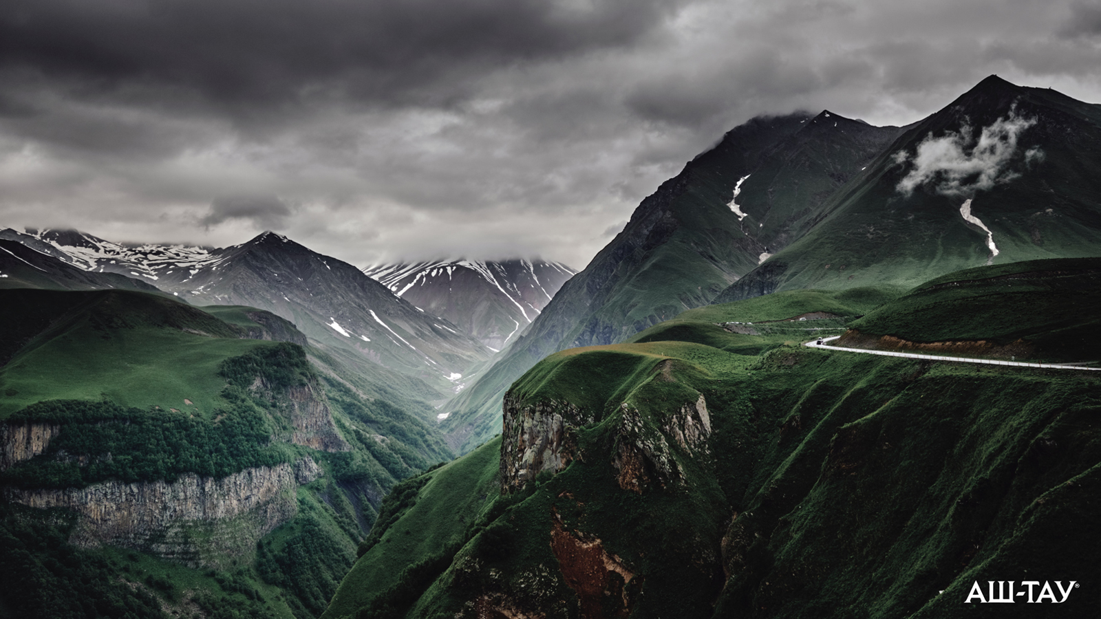
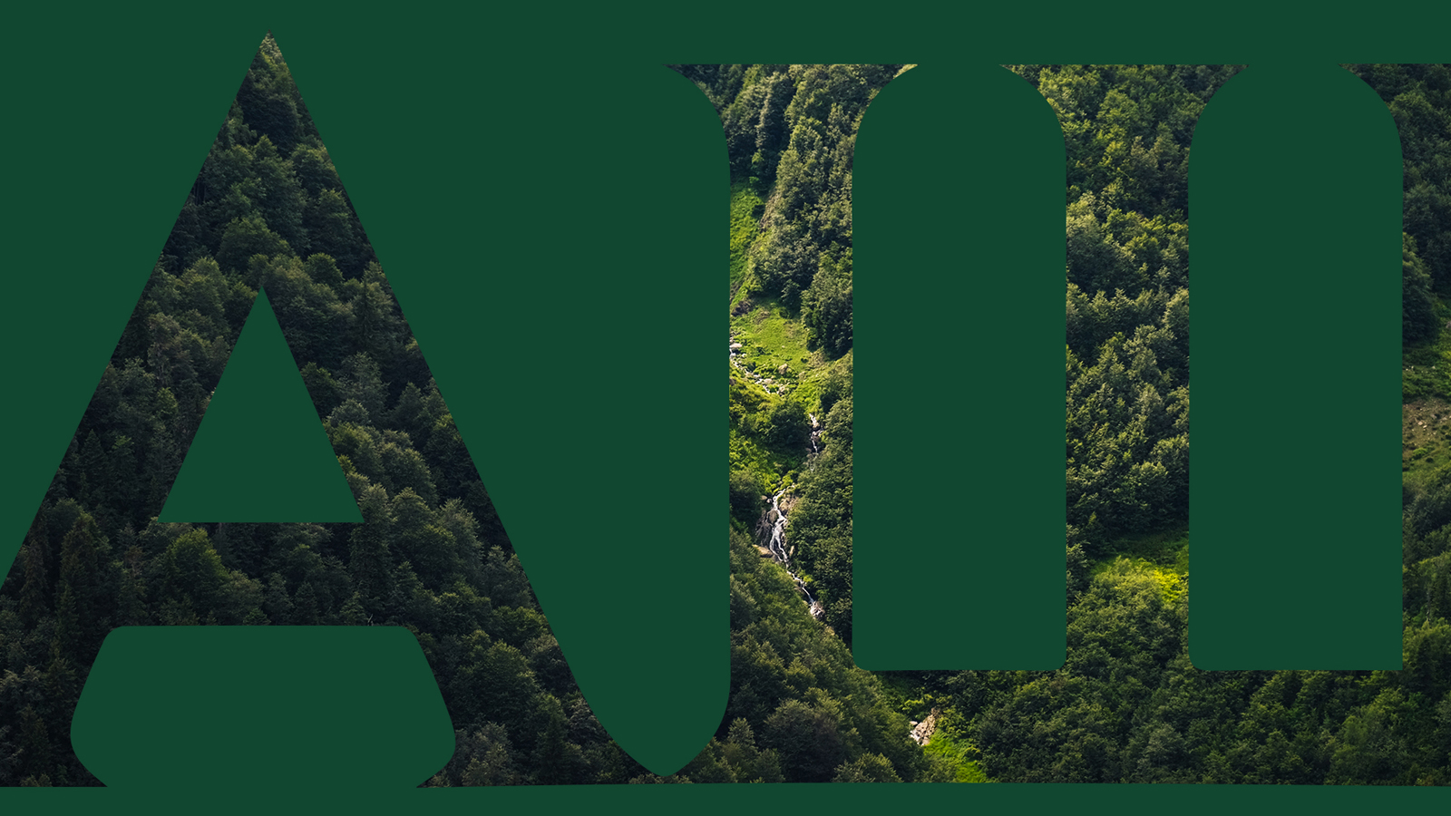
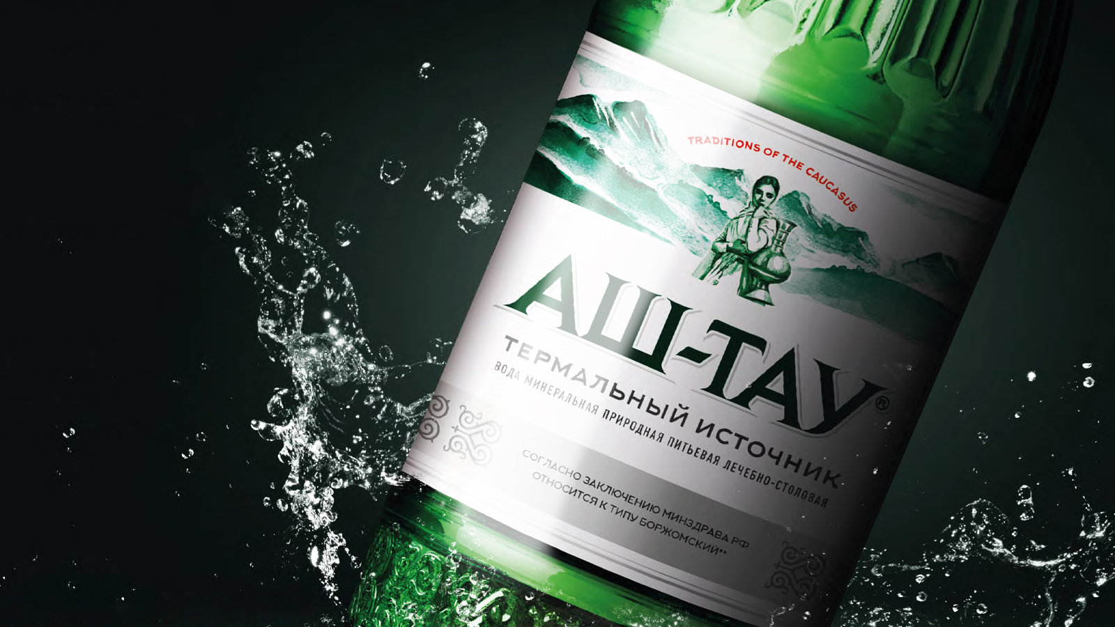
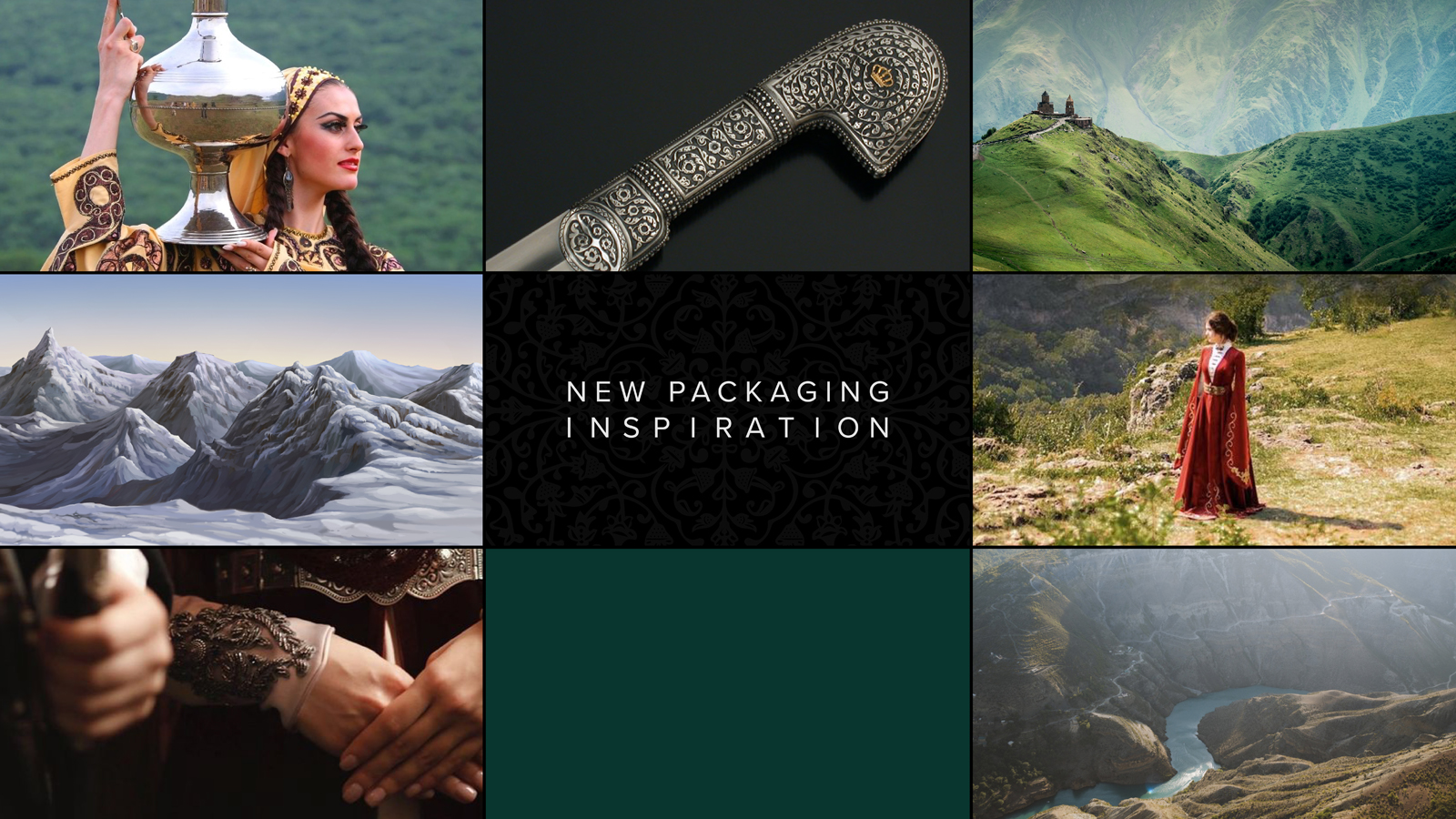
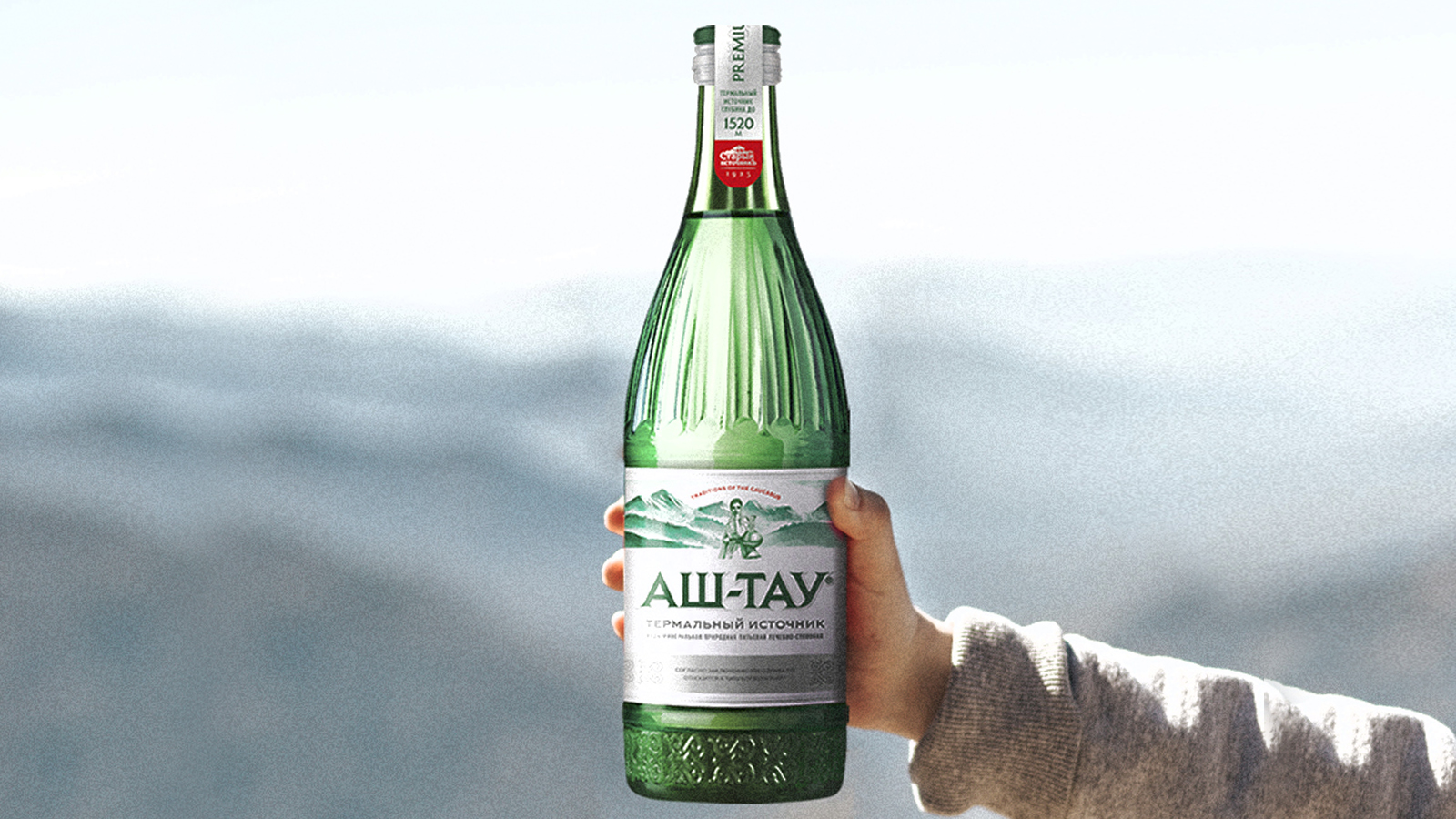
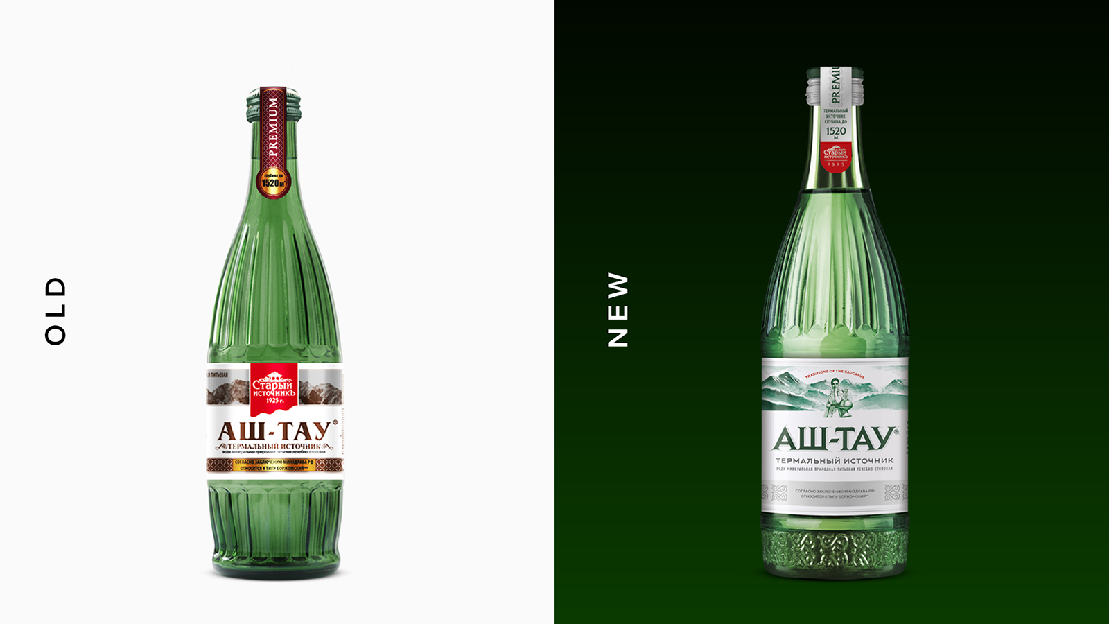
Stariy Istochnik is a major player in the mineral water market in southern Russia. Its Caucasian water Ash-Tau, boasts unique health properties. Break has been called to revise its visual identity, acting on both bottle and label with an evolutionary approach to reposition the product in the premium segment of the market. The new bottle simplifies the previous one and adds decorations inspired to the hilt of a Caucasian sword, stressing the unique origin of this water. By the same means, the illustration of a woman on the label (referring to a local legend) contextualizes an otherwise generic, overused element such as mountains. Consistently, the new pay off reads: “Traditional Caucasian.” The logo has been made premium while maintaining its recognizability. The company logo, on the other hand, has been moved up and, in general, the entire hierarchy of information has been streamlined. The colors (aqua green) are now in line with the water category.Stariy Istochnik is a major player in the mineral water market in southern Russia. Its Caucasian water Ash-Tau, boasts unique health properties. Break has been called to revise its visual identity, acting on both bottle and label with an evolutionary approach to reposition the product in the premium segment of the market. The new bottle simplifies the previous one and adds decorations inspired to the hilt of a Caucasian sword, stressing the unique origin of this water. By the same means, the illustration of a woman on the label (referring to a local legend) contextualizes an otherwise generic, overused element such as mountains. Consistently, the new pay off reads: “Traditional Caucasian.” The logo has been made premium while maintaining its recognizability. The company logo, on the other hand, has been moved up and, in general, the entire hierarchy of information has been streamlined. The colors (aqua green) are now in line with the water category.
CREDIT
- Agency/Creative: Break Design
- Article Title: Ash Tau Stariy Istochnik Mineral Water Packaging Design Break Design
- Organisation/Entity: Agency
- Project Type: Graphic
- Project Status: Published
- Agency/Creative Country: Italy
- Agency/Creative City: Milano
- Market Region: Middle East
- Project Deliverables: 3D Design, Brand Creation, Brand Design, Brand Tone of Voice, Graphic Design, Packaging Design
- Industry: Food/Beverage
- Keywords: water, ashtau, breakdesign
-
Credits:
Olga: Manoilenko


