


Asgard Branding agency performed rebranding work the famous medical supplies Arbidol for the pharmaceutical company OTC Pharm. Arbidol is an original Russian antiviral drug with a wide spectrum of activity. It is one of the leading brands of OTC Pharm and is the company’s business card.
Brand history: Developed back in the Soviet period in 1974, the drug for a long time was the only one that was used to treat patients with influenza and ARVI. In Russia, Arbidol was the first player on the market to announce a new category of “antiviral agents”. Media promotion of the brand began in 2000, and by 2010 Arbidol entered the register of strategic drugs within the country.
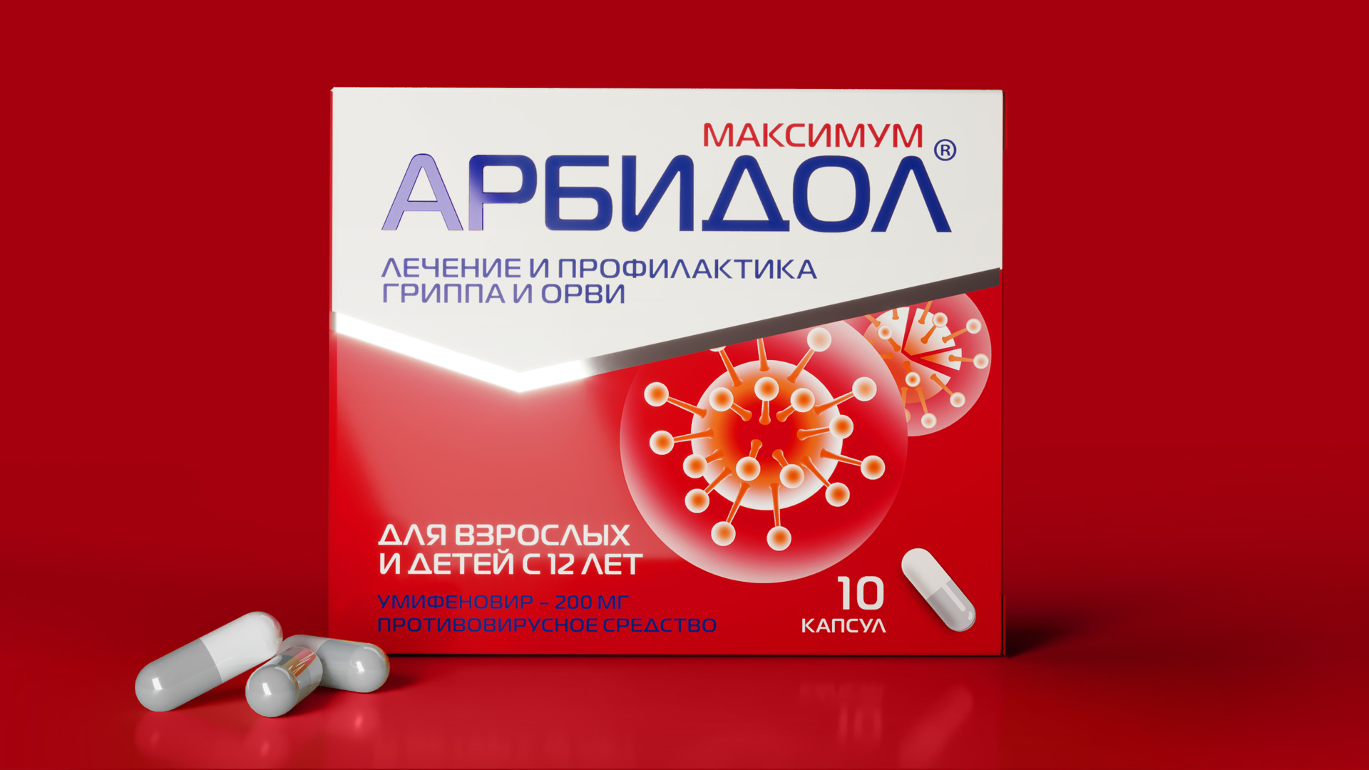
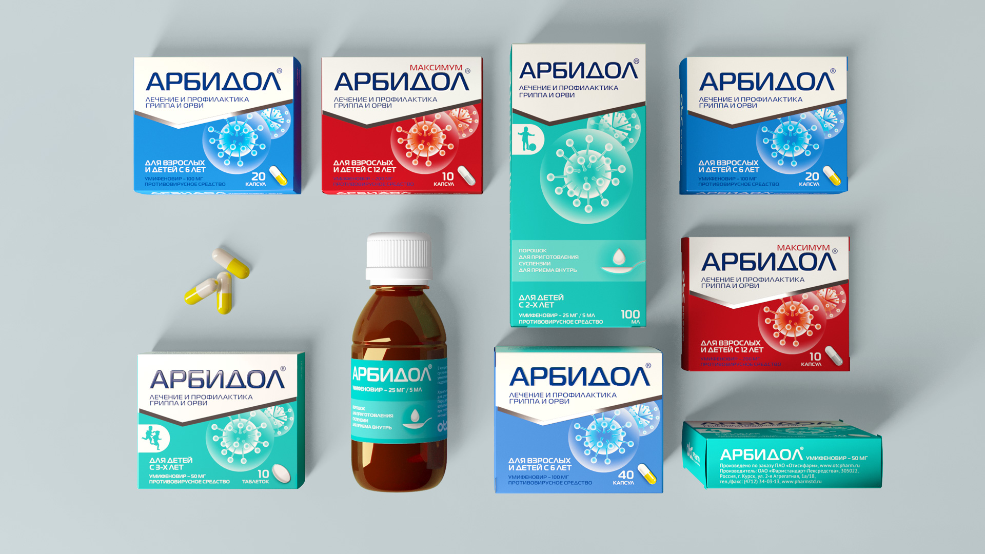
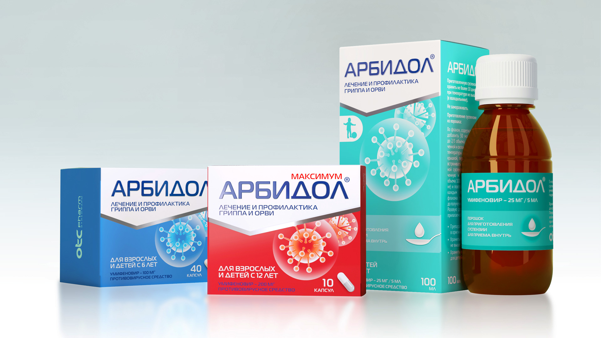
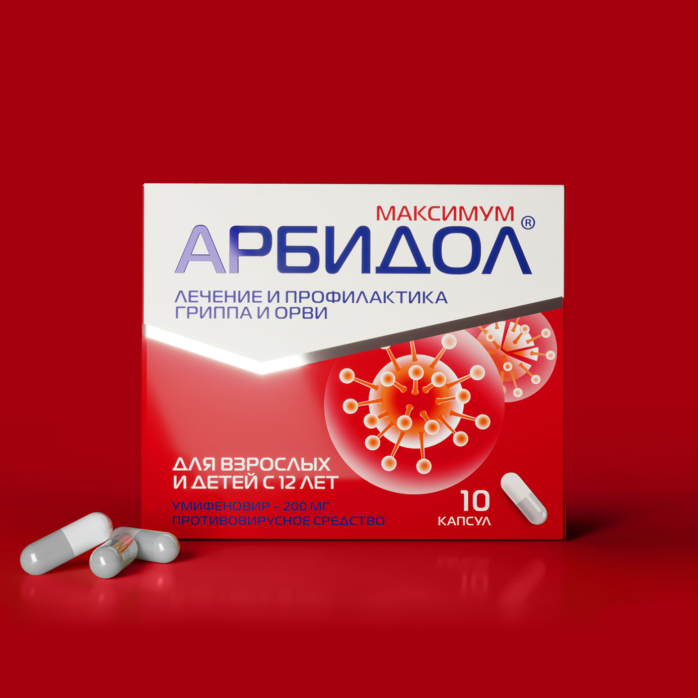
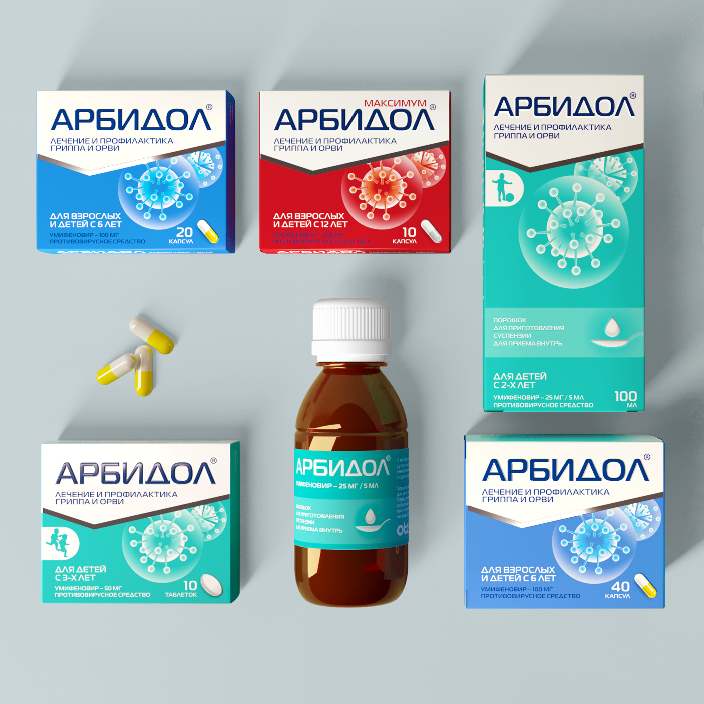
After a series of sales, the Arbidol trademark in 2014 was acquired by OTC Pharm, which expanded the range of drugs by adding two forms – Arbidol Maximum with a convenient dosage and Arbidol in suspension for children.
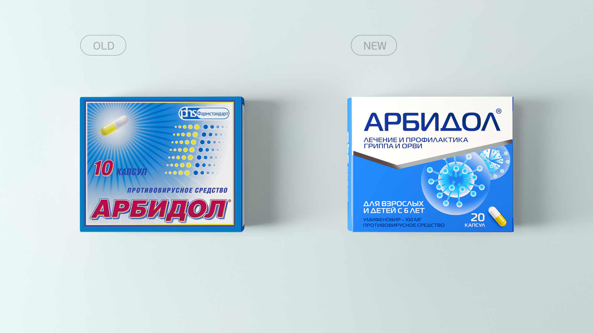
Rebranding goals: By 2016, the brand had lost many of its appeal. With the emergence of active competitors, Arbidol began to be perceived by the target audience as “outdated and ineffective”.
The agency was to reverse this process. It was necessary to analyze the reasons for refusing purchases and find the right approach to solving the problem of visual communication with the consumer.
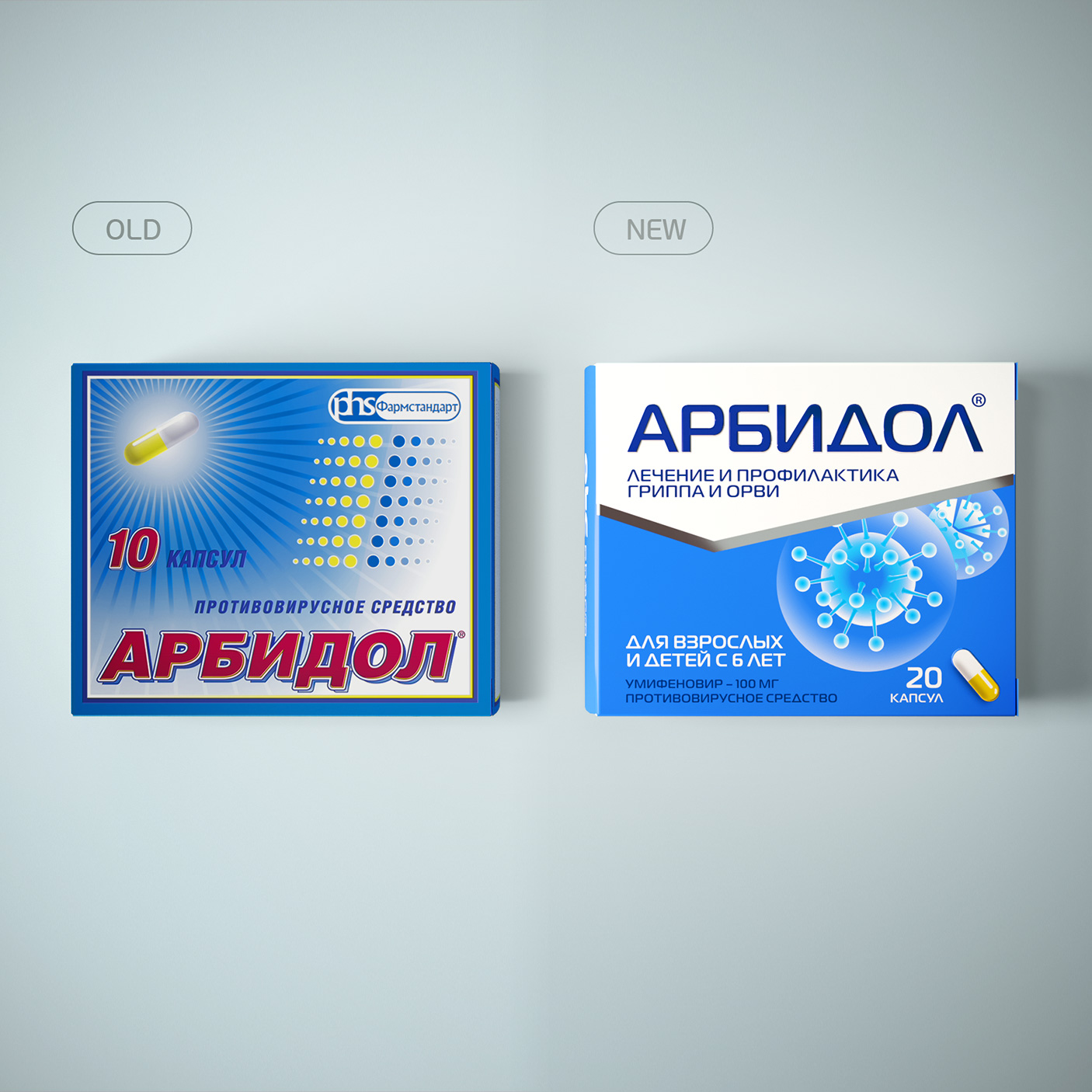
After in-depth research and conferences held with OTC Pharm employees, we came to the conclusion that the packaging style of the early 2000s looked archaic, “non-medical” and did not inspire confidence in the target audience. The front of the package did not contain important information for the consumer to assist in making a purchase decision. There was no clear difference between drugs within the lineup.
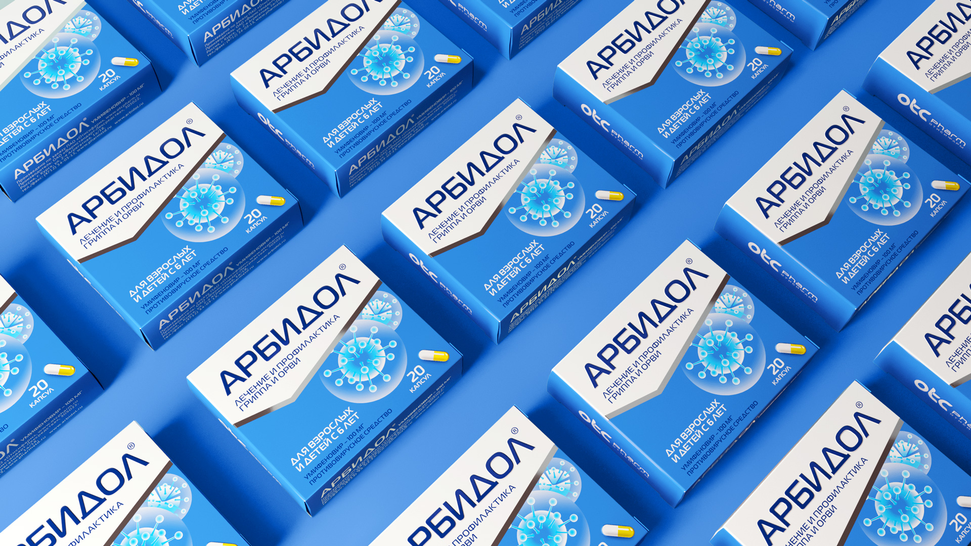
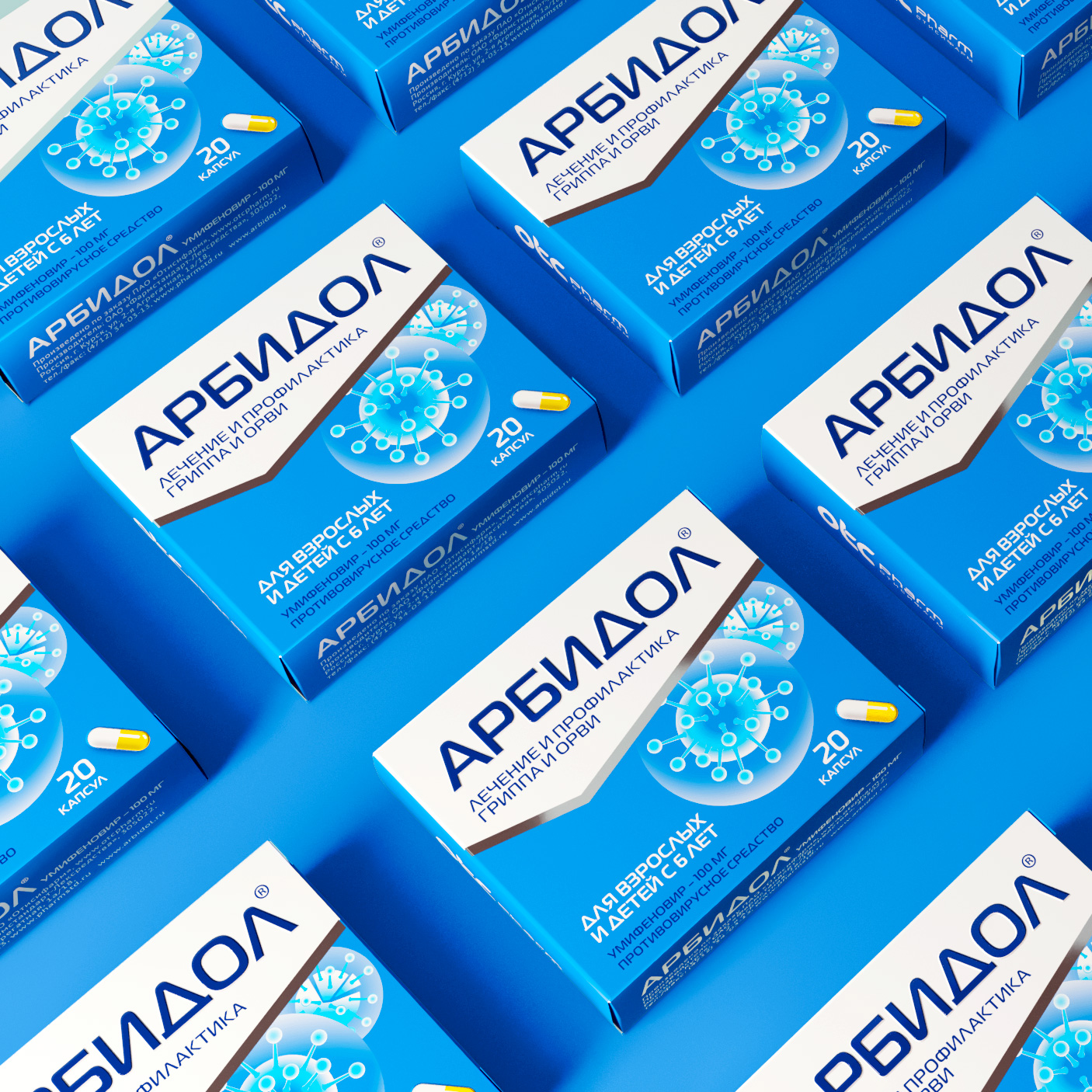
The agency was tasked with developing a radically updated trademark and a line of packaging that would be noticeable on the shelf, distinguish this product from the competitive environment and inspire confidence in the drug. The main feature of the drug is its direct antiviral orientation. We decided to focus on this and reflect it on the front of the package, creating an additional identity element in the form of a schematic image of a virus.
During research interviews, consumers complained that they could not immediately see the drug on the shelf, since its name is often blocked by foreign objects on the product shelf in the pharmacy chain. We have moved the brand logo to the top of the label, which cuts into the illustrative front of the package with a white wedge. This technique made it possible to focus attention on the active brand zone, to give it the necessary feeling of a medicine and to unite the entire product line, making it stand out from the competitive environment.
SKU positions are markedly different in color, which simplifies the selection of the required type of drug. The trademark logo has also been seriously redesigned. It has become more modern and austere.
To add the necessary premium to the brand, when printing packaging, we suggested using such techniques as foil stamping, hot stamping and spot varnishing. So the logo of the trade mark acquired a relief and glossy UV varnishing, and the brand area is emphasized by a foil silver line in the form of a check mark.
All these changes led to the set goal – after the rebranding, sales of the drug increased by more than 50%.
CREDIT
- Agency/Creative: Asgard Branding
- Article Title: Asgard Create the Rebranding for Arbidol Medical Supplies
- Organisation/Entity: Agency
- Project Type: Packaging
- Project Status: Published
- Agency/Creative Country: Russia
- Agency/Creative City: St. Petersburg
- Market Region: Asia, Europe
- Project Deliverables: Brand Design, Brand Mark, Packaging Design
- Format: Blister-Pack, Box
- Substrate: Pulp Carton
- Industry: Pharmaceutical
- Keywords: Arbidol, Asgardbranding, Asgard, Pharma, Pharmaceuticals, Medicine, Red box, Drug
-
Credits:
Art Director: David Avakyan
Creative director: Olga Loseva
Designer: Stanislav Virin
Designer: Polina Savenkova
Project Manager: Nadezhda Manokhina


