


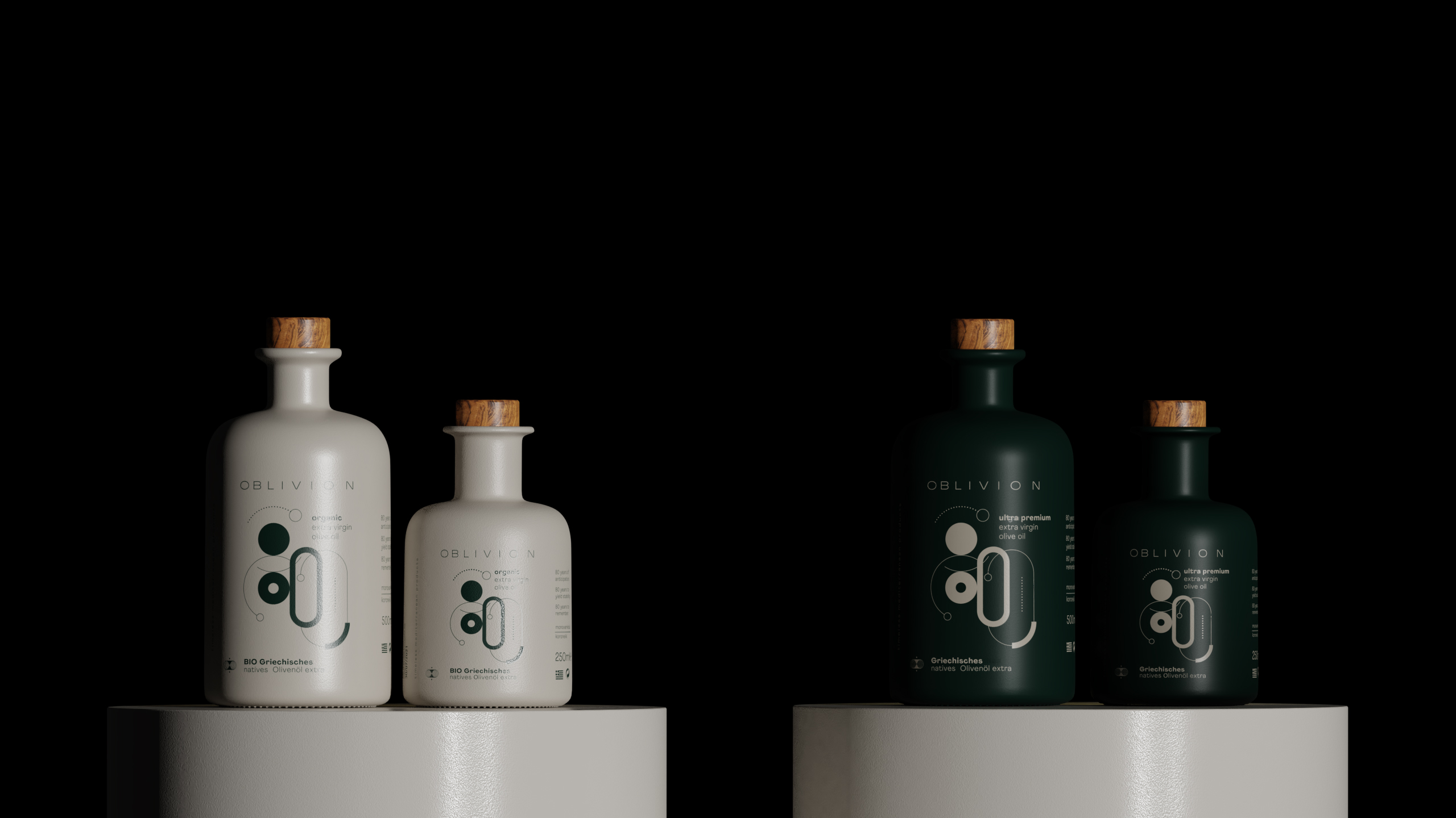
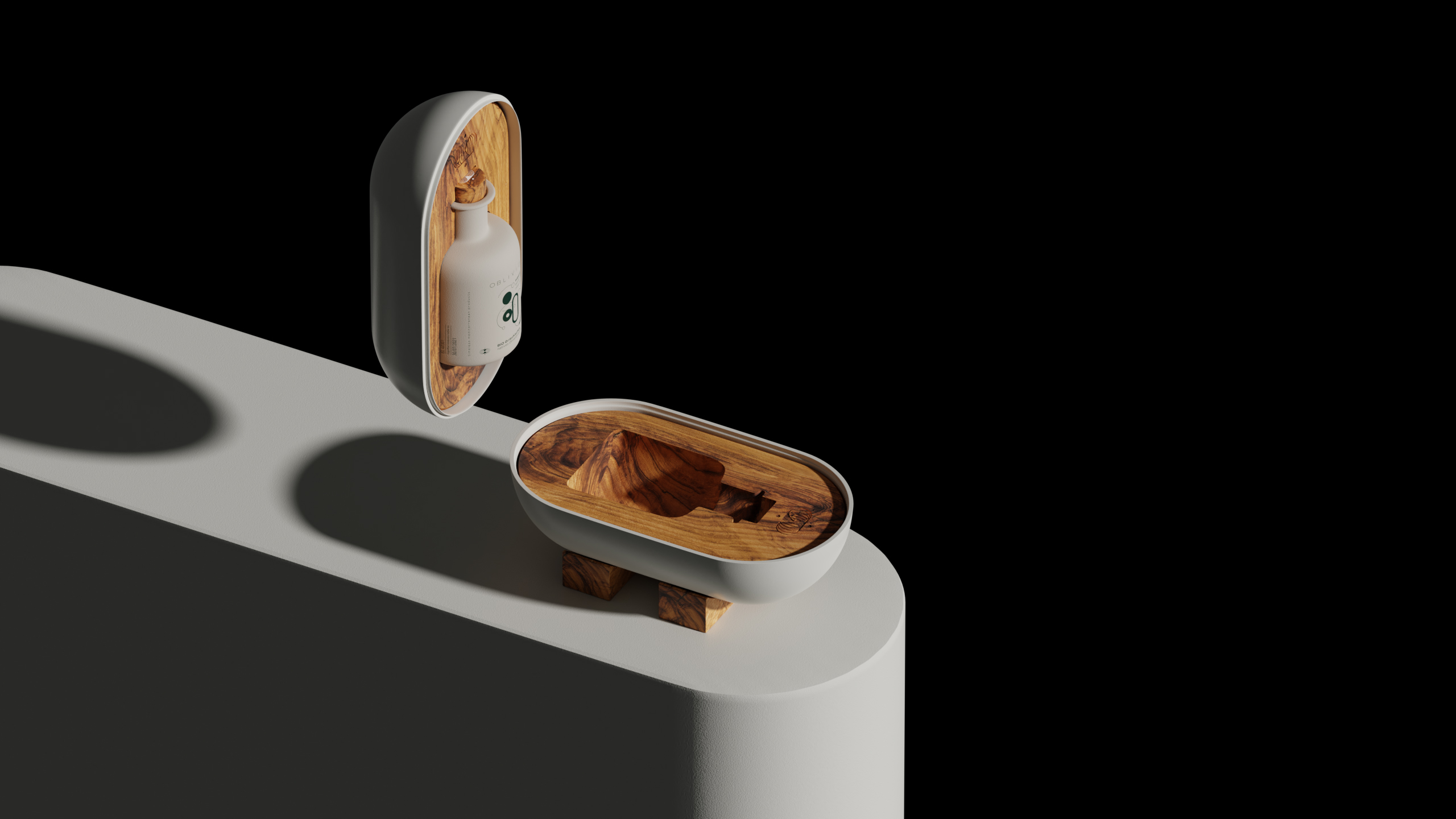
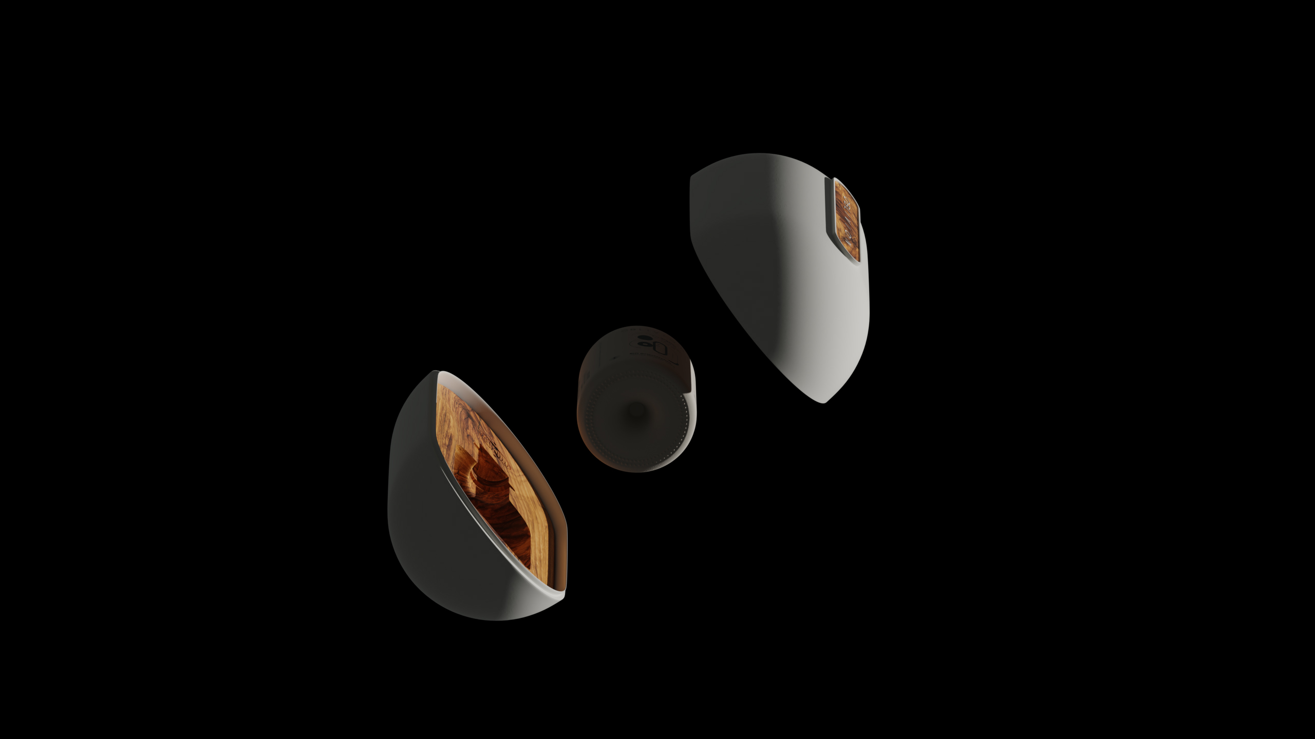
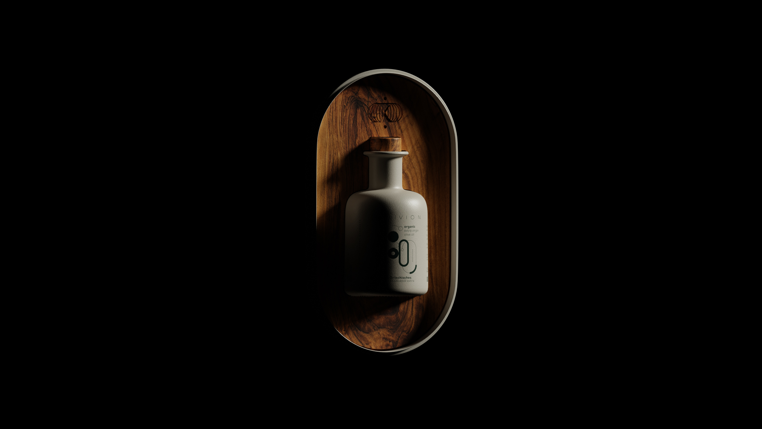
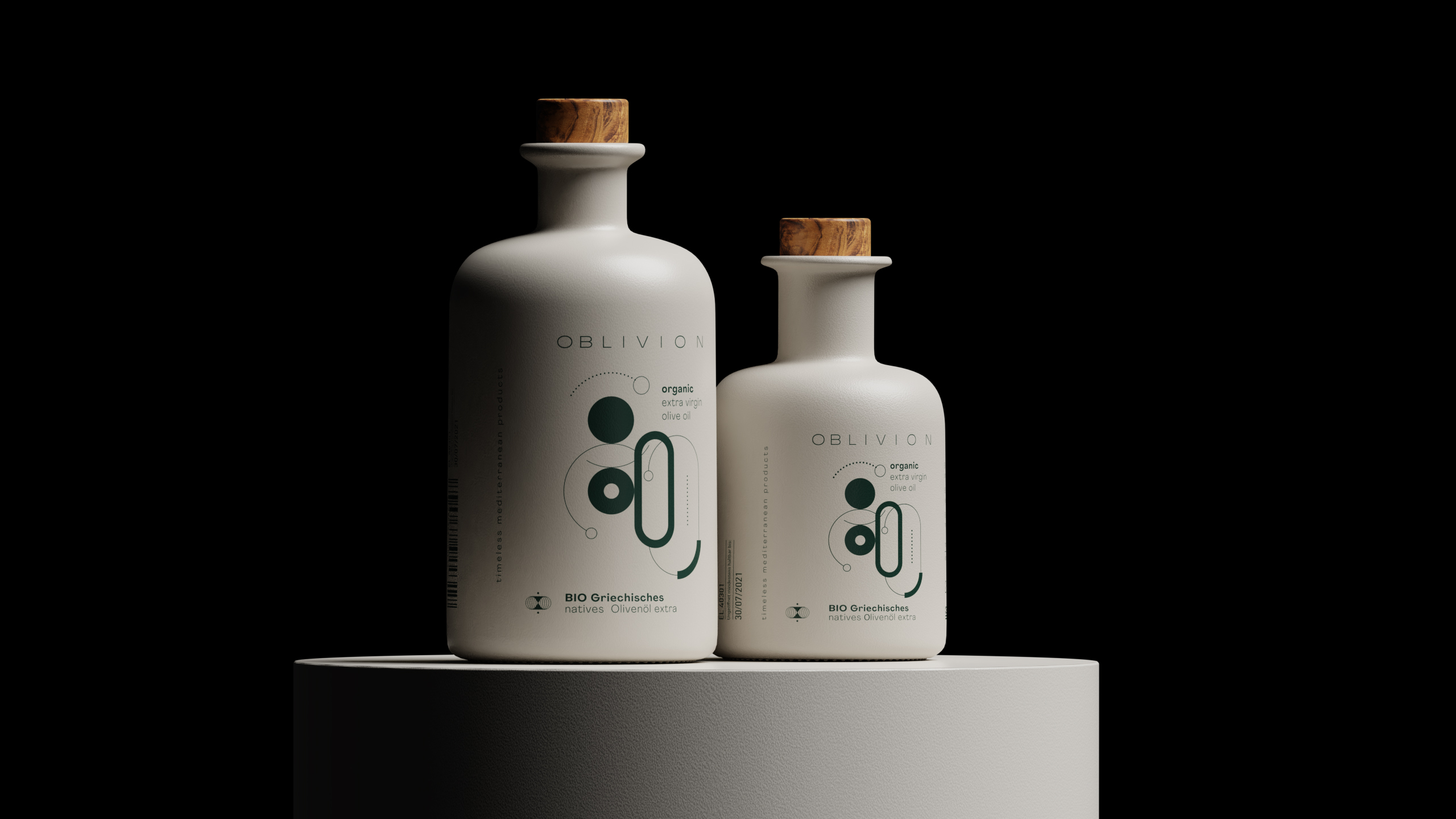
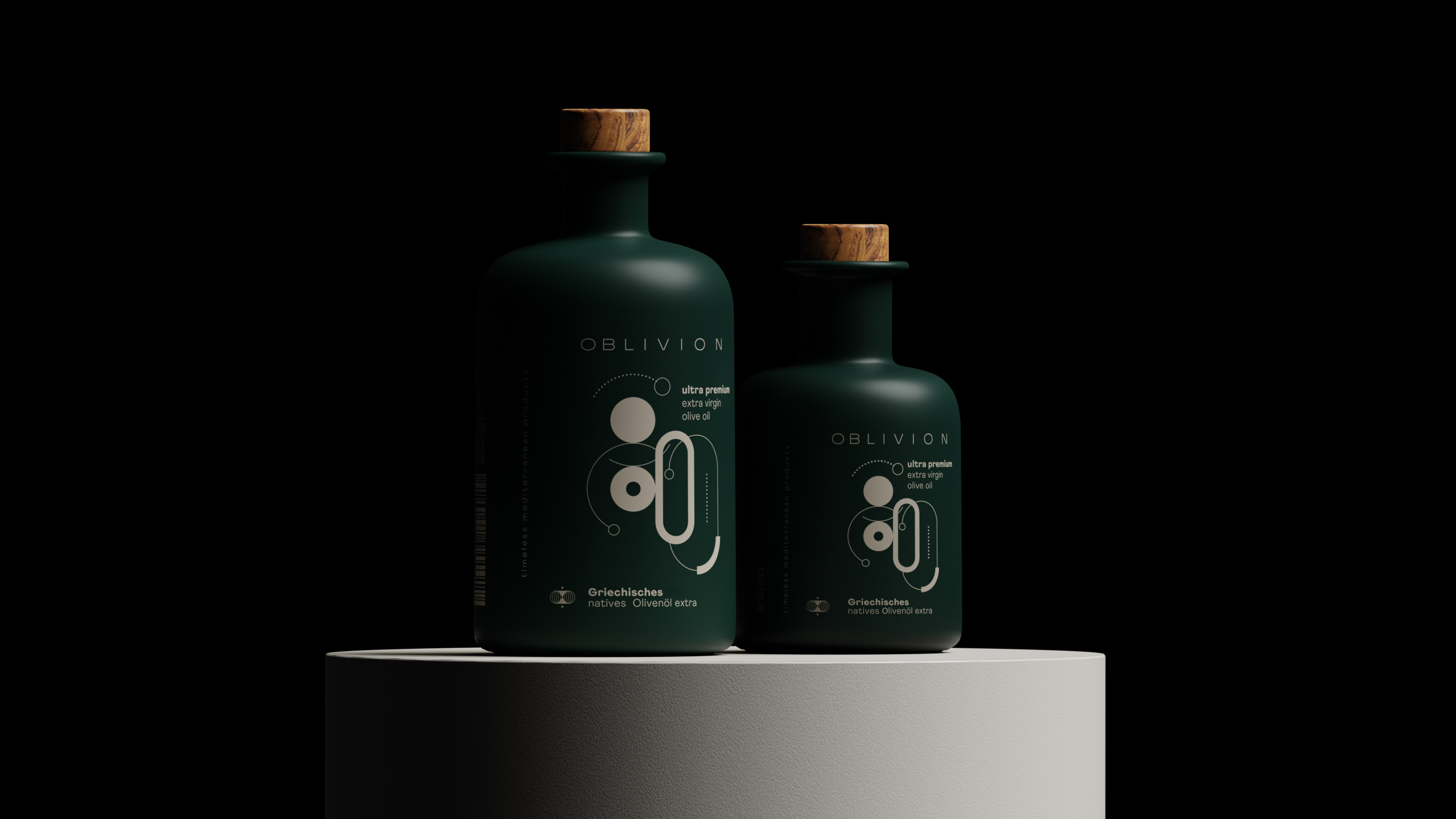
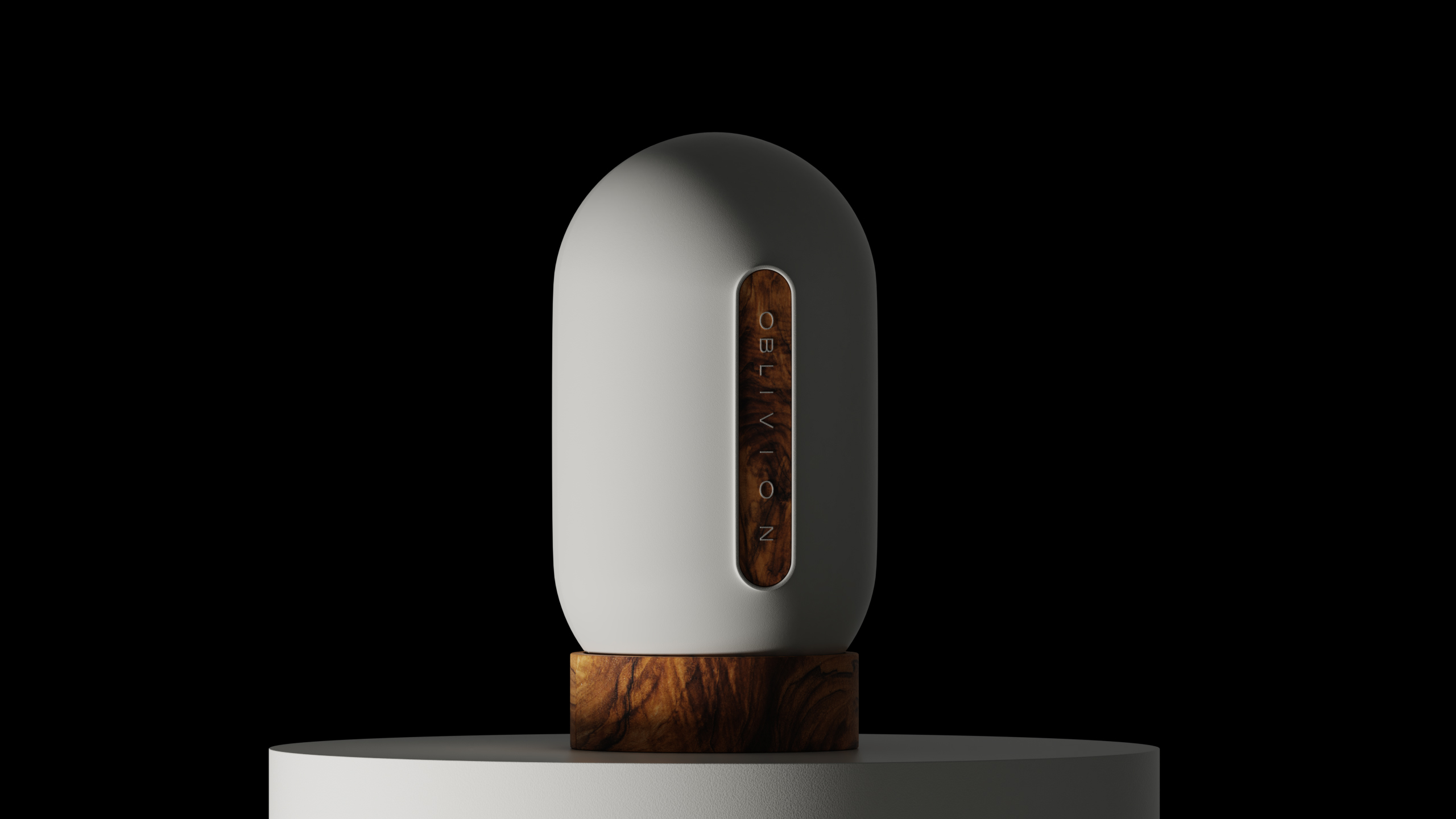
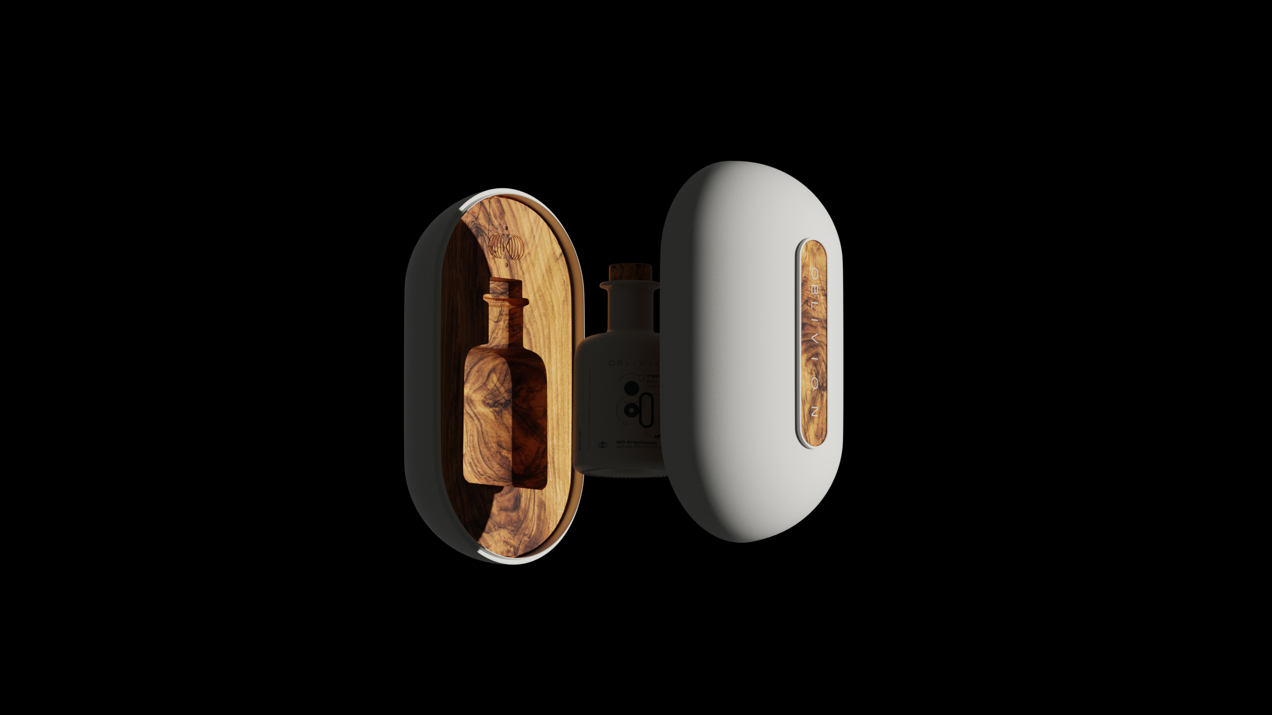
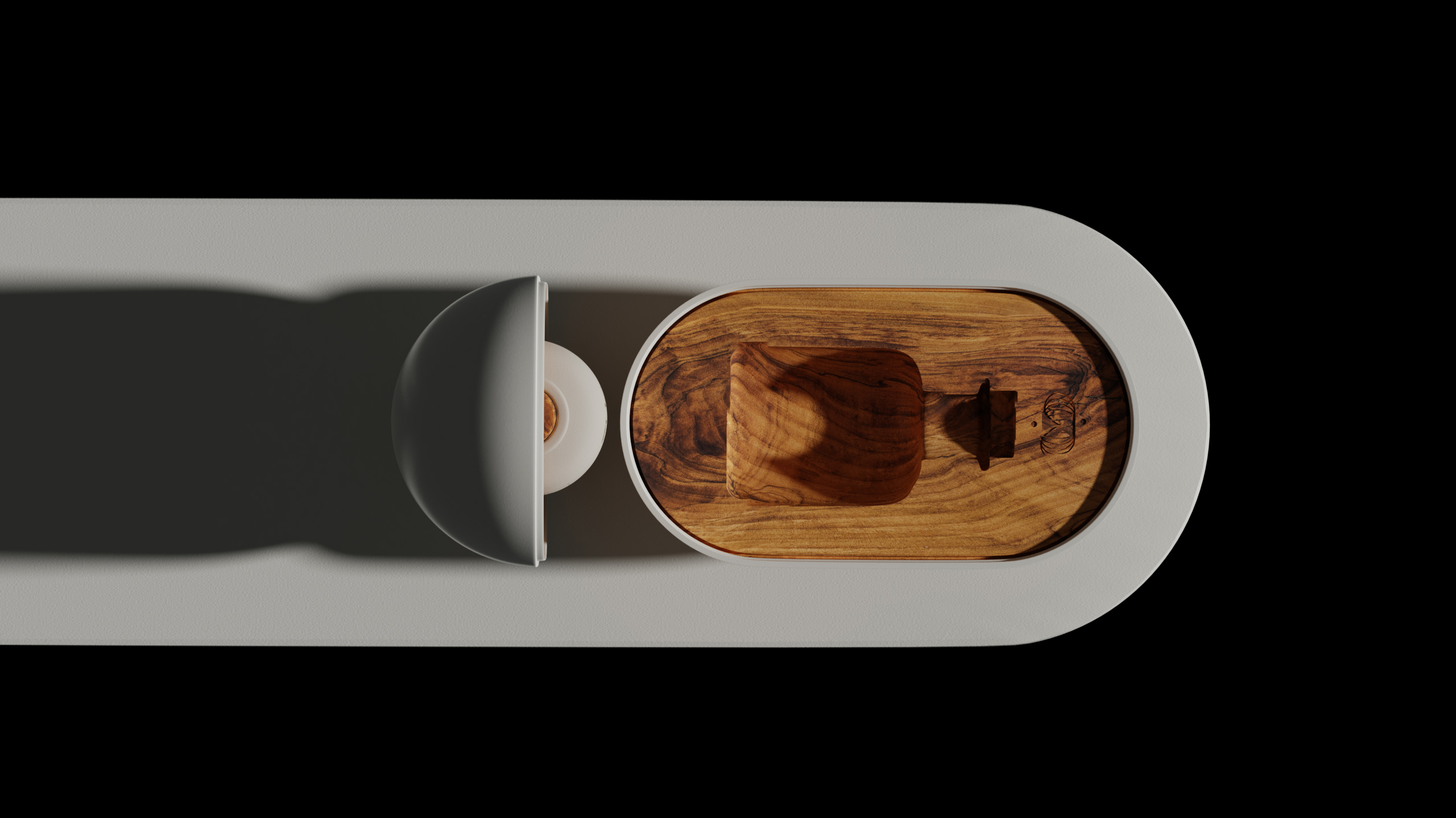
In this context, a series of top olive oils has been seeking its identity. Thus, it’s been our duty to retrieve from this mists of oblivion all those”forgotten” characteristics of these products’ substance and quality, whichare directly related to their production, history and essence.
So, at Artware, we embraced the Organic and Ultra Premium versions ofthis Extra Virgin Olive Oil with the meanings that were hidden in their Oblivion. Extracted from the most valuable fruit of the Mediterranean: theolive, a fruit that has defined the history, society and daily life of thepeoples of the region over the centuries, and following the modern care ofproduction and standardisation with quality and safety, the product blendsharmoniously with the name “Oblivion” to remind the consumer of allthose characteristics of its origin.


CREDIT
- Agency/Creative: Artware
- Article Title: Artware Create Oblivion Organic Olive Oil Packaging Design
- Organisation/Entity: Agency, Published Commercial Design
- Project Type: Packaging
- Agency/Creative Country: Greece
- Market Region: Europe
- Project Deliverables: Brand Architecture, Brand Identity, Brand Naming, Brand Strategy, Brand World, Branding, Packaging Design, Product Architecture, Product Naming, Research, Tone of Voice
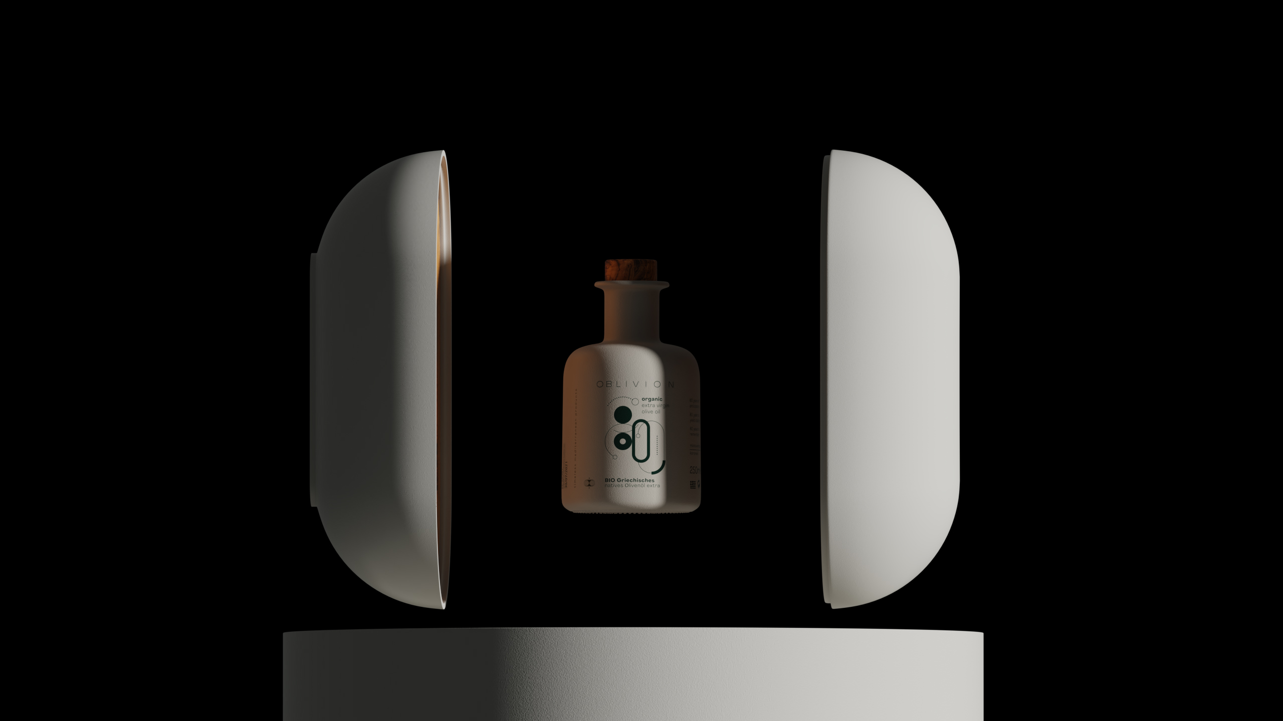
- Format: Bottle
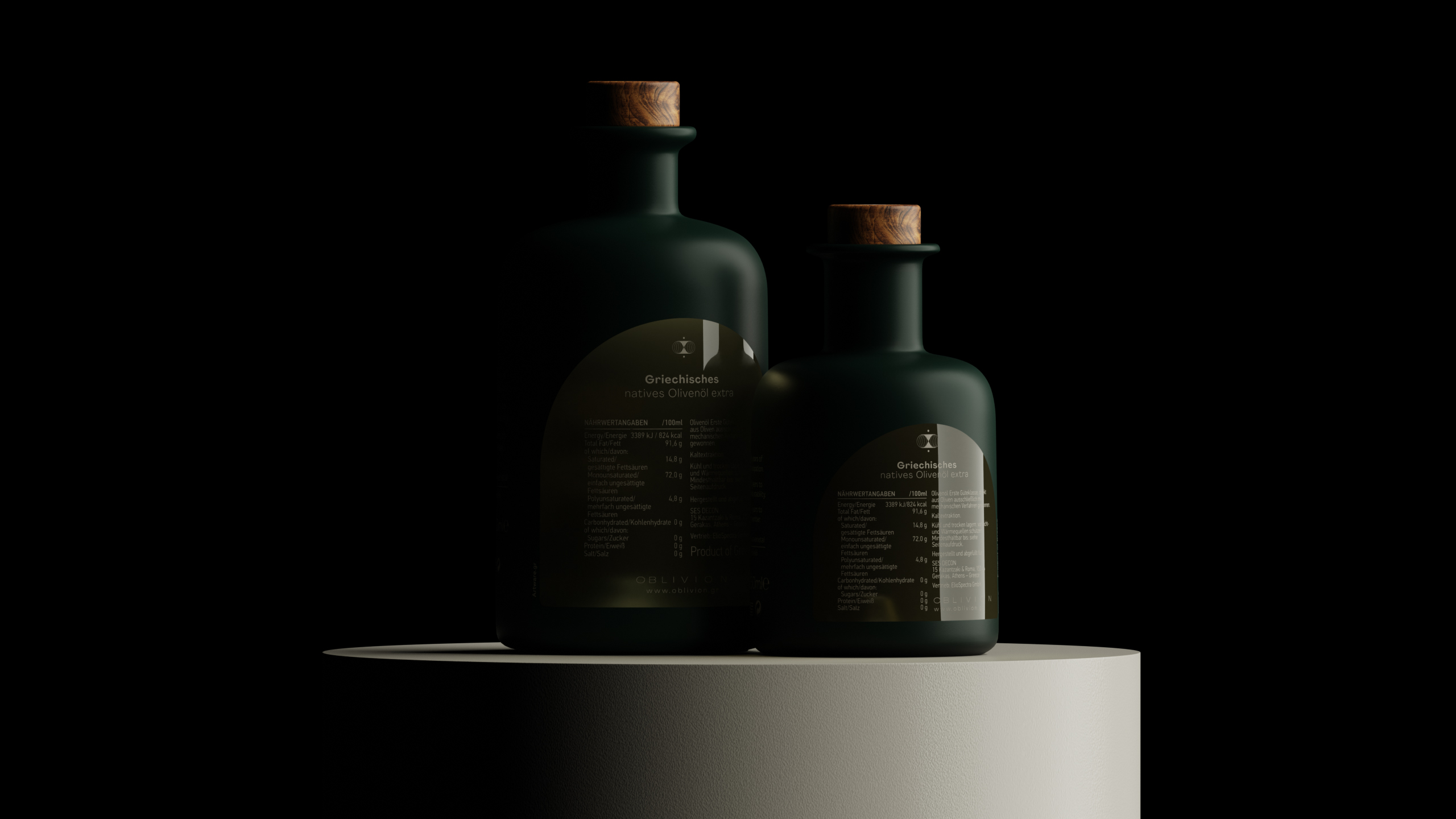
- Substrate: Ceramic, Glass Bottle, Wood


