


The story of Divino Grano goes back 50 years: Pablo’s grandfather started this business with products derived from nixtamal dough and flour. This business has passed from generation to generation in his family, and Pablo decided to create a new brand for products that would broaden the horizons of his business.
This is how Divino Grano was born.
We created the name thinking about all the properties that corn has, our ancestral Aztec cereal, to which divine origins were attributed.
This name exalts the grace and majesty of corn.
Divino Grano does not speak specifically of corn, and leaves open the possibility to focus on wheat and rye products, an expansion that has been an advantage for the company by diversifying its products.
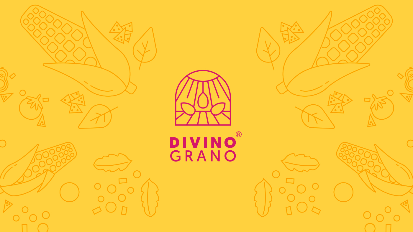
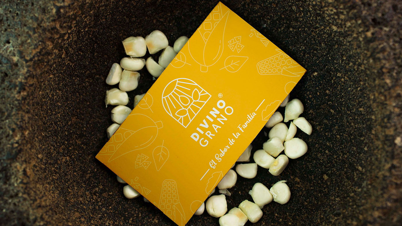
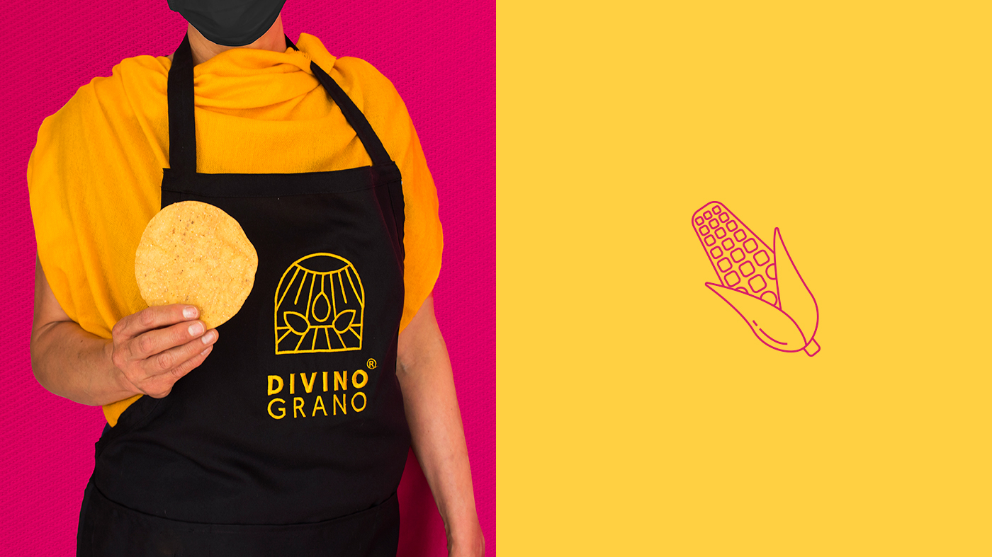
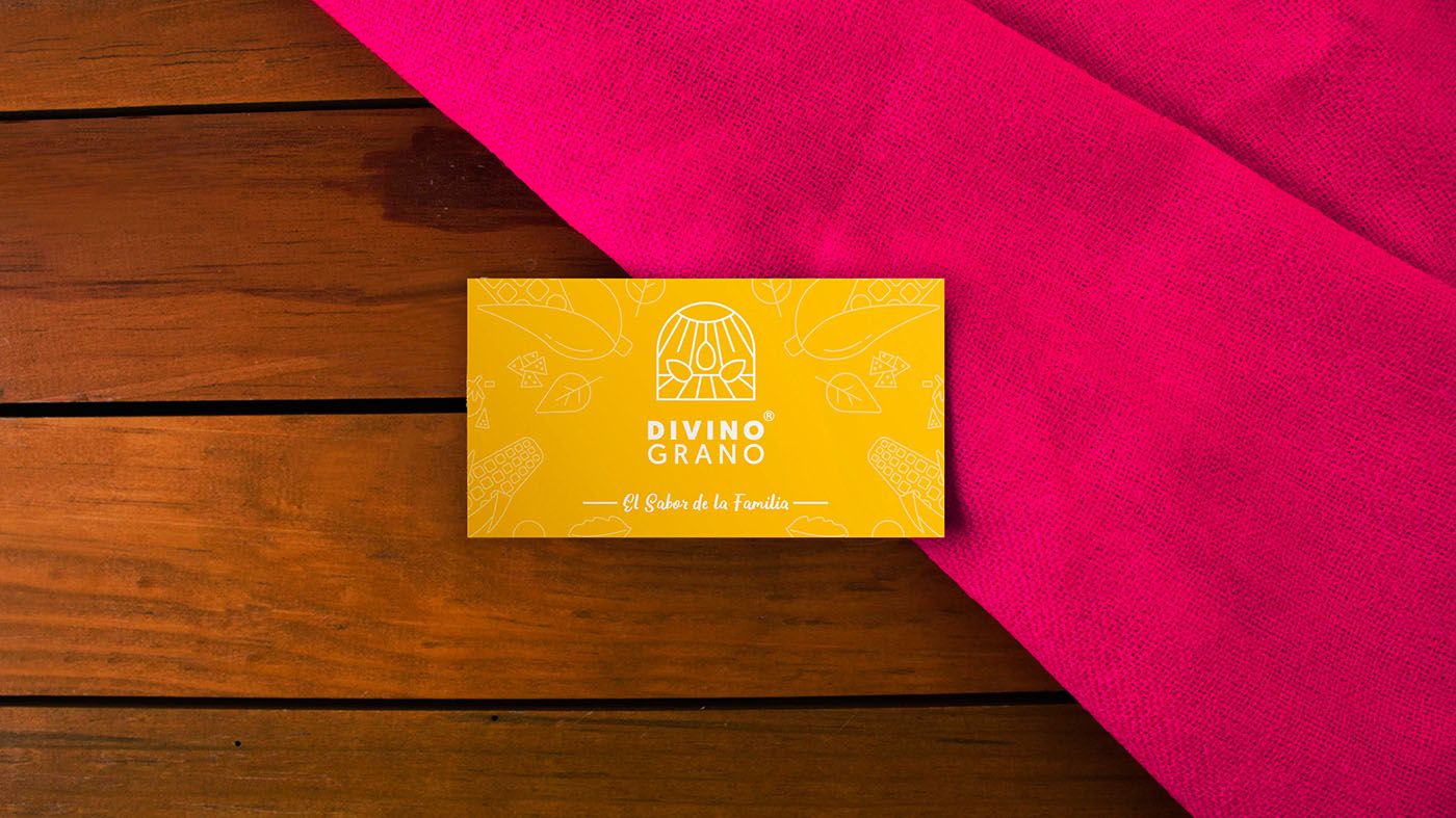
Based on the concept of divinity, the brand’s logo refers to the stained glass windows found in churches, which are a symbol of light and hope. The logo draws a landscape with the sun as a pillar for agriculture and a field on the horizon, where food comes from.
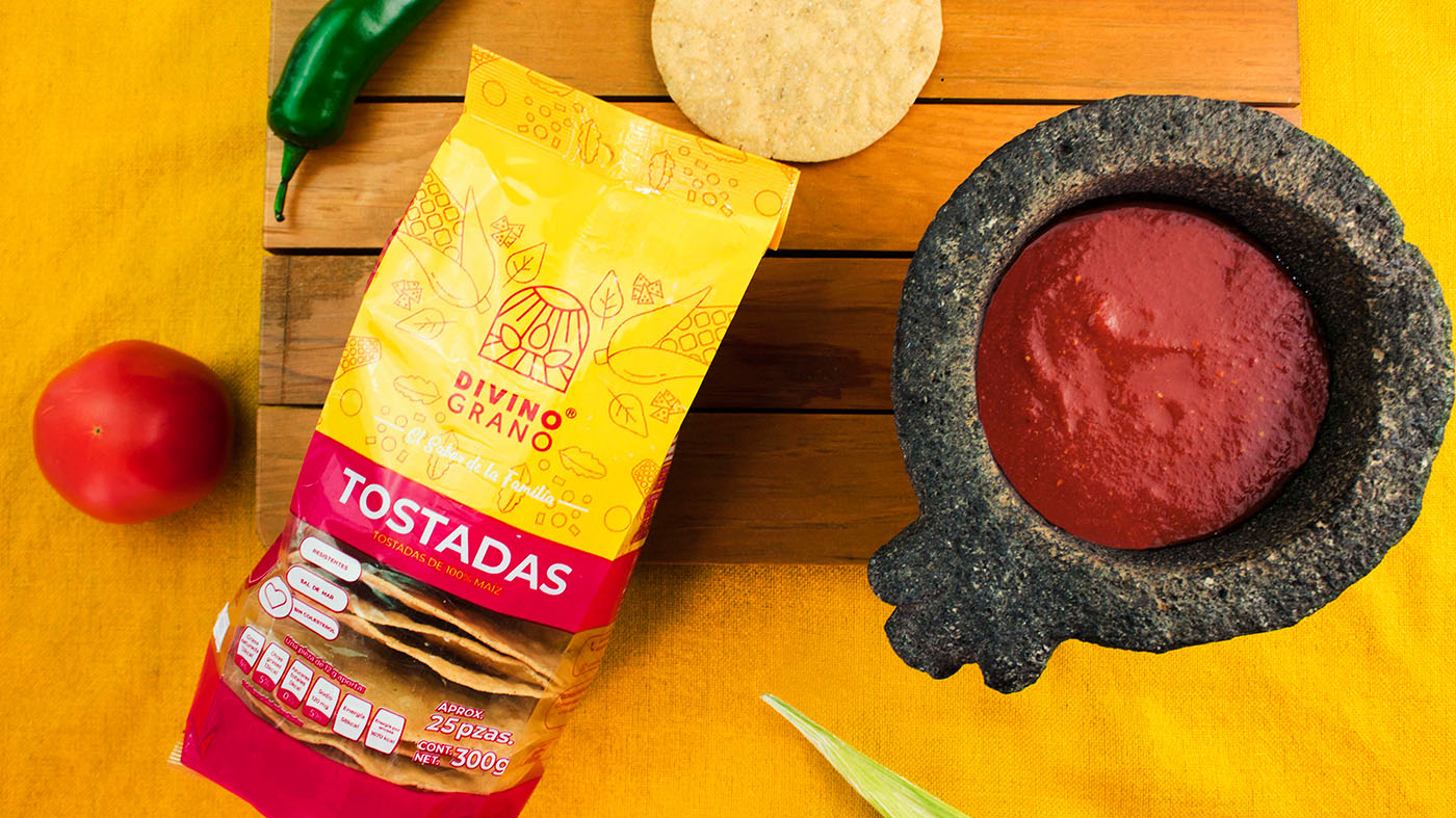
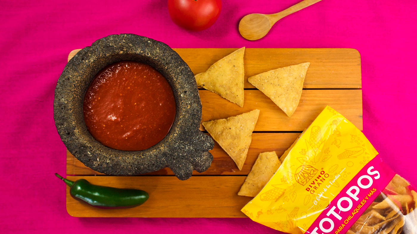
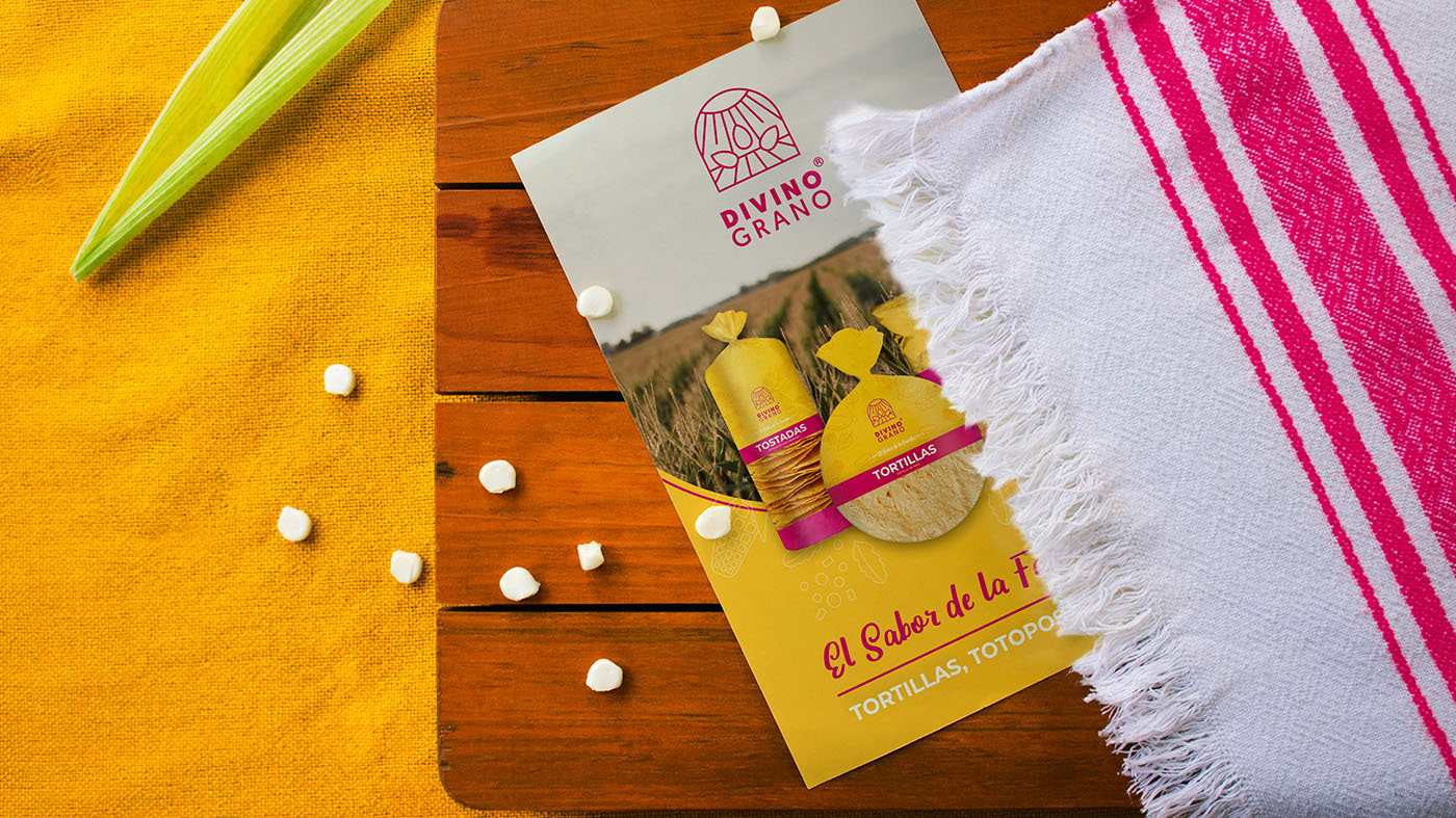
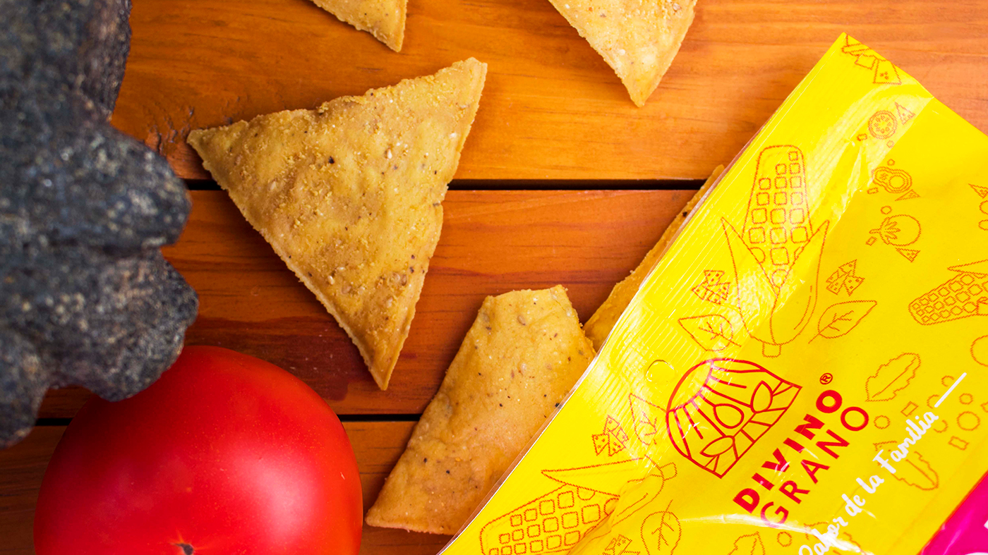
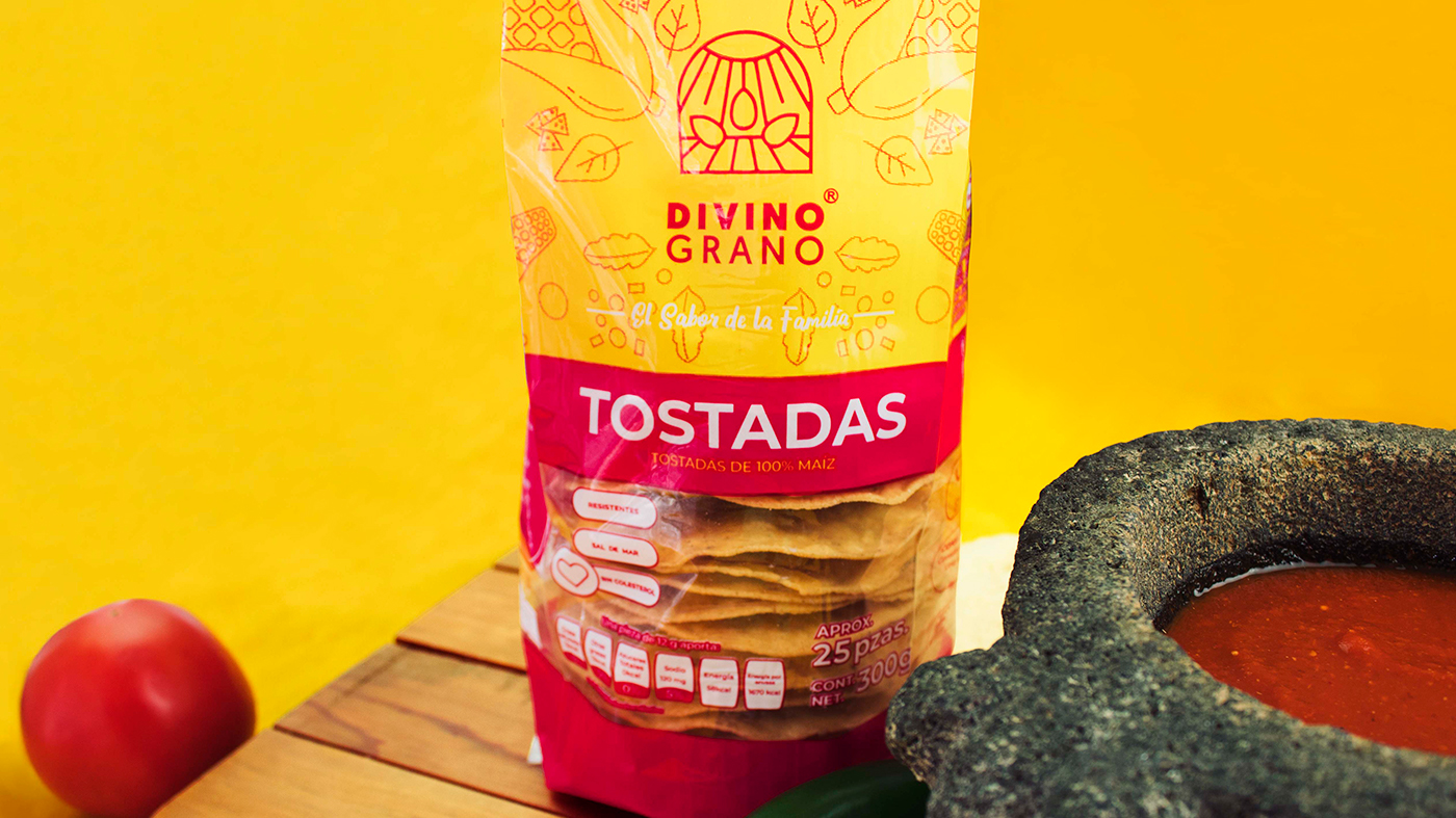
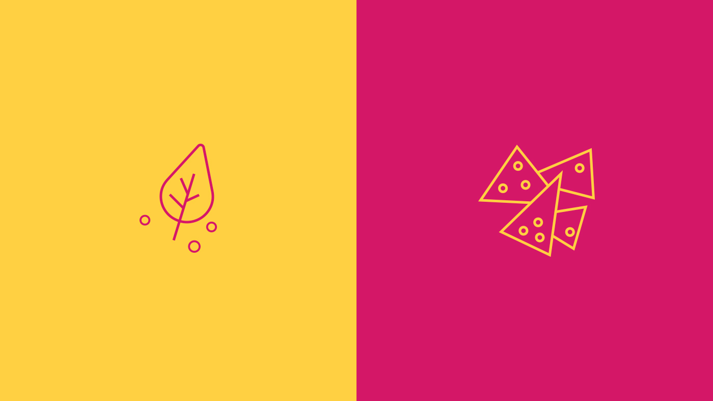
In 2019, the year in which we created this brand, we designed the image of the main products: chips, tostadas and tortillas. We design complementary illustrations to the identity with the ingredients used to prepare tostadas and Mexican food. The main colours in the brand system are yellow, which represents the colour of corn, and pink, a colour clearly identified as Mexican. Our goal was to create a brand focused on housewives of Mexican households, who bring the best food to the center of the table for their families. We designed this brand to communicate that love, joy and tradition.
CREDIT
- Agency/Creative: Armatoste
- Article Title: Armatoste Create Divino Grano Brand and Packaging Range
- Organisation/Entity: Agency
- Project Type: Identity
- Project Status: Published
- Agency/Creative Country: Mexico
- Agency/Creative City: Mexico City
- Market Region: North America
- Project Deliverables: Brand Design, Brand Naming, Illustration, Packaging Design
- Industry: Food/Beverage
- Keywords: Corn Products, Branding, Naming, Packaging
-
Credits:
Copywriter: Angu00e9lica Pliego
Copywriter: Hilda Cervantes
Concept Designer: Cinthia Cruz
Creative Leader: Ana Nuu00f1ez
Design & Photography: Aldo Manzano
Art Developer: Rosario Badillo
Art Leader: Ivu00e1n Almazu00e1n


