


“New Zealand is 42 degrees south of the Equator, two islands surrounded by water that has evolved over millions of years of unpolluted nature, low population density and some of the world’s most untouched nature.” Antipodes’ brand focuses on delivering the world’s highest quality skincare from her lush green New Zealand forests out here on the edge of the world.
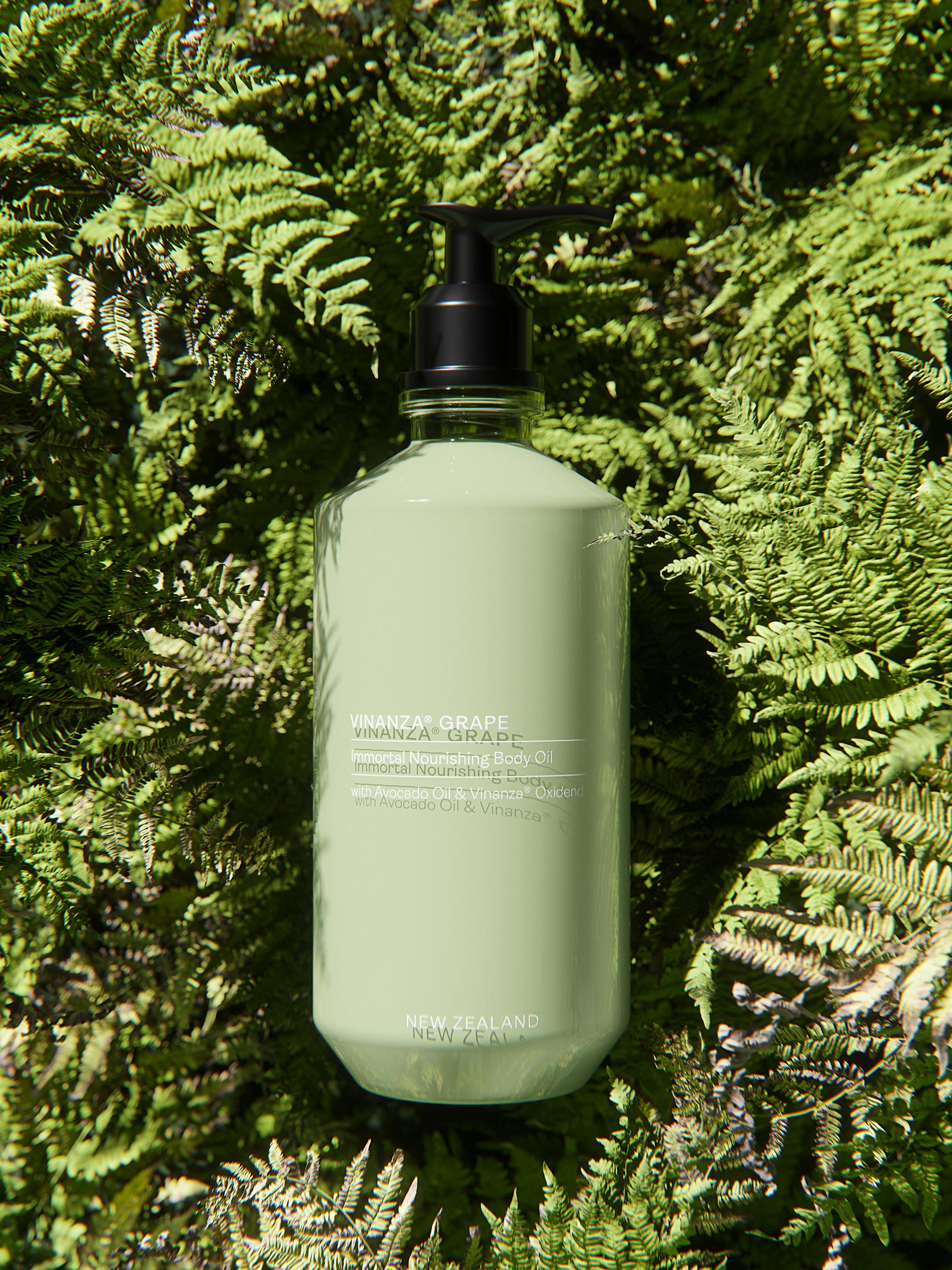
“Vinanza Grape is a revolutionary antioxidant extract sustainably sourced from the by-product of Marlborough sauvignon blanc grape seeds.” – This statement was our main inspiration for the new Antipodes’ design concept.
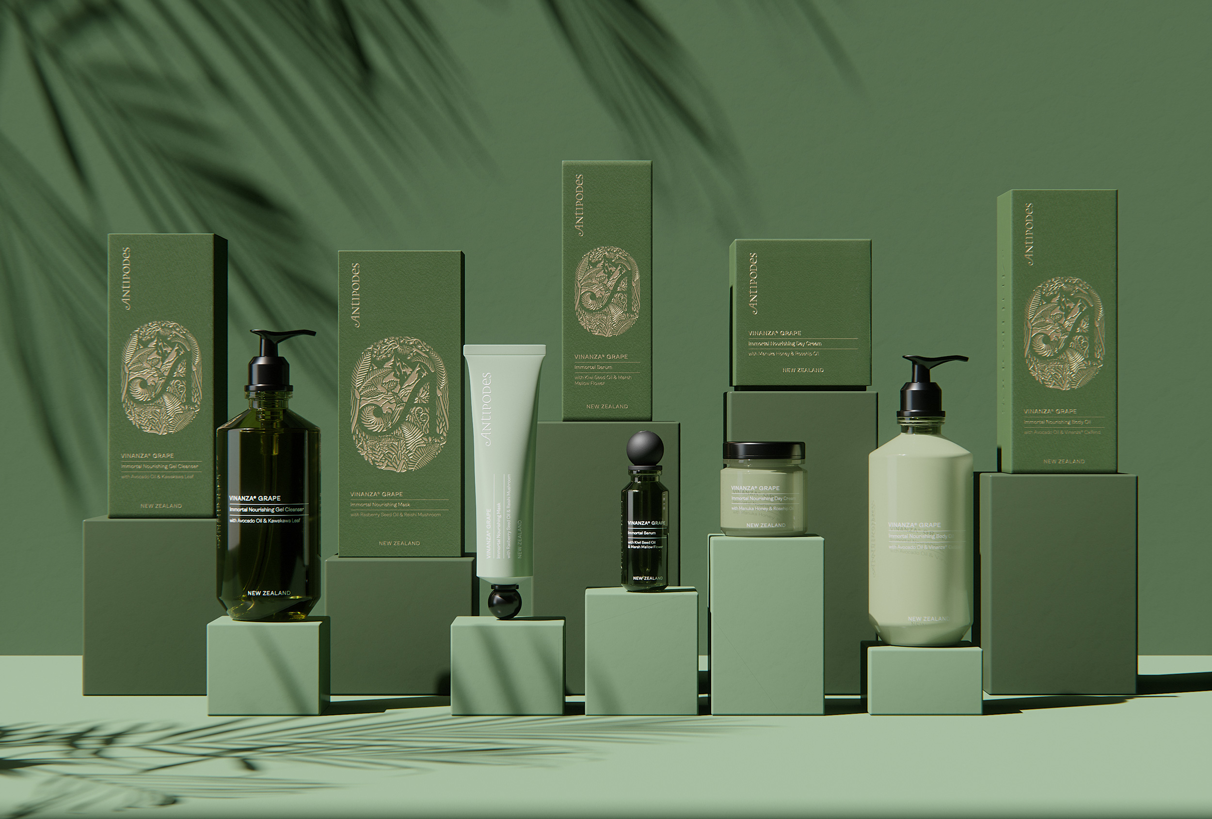
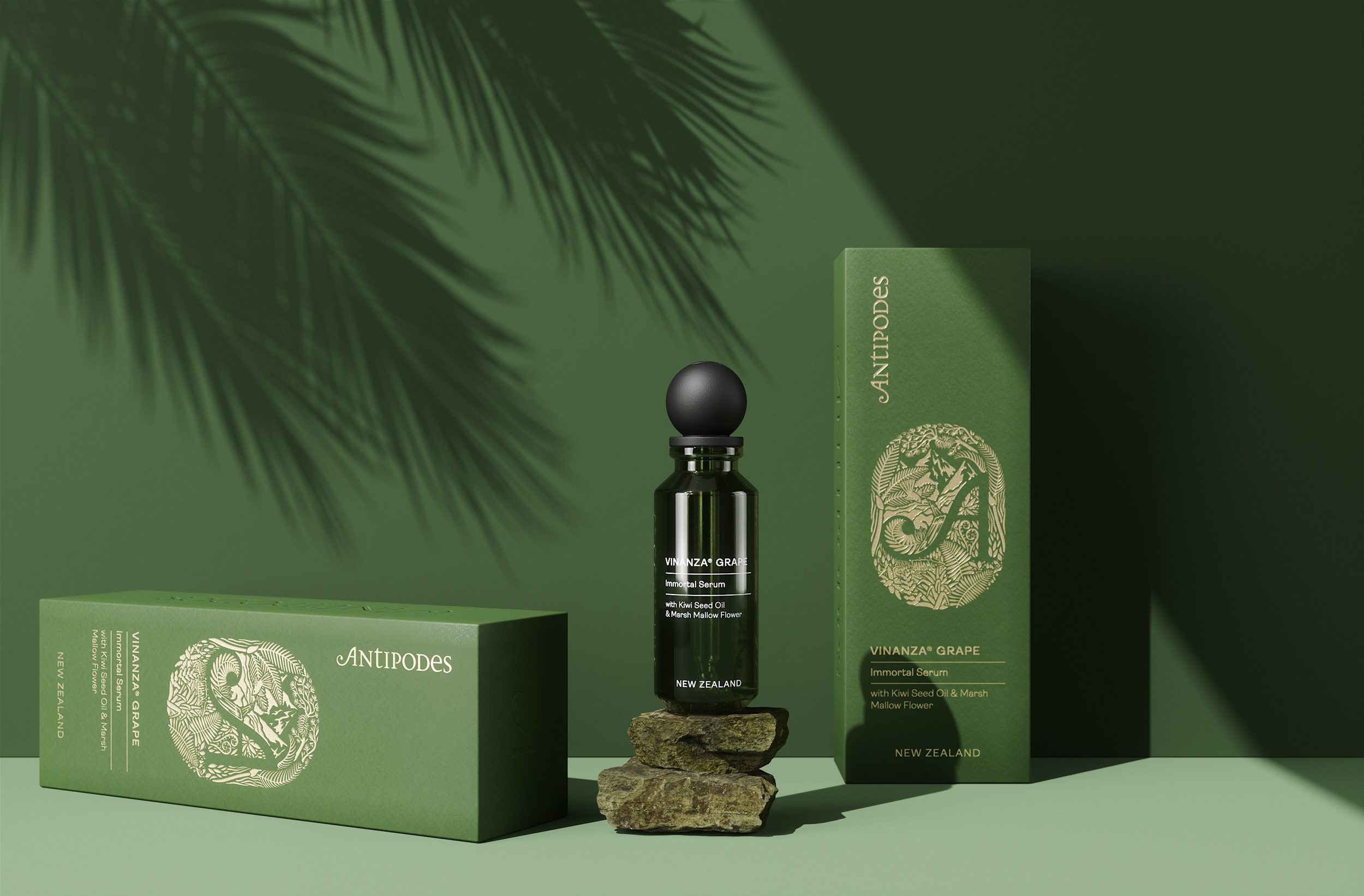
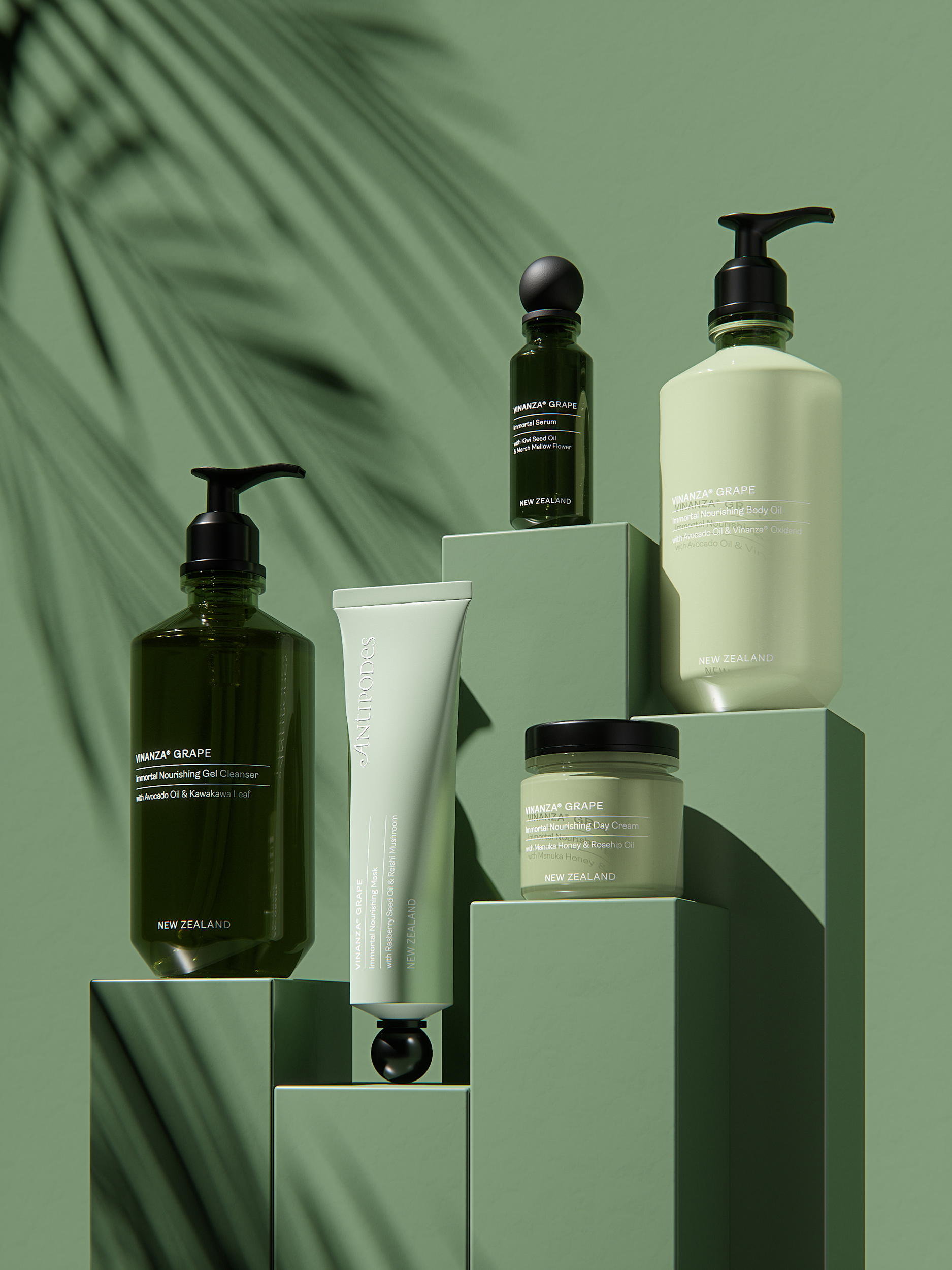
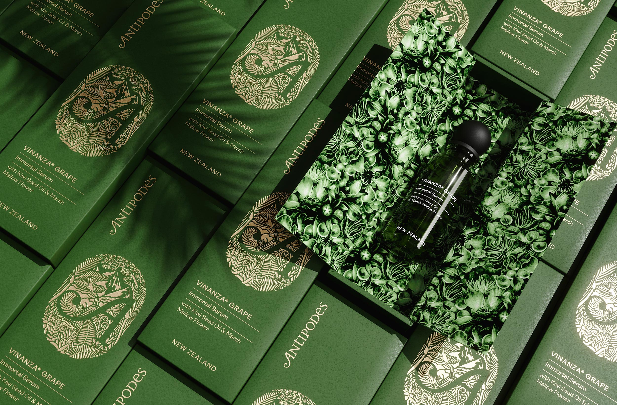
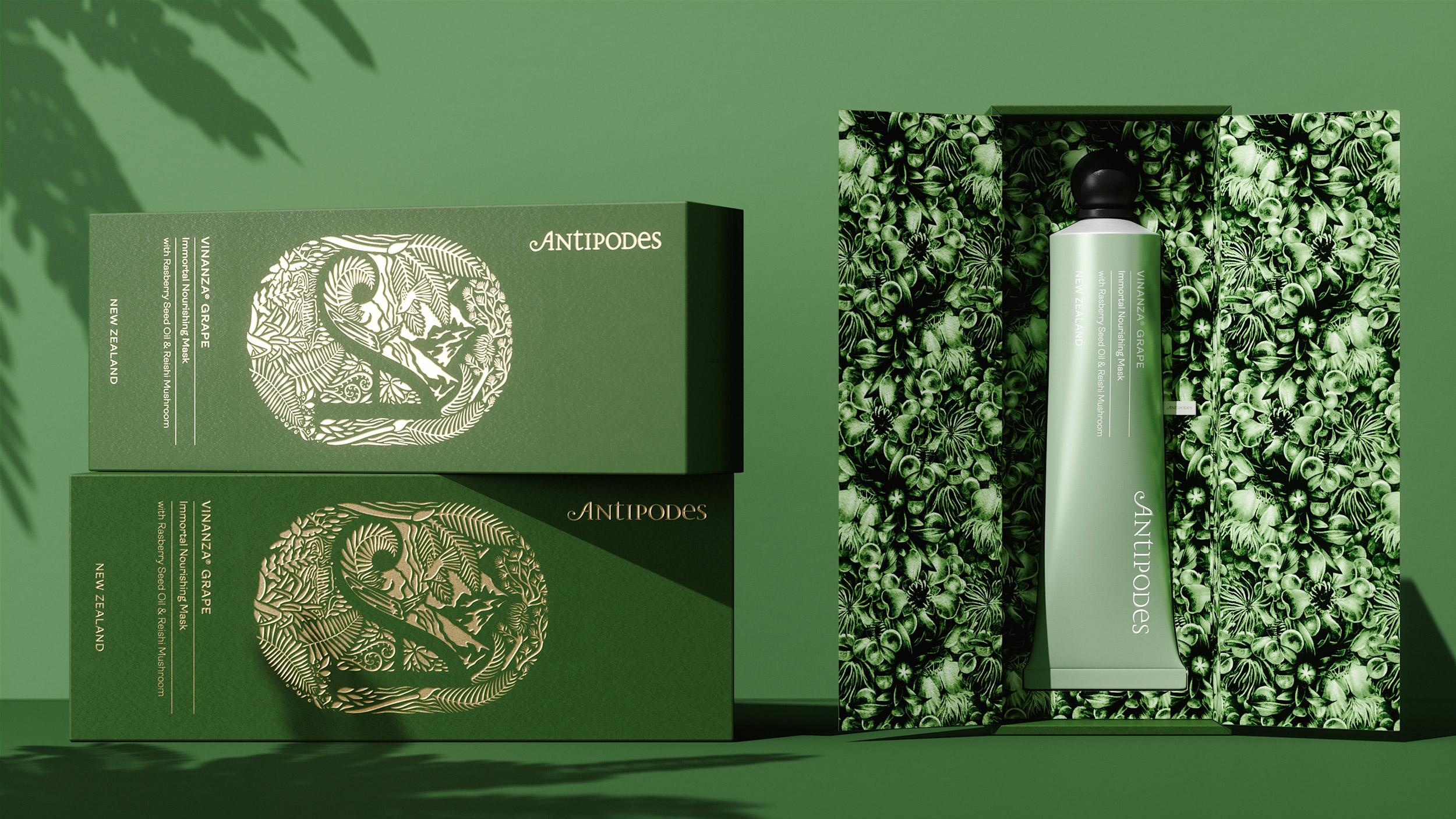
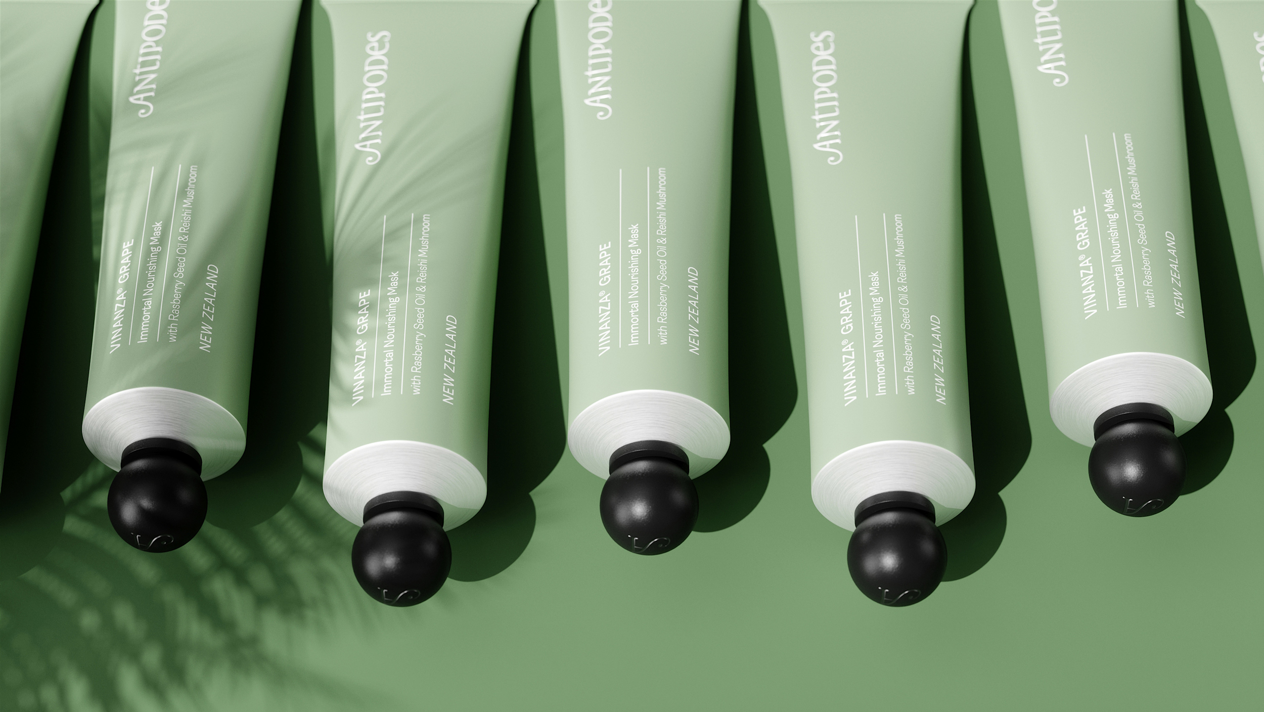
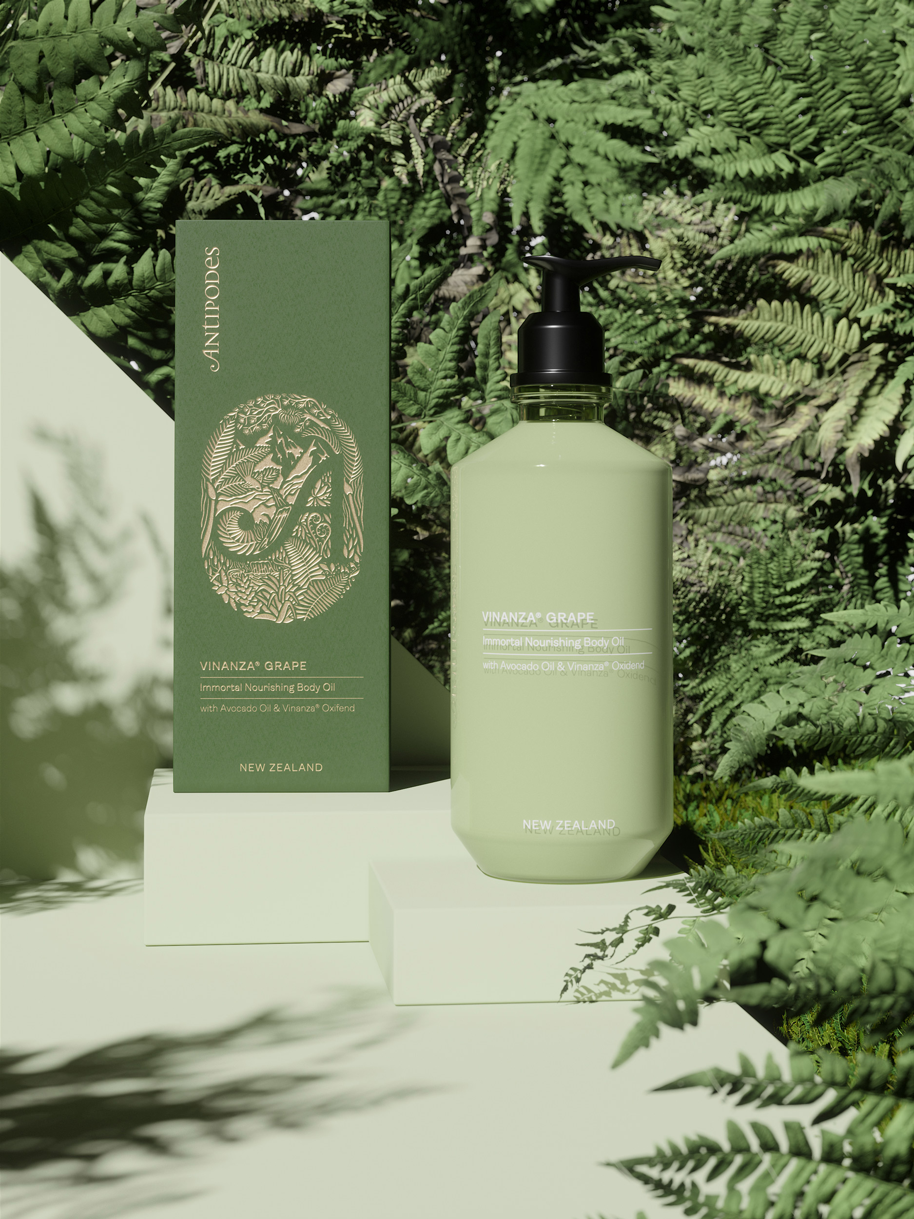
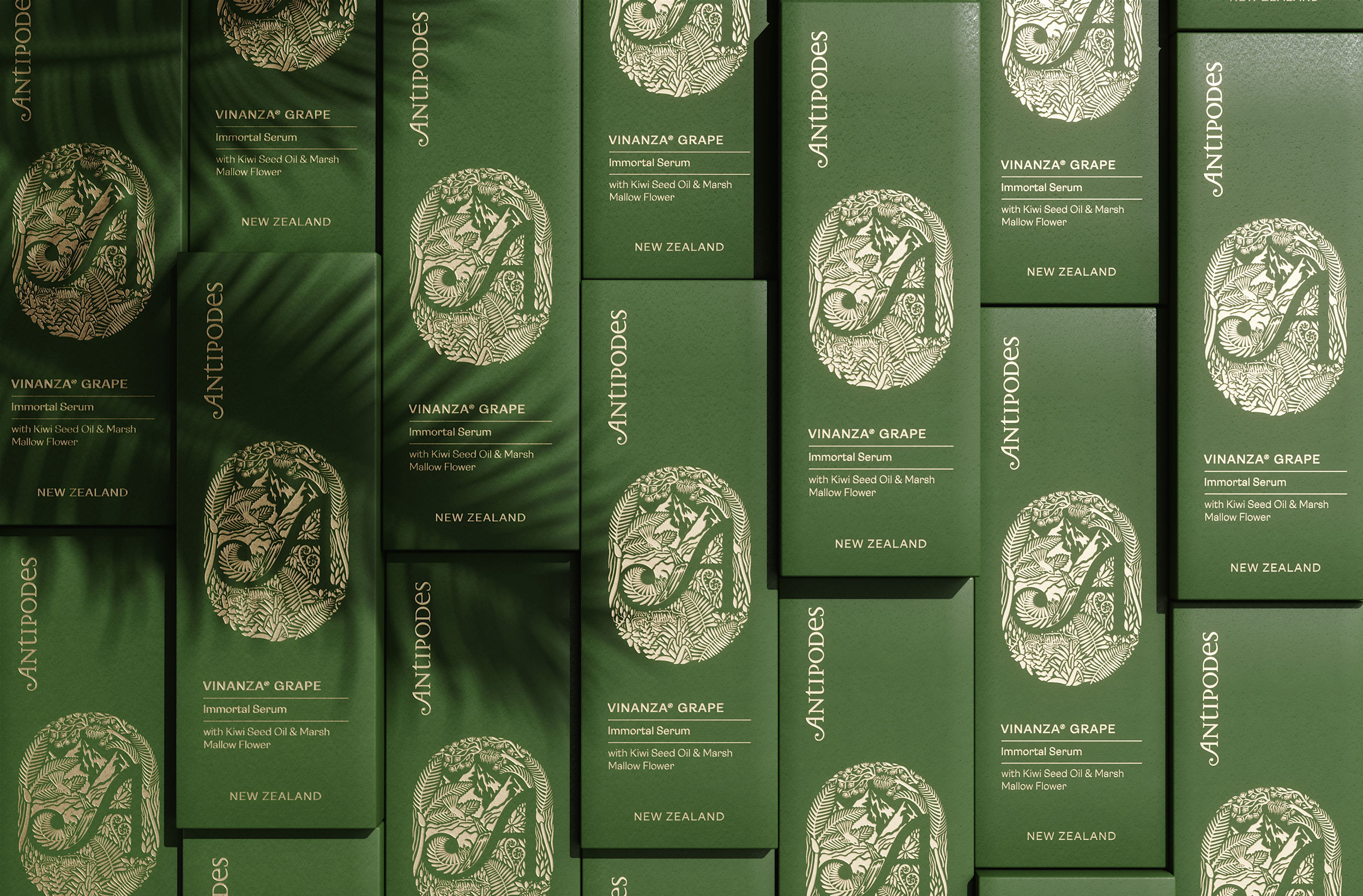
We created a bespoke cosmetics range (design concept/non-commissioned work) for Antipodes New Zealand, including handmade logo and pattern illustrations as well as packaging and bottle designs. We choose to redesign five main products to compose this Vinanza Grape collection; the iconic Mask makes the brand so famous, a Serum, a Day Cream, a Body Oil, and Gel Cleanser. The outer packaging is a straight and modern box with beautiful paper and hot-stamping copywriting.
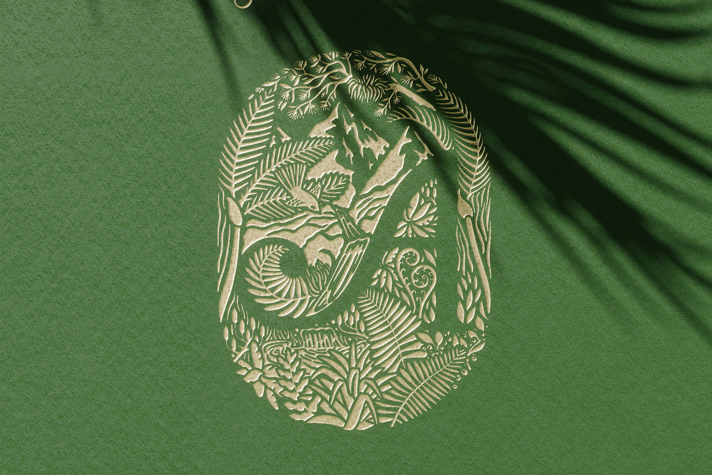
With its modern shape, the handmade logo acts as a frame for the generous and lush New Zealand landscape surrounding the iconic « A » of the brand. The illustration is debossed with a gold foil stamping on top for a premium finish packaging.
Diving inside the packaging, the product is hidden through a two-layers leaflet, the first one with the embossed gold logo. The next one is a quotation from Elizabeth Barbalich, Antipode’s founder; we used it as a manifesto introducing each product discovery. The handmade pattern is a sophisticated mix and match of natural ingredients from the unique New Zealand landscape.
This new Antipodes’ product range is delicately well-designed, with its iconic apothecary shape and deep green glass, a reference to its natural and scientific legacy. The label is a light and delicate silkscreen printing for an understated signature, and Antipodes’ logo is embossed on each glass bottle’s side.
From the finest and elegant packaging, the attention to details to the modern product design, the project aimed to deliver a refined and contemporary Antipodes’ range vision that plays with the abundant nature of New Zealand and the scientific innovation of their products.
CREDIT
- Agency/Creative: Petitmoulin Studio
- Article Title: Antipodes New Zealand Design Concept Designed by Petitmoulin Studio
- Organisation/Entity: Agency, Non Published Concept Design
- Project Type: Packaging
- Project Status: Published
- Agency/Creative Country: France
- Market Region: Europe
- Project Deliverables: Brand Refinement, Graphic Design, Illustration, Packaging Design, Research
- Format: Bottle
- Substrate: Glass Bottle
- Keywords: WBDS Creative Design Awards 2021/22


