


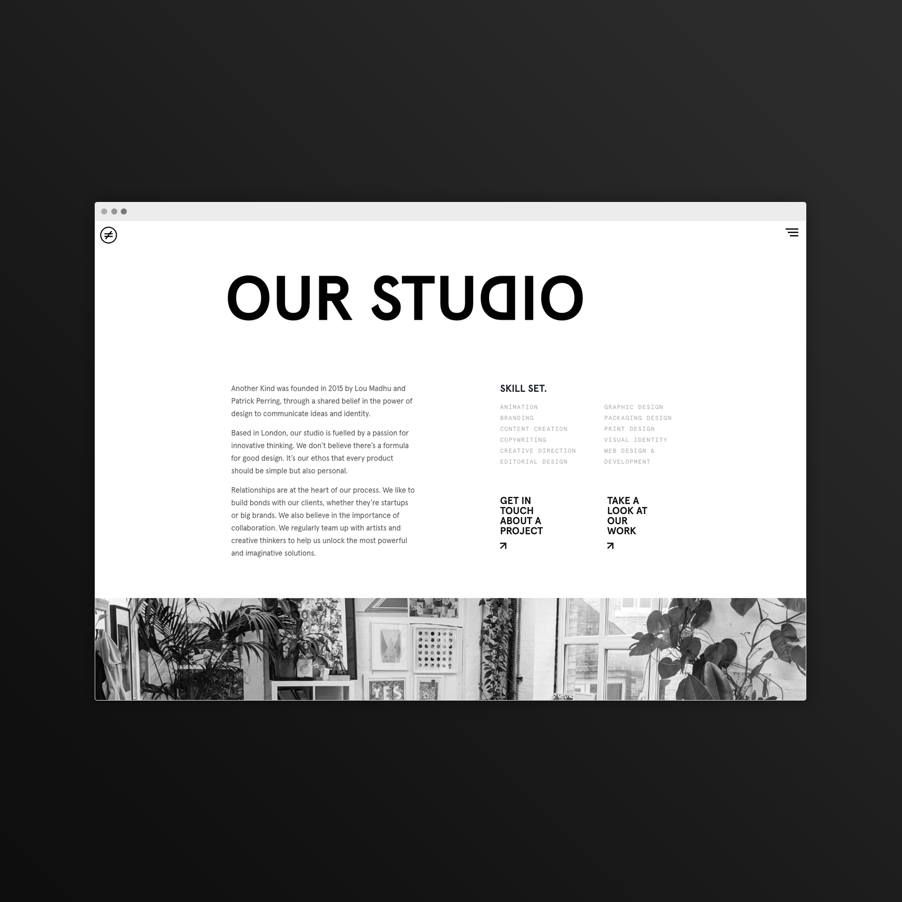
We’re a small design studio based in London and have just relaunched our website alongside a little rebrand.
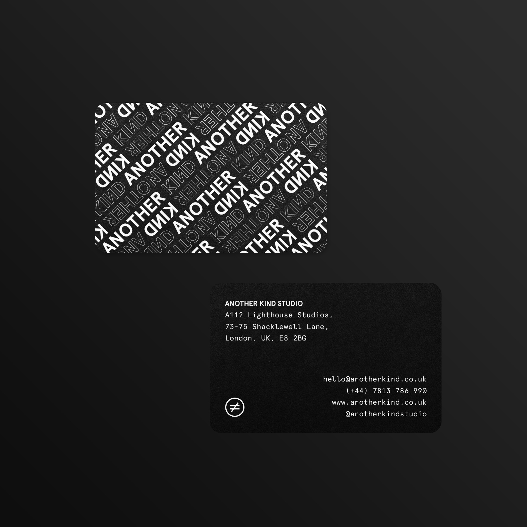
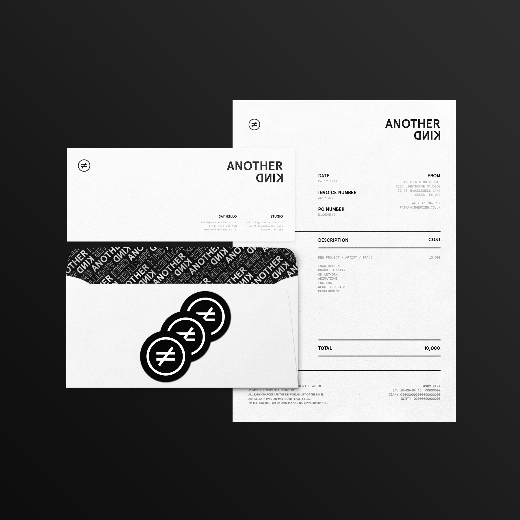
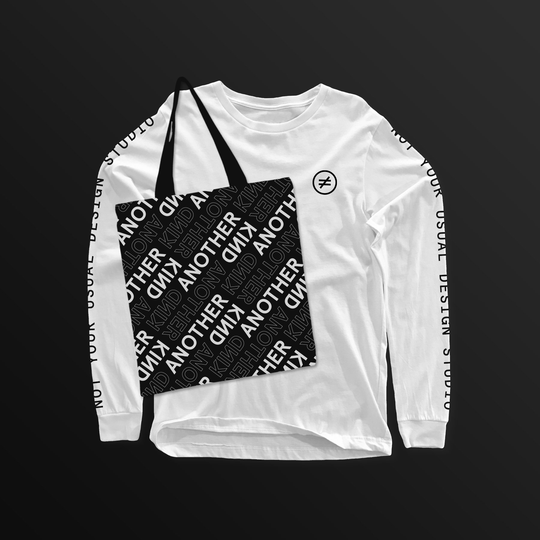
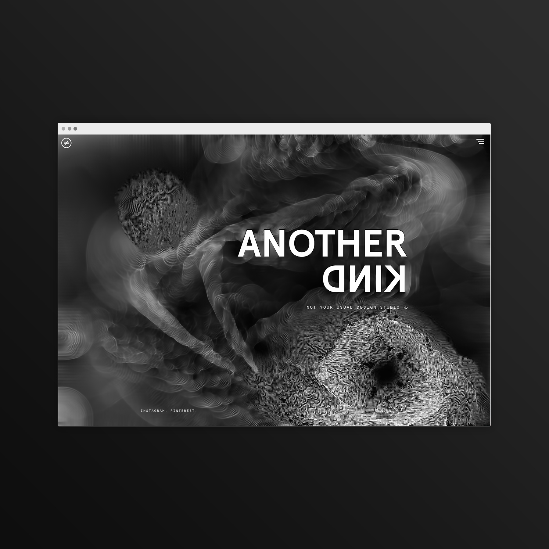
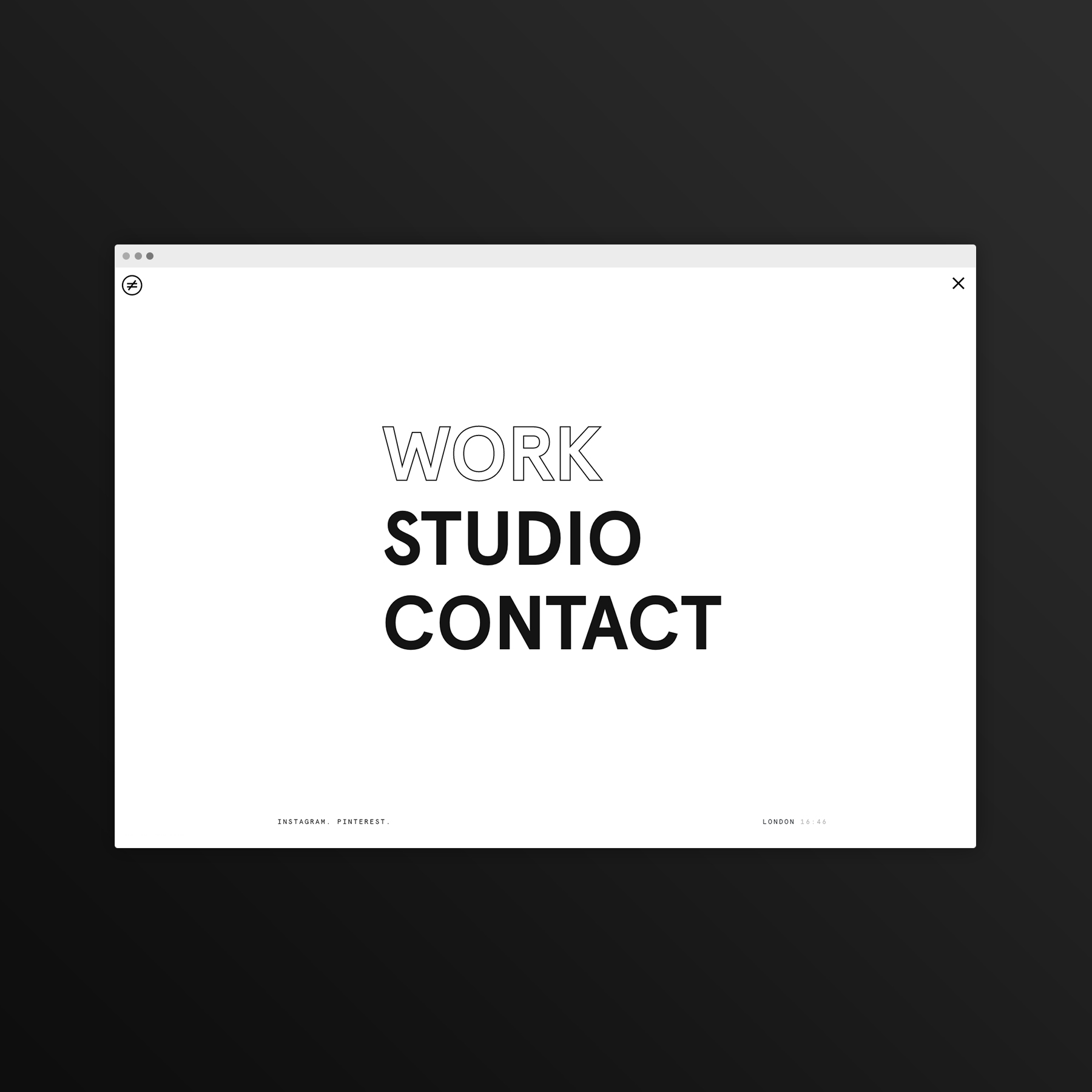
Our brand refresh centres around a minimal “forward/backwards” logo that neatly represents our unconventional approach to design and studio name.
Inverted lettering is present in our identity and has become a recurring motif in our studio assets as a subtle form of branding.
We’ve also adopted a roundel made from the Not Equal symbol as a simple icon across our print collateral and online profiles.
For typography we use the Aperçu family and we play with its scale, inverted letters or outlines across our website and wider assets.
Overall we wanted our identity to be eye-catching yet minimal enough to not detract from our stylistically varied work with clients in a diverse range of fields, including lifestyle, entertainment, fashion, food and publishing.
https://www.instagram.com/p/B5sBY03hQRq/
CREDIT
- Agency/Creative: Another Kind Studio
- Article Title: Another Kind Studio Brand Identity
- Organisation/Entity: In-house, Published Self Promotional Design
- Project Type: Identity
- Agency/Creative Country: United Kingdom
- Market Region: Europe
- Project Deliverables: Brand Identity, Brand Naming, Brand World, Branding
- Industry: Entertainment
- Keywords: Design Studio


