


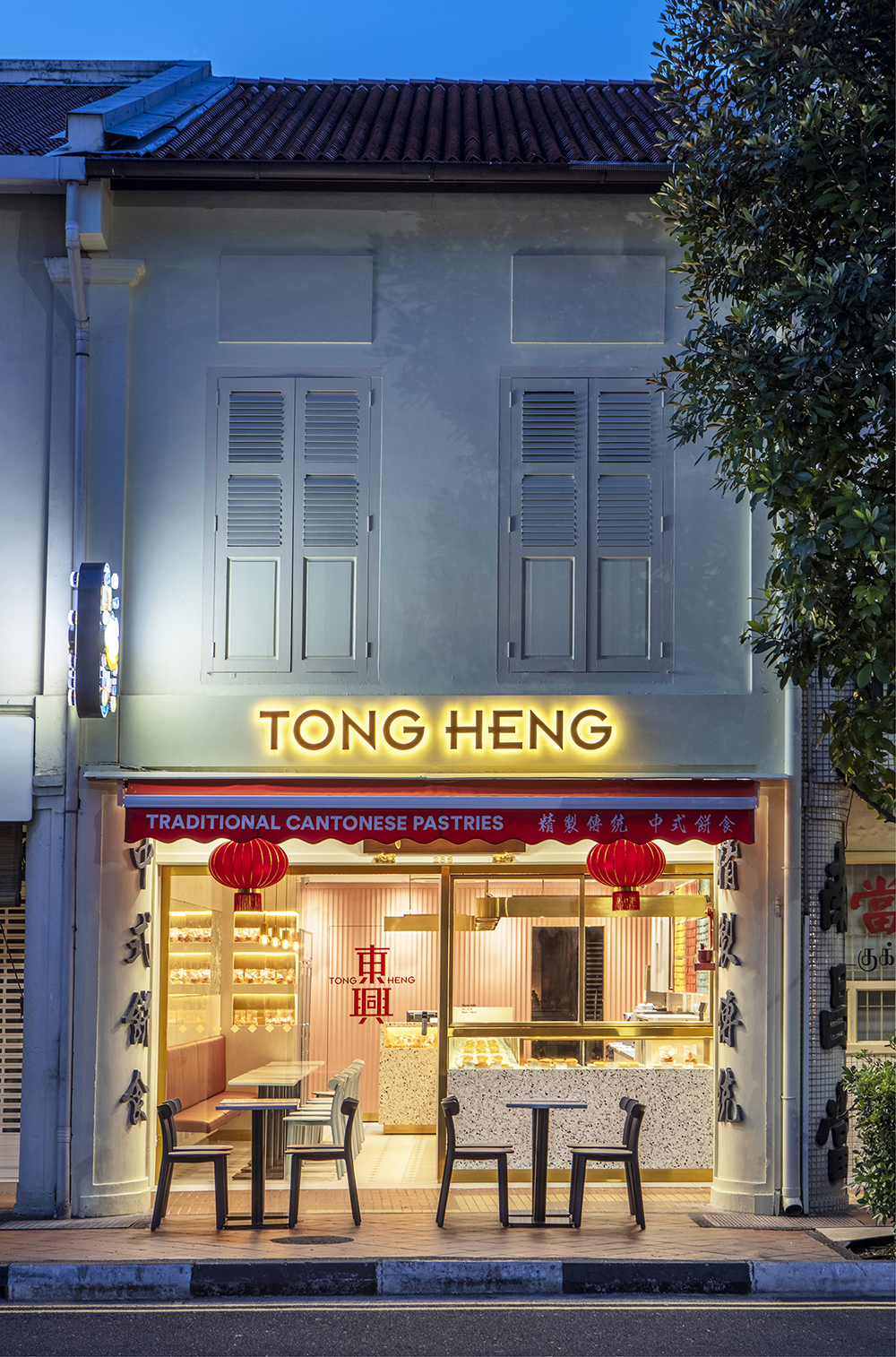
A Singapore pioneer in traditional Cantonese pastries since 1935, Tong Heng faced the familiar challenge of brand relevancy in an increasingly fast-paced world. Together with the owners and team at Tong Heng, &Larry undertook an extensive multi-phase rebranding exercise, deep-diving into the heart of the brand and its people to discover the essence of what makes Tong Heng (Chinese for Happiness in the East).
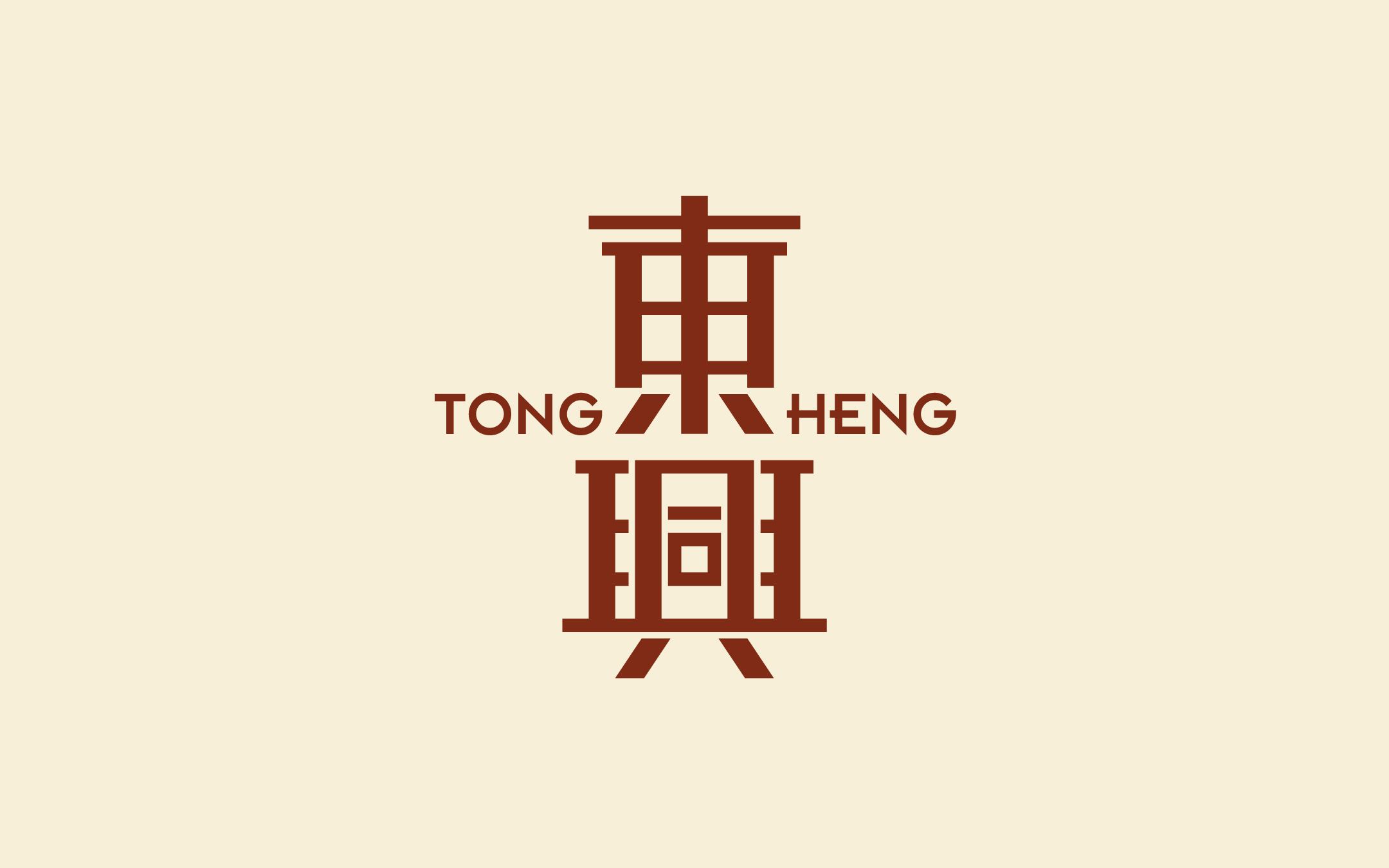
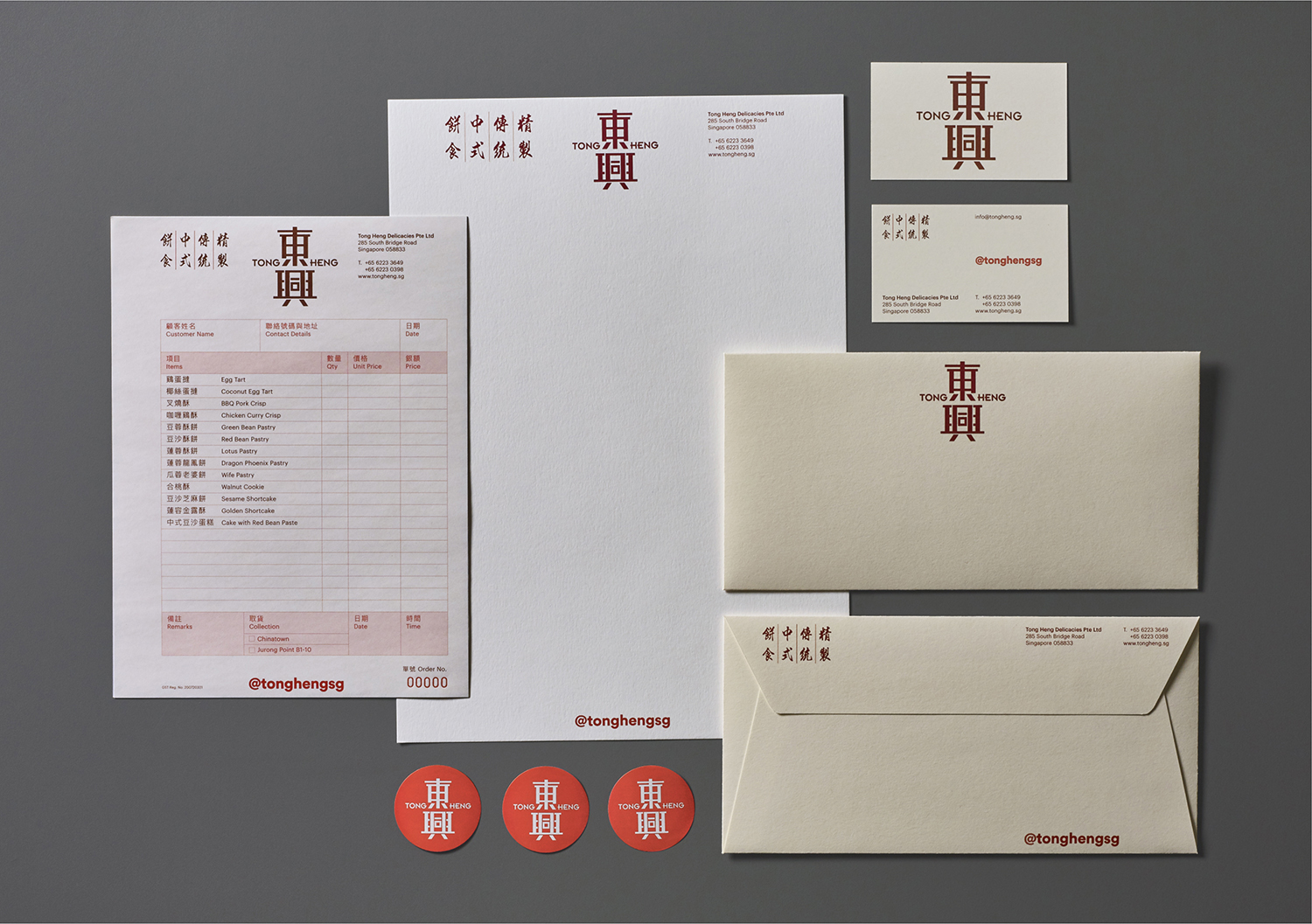
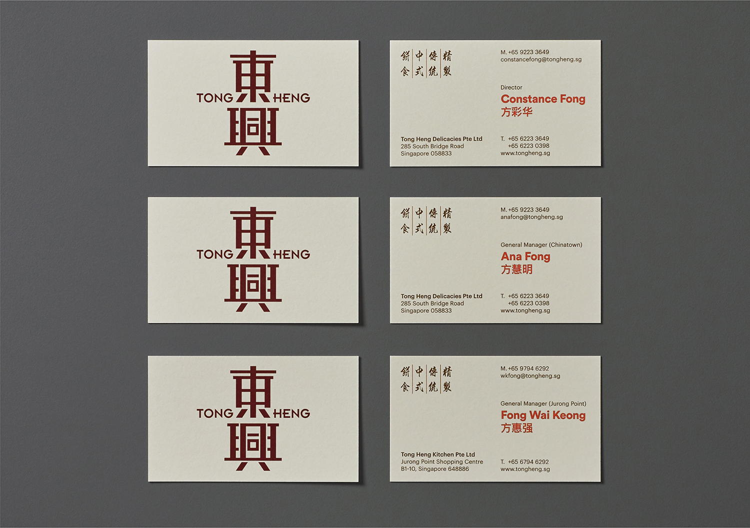
From the initial phase of brand discovery through development and design, we clarified and crafted an authentic branding and digital strategy, a modern identity, redesigned packaging and a revamped store design that reconnects the brand with a younger generation while staying true to their heritage. In discussing what ‘heritage’ meant to Tong Heng, the answer fell back on the name and the tradition: bringing joy to people in every pastry Tong Heng makes.
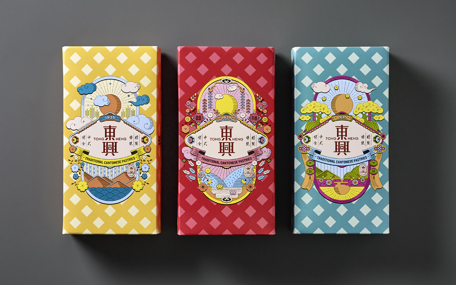
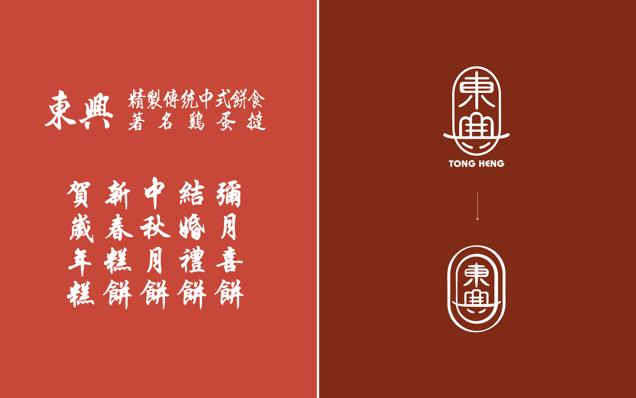
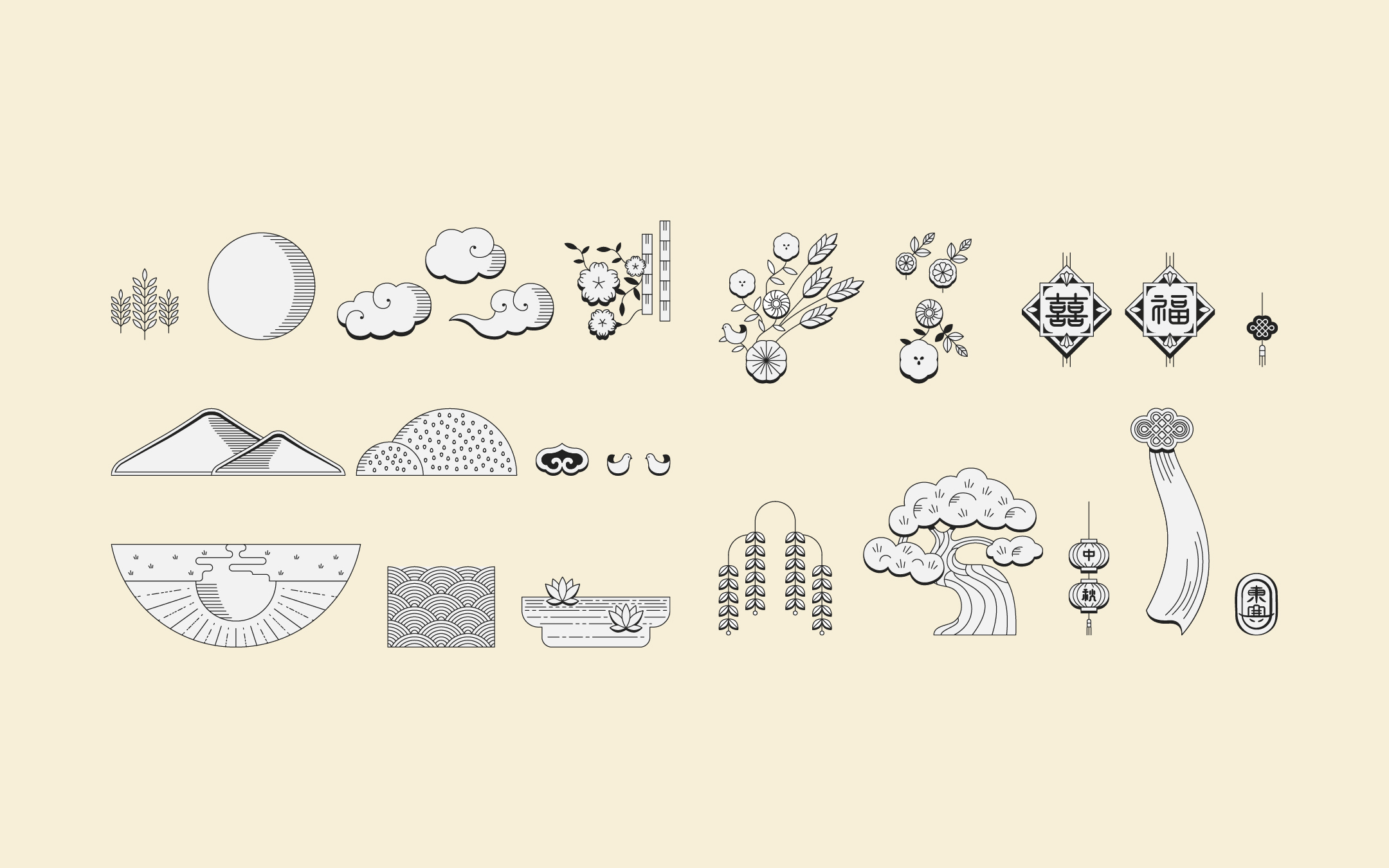
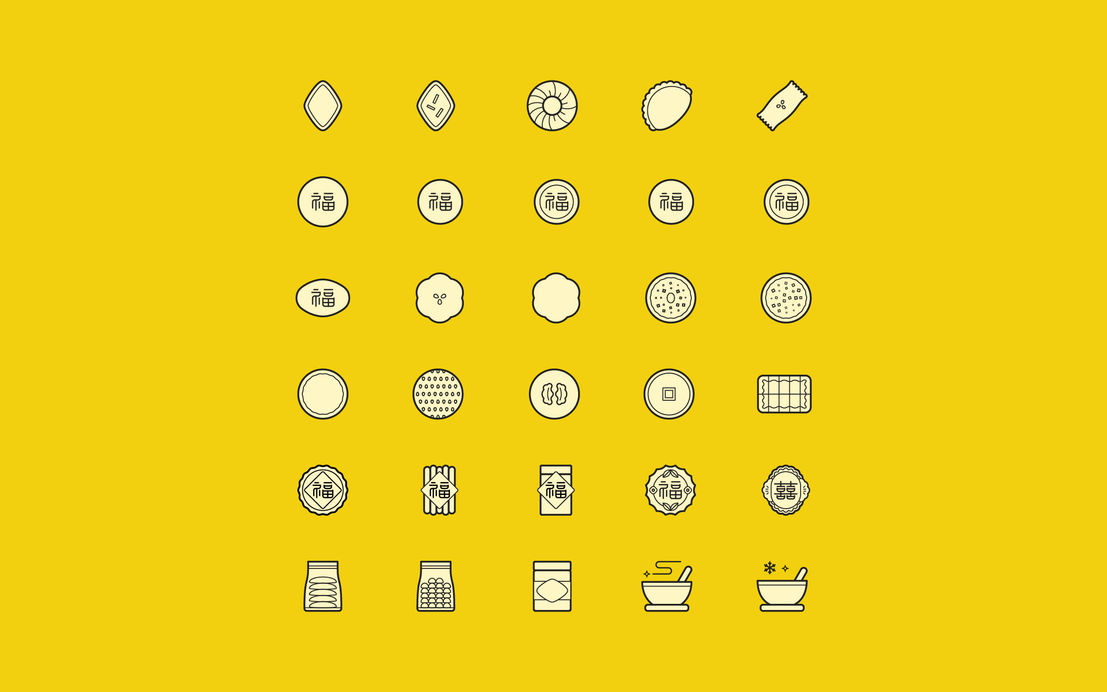
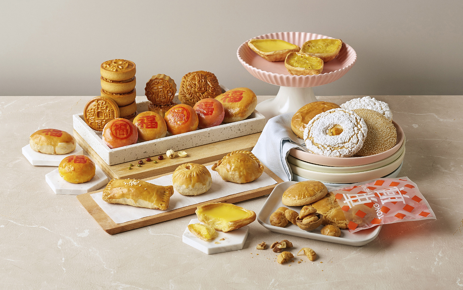
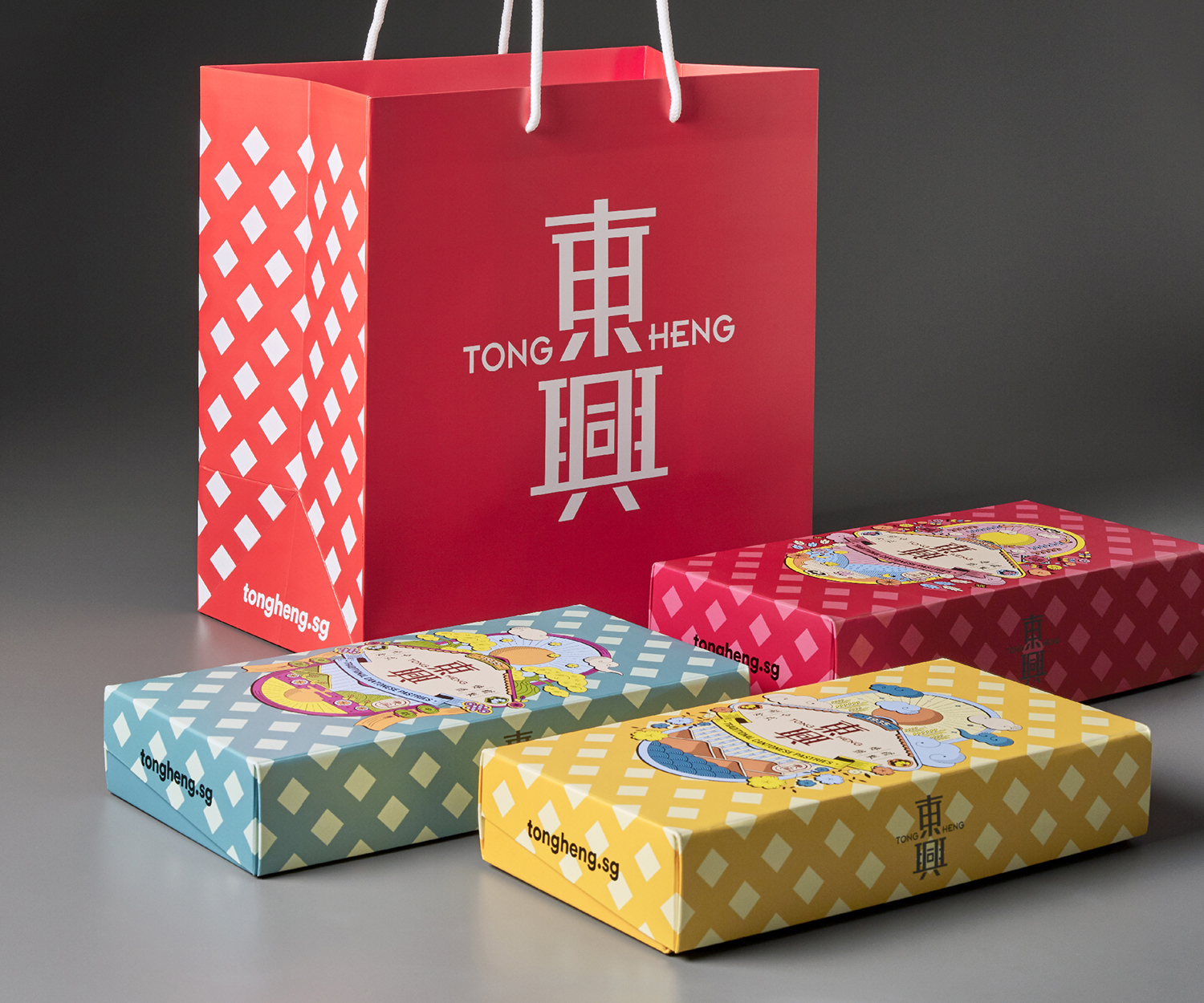
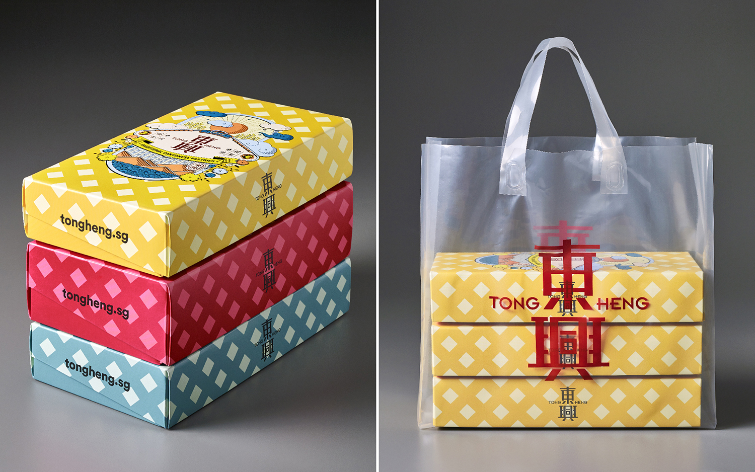
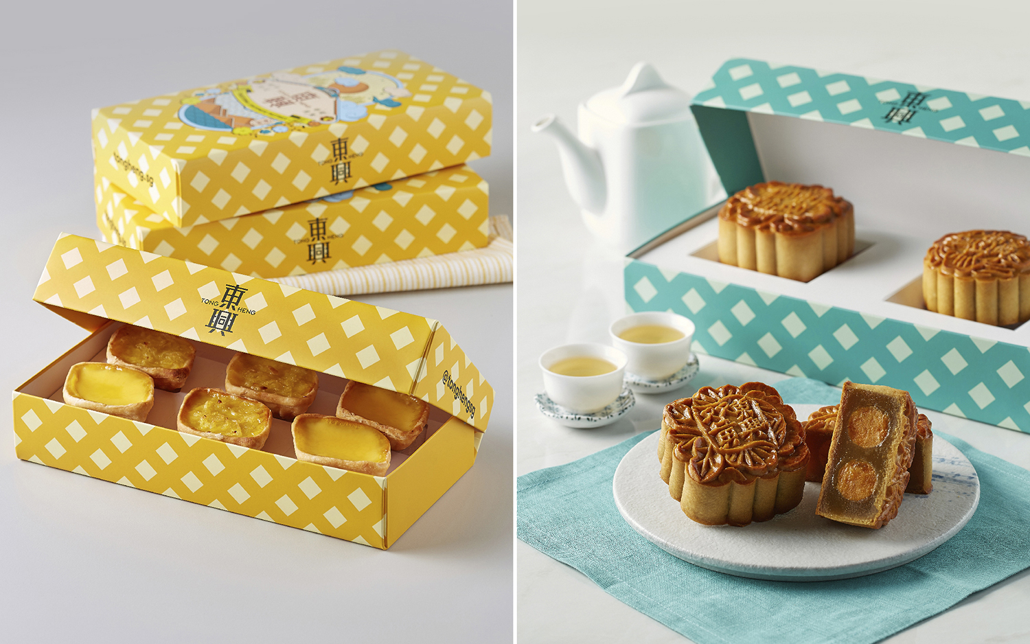
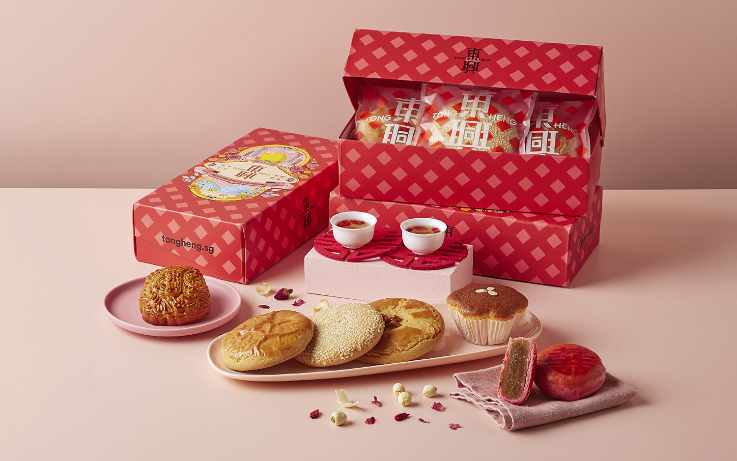
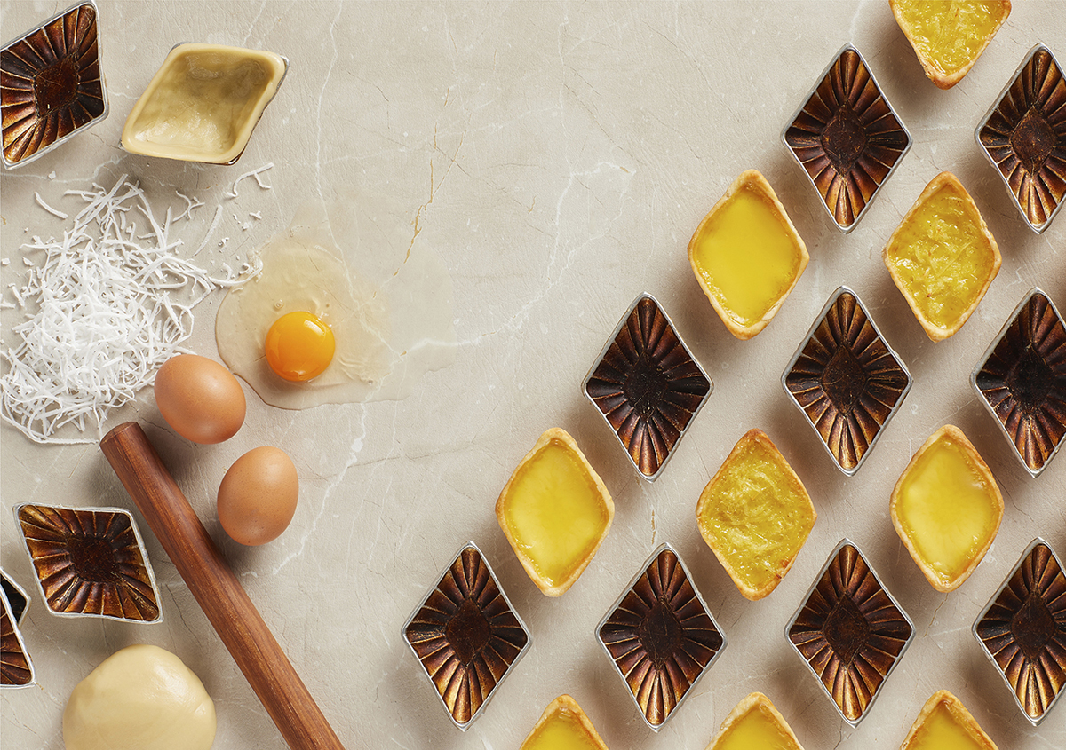
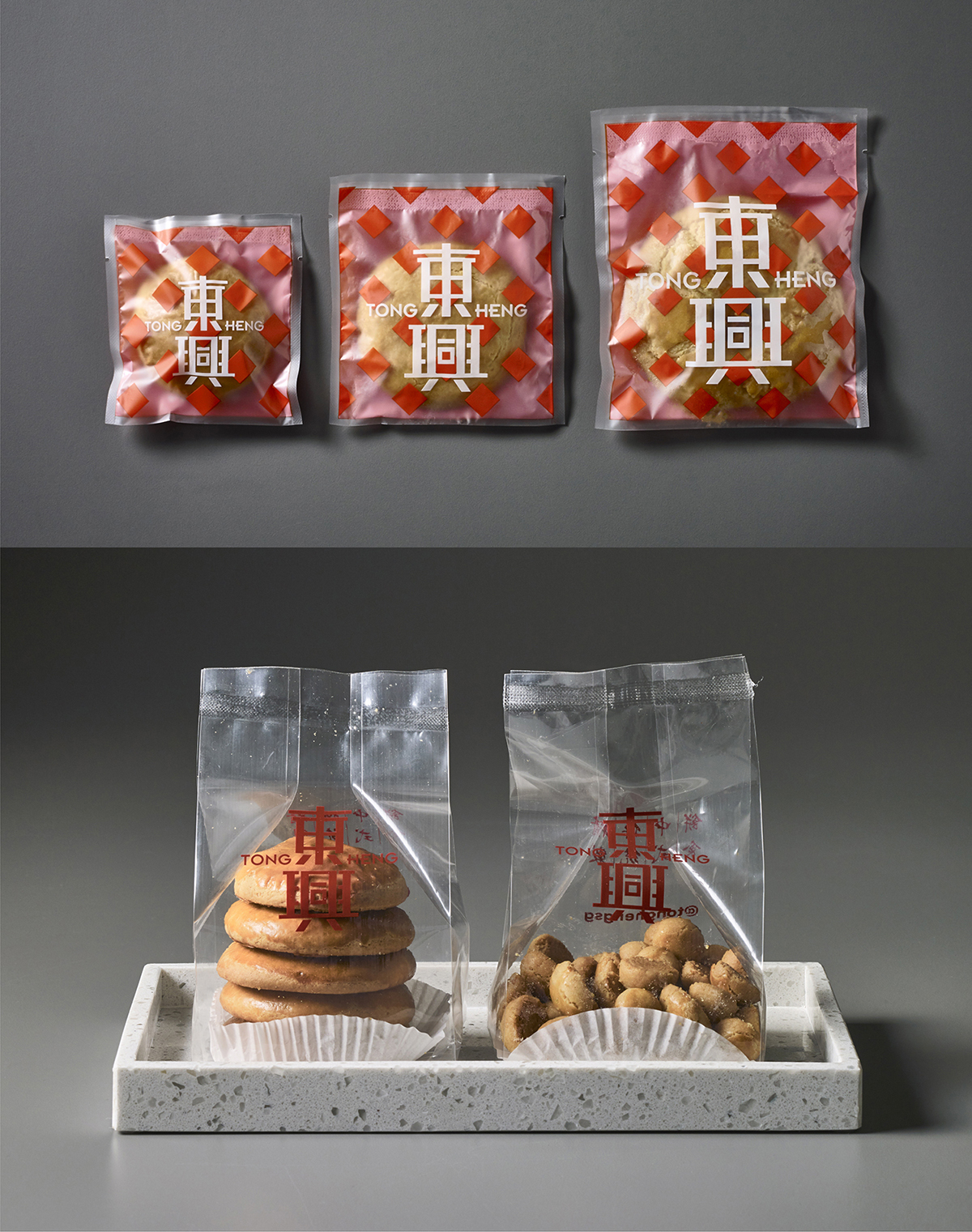
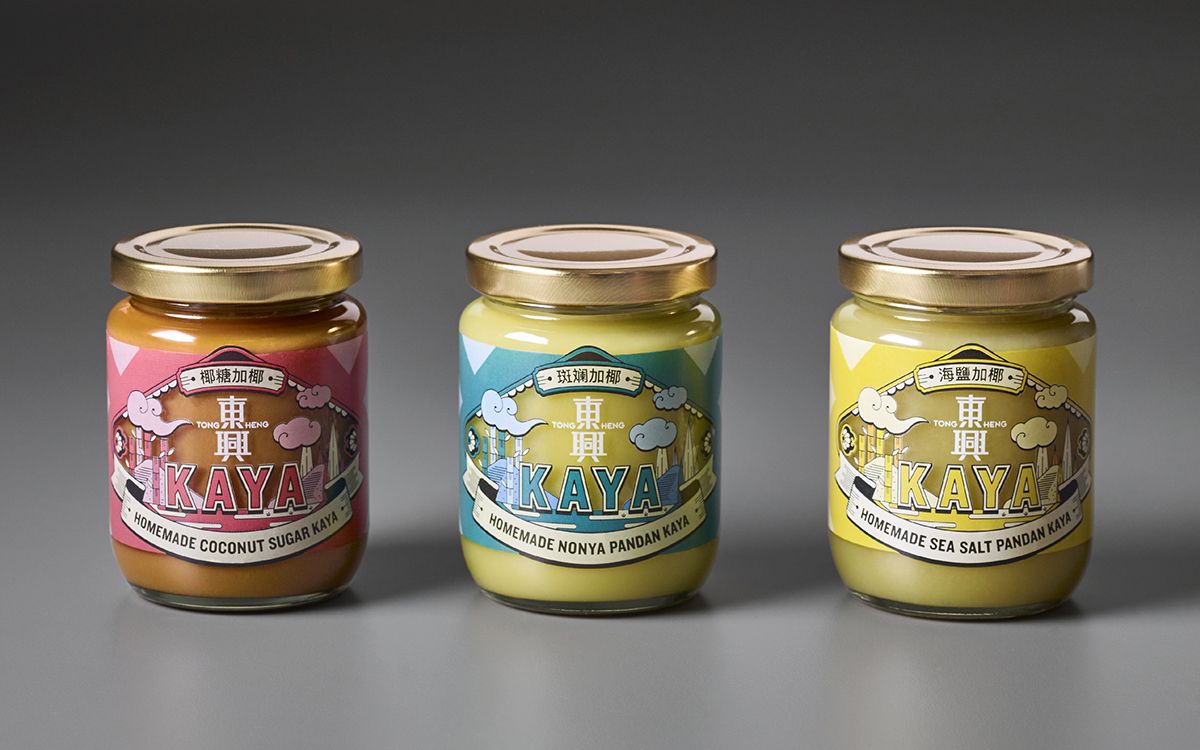
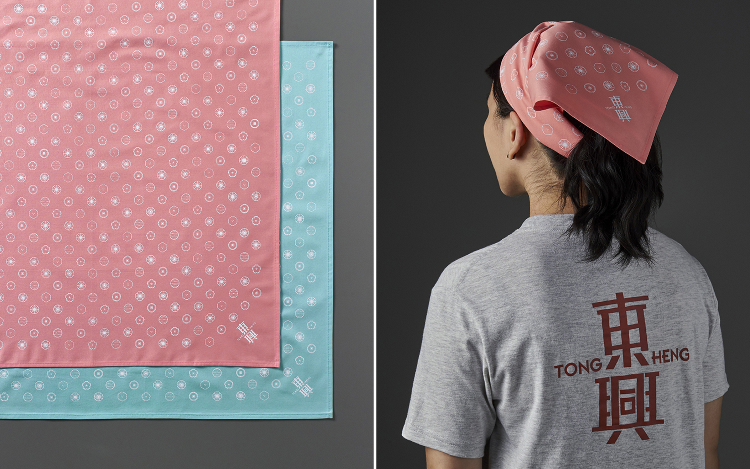
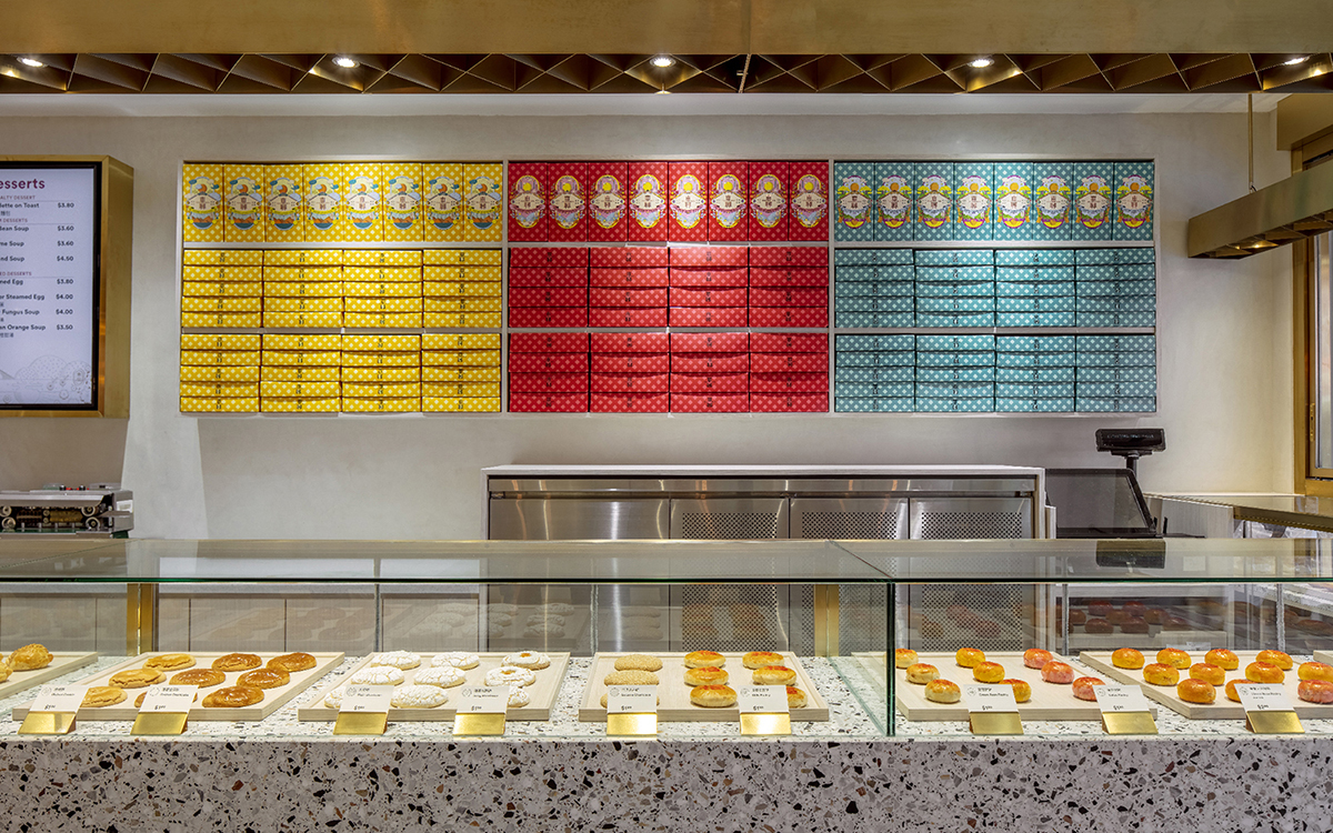
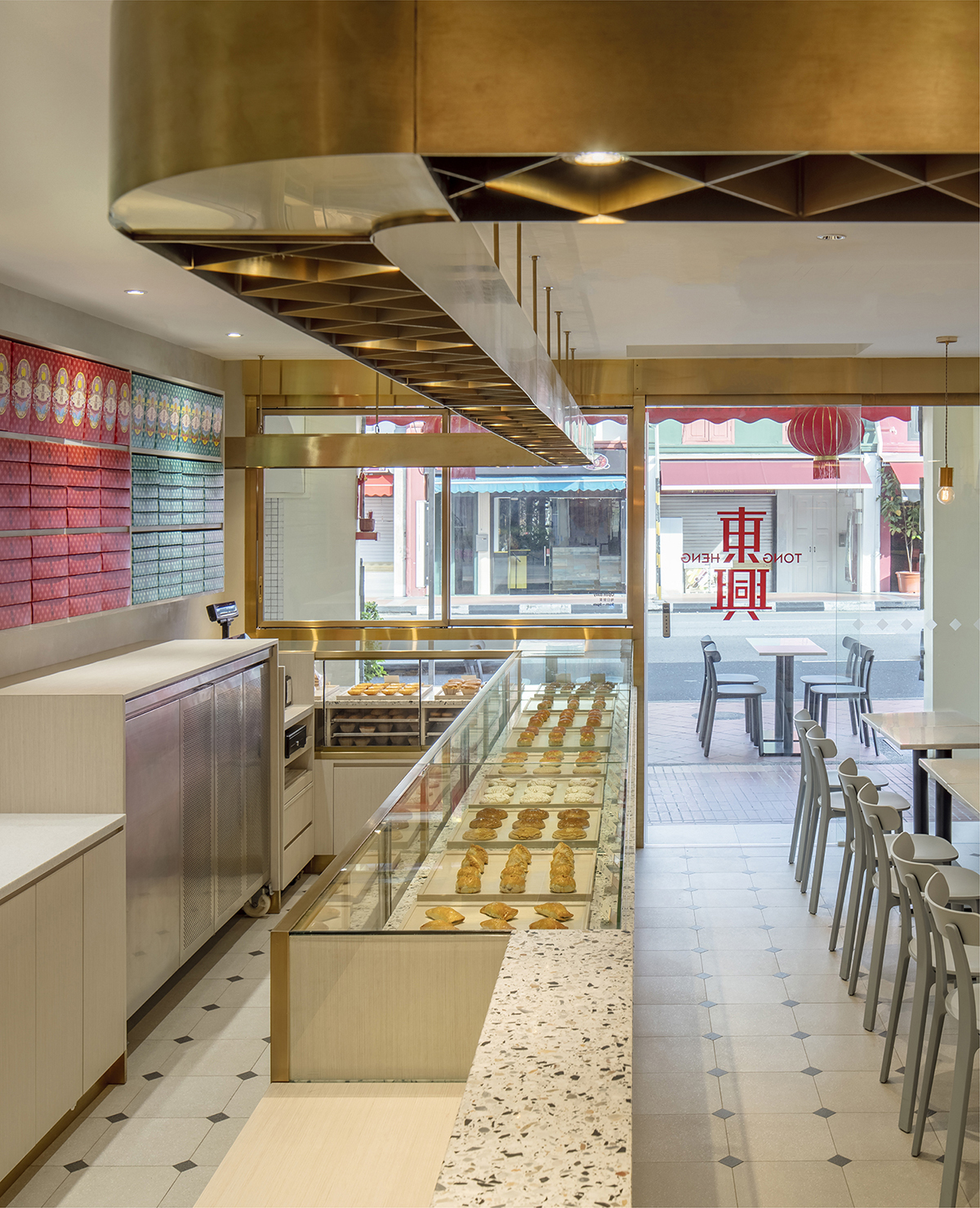
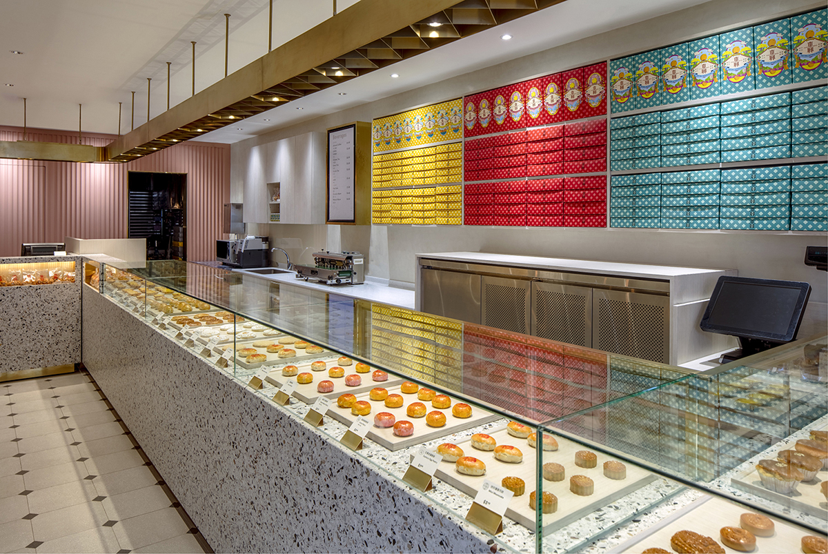
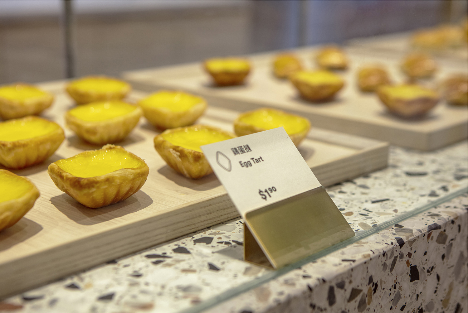
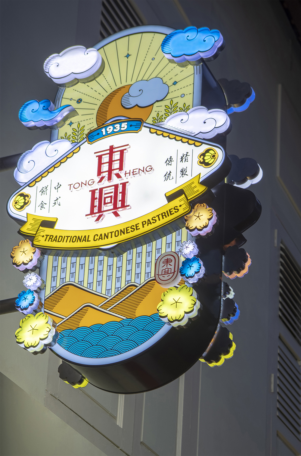
Designing with this in mind, what emerged was a vibrant portrayal of the essential elements of the brand. We created a brand universe of illustrations: the diamond shape of Tong Heng’s signature egg tarts, ‘lucky clouds’ and other Chinese symbology for auspicious days, various shapes of pastries and ingredients, etc. We also re-introduced the old logo as a seal of quality. The colours are both aesthetic and functional – yellow for everyday orders; red for anniversaries, baby showers, betrothals and Chinese New Year; turquoise for Mid-Autumn Festival. The bright colours add cheer to the store and help staff to quickly discern and pack respective purchases.
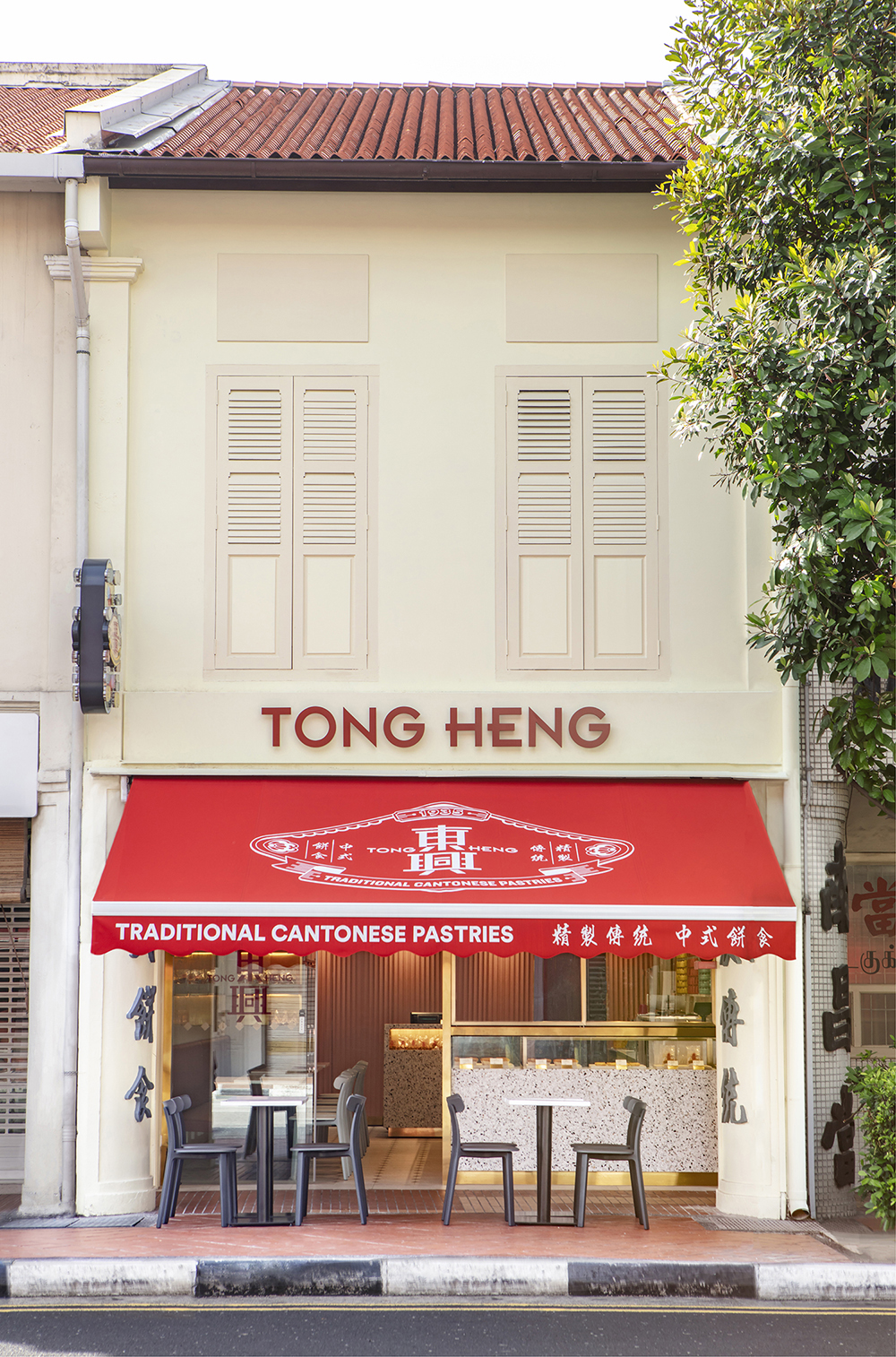
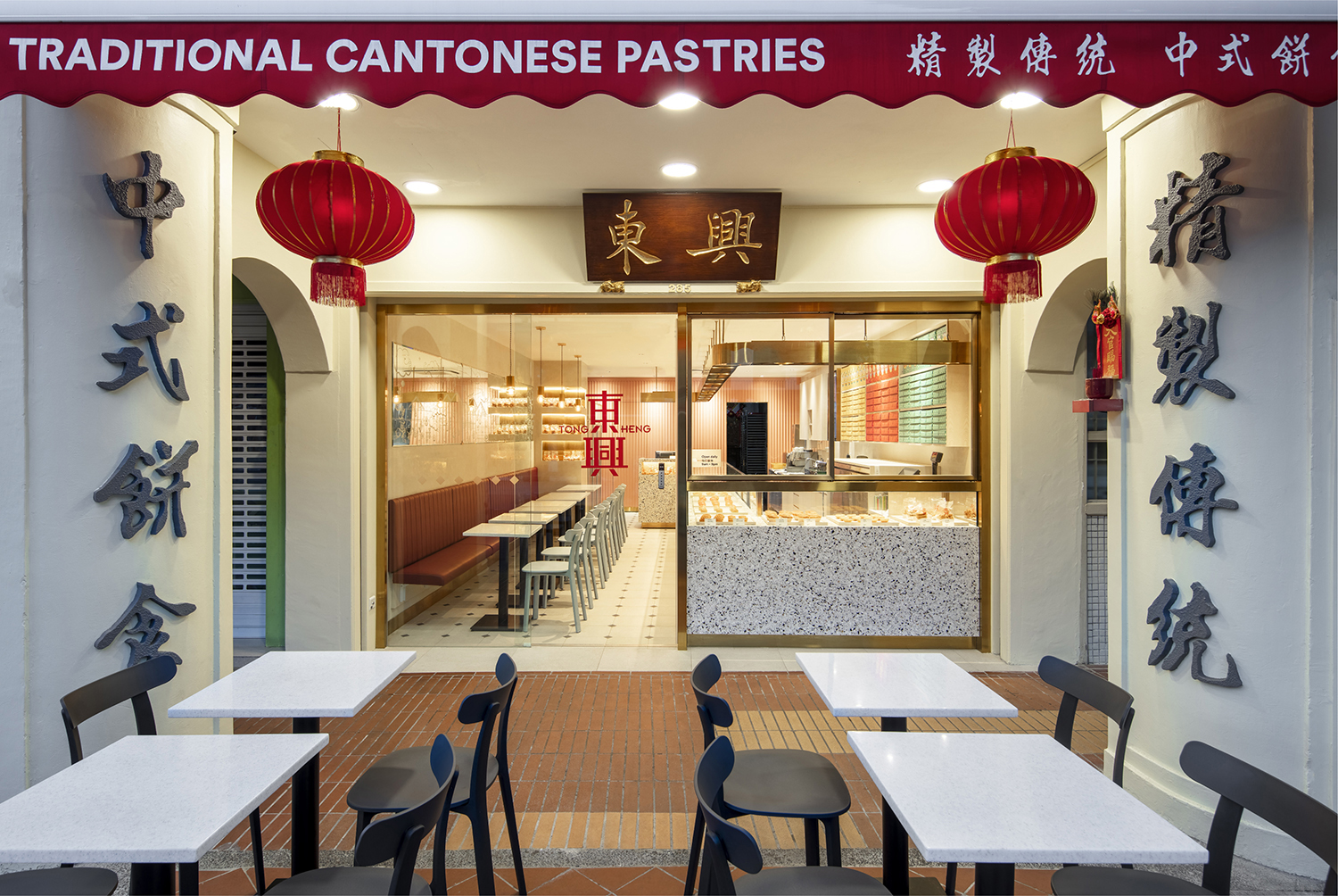
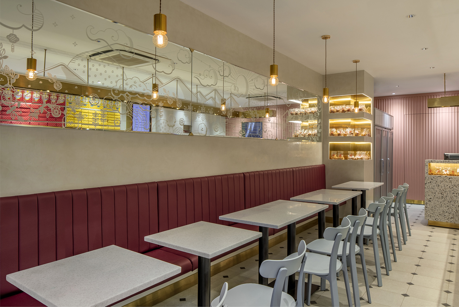
In line with the new aesthetics, the renovated store features a custom diamond-shaped track light that is inspired by Tong Heng’ssignature egg tarts, uses modern flat-lay product displays to entice younger customers, and incorporates shelf space to showcase the colourful packaging alongside a colourful digital menu.


CREDIT
- Agency/Creative: &Larry
- Article Title: &Larry Agency Helping Evoking Joy in a Bite for Every Generation
- Organisation/Entity: Agency, Published Commercial Design
- Project Type: Packaging
- Agency/Creative Country: Singapore
- Market Region: Asia
- Project Deliverables: Brand Advertising, Brand Guidelines, Brand Identity, Brand Redesign, Brand Strategy, Branding, Graphic Design, Illustration, Packaging Design, Photography, Rebranding, Research, Tone of Voice
- Format: Bag, Bottle, Box
- Substrate: Glass Bottle, Plastic, Pulp Paper


