


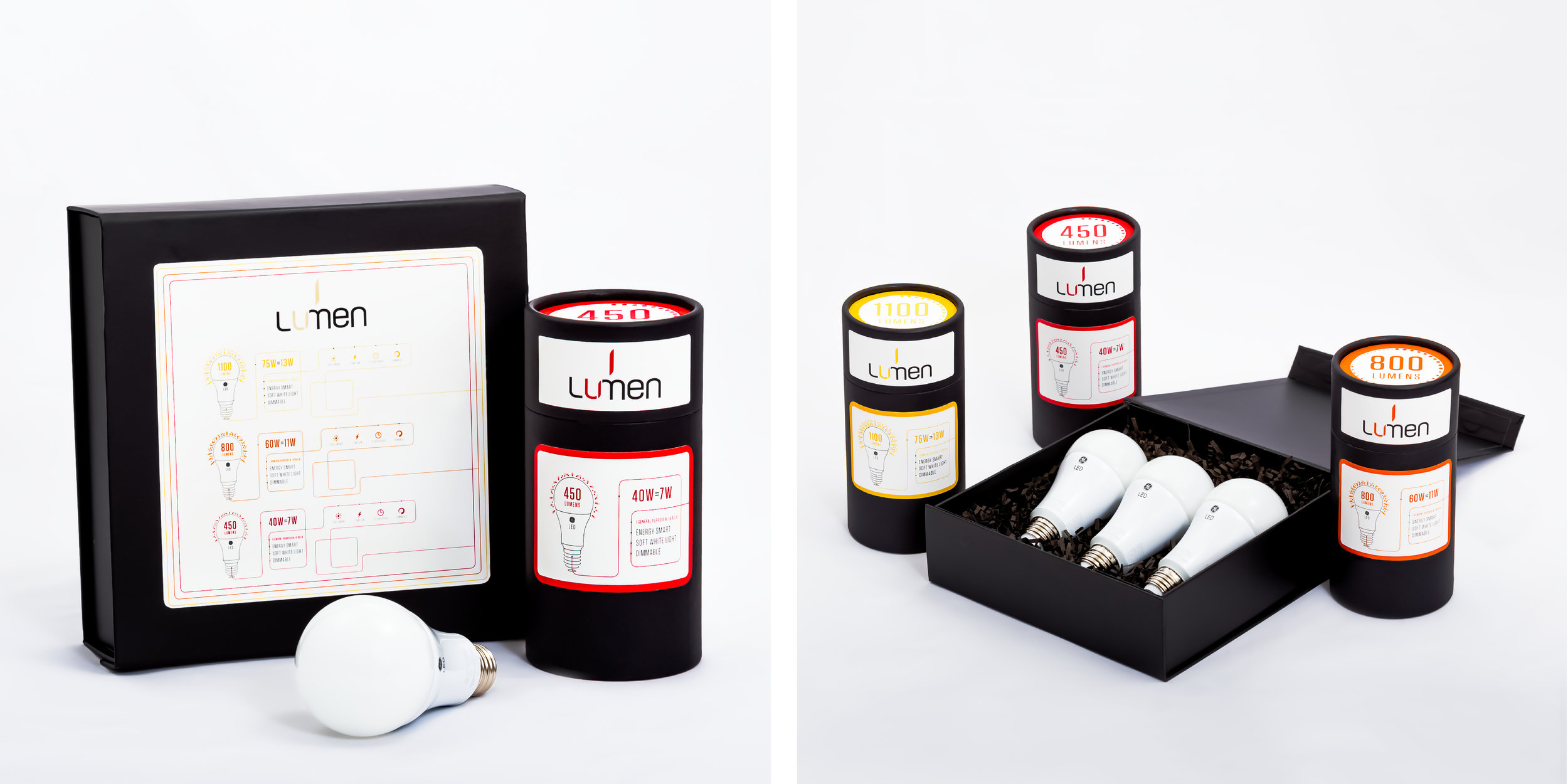
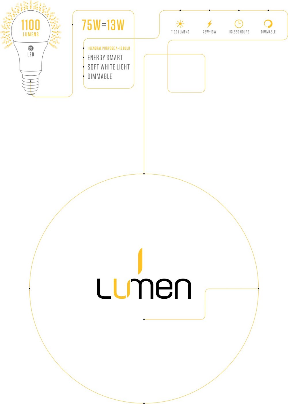
” While researching this project I found that all of the bulbs on the shelf looked essentially the same and so my main goal with my design was to differentiate my bulbs from all of the others on the shelf. I went with a clean look that would make the bulbs the focal point and draw attention to the specifics of each bulb so that they would be easily recognizable as a related set and as different wattages of bulbs.
The tubes are reusable to decrease waste and to give something to the customer that they would have fun reusing. I used shred paper to protect the bulbs as I find it difficult to remove a bulb from the standard insert and thought that the consumer would find it useful rather than frustrating.
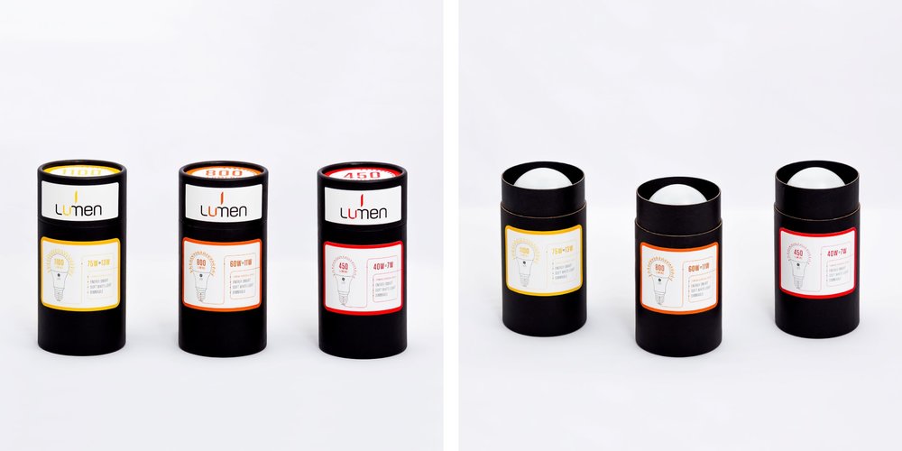
The colour palette conveys that the bulbs are related and have a progressively brighter hue as the wattages increase. This gives the consumer a noticeable visual clue as to each of their brightness.
PROJECT OBJECTIVES
Design a packaging structure and identity for a collection of three different light bulb wattages, as an extension of an existing brand of light bulbs. ”
CREDIT
- Agency/Creative: Ana Paulsen
- Article Title: Ana Paulsen – Lumen (student)
- Project Type: Packaging
- Format: Box, Tube
- Substrate: Pulp Board


