


The Brief: This project consisted of creating a craft beer brand and identity, that tapped into the modern, contemporary beer culture of today, particuarly in Melbourne, aiming to target white collar professionals who don’t want to drink ‘their parents beer’.
The Brand: It’s a little stonger than lemonade, but it’s ABV is low enough for you to have a drink or two with your mates after work without feeling a whole lot of guilt, yet crisp enough for you to actually enjoy the taste of. Ammo is a craft beer that hits the spot and leaves you with enough in the tank for your plans the next day.
The Design Strategy:
In some opinions the name Ammo sounds more like a spirit then a craft beer brand. However, the name was chosen as I wanted to challenge the idea of what a craft beer usually sounds and looks like…
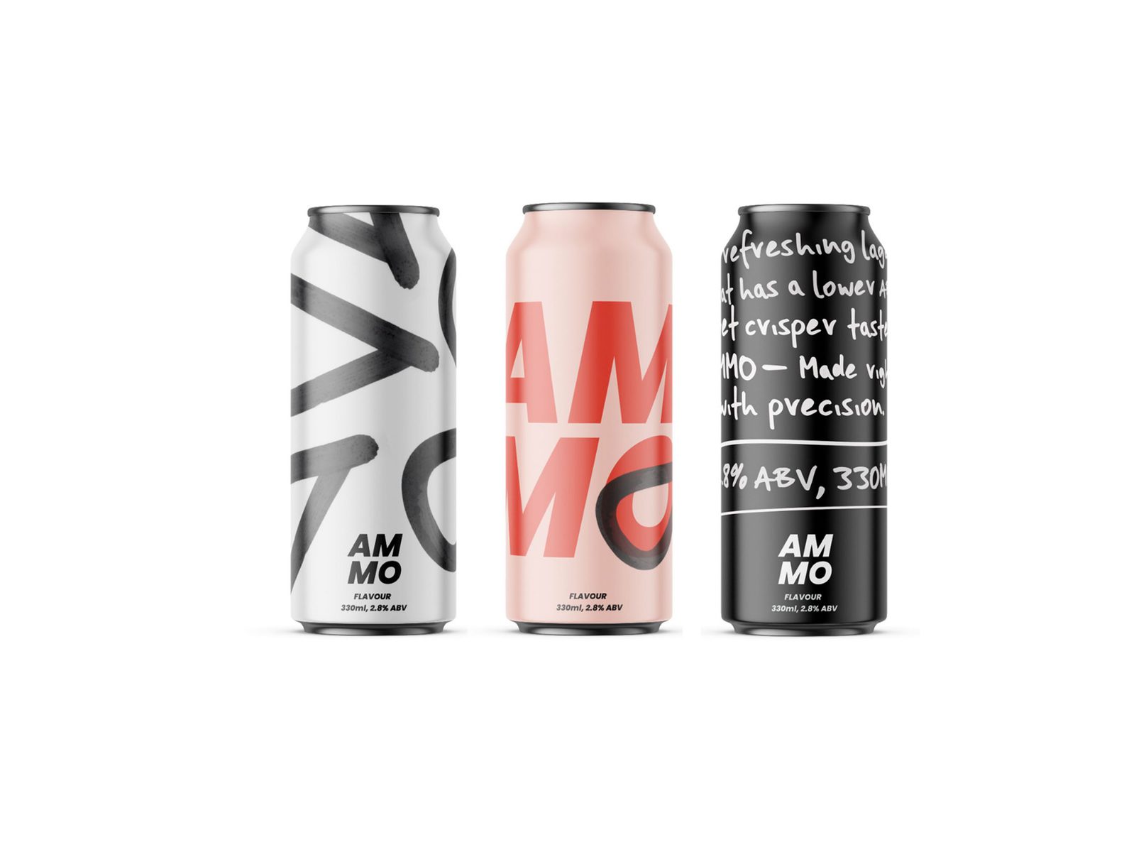
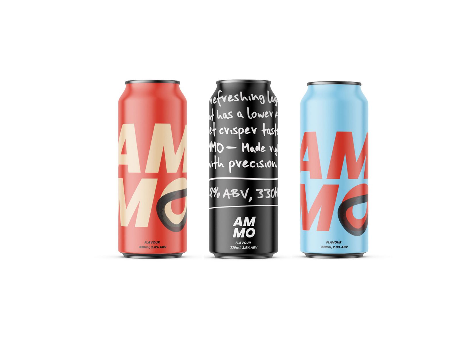
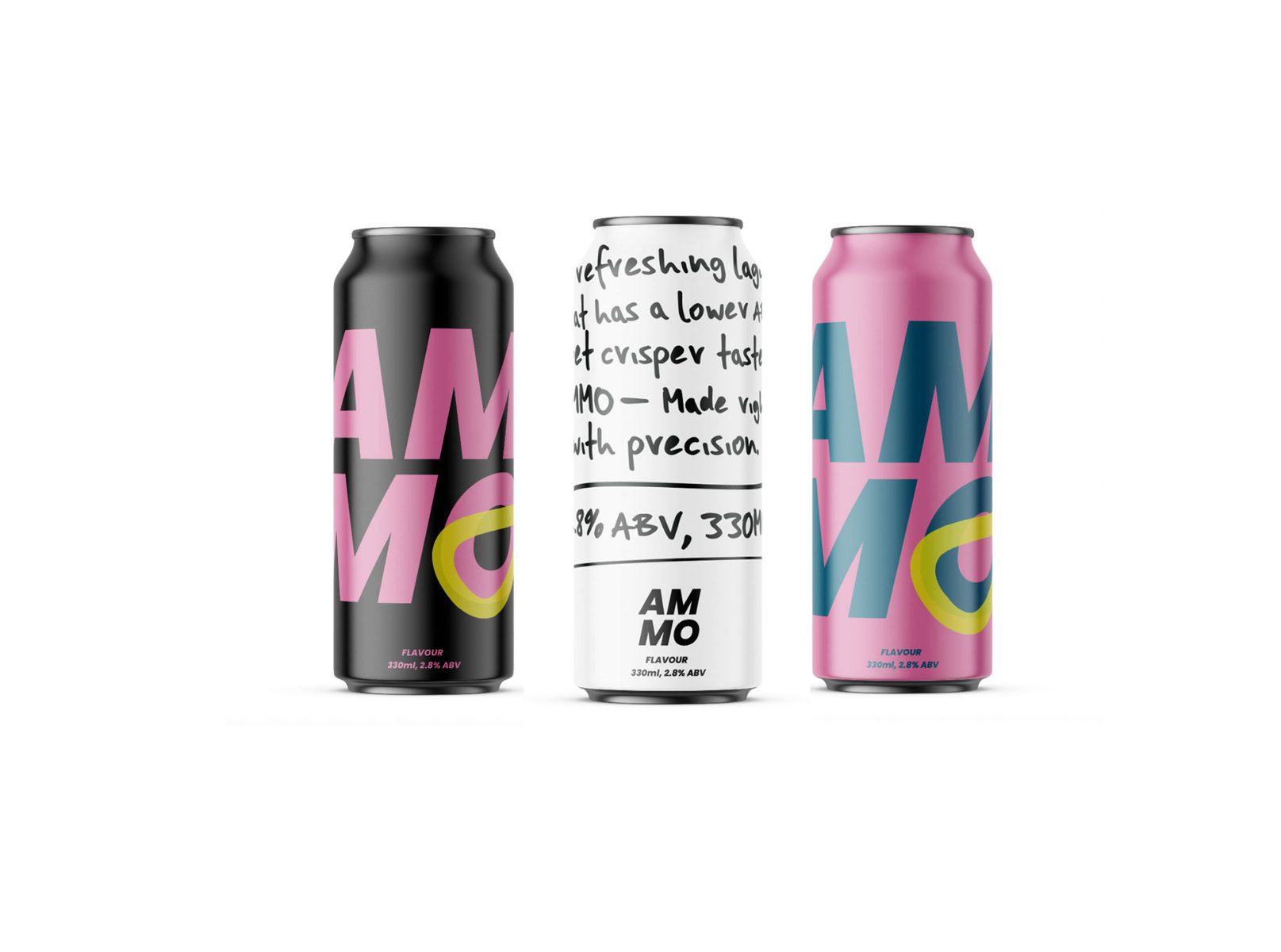
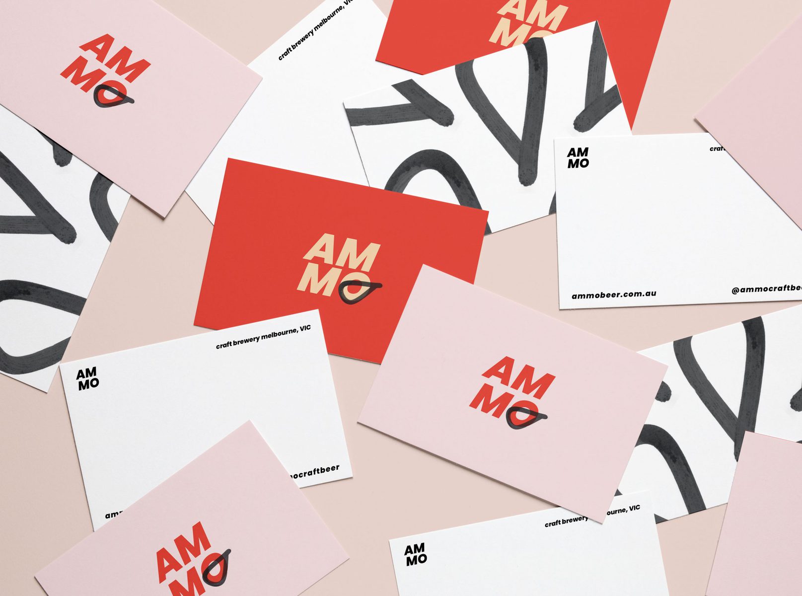
The design strategy therefore incorporates a bold yet playful identity to appeal to the modern white collar professional. A more contemporary design aesthetic within beverage packaging is becoming more and more familiar to consumers, therefore Ammo aims to amplify this shift in design. Short for ammunition, the brandmark incorporated into the logo gives connotations towards the name’s true definition, however in a subtle manner. The typeface has been italised to subtly reference on the idea of moving forward, which again, plays tribute to the true meaning of the name.
These aspects in combination with a light colour palette, hand generated type and slim beer can all help achieve a contemporary and mature aesthetic to this new lighter beer alternative.
The design objectifies the true meaning of the word ‘Ammo’ and transforms it into something that seems so fitting for a contemporary beer brand.
Ammo also rolls off the tongue nicely which was an important decision when choosing the name, for example, ‘a six pack of Ammo,’ or ‘two pints of Ammo.’ It also lends itself effectively to incorporating brand language on adshells such as:
– Hit’s the spot
– Stay on target
– Made with precision
– When you’re not quite ready for a Crownie
– Still managed to get this report in after a six pack
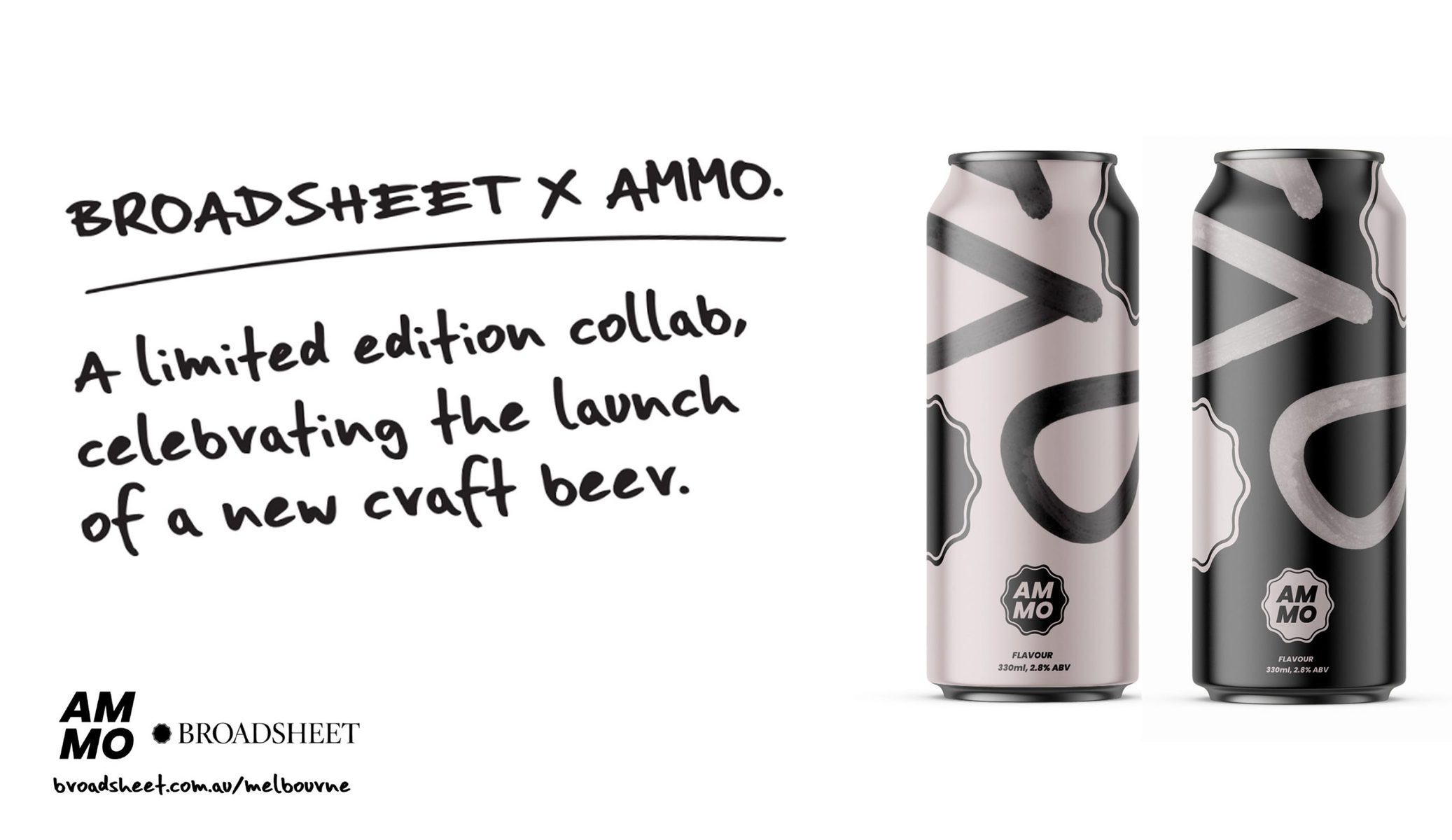
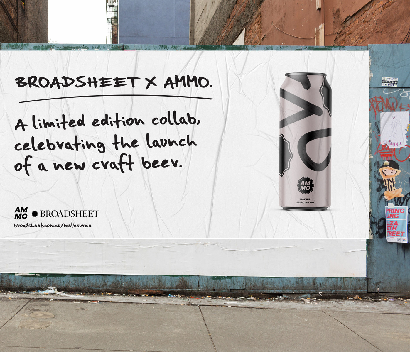
Brand Extension: Ammo X Broadsheet
Broadsheet is an Australia wide, city guide to food & drink, art & design, fashion, entertainment and active lifestyles. Broadsheet write reviewsand promote local businesses. As an upcoming craft brand, a brand expansion concept incorporated a collaboration with Broadsheet magazine, to release a limited edition flavour to celebrate its launch. This collaboration is highly on brand for both parties and would help Ammo secure the niche target audience within Melbourne that it’s aiming to reach.
CREDIT
- Agency/Creative: Swinburne University Of Technology
- Article Title: Ammo Craft Beer Branding and Identity by Hannah Tempany, Swinburne University Of Technology
- Project Type: Packaging
- Project Status: Published
- Agency/Creative Country: Australia
- Keywords: WBDS Student Design Awards 2019/20


