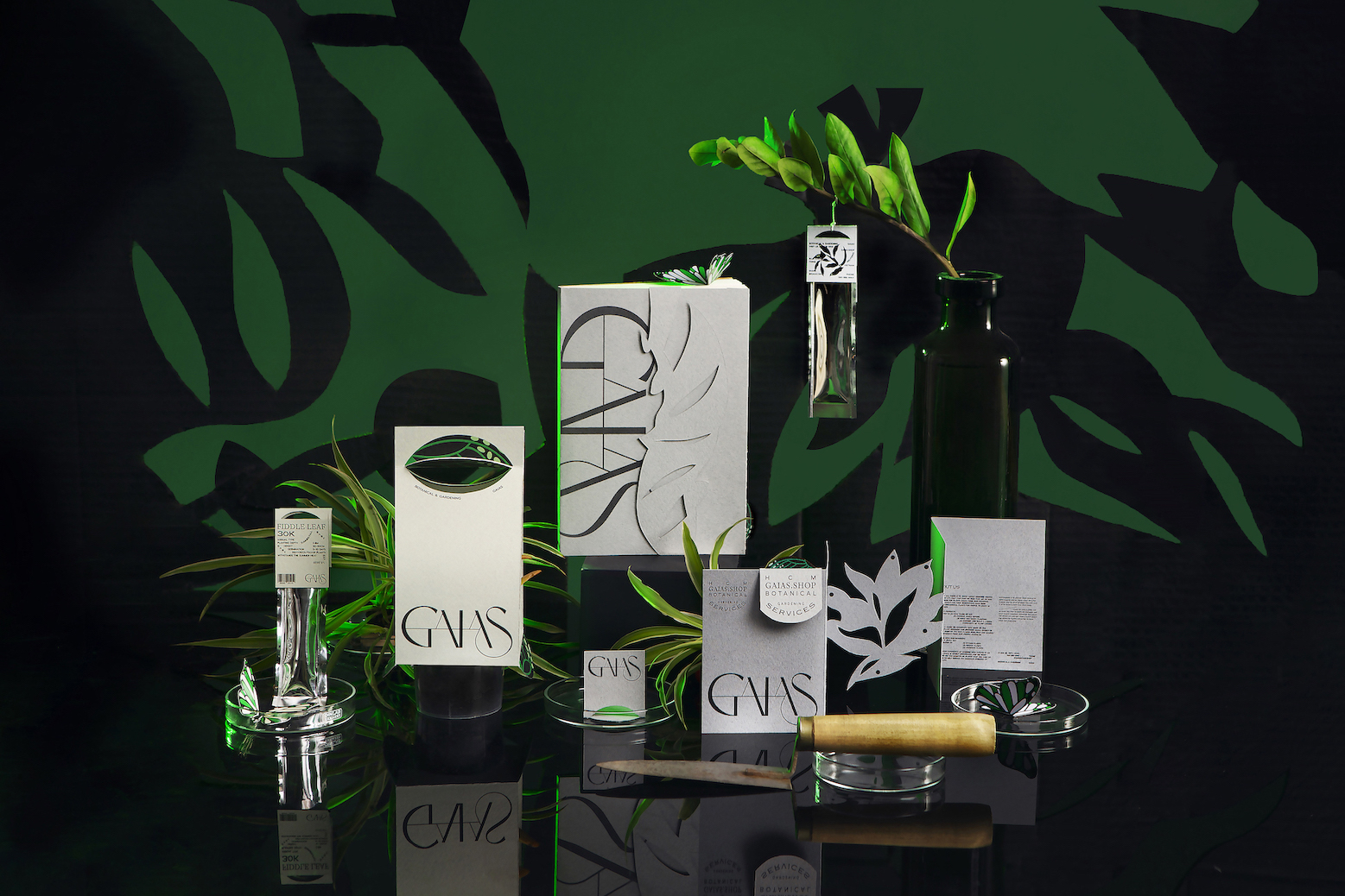
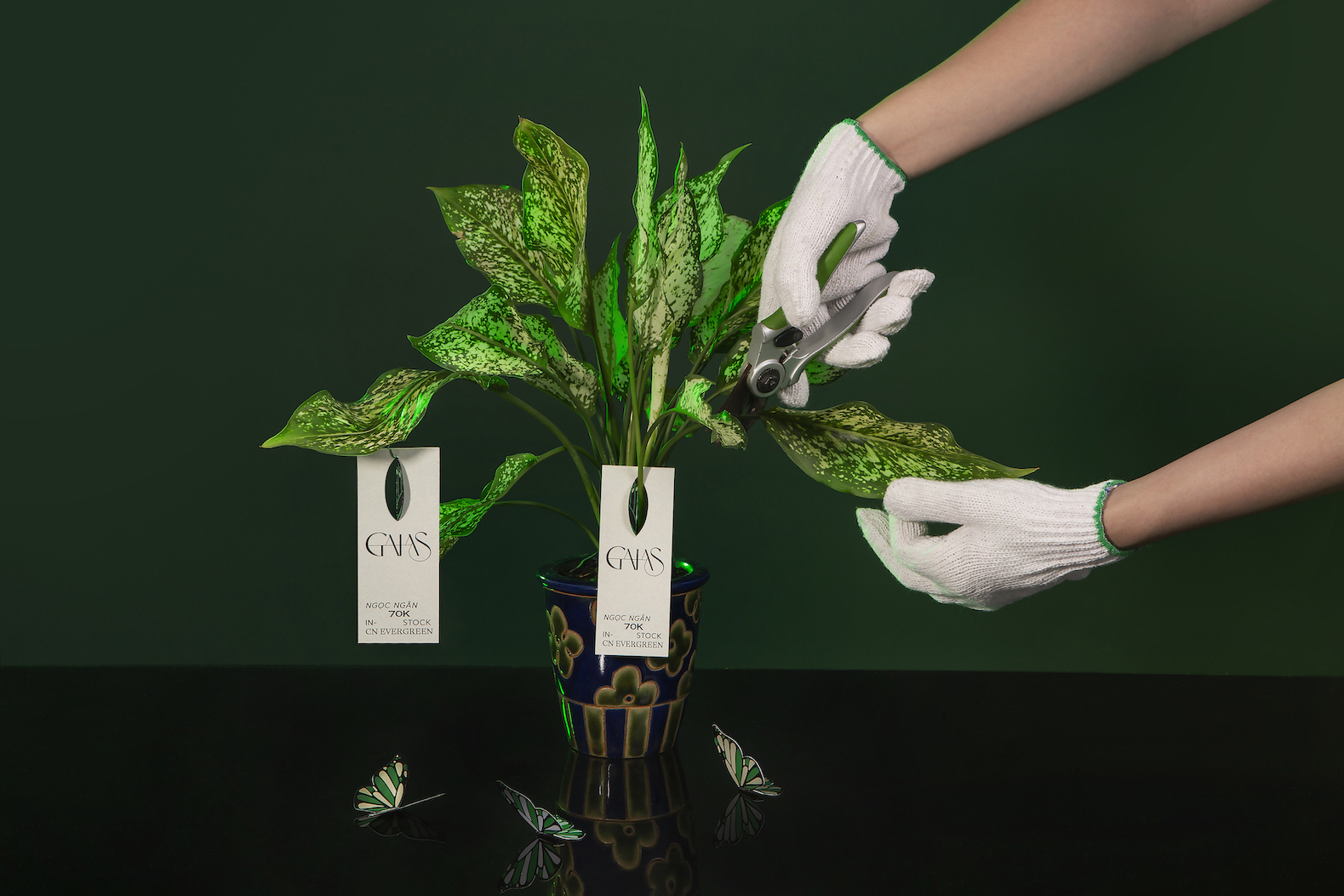
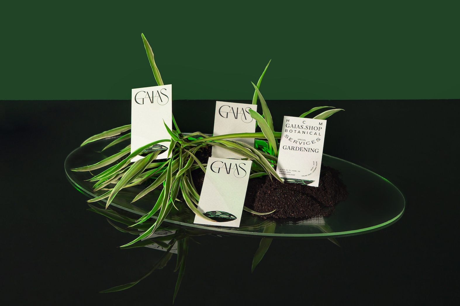
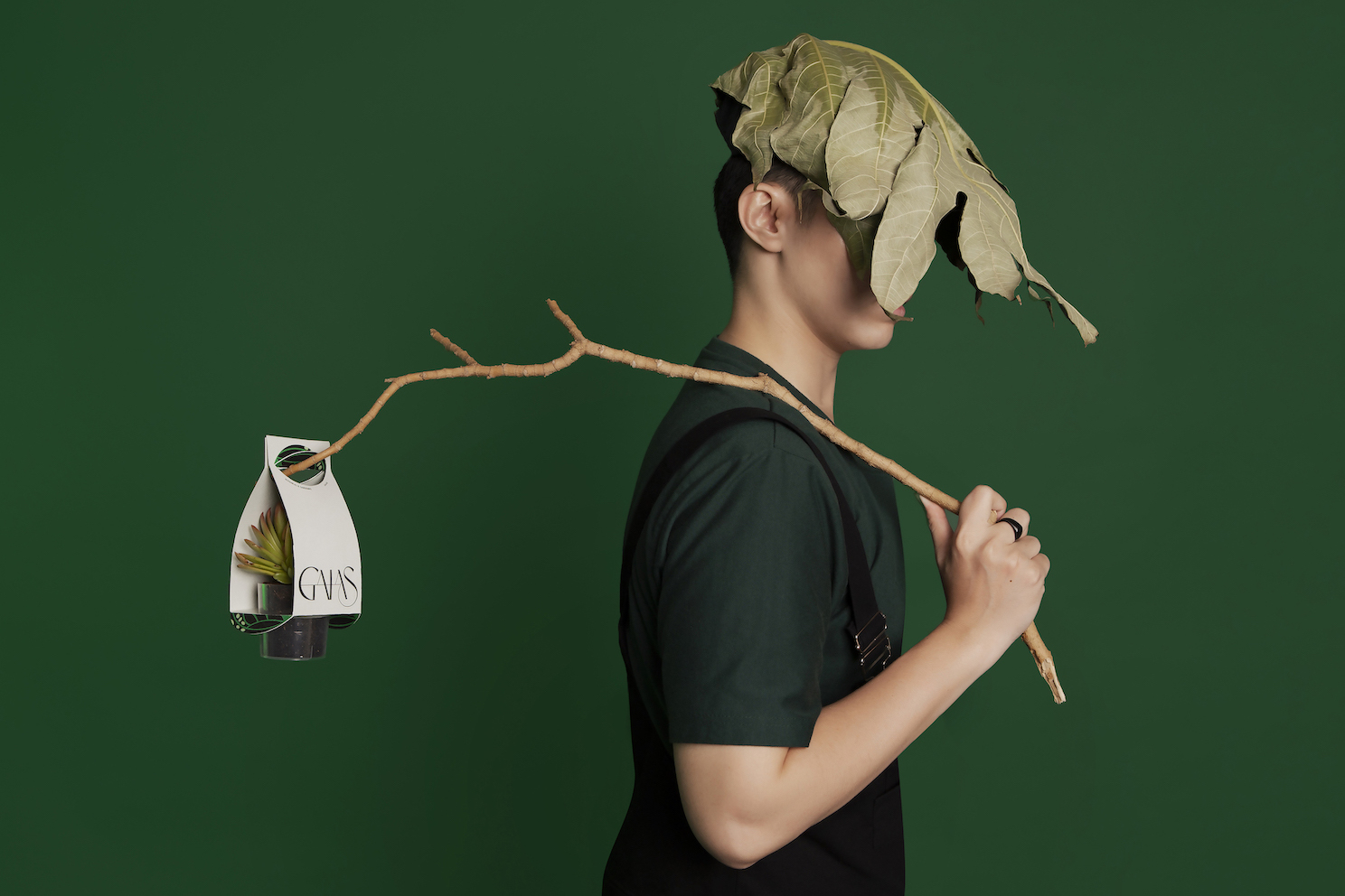
The first seed of Gaias was the idea to improve the human-plant symbiosis. Our solution is to create the most seamless yet exciting shopping and planting experience by offering a wide-range botanical collection, attached with precise care information and full supports. The name ‘Gaias’ inspires our message ‘Everyone is a God of Earth (Gaia) nurturing nature’ and bridges the gap between people and plants by fostering an active and helpful plant-parent community.
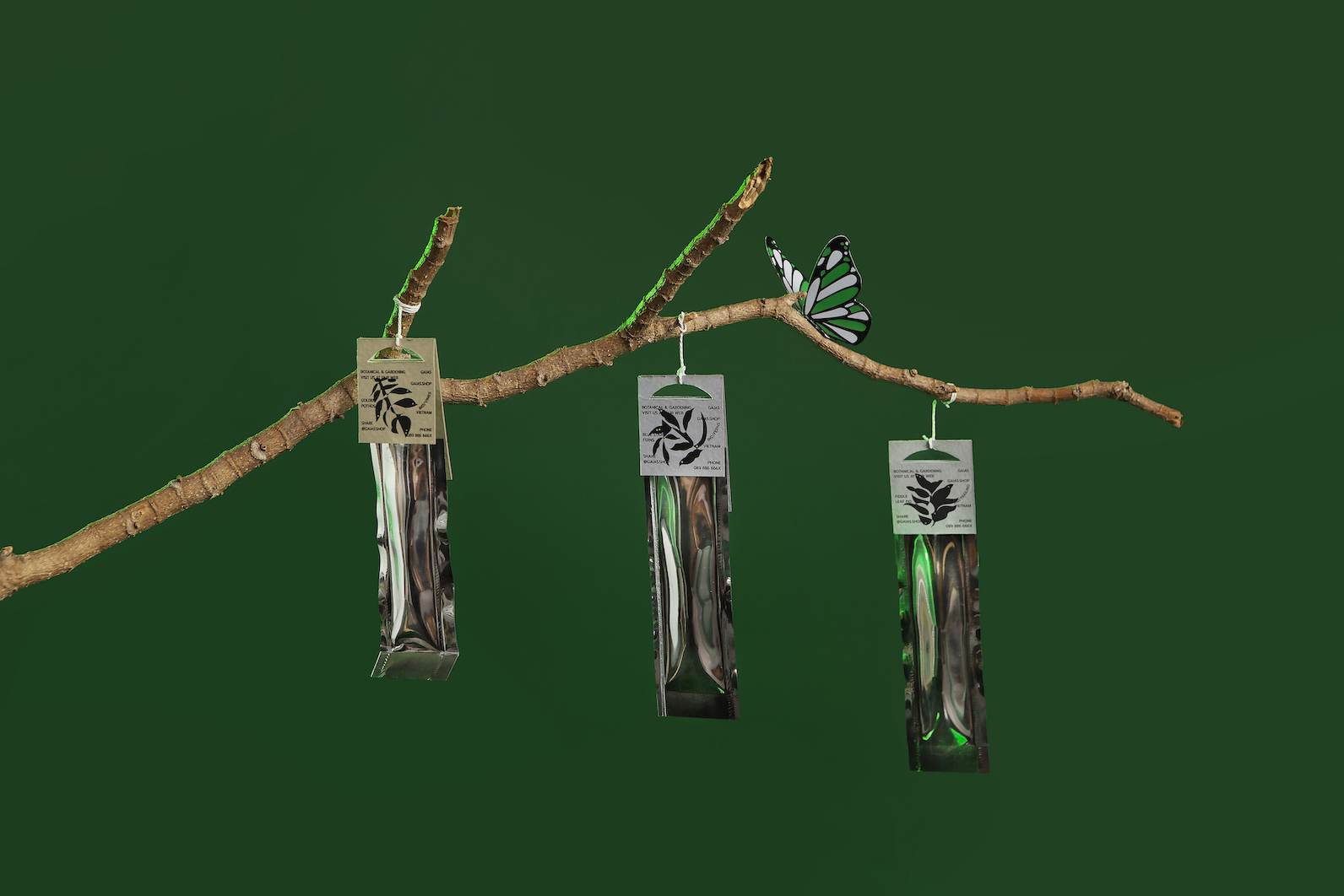
Butterflies play a significant role in maintaining natural biodiversity and a healthy ecosystem. More than adding colors to your garden, butterflies also help to pollinate plants and produce new seeds. Therefore, there is no better option than butterflies to represent Gaias, a community of hard-working planters.
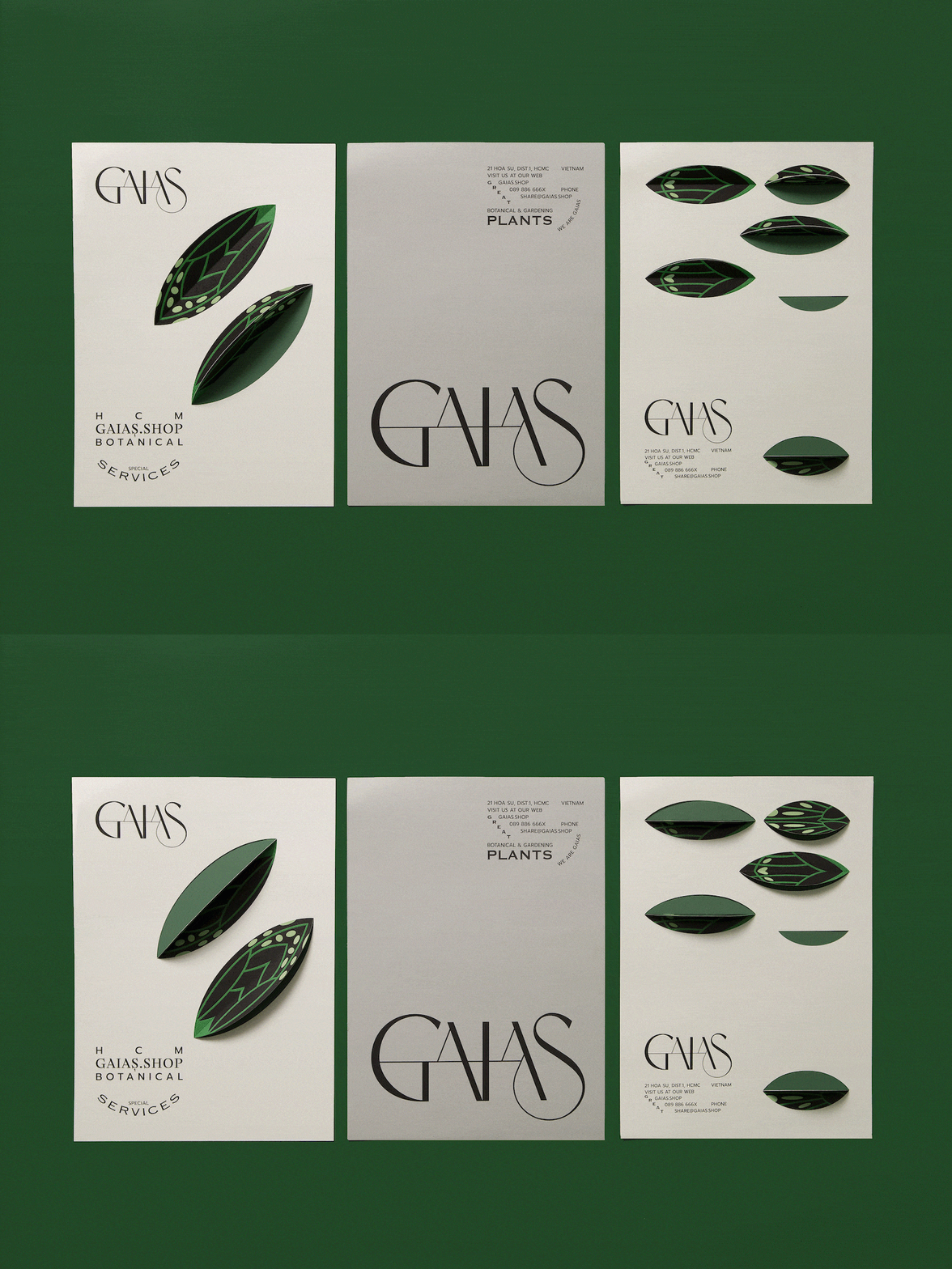
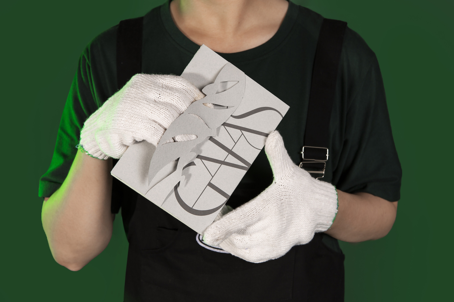
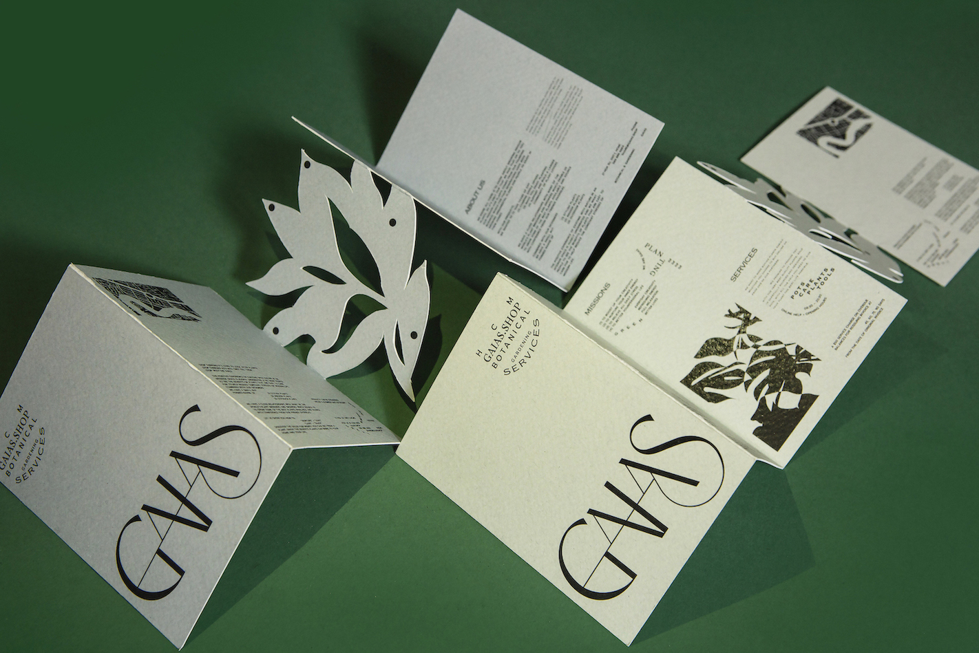
Green leaves fused with butterfly wings into ‘lefa’ – the main graphic element of the identity to amplify the connection between monarch and vegetation. With attractive shades of green and black, ‘lefa’ is a medium to compose the natural rhythm in every design. The die-cut flap effect of ‘lefa’ also captures the movement of flapping wings, effectively arousing the viewer’s interaction.
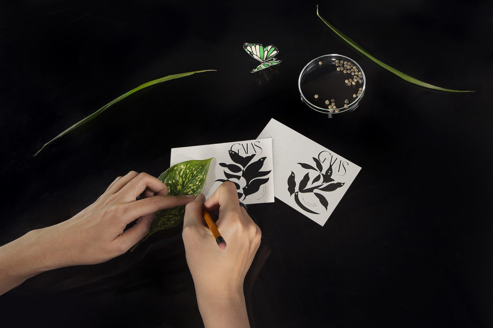
Plants usually grow thick, undirected, and also unexpected. We mostly witness the existence of plants in dynamic yet astonishing propagation. The collection of Gaias illustrations reproduce the presence of plants in organic and abstractive contours, by tracing the specific tree profile. The continuous tracing line constructs the overlap and symbolic silhouette of plants blooming on the canvas to honor all moments of tree growth. Are you eager to experiment? A half-blank postcard is ready for your first trial.
A further surprise is awaiting when organic illustrations appear in different applications and ready to play. The shadow effect of these die-cuts resembles the greenery shade falling on the ground, allure the viewer’s sensibility. These graphics are a small help to make your reading experience more pleasant and amusing. The goal of this experiment is to determine further visual development and potential discoveries for Gaias identity. It also shouts out the brand message: “Stay wild and spread your creativity as free plantlets.”
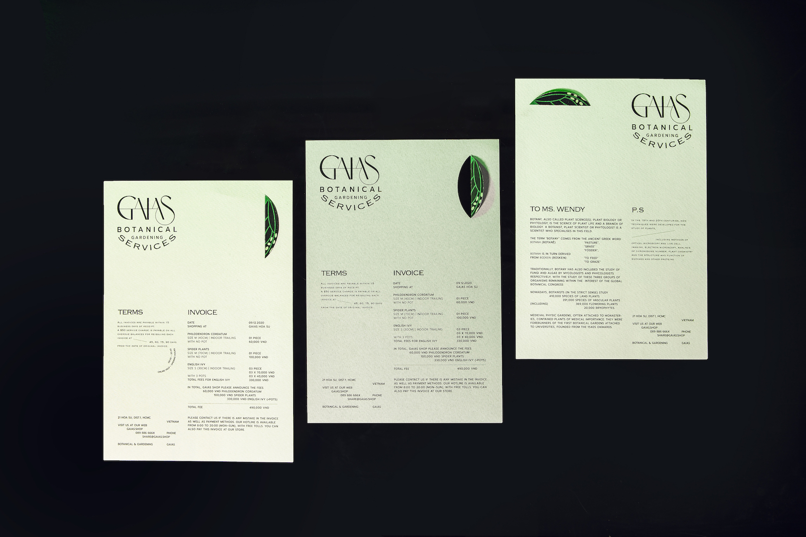
The editorial layout of recent brand identity is usually balance and concrete in continuous even columns and baselines. In contrast, Gaias’s typesetting sets a free-growing guideline for content and surprises people with their unpredictability. With no boundary or limit of a usually aligned grid, the textual graphics branch into various directions unexpectedly while maintaining eligibility. What is the correct editorial treatment for typography? Let it will be, nature says.
CREDIT
- Agency/Creative: Alex Dang
- Article Title: Alex Dang Creates Gaias Branding for a Community of Nature Protectors
- Organisation/Entity: Freelance, Non Published Concept Design
- Project Type: Identity
- Agency/Creative Country: Vietnam
- Market Region: Asia
- Project Deliverables: Brand Identity, Brand Naming, Brand Strategy, Branding, Graphic Design, Identity System, Research
- Industry: Agriculture
- Keywords: Gaia, Plant, Gardening, Planting, Nature, Butterflies, Trees


