


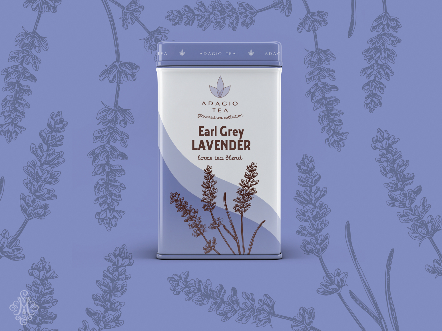
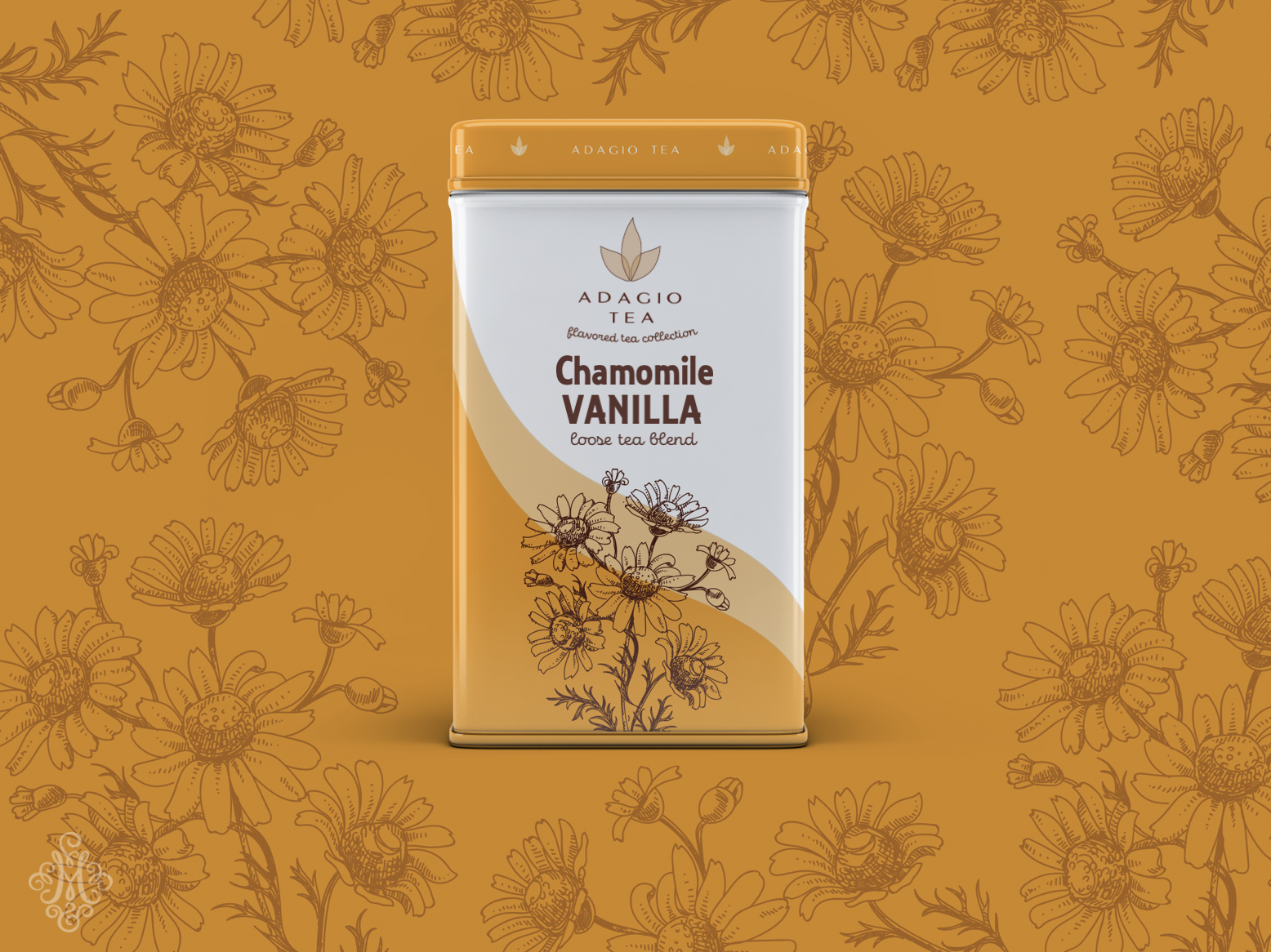
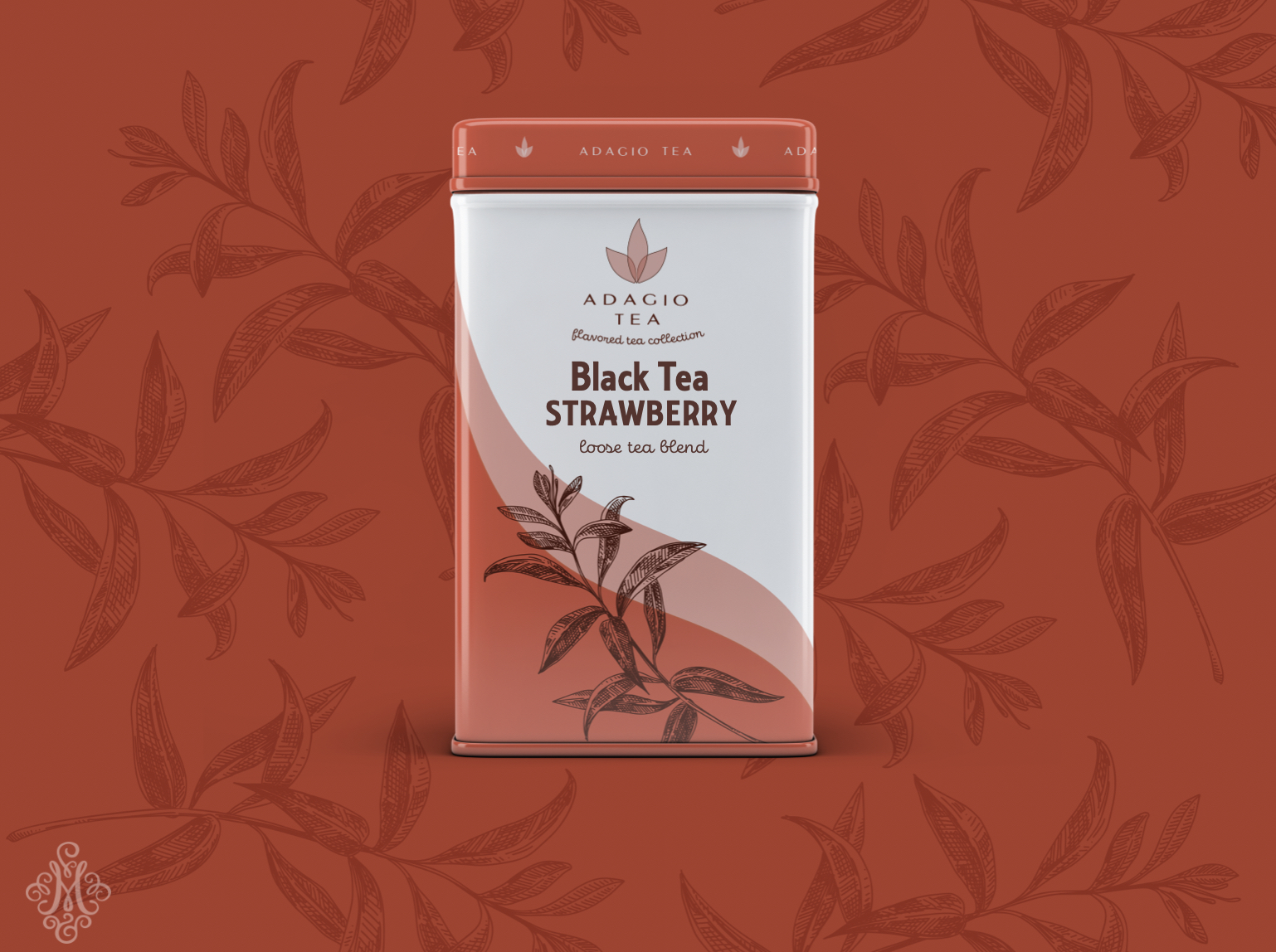
Adagio is a small family-owned company, offering unique blends and variety of teas. The company is called Adagio, a musical term meaning “slow,” or “at ease.” The word perfectly captured tea helping us unwind, slow down and relax.
The concept behind the logo is to show harmony and balance the tea can bring into your life. Adagio offers many different blends with fruits and other herbs. The overlapping of transparent leaves captures that idea.
CREDIT
- Agency/Creative: Maryia Stupakova
- Article Title: Adagio Tea Packaging and Brand Design Concept
- Organisation/Entity: Student, Published Self Promotional Design
- Project Type: Packaging
- Agency/Creative Country: United States
- Market Region: North America
- Project Deliverables: Brand Redesign, Brand Strategy, Brand World, Branding, Graphic Design, Illustration, Packaging Design, Rebranding, Research
- Format: Jar
- Substrate: Metal
FEEDBACK
Relevance: Solution/idea in relation to brand, product or service
Implementation: Attention, detailing and finishing of final solution
Presentation: Text, visualisation and quality of the presentation


