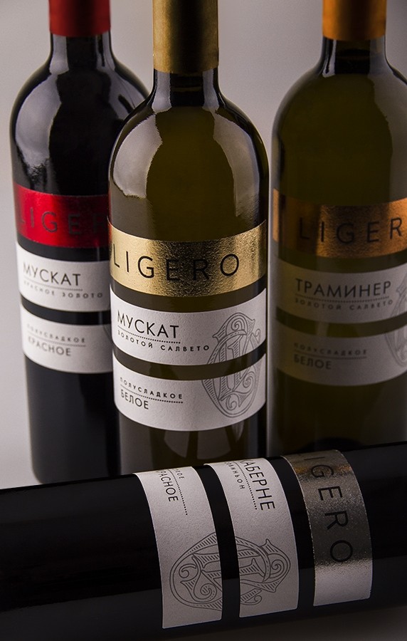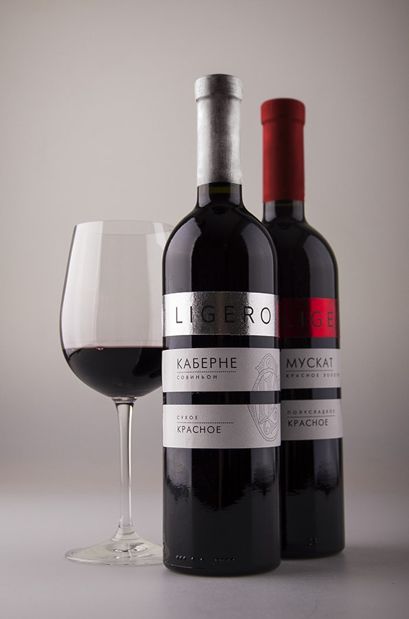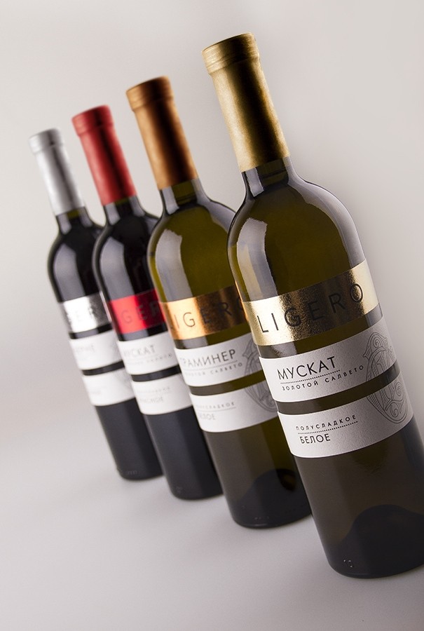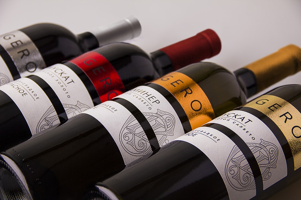
“Winemaking company «Albastrele Wines» (Moldova) contacted us for to develop label design for a new series of ordinary wines of “Ligero” Trade Mark. We were tasked to create a modern look wine bottle and by which means to stand it out on a shelf; as Ligero wine refers to the segment of ordinary wines there are a kind of comfortable competition.We decided to use one of the known approaches in designing wine labels and turned our attention to multi-position appearance. In result it was approved 3-positional label design concept, where each part has its own meaning: first – TM name, second – wine name and third – wine properties.”
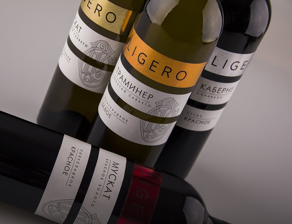
“Upper section of labels is entirely performed in foil technique that helps to attract customer’s attention; so for to make labels work better on a shelf we used a different foil colours to mark wine classification (red/white/dry/semisweet). Lower parts are united by means of monogram at the heart of which lies a letter “L” from TM name “Ligero””