


The first Grotesk typeface in history was the Akzidenz Grotesk, whose first weight was published in 1898 by Bauer&Co in Stuttgart and Berthod in Berlin. During the 1950s, the typeface was quite successful, especially in advertising, initially only in Europe.
Akzidenz has inspired many Grotesk fonts, such as Record Gothic, Monotype Groteseque, Helvetica and Univers. Helvetica was designed in 1957 by Max Miedinger under the supervision of Edward Hoffman for the Haas foundry. The goal was to introduce an ungrateful typeface to the market that could compete with Akzidenz Grotesk. It was released shortly after Univers, but initially the font was called Neue Haas Grotesk, a name changed in 1961 to Helvetica for commercial launch by Stemper and Linotype.
In the same year the character spread beyond European borders to the United States. In a short time Helvetica became one of the most famous and used sans-serif fonts in the world.
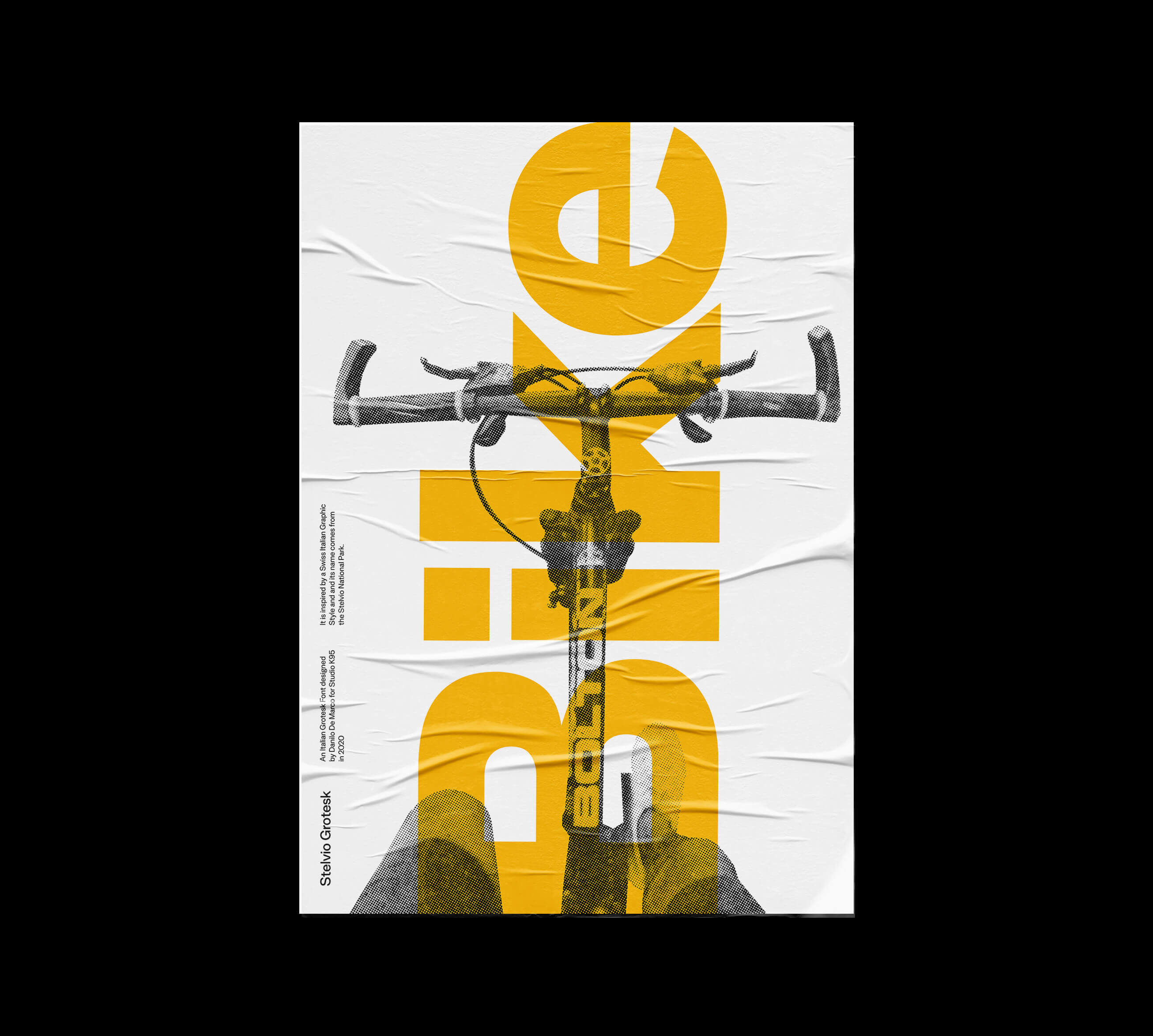
The Stelvio Grotesk was born drawing inspiration mainly from the Unigrid project (1977) by Italian designer Massimo Vignelli. This project allowed the American National Parks to have a single communication system, that until 1976 had been different for the whole of each park, forcing the American government to pay huge annual expenses for communication.
Massimo Vignelli designed a grid system that allowed anyone to easily make maps, brochures and any other printed material, without waste. We imagined how a similar system could work within the Italian National Parks, designing a font and a set of icons that could be used.
Architecture, nature, art, literature, design and fashion, Italy is an inexhaustible source of beauty. Italy has always managed to express an incredible “visual poetics”.At the end of the Second World War a real cultural exchange between Italian and Swiss designers began, some of the latter moved to Milan attracted by the nascent cultural and design climate. The Swiss brought their own design style and the Italians combined their creativity with it, starting a style that became unique in the world.
Albe Steiner, AG Fronzoni, Armando Testa, Giovanni Pintori, Bruno Munari, Massimo Vignelli are just some of the Italian designers/advertisers who managed to leave a deep imprint in world design as well as foreign designers who worked in Italy such as Bob Noorda, Max Huber, Bruno Monguzzi and others.
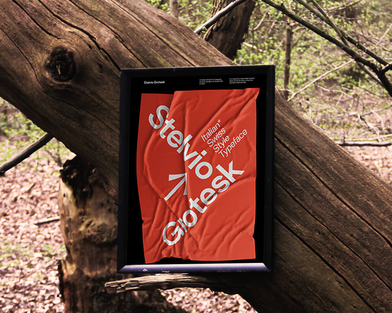
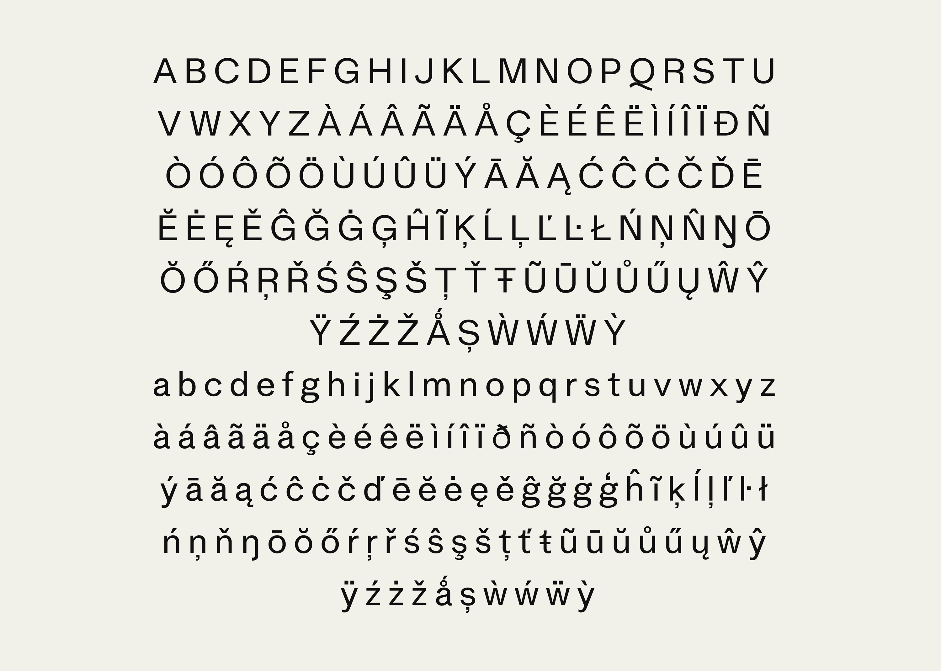
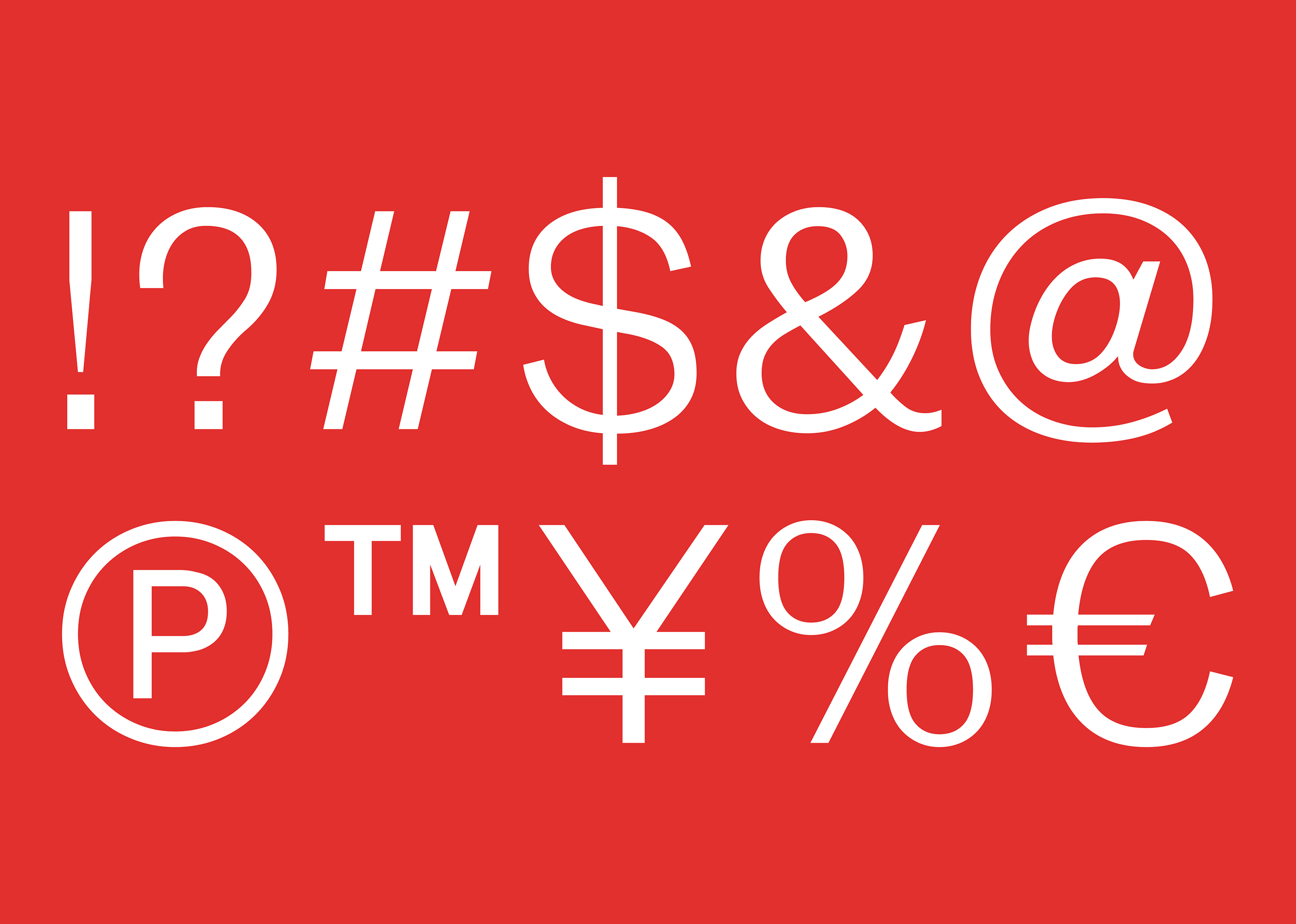
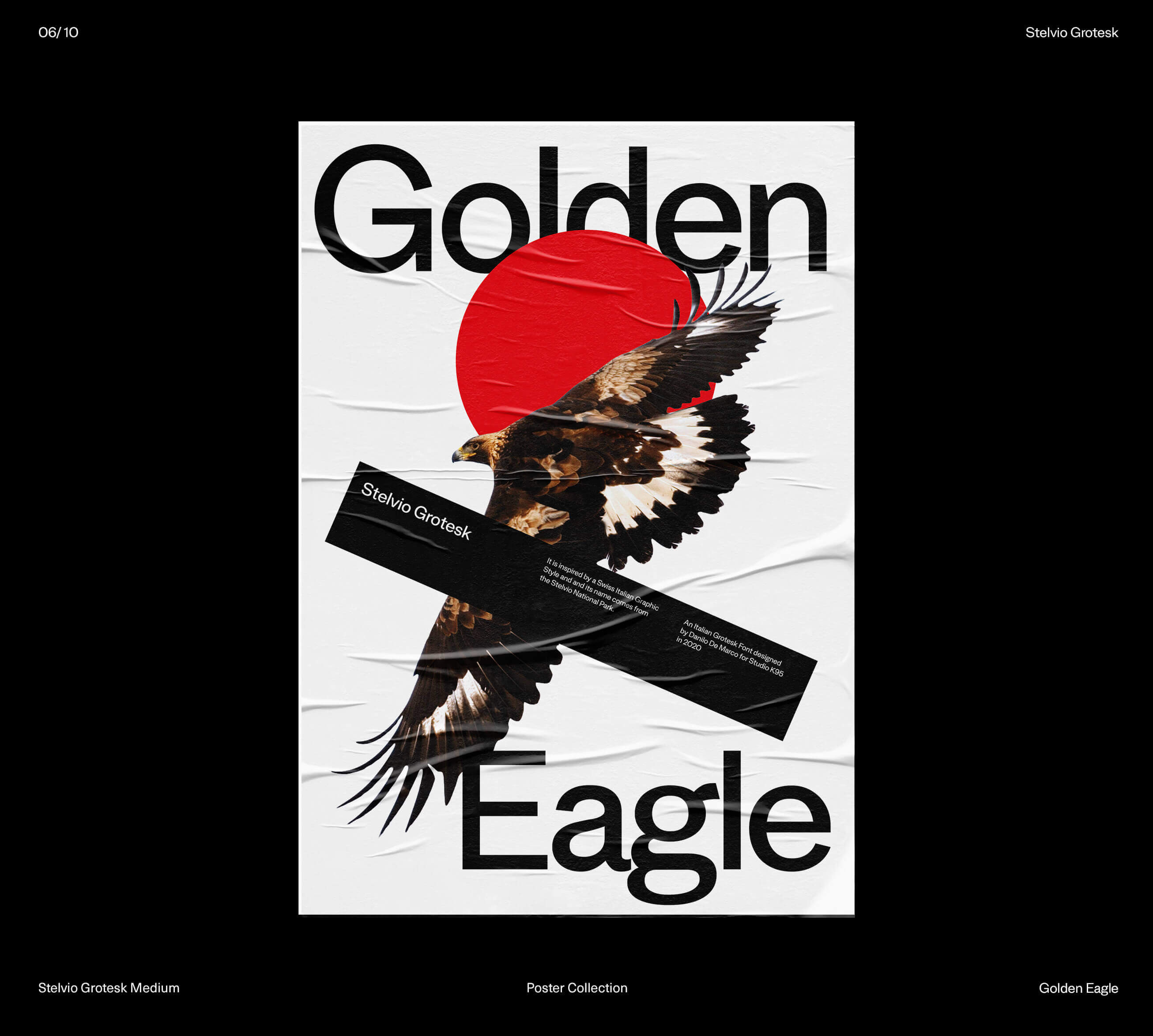
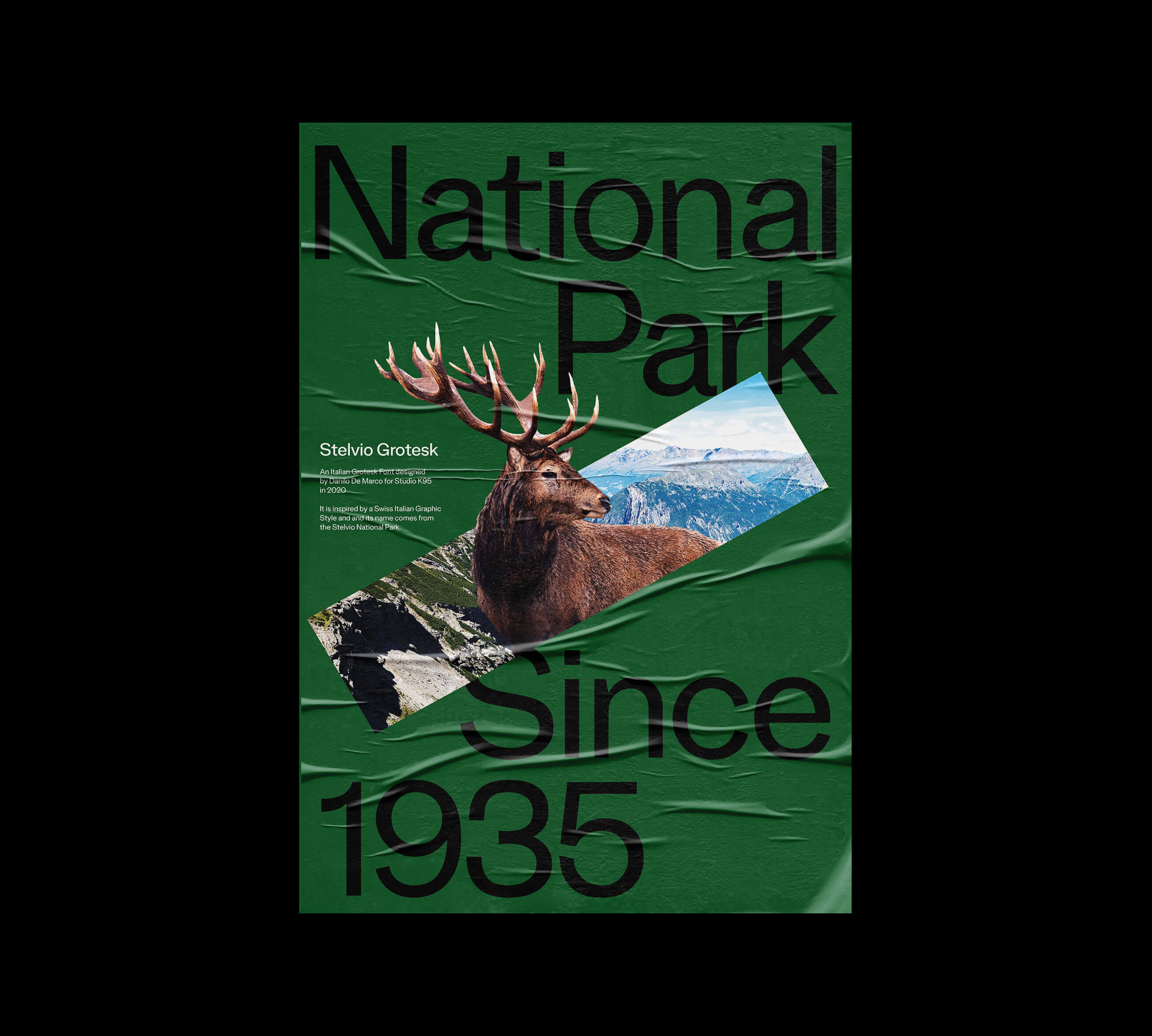
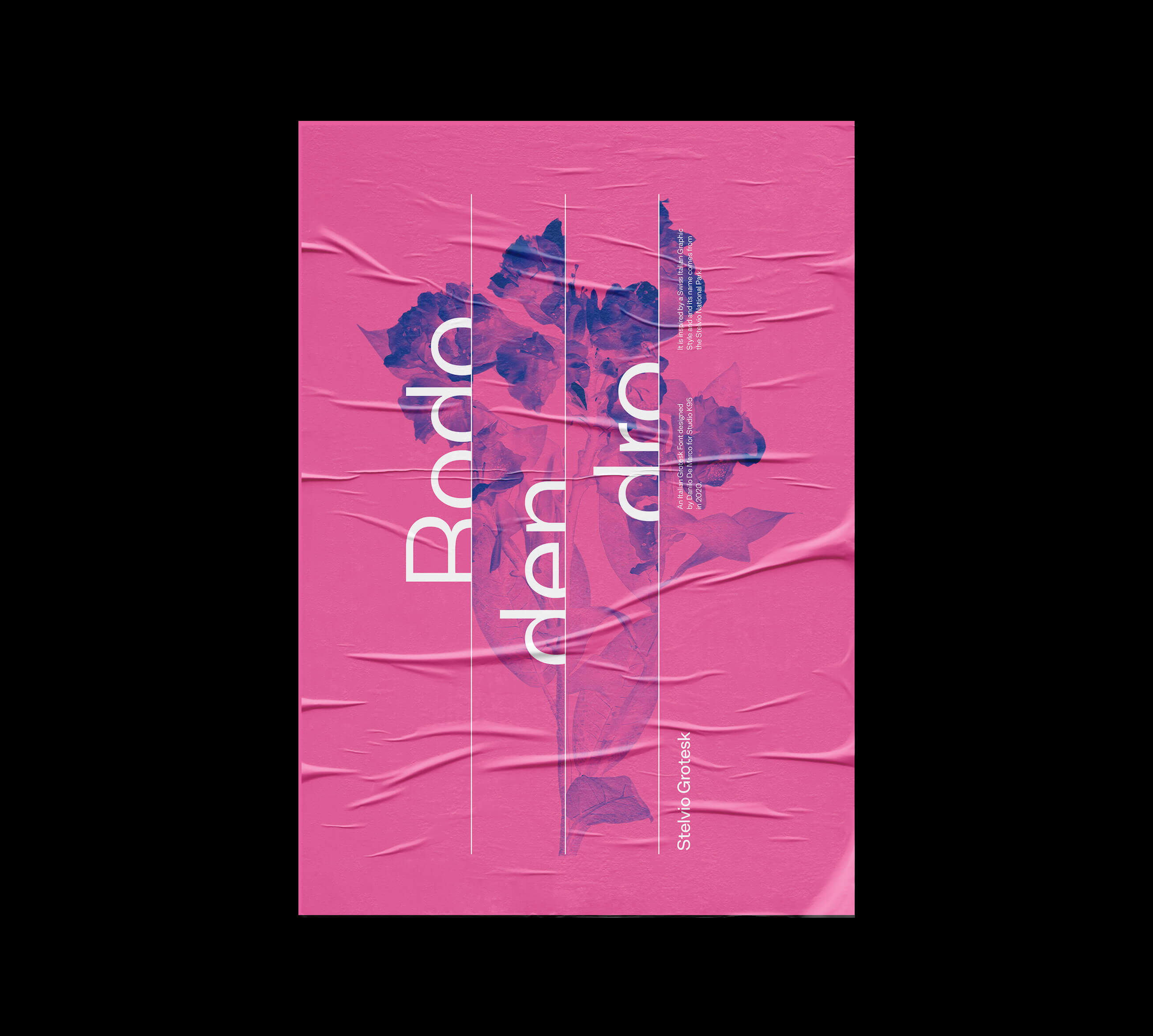
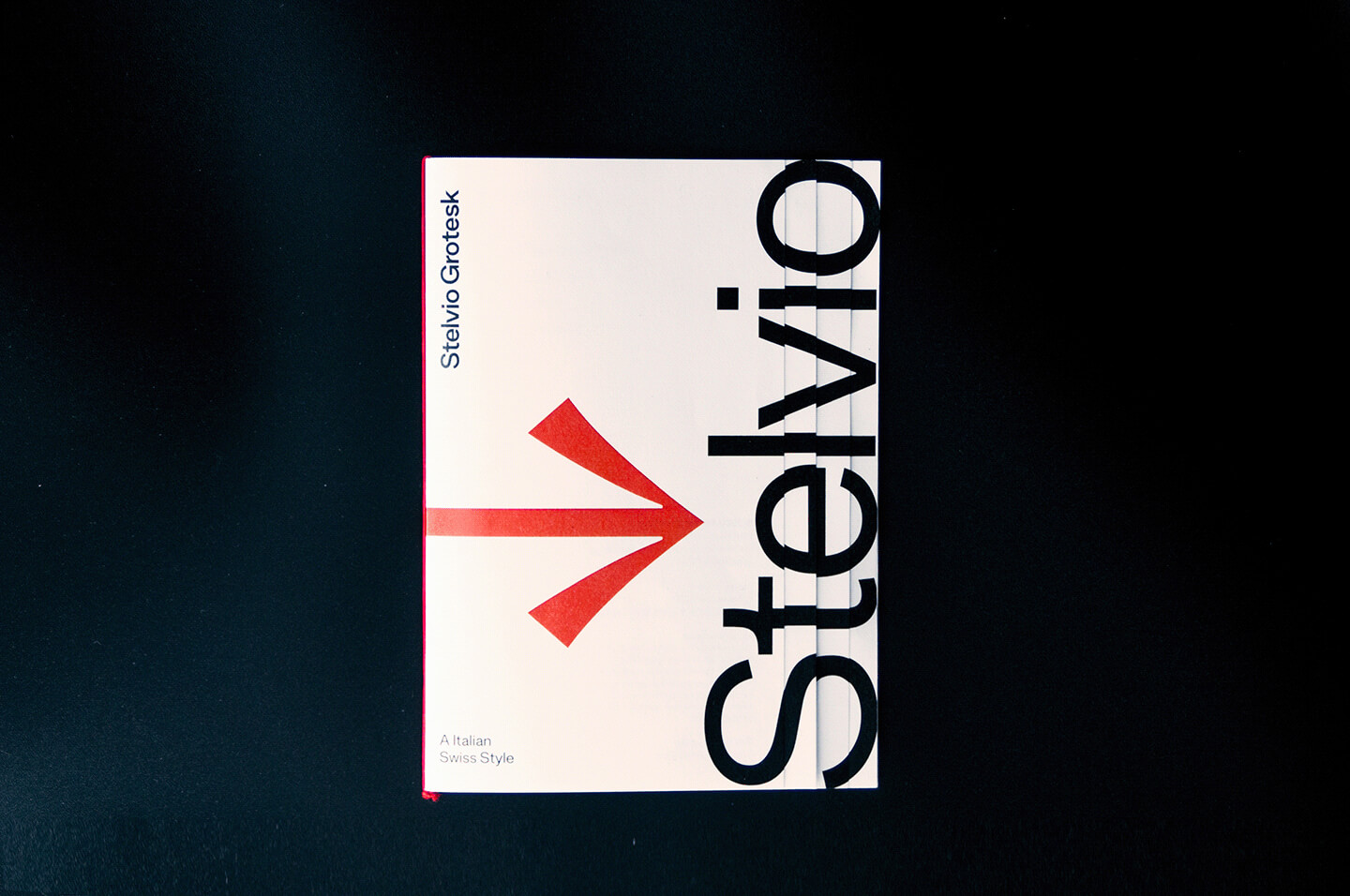
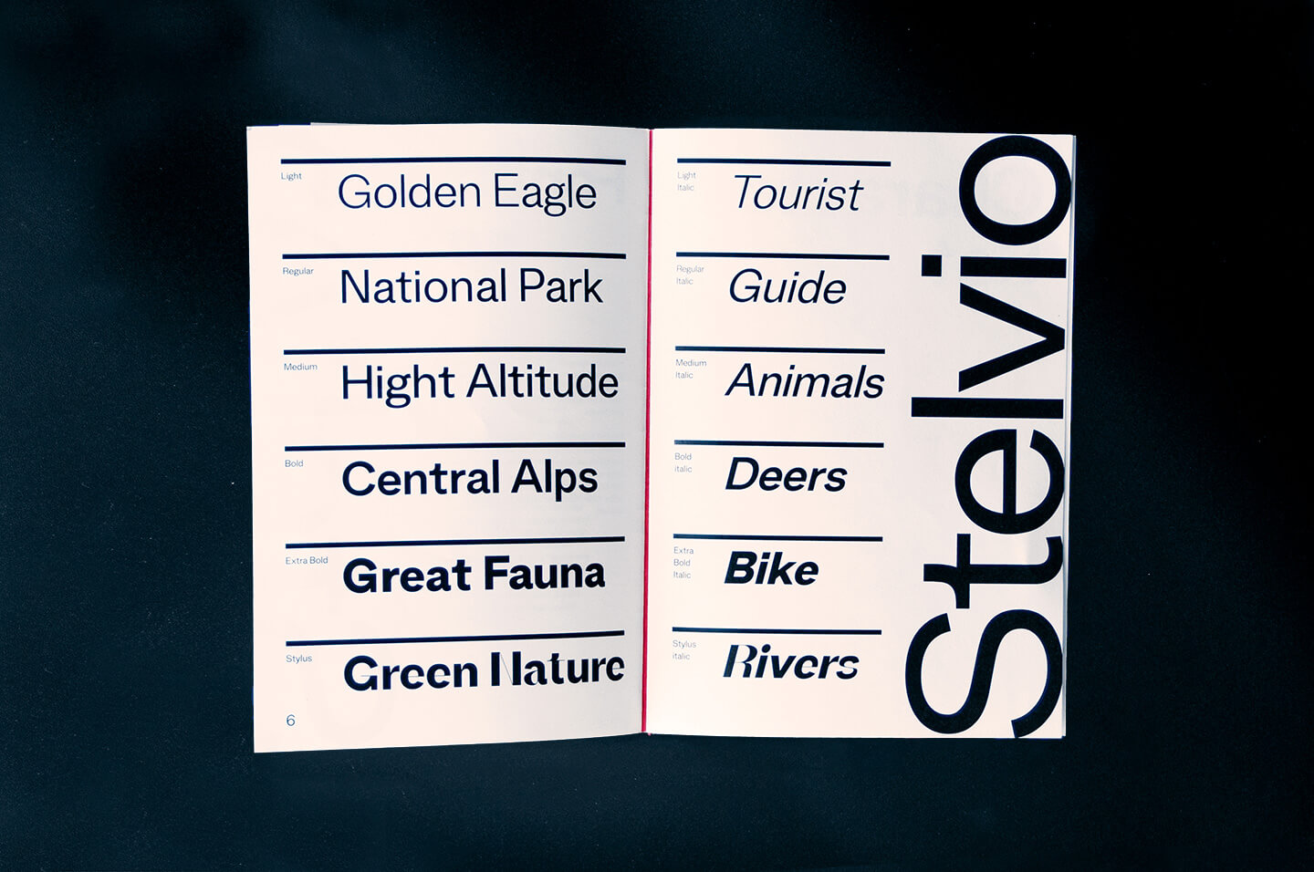
The Stelvio Grotesk is a modern sans-serif character designed by Danilo De Marco between 2018 and 2020 for Studio K95. It is the result of a long study of the Grotesk characters of the past, such as the already mentioned Akzidenz, Helvetica and Univers. The font is composed by 5 weights (Italic, Regular, Medium, Bold, Extra Bold), the Italic versions and a style we have called Stylus, ideal for titling and graphic uses.
Some letters of the font are characterized by sinuous strokes belonging to the romantic/modern Italian typographic tradition.
We designed 10 posters for advertise the Stelvio Grotesk. We were inspired by nature, fauna and activities in the Stelvio Natural Park. These posters show the use of the font as a graphic component and not only textual, their design has helped us in the last phases of realization.
Danilo De Marco and Giulia Gambino designed a set of 70 icons that they named Stelvio Icons. The icons are suitable for use within wayfiding systems, but initially they were designed to be used within a system for nature parks. Later we designed other icons that could be used within urban systems such as metro, airports, stations and others.
The design of the icons, in outline, is inspired by the shapes of the letters of the Stelvio Grotesk and the entire set comes in four different thicknesses (Light, Regular, Medium, Bold).
CREDIT
- Agency/Creative: Studio K95
- Article Title: 10 Posters that Promote Stelvio Grotesk
- Organisation/Entity: Agency
- Project Type: Typography
- Project Status: Published
- Agency/Creative Country: Italy
- Agency/Creative City: Catania
- Market Region: Europe
- Project Deliverables: Icon Design, Poster Design, Type Design
- Industry: Entertainment
- Keywords: type design, font, typography, sans serif, grotesk, type, fonts
-
Credits:
Type Desginer and Icon Designer: Danilo De Marco
Icon Designer: Giulia Gambino


