Today, the borders between the real and virtual worlds are more transparent than ever. Zerion is depicted as an enigmatic space, inviting users to immerse, explore, and discover infinite possibilities. The deeper you go, the more artefacts you uncover. As the layers unfold, the space becomes more complex, representing the evolving en engagement of users with shapes, colors, icons, illustrations, and above all, dynamic NFT avatars known as Zerion DNA.
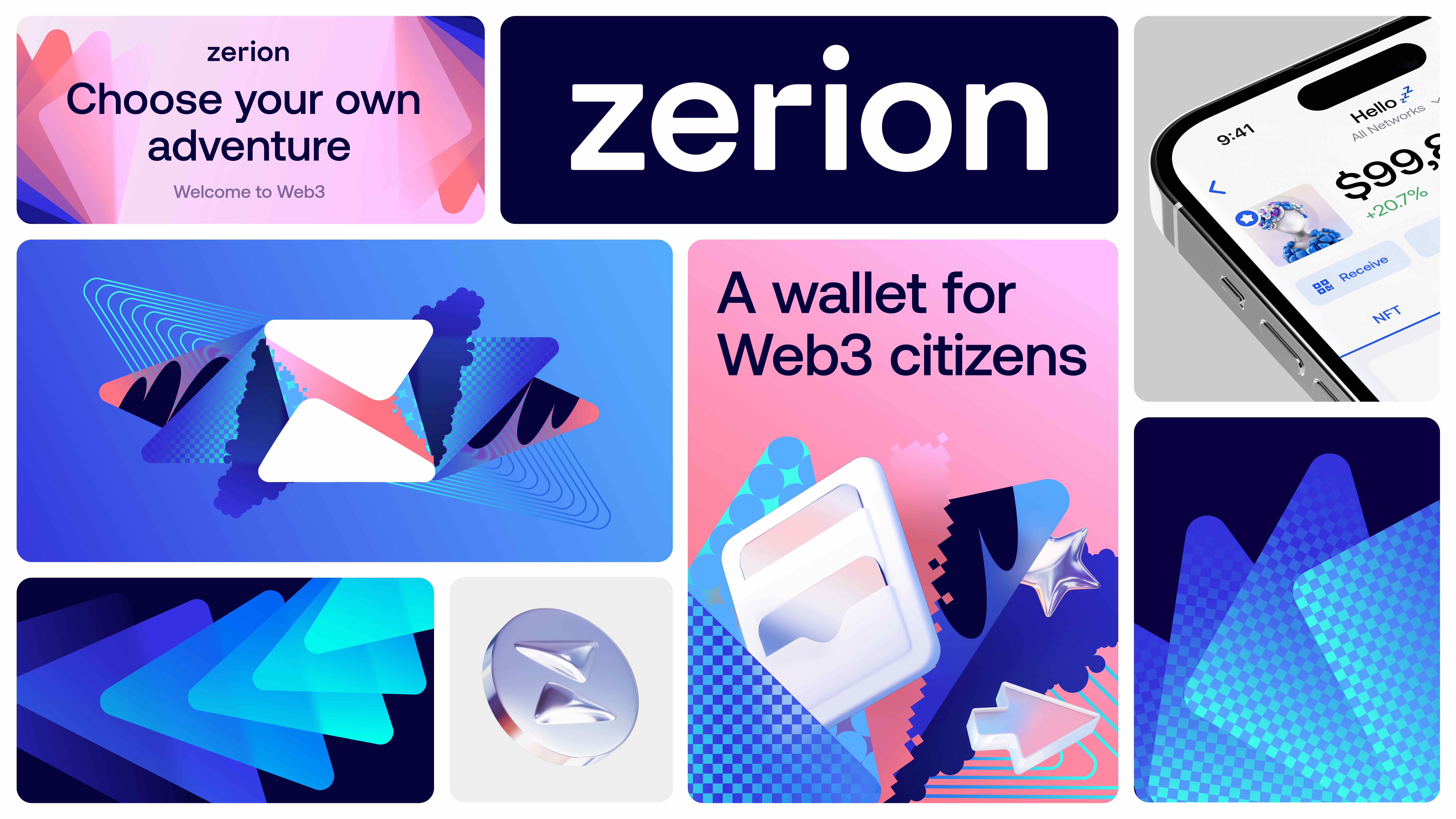
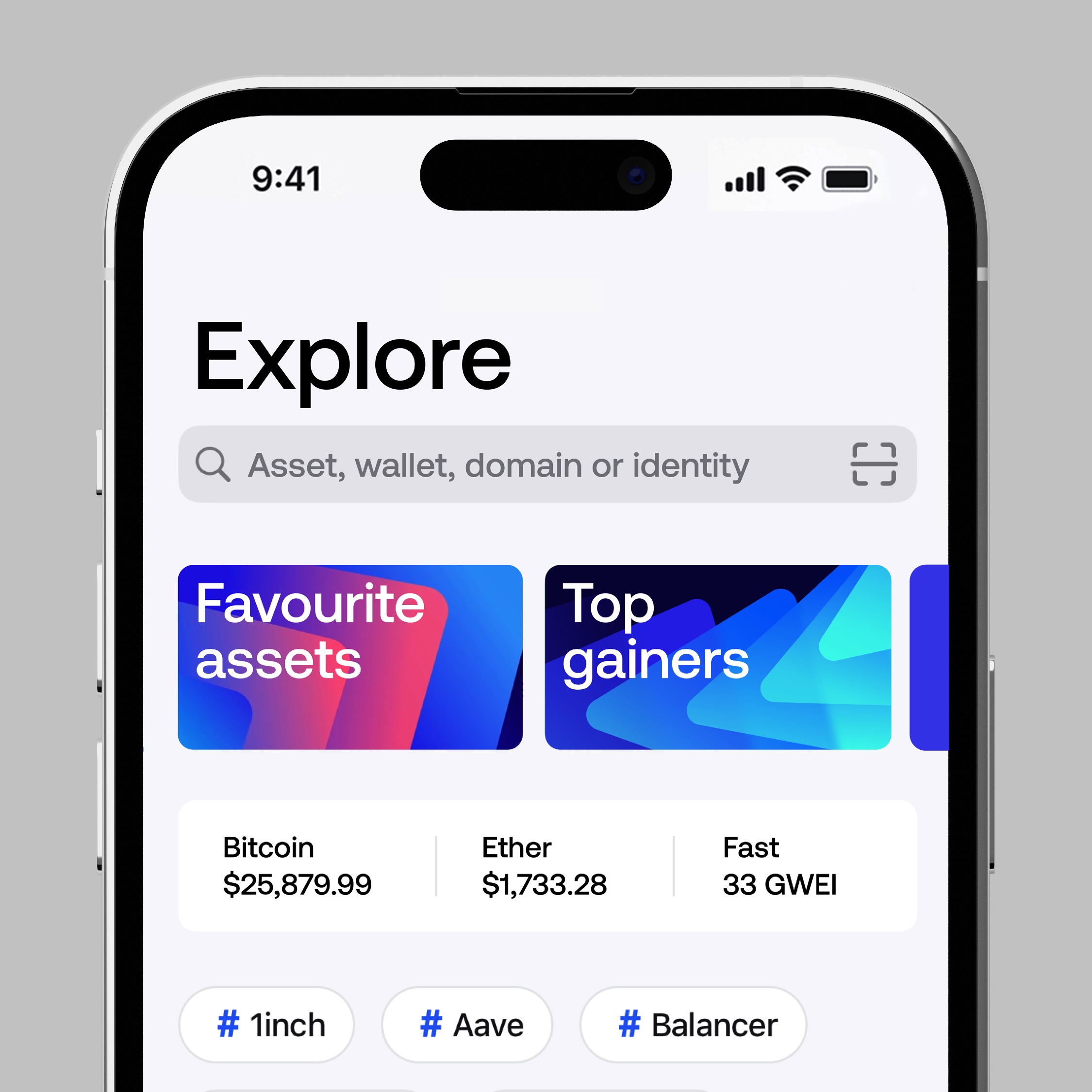
The new brand identity of Zerion offers a range of diverse elements, including a custom logo and symbol, multiple levels of motion and static graphics, visuals, illustrations, shapes for layers with individual color and pattern options. These assets provide a vibrant and fluid language for solid graphic communication.
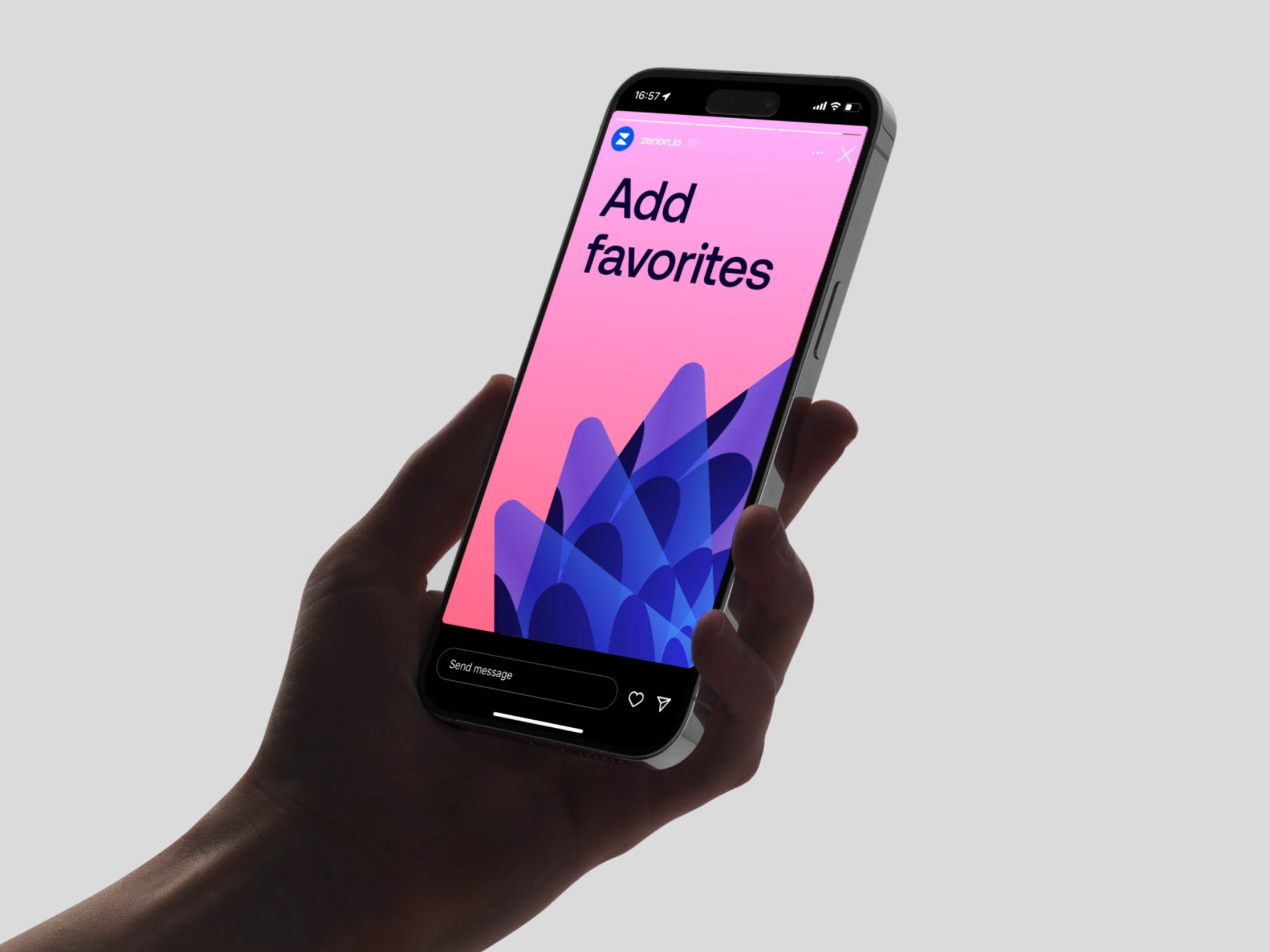
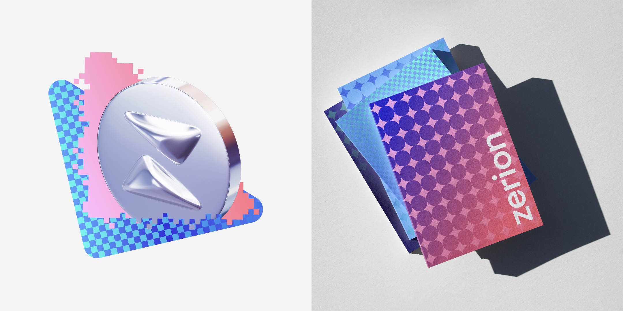
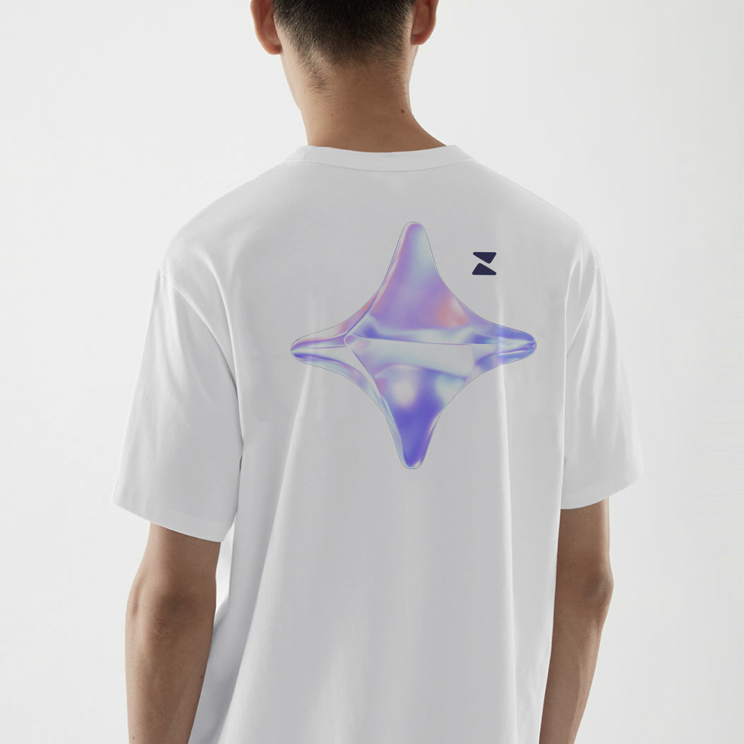
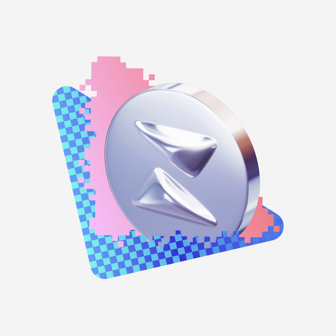
In the **symbol**, the cohesive connection of the layers represents stability and safety. As an icon, the symbol is placed on patterned backgrounds for social media and adopts a monochrome backdrop for smaller sizes, including favicons.
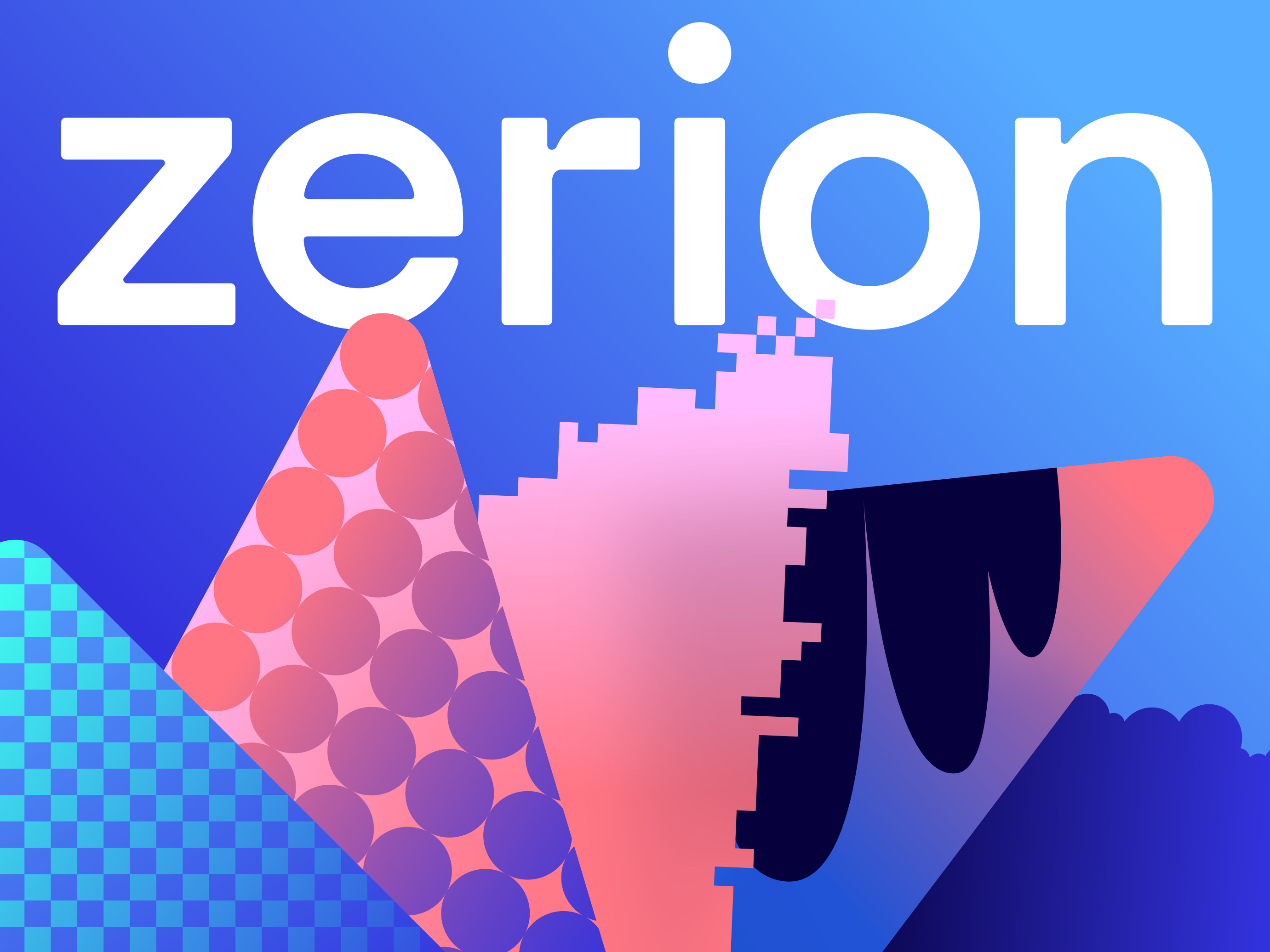
The revisited **logo** is a lowercase grotesque typeface that is clear and acceptable. The shape aligns with that of the symbol through a lighter weight, gentle inktraps, balanced spacing, smooth contrast, and slightly rounded corners.
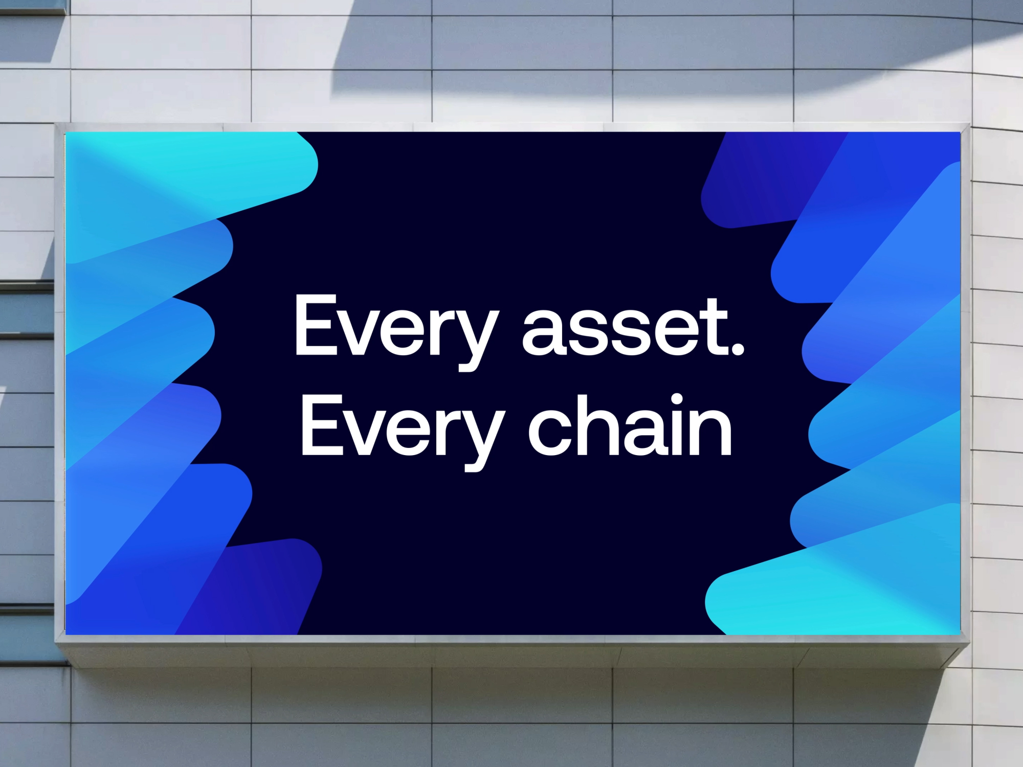
The **colour palette** is centered around trustworthy blue, with added warmth for a humane and friendly feel. Gradients are created using brand colors. There are three themes: dark, main, and light. Dark is for essential announcements, suitable for investor relations and financial updates. Main is for offline and online events, as well as initial brand encounters. Light is for promoting features, APIs, and engaging with a familiar audience.
The primary **typeface** used is Aeonik Pro Medium, which has a precise and condensed style. Other font weights are suitable for web applications. Left alignment is used for all types of assets, such as symbols, logos, and lockups. Central alignment is reserved for the logo, particularly for special announcements.
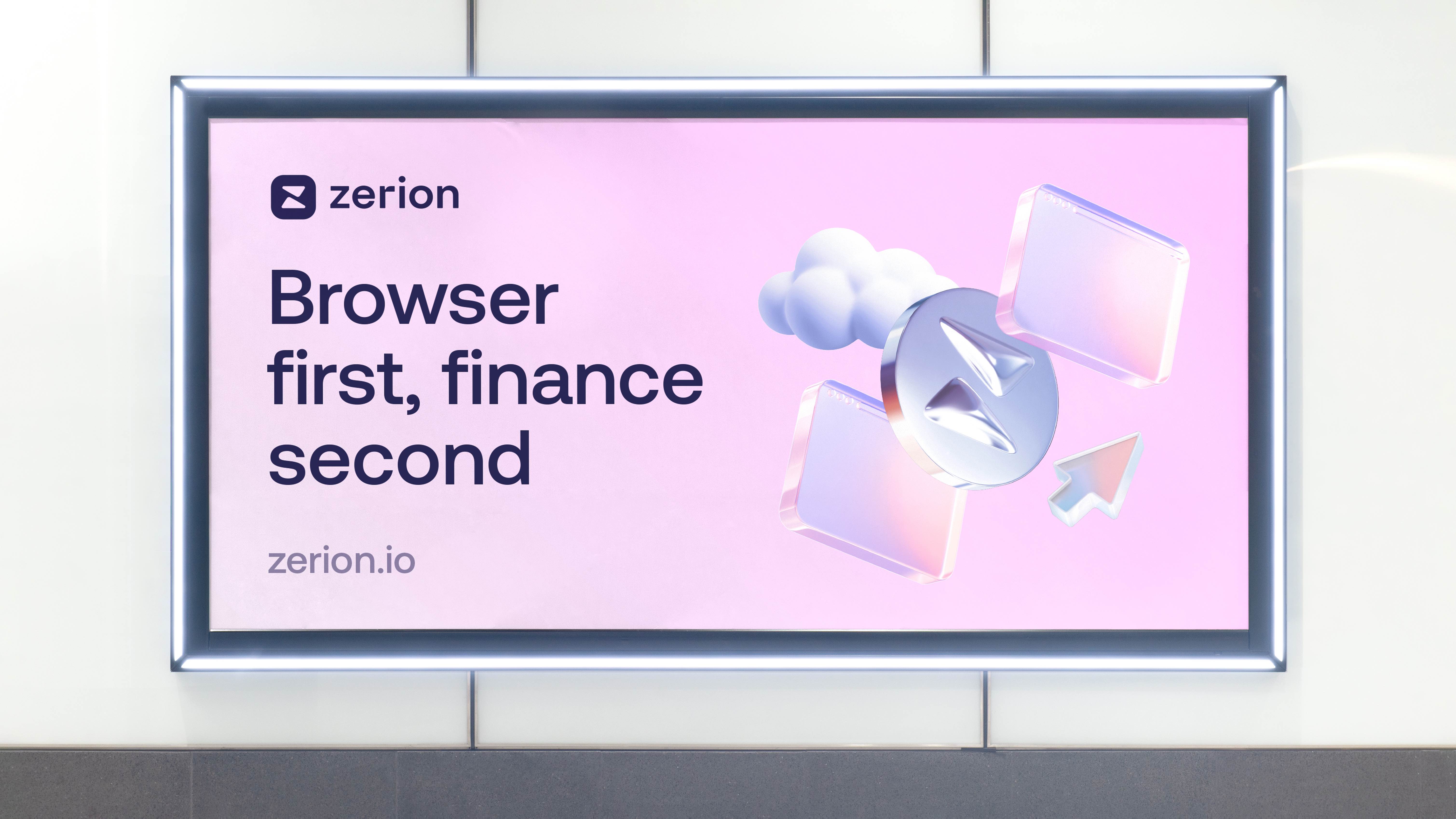
Zerion’s character is emphasized by a set of **illustrations** featuring rounded-corner circles, rectangles, and triangles. The objects are crafted using glossy metal, glass, and plastic. The angled view is for illustrations with cut edges, while frontal is for streamlined shapes or multiple edges. These illustrations can be combined in various compositions or used independently to fulfill the brand’s communication.
**Motion graphics** enhance the visual language by adding movement and functionality. The core concept revolves around the dynamic manipulation of triangles through rotation, transformation, and intersection, showcasing Zerion’s versatility. There are four main motion scenarios: rotation, unfolding, folding, and combinations thereof.
The brand identity of Zerion includes **DNA** – Dynamic NFT Avatars that represent the on-chain actions of users. These avatars evolve with each move made within the wallet, depending on the network used, assets held, and gas spent. Over 3,000 custom avatars are designed through a variety of backgrounds, fillings, bodies, clothing, heads, and colours.
CREDIT
- Agency/Creative: Shuka Design
- Article Title: Zerion Web3 Wallet New Visual Identity
- Organisation/Entity: Agency
- Project Type: Identity
- Project Status: Published
- Agency/Creative Country: Germany
- Agency/Creative City: Berlin
- Market Region: Europe, North America
- Project Deliverables: Art Direction, Brand Design, Brand Experience, Brand Identity, Brand Redesign, Brand Refinement, Brand Strategy, Illustration, Logo Design, Motion Graphics, Performing Arts, Rebranding, Typography
- Industry: Financial
- Keywords: Visual system for Web3 wallet & DeFi portfolio from San Francisco
-
Credits:
Creative strategy directoru2248xz: Anastasia Butrym
Creative director: Ivan Vasin
Design director: Alexander Koltsov
Lead designer: Polina Zagumenova
Designer: Anna Esedullaeva
Motion designer director: Dmitry Kozlyaev
Motion designer: Anton Gremyakov
3D icons: Thingers Studio
Project director: Maria Orlova
Project manager: Valeria Ivanova
Head of content: Vasilii Kolesnik
Content producer: Ekaterina Shcherbakova


