


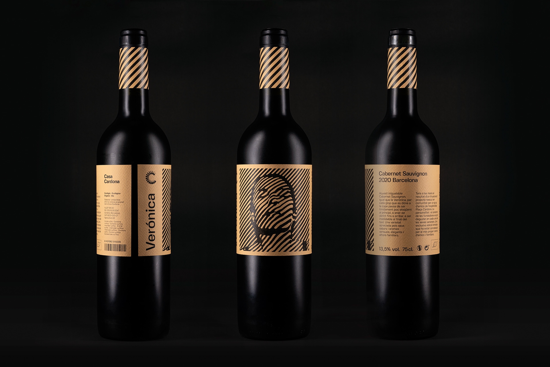
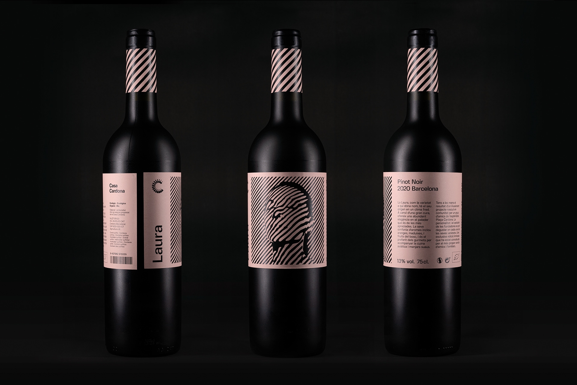
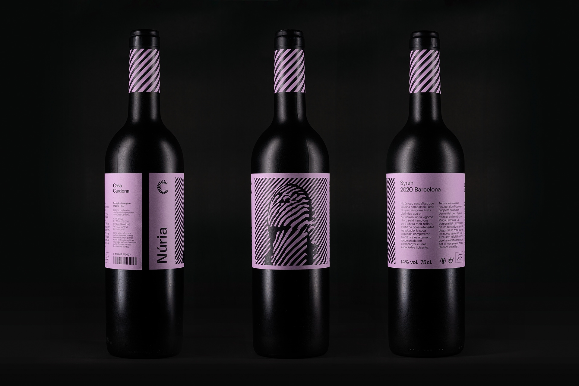
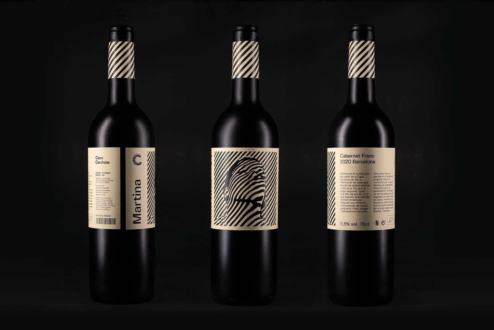
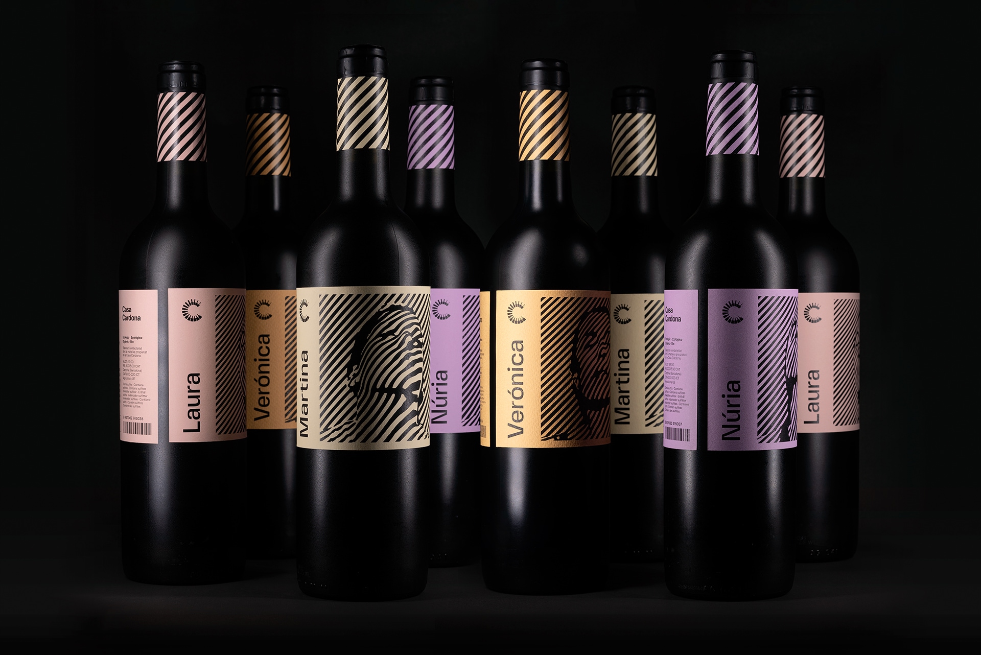
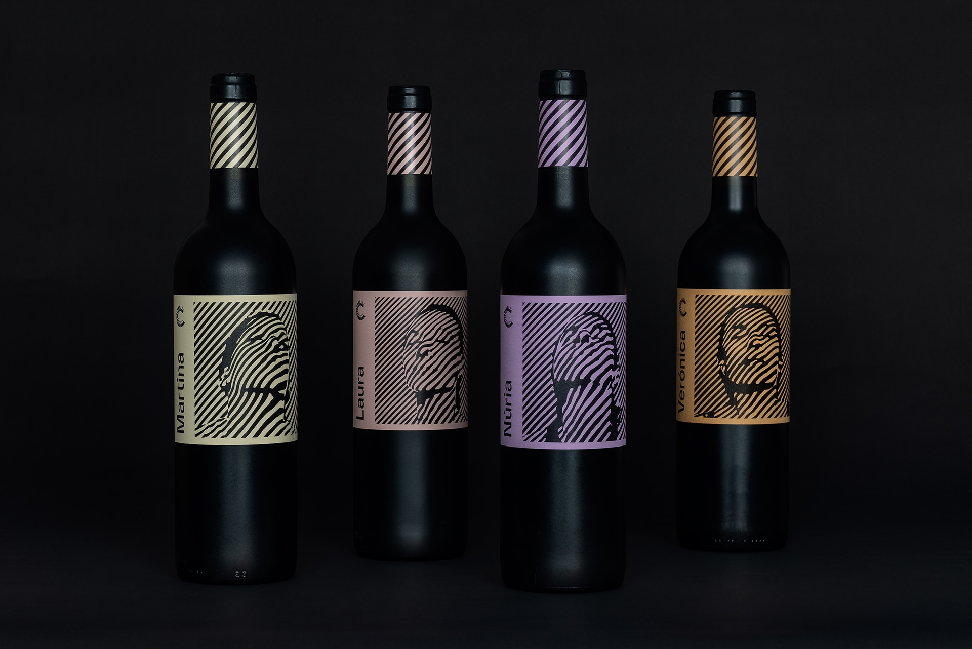
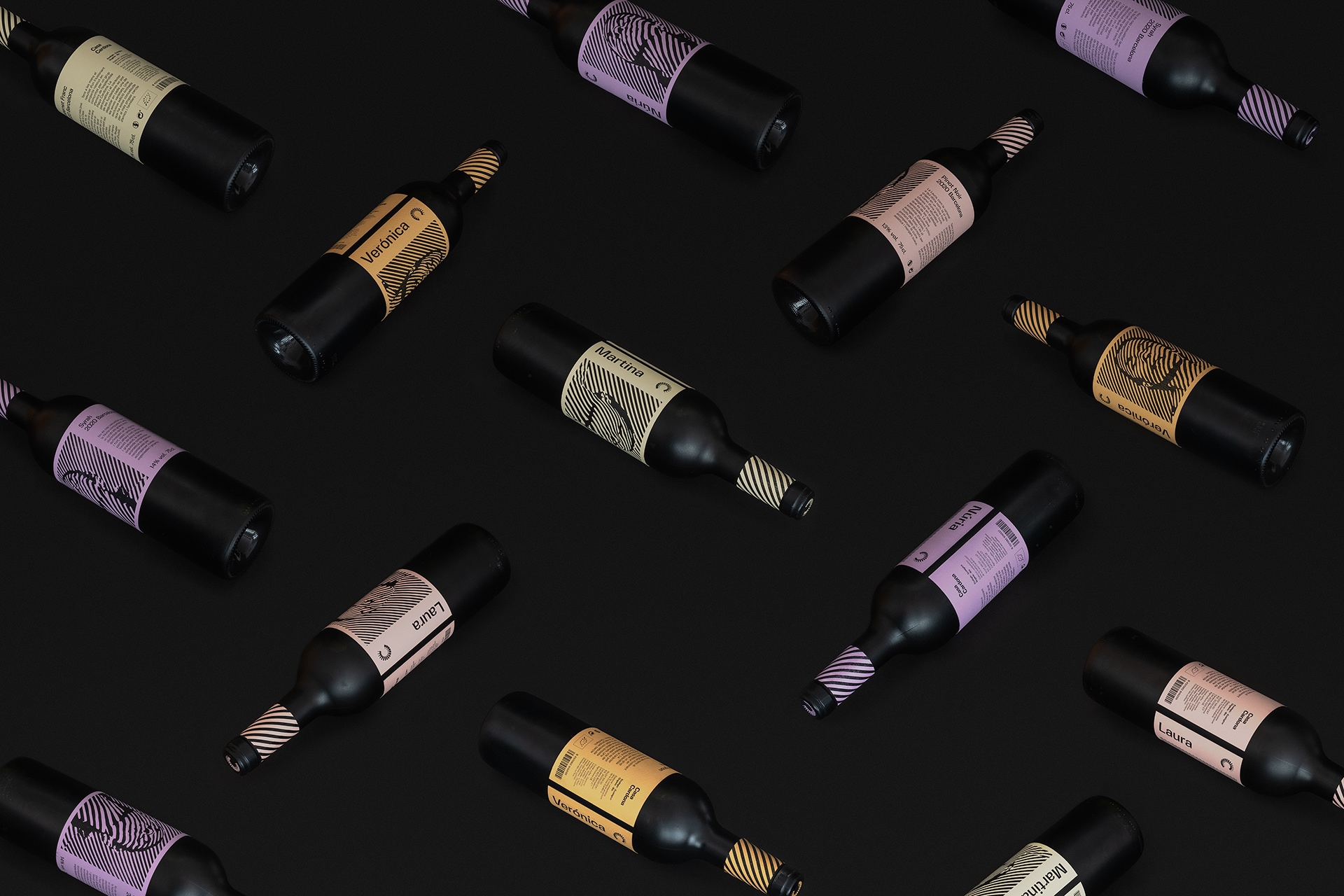
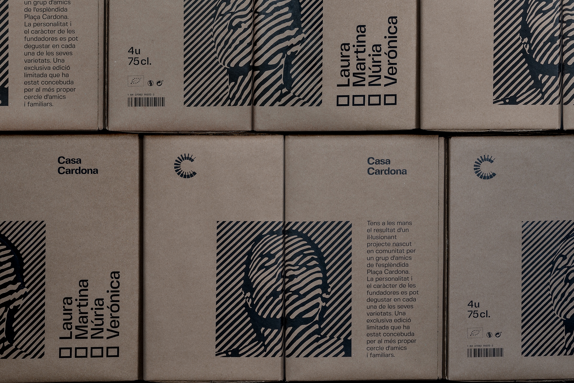
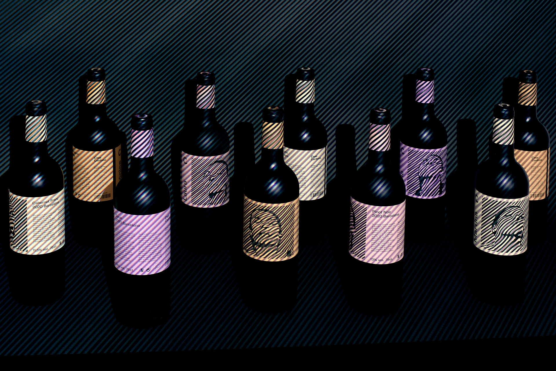
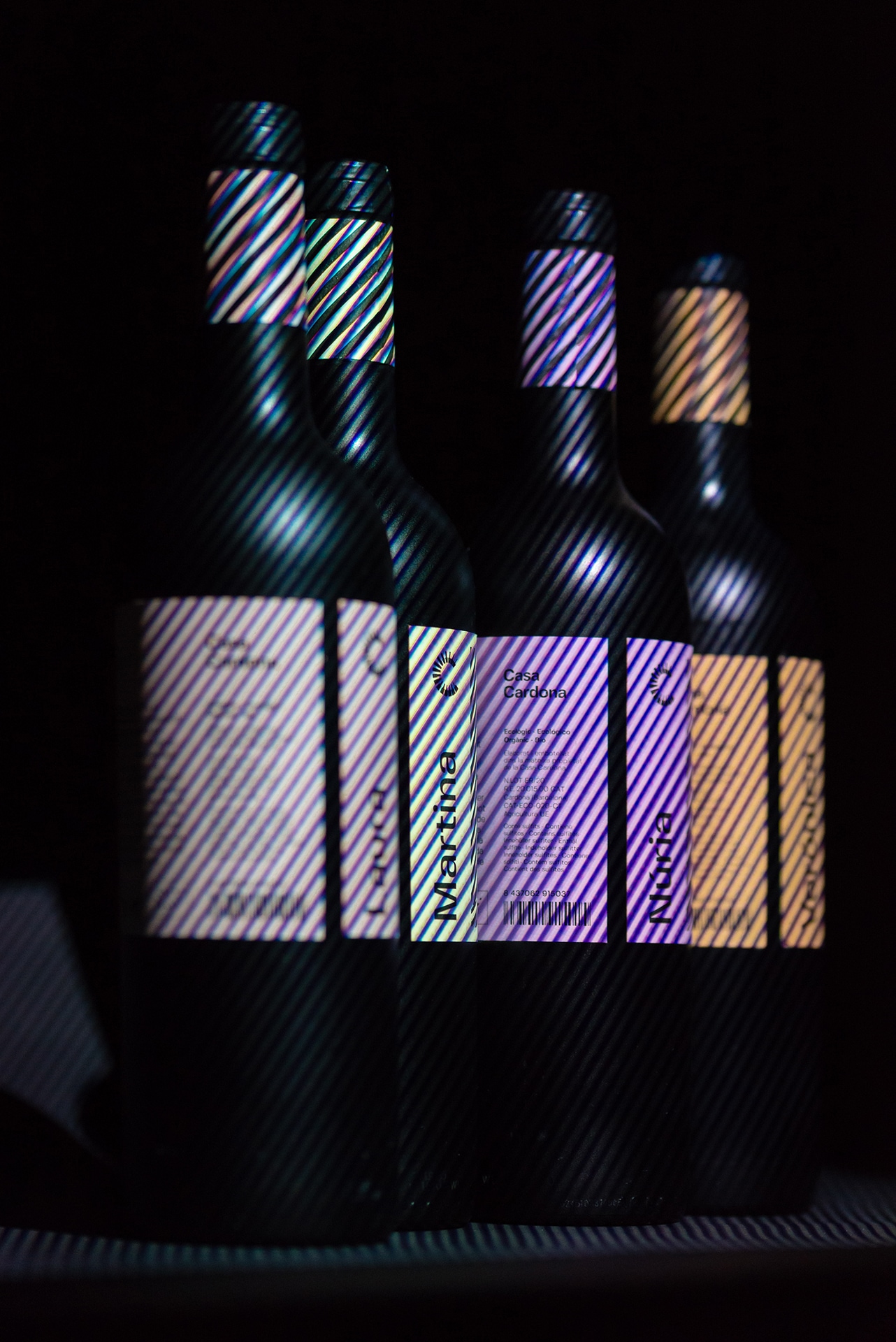
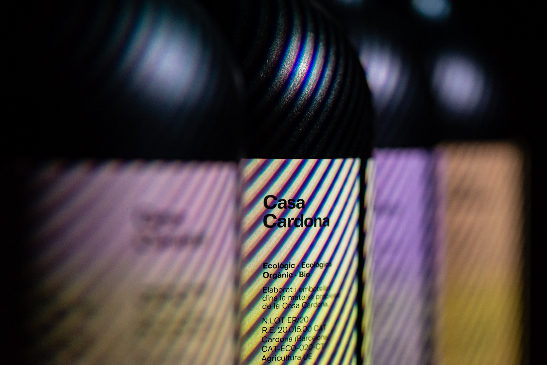
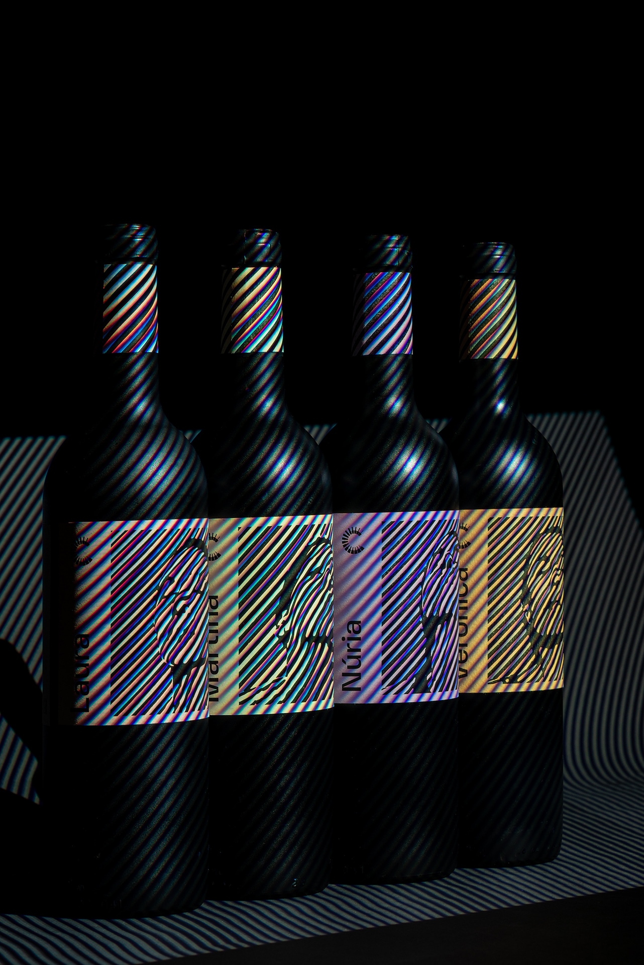
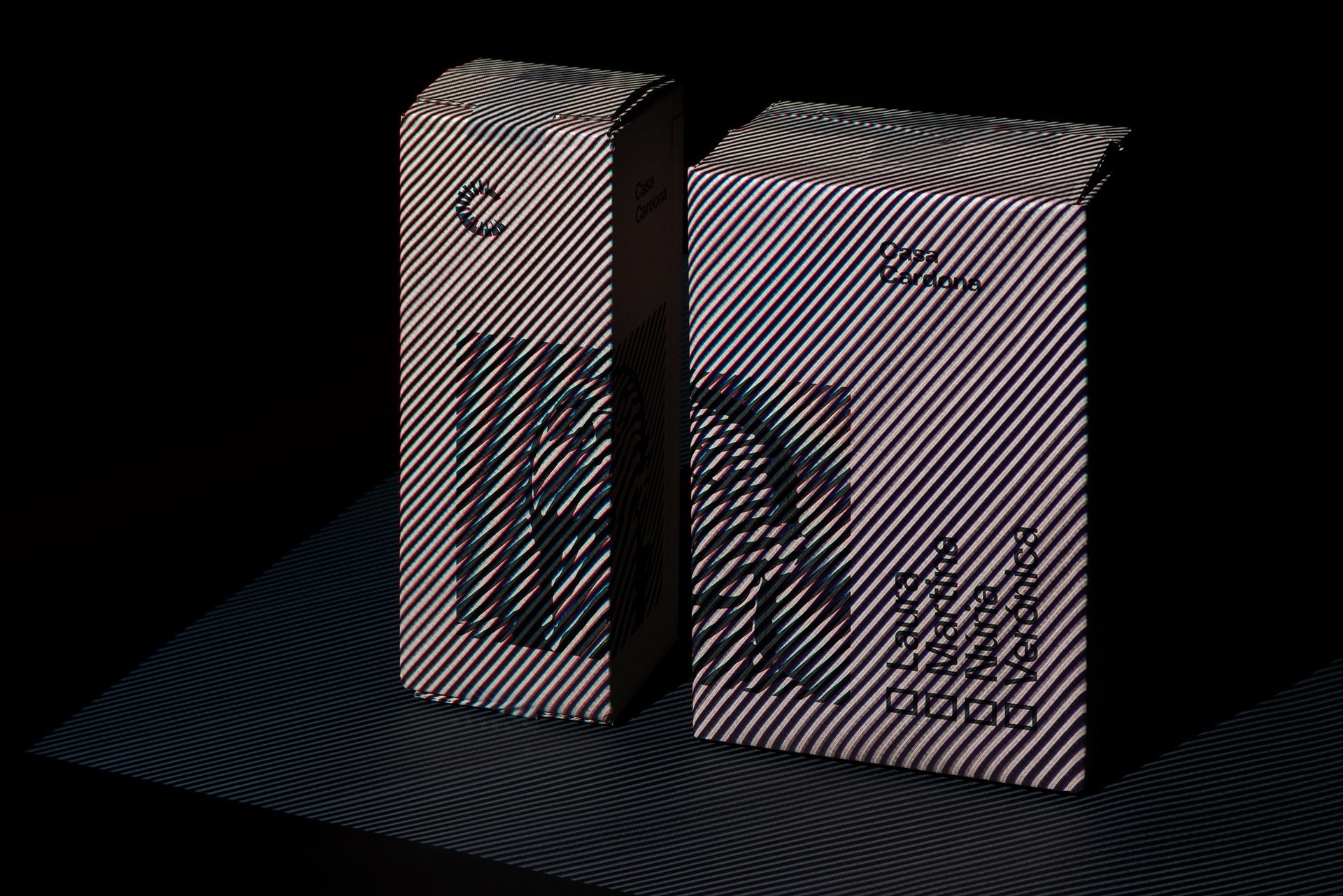
Casa Cardona wines are the culmination of an exciting community-born project by a group of friends from the beautiful Cardona Square, Barcelona. The personality of the female founders can be savoured in each of its varieties.
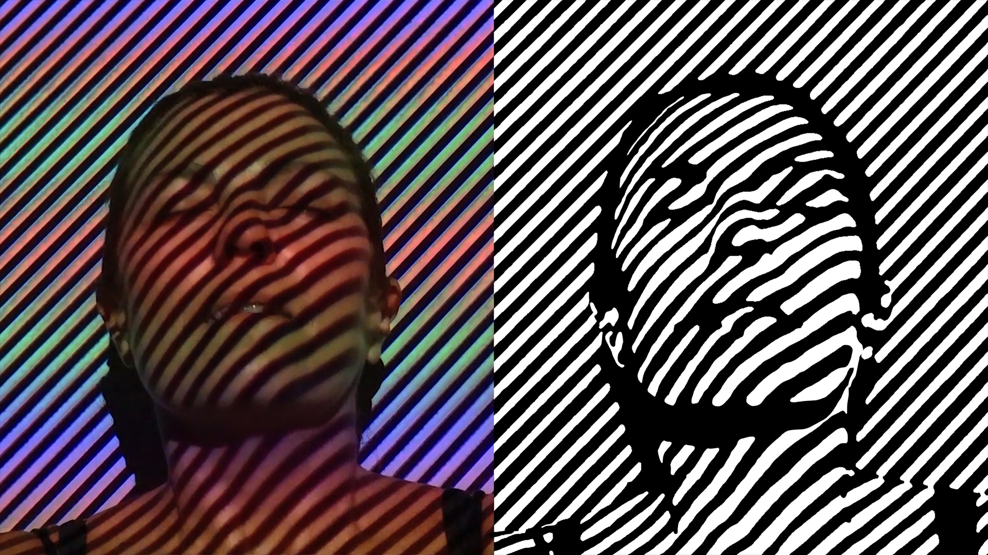
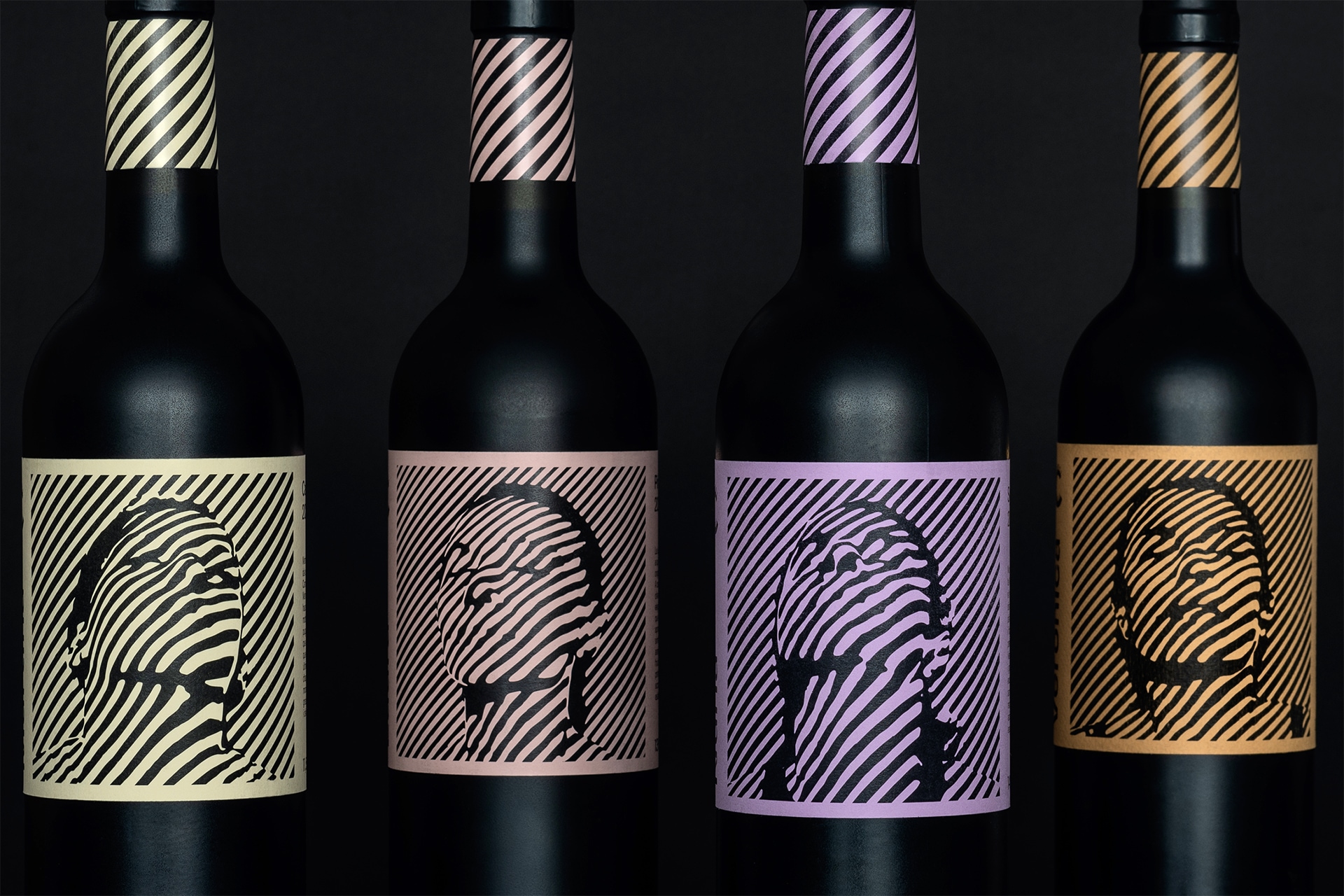
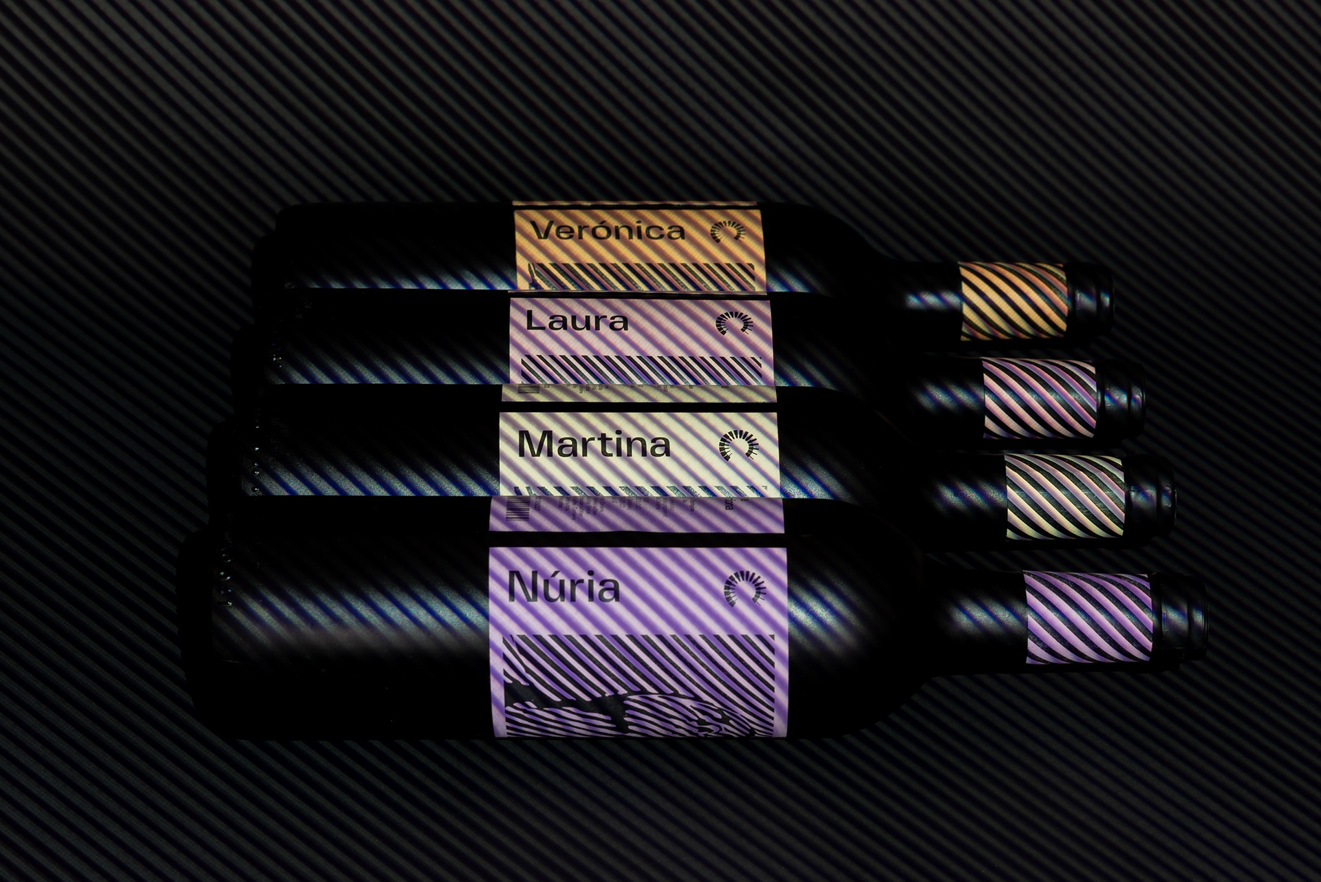
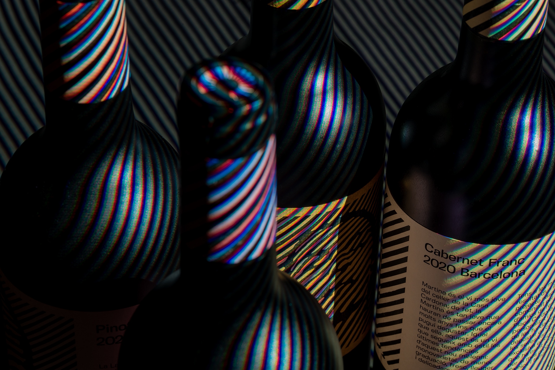
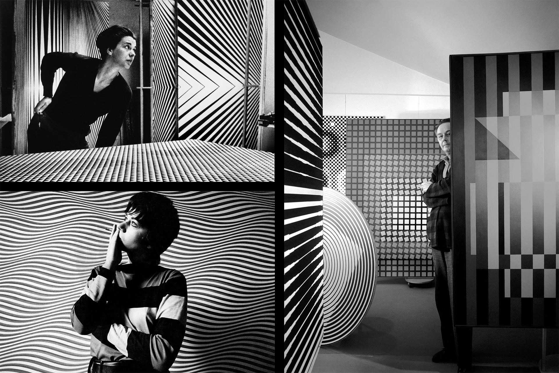
The portraits are the result of a series of lighting experiments focused on illusion and perception, capturing depth and motion effects onto two-dimensional surfaces. While the artwork is genuinely inspired by the 1960s Op-art paintings of Bridget Riley and Victor Vasarely, the choice of Fivo Sans Modern typeface evokes the same period—when Aldo Novarese’s Eurostile was widely used.

CREDIT
- Agency/Creative: Marcal.net
- Article Title: Wine Label Design Inspired by 1960s Op-art
- Organisation/Entity: Freelance, Published Self Promotional Design
- Project Type: Packaging
- Agency/Creative Country: United Kingdom
- Market Region: Europe
- Project Deliverables: Brand Identity, Brand World, Branding, Graphic Design, Illustration, Packaging Design, Photography
- Format: Bottle, Box
- Substrate: Glass Bottle, Pulp Carton, Pulp Paper
FEEDBACK
Relevance: Solution/idea in relation to brand, product or service
Implementation: Attention, detailing and finishing of final solution
Presentation: Text, visualisation and quality of the presentation


