Fundament is an NGO founded in Spain in 2019 with the goal of changing coexistence paradigms through human-centered design methodologies.
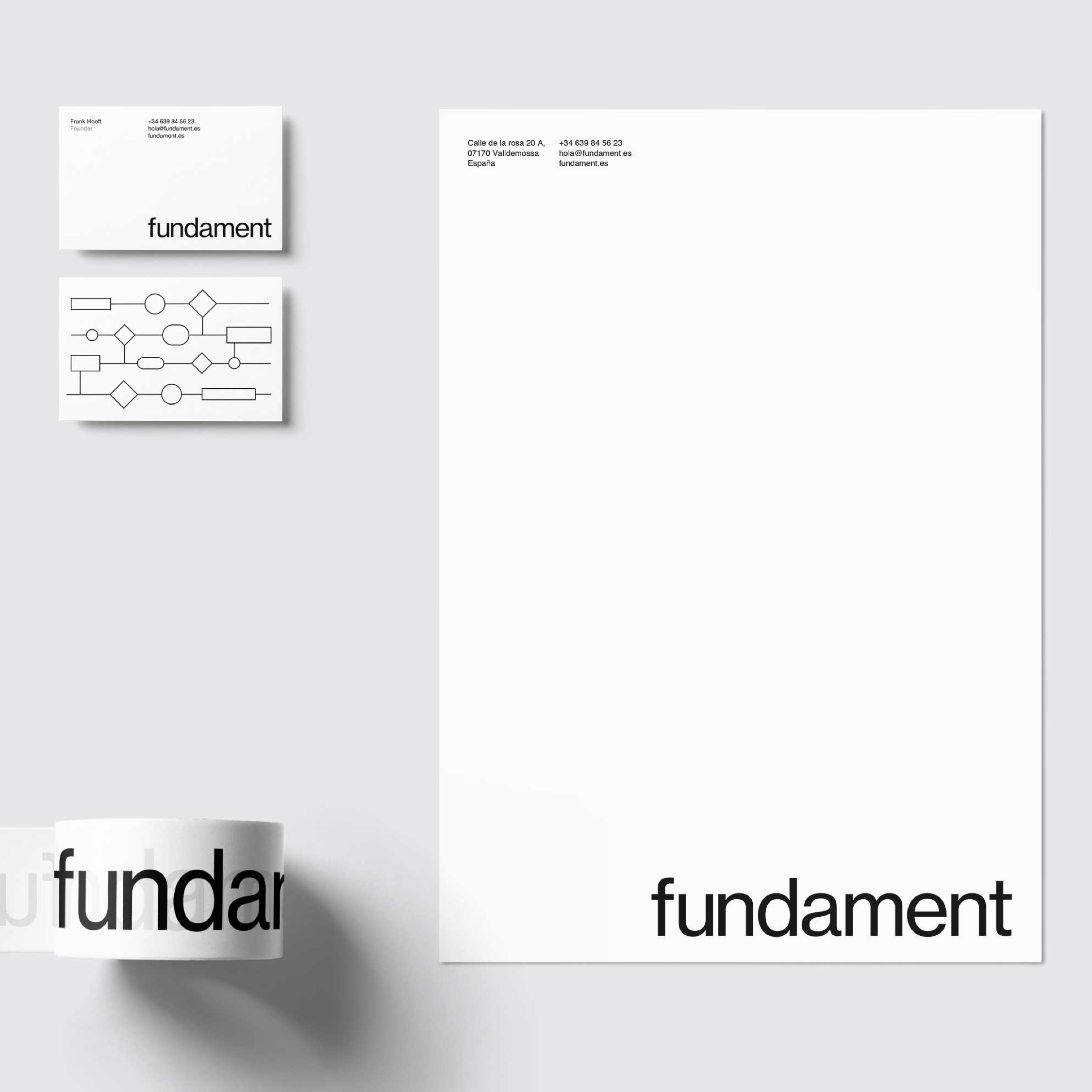
We were asked by Fundament to create a visual identity that had to be simple, easy to implement and maintain, and non-designer-frendly. A cohesive visual language that will be functional, distinctive and allows a potential network of collaborators to adopt it and implement it seamlessly.
Approach: We defined the core values and the design principles of Fundament throughout several sessions with Foundament’s founder.
A reductionist approach was followed, with a stripped-down design solution that removes unnecessary visual noise and creates a system that allows to focus on content.
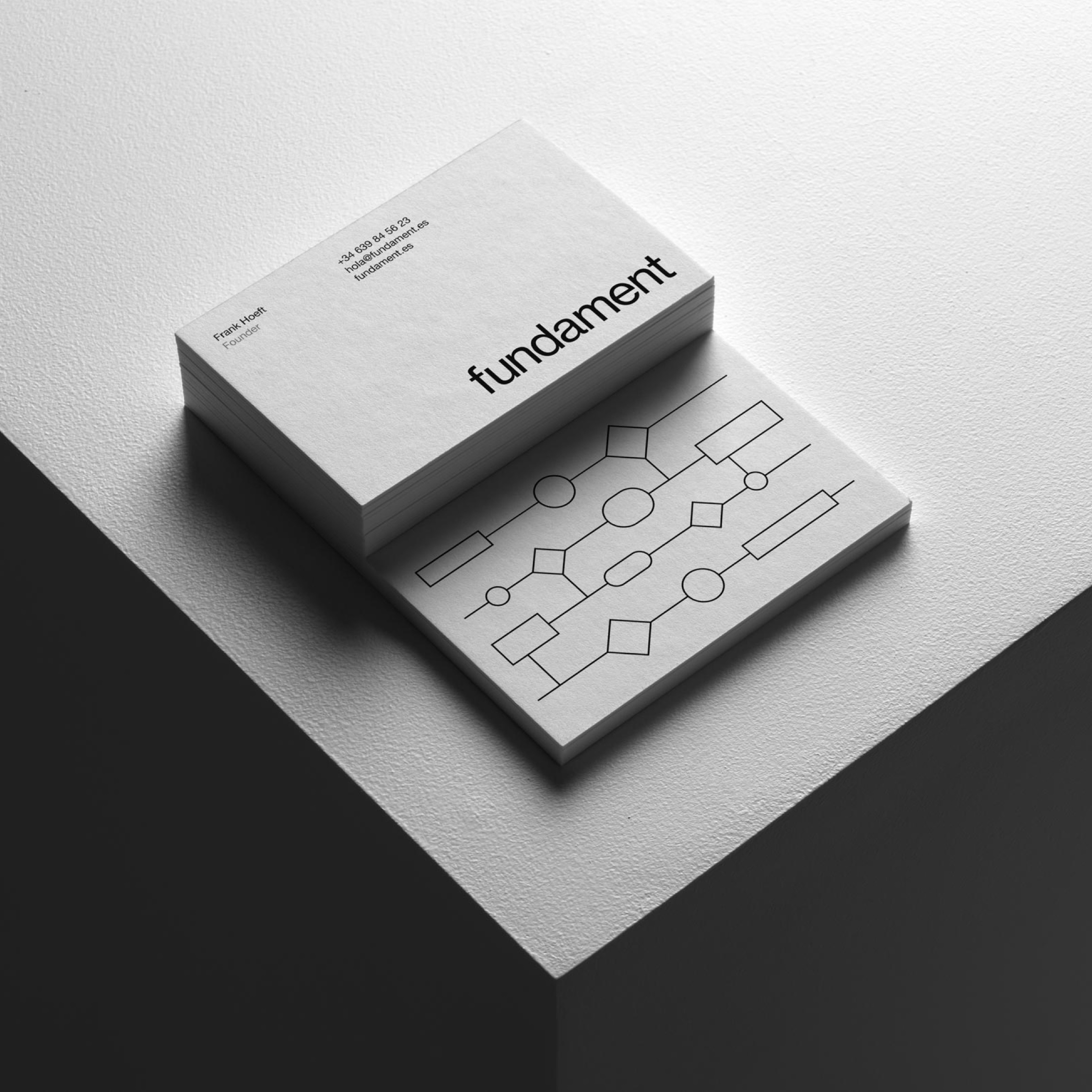
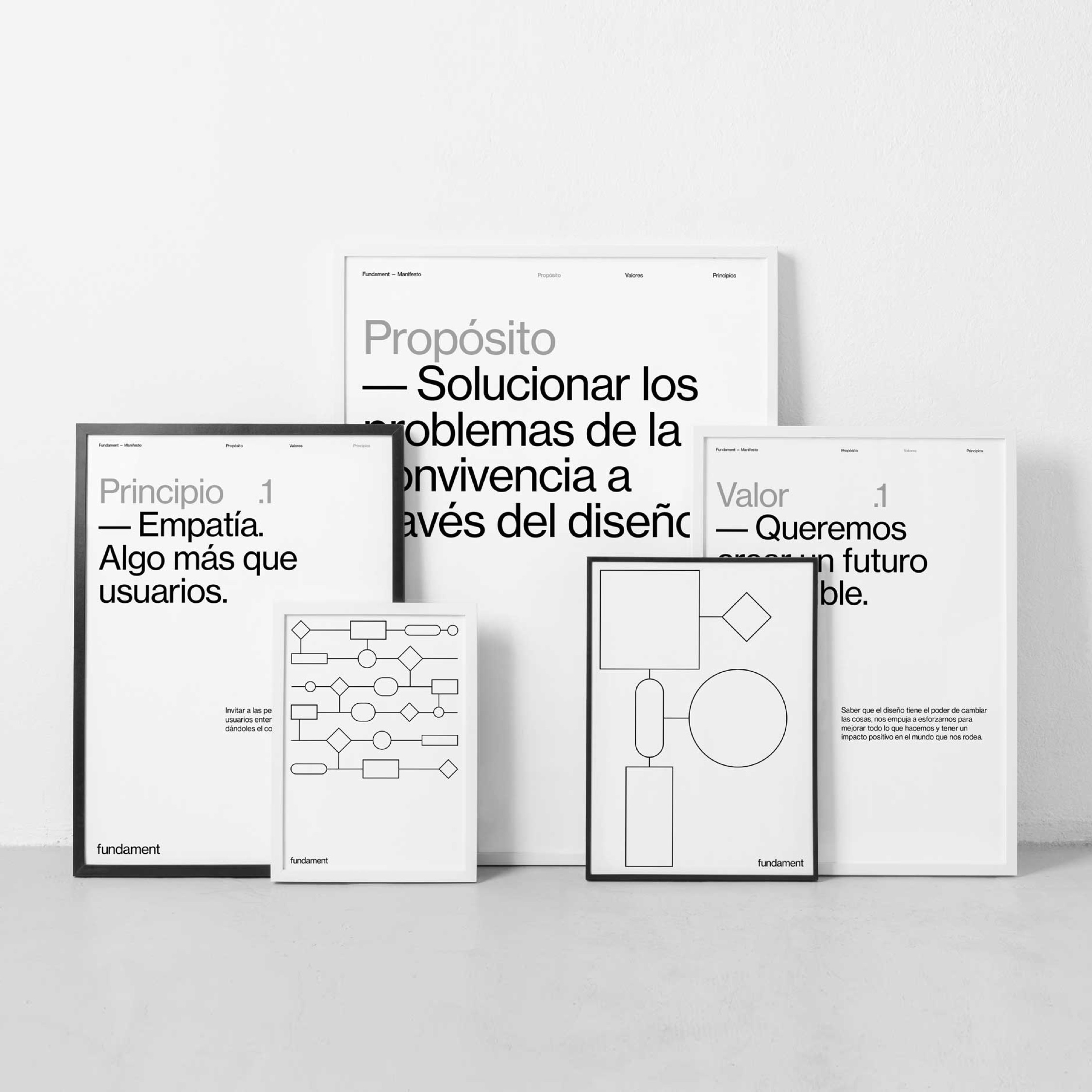
Outcome: Using only a typeface, mostly in one type weight, in combination with a grid-oriented layout —and a few defined usages for a symbol and patterns— we simplify implementation, design decision-making, and generates consistency.
Details—
Logotype: Due to its democratic, neutral, minimalist heritage, and as an expression of forward thinking throughout the history, we choose Helvetica as starting point for Fundament logotype.
Helvetica is the chosen font also for headlines and body copy, always in Regular. Medium will be used only on small labels written in capital letters, Bold on paragraph titles.
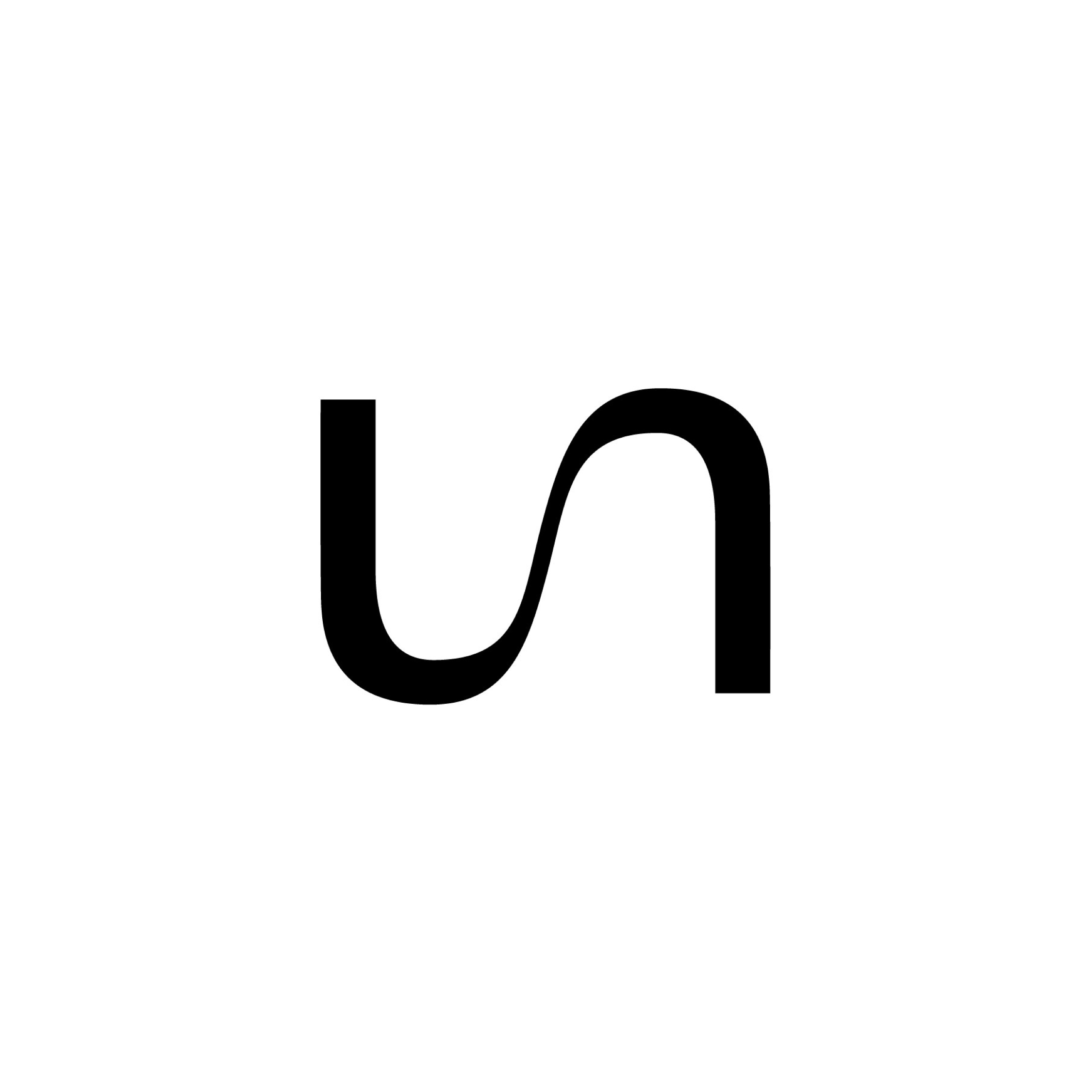
Symbol: Joining the letter “u” and the “n” generates a visual metaphor symbolising union, movement, collaboration, responding to Fundament’s strategic purpose. It also suggests a convergent movement toward a common way from different sides.
This symbol will live in different application as an iconic and memorable secondary brand element.
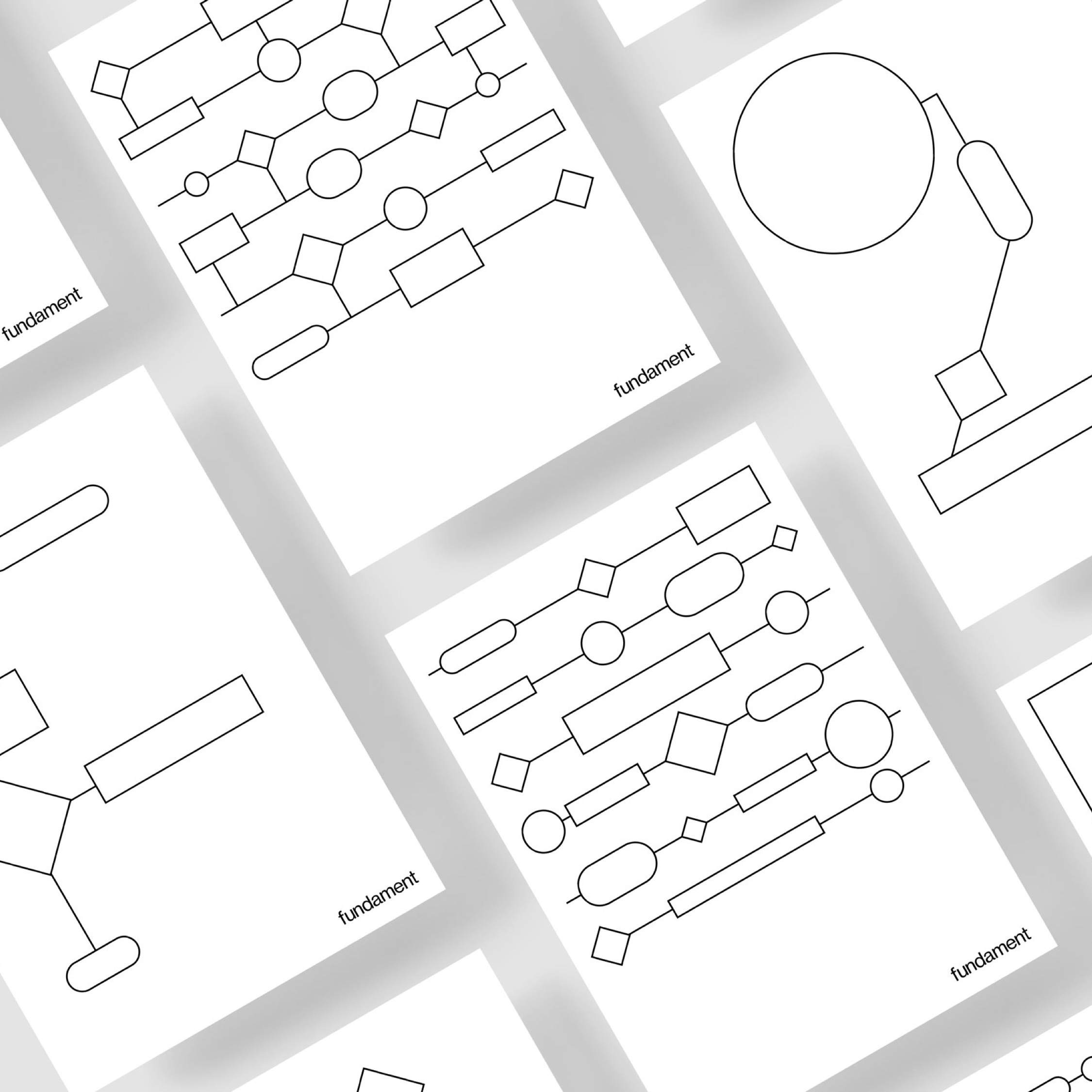
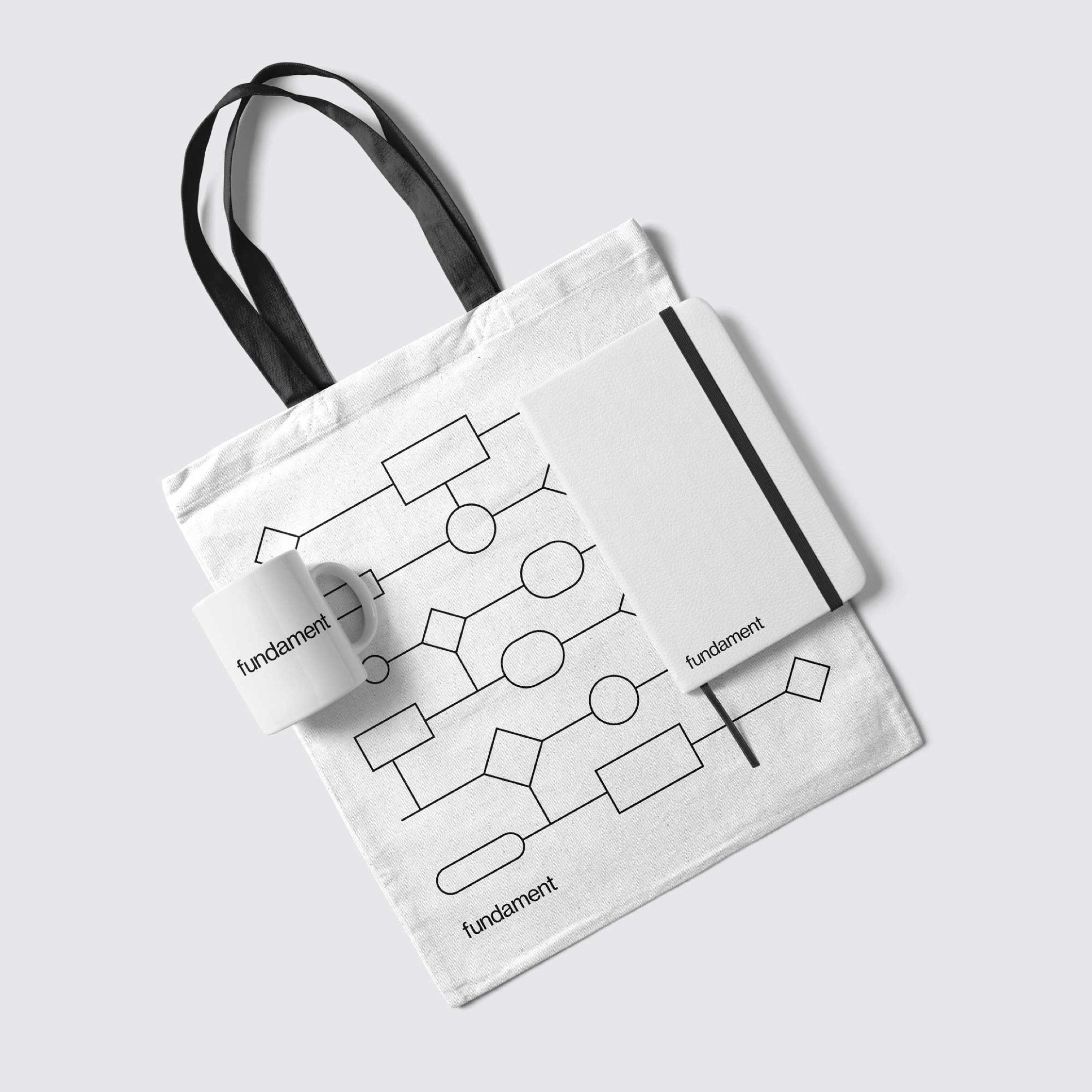
Shapes: Inspired by mind-mapping and interaction flows design basic elements, we created a set of abstract shapes that ultimately depict a potencial ever-changing letter F —or an entire alphabet, or numbers— or act as dynamic patterns, reflecting Fundament’s values such as curiosity, diversity and coexistence of different elements.
These elements will be used to create awareness, in editorial content, or as graphic elements in data visualisation. Besides, they are really easy to create in Keynote or Power Point, providing effortless consistency.
CREDIT
- Agency/Creative: Gio Pandone
- Article Title: Visual Identity for Fundament
- Organisation/Entity: Freelance, Published Commercial Design
- Project Type: Identity
- Agency/Creative Country: Spain
- Market Region: Europe
- Project Deliverables: Brand Guidelines, Brand Identity, Brand Strategy, Branding, Graphic Design, Identity System
- Industry: Non-Profit
- Keywords: Human-centered, branding, brand identity, coexistence, brand guidelines


