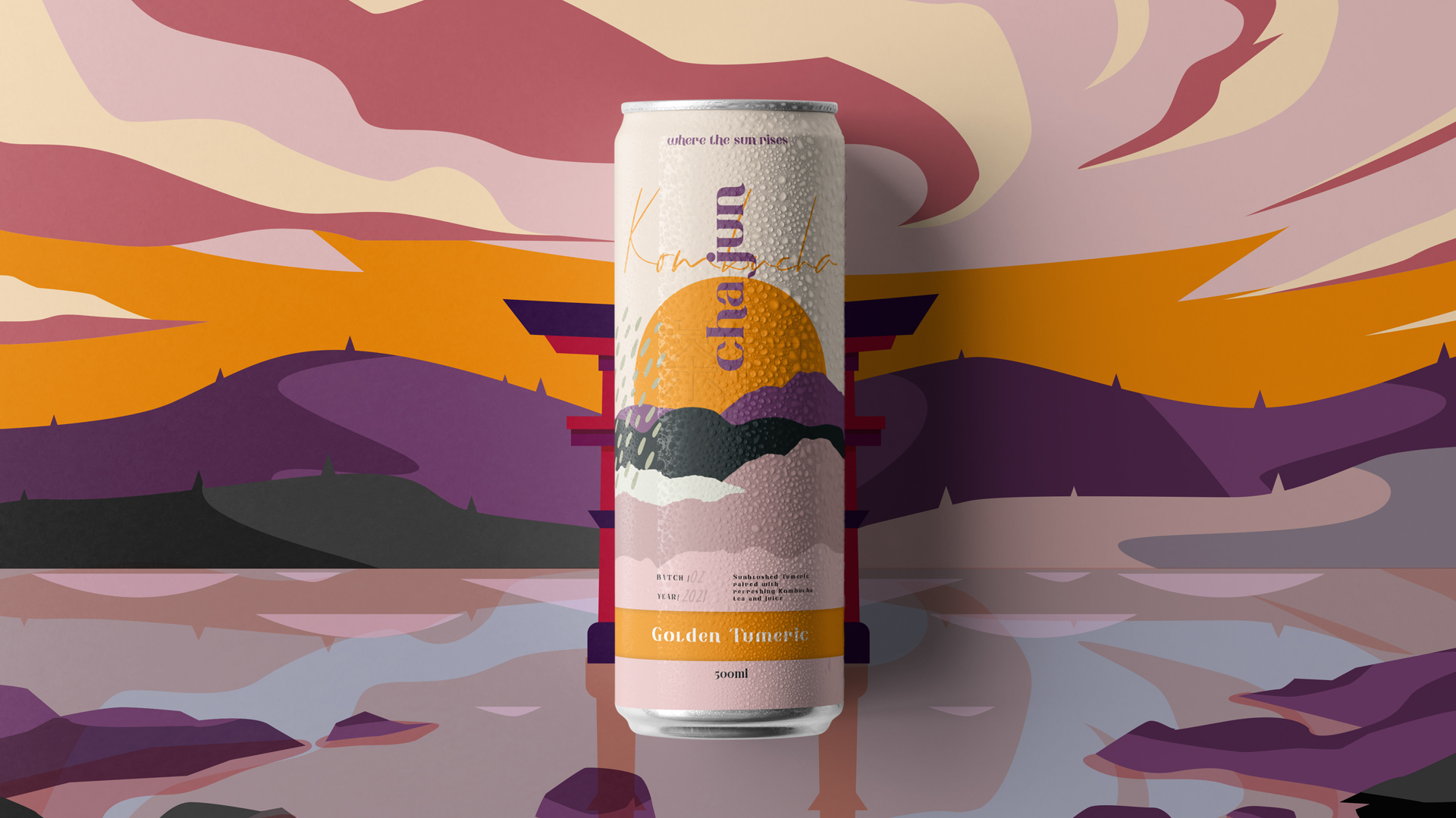
“cha jun” embraces today’s kombucha movement with a rebellious streak. Our packaging design, brand identity and strategic positioning for this confident new challenger aim to capture the imagination and reflect the picture of a place where the sun rises up. The creative approach needed to break through the generic and prescriptive look and voice of the turmeric kombucha and elevate “cha jun” as a premium and progressive drinking experience – an innovative golden turmeric kombucha drink brand with the added benefits of magnesium and probiotics.
Kombucha has proven its credentials as a lucrative drinks category in Asia and worldwide, founders of “cha jun” have introduced this healthier alternative drink to customers with a new taste sensation of kombucha in one flavor variants of Turmeric Gold. Our main goal was to express this idea in a package design through the visuals and collaterals.
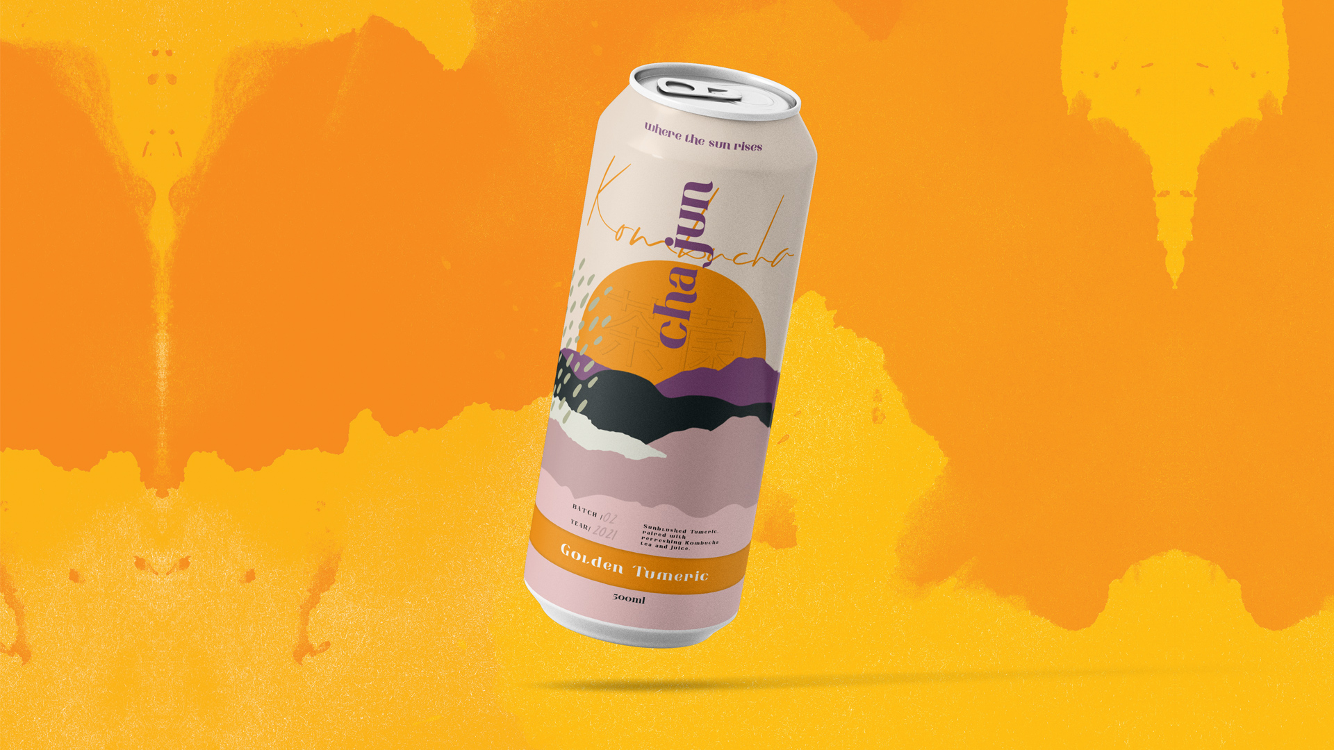
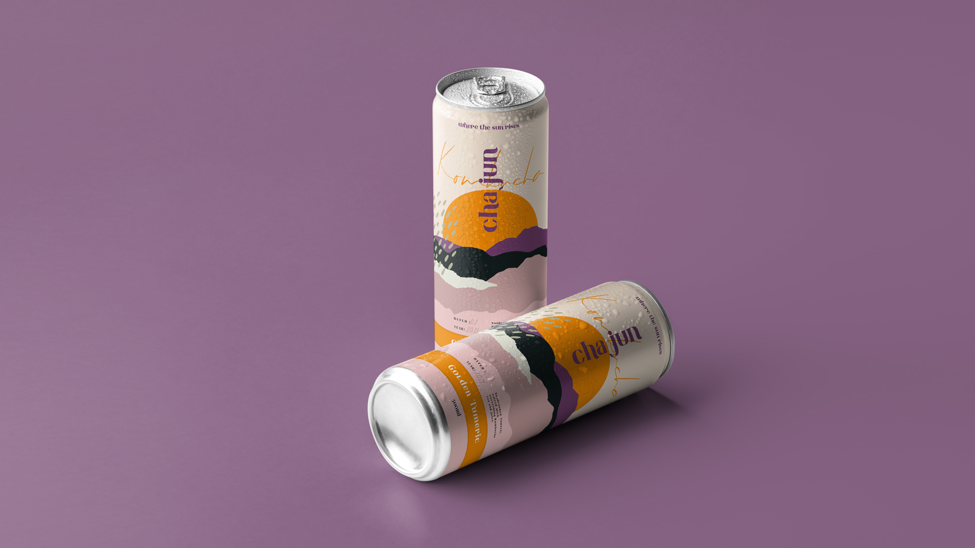
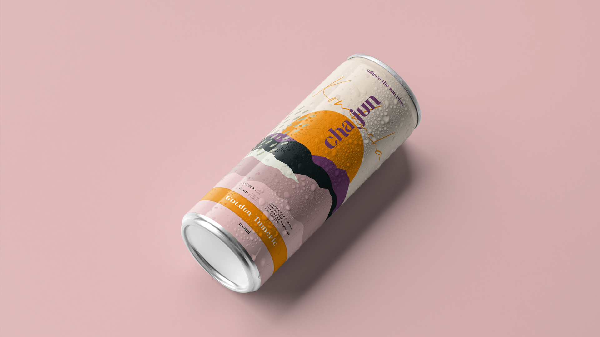
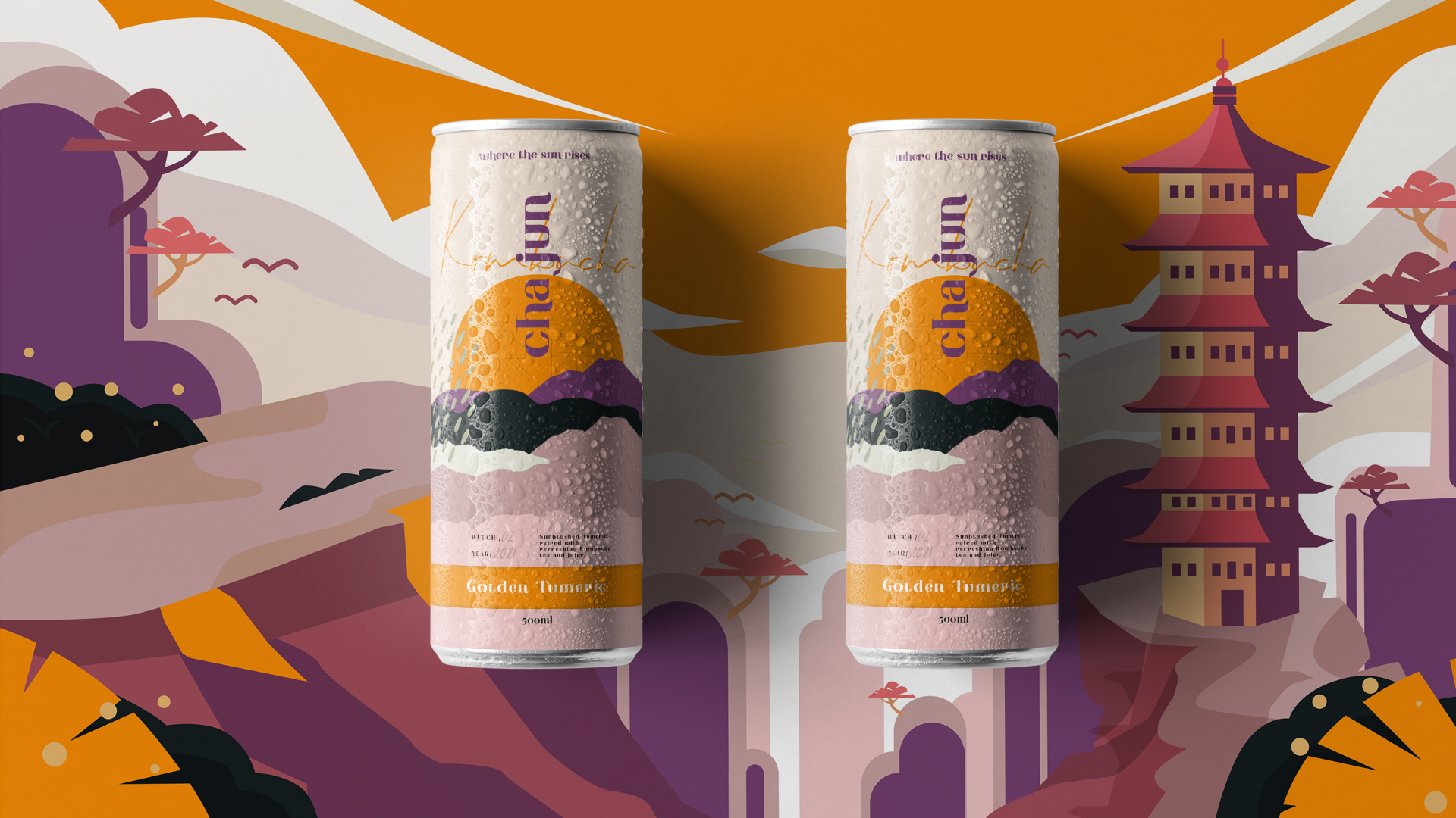
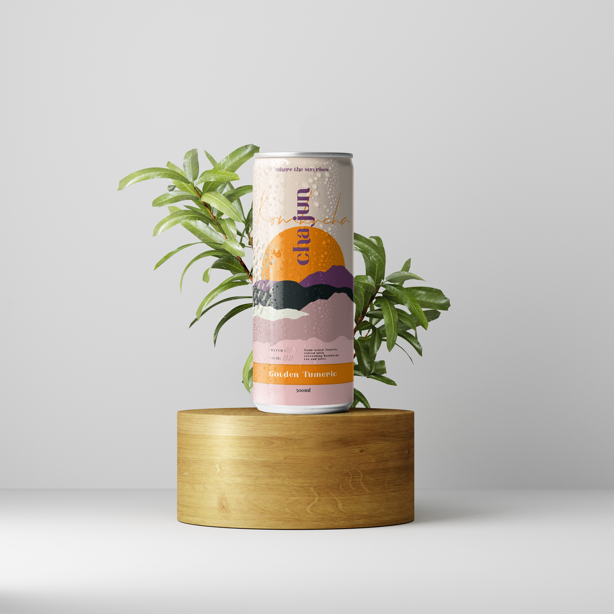
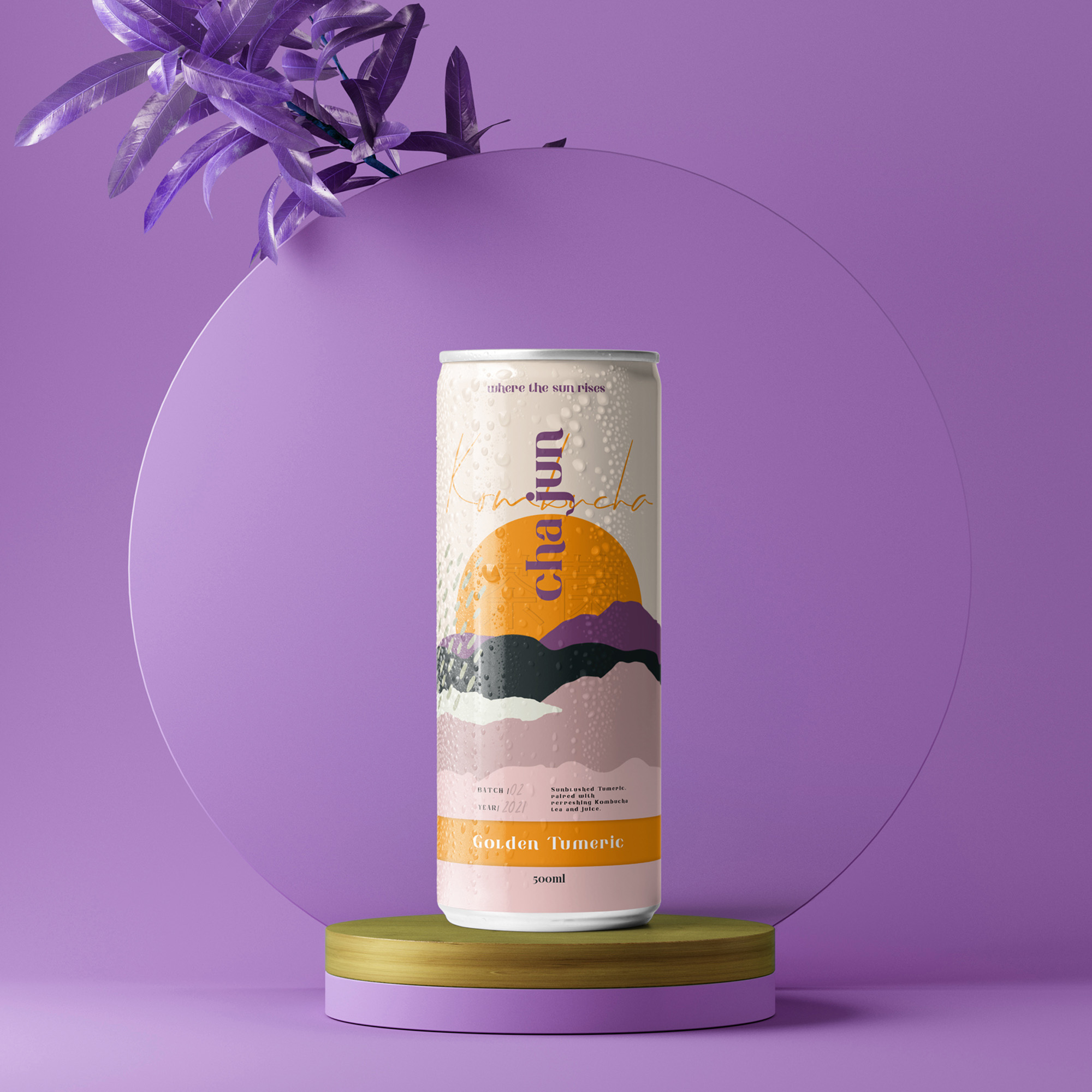
Our modern packaging design is lively, raw and confident and reflects asian nature. Printed on stylish ready-to-drink cans, we crafted a bold typeface and striking illustrations of Japan Nature with an attitude which became an ownable graphic for the “cha jun” brand to satisfy customers and enjoy a new drinking experience. The name hints at both the perceived benefit of an old kombucha ingredient and also the super-nutrient goodness of turmeric. The light, feathery feel of the inside of a kombucha is expressed through a unique and embossed visual identity to symbolise the lighter nature of the drink and create an experience led by the can in the hand. The can cues a more crafted and premium golden feel, protects the integrity of the drink and is fully recyclable.
“This was the inspiration for the whole project: “cha jun” becomes a minstrel who entertains guests at the bars, narrating the people in shops and soon becoming the best in the world.” – said CMO of cha jun.
Inspired by the unique “cha jun” way of creating golden kombucha we created a bold, contemporary visual language for the brand. Coupled with a new name and tone of voice that speaks directly to consumers, we created a total transformation in taste and authenticity to allow the brand to grow with other drinks through existing and innovative new ranges of products that are successfully taking on the industry giants.
CREDIT
- Agency/Creative: vinille
- Article Title: Vinille Create Identity, Packaging, and Print Collateral for the Asian Kombucha Brand
- Organisation/Entity: Agency
- Project Type: Packaging
- Project Status: Published
- Agency/Creative Country: Estonia
- Agency/Creative City: Tallinn
- Market Region: Asia
- Project Deliverables: Packaging Design, Packaging Guidelines
- Format: Can
- Substrate: Metal
- Industry: Food/Beverage
- Keywords: kombucha, drink, beverage, asia
-
Credits:
Creative Director: Andrey Davidovich
Client Manager: Diana Kine
Art Director: Jevgeni Trombovetski
Brand Strategist: Deniss Svechnikovs
Designer: Maryan Strizhak
Designer: Aleksandr Smirnovs


