Vilde Joranger is a young label for caring knitwear. The term caring has a double meaning as the brand cares for the the wellbeing of their customers as well as for eco friendlyness and sustainability in general. Vilde Joranger offers highest quality, handmade knitwear – made from certified material. The pieces are authentic and straight forward. The founder´s background is in the craft of knitting, she has a profound knowledge of material and processing. Every @vildejorangerde piece lasts – let’s say – FOREVER.
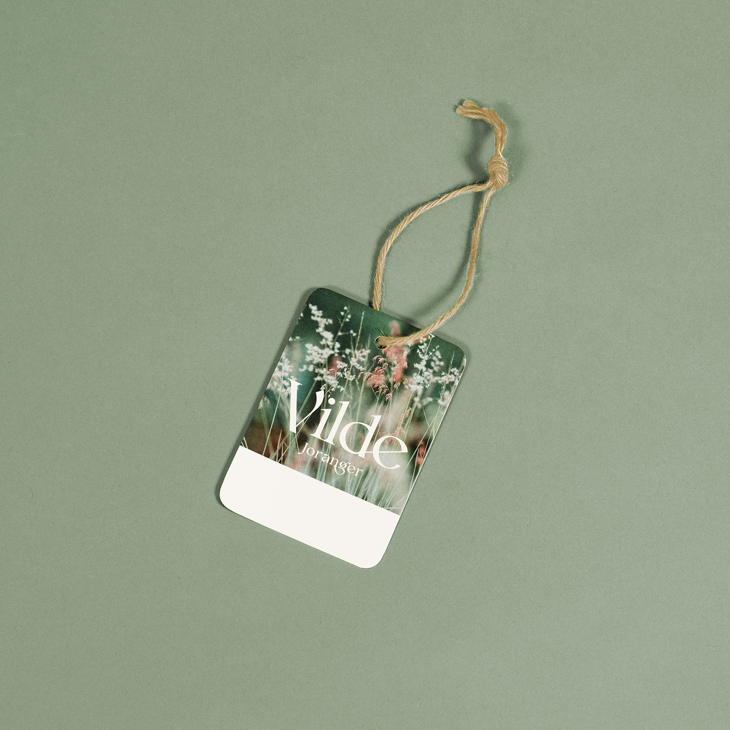
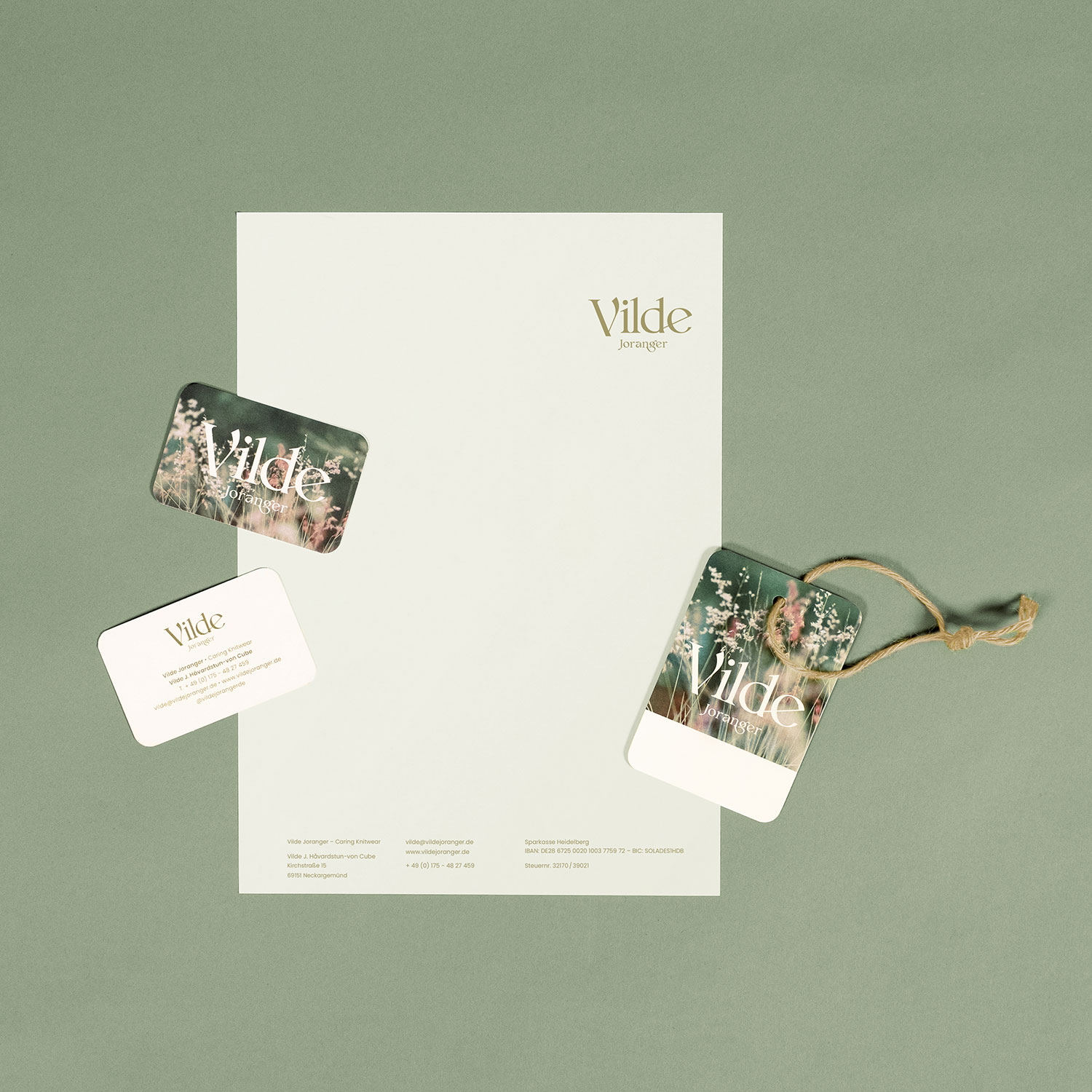
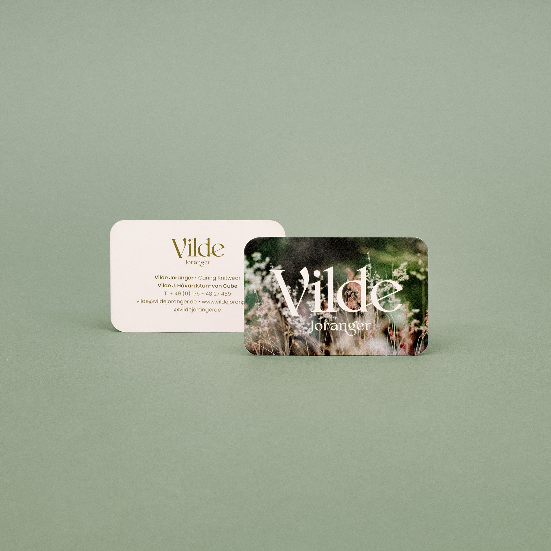
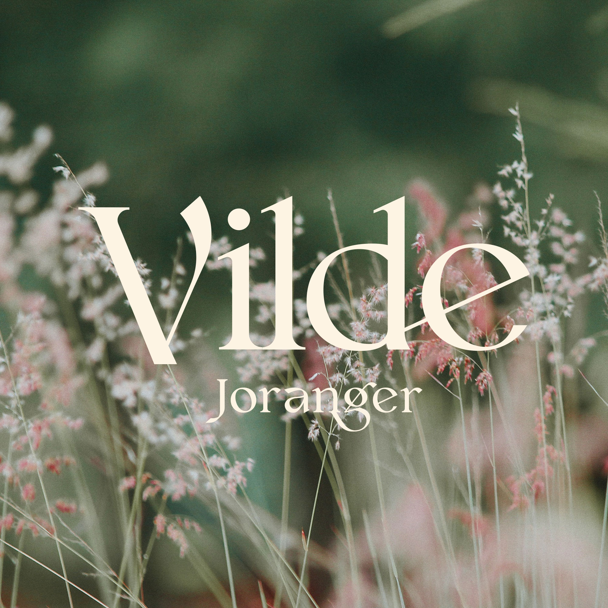
Vilde Joranger is inspired by nature, its colors, its textures. The branding therefore features organic & feminine shapes combined with soft, natural colors, moody images and nature sujets. Main colors are olive green and a light beige – inspired by the founder´s workshop view.
The logo accentuates the founder´s prename to make the brand´s name easy to remember. Phonetically „Vilde“ resembles the German Word „wilde“ (wild) which is a nice a connotation in terms of the label´s values. The logo serif-type has a retro-touch but stays contemporary. On all designs the brand´s logo dominates the rather factual and straight forward typography to create an interesting contrast.
All media is printed on eco-friendly material of course. On items that are handed out to customers, corners are rounded to underline the logo´s shapes and give pleasant haptics. The design offers space for Vilde Joranger to add handwritten details such as personal notes, information or product prices here and there.


CREDIT
- Agency/Creative: Alexandra Bald
- Article Title: Vilde Joranger Brand Design by Alexandra Bald
- Organisation/Entity: Freelance
- Project Type: Identity
- Project Status: Published
- Agency/Creative Country: Germany
- Agency/Creative City: Alexandra Bald
- Market Region: Europe
- Project Deliverables: Brand Design
- Industry: Fashion
- Keywords: knitwear, smallbusiness, startup, femalefounder, smallbusinessdesign
-
Credits:
Design: Alexandra Bald


