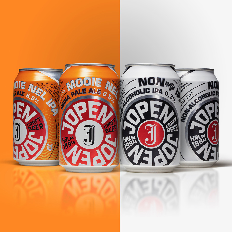
Last year we introduced the new bottle designs and new logo for Jopen Craft Beer. The story continues with the introduction of the new beer can designs.
The, last year, newly created logo still is the hero of the design. the contemporary logo stands for reliability and quality, in keeping with Jopen’s mission and ambitions. The logo supports the leading and innovative role of Jopen within the craft beer landscape. It connects with a wider audience of (beer) drinkers, while naturally retaining the current, loyal Jopen beer lover.
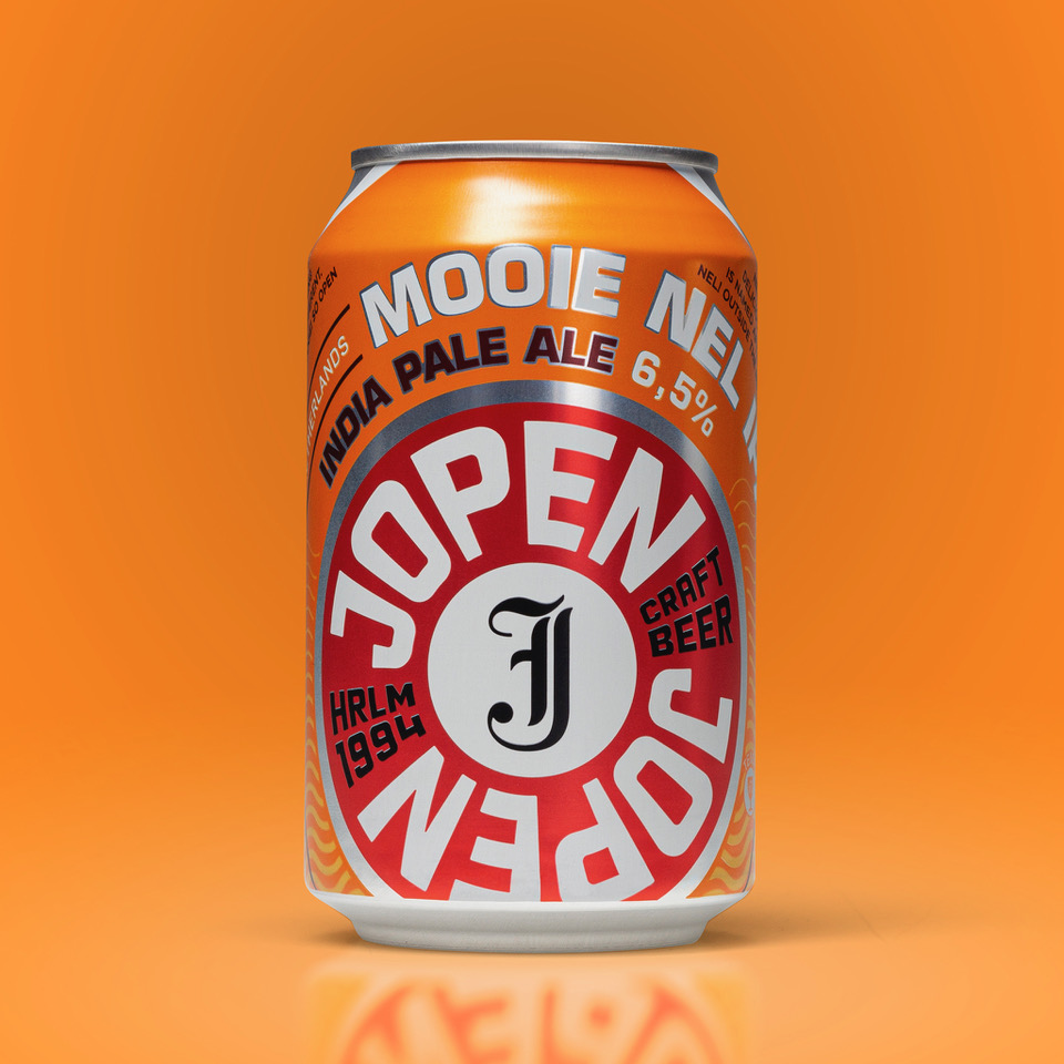
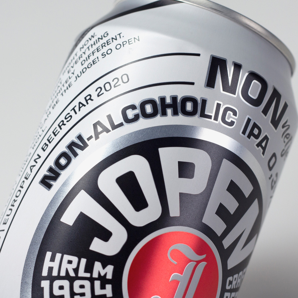
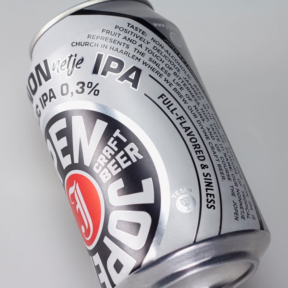
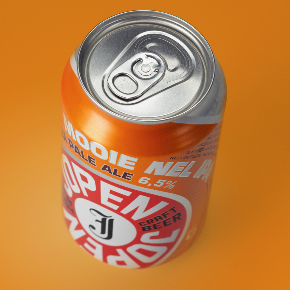
Iconic J: The round shape of the logo is a nod to the 112 litre “Jopen barrels” from the Haarlem brewing heritage. Furthermore, the logo consists of two parts, an inner and an outer circle. In the inner circle is the iconic “J”, which represents both the past and the future. The historic letter as a modern icon. The eye is drawn to this center and refers to the to-the-point attitude of Jopen.
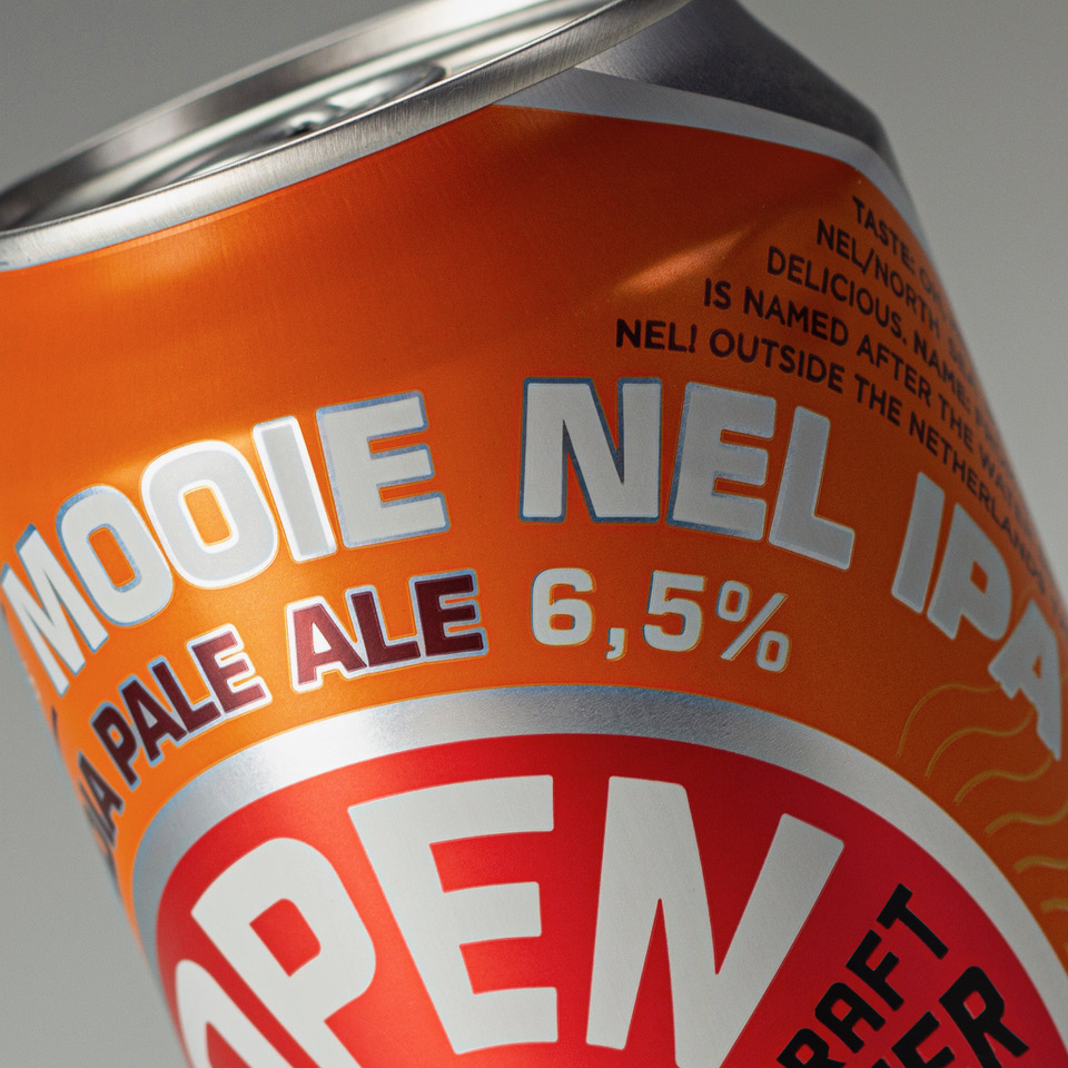
Contemporary jacket: The surrounding edge is used to emphasise the young and innovative appearance of the beer brand. The designation of the Jopen brand is repeated herein. Because of the positioning and repetition, the brand is clearly visible and legible on the cans. The font is unique and the red color is recognizable for Jopen.
Largest independent craft brewer: Moreover, this edge underlines the history and heritage of Jopen. For example, the home base “HRLM” (Haarlem), the foundation year “1994” and “craft beer” are all named. Finally, the outer circle represents the planned growth of Jopen. From the current market position, symbolically seen as the “J”, growth is started and the market expanded.
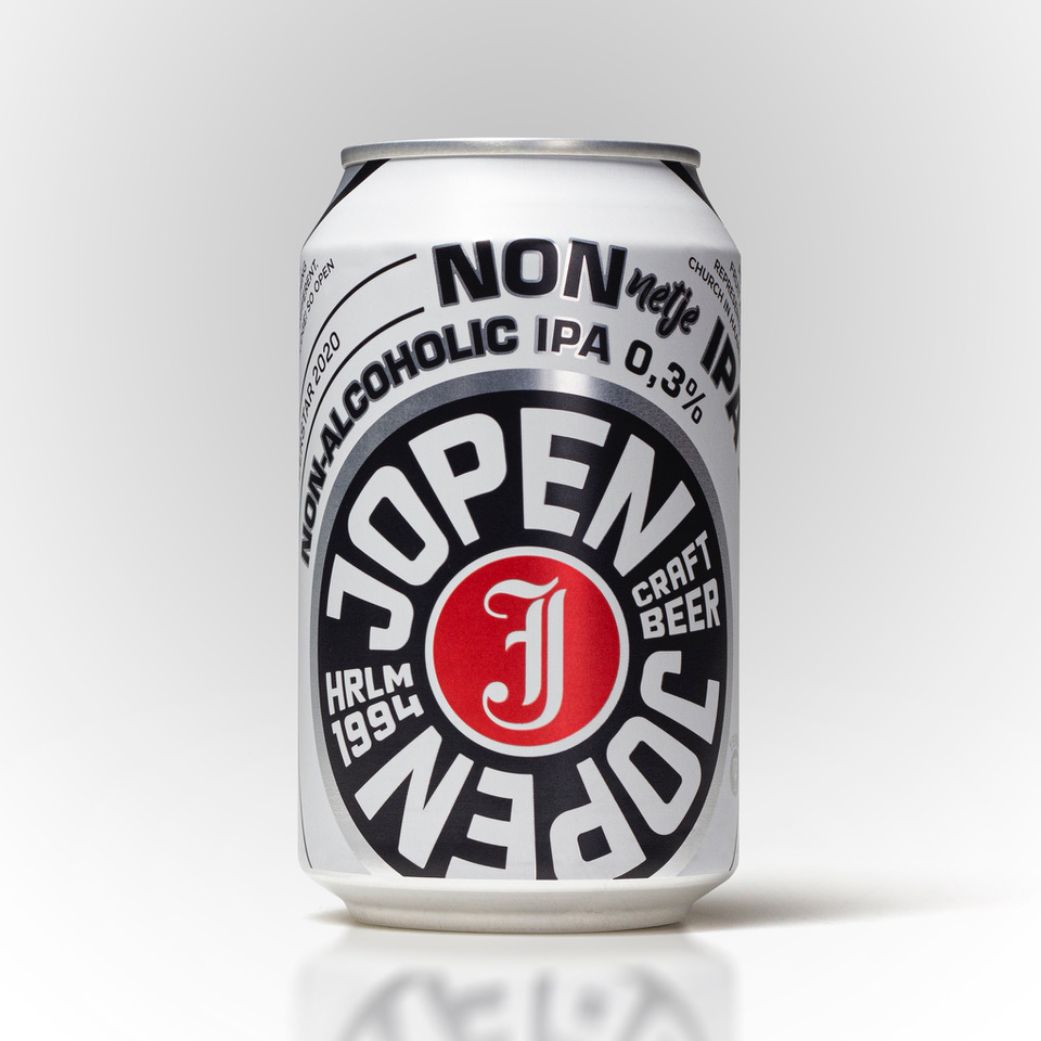
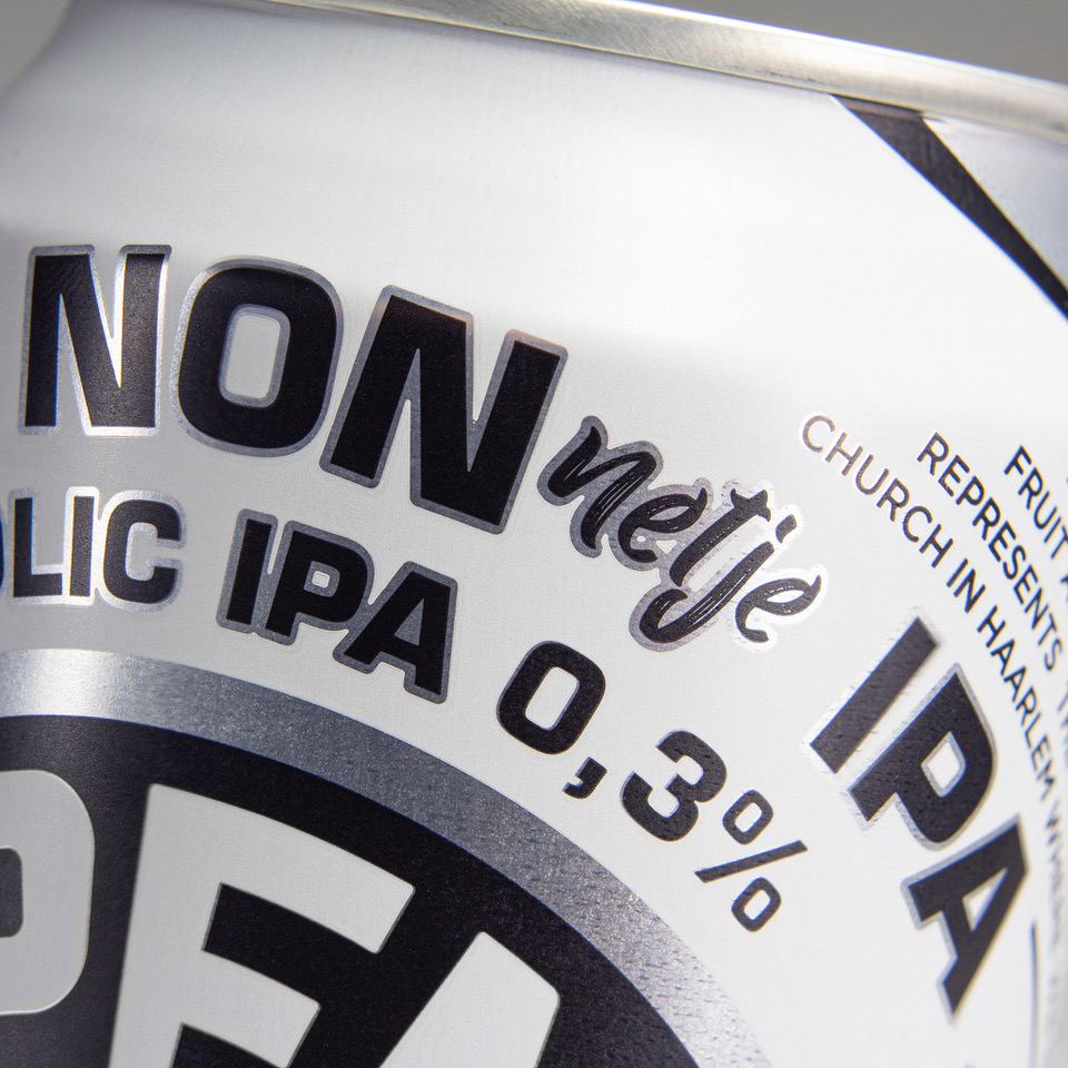
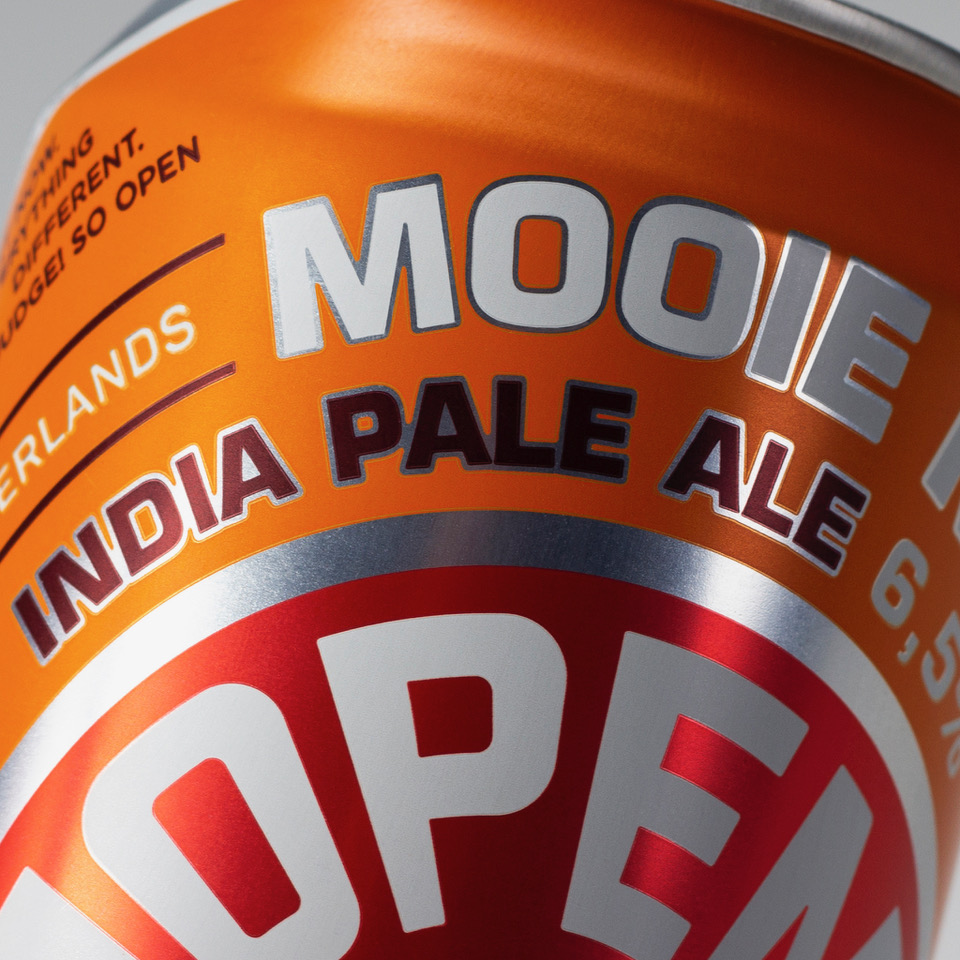
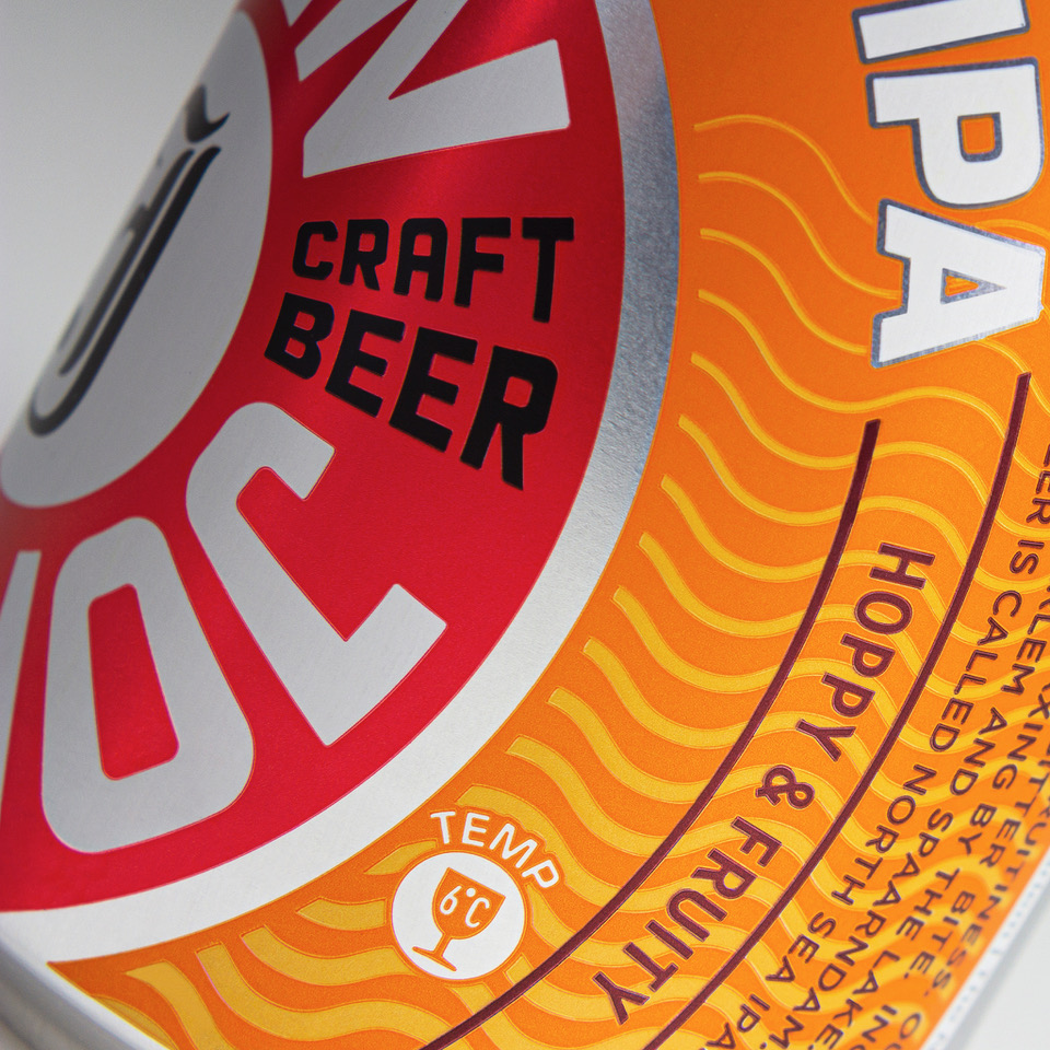
The can design has been developed for their most successful SKU’s. Where a clear shift in colourful versus black/white communicates the alcoholic IPA versus the low alcohol version. The complete brand transformation continues its journey and lots more to come in the complete new design style.
CREDIT
- Agency/Creative: Van Heertum Design VHD
- Article Title: Van Heertum Design VHD Designs Jopen Craft Beer Can
- Organisation/Entity: Agency
- Project Type: Packaging
- Project Status: Published
- Agency/Creative Country: Netherlands
- Agency/Creative City: Tilburg
- Market Region: Europe
- Project Deliverables: Packaging Design
- Format: Can
- Substrate: Metal
- Industry: Food/Beverage
- Keywords: beer, craft beer, jopen, can
-
Credits:
Client: Jopen Craft Beer


