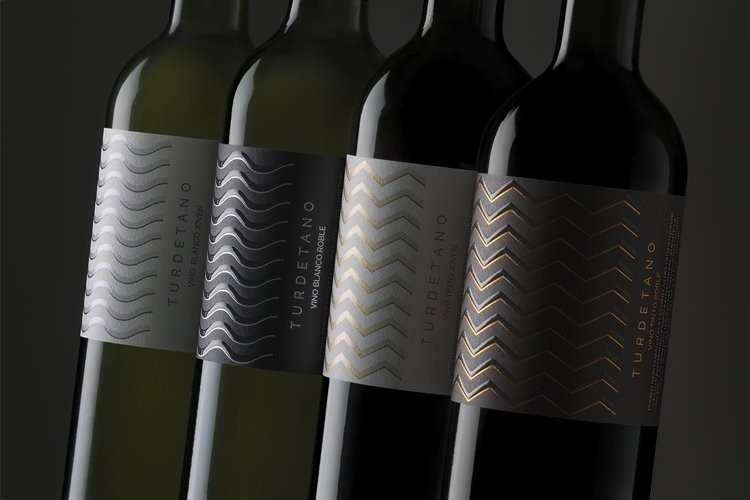
“Project summaryThe Turdetano range is composed of two red wines and two white wines. Its image was inspired by the ceramic vestiges of Turdetania, the most prosperous region of the Iberian village settlements in the Aljarafe region of Seville. A proposal that captures the essence of its art; creating harmony from opposing geometric elements of great symbolism and genuine beauty.Preliminary notesBodegas Salado, one of Andalusia´s most active, most innovative wineries, devotes its efforts to give value to the region´s indigenous varieties. The winery comes to us to achieve visual consistency for its range of still wines, two reds and two whites, originating in a land full of history.Strategy- Recover the cultural origin of the Aljarafe region of Seville, its history and its symbolism.- Generate a modern, systemic design which clearly identifies the range.- Form a concept which translates graphically in a poignant, convincing and clear way.- Create an exclusive, striking image which generates attraction.”

“StorytellingThe wealth of the Aljarafe region of Seville dates back to the prosperous Turdetan civilization: birthplace of art and culture for the Iberian village settlements on the Guadalquivir River. Numerous vestiges of the Turdetan people still remain, one of these being its pottery, which follows a particularly distinctive style thanks to the geometric patterns and the contrast of lines, colours and shapes which decorate it.The decorative elements of Turdetan pottery revolve around the symbolism of natural elements, opposing each other, yet in perfect harmony: fire and water; the sun and the moon; feminine against masculine; curved forms versus straight lines.Our design interprets the contrasts of Turdetan decoration, creating a graphical representation system for the entire range of wines which combines the old and the new; the force of fire against the versatility of water, feminine against masculine.”

“Graphic solutionWe create a system which graphically represents the characteristics of each wine. Inspired by the geometric motifs of Turdetan art, we make use of opposing concepts to create balance:The aging of wines (its absence, in young or semi-crianza wines aging in barrels) is depicted in the background colour on the bottles:- Red and white wines semi-aged in barrels acquire dark tones on their label, in tune with its maturity and presence in the mouth.- By contrast, the young red and white wines in the range are represented in light tones, reflecting femininity.The type of wine is determined by the Turdetan-inspired graphical details, lines which acquire different forms depending on whether it is a red or a white wine:- The intensity and character of the reds is represented by straight lines, in copper tones, inspired by the ferocity of fire and the sun.- Conversely, white wines found in the range, more sensitive and subtle, acquire rounded, more feminine, softer lines. Printed in silver and blue tones, they are reminiscent of the fluidity of water, the serenity of the moon.”

“The meticulousness of the Turdetan artisans can still be felt in its art. As a tribute to this careful attention to detail, we apply inks with metallic flashes to the labelling, in addition to Braille varnish techniques on Crianza wines to create embossed features, with UVI varnish for the young wines.The result is a cohesive range which shows the unique personality of each wine in a surprising, modern way, rich in meaning.”


CREDIT
- Agency/Creative: TSMGO | The show must go on<
- Article Title: TSMGO – Turdetano
- Project Type: Packaging
- Substrate: Glass, Pulp Paper


