Biles Hendry – Biles Hendry takes Ella’s Kitchen into the frozen aisle
‘‘The UK’s number one baby food brand Ella’s Kitchen has moved into the frozen category for the first time under a new brand architecture and identity by independent brand and design consultancy Biles Hendry.
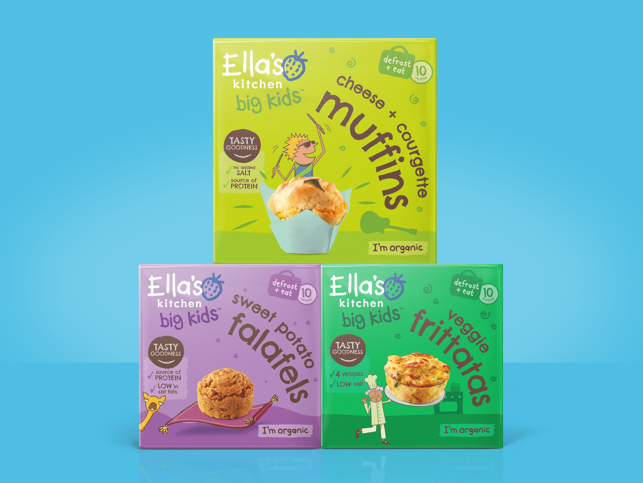
Launching exclusively across Tesco stores in the UK and Ireland this month, the new Ella’s Kitchen range of healthy, tasty and convenient frozen products features a playful identity that appeals to both children and adults with bespoke illustrations and food photography.
New options for health-conscious families
Having established a dominant position in the ambient aisle with a range of organic, delicious and convenient food for little ones, Ella’s Kitchen identified an opportunity to deliver a range of equally nutritious and tasty products from frozen for a broader age range including older children.
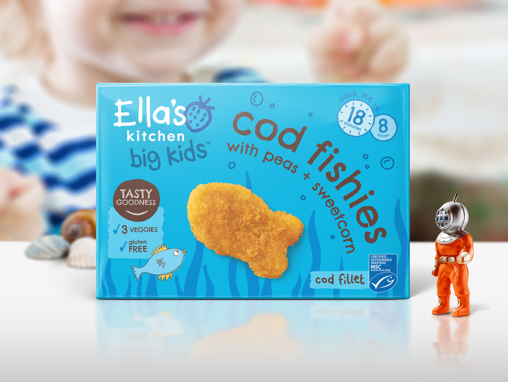
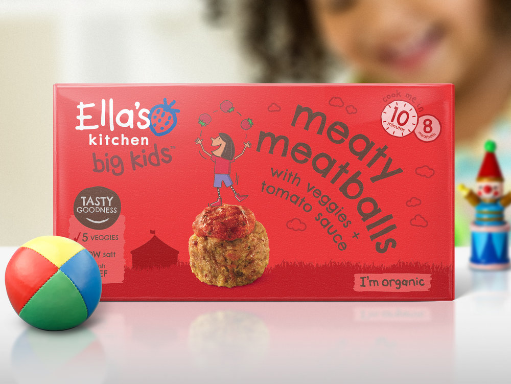
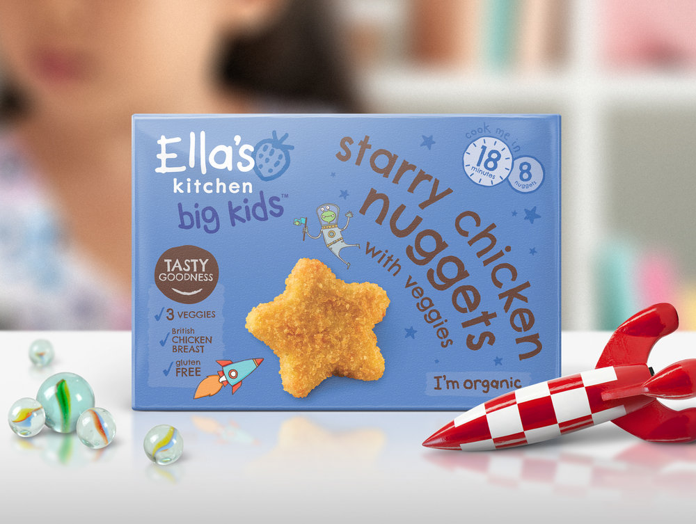
Building on the strength of the core ‘kids-first’ brand identity by retaining the Ella’s Kitchen logo, bright colour palette and handwritten typographic style, Biles Hendry introduced a brand architecture for the new ‘Big Kids’ sub-range designed for ages up to 8 years.
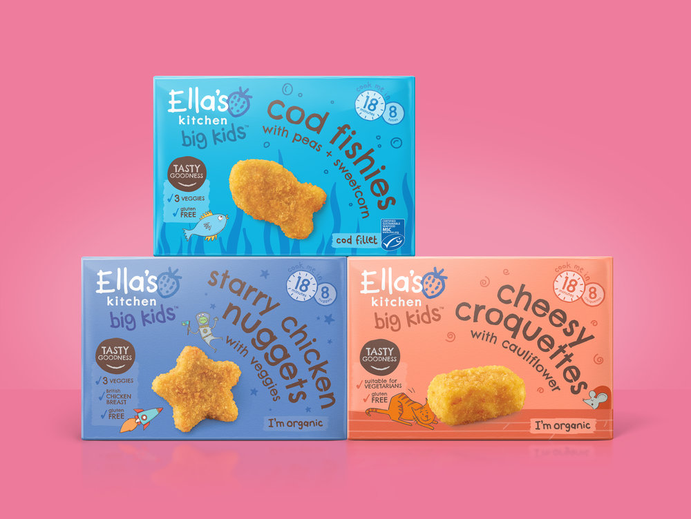
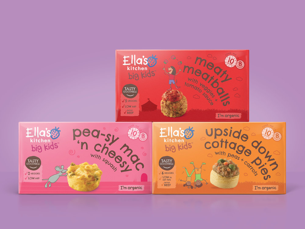
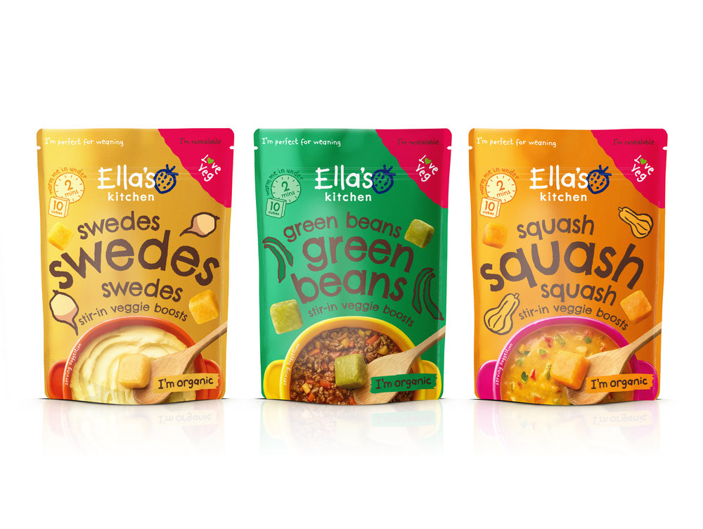
The newly-released frozen products include meal-boosting veggie cubes that can be added to recipes like risotto or shepherd’s pie for a quick and easy nutrition and flavour boost, or used to create smooth and tasty purees perfect for weaning; Big Kids ‘Light Bites’ including falafels and muffins for little lunchboxes; and Big Kids ‘Tea-Time Stars’ with heartier options such as fishcakes and cottage pies.
Playful interactions between product and brand
Biles Hendry has blended photography of the food with illustrations developed in-house in a series of playful interactions between the food and brand, engaging kids of all ages.
This photography also acts as a serving suggestion to adults, offering inspiration to try new recipes and incorporate additional vegetable boosters into home-made meals. Supporting icons and illustrations give helpful guidance on cooking times and nutritional benefits such as veggie or gluten content.
Stretching the brand to appeal to older children, the two original typefaces crafted for the core Ella’s Kitchen range have been reappropriated for a more ‘grown-up’ feel and the brand language evolved to engage an older audience whilst still maintaining shelf standout.
Big kids don’t want ‘baby food’
Anthony Biles, founder and creative director of Biles Hendry, said: “Moving into a new category can be challenging for a brand and with Ella’s Kitchen we weren’t just looking to establish a strong position in a new aisle but to appeal to a slightly older audience.
“Bigger kids don’t want to be eating ‘baby food’ so we worked closely with Ella’s Kitchen to adapt the core brand identity to ensure that it appeals to this older age range whilst still clearly communicating all of the healthy goodness and convenience that parents love.”
Kim Gelling, Head of Friends at Ella’s Kitchen, said: “Many parents already use their freezers when batch-cooking for little ones, and there’s a growing understanding that frozen food can be healthy and tasty too – everything that Ella’s Kitchen stands for.
“By launching into the frozen category Ella’s Kitchen is now able to grow with our little consumers as they move onto more complex flavours and textures. This was a big move for us and we needed a strategic and creative partner we could trust.
“Having worked with us for the past three years, Biles Hendry understands our playful personality and has translated this into a powerful new brand extension that still connects with our core consumers and beyond.”
CREDIT
- Agency/Creative: Biles Hendry
- Article Title: Ella’s Kitchen Enter Frozen Category with New Brand Architecture and Identity
- Project Type: Packaging
- Agency/Creative Country: United Kingdom
- Market Region: Europe
- Format: Box
- Substrate: Pulp Board


