Toronto Real Estate Company stands out as the ultimate destination for finding a diverse range of properties across all areas of Istanbul. Look no further because Toronto Real Estate is fully equipped to meet all your real estate needs and preferences. With a strong commitment to professionalism, we hold all the necessary qualifications and maintain memberships in esteemed trade associations. This ensures that our interactions with clients are guided by a stringent code of conduct, guaranteeing the highest level of service and integrity.
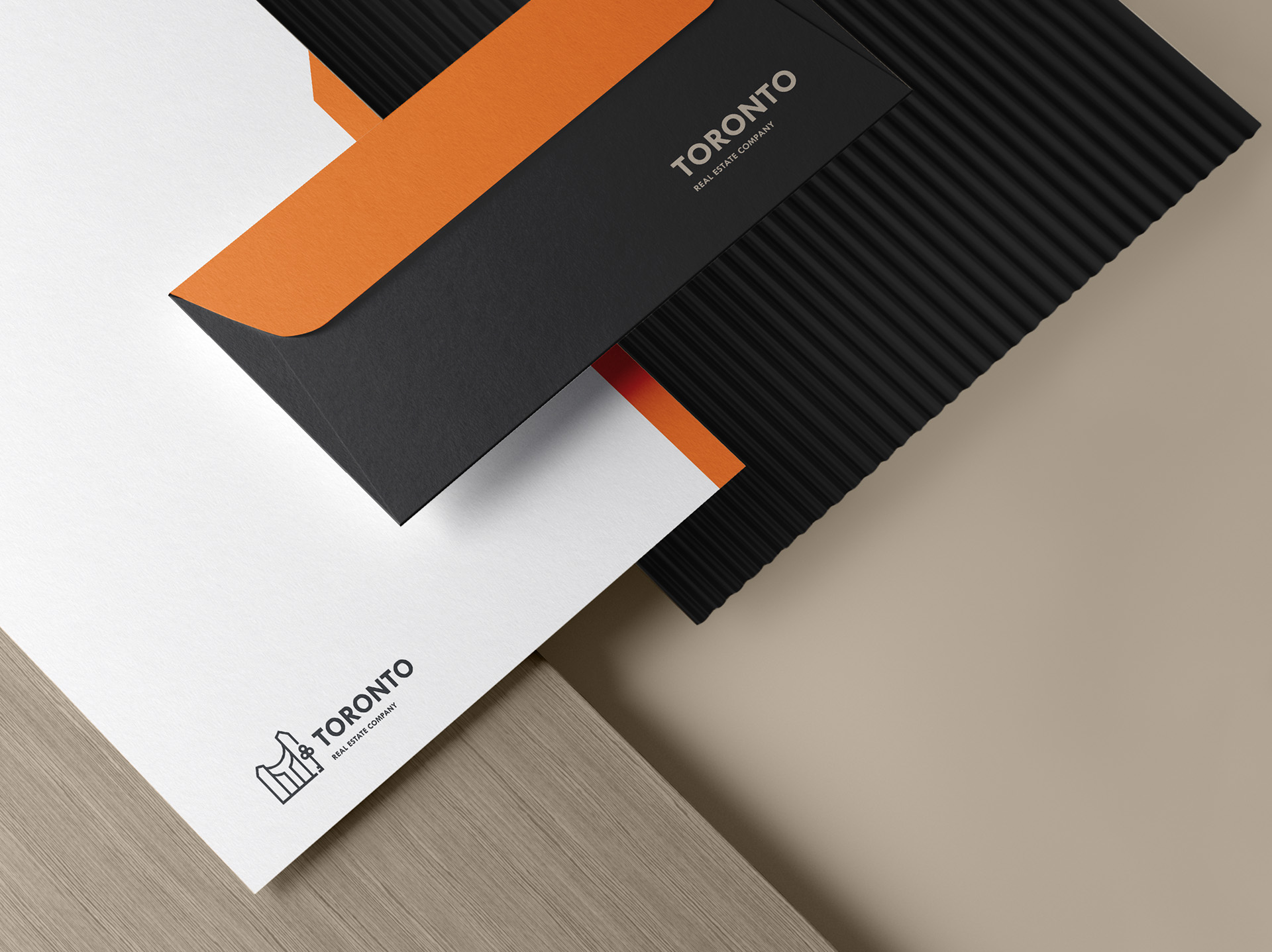
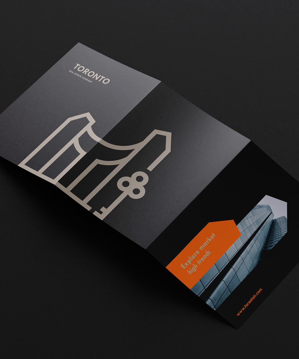
Upon thorough examination of the data pertaining to Toronto Real Estate Company, the project was meticulously analyzed, taking into account various significant aspects. The centerpiece of the logo is a 3D rendering of the letter “T,” which showcases an iconic building that is prominently featured in the distinguished skyline of Toronto. This representation symbolizes the association of the company with the Toronto Municipal Council, lending a sense of credibility and authority.
The upper section of the letter “T” holds a visually captivating portrayal of the Bosphorus Bridge in Istanbul. This iconic landmark serves as a powerful metaphor, representing the crucial link between the buying and selling operations facilitated by the company. It conveys the notion of seamless connectivity and the vital role played in enabling successful transactions.
Additionally, the incorporation of a key within the logo carries a profound meaning. It serves as a symbol of accessibility, emphasizing the ease with which clients can engage in prosperous investments when partnering with Toronto Real Estate. The presence of this key highlights our commitment to providing a smooth and hassle-free experience, granting clients the opportunity to unlock lucrative opportunities within the real estate market.
Moreover, the logo features a set of circles creatively arranged to form the three letters “O” in the word “TORONTO.” This artistic representation adds an aesthetically pleasing touch while maintaining the brand identity and further emphasizing the connection to the city.
In summary, Toronto Real Estate Company epitomizes excellence in the real estate industry, offering an extensive selection of properties in Istanbul. logo encapsulates the essence of the brand, portraying a strong association with the Toronto Municipal Council, emphasizing seamless connectivity, accessibility to successful investments, and deep-rooted connection to the vibrant city of Toronto.






CREDIT
- Agency/Creative: Root agency
- Article Title: Toronto Real Estate Company Branding
- Organisation/Entity: Agency
- Project Type: Identity
- Project Status: Published
- Agency/Creative Country: United Arab Emirates
- Agency/Creative City: Dubai
- Market Region: Middle East
- Project Deliverables: Brand Design, Brand Guidelines, Brand Identity, Brand Strategy, Branding, Design, Graphic Design, Identity System, Logo Design
- Industry: Real Estate
- Keywords: Branding, Brand Identity, Logo, Logo Design, Mass Media, Icon, Brand Guidelines
-
Credits:
Founder, Creative Director: Mahmood Mira
Partner, Project Manager: Mohammad Douba


