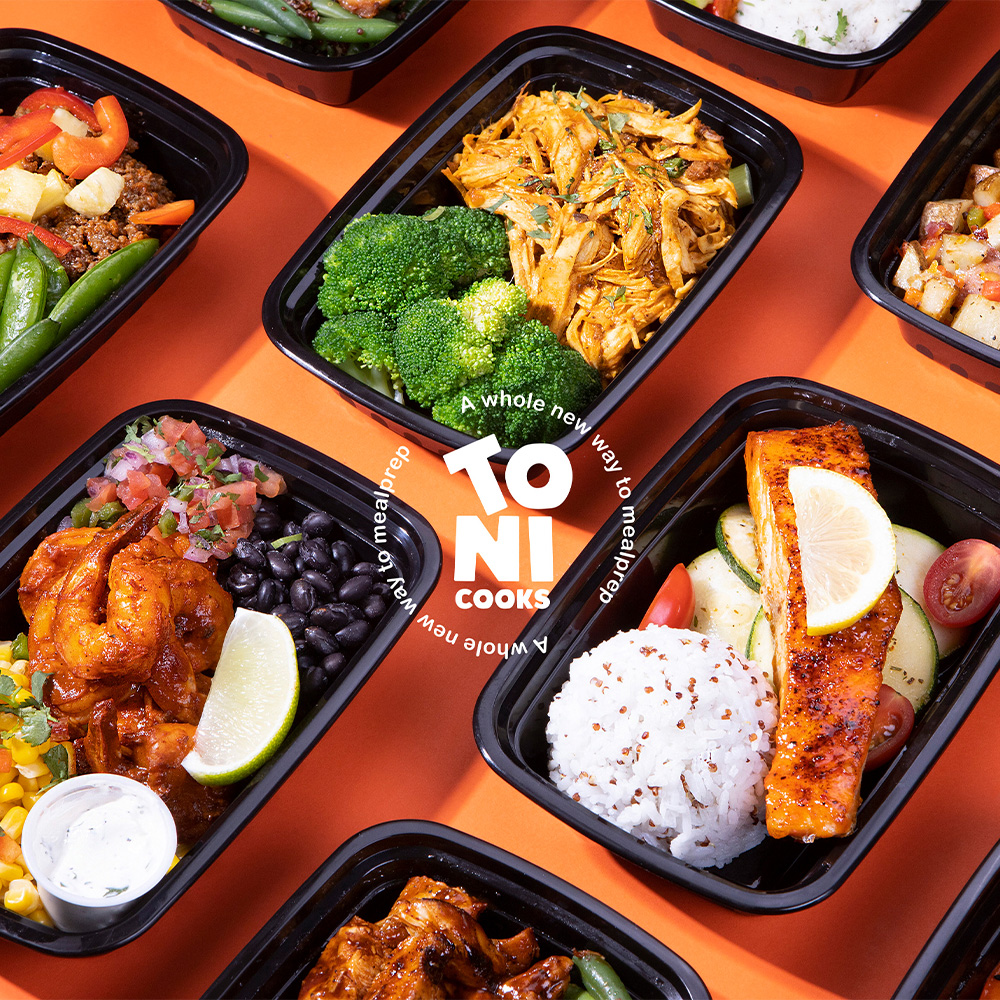
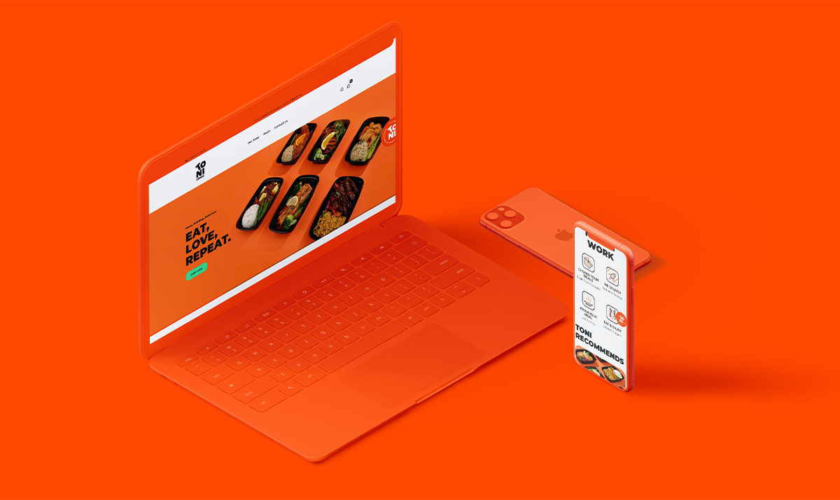
ToniCooks is an exciting New York based new business with a strong track record of exceeding sales goals who has a promising future as an industry leader within the meal-prep distribution. ToniCooks has a unique approach to helping people enjoy delicious, nutritious meals. Customers can order meal plans online and meals are prepared at our Teaneck, NewJersey commercial kitchen.
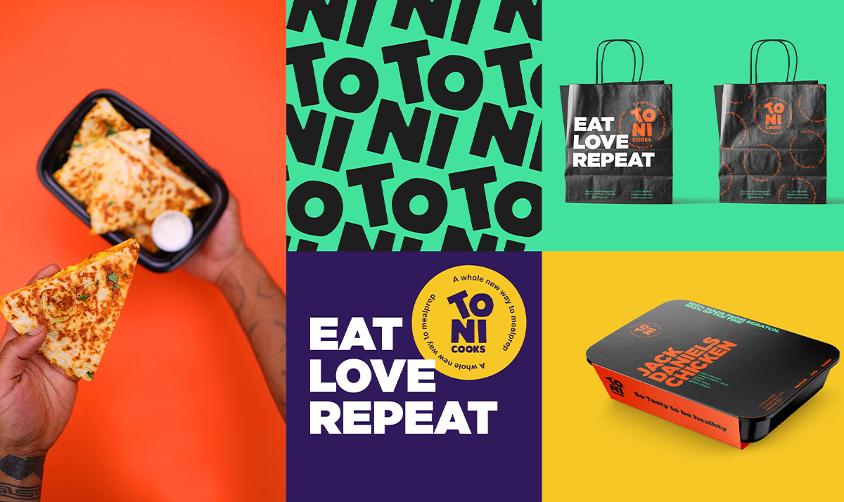
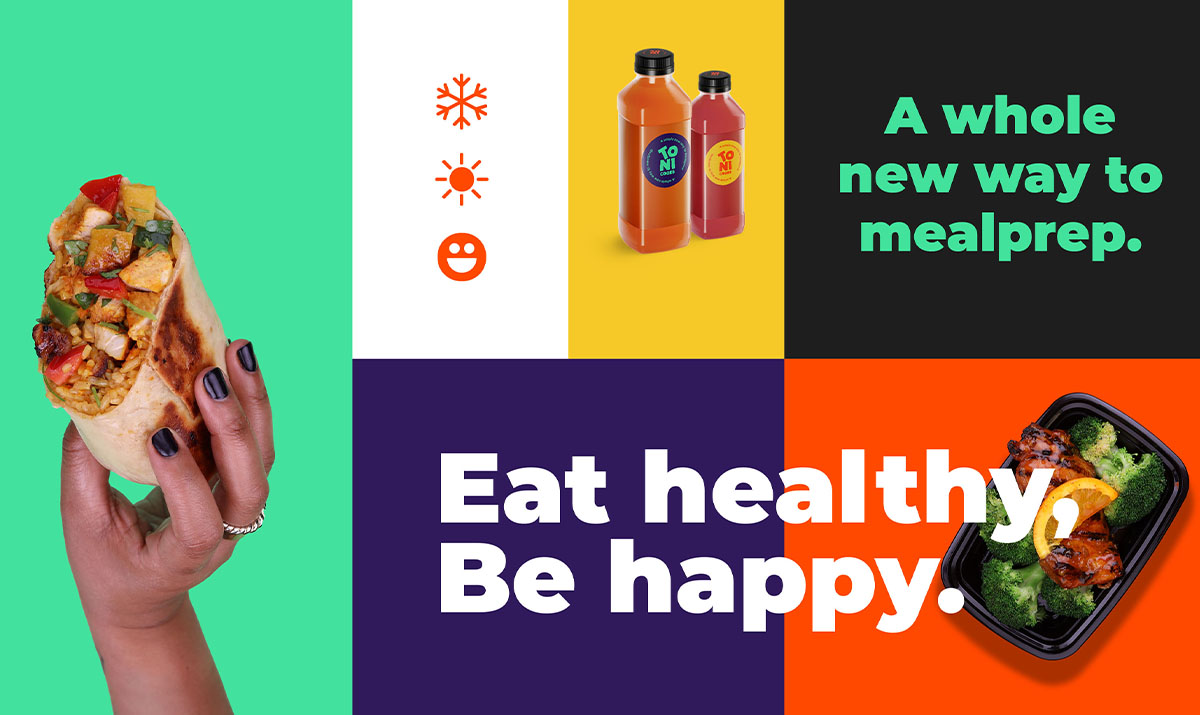
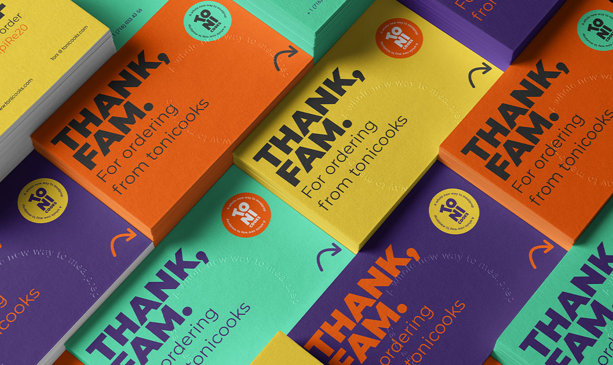
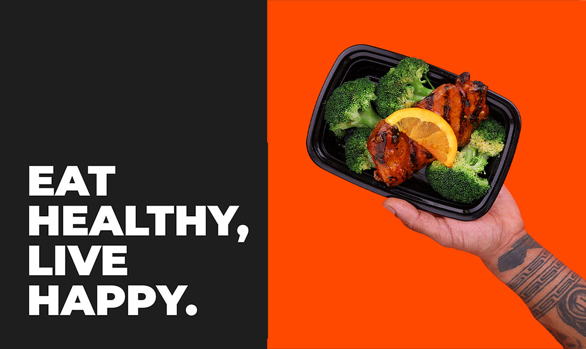
Our mission was to create a modern, vibrant and cheerful brand identity that reflects ToniCooks values and personality. They wanted their visual brand identity to look as good as the taste of their meals. The new brand identity in all its aspects encapsulates who ToniCooks really are and their values. ToniCooks is exciting, urban colourful and fun. their food makes their customers feel happy, cool and young.
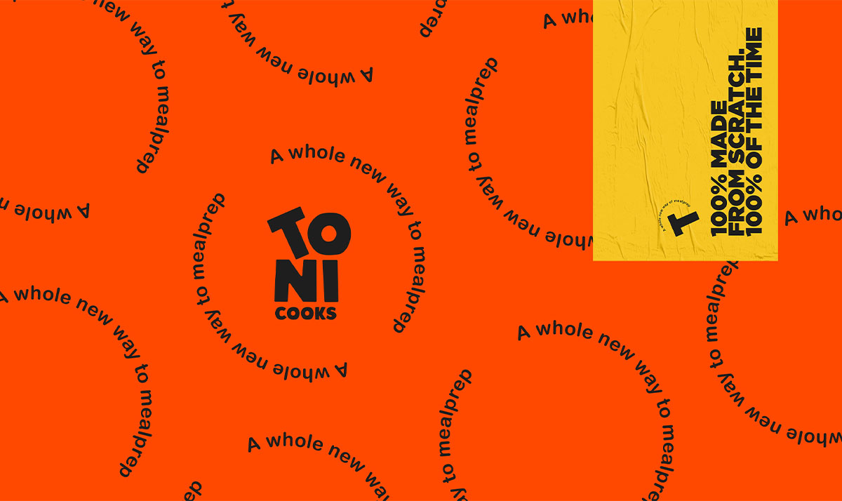
The new logo is a typography-based logo. It is playful, modern and Bold.
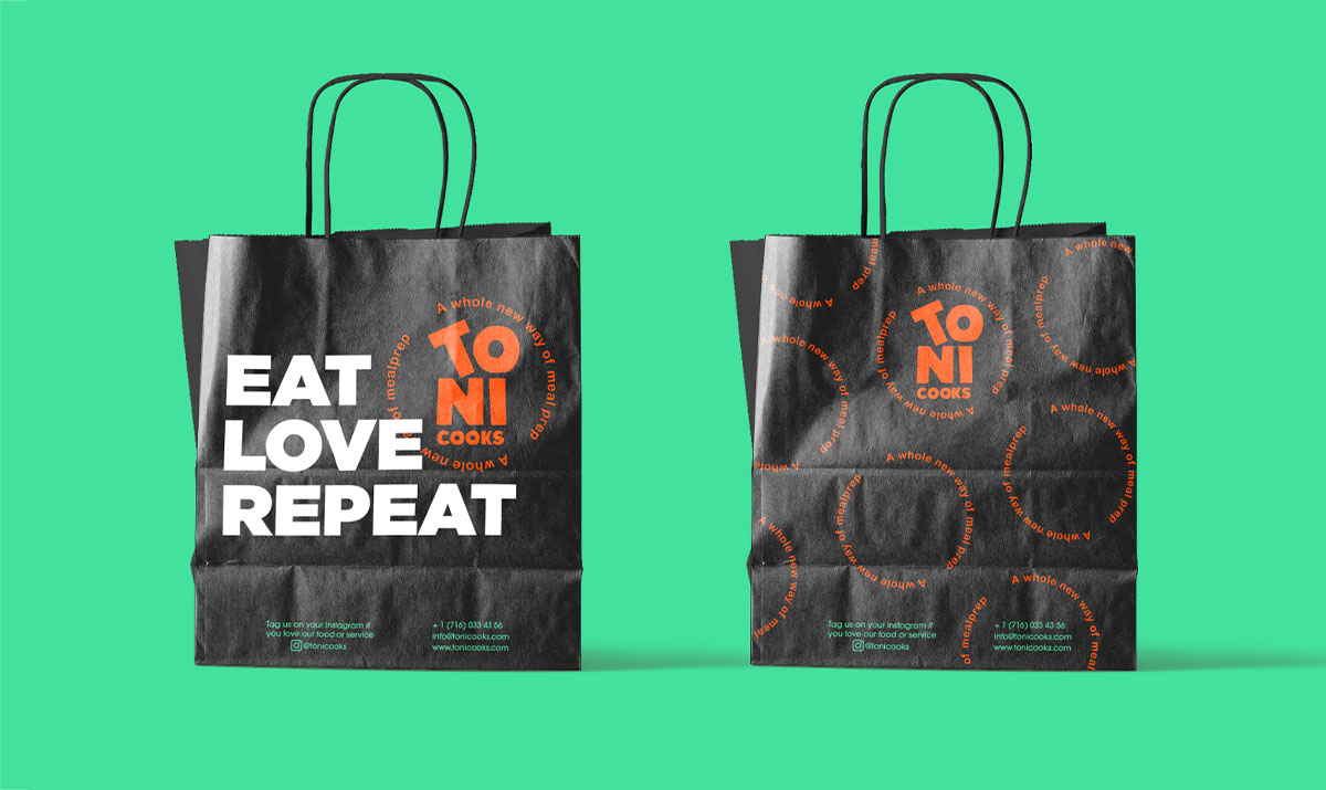
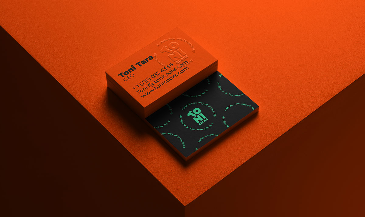
The logo is basically composed of two parts: the first part is the four letters of the word “Toni” which were created in an asymmetric composition and the second part is the word “cooks” under it in a small font to create a visual hierarchy. The slogan “A whole new way to meal prep” was positioned on a circular path around the letter “O” to highlight the circle shape which represents the food plate and makes the logo feel playful and friendly. The new logo is also technically characterized by its dynamism and ease of use, in addition to its suitability to different contexts and requirements.
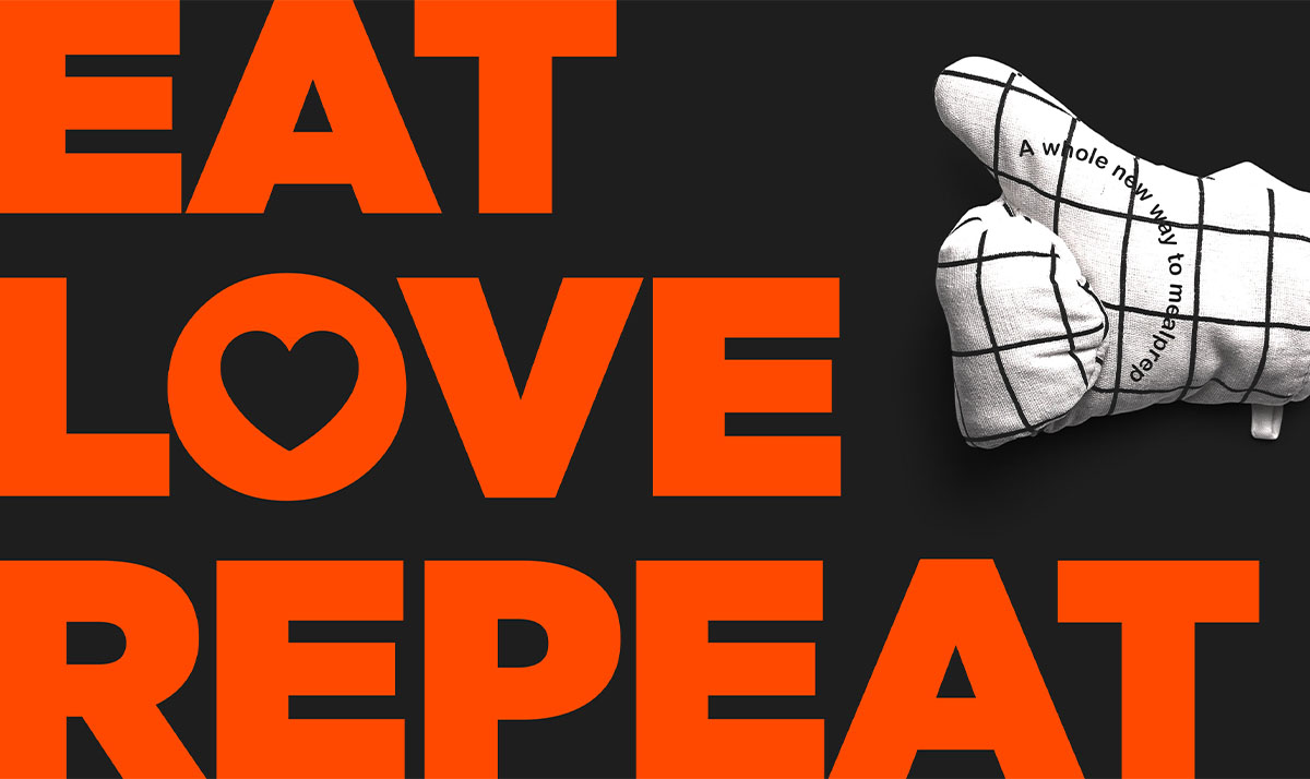
In addition, the new logo also has, besides its main variations, these five variations which represent and highlight the brand values (Diversity, Integrity & Impact) and brand attributes (Bold, urban, passionate, energetic, fun, cool, modern, exciting, healthy & young). These five variations can also be used as a part of the brand identity and in marketing campaigns to convey the brand messages and raise awareness. We chose different elements/icons for these different variations. each one of them is unique and has more than one meaning in it. They represent what ToniCooks is as a brand and who they really are.
CREDIT
- Agency/Creative: Selwaye Studio
- Article Title: ToniCooks Brand Identity Designed by Selwaye Studio
- Organisation/Entity: Agency
- Project Type: Identity
- Project Status: Published
- Agency/Creative Country: Sweden
- Agency/Creative City: Selwaye Studio
- Market Region: Europe, Global
- Project Deliverables: Art Direction, Brand Creation, Brand Design, Brand Identity, Brand Redesign, Packaging Design
- Industry: Food/Beverage
- Keywords: WBDS Agency Design Awards 2021/22
-
Credits:
Creative Art Director: Moe Selwaye
Motion Designer: Motaz Faysal


