The PRO14 was the professional rugby union league containing the top clubs from Ireland, Scotland, Wales, Italy and most recently two teams from South Africa. Having received investment from private equity firm CVC, a bold and ambitious strategic plan was developed by management to rename the league, revamp the format and add more teams, with the aim of increasing audiences and building a truly world class sports and entertainment brand.
Historically, the League’s the title sponsor had directed much of the brand’s look and feel. We needed to develop a brand that had the confidence to stand on its own in the slick and sophisticated world of sport and entertainment, whilst also giving it a feeling of authority as the governing body of the league.
The global COVID-19 pandemic inevitably brought it’s challenges to the league and the sport in general. But out of this adversity arose an opportunity for the four big teams from South Africa (Stormers, Bulls, Lions and Sharks) to join the new league, bringing with them a number of world-class players from South Africa’s 2019 World Cup winning side as well as their huge fanbases.
With this in mind, we needed to develop a name, positioning and identity that resonated with the exciting developments of the league and clearly communicate its USP.
To understand the plans for the brand we needed to speak to the countries represented in the league who are also shareholders, the rugby unions of Wales (WRU), Scotland (SRU), Ireland (IRU), Italy (FIR) and South Africa (SARU).
Over months of engagement with the marketing team, unions and the clubs themselves, it became clear that the new competition would be unlike any other in club rugby. Five powerhouse rugby nations, crossing both the North and South hemispheres, bringing with them different playing styles, clashes of culture, languages, and a global fanbase, means that the diversity in this competition is what makes it different from any league in the world.
The new format will truly be the only global club rugby championship. The brand positioning ‘A Different League’ is a statement of intent to be unlike another rugby competition in the world. This positioning reinforces the diversity of the teams and supporters within the league and sets an aspirational challenger mindset to be bold and different to other rugby brands.
The new name needed to reflect the brand positioning and be future-proof to allow for the league growing even further at a later date. This meant using a number in the name (e.g PRO16) was off the table.
We worked with key stakeholders within the business to develop United Rugby Championship. A descriptive name with gravitas, which is easily abbreviated, and has the potential to work well in future commercial and broadcast package discussions.
The new name speaks to the idea of league that is unified not uniform. A place where different teams, clubs and fans come together in one unique league to celebrate rugby and take the game forward.
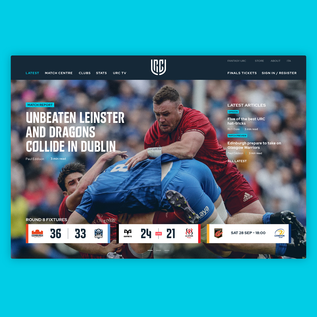
The logo for URC is the embodiment of the brand positioning. In a world full of traditional logos that feature rugby balls and posts, we decided to take a different approach and produce a marque that felt more aspirational and lifestyle driven.
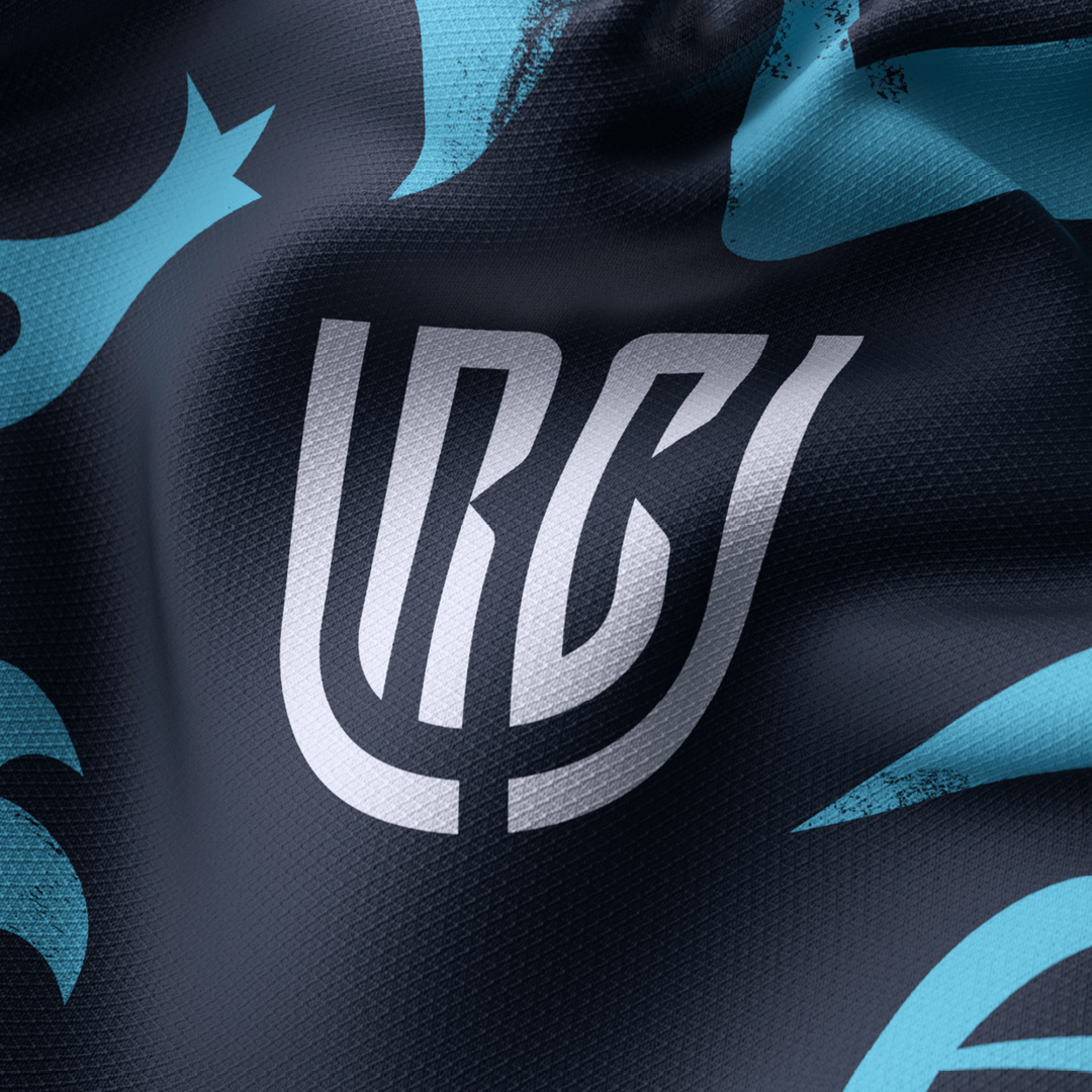
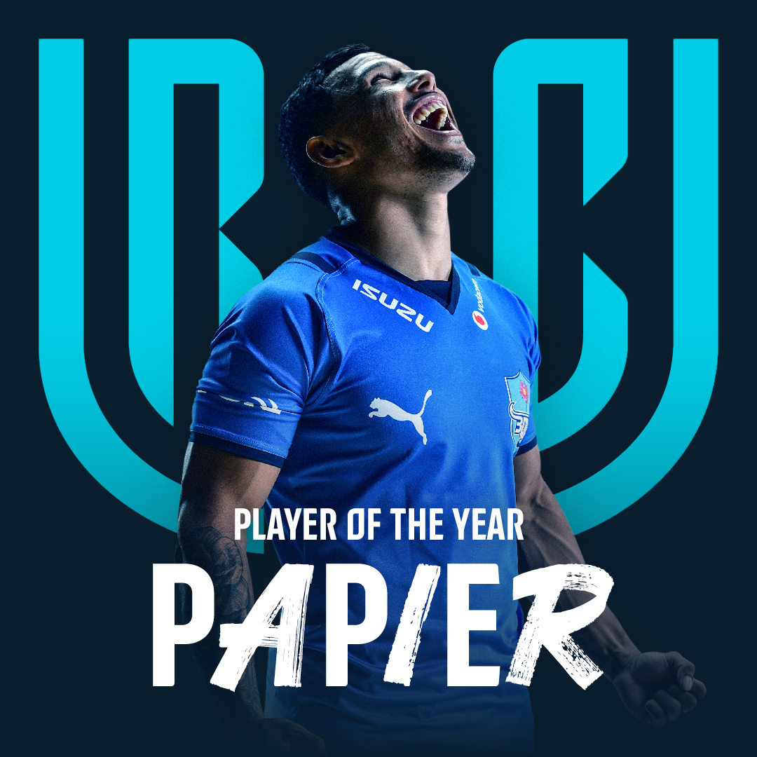
We created a graphic monogram using the letters U, R, and C. The result is a solid, stylish, authoritative marque which can work with the team crests rather than fight with them.
The shield-like nature of the logo communicates the ‘united’ aspect of the new name by having the ability to separate into two parts to reveal type, club crests, and other brand assets, before uniting to form it solid state.
We worked with type foundry Colophon to produce a bespoke typeface that compliments the logo and gives more own ability to all the brands’ touchpoint.
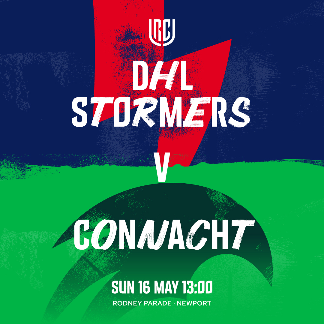
The typeface comes in three styles. URC Sans is the main headline typeface. It can be supported by URC Hand which adds pace and energy to communications. URC United mixes both URC Sans and Hand and aims personify the ‘unified not uniform’ concept.
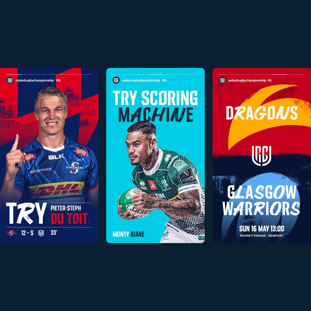
We wanted the identity to have the ability to flex from the more serious governance side of the brand to the energetic playing side.
Therefore, when comms are relating to a league issue (disciplinary action, fixtures etc) we predominantly use the primary brand colour palette. All team and match day related content uses the wider brand and team colour palette to make the communications more exciting and engaging.
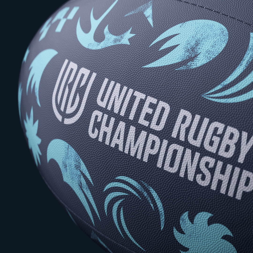
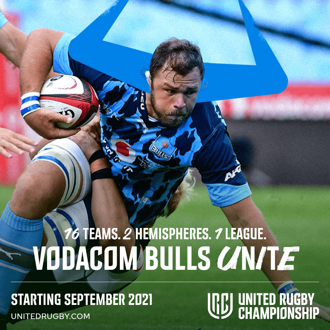
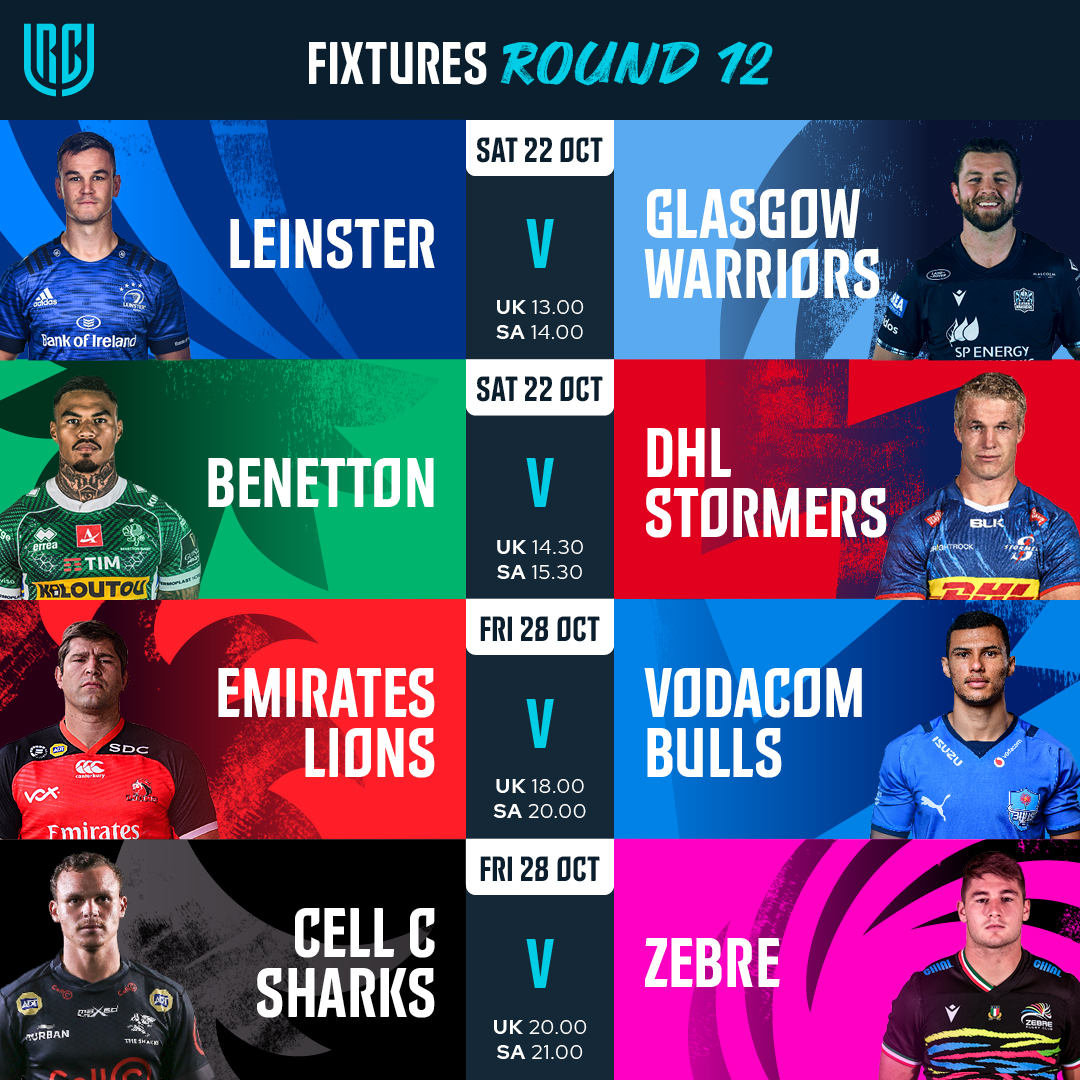
In every round of fixtures, teams from different countries battle against each other on the field. To reflect these tribal head-to-heads we created patterns loosely based on the team crests and colours. The patterns add energy and vibrancy to communications and feel more celebratory rather than aggressive. We can also use elements of the patterns with player imagery to show a lighter and more fun side to the brand.
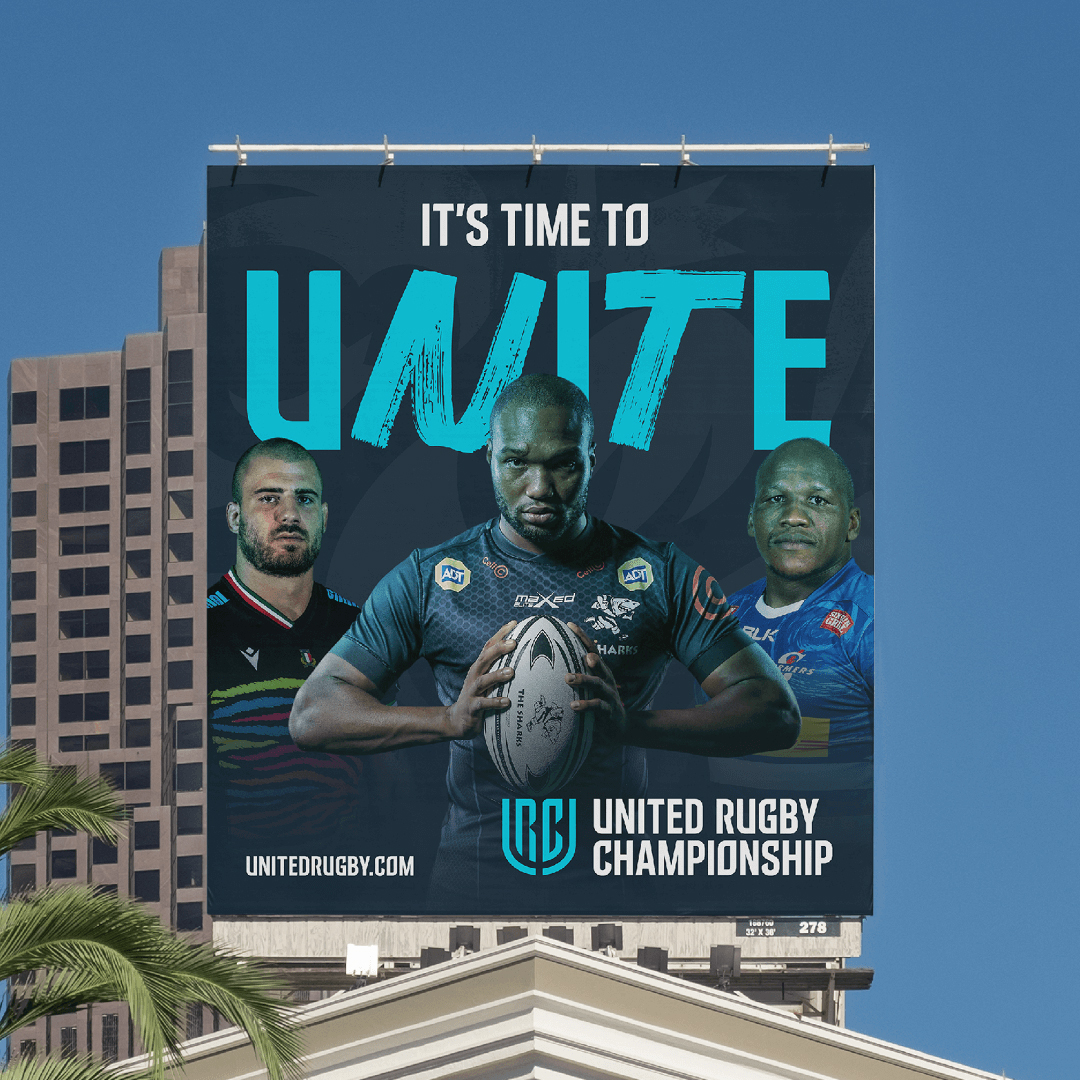
The global nature of the championship means that fixtures will be played in some of the world’s most iconic cities. From Cape Town to Venice to Dublin to Edinburgh and many more. We want the brand to highlight these beautiful locations, plus the culture and fans within them. Truly showcasing the extraordinary stories from around the league.
CREDIT
- Agency/Creative: Thisaway
- Article Title: Thisaway Rebrands PRO14 as United Rugby Championship
- Organisation/Entity: Agency
- Project Type: Identity
- Project Status: Published
- Agency/Creative Country: United Kingdom
- Agency/Creative City: Bath
- Market Region: Global
- Project Deliverables: 3D Motion, Animation, Art Direction, Brand Creation, Brand Design, Brand Experience, Brand Guidelines, Brand Identity, Brand Mark, Brand Naming, Brand Redesign, Brand Refinement, Brand Rejuvenation, Brand Strategy, Brand Tone of Voice, Brand World, Branding, Copywriting, Creative Direction, Design, Graphic Design, Identity System, Illustration, Lettering, Logo Design, Motion Graphics, Pattern Design, Photography, Photography Styling, Rebranding, Tone of Voice, Type Design, Typography
- Industry: Entertainment
- Keywords: Sport, Rugby, Rugby Union,
-
Credits:
Agency: Thisaway


