All Jokes Aside!
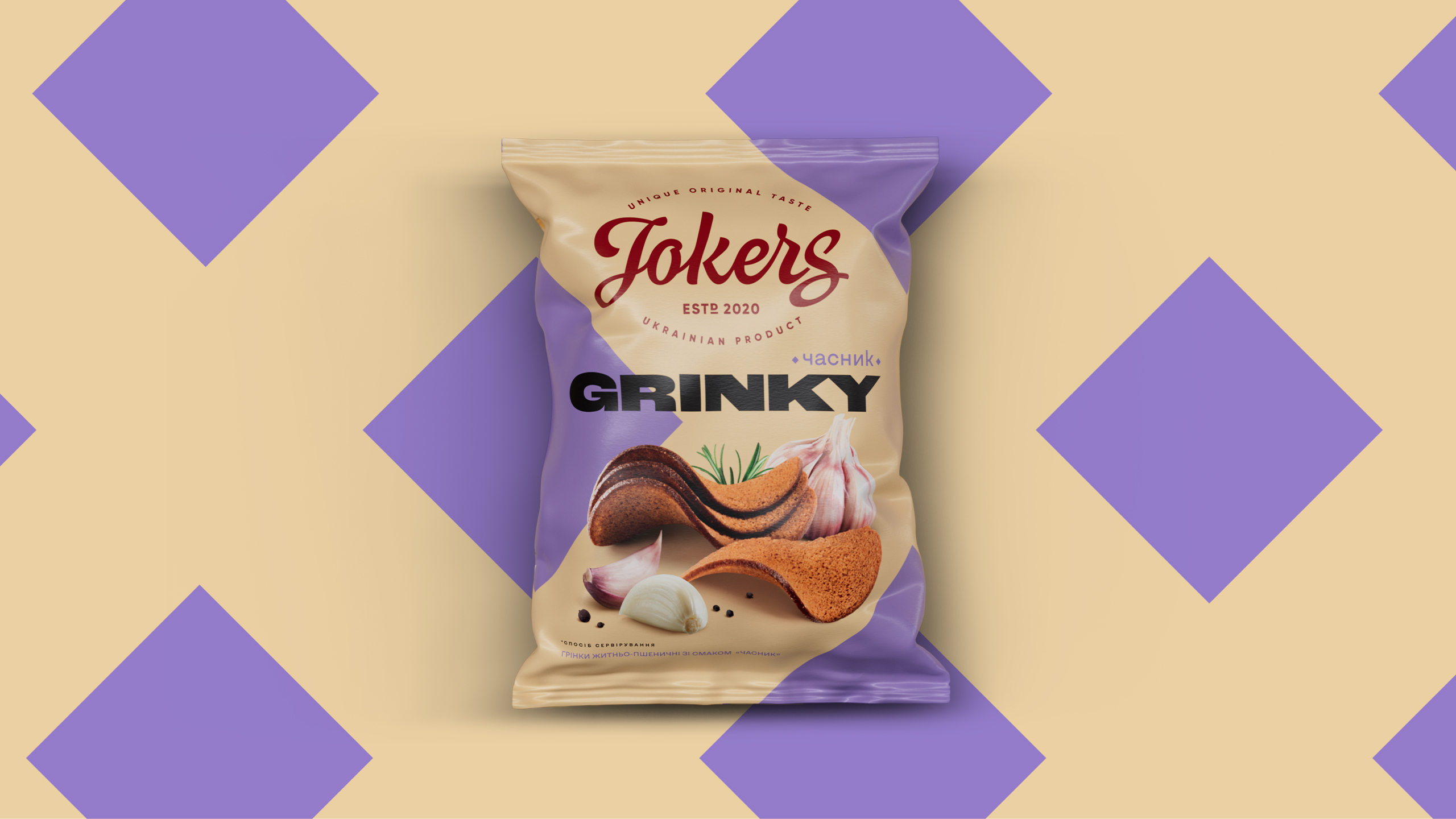
Everything is seriously crispy (or crispy serious). The history of Jokers croutons began in 2020, and within a couple of years, the business owner sought out our team as snack redesign champions to rebrand his brainchild too. In order to keep it unique a little bit and at the same time become different—more charismatic, modern, and noticeable. That’s why we started the transformation by Ukrainianizing the name of the product line. As a result, Grenki turned into Grinky.
Up to the Next Stage,
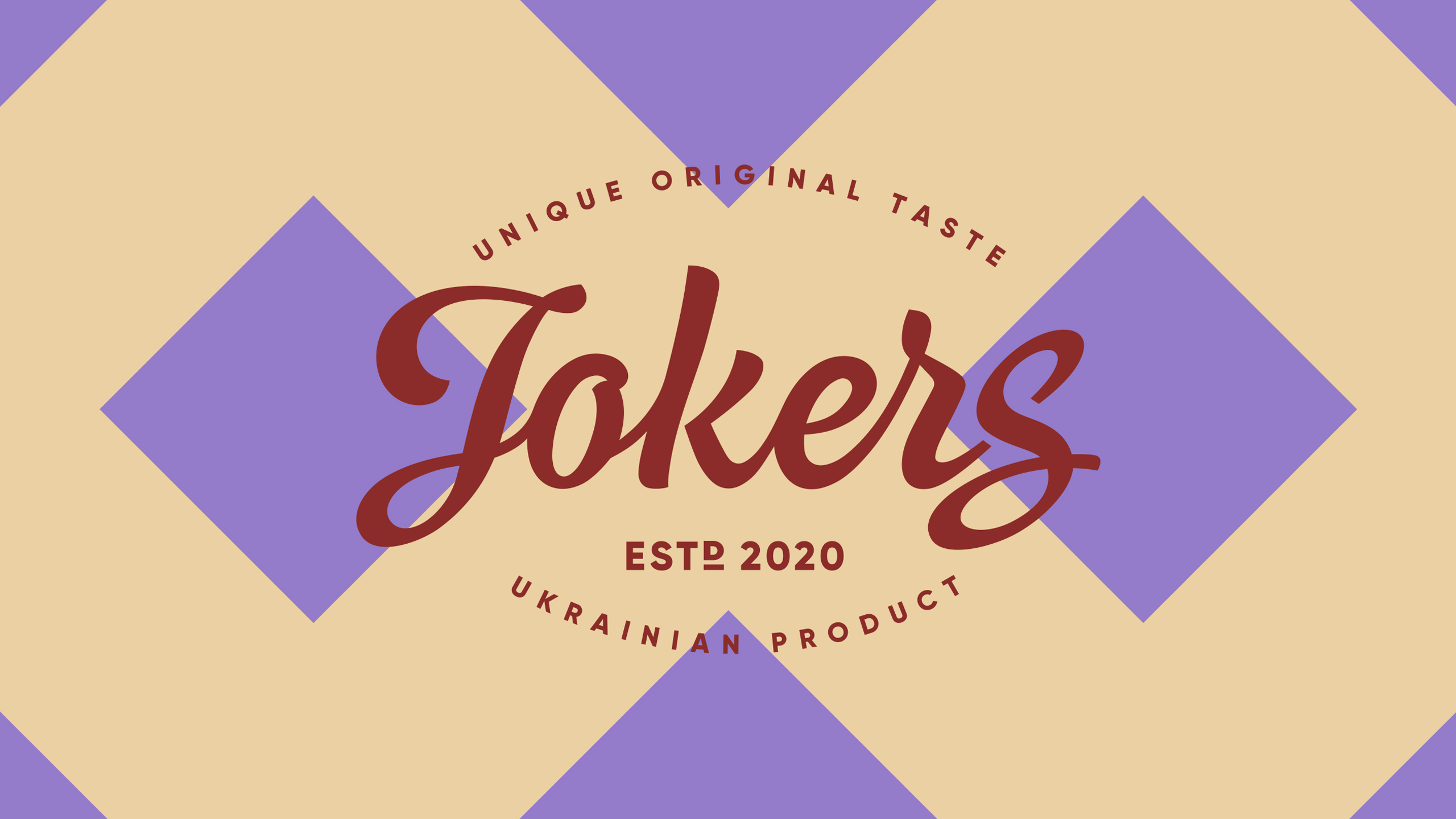
we worked with the background color of the brand and the general nature of the logo—color, lettering, and visual reference to the rounded shape. Our client liked all this, so there was no urgent need to say goodbye to it. But to support the diverse tastes united under the Jokers brand, we decided to reinforce the naming influence and create a thematic pattern borrowed and interpreted from the cards’ world.
A Unique Pattern and a Large Food Zone
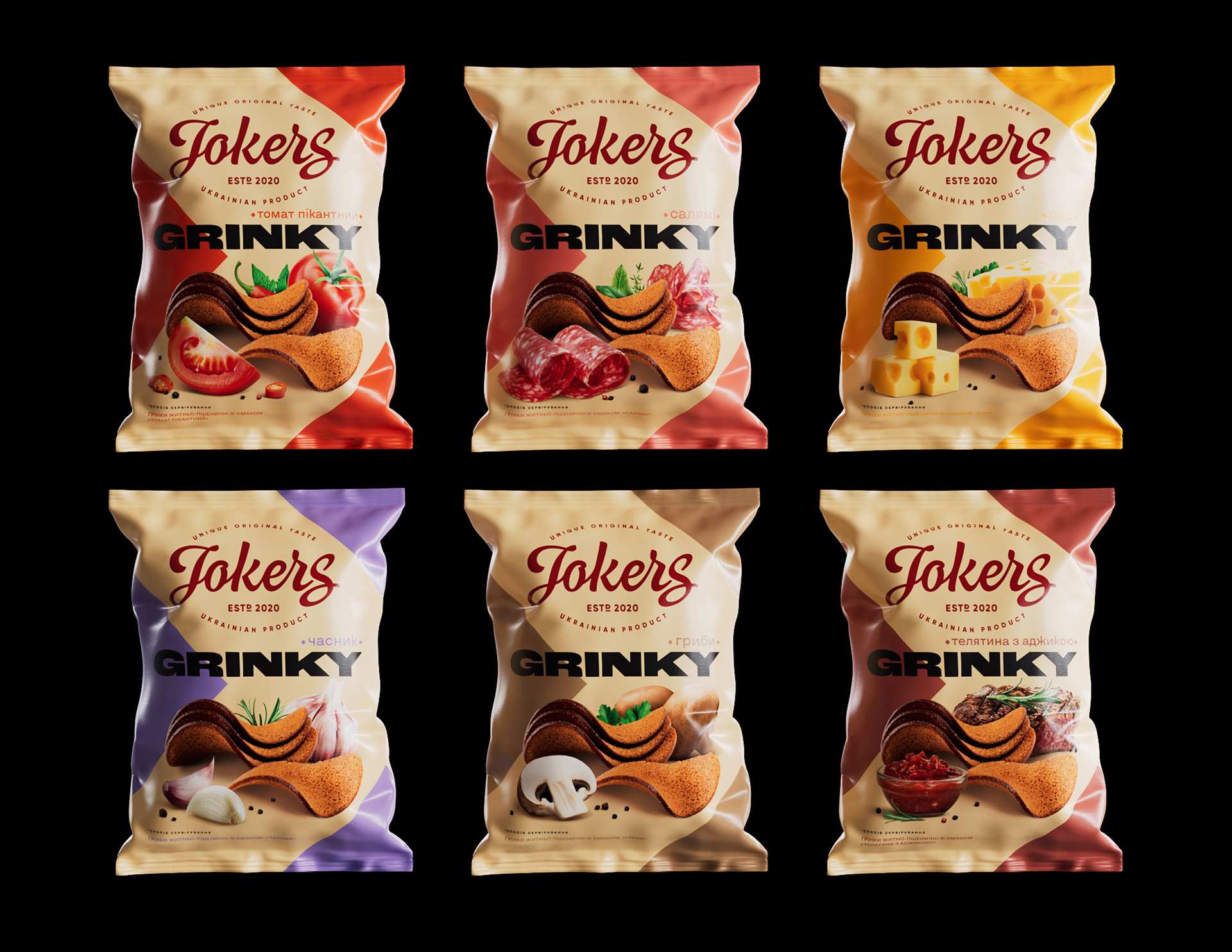
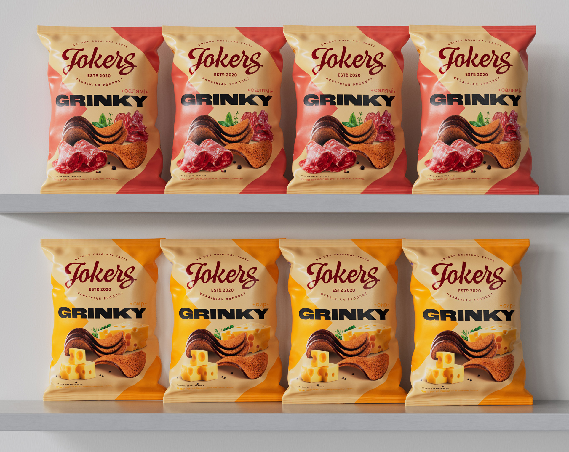
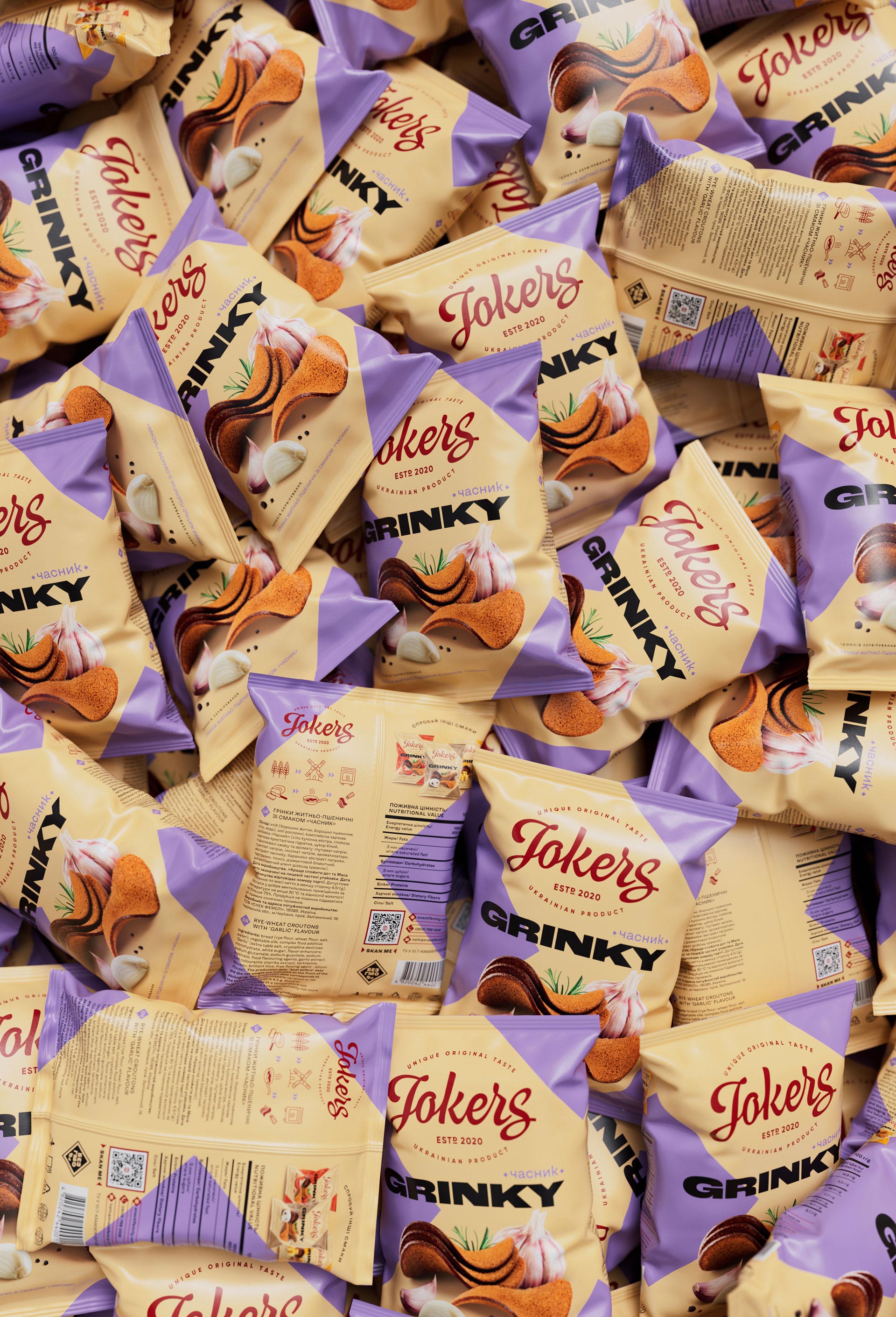
with delicious tastes finally became the leading eye-catchers on the shelf. At the same time, both of them work on the front and back of the package. The pattern is made up of a single element, whether facings or backsides. And the food zone has become more premium and gastronomic due to the strengthening of taste ingredients. Therefore, on the back of the package, we decided to entice the clients with other flavors of the line. In addition, each position received its own differentiating color. And when they are all lined up on the shelf, a “go-go” mood is created thanks to the visual arrow.
In Such a Way, Combination of Lettering
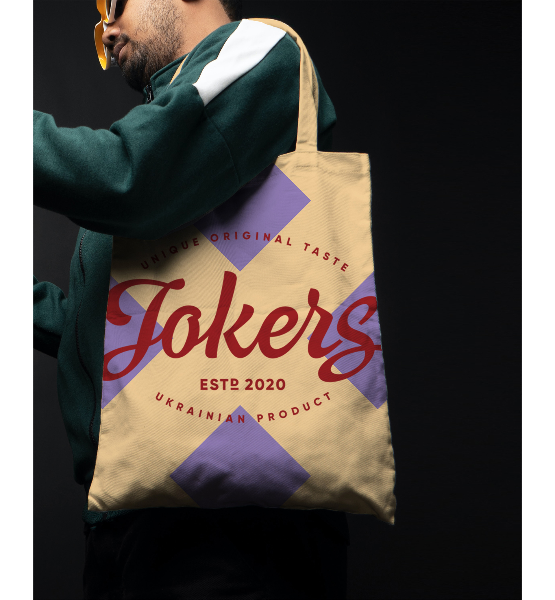
and pattern gave birth to an interesting combination that survives not only within the food zone but also on a self-sufficiency basis, for example, on merch with a taste of modernized vintage.
And Everything That a Fan of Croutons
doesn’t take away in a branded bag, will fly around retail outlets in ideal logistics boxes. This is the option when the limitation of the number of colors and printing technology in no way interferes with conveying the individuality of the brand, breathing into it another new rhythm of the patterns. As soon as we were sent the first printed photo samples, we fell in love with them at first sight. Designers are supposed to play with fonts or colors, but this was a case when we did want to play with boxes.
The Secret Power of Jokers
is in the pattern that doesn’t even need a rigid system and conscientious explanation. Just look at this chaotic scattering of packages! All around, it remains tasty and recognizable from all sides. With each spin, the kaleidoscope effect is turned on, and a casual harmony of new combinations is created from the bright Jokers packages.




CREDIT
- Agency/Creative: Dozen agency
- Article Title: The Secret Power of the Jokers – Snacks Branding and Packaging Design
- Organisation/Entity: Agency
- Project Type: Packaging
- Project Status: Published
- Agency/Creative Country: Ukraine
- Agency/Creative City: Kyiv
- Market Region: Europe
- Project Deliverables: Art Direction, Logo Design, Packaging Design
- Format: Flow-Pack
- Industry: Food/Beverage
- Keywords: Jokers, snack, Kyiv, Ukraine, packaging, design, logo
-
Credits:
Art Director: Elena Gavriluk


