José Maria da Fonseca chose Omdesign to sign the rebranding of the iconic João Pires, a Portuguese wine that is a reference, in Portugal and across borders, and that is produced since the 70s.
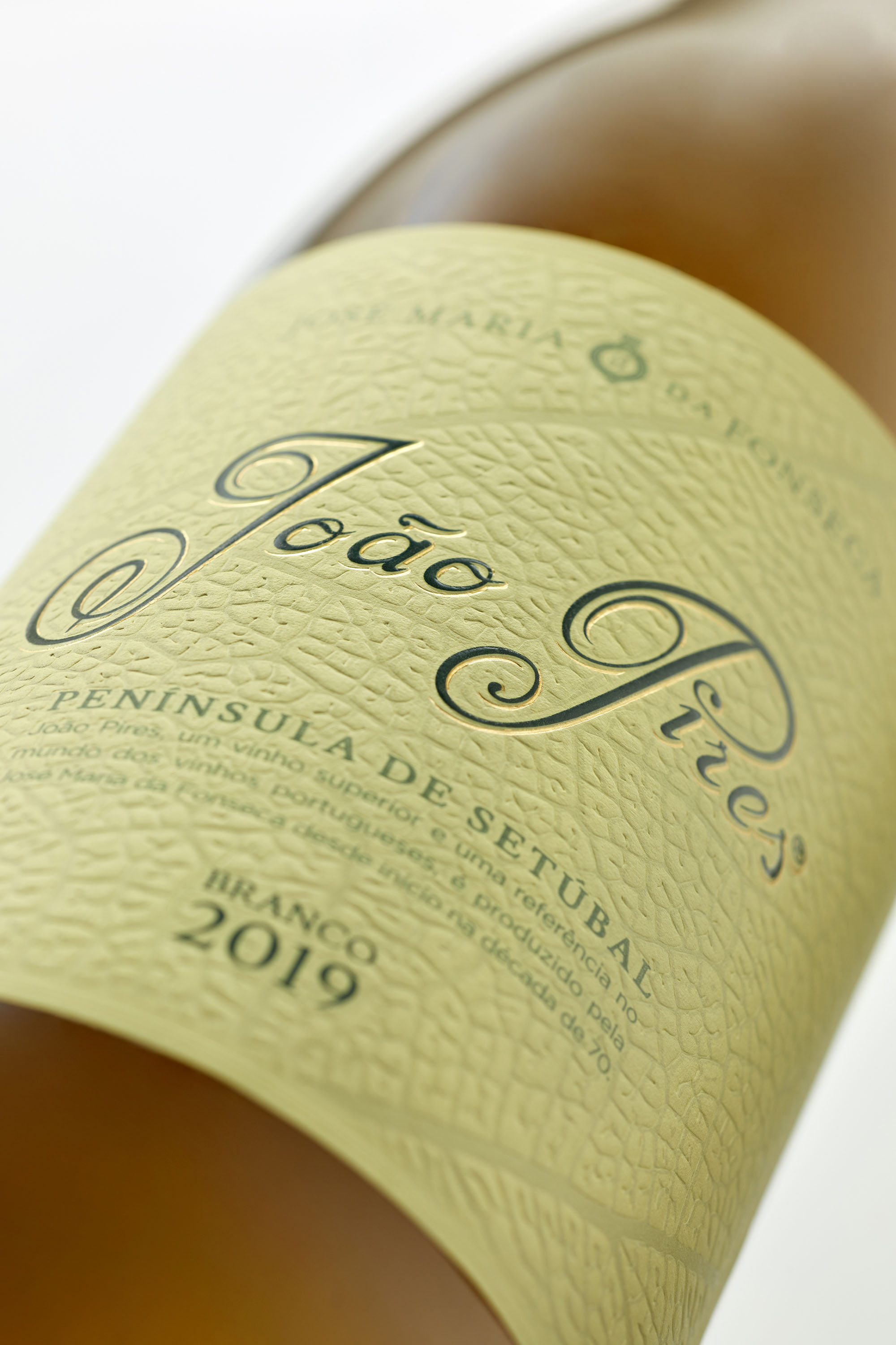
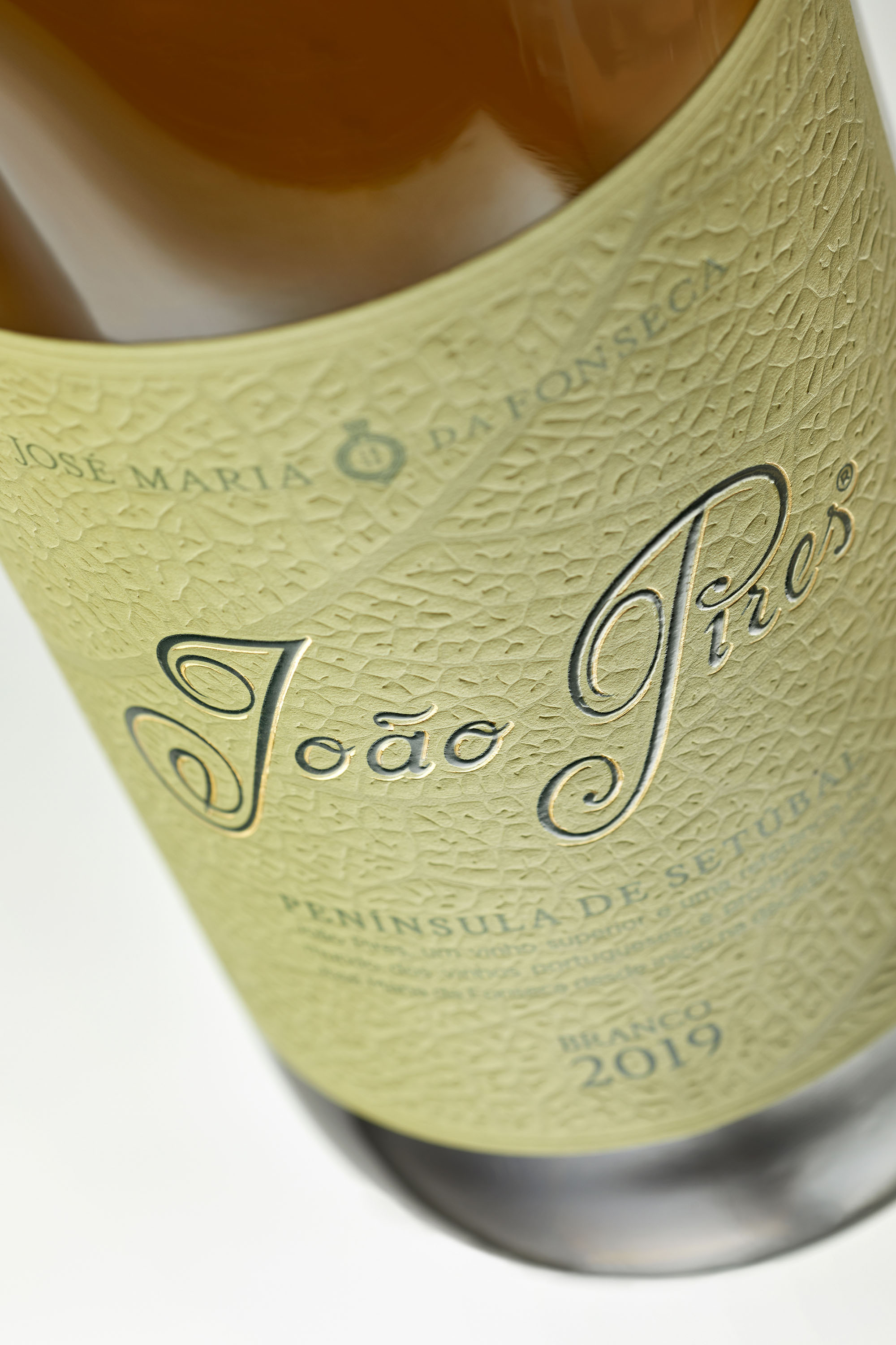
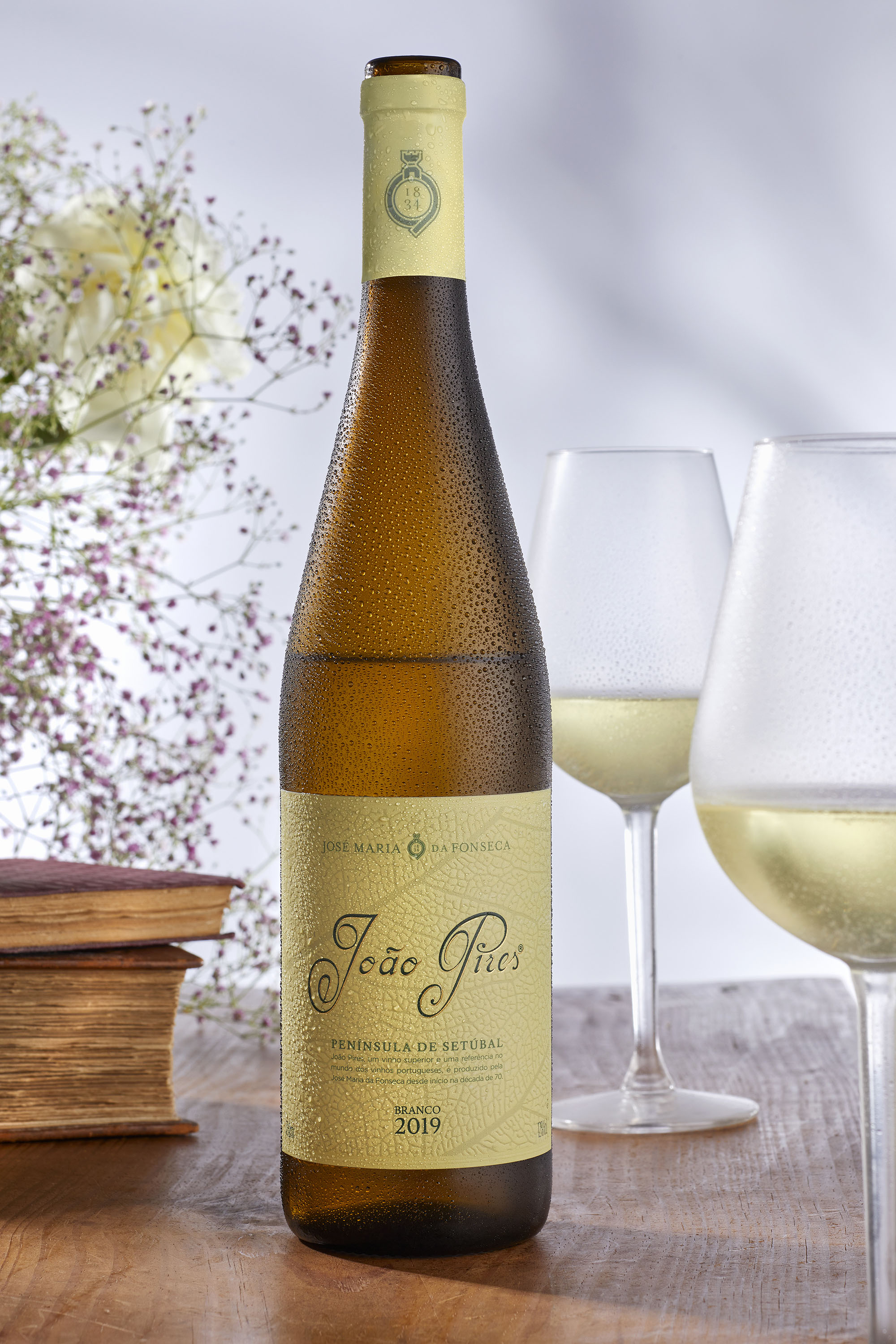
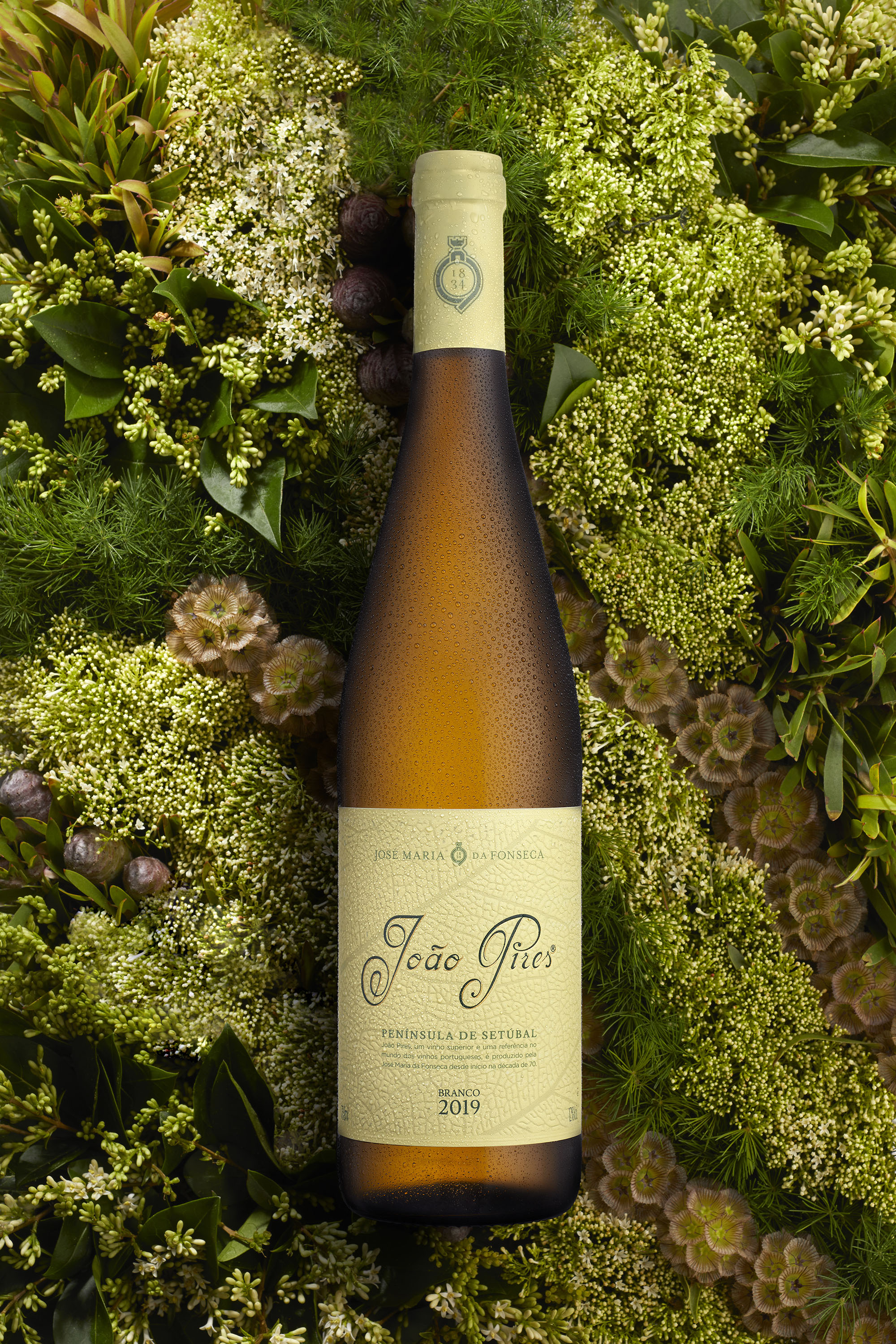
João Pires is available on the market with the new image, more premium, younger and fresher, that whose last visual renovation took place more than thirty years ago. This superior white wine has now a darker glass bottle and the Moscatel de Setúbal variety, that composes this wine, is here highlighted through the presence in the label of the vine of this unique vineyard. In turn, João Pires brand was surgically modernized, maintaining its traditional typography, which now occupies a more prominent position in packaging.
The combination of green tones refers to a fresh and perfumed taste, at the same time that the materials and finishes selected by the creative agency, such as low relief, varnish, foil stamping and fine paper, result in a differentiating and impacting image, reinforcing the brand identity and the quality and profile of this wine.
To Omdesign, the new image, with the different adopted elements managed in perfect harmony and balance, grant this wine from Península de Setúbal a greater proximity amongst the actual and also the new consumers, at the same time that reflect the essence and values of José Maria da Fonseca.


CREDIT
- Agency/Creative: Omdesign
- Article Title: The Iconic João Pires Wine Designed by Omdesign
- Organisation/Entity: Agency, Published Commercial Design
- Project Type: Packaging
- Agency/Creative Country: Portugal
- Market Region: Multiple Regions
- Project Deliverables: Brand Strategy, Packaging Design, Research
- Format: Bottle
- Substrate: Glass Bottle, Pulp Paper


