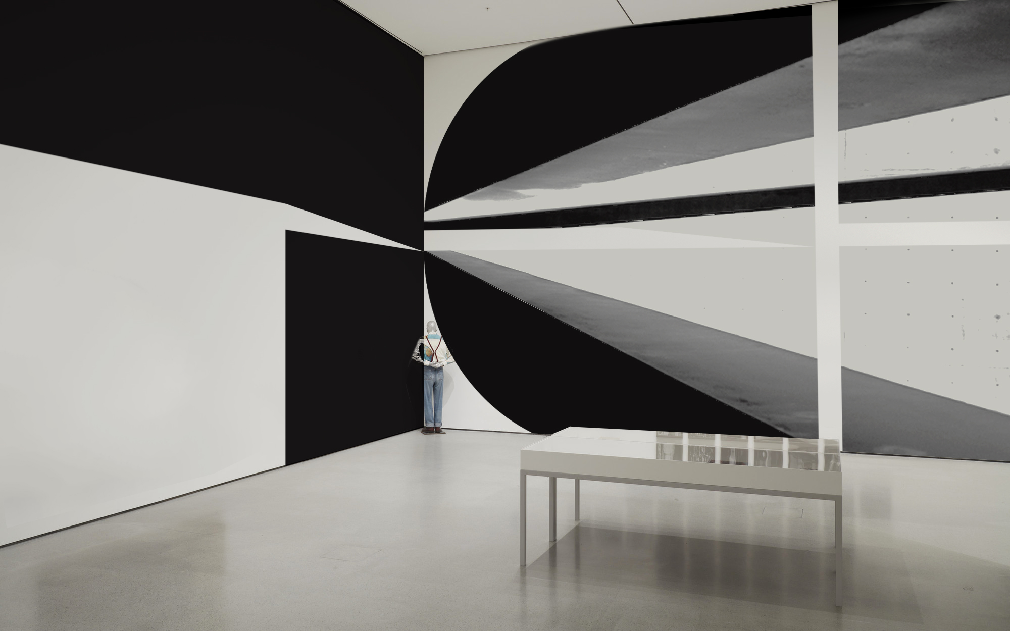
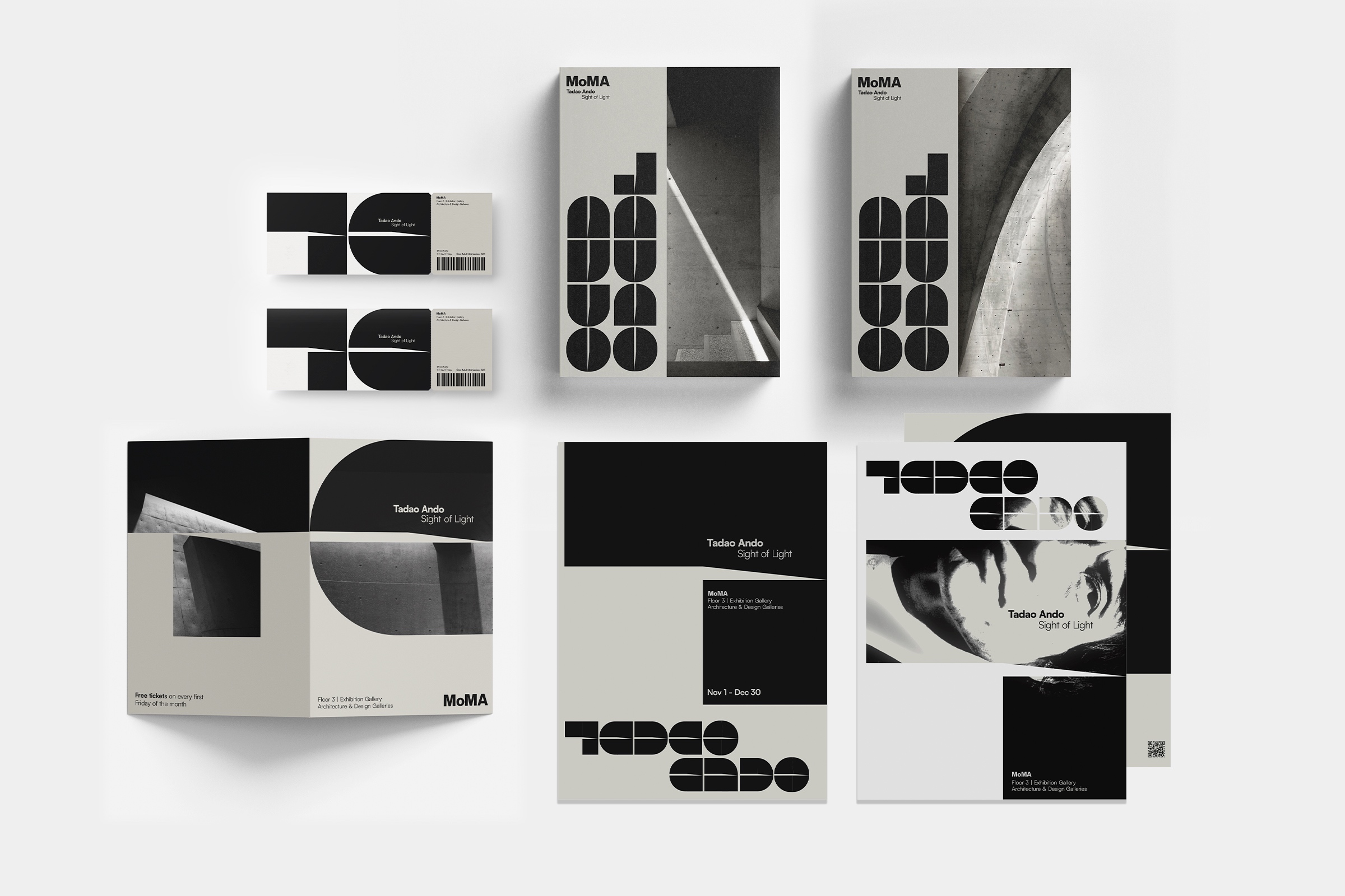
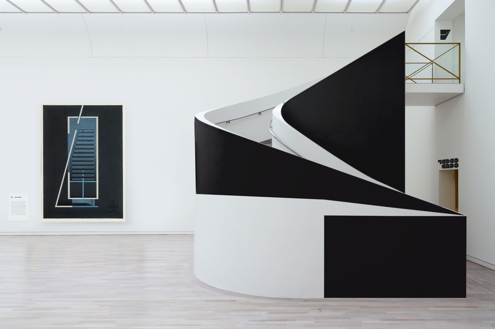
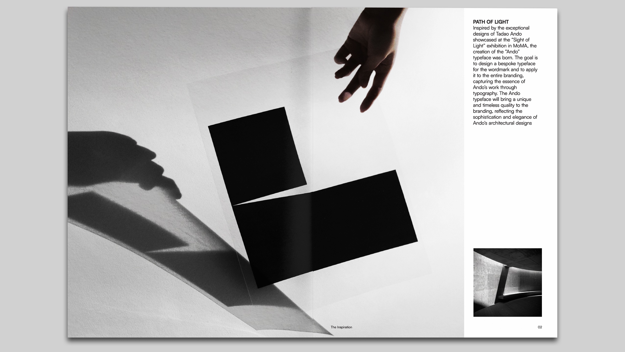
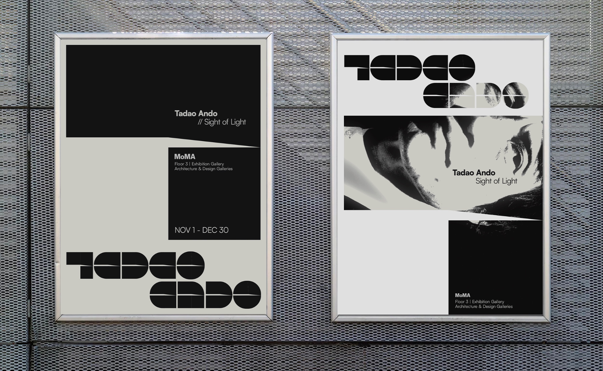
The “Ando” typeface, designed for the “Sight of Light” exhibition featuring Tadao Ando’s exceptional designs, captures the ethereal essence of Ando’s architectural style through its striking strokes. More than a typographic creation, “Ando” embodies the ethereal dance between light and shadow intrinsic to Ando’s architectural marvels.
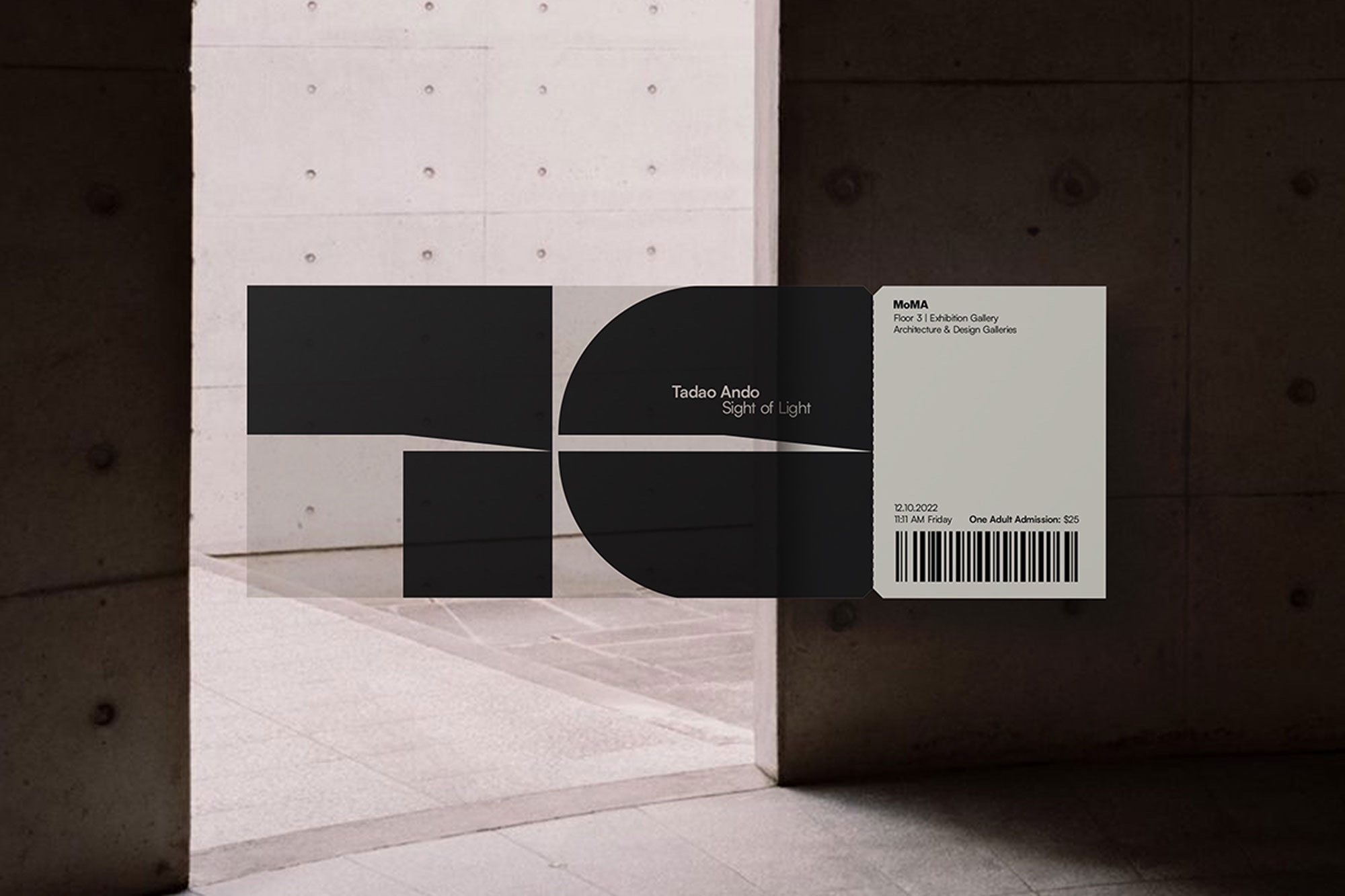
By employing transparent paper as the chosen canvas for tickets and promotional materials, “Ando” undergoes a remarkable transformation, transcending the ordinary constraints of traditional printing. This deliberate choice of material imbues the typeface with a unique quality: the ability to interact dynamically with light. What’s fascinating is how “Ando” becomes a chameleon, adapting to the specific ambient light of each environment where it resides. Whether bathed in the warm hues of sunlight or the cool artificial glow of indoor lighting, the typeface’s appearance alters, revealing different facets and nuances.
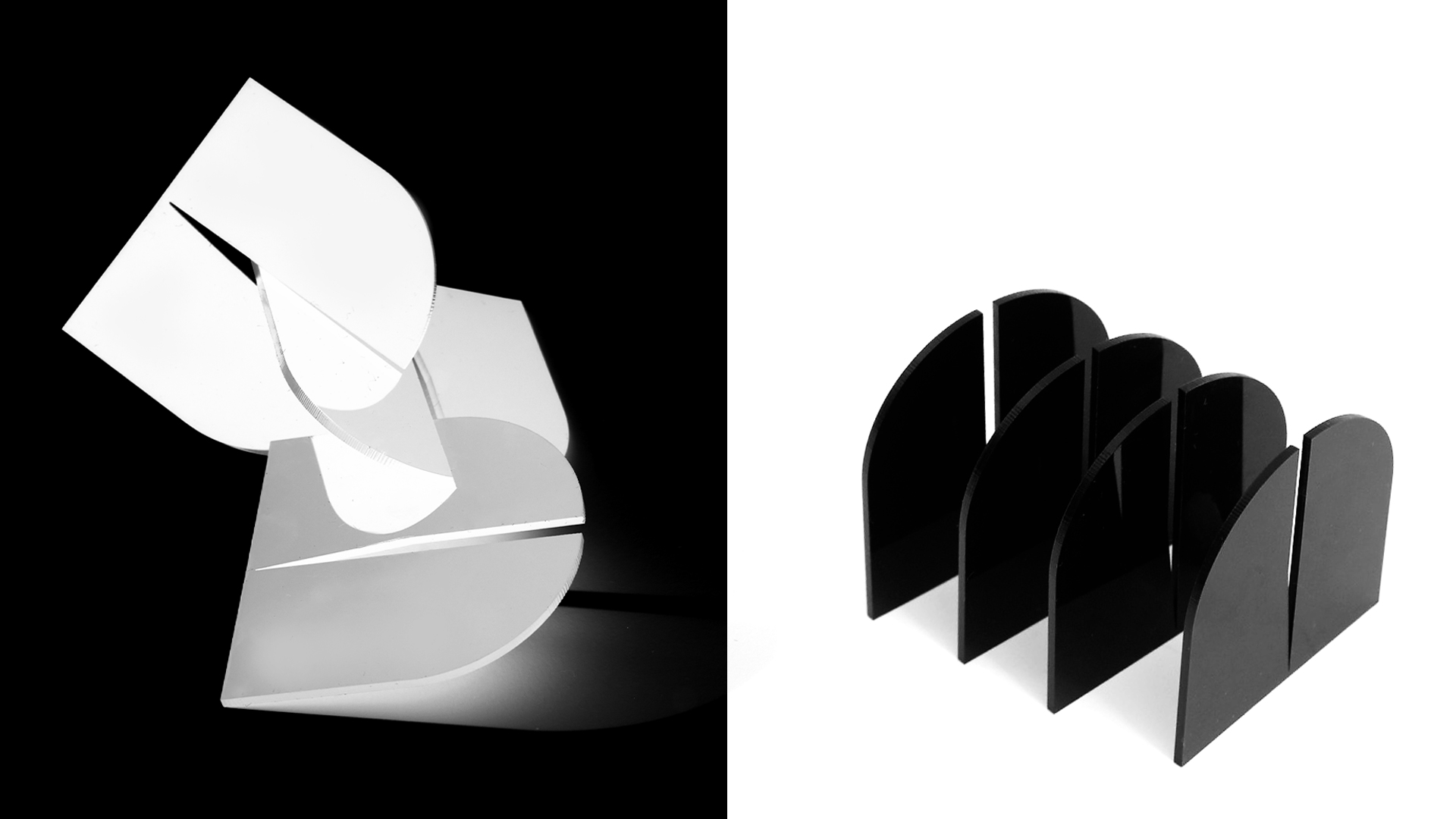
Expanding beyond conventional applications, “Ando” finds new life in spatial design and 3D printing. By exploring these avenues, the typeface transcends the confines of a two-dimensional plane. It becomes a tangible entity, transforming into mini-sculptures that invite tactile exploration. Whether etched into architectural models or created as intricate three-dimensional designs, “Ando” transcends the boundaries of traditional typography, inviting visitors to engage and physically interact with the essence of Ando’s architectural philosophy.
The transparency of the paper adds another layer of complexity to this interplay. As light filters through, “Ando” not only showcases its strokes but also offers glimpses, almost like windows, inviting viewers to see through the space it occupies. Imagine holding the ticket up to the light—there’s a sense of looking beyond the mere typography. The intricate play of shadows, the see-through quality of the paper, and the dance of light together create an ever-changing, almost ethereal experience.
“Ando” doesn’t stand still; it becomes part of its environment. It breathes life into the printed realm, transcending the static, and introducing a new chapter in the physicality of typography. It’s not just representation; it’s a collaboration between type and light, infusing our space with the essence of Ando’s architectural genius.


CREDIT
- Agency/Creative: Minh Pham
- Article Title: Tadao Ando Exhibition Brand Identity
- Organisation/Entity: Student
- Project Type: Identity
- Project Status: Non Published
- Agency/Creative Country: United States
- Agency/Creative City: Long Island City, Queens
- Market Region: North America
- Project Deliverables: Brand Identity
- Industry: Entertainment
- Keywords: WBDS Student Design Awards 2023/24
- Keywords: Identity, Brand Design Communication,
-
Credits:
Educational Institution: School of Visual Arts
Educator's Name: Pedro Mendes


