For many years, anti-aging cosmetics have been popular among women in many countries, and our time is no exception. Thus, Russia is one of the leading regions with the largest market for anti-aging cosmetics. As a result of research, it was revealed that the largest percentage of women begin to use such cosmetics starting from the age of 30.
The Russian company Savage produces cosmetics from Krasnodar grapes, which is famous for its quality not only in Russia, but also abroad.
Everyone knows that grapes have strong anti-aging properties, however, not many people know which substance is responsible for beauty and youth.
Resveratrol is one of the most powerful antioxidants that slows down the aging process. It is often added to anti age drugs, recently cosmetics containing this ingredient has even become a trend, and it has become the basis for the identity of the Savage company.
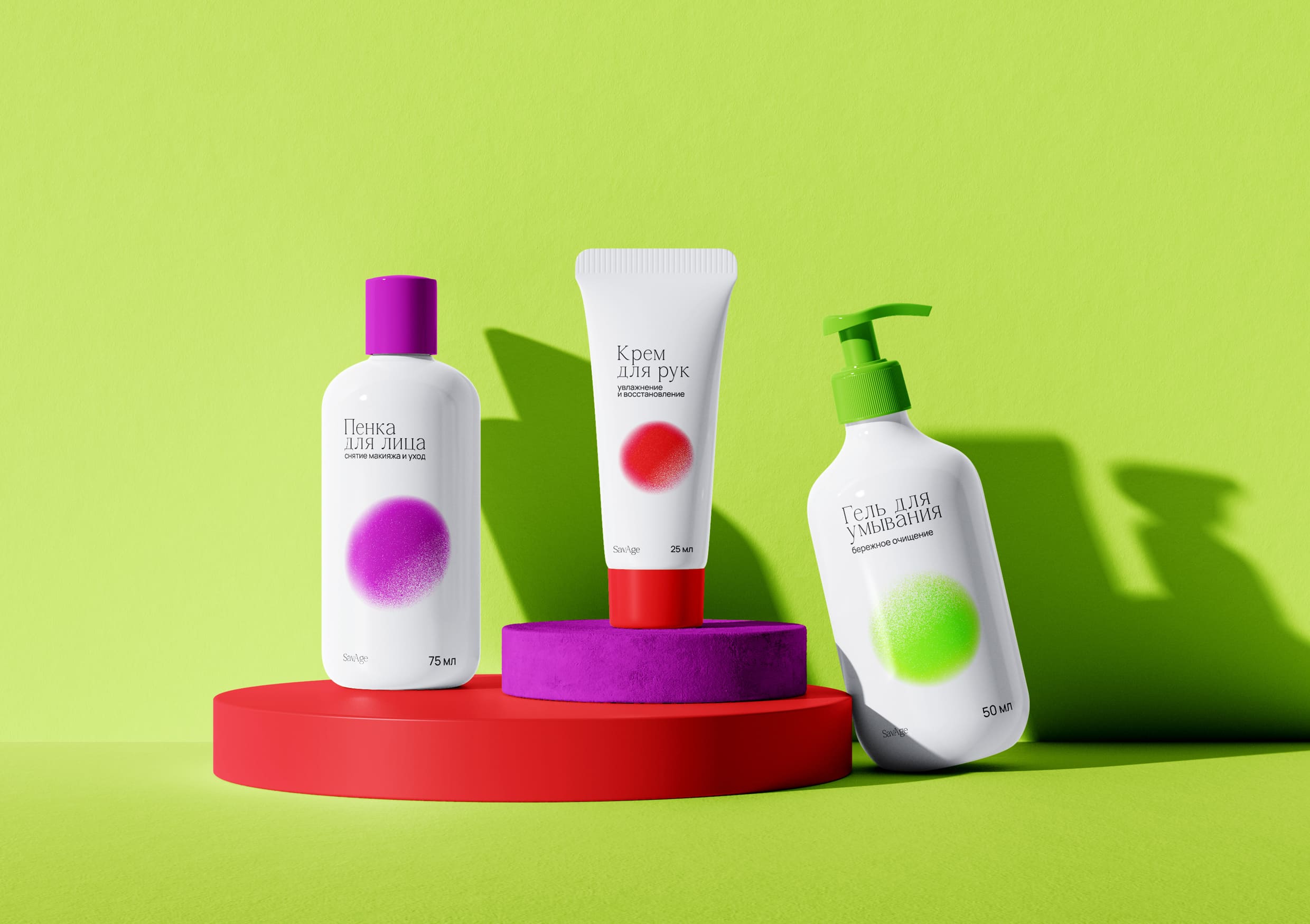
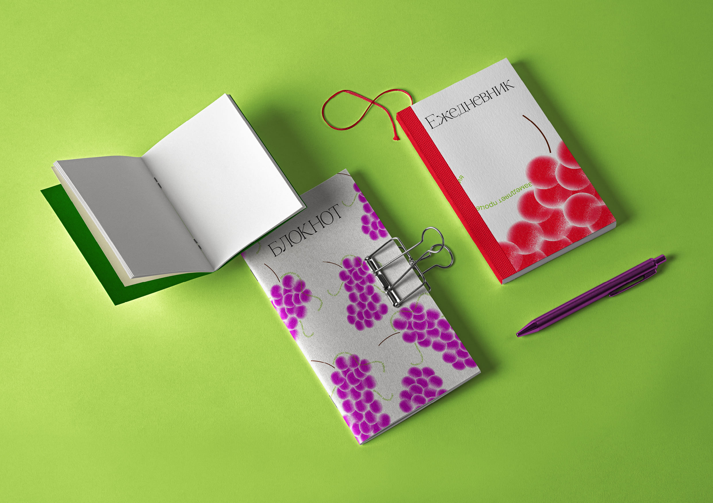
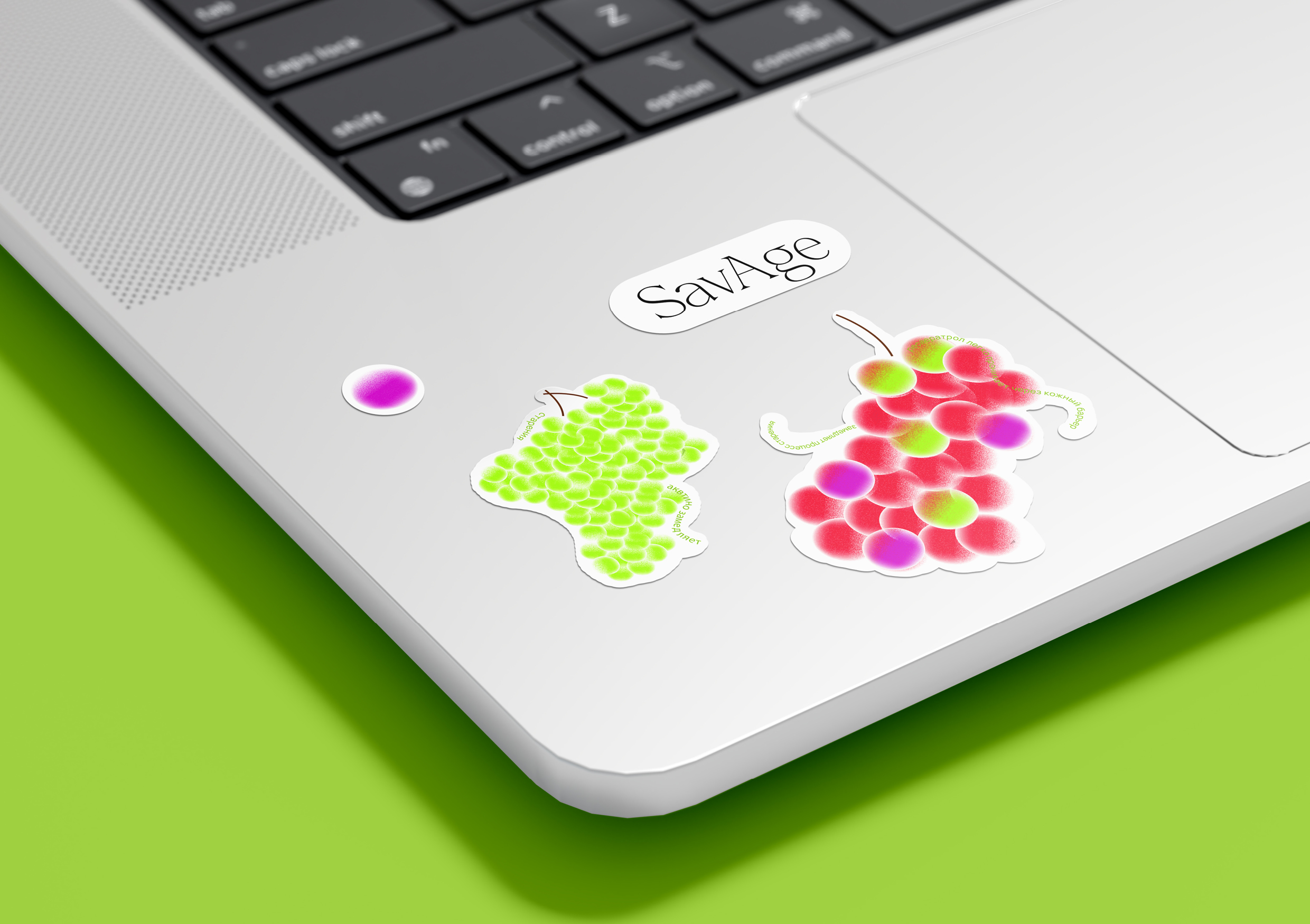
The style is based on a combination of images of grapes and resveratrol molecules, which are similar to each other due to their round shape. The silhouette of resveratrol is made up of grapes, which is complemented by elements such as a graphic twig and a vine from typography, thereby referring to real grapes.
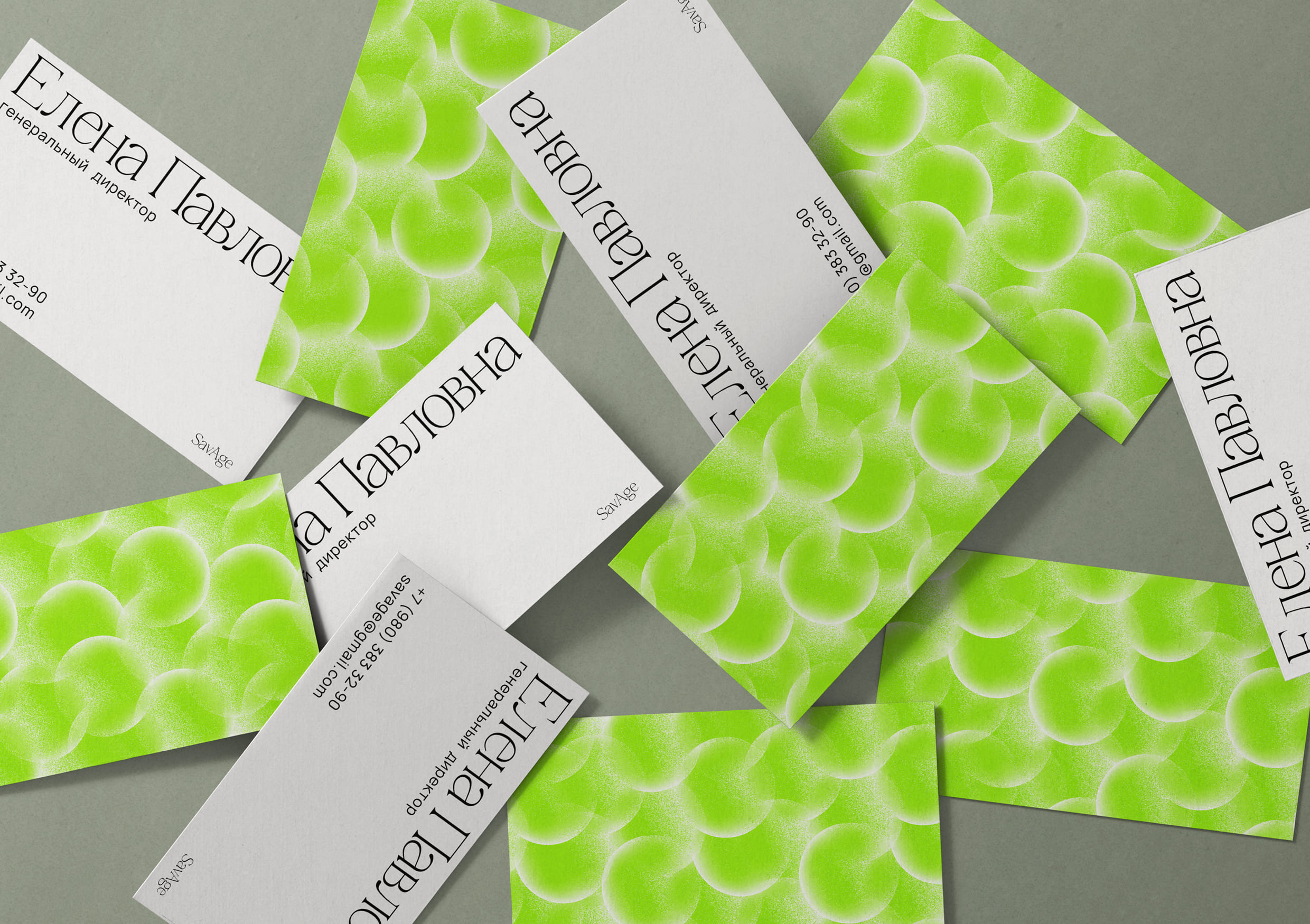
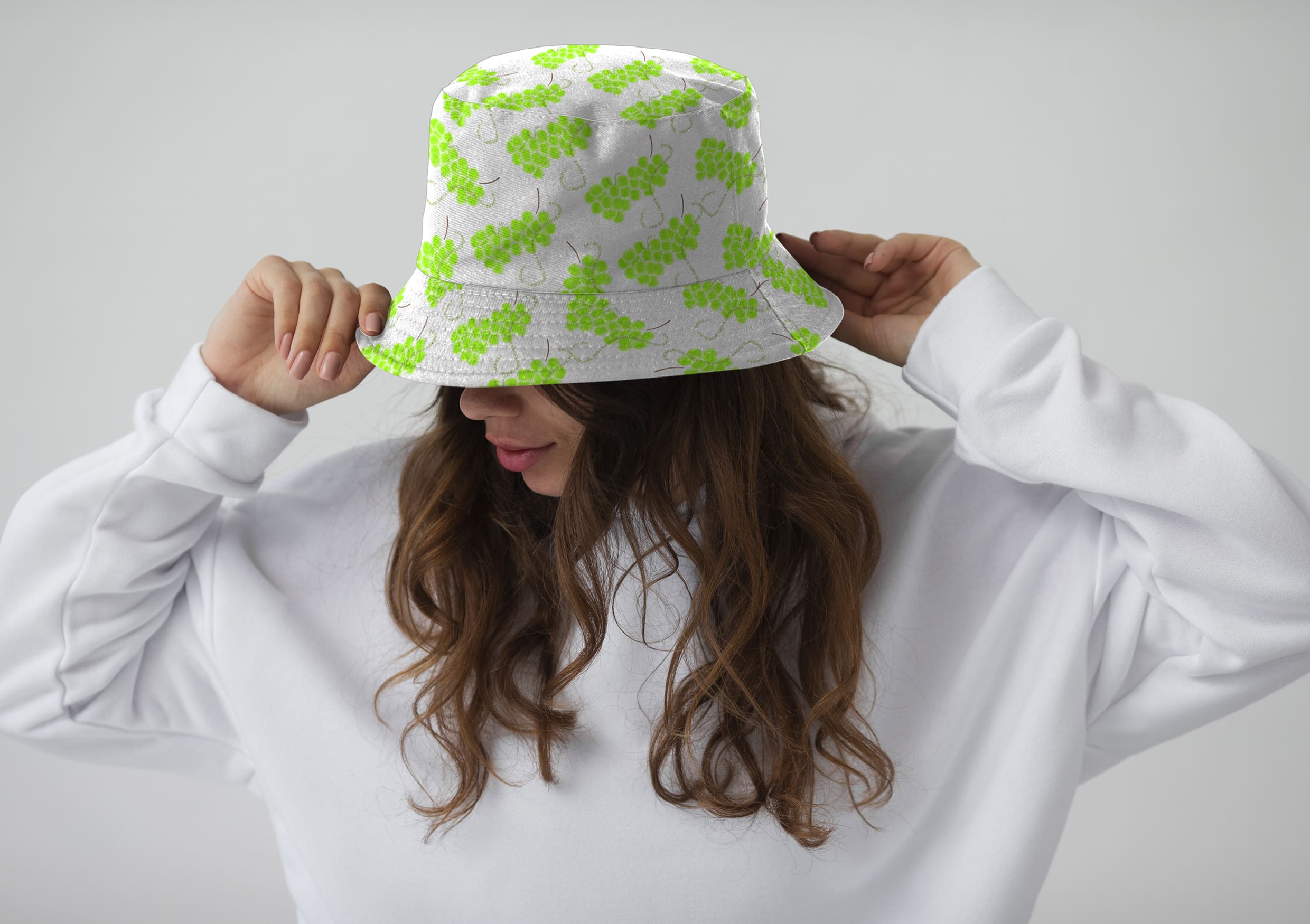
From small clusters, one large one can be collected, and combinations can be absolutely any. Since the products are for girls 30-35 years old, the style is made in bright, juicy colors, namely: green, purple and red. All these are types of grapes, which in further combination are going to form an interesting, fun pattern.
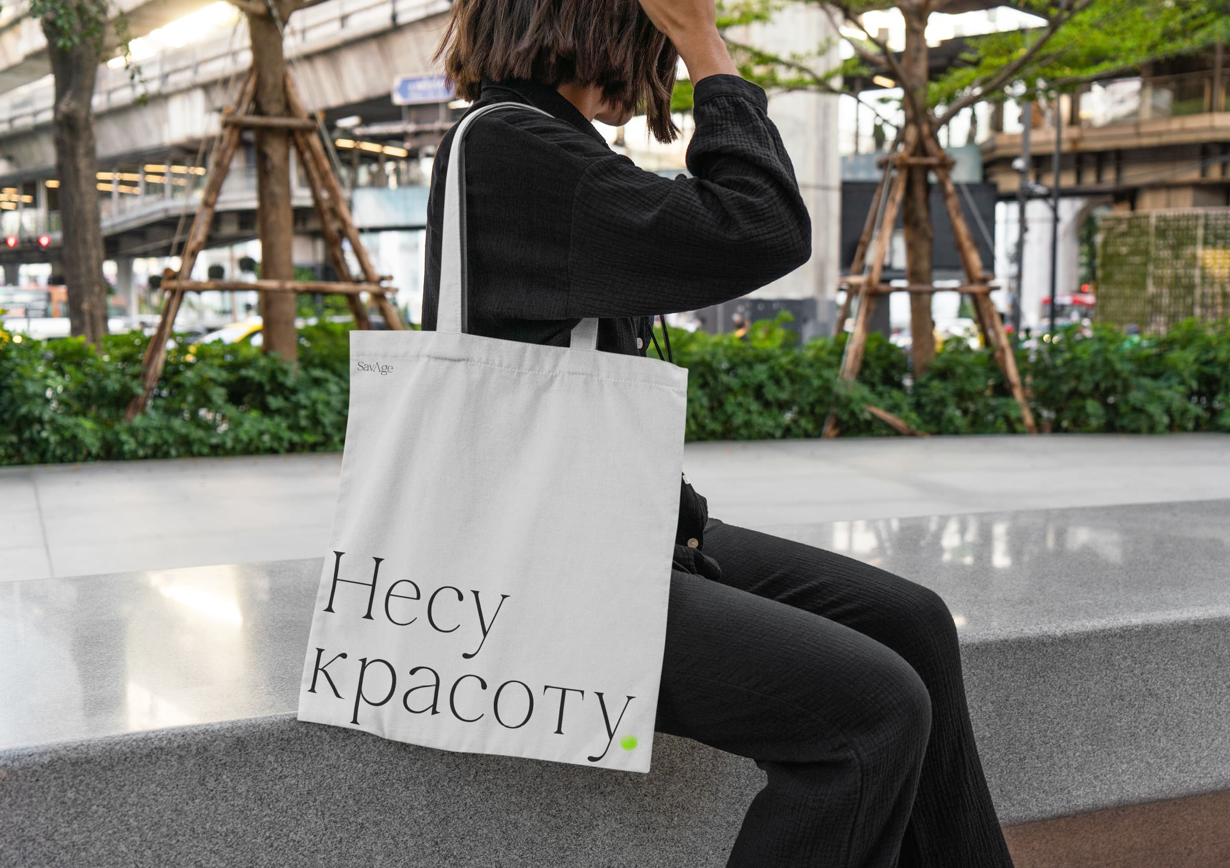
The name of the company is assembled from a game of two words: Save and Age, from which the word “Savage” is obtained, which figuratively has the meaning of rebellion, because usually anti-aging cosmetics are very restrained and not so noticeable. Unlike bright graphics, the company’s logo is typographic, so it is quite simple and concise.
The logo and graphics work together on posters and advertising banners. The logo can also work with a photo or even separately, for example, on signage and other media. The graphics are very flexible and can take different sizes and shapes depending on how appropriate it is. The style also uses phrases that are complemented by a small element in the form of a single grape, which refers to the company.
Special thanks should be given to the Russian Higher School of Economics (HSE Art and Design School) and personally to the tutor Tanya Dunaeva.

CREDIT
- Agency/Creative: Katya Nadina
- Article Title: Student Concept for Savage Brand Identity by Katya Nadina
- Organisation/Entity: Student
- Project Type: Identity
- Project Status: Non Published
- Agency/Creative Country: Russia
- Agency/Creative City: Katya Nadina
- Market Region: Global
- Project Deliverables: Brand Identity
- Industry: Beauty/Cosmetics
- Keywords: Katya Nadina Brand Identity Concept Savage
-
Credits:
Tutor: Tanya Dunaeva


