What does it mean — ХОБА [hɔba]? When you did something cleverly you can say «hoba» to increase effect and show how dexterous you are.
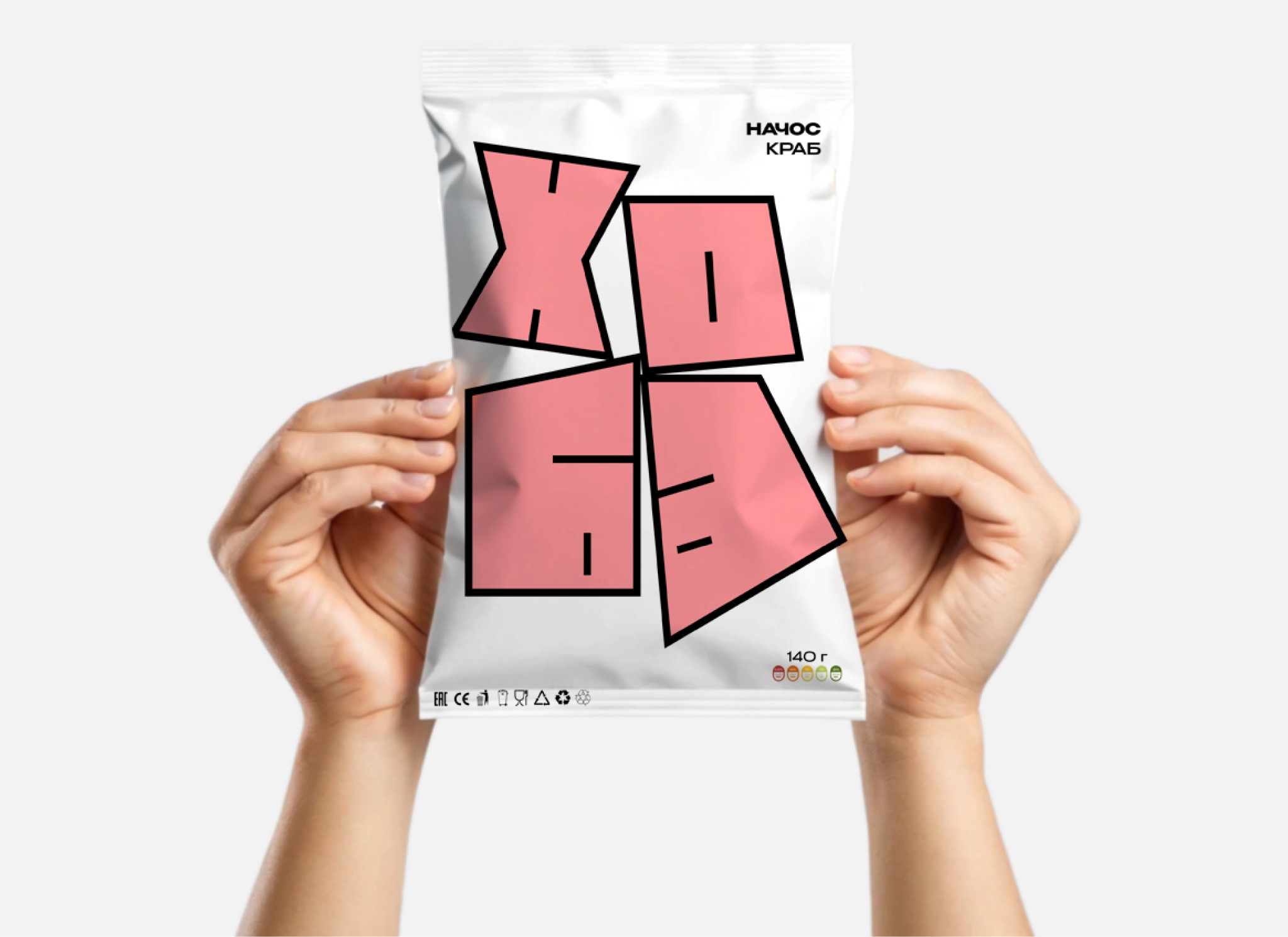
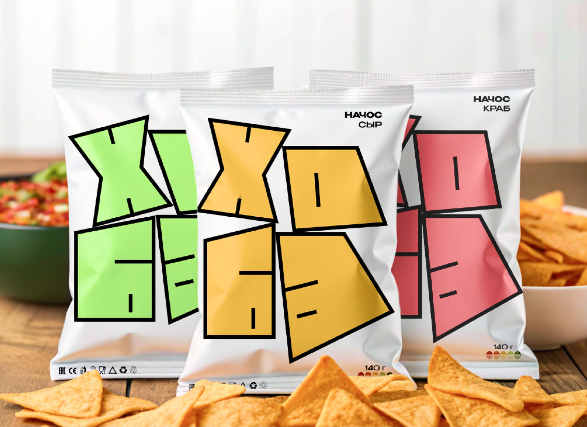
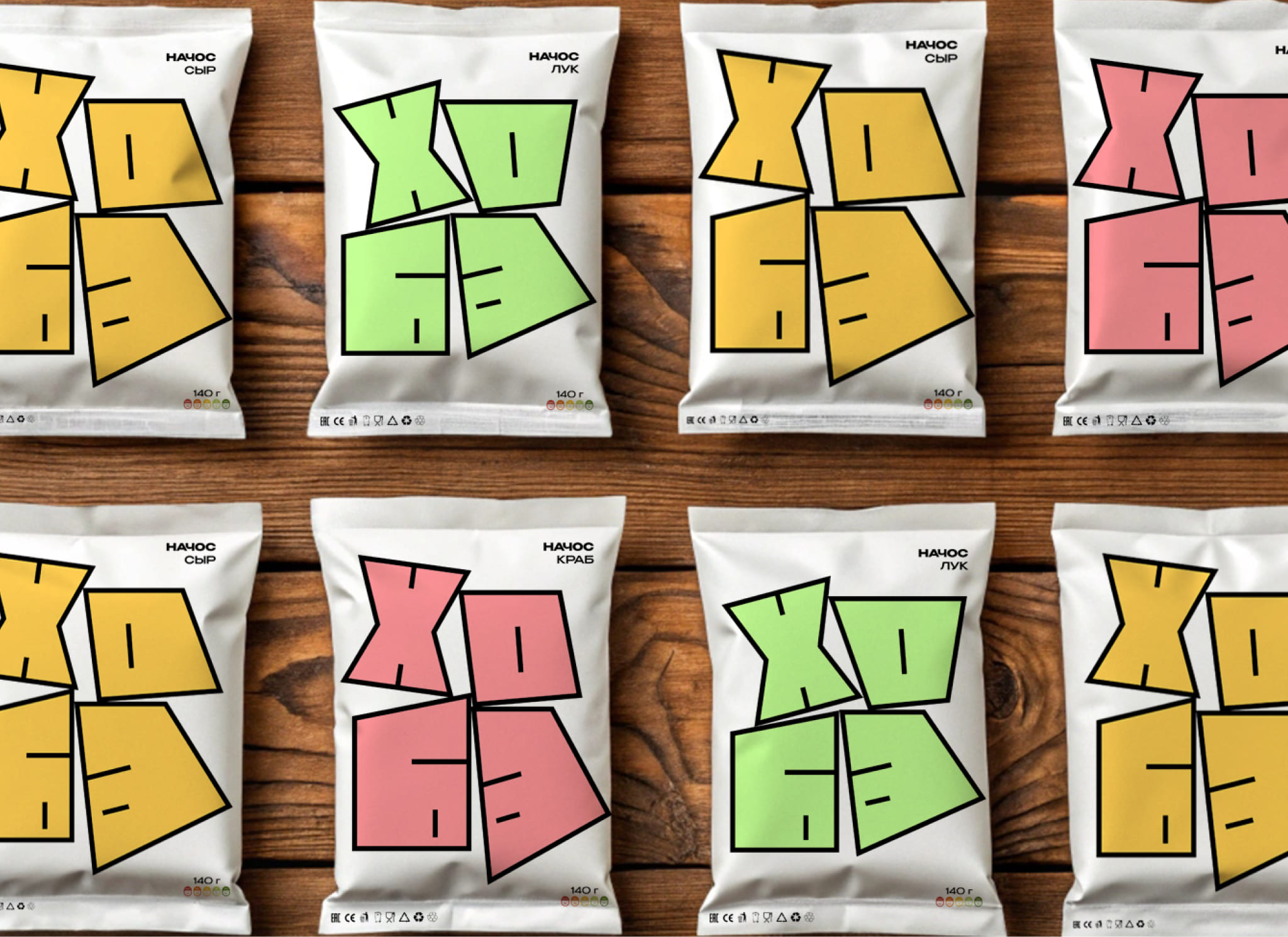
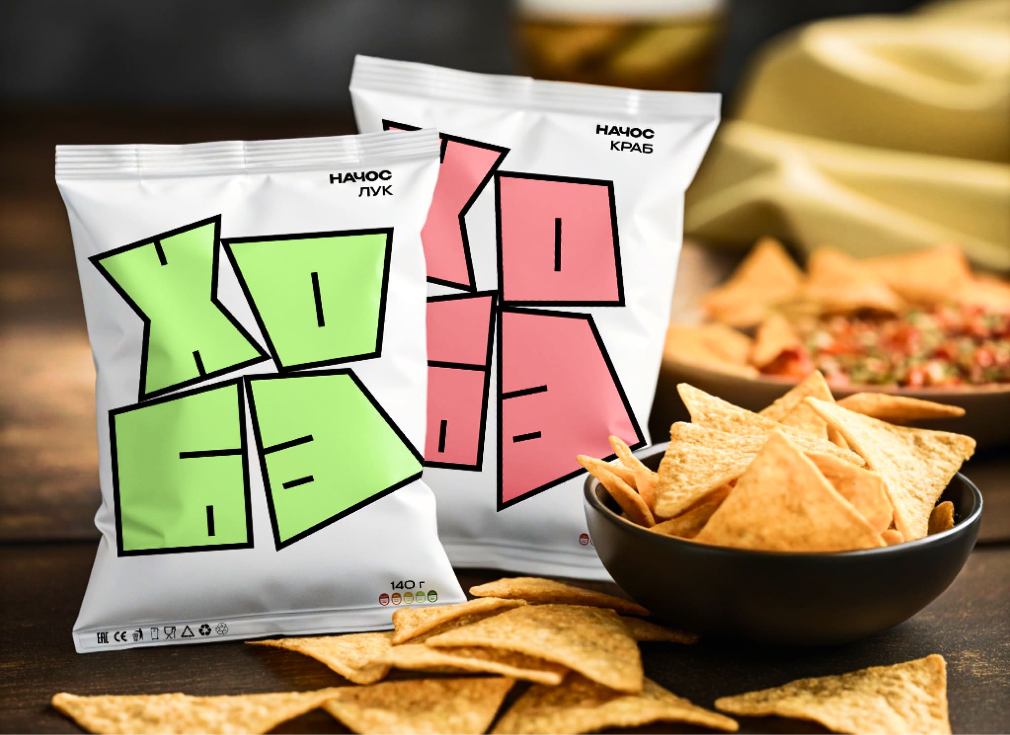
The «hoba» nachos packaging is designed to be both eye-catching and memorable. The unusual logo placement, combined with vibrant colors and unexpected geometry, will communicate the brand’s playful personality and the deliciousness of the product, creating a strong shelf presence that encourages impulse purchases. The design will convey the brand’s message clearly and effectively: «hoba» it’s unexpectedly good.
Instead of relying on predictable rectangular shapes, the pouch will subtly incorporate unexpected angles and folds, mimicking the irregular, almost haphazard, yet ultimately satisfying nature of nachos. This playful asymmetry complements the «HOBA» logo, which appears to dynamically burst forth from the packaging, further enhancing the sense of unexpected deliciousness. The bag’s material chosen to feel substantial and high-quality, reflecting the premium nature of the nachos inside. The back of the packaging will feature simple, bold typography detailing the ingredients and nutritional information, maintaining the overall minimalistic design aesthetic while providing necessary information clearly and concisely.
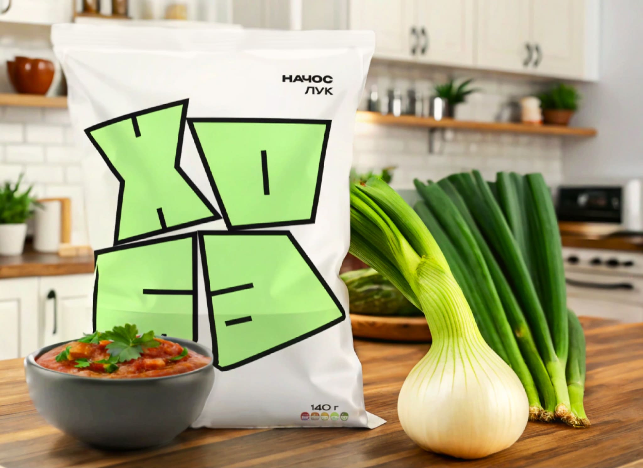
The overall color scheme, though vibrant, carefully selected to avoid overwhelming the consumer and to complement the chosen nacho flavor, enhancing the appetite appeal. The result will be a package that is both eye-catching and informative, reflecting the unexpectedly delicious experience awaiting the consumer. Ultimately, the «HOBA» nachos packaging aims to be more than just a container; it’s a bold statement and an extension of the brand’s playful, unexpectedly delicious personality.

CREDIT
- Agency/Creative: Yegor Bilyk
- Article Title: Student Concept for Hoba Nachos Packaging Design Created by Yegor Bilyk
- Organisation/Entity: Student
- Project Type: Packaging
- Project Status: Non Published
- Agency/Creative Country: Russia
- Agency/Creative City: Moscow
- Market Region: Global
- Project Deliverables: Art Direction, Branding, Packaging Design
- Format: Pouch
- Industry: Retail
- Keywords: Nachos, Design, Packaging design, Pouch
-
Credits:
Curator: Leonid Slavin


