Aurora is a beauty product brand that supports and empowers survivors of domestic violence through the donation of products, starting conversations, and sharing resources. 1 in 4 women experience some form of domestic abuse. Due to the emotional trauma of these situations, many survivors have lost sight of their confidence and self-worth, even after leaving these situations. Research has shown that donations of beauty products, such as lipstick or lipgloss, can serve a very impactful purpose in bringing positive light into their lives and helping women find their own inner beauty once again.
However, domestic violence is not a topic frequently talked about in the beauty industry, despite the positive impact makeup can have. This brand uses its platform and position in the beauty industry to bring this topic to a more public light, encouraging conversations and releasing the stigma on this topic; as well as using its products for good by donating select items through each purchase.
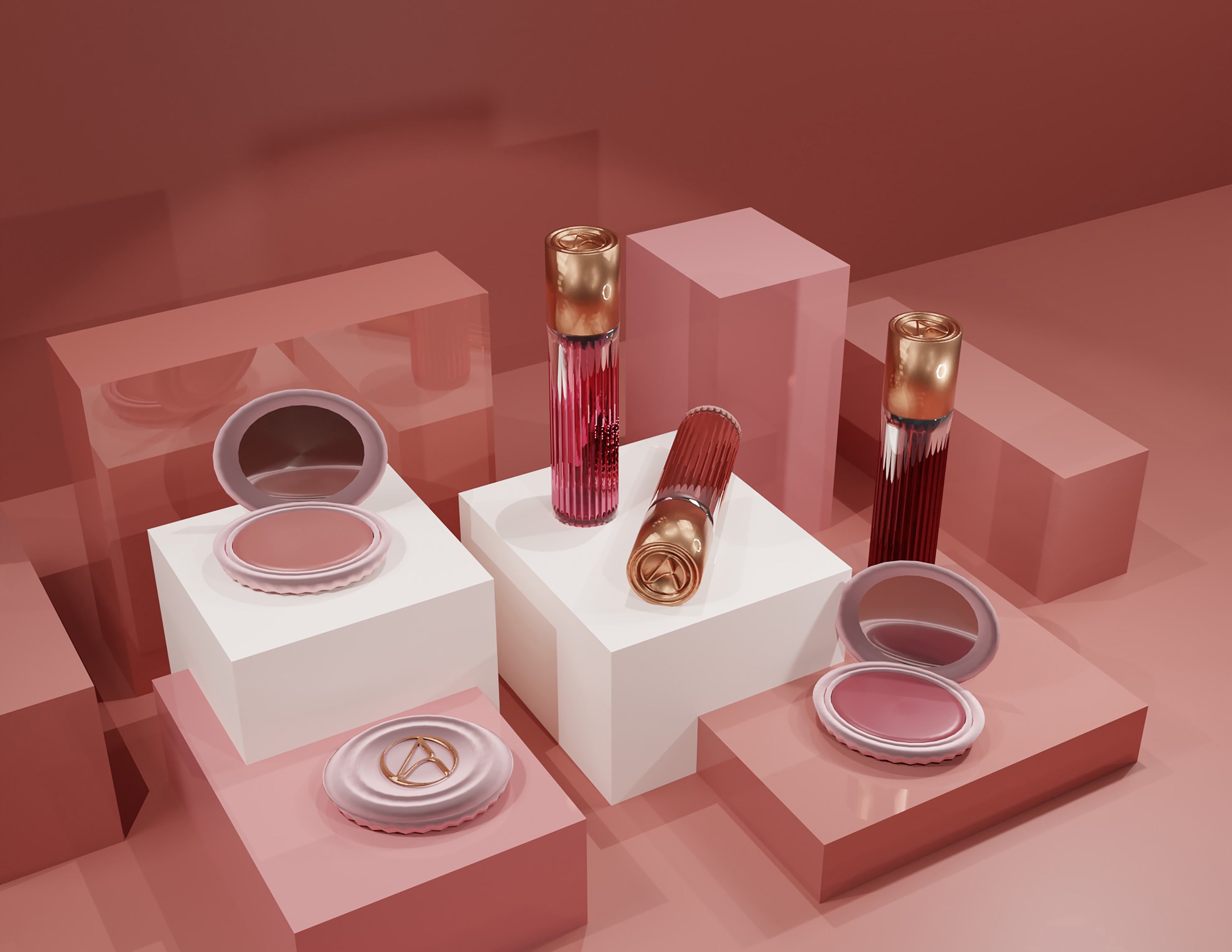
The products are designed to reflect the mission of the brand and to stand out from competitors. They use subtle design features pulled from Greek Ionic columns, like the ribbed column structure and the circular detail, or volute, from the top. The references to ionic columns are designed to symbolize feminine energy, strength, and perseverance. These notions are utilized on all product designs to create a cohesive style. These products use the logo symbol rather than the wordmark to compliment the structural design, attaching the brand identity without sacrificing the overall power of the design itself.
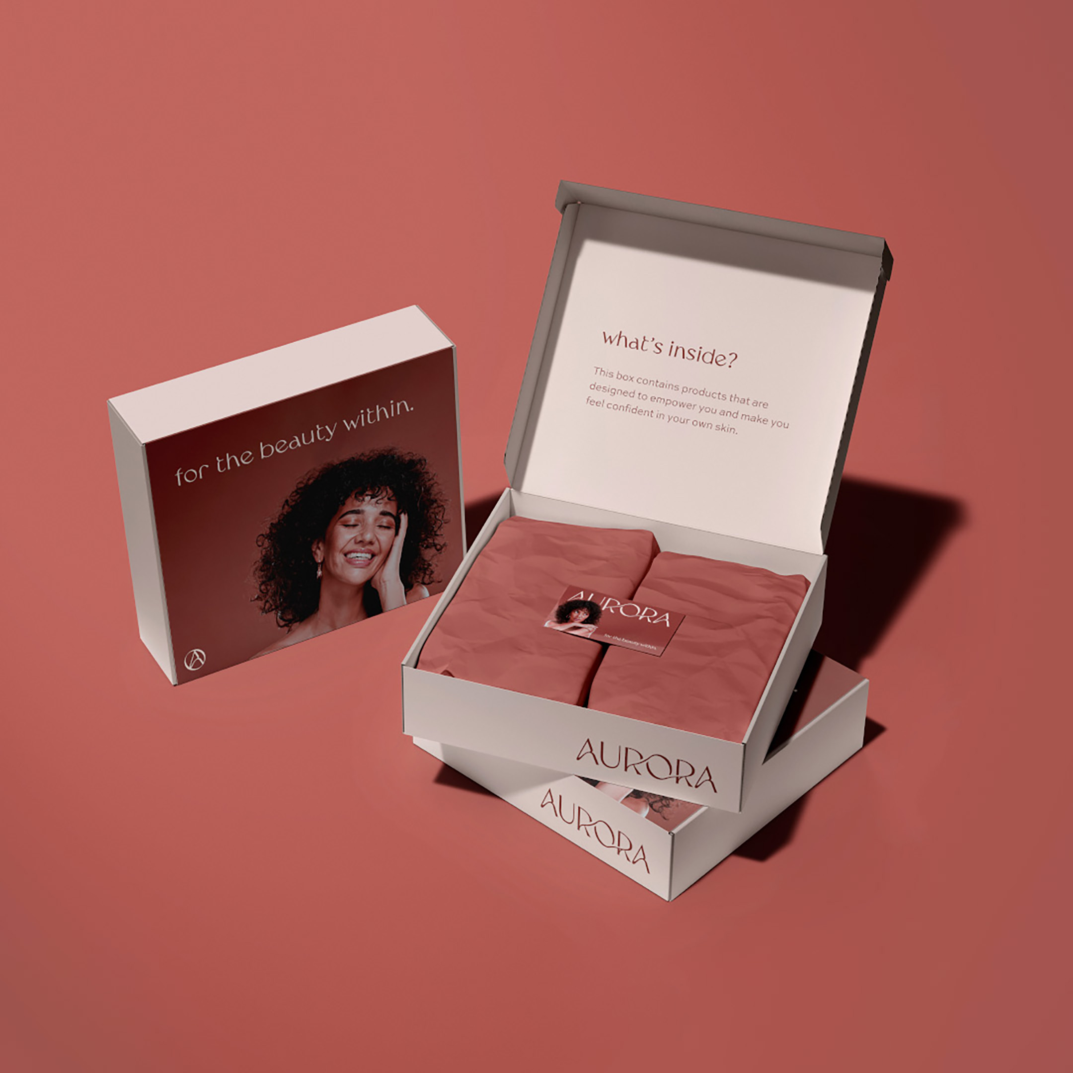
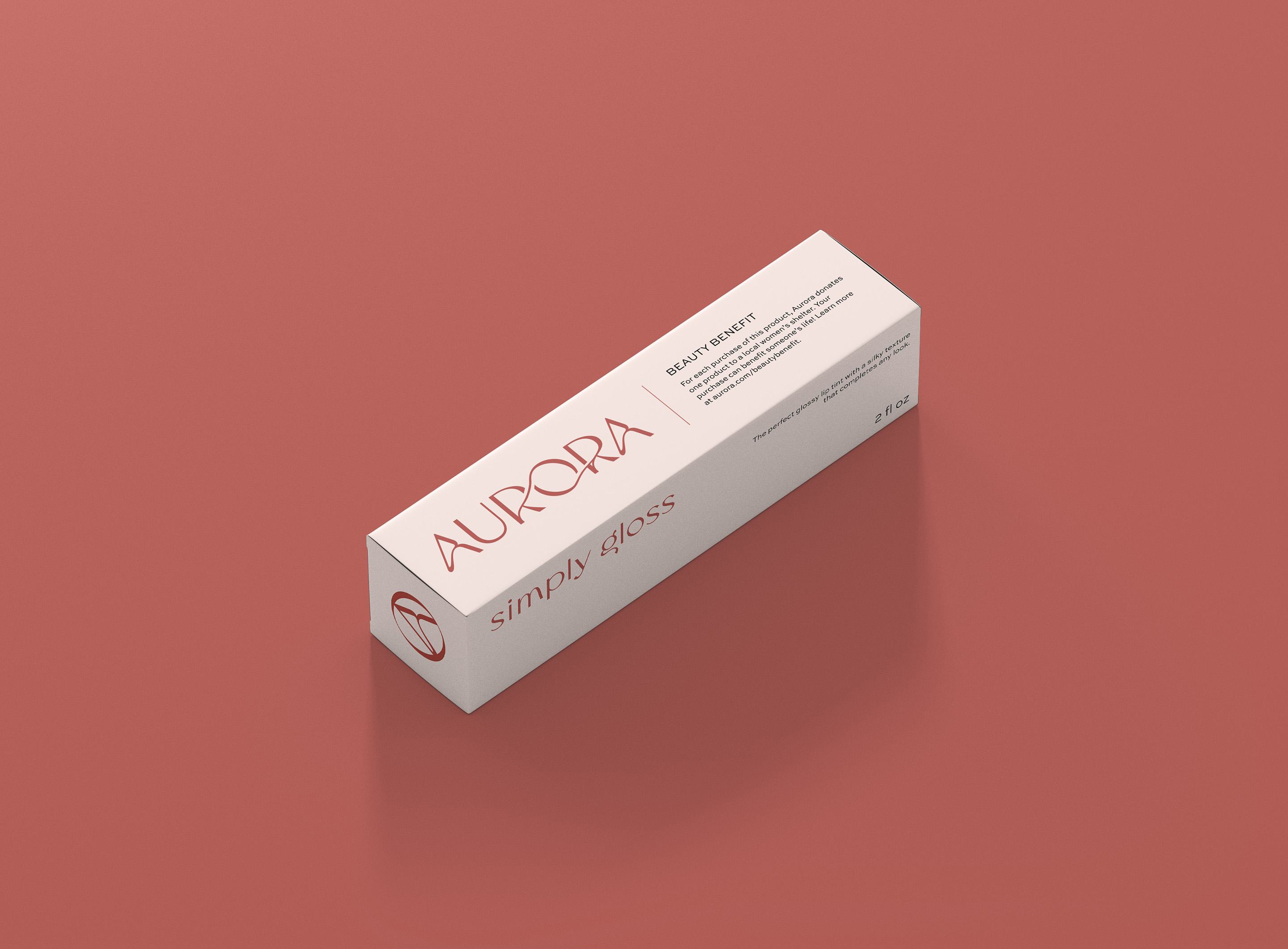
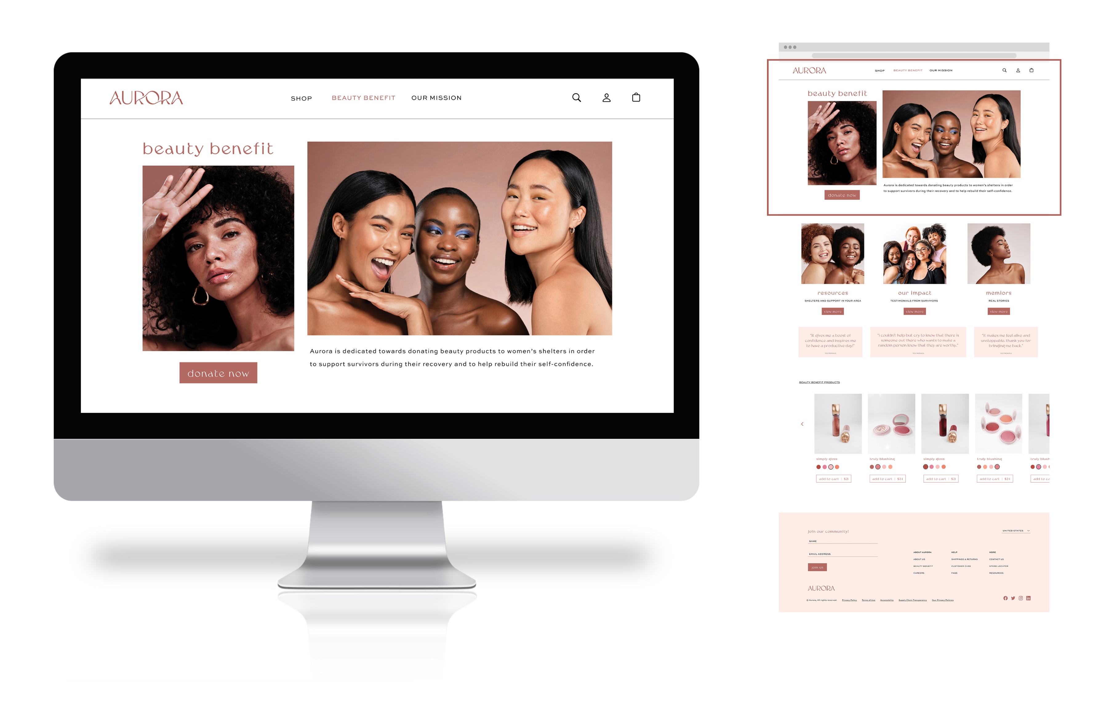
The Beauty Benefit promotes education and resources for survivors of domestic violence through sharing real stories and donating products. Aurora donates several of its products to local women’s shelters with each purchase of one of the selected items. These products are identified on packaging and on the website as “Beauty Benefit Products,” which includes information on how the process works. This is also utilized throughout majority advertising campaigns to identify the main mission of Aurora.
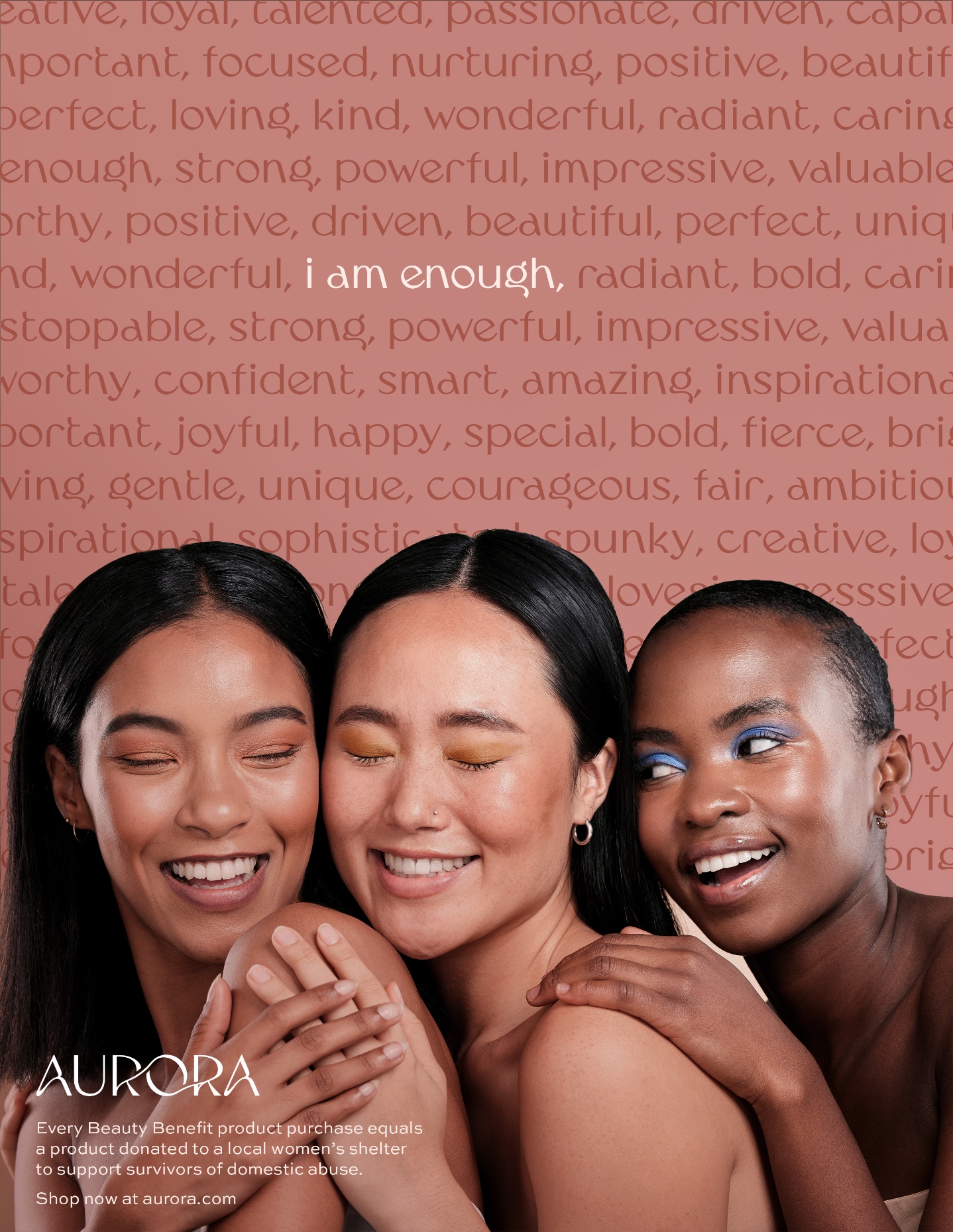
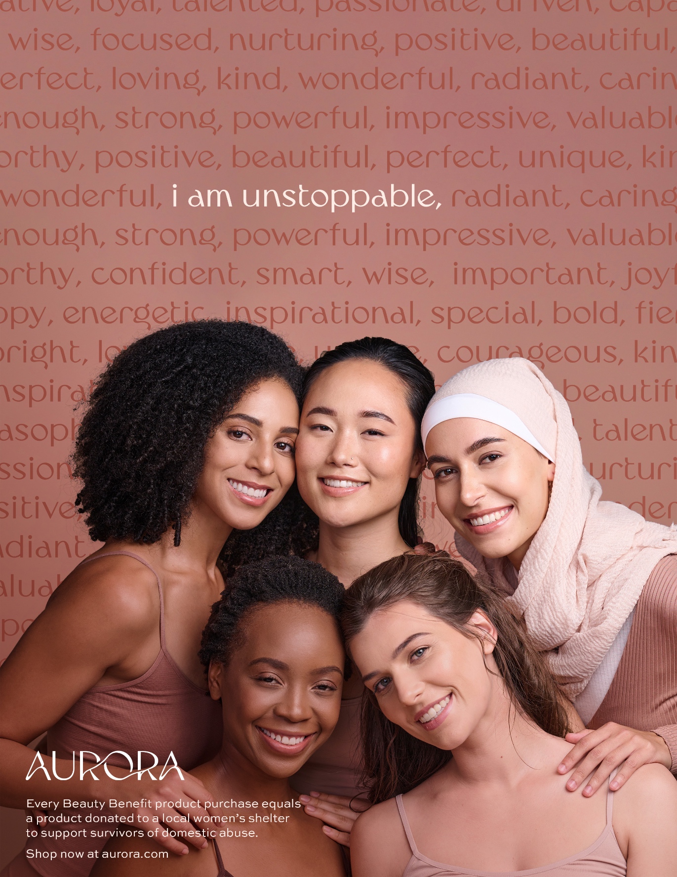
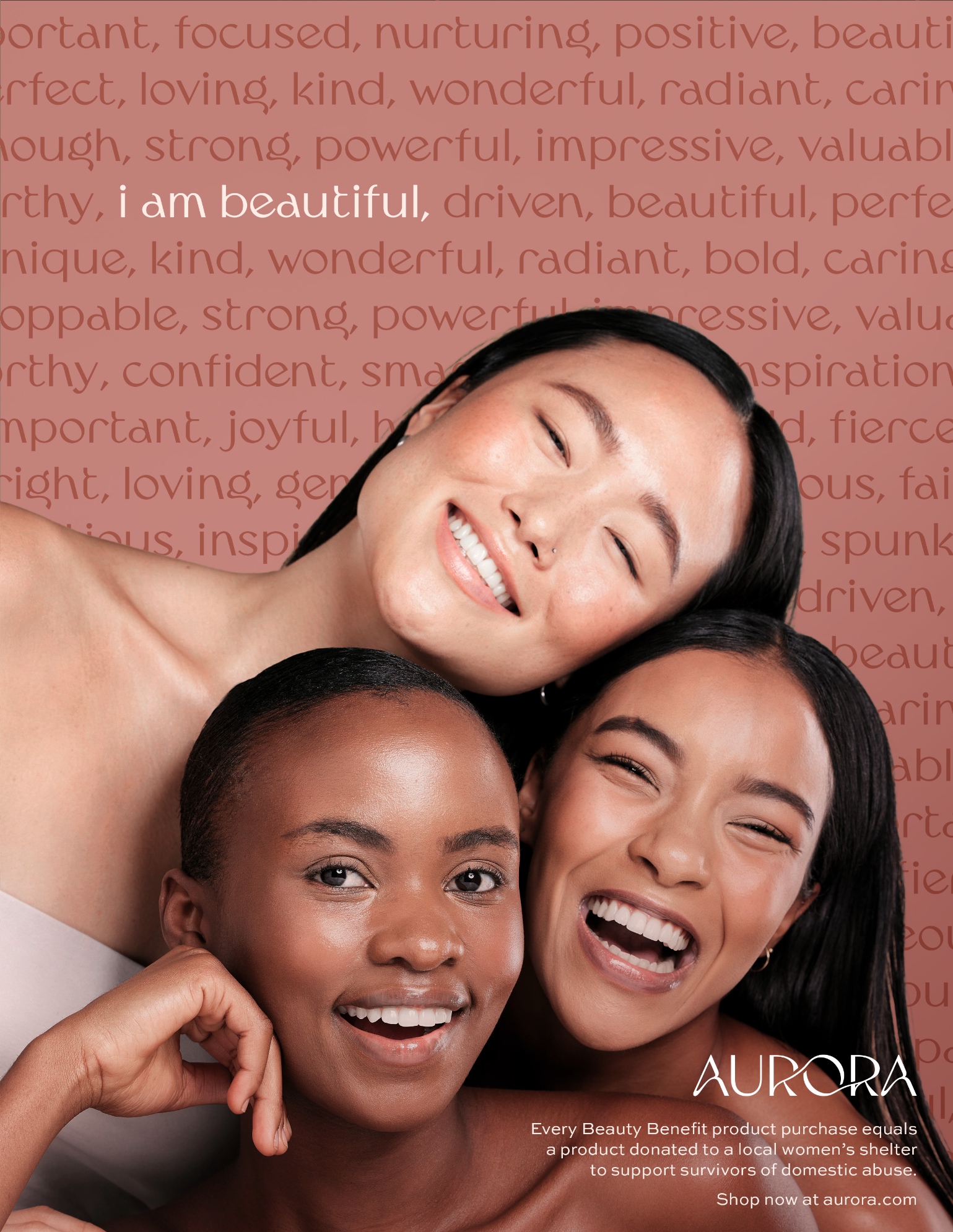
The main advertising campaign promotes the main message of Aurora’s brand rather than the products itself. It encourages viewers to see their own self-worth and grow in their own confidence. The tagline “I am…” is used in several different ad designs, followed by a series of adjectives with one specific word highlighted. It is phrased as “I am…” so that when the viewer is reading it, they are internally saying it to themselves.
This ad campaign is used on several different platforms, like print, social media, and public signage. For large platforms, such as billboards, the copy is reduced to the brand’s main tagline: “For the beauty within.” This is meant to represent how it is not the makeup itself that makes you beautiful, it is simply a tool which you can use to find that beauty already within yourself and build confidence in your own skin.



CREDIT
- Agency/Creative: Abigail Lund
- Article Title: Student Brand Identity Concept for Aurora Beauty Products
- Organisation/Entity: Student
- Project Type: Identity
- Project Status: Non Published
- Agency/Creative Country: United States
- Agency/Creative City: Fort Worth
- Market Region: North America
- Project Deliverables: Brand Identity
- Industry: Health Care
- Keywords: WBDS Student Design Awards 2023/24
- Keywords: Identity, Brand Design Creation
-
Credits:
Educational Institution: Texas Christian University
Educator's Name: Dusty Crocker


