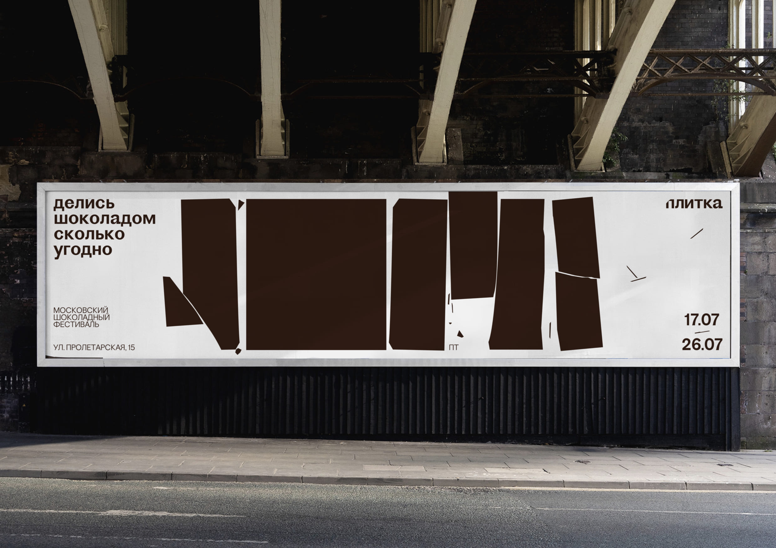
Plitka is the first major chocolate festival in Russia, which takes place in Moscow. In addition to tastings and master classes from world-famous chocolatiers, festival guests will be able to see chocolate sculptures, chocolate painting and even chocolate clothes.
Naming «Plitka» — chocolate «bar» translated into Russian language
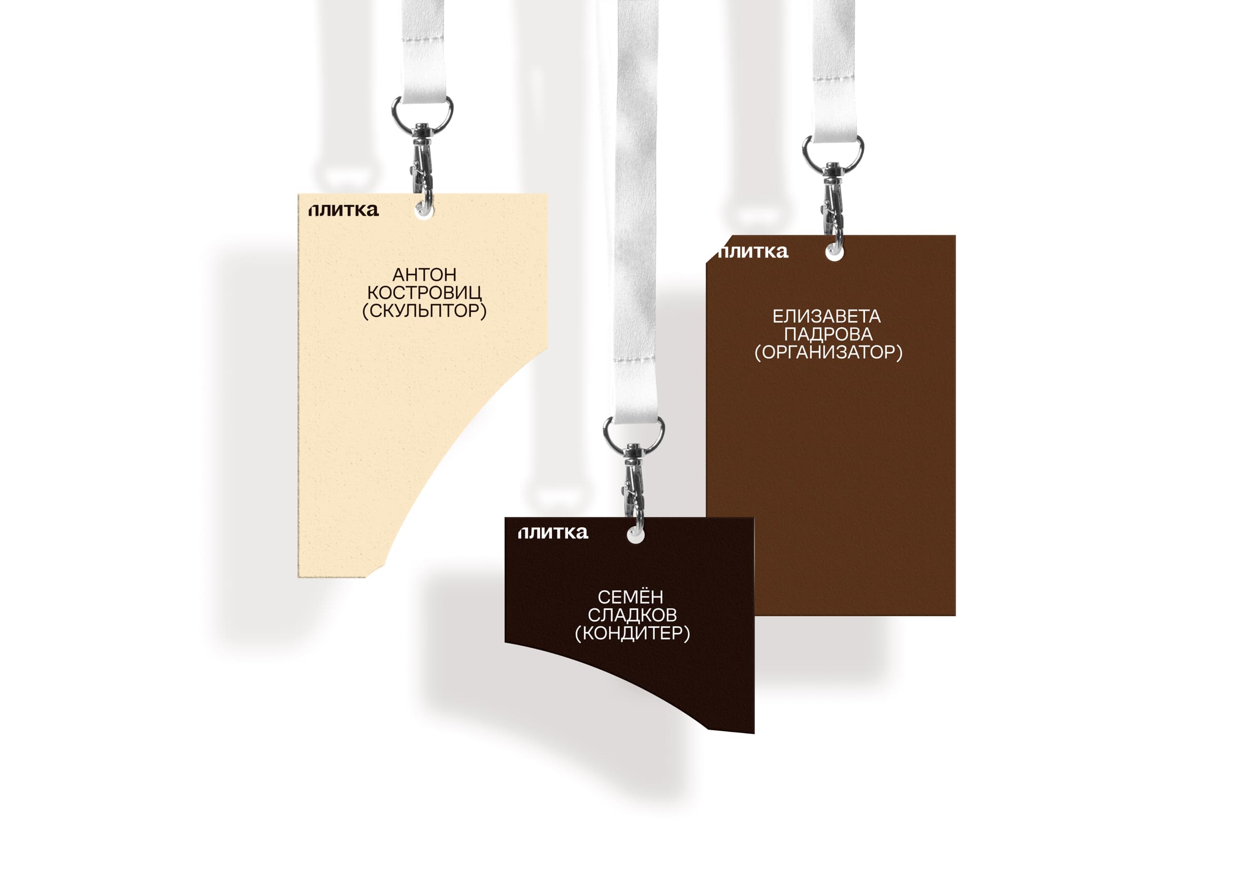
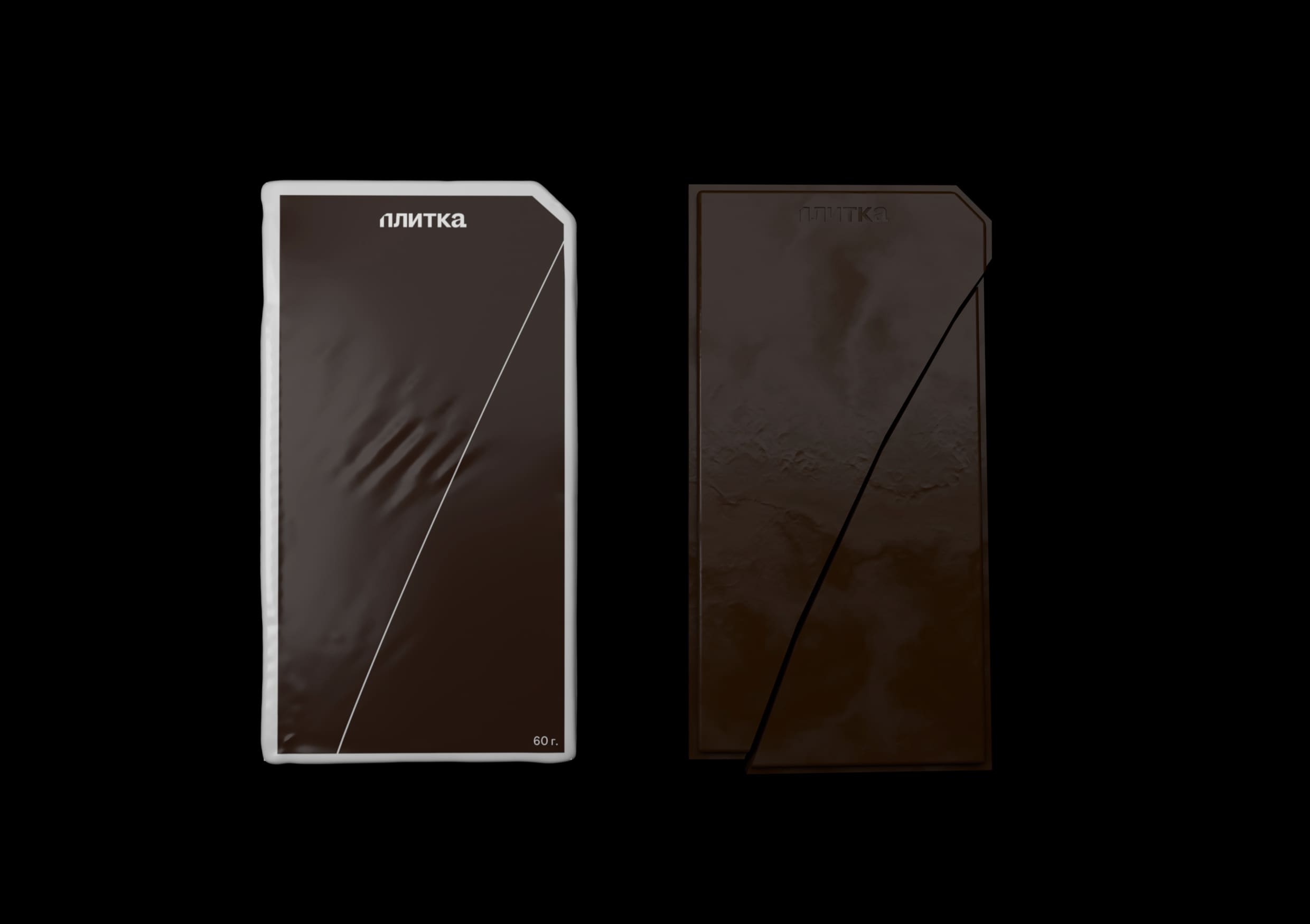
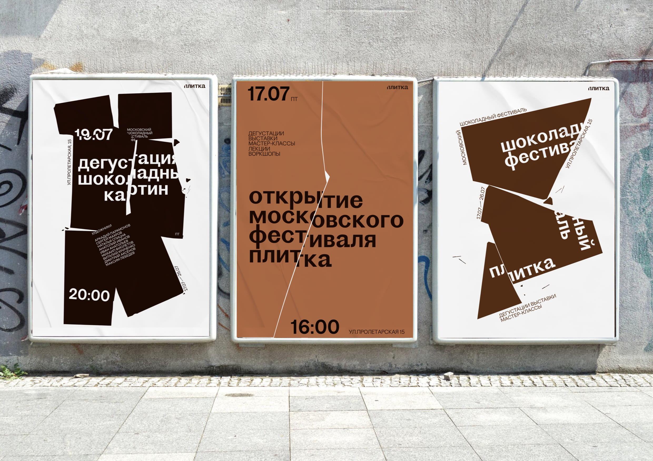
The logo imitates the mechanics of breaking off a chocolate bar. In order for the logo to be scalable and easy to read on large and small formats, only a small part of the letter “p” is chipped off.
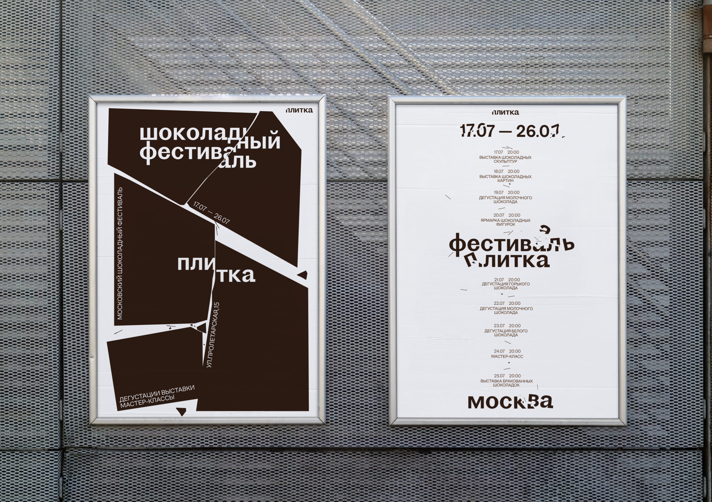
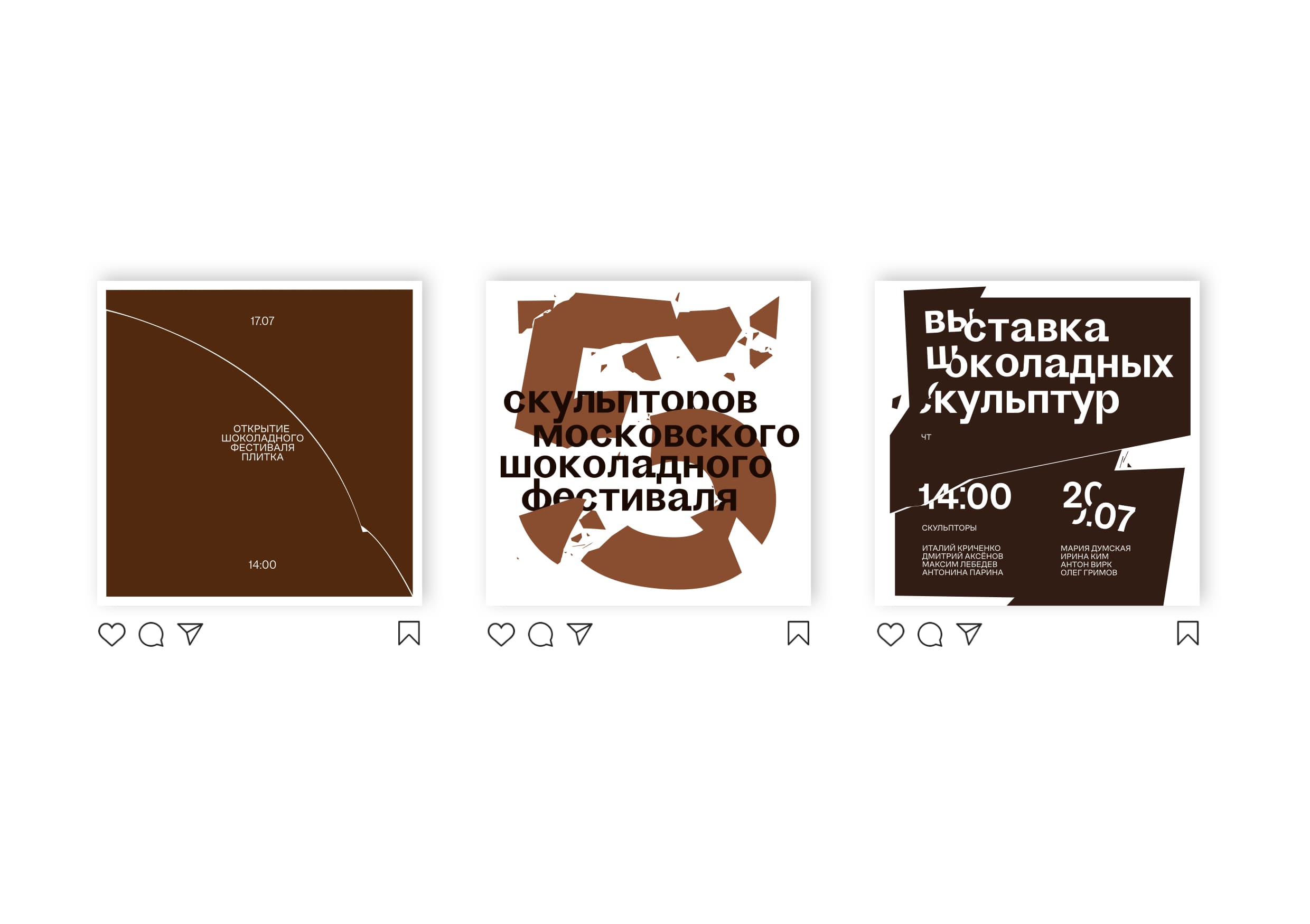
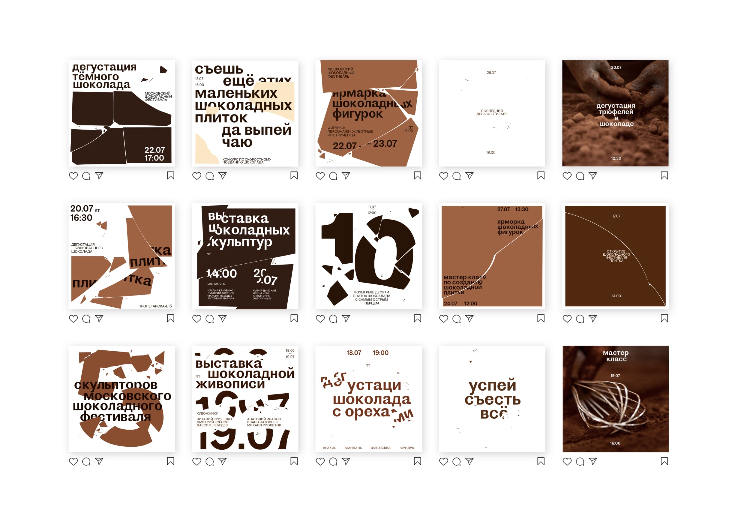
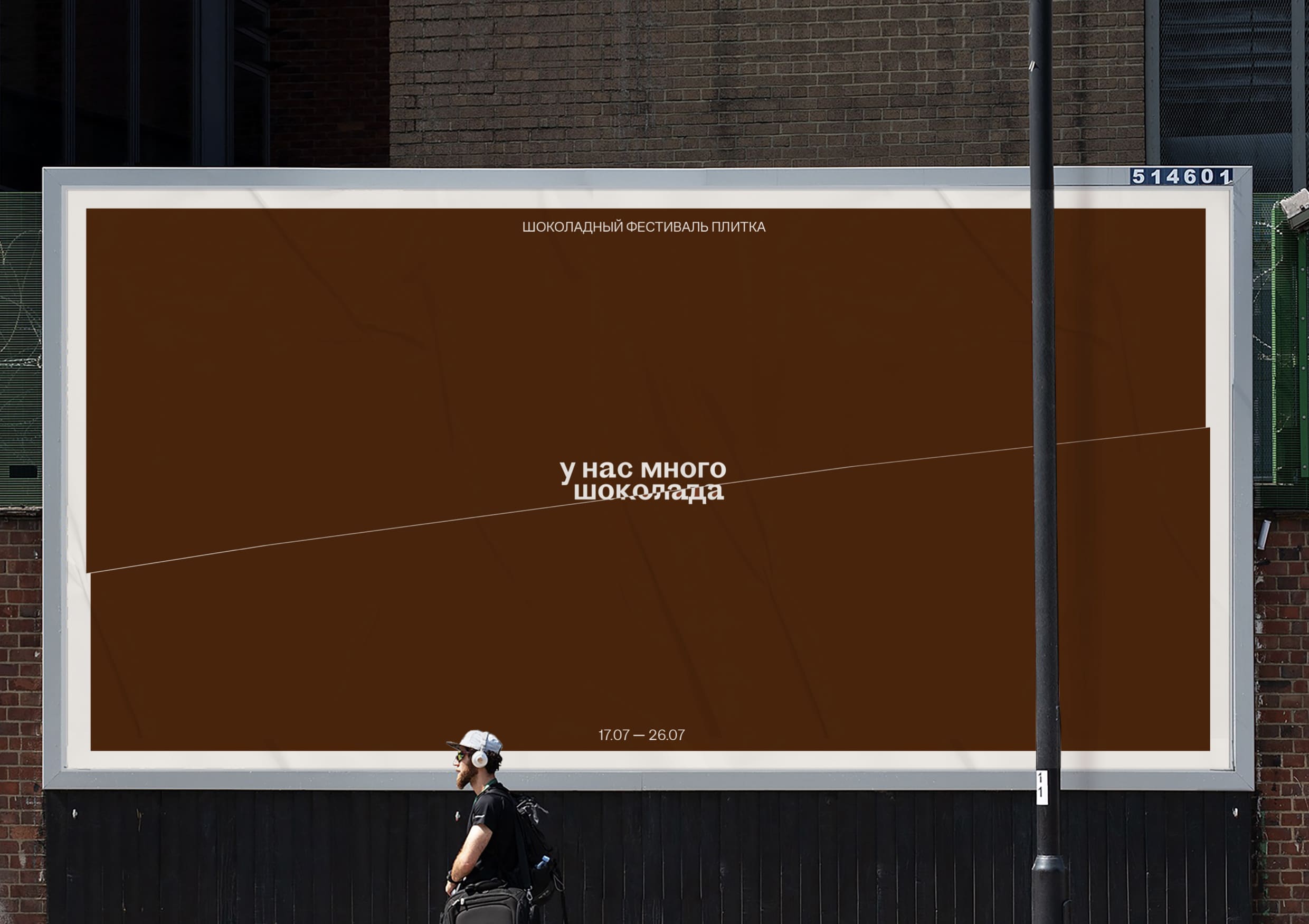
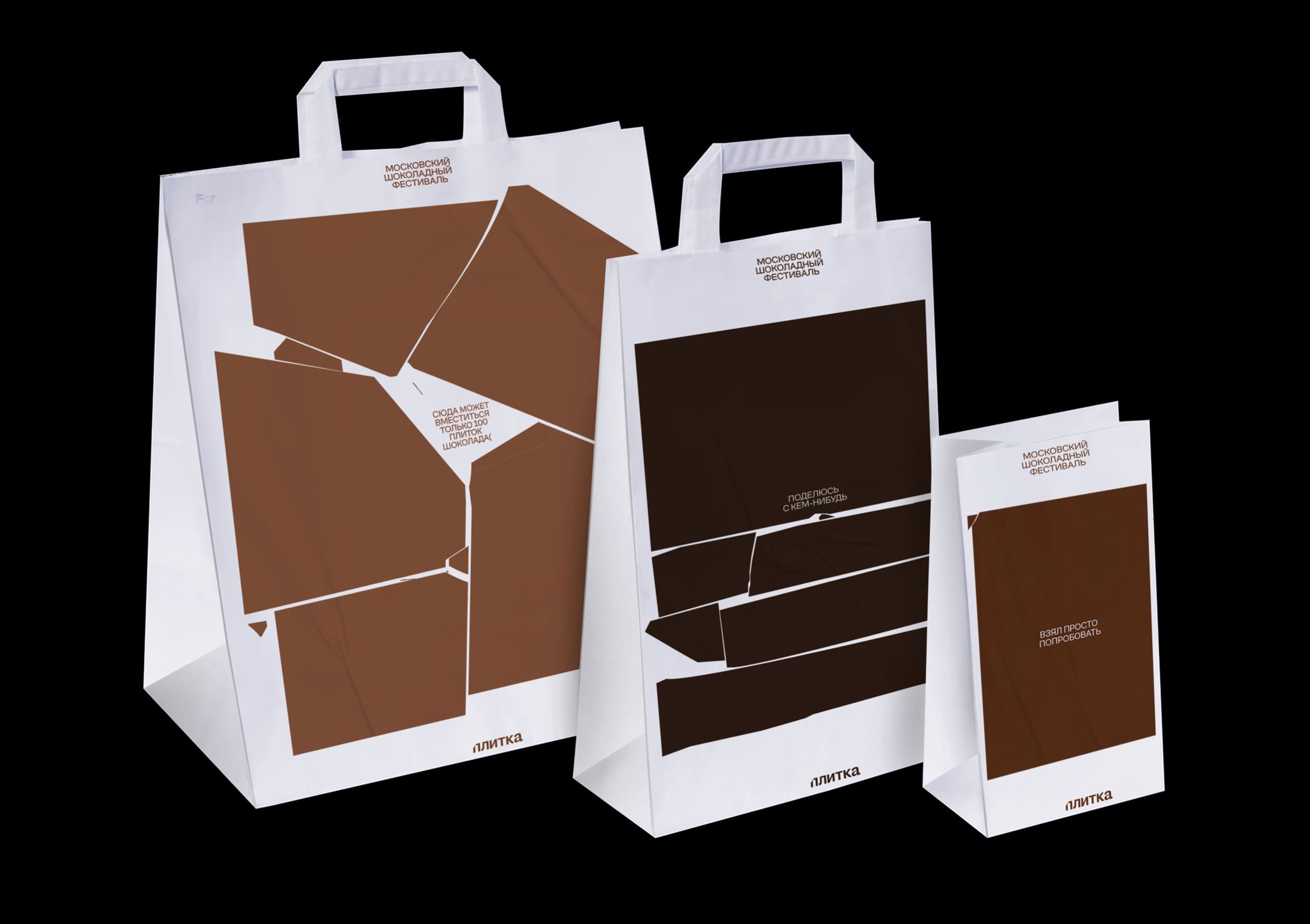
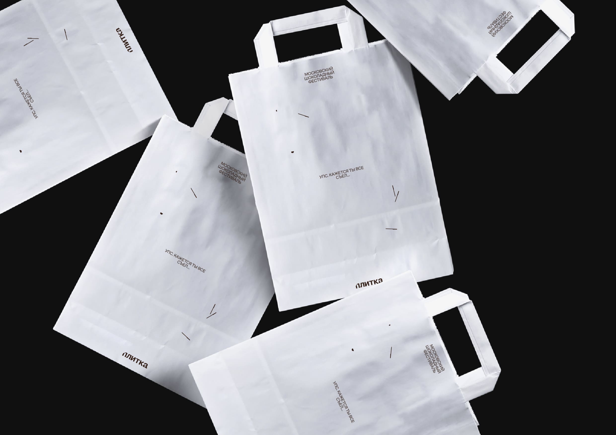
The identity is based on the main slogan of the festival “chocolate is enough for everyone”. Therefore, the graphics are based on all kinds of eating chocolate: you can chip it, cut it, crumble it — it will not end anyway. The range of using this technique in graphics is quite wide: from breaking off a small piece for tasting, to breaking the whole chocolate bar. You can also use this method and chip typography. Sometimes only chocolate crumbs may remain on the layout, what complemented by copyrights. For example «The final day of the festival». Graphics are often complemented by copyrights. For example, a large-format poster might show a chocolate bar with one break and the copyright “we have a lot of chocolate.”
The colors in the identity are the most common types of chocolate around the world: dark, milk and white chocolate. Moreover, their shades are used to maintain the feeling of an abundance of types of chocolate at the festival.
Proto grotesk and Сofo sans are used as corporate fonts. Proto grotesk is used for titles and dates. It was chosen because of the characteristic shape in some glyphs: for example, in the number 7, the lower serif ends as if a piece had been chipped off of it. Cofo sans is used for body text.
CREDIT
- Agency/Creative: Timofey Kirin
- Article Title: Student Brand Design Concept for Chocolate Festival Plitka
- Organisation/Entity: Student
- Project Type: Identity
- Project Status: Published
- Agency/Creative Country: Russia
- Agency/Creative City: Moscow
- Market Region: Global
- Project Deliverables: Brand Design, Brand Identity, Branding, Identity System
- Industry: Entertainment
- Keywords: identity, chocolate festival
-
Credits:
curator: Evgeny Kashirin


