Barra’s Graphic Style
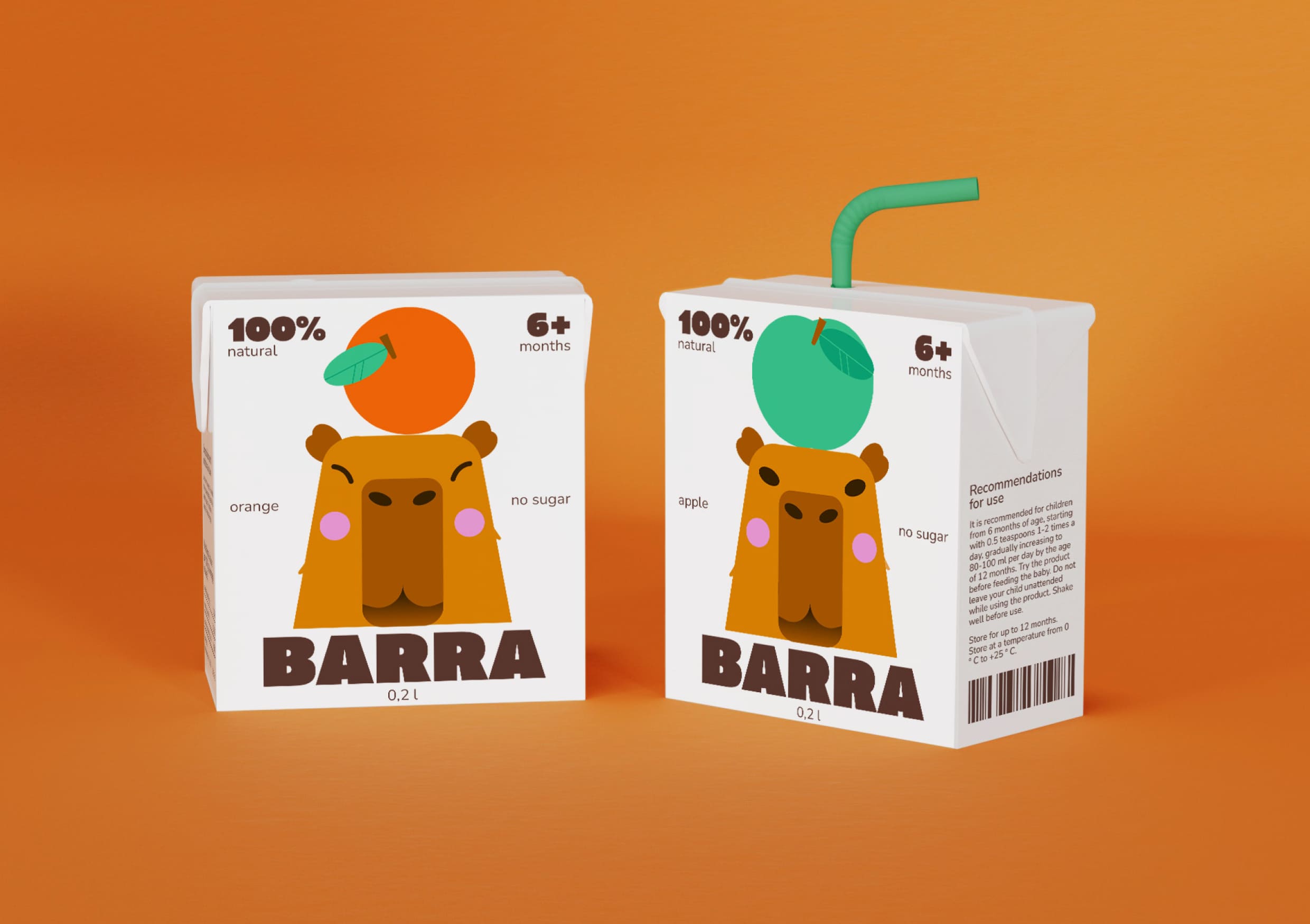
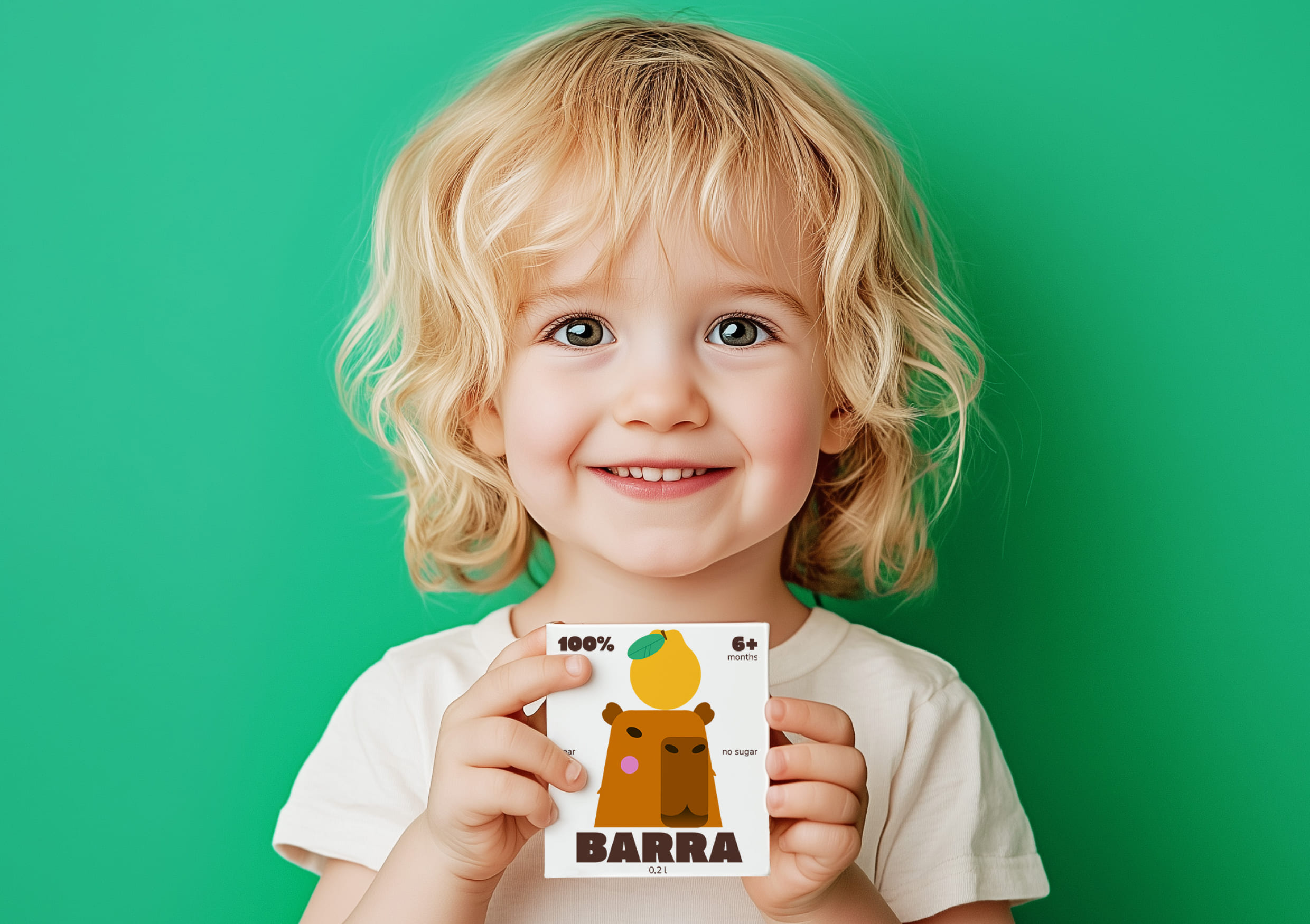
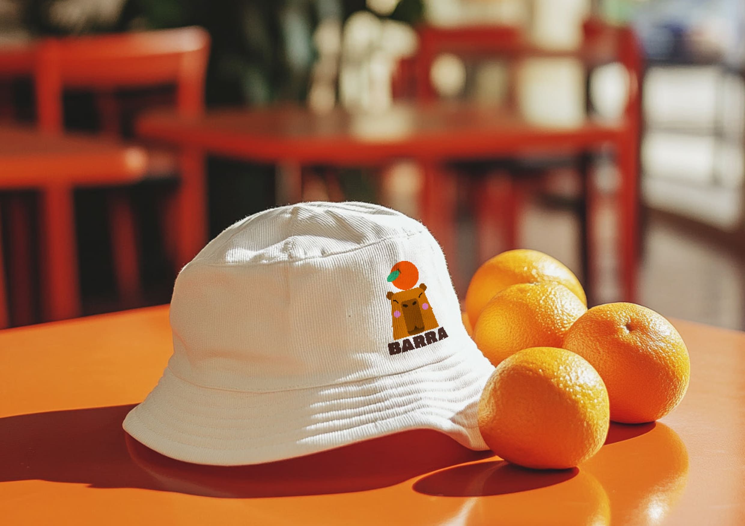
The graphic style of Barra’s packaging is modern minimalism, built on clean shapes, bright colors, and concise illustrations. It combines childlike playfulness with visual simplicity, making the product appealing to both kids and their parents. The brand identity of Barra’s children’s juices revolves around a friendly and memorable visual representation of a capybara.
Concept & Inspiration
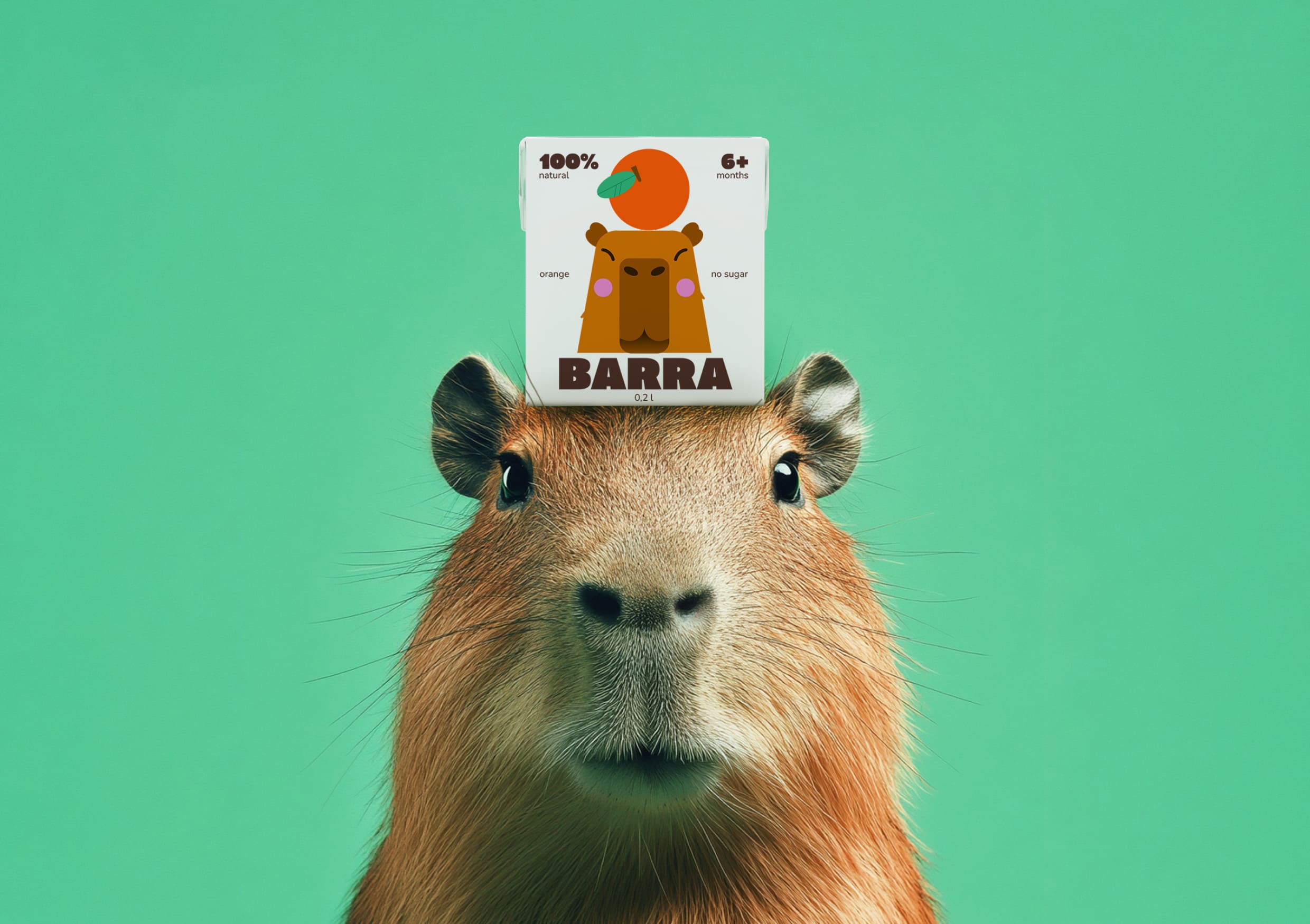
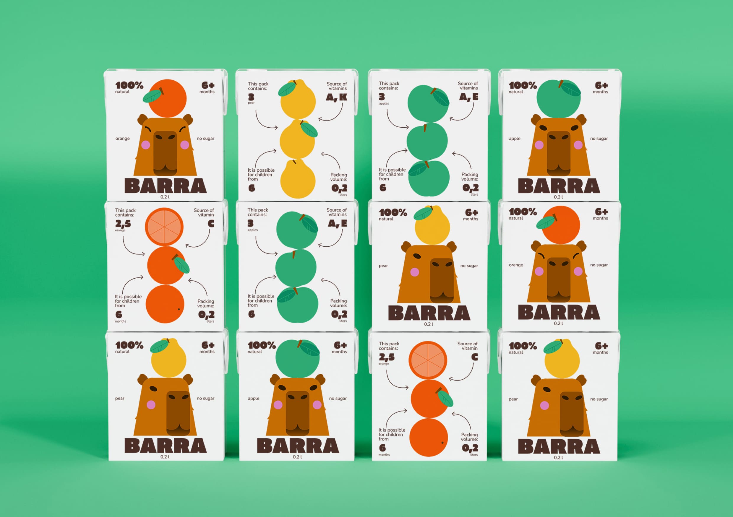
The design is inspired by the popular photograph of a capybara with a mandarin on its head. This image perfectly conveys the brand’s atmosphere—natural, lighthearted, and playful. The product line includes three flavors: orange, apple, and pear.
Visual System
1. Bright Vector Illustrations:
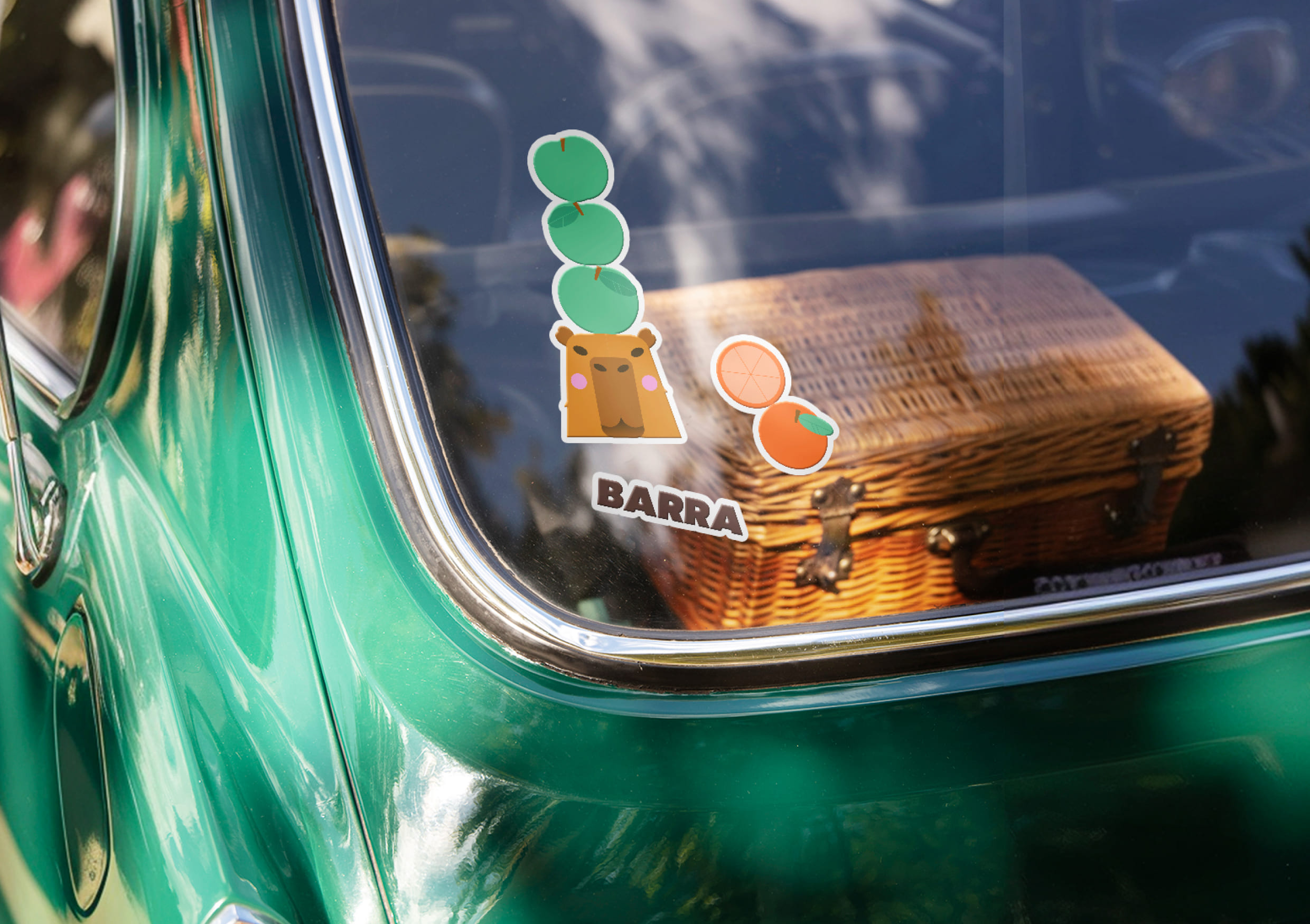
The foundation of the design is 2D vector illustrations. The capybara’s face expresses friendliness and calmness, creating a welcoming and approachable character. Fruits are depicted in a schematic way, without excessive shading or textures, emphasizing the product’s purity and naturalness.
2. Modularity:
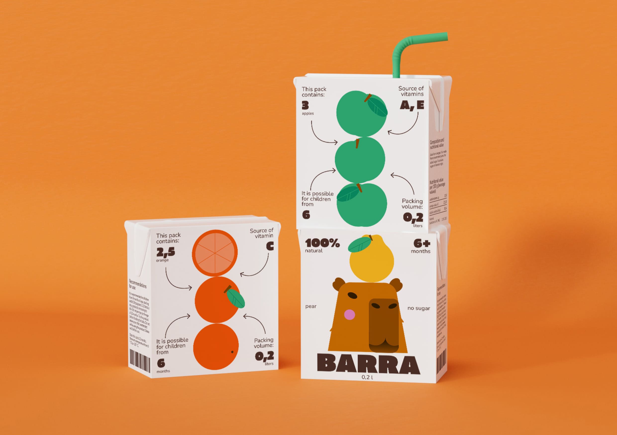
The juice packaging is designed to be stacked in various ways, creating engaging compositions. This approach makes product displays more dynamic, attracts customer attention, and enhances brand memorability.
3. Typography:
The chosen display typeface is Code Pro Black—a bold, geometric grotesque font. Its massive, structured letterforms provide visual stability and easy readability. The font reinforces the idea of a modular packaging system, adding a sense of structure and reliability. Its boldness balances the large illustrations, helping to create a cohesive and well-balanced design. It also acts as a strong visual accent, reinforcing the youthful and minimalist character of the brand.
Conclusion
Barra’s graphic style is a combination of a friendly, recognizable identity with a functional and contemporary design. The minimalist vector illustrations of capybaras with fruits create a distinctive visual image while turning the packaging into an interactive experience that captivates customers and makes the product stand out from competitors.
CREDIT
- Agency/Creative: Anastasia Kleyman
- Article Title: Student Anastasia Kleyman Brings Playful Minimalism to Life in Barra’s Juice Packaging
- Organisation/Entity: Student
- Project Type: Packaging
- Project Status: Non Published
- Agency/Creative Country: Russia
- Agency/Creative City: Kleyman Anastasia
- Market Region: Europe
- Project Deliverables: 2D Design, 3D Design, Illustration, Label Design
- Format: Box
- Industry: Food/Beverage
- Keywords: Juice boxes
-
Credits:
Designer: Anastasia Kleyman
Сurator: Pavel Borisovsky


