A delicate jewelry brand that brings the modern luxury experience to life through precise technology. Since 1975, Sözer has been offering a wide range of their exquisite products to its customers in the USA and Europe. The Monaco Chain is one of their products which is popular in the USA market, so SÖZER decided to redesign their identity to introduce all of their products to the world.
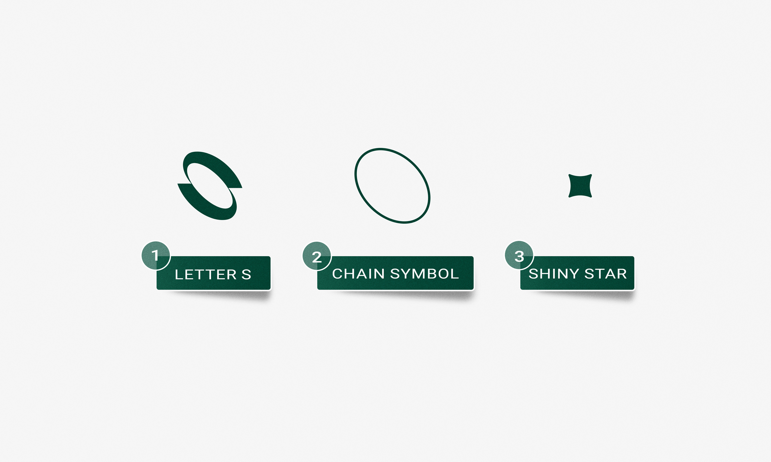
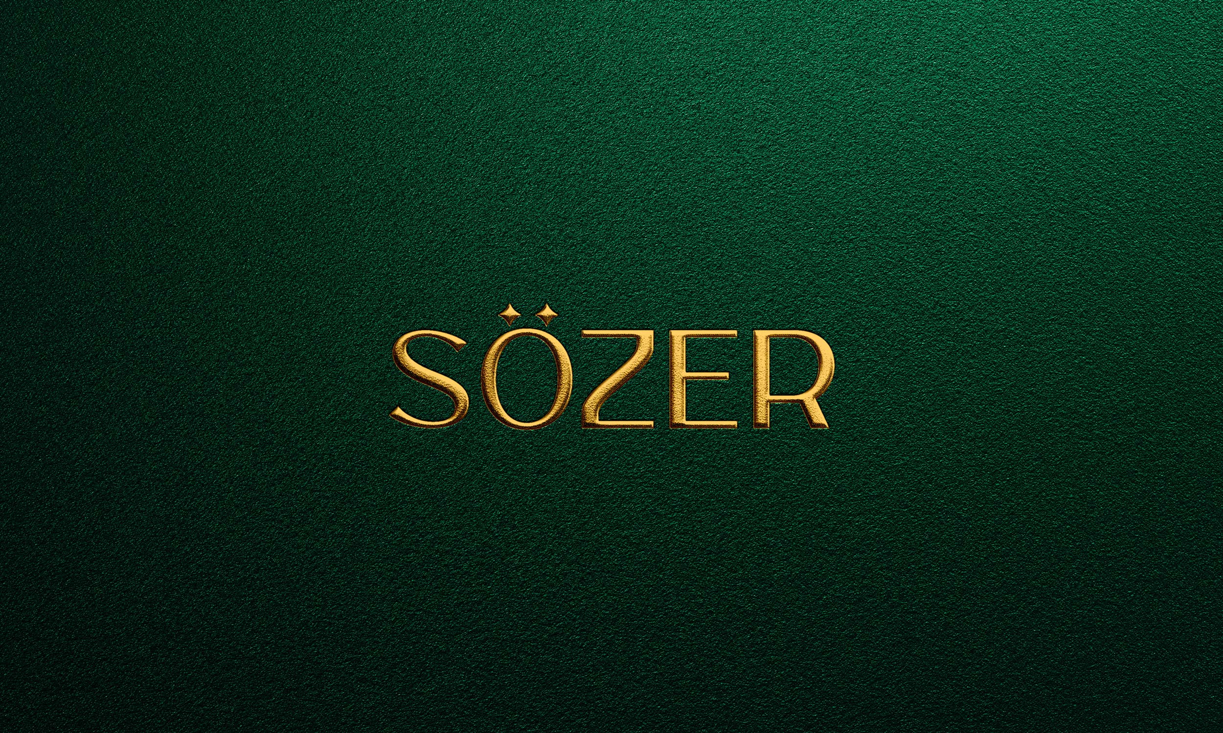
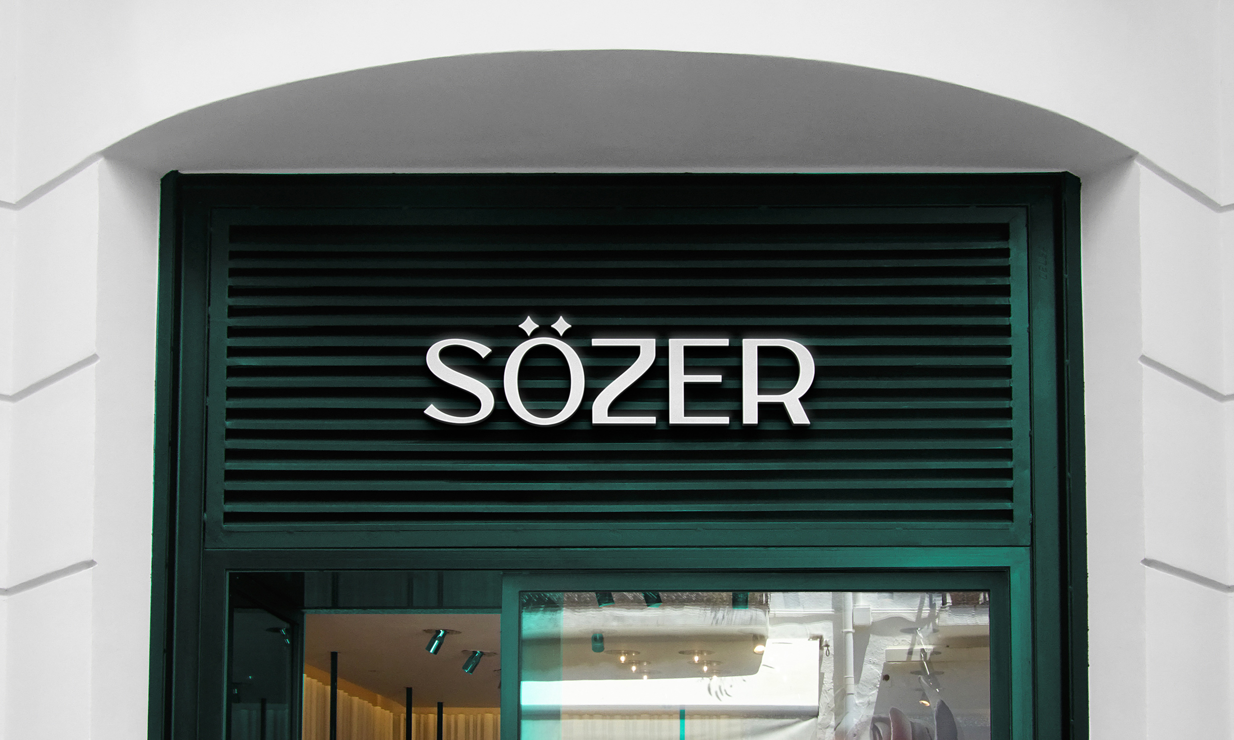
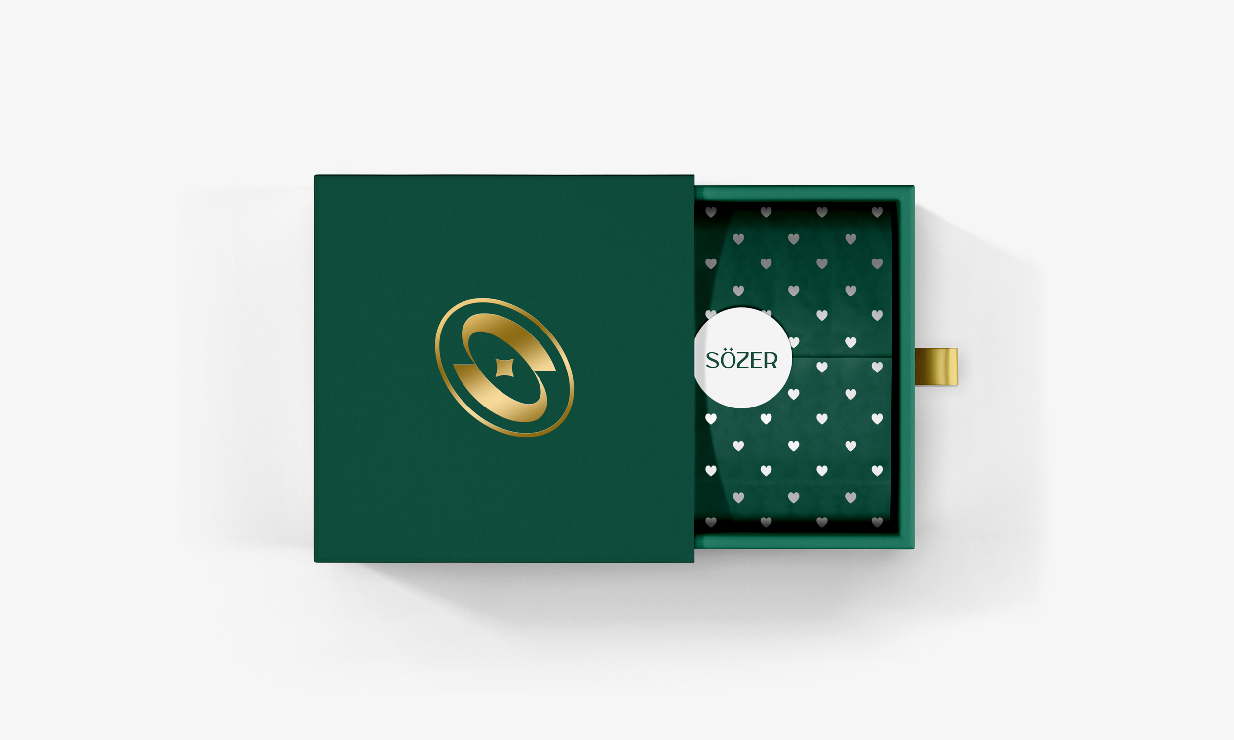
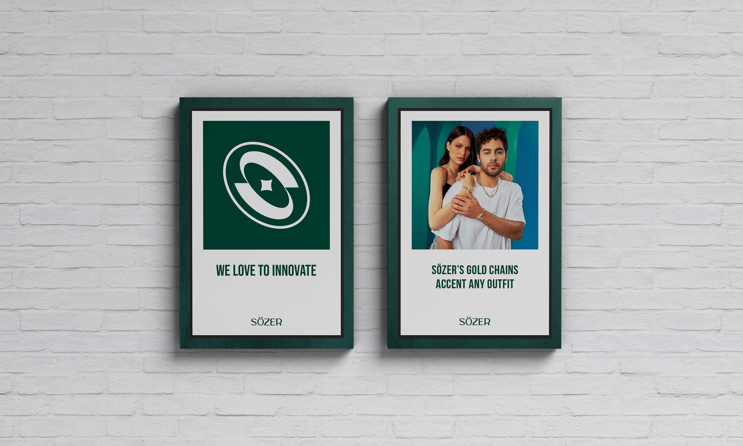
Sözer’s new visual identity is built around a new logo that symbolizes the idea of luxury and precious jewelry products by stylizing the letter S in chain and exquisite gold feelings.
This elegance and newfound idea installs the codes of an impacting and valuable identity. This well executed symbol communicates the reassuring and supreme image of Sözer.
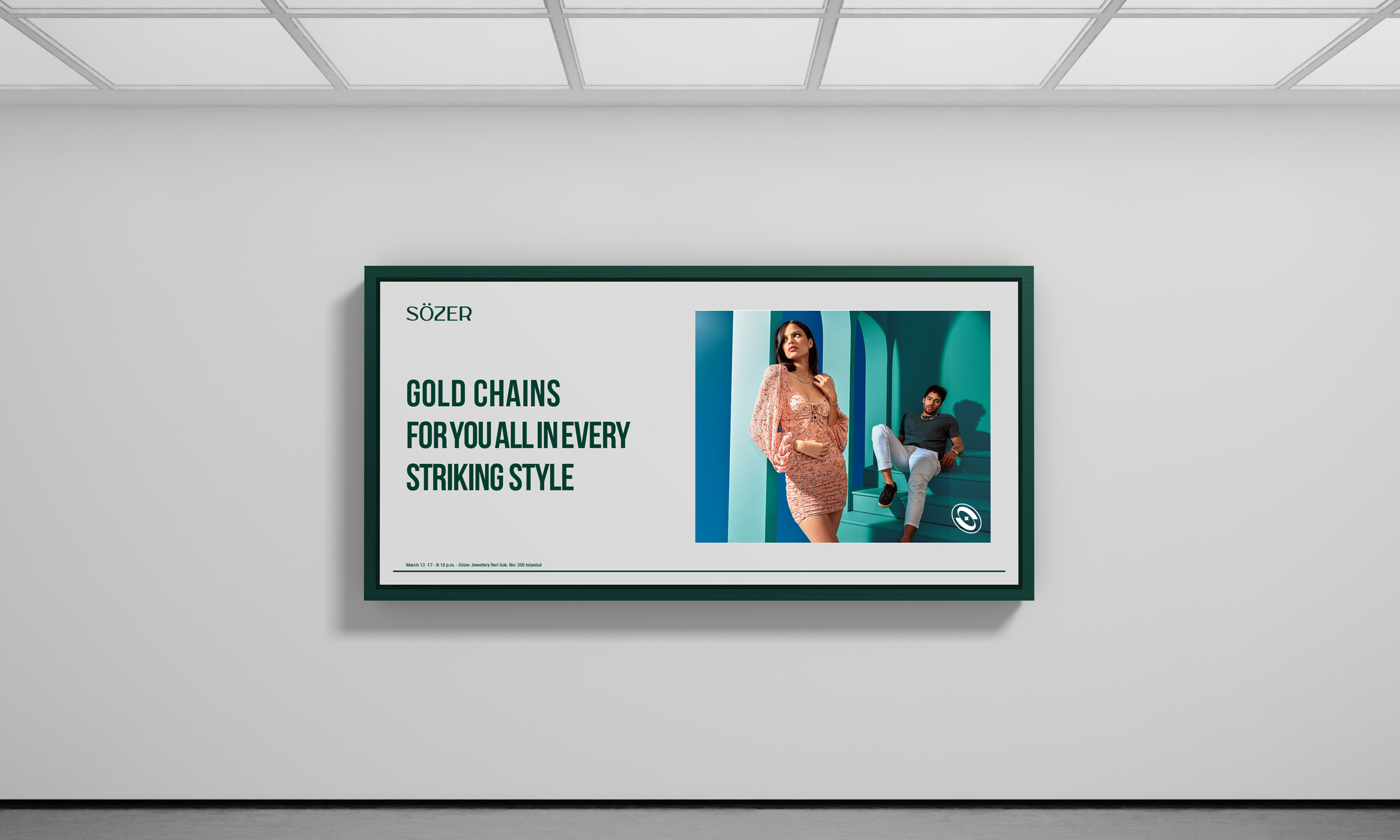
The emblem and their unique color scheme creates a perfect universe that distinguishes SÖZER from its competitors. Special typeface of Sözer creates a strong graphic consistency across the brand’s various communication media.
1: Challenge;
Sözer designs and creates different types of jewelry like bracelet, choker, necklace, rings, chain which are mainly divided into five categories: Monaco Chain, Flex, Tennis, Shinny and Sunny their desire was to create a logo that stands out and should show the quality and the historical antiquity of Sözer in the gold industry.
2: Idea;
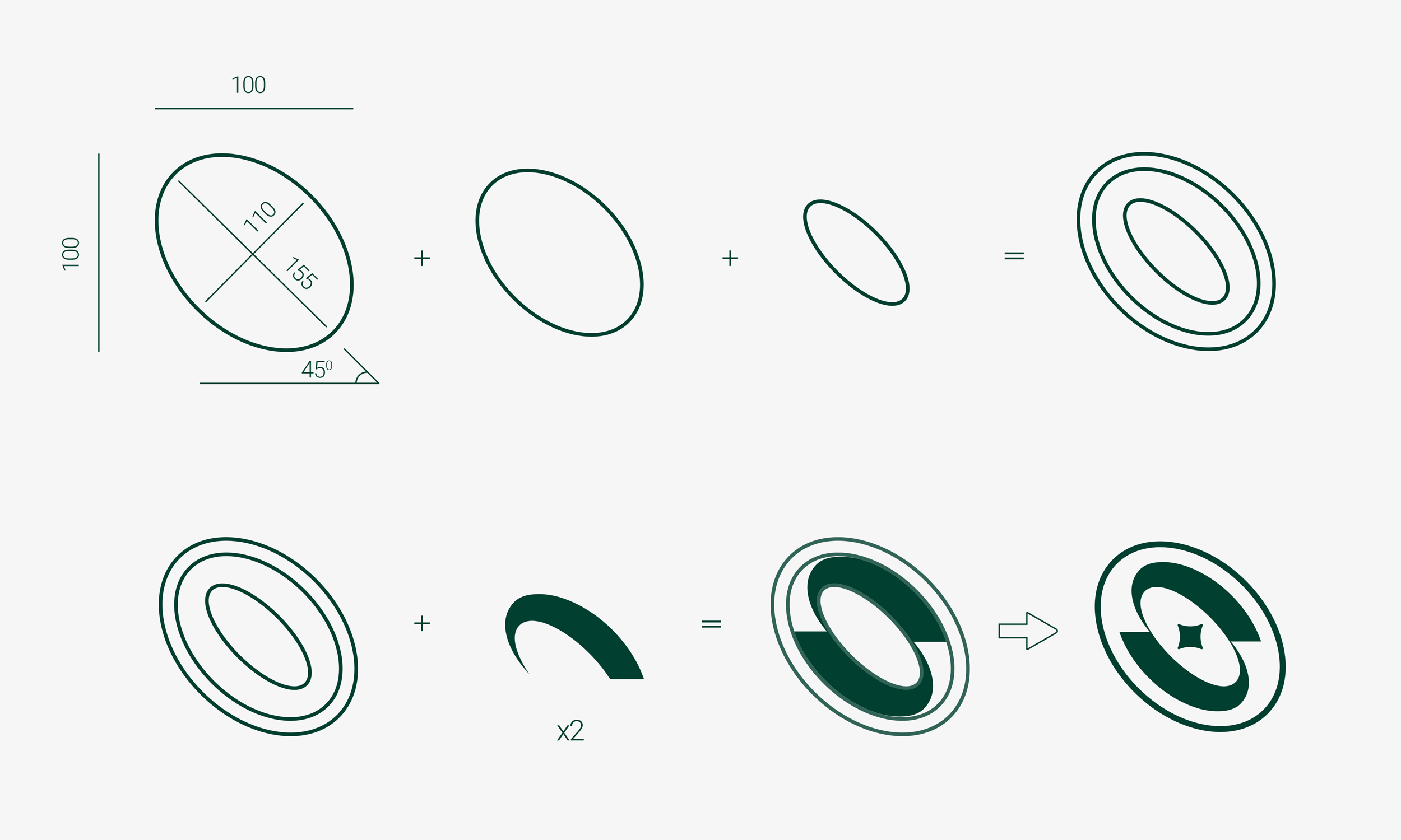
After researching and collecting all the datas and infos about the company and their products I noticed two important common relations between Sözer and the circle shapes that all gold products have; so I decided to create a strong relationship between the letter “S” and the circle shapes of jewelry products.
3: Creation;
As you can see in every jewelry products they made you can come across with the circle shapes in
instance I put three different types of chains; now if we look at the products like bracelet choker, ring and so many more all of them were made with circle shapes more importantly if they do not have circle shapes in their creation; but at the end of the road the become circle when you lock it.
4: Lookup
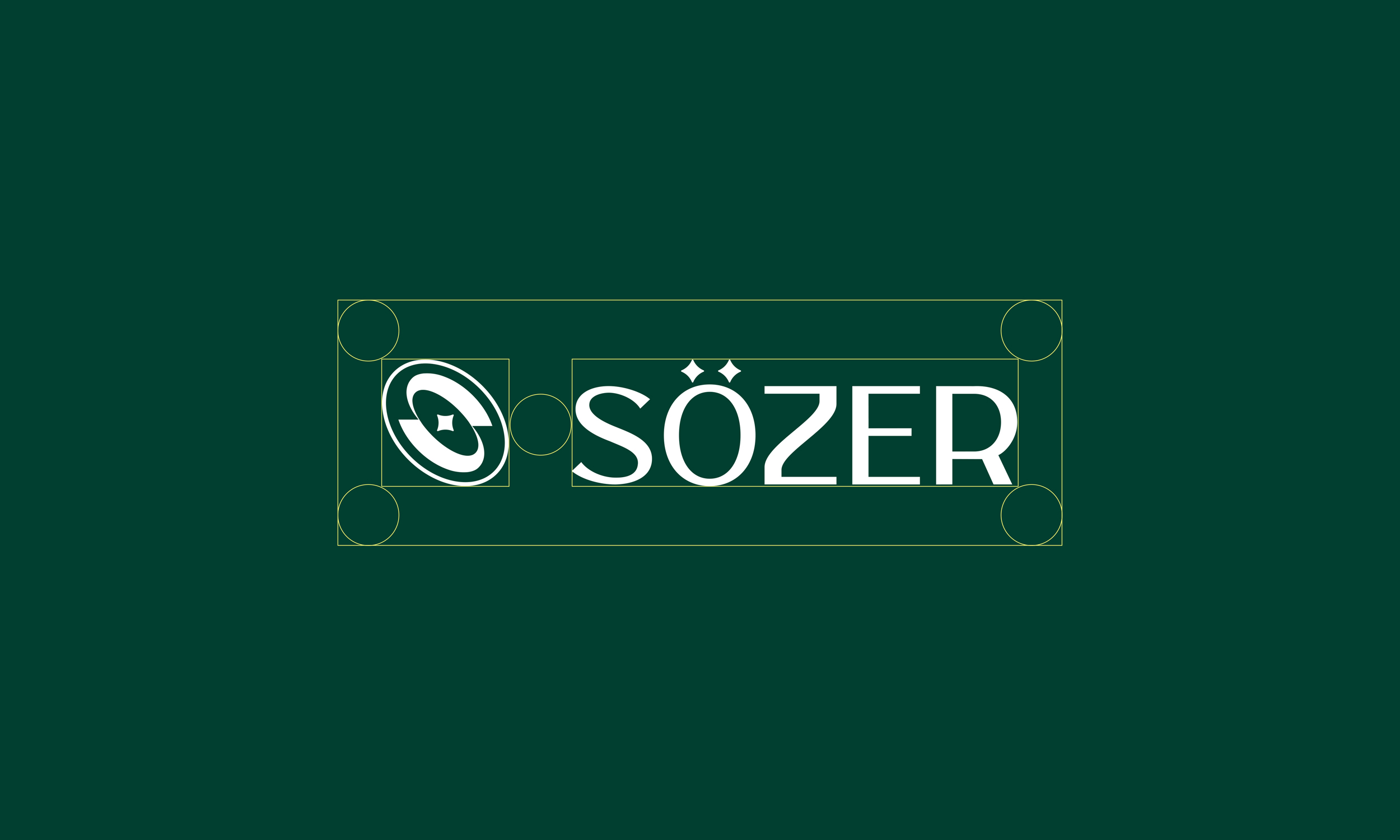
The logo looks best when it’s given the space to stand out. No graphic clements should interfere with the specified clear space, which equals the size of the letter “O” on all sides. The numbers define the correct kerning between the letters. This weight is unique to the logo and should not be used anywhere else.
CREDIT
- Agency/Creative: Sarwar Hatif
- Article Title: Sözer Rebrand
- Organisation/Entity: Freelance
- Project Type: Identity
- Project Status: Non Published
- Agency/Creative Country: Turkey
- Agency/Creative City: ISTANBUL
- Market Region: Europe
- Project Deliverables: 2D Design
- Industry: Fashion
- Keywords: sözer, brand, branding, typegraphy, jewelrybrand, rebrand


