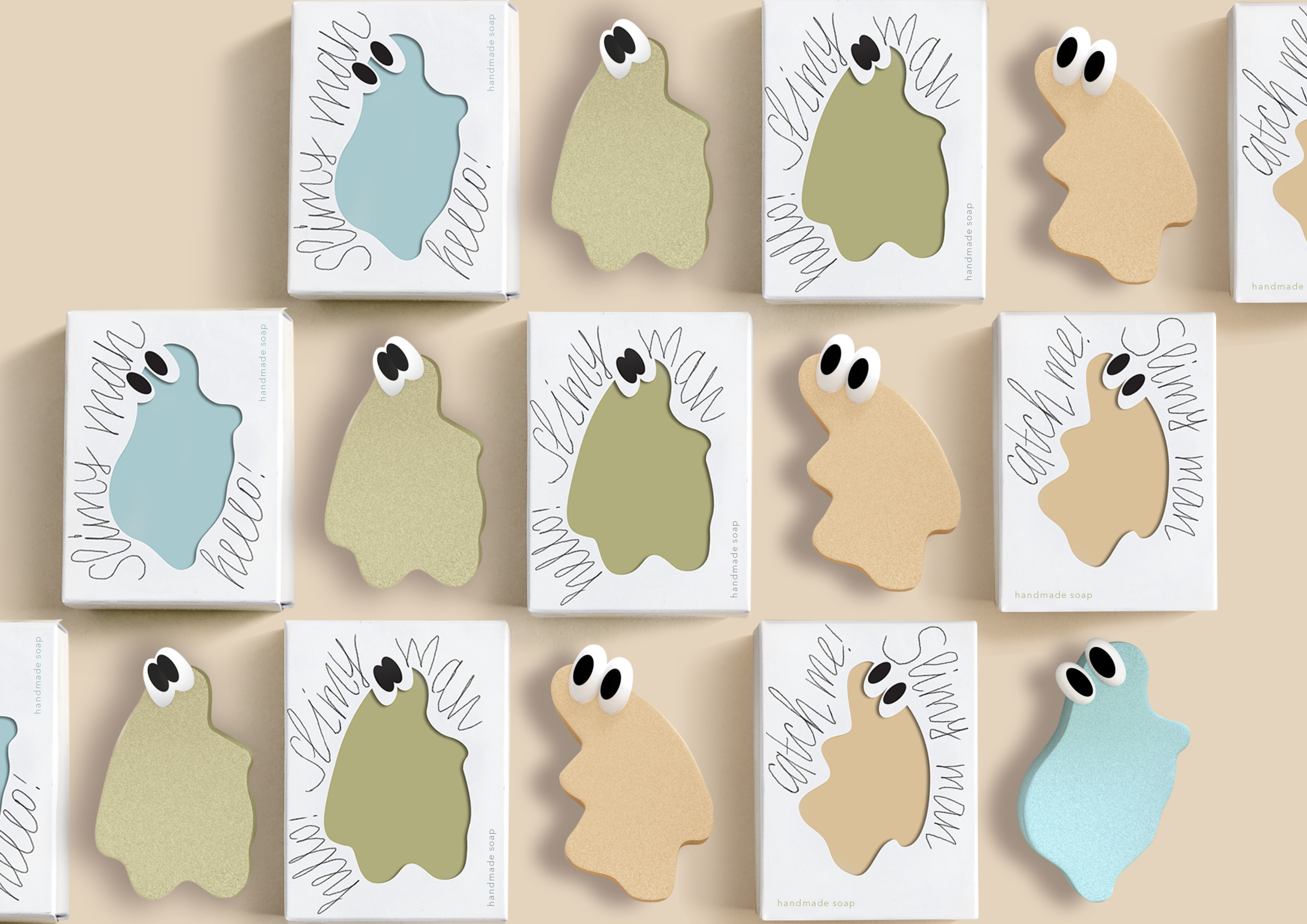
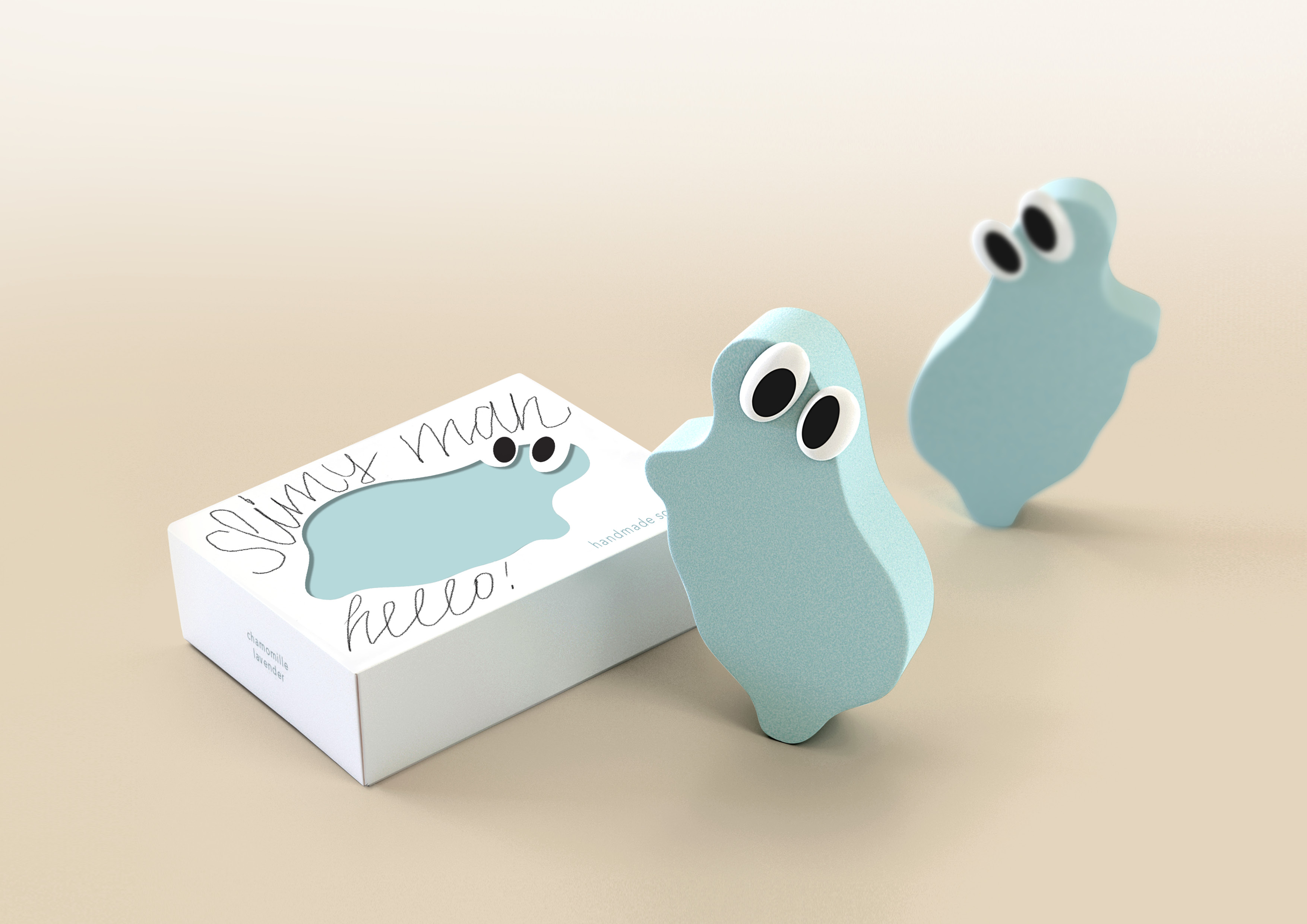
Slimy man is a handmade baby soap that supports the “sustainable beauty” trend and meets eco-standards. For packaging, it is planned to use a biodegradable material that does not harm the environment. In Russia, the 0+ segment is the most capacious, fast-growing and attractive, because modern young parents are actively interested in safe hygiene products for their children and are willing to pay extra for products that protect the environment. The high standard of quality and safety distinguishes Slimy man soap from its competitors.
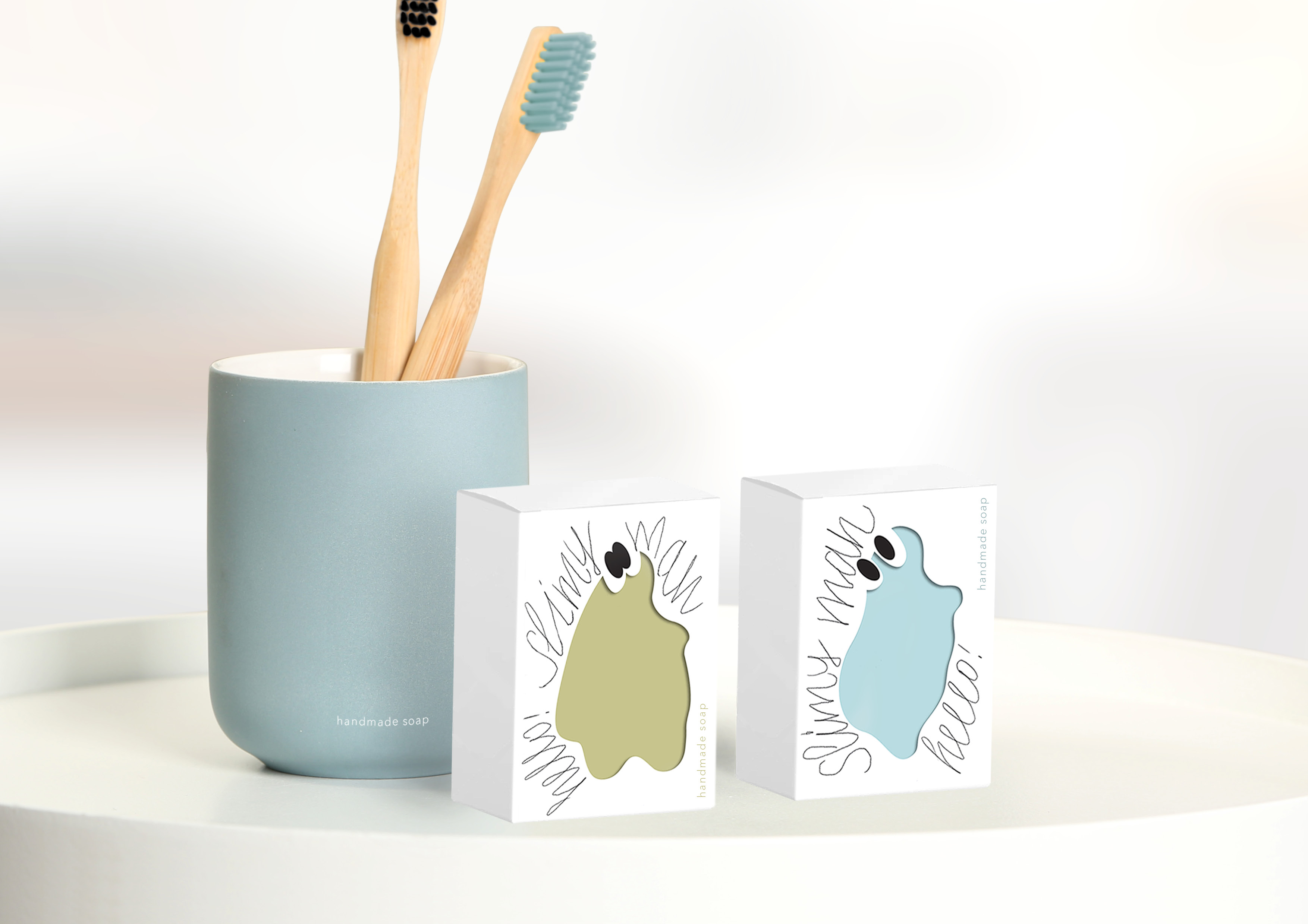
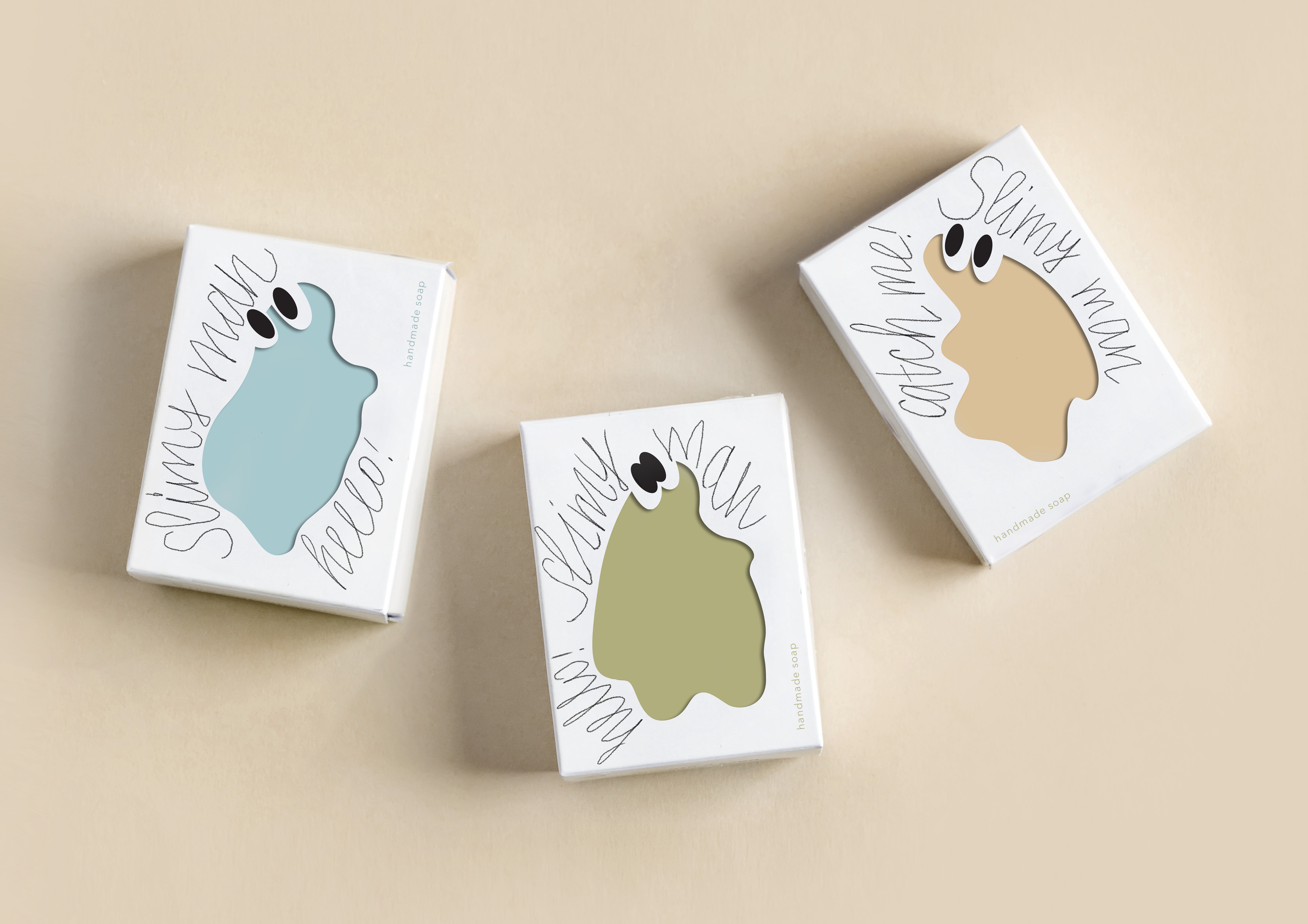
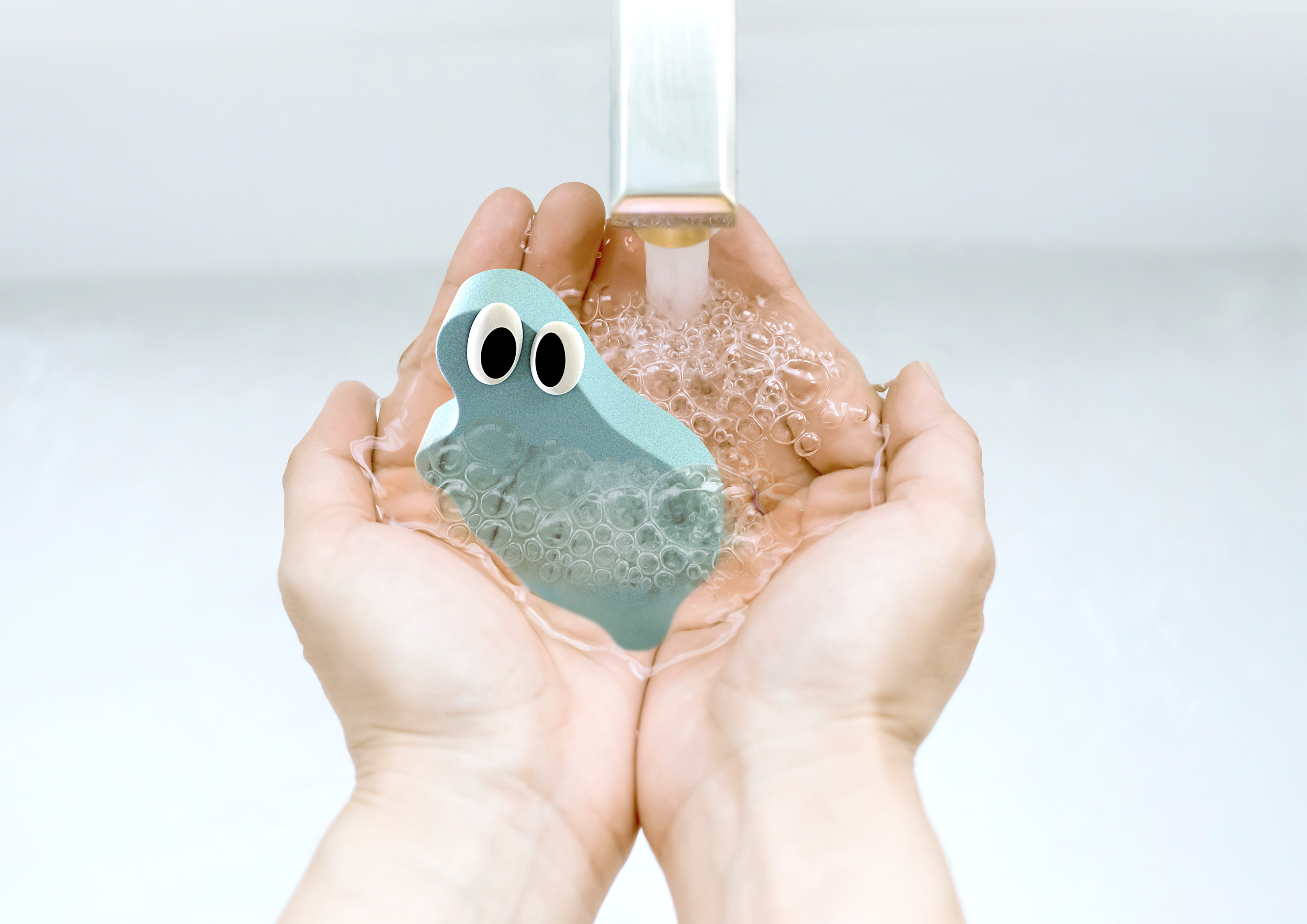
The main character of the soap packaging is Slimy man, a fantastic creature with no exact gender characteristics, who constantly tries to slip out of the child’s hands. The silhouette of Slimy man changes on each SKU and thus creates a small company Slimy friends, which will turn a simple procedure to wash your hands in an exciting game. The image of Slimy mans creates a positive mood and evokes positive emotions in customers, cute shapeless creatures of delicate pastel colors have a smile and are an excellent motivator for impulse buying. Special attention should be paid to the manual lettering on the packaging – it is made with a certain degree of carelessness, reminiscent of a simple letter from the hand of an ordinary person, not a calligrapher, and designed to emphasize the manual manufacture of soap.
Special thanks should be delivered to Russian Higher School of Economics (HSE Art and Design School) and personally to Leonid Slavin, head of Art direction MA Program.
CREDIT
- Agency/Creative: Tanya Dunaeva
- Article Title: Slimy Man Soap Concept Packaging Design by Tanya Dunaeva
- Organisation/Entity: Student
- Project Type: Packaging
- Project Status: Non Published
- Agency/Creative Country: Russia
- Agency/Creative City: Moscow/Russia
- Market Region: Global
- Project Deliverables: 3D Design, Brand Identity, Graphic Design, Packaging Design, Typography
- Format: Box
- Substrate: Pulp Carton
- Industry: Health Care
- Keywords: Packaging, Moscow, Identity, Typography, Tanya Dunaeva, HSE Art and Design School, Leonid Slavin
-
Credits:
Tutor: Leonid Slavin


