Streaming service, Philo, has partnered with creative agency Sibling Rivalry to imagine an entirely new visual identity and overall brand positioning, enhancing customer experience and brand perception, and confidently positioning the platform for its next phase of growth.
Delivering a content-forward, personality-packed visual identity and accompanying brand campaign, Sibling Rivalry’s work highlights Philo’s evolving offering and its dedication to delivering an audience-first TV experience.
A bold new approach
As consumers face more choices and a more complicated media ecosystem, Philo’s rebrand offers the ideal solution for affordable, free and premium content without the complexity and hassles of the modern streaming universe that have become all too commonplace. With the return of the juggernaut series Yellowstone and other fan-favorite shows this fall, Philo’s rebrand comes at the perfect time to introduce the newest iteration of the streamer to large audiences.
Sibling Rivalry was tasked with overhauling the brand in a way that would resonate with its existing audience while clearly communicating its unique position as a simpler, more affordable alternative to traditional cable providers. With the addition of a standalone FAST service and premium services like AMC+ into their core package, Philo has now become a singular home for the entire spectrum of content, from free to premium.
“At a time when there has never been fiercer competition for the attention of audiences, the need to have a strong brand point of view that expresses not only what you offer, but who you are as a company, has never been more important,” says Matt Stein, Head of Brand & Creative Strategy at Philo.
“Philo’s bold new visual approach lands at a thrilling time for the brand. Our audience-centric focus has driven the platform into new and exciting territories—including the rapid expansion of FAST channels and premium services, all under one roof. Our strategy has been to reimagine what a modern streaming service can be for today’s viewers and to make the experience easy, and joyful—much like the experience partnering with Sibling Rivalry to develop the fun, whimsical creative and design system.”
Amplifying what makes Philo special
Leaning into a streamlined brand identity and customer-obsessed ethos, Sibling Rivalry positioned Philo as an antidote to the complexity of a tumultuous market: “Our goal was to clarify and amplify what makes Philo so special, setting the stage for the company’s continued growth as an entertainment brand,” says Bo Bishop, Executive Director of Creative Strategy at Sibling Rivalry.
One of the main findings during the rigorous strategy process was that it was challenging for consumers to understand exactly what Philo offers – a mix of live TV, on-demand content, and free channels. The complexity of offering multiple options to different people could actually be leveraged as a core strength, enabling Philo users to customize packages and combine all the best ways “to TV” in one service.
This single, compelling idea, representing Philo’s overarching brand purpose, informed all creative decisions throughout the rebrand project and sets the tone for customers’ overall experience with the brand. “The advantage was very clear to me…they’re the only service offering all these convenient, intuitive ways to watch what you love,” says Bishop. As such, Sibling Rivalry decided to “lean into the simplicity and joy of TV,” he adds.
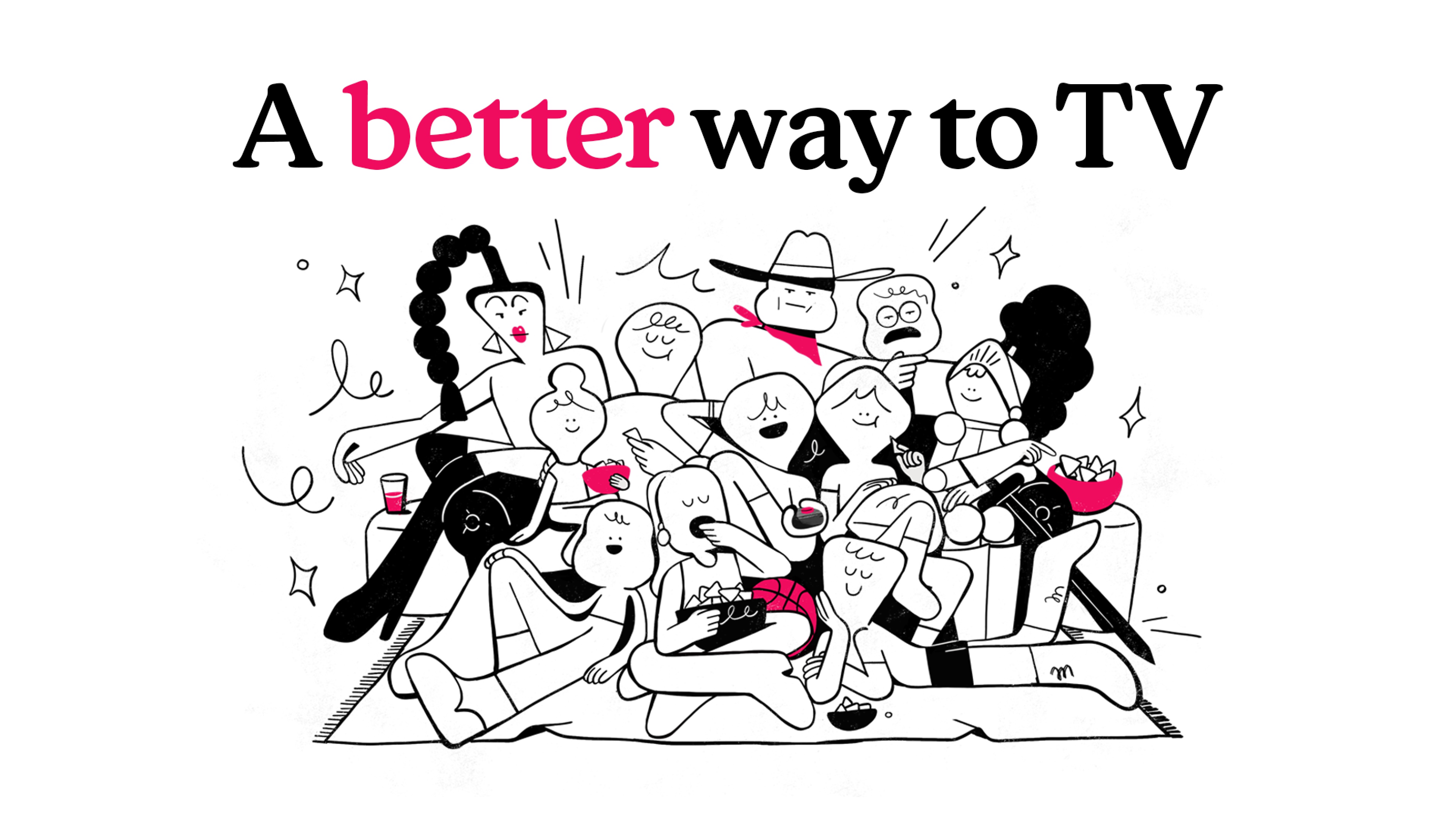
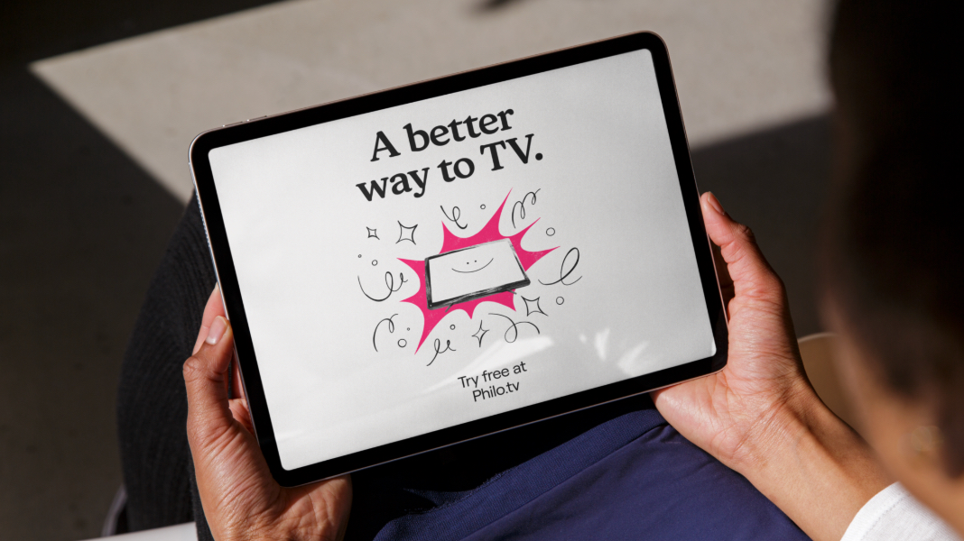
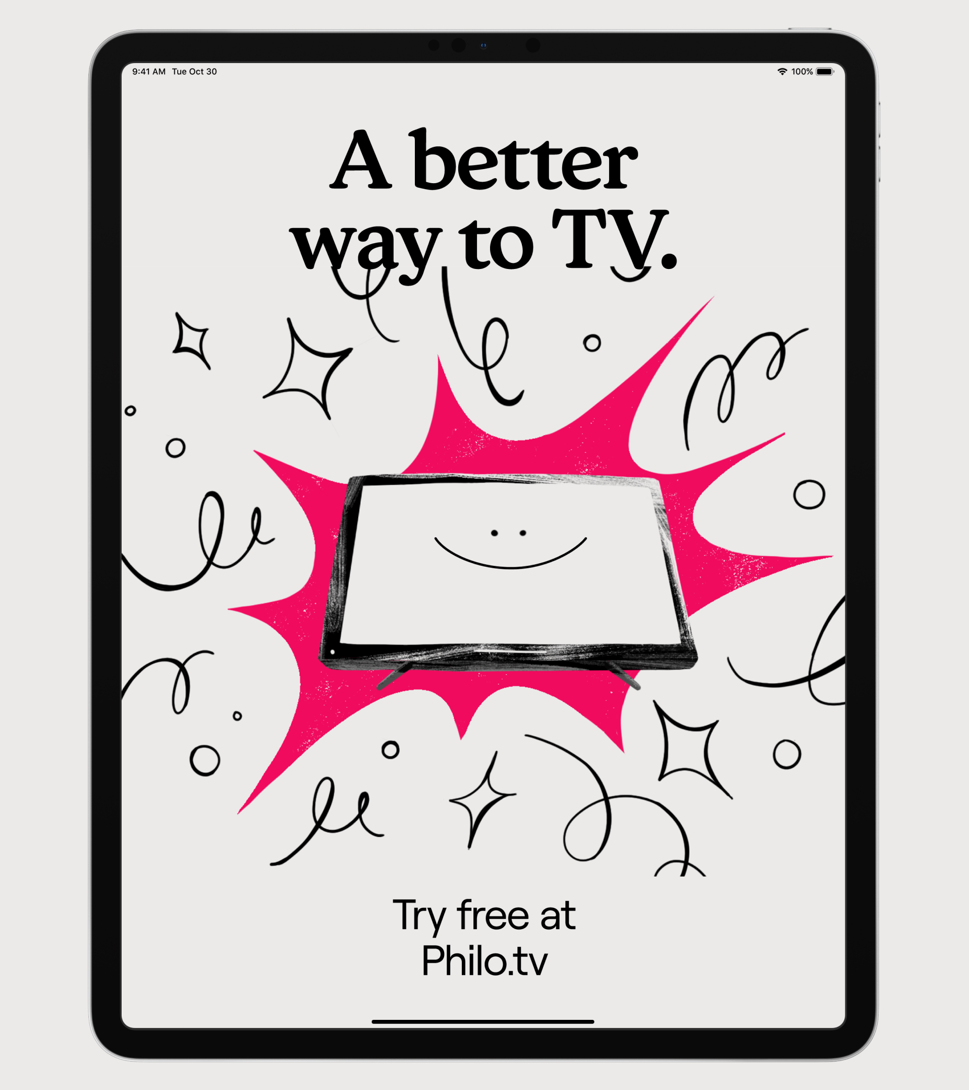
This resulted in the creation of a new memorable, directional tagline, ‘A better way to TV’, which positions Philo as a better means to access great entertainment.
“The language had to be clean, direct, and conversational—making Philo feel like a TV fan talking to other TV fans,” says Lauren Hartstone, Executive Creative Director & Partner at Sibling Rivalry. “Where traditional streaming can have a technical, dry feel, we wanted Philo to feel like a brand that gets you, with a little bit of humor and fun.”
Driving emotional connections
The rebrand emphasizes Philo’s brand voice with an attitude that’s confident, sophisticated and witty. Philo now talks directly to audiences in a tone that’s refreshingly personal and conversational to stand out from the more corporate, straight-laced approach of big-box streamers and drive long-term emotional connections.
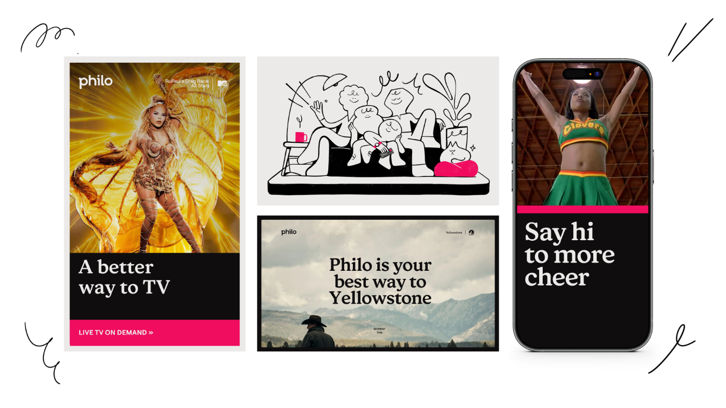
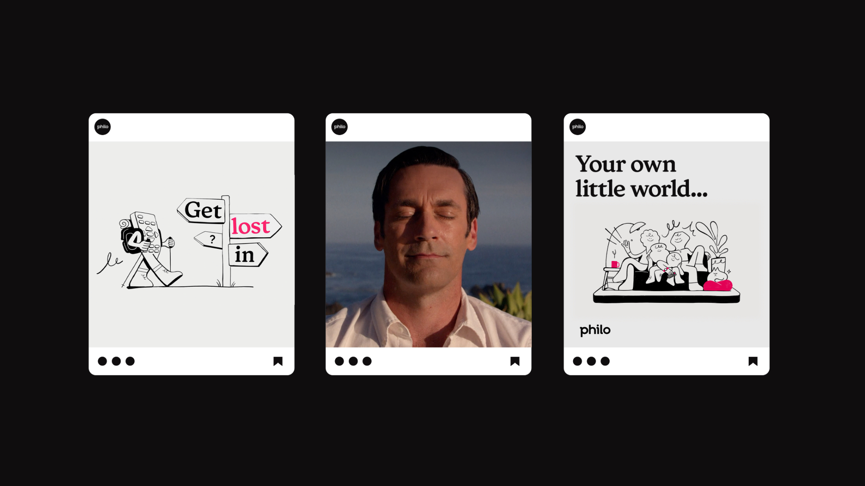
The identity takes the existing Philo logo and animations, which were developed by the Philo in-house team, and builds on it with striking core brand elements including a signature color palette of black, white and magenta; a suite of hand-drawn illustrations; and a new approach to typography.
The organic, gestural, and whimsical illustration style gives Philo a distinctive charm, infusing humor and personality into its identity with its elegant, single-stroke black linework on a clean white background. These illustrations can be used together or individually, offering flexibility and scalability for various applications.
For the main brand type, Sibling Rivalry selected Honey, a personality-driven, bold serif font by California-based foundry Very Cool Studio. Roobert by Prague-based Displaay Type Foundry is the supporting font used for applications including all attribution copy, and was selected for its clean look and scalability.
The identity features a simple, bold, dynamic rectangular frame as a central graphic element that can become synonymous with the Philo experience. The shape expands, moves, builds, frames and reveals footage while “paying homage to all the ways we watch TV”, says Bishop.
Launching the next phase of growth
Sibling Rivalry’s rebrand culminates in a brand campaign portraying the Philo customer’s journey away from the hassles of modern streaming towards the magic of infinite entertainment possibilities. The campaign brings Philo’s updated identity to life across all touchpoints, with the hero :60 spot making use of cel animation, as “a whimsical celebration of Philo’s evolution — and an exciting signal of where the brand is headed,” says Hartstone.
The campaign features a mix of broadcast, social and OOH elements, all focused on making Philo’s content the star through an interface that prioritizes ease and accessibility without ever compromising on wit and charm.
The new brand is now live setting Philo up as it embarks on its next chapter — simplifying and improving the future of TV for everyone.





CREDIT
- Agency/Creative: Sibling Rivalry
- Article Title: Sibling Rivalry’s Strategic Rebrand Positions Philo as the “Better Way to TV”
- Organisation/Entity: Agency
- Project Type: Identity
- Project Status: Published
- Agency/Creative Country: United States
- Agency/Creative City: New York / Los Angeles
- Market Region: Global
- Project Deliverables: Animation, Brand Design, Brand Identity, Brand Redesign, Brand Tone of Voice, Identity System, Illustration
- Industry: Entertainment
- Keywords: Rebrand, Strategy, Campaign, Illustration, cel animation, TV streaming, audience-first, bold, joyful, streamlined
-
Credits:
Creative Agency: Sibling Rivalry


