Saeta is a sportswear brand based in Colombia, one of the first to sponsor professional soccer teams and local tournaments. This brand has won the heart of colombians, supporting their favorite teams and making the sport grow from the streets. Pedro carrero, its founder, built the company solely after realizing that his dream of becoming a pro player will not become true, so he decided to serve all who share the same passion and that’s what he’s been doing since then.
Saeta is top of mind of the most humble neighborhoods from colombia, younglings dream of having a garment that inspires fear on the court to other players. Nevertheless, for others, the brand represents street-life and low social status, so they prefer to get new adidas, nike, or other sportswear that leverage its social status, denying the equipable, and sometimes superior quality of the clothes. This is why, the work has been on transforming the brand not only visually but holistic, for that the new messages get to new users and little by little, change the brand perception.
Now, 38 years later, saeta has encountered so many challenges, due to globalization, new sportswear brands had appeared in the country, making saeta behind in consumers’ minds. At the end of 2019, pedro and his daughter vivi decided to enroll in a process for crafting the new brand, according to the new values and requests that the market was putting on them.
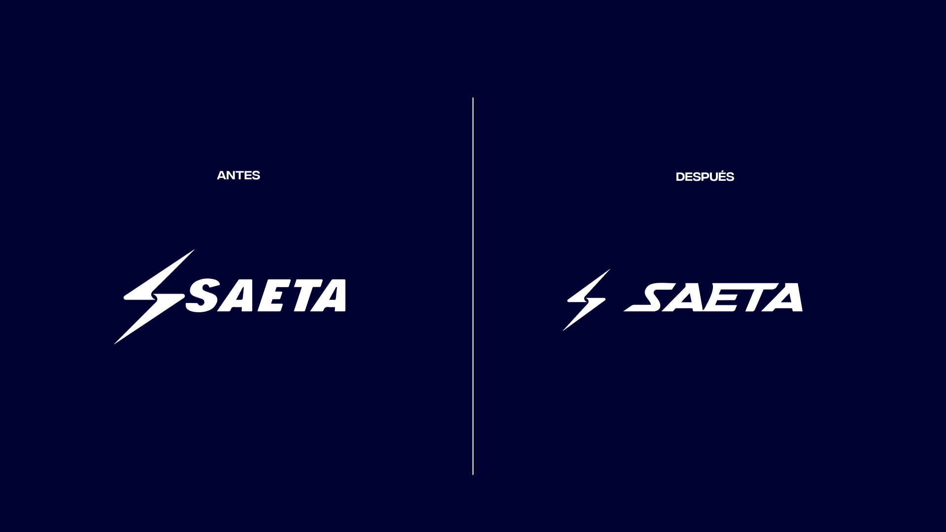
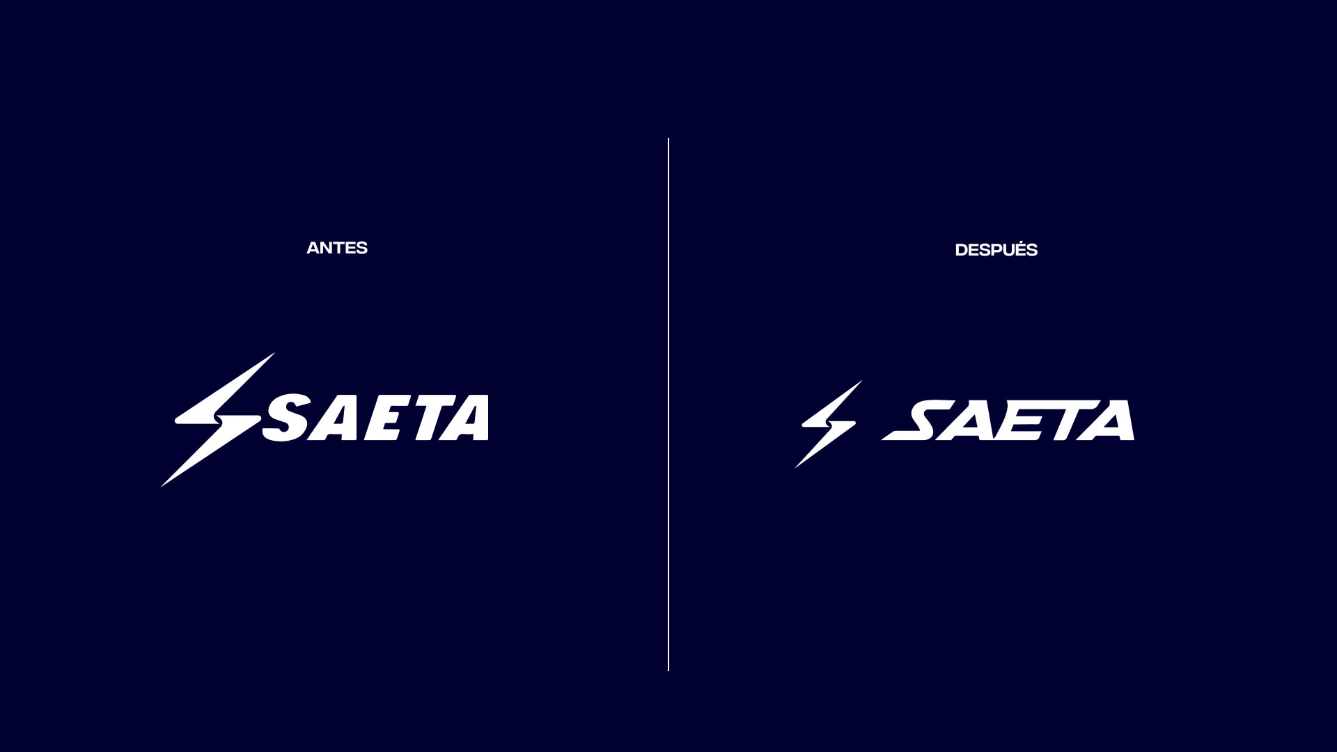
Saetas old identity was a mixture of many things: the name came up from pedro’s mind, meaning arrow in spanish, representing the goal-oriented focus of athletes, the symbol, a lightning bolt symbolizing the power within, and finally, blue and white as the main color, picked randomly and reinforced by the sponsorship of a local club.
Our first task was to investigate saeta’s mind, understand the family, their aspirations, and brand desires, and in parallel, check the perception of the brand with athletes, and identify which specific aspects were urgent to modify and which ones we should keep. This, added to the fact that we approached the project weeks before the emergency caused by covid began to spread around the world.
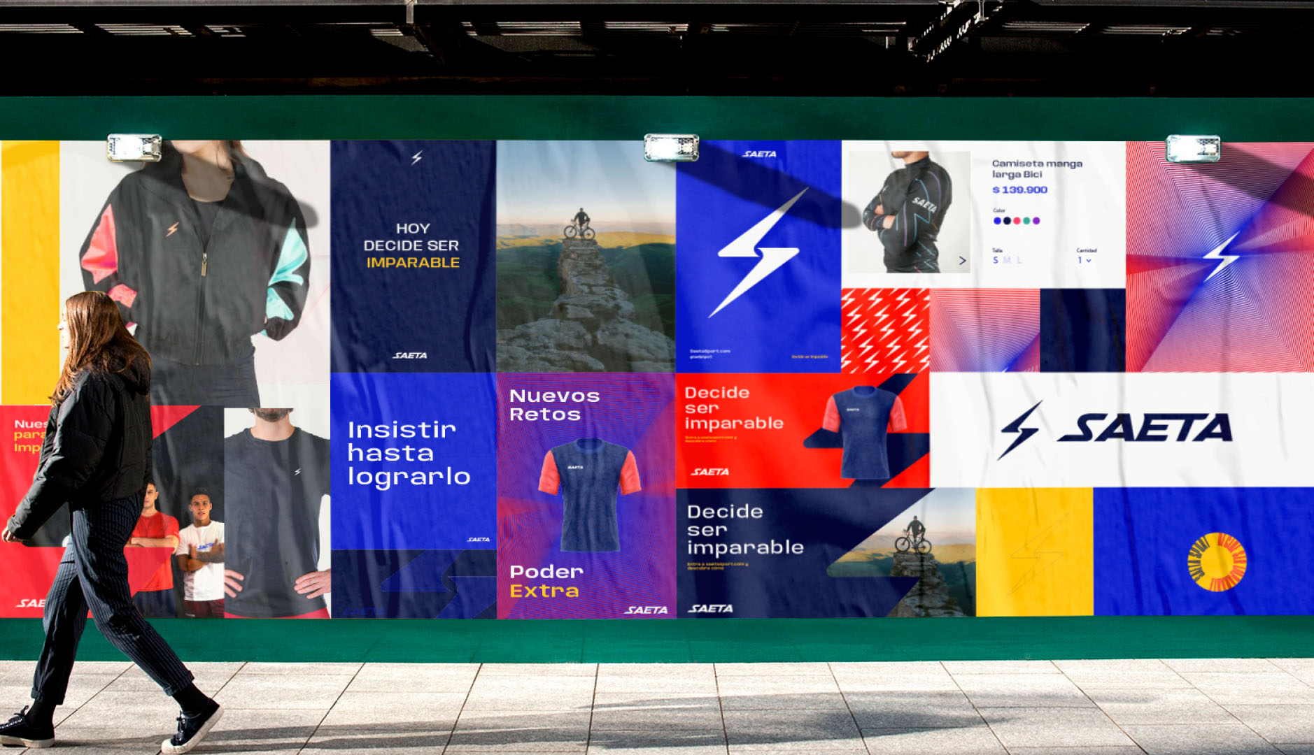
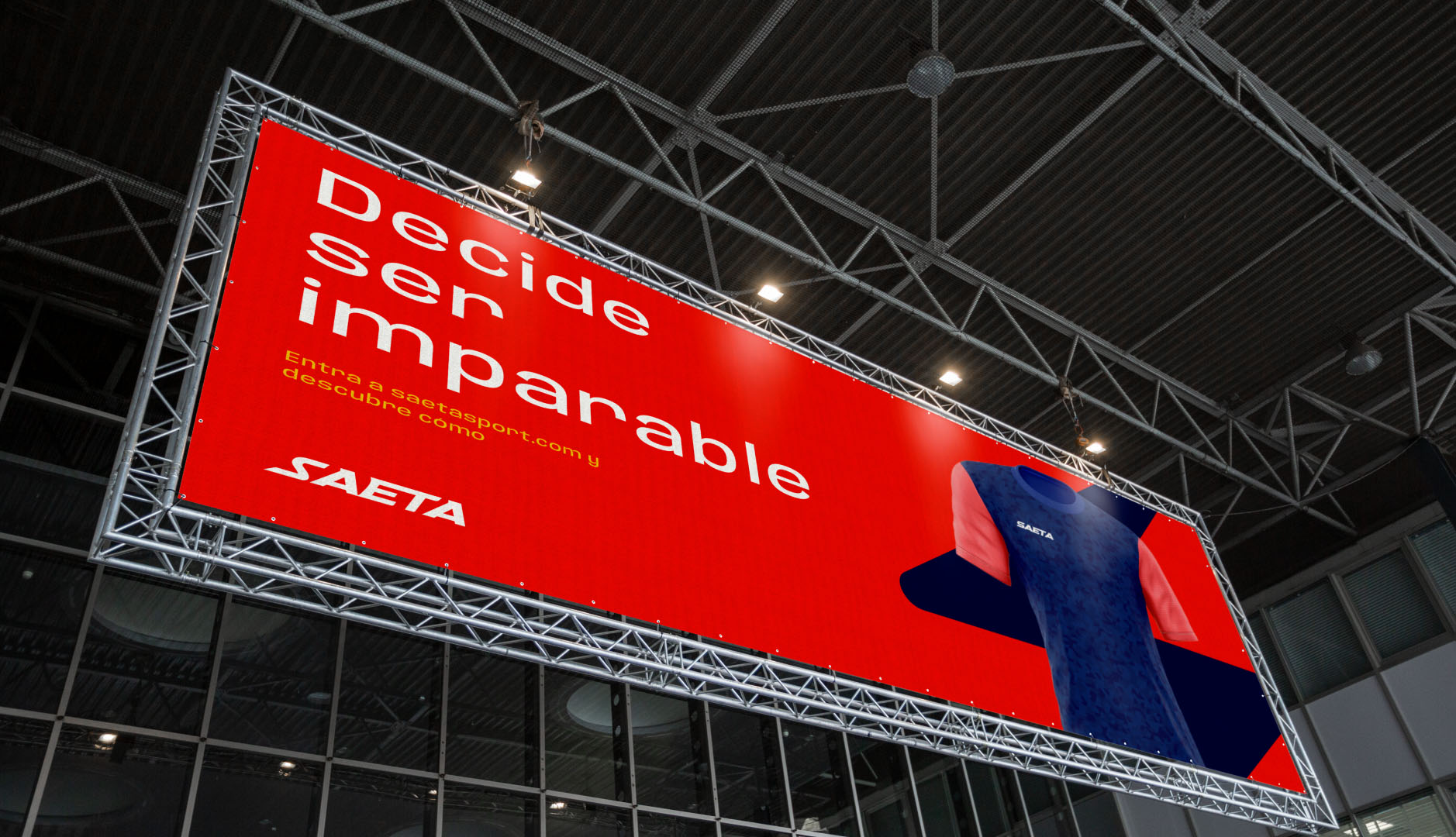
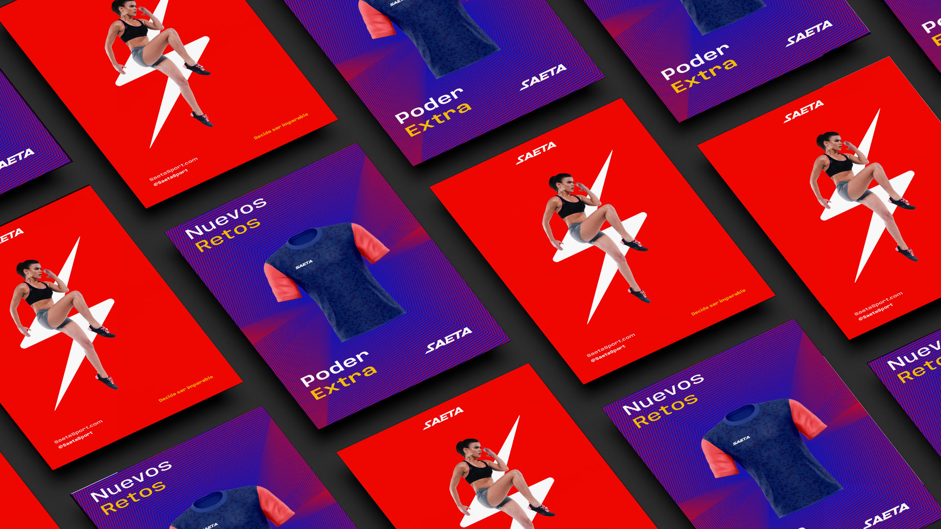
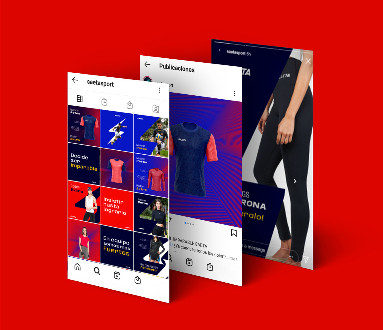
As a result of our research and virtual fieldwork, we decided to keep the lightning bolt, a powerful identifier already intrinsic to the brand, and we focus on communicating the same dynamism and speed to the type and the brand’s communication messages. As a result, we arrive at a new proposal, where everything is part of a great visual system and where the typography is at the same level as the other elements.
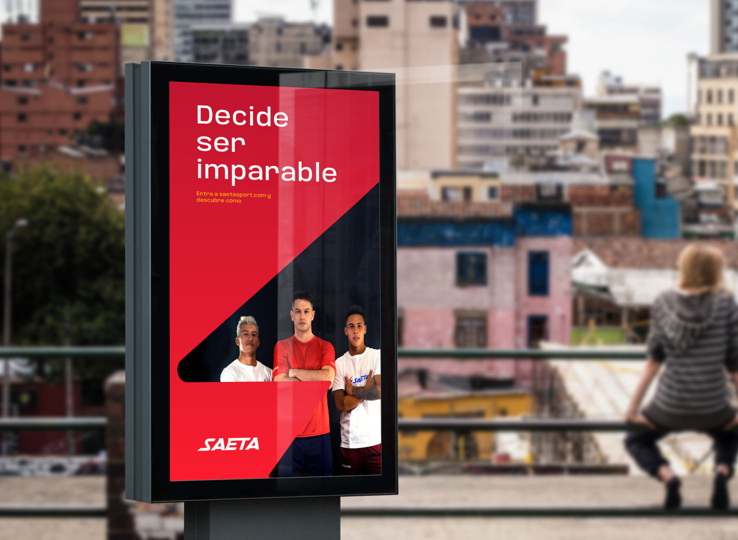
We create the slogan “Saeta: decide to be unstoppable”, not only the brand that declares its own unstoppability but also invites all its followers and athletes to go further by playing as a team.
In the same way, we created a launch campaign based on the history of the brand, its important moments, and we put pedro in the spotlight, the founder, and the main spokesperson, to announce the new saeta.
To date, the brand has managed to overcome the pandemic, is beginning to position itself again in the local market as a powerful player, and continues to step on micro football fields with its clubs.
Our learning: a brand must always listen to these three elements to be big: their clients, annual budgets, and the brand heart.


CREDIT
- Agency/Creative: El Engalle
- Article Title: Saeta Sportswear Brand Design by El Engalle
- Organisation/Entity: Agency, Published Commercial Design
- Project Type: Identity
- Agency/Creative Country: Colombia
- Market Region: South America
- Project Deliverables: Brand Design, Brand Guidelines, Brand Redesign, Brand Strategy, Graphic Design, Identity System, Rebranding, Research, Tone of Voice
- Industry: Fashion
- Keywords: sportswear, soccer, athletes, lightning, sports,


