SDVIG is a theater in Kazan, the main concept of which is to create a small transition of people’s consciousness, highlight problems and tasks that vision can see and understand with the help of theater.
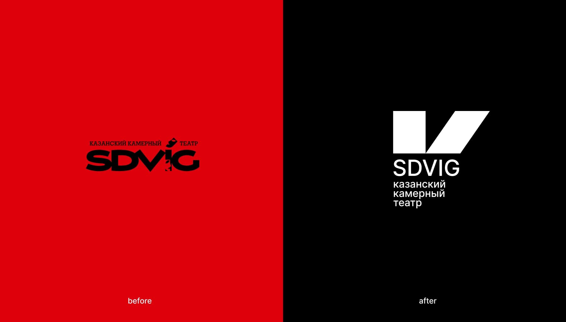
The goal was to rebrand the theater, to reflect in the new design the visual metaphor of the shift in people’s minds.
The theater’s target audience is students, young married couples, groups of friends, and visiting guests.
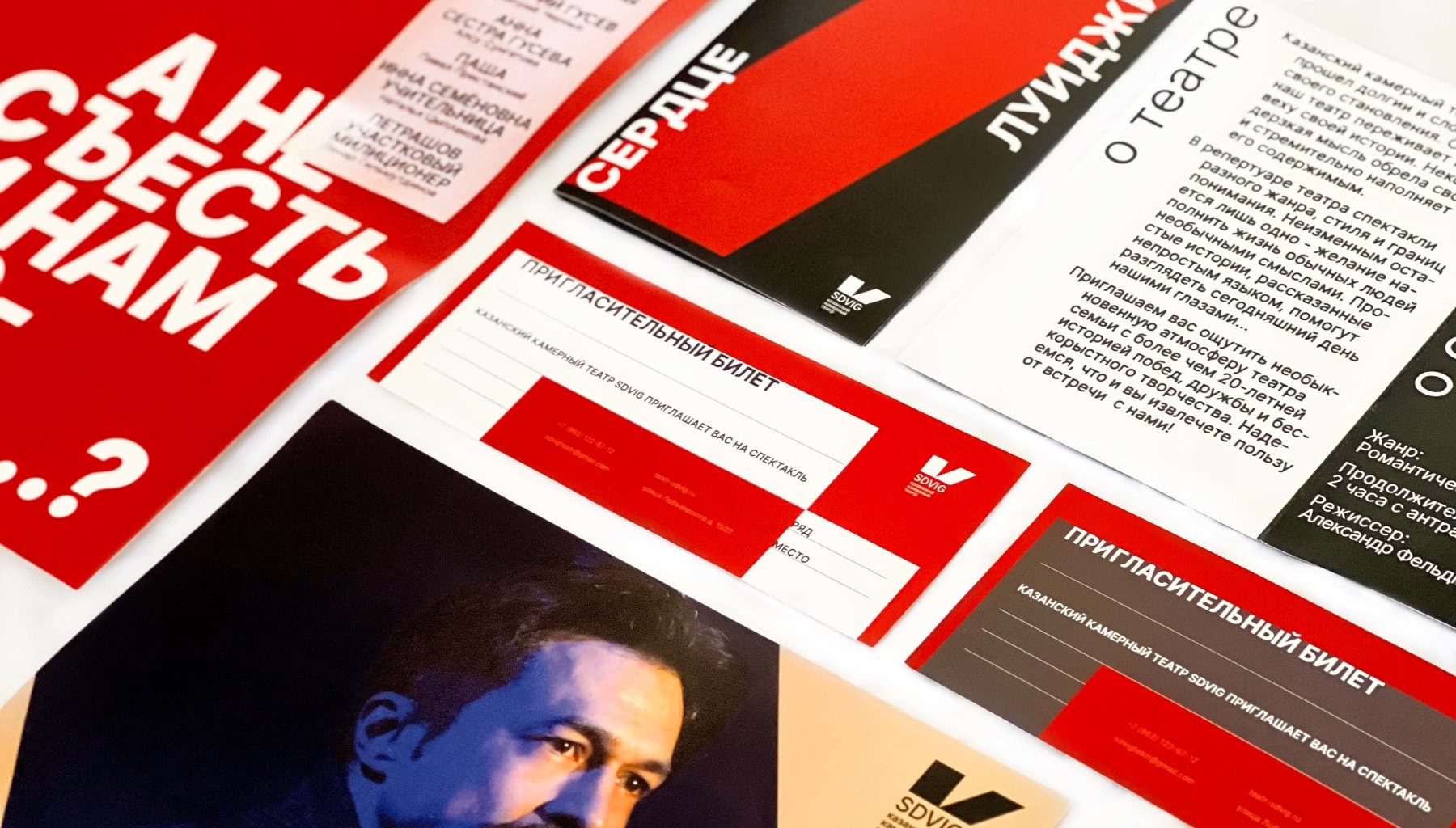
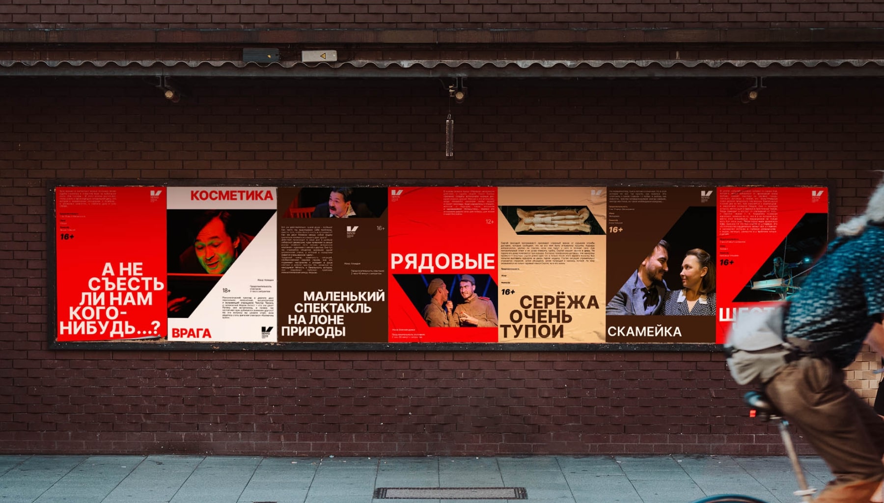
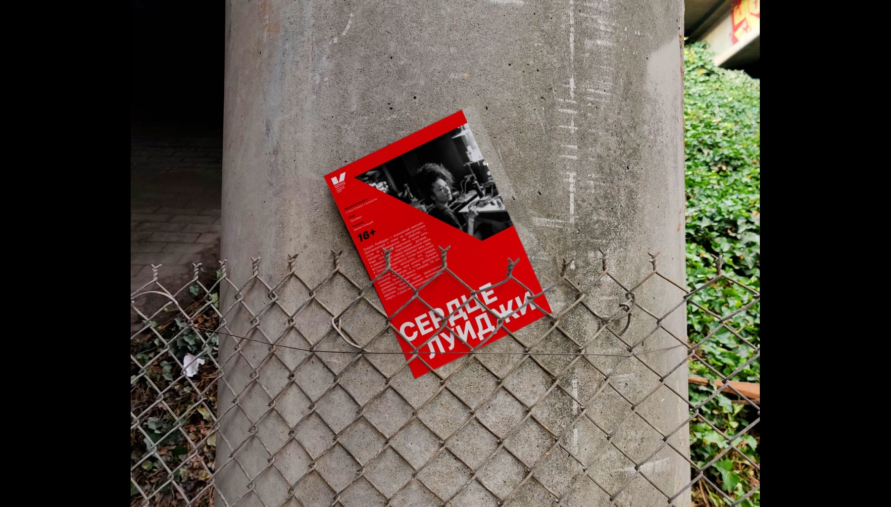
As a result, we have developed posters for all performances in the same style and at the same time unified, which will be placed on the streets of the city, merch shoppers and invitation cards, a concept for photographing the actors of the performance in order to arrange photos in the foyer of the theater in a general style, brochures for performances with replaceable inserts.
According to the customer’s instructions, the Inter font and the standard theatrical palette of black, white and red, supplemented with shades of beige and brown, were chosen as the basis for the identity to detach from the main competitors in the city. The photo style, which was proposed to the representatives of the theater, represents the concept of stopping the frame — a metaphor for stopping time. So, we focus on the main character, the actor. At the same time, the metaphor of the shift remains with the shift (blueray) of people.
The mission of the theater is to tell simple stories in a difficult language that help to see today through the eyes of the directors. With its productions, the theater makes a certain shift in the minds of the audience.


CREDIT
- Agency/Creative: Black&White Design Studio
- Article Title: Rebranding SDVIG Theater’s Visual Identity
- Organisation/Entity: Agency
- Project Type: Identity
- Project Status: Published
- Agency/Creative Country: Russia
- Agency/Creative City: Moscow
- Market Region: Global
- Project Deliverables: Brand Design, Brand Identity, Brand Redesign, Design, Logo Design, Photography Styling, Poster Design
- Industry: Entertainment
- Keywords: theater, concept, rebranding, visual metaphor, minimalism
-
Credits:
Art-director: Veronika Potapova
Brand-designer: Polina Shipilova
Brand-designer: Maria Kopylova


