Ruto Design Studio – exis
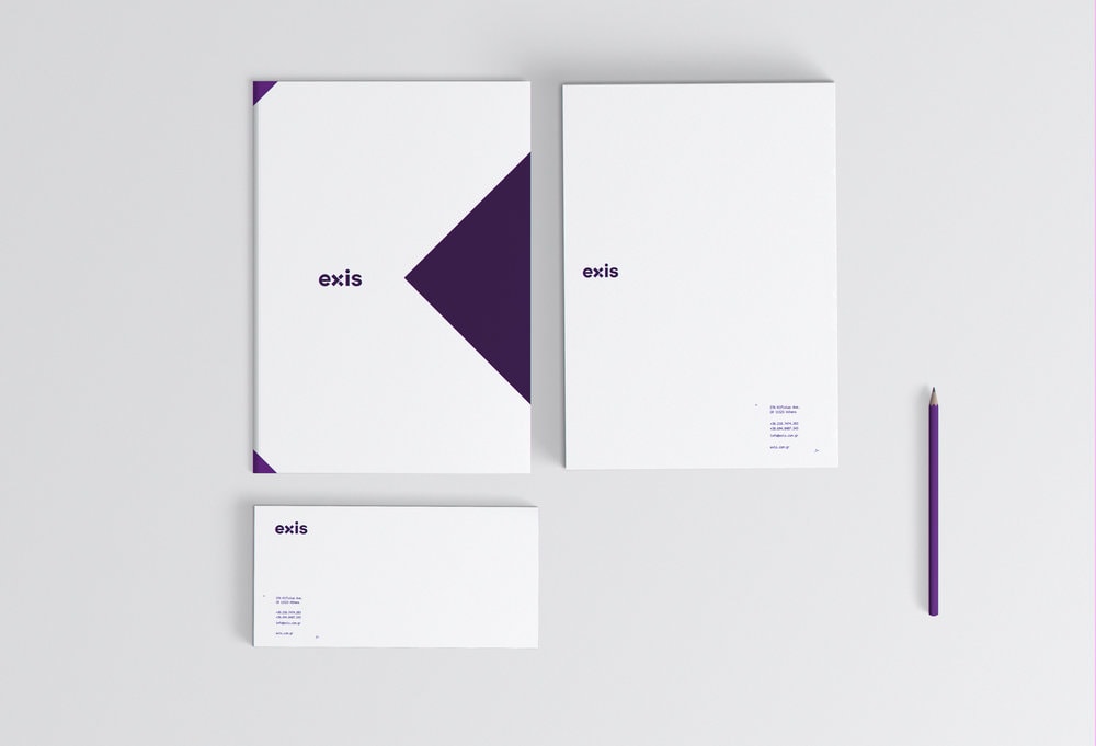
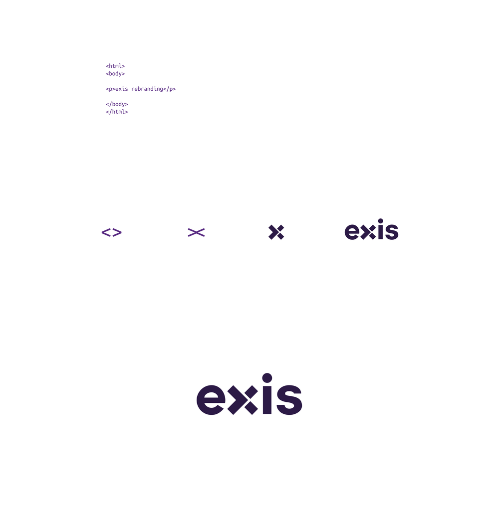
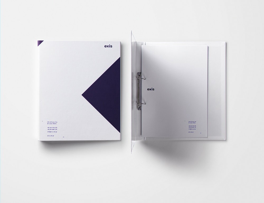
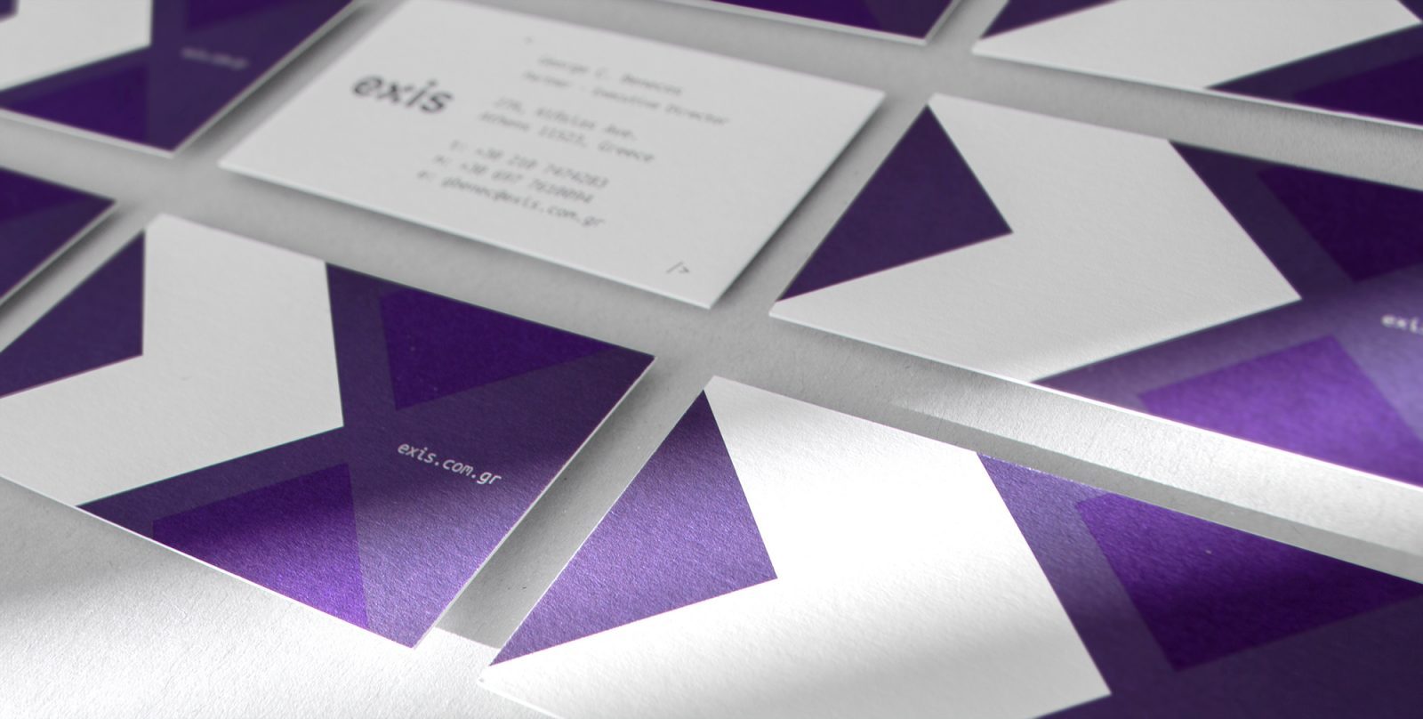
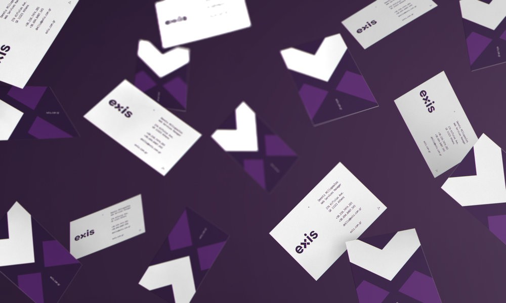
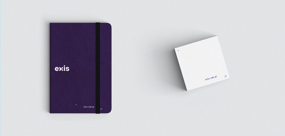
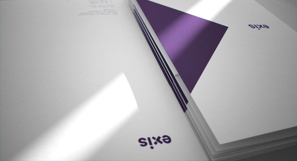
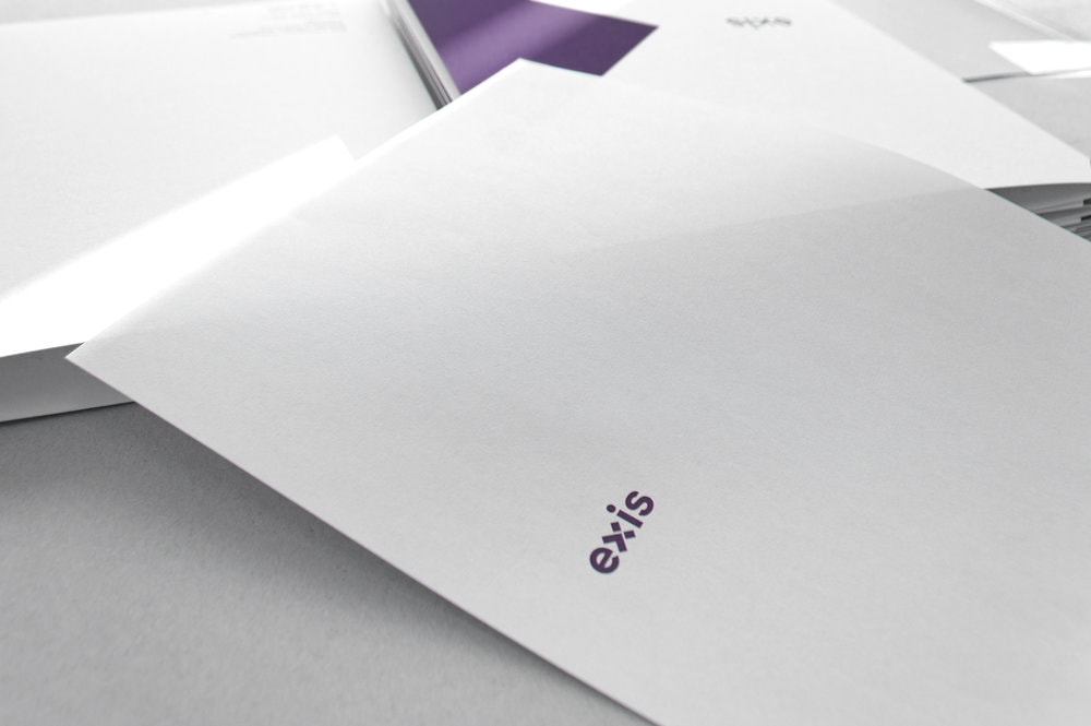
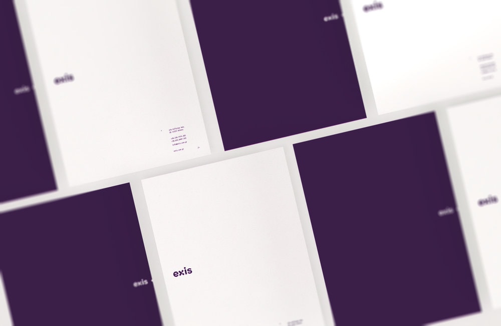
“The Briefing: Α complete brand identity redesign for the technology company exis. ” Exis is an active, agile, fast growing technology company. The constant evolution and the fresh ideas on how to offer better services to our clients is a key element they we want to bring out with our new identity.”The Design: The target was to connect the roots of the company with an aggressive and bold image that will mirror their values. The logo is based on that strange brackets which starts every line of code, a simple but fundamental element of programming. Playing around with them we have the letter “x”, designed that way so the arrow on the top is moving forward, symbolising the constant evolution. The logotype font is strong and geometric to build confident, the secondary fonts are inspired by the simple monotype programming style fonts. Across the corporate ID we will find coding references and big bold shapes made from the “x” and the arrows. The two tones of purple adds an other modern aspect on the new identity of the brand.”
CREDIT
- Agency/Creative: Ruto Design Studio
- Article Title: Rebranding for a Technology Agency in Greece
- Organisation/Entity: Agency Commercial, Published
- Project Type: Packaging
- Agency/Creative Country: Greece
- Market Region: Global
- Industry: Technology


