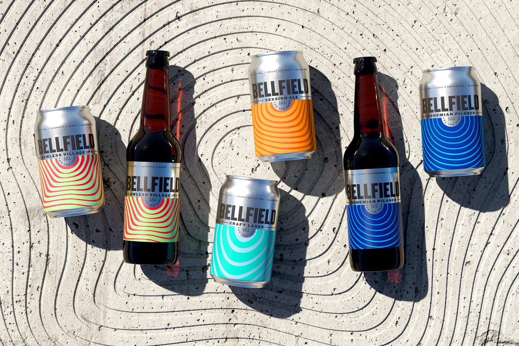
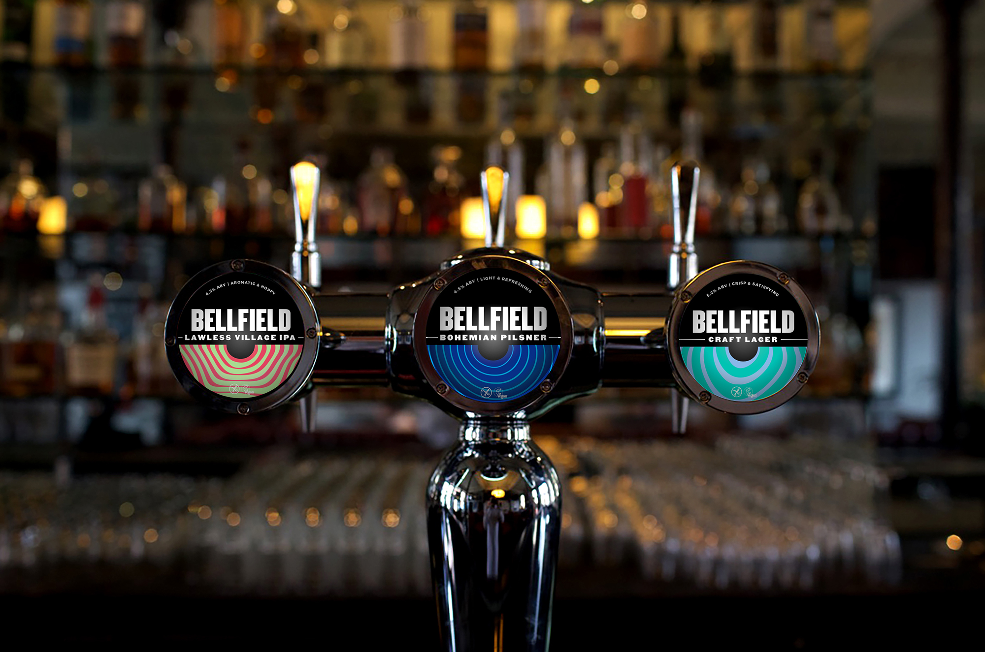
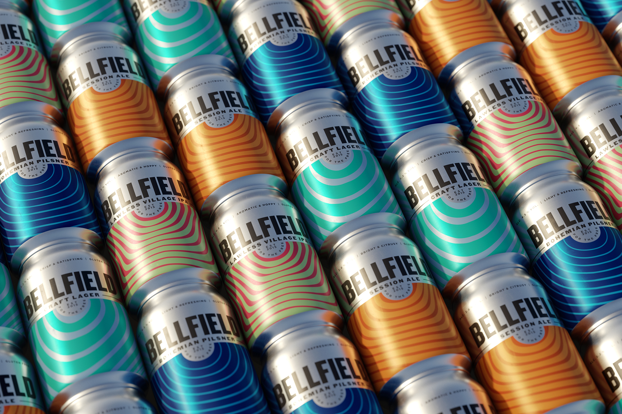
Bellfield is on a mission to brew delicious beer – beer that just happens to be gluten free. However, with an uninspiring, healthy-looking brand they were increasingly getting pigeon holed as only for the gluten-free few. With multiple taste awards in their pocket, they wanted to open their beer up to the masses with a more contemporary design that cut through on shelf.
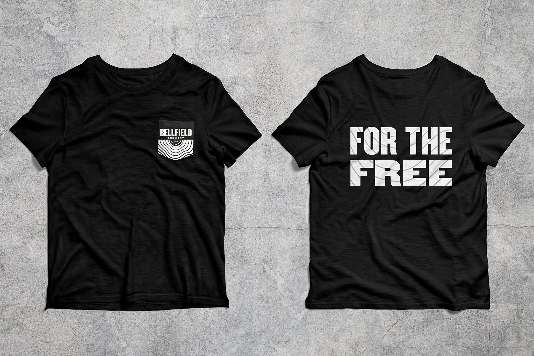
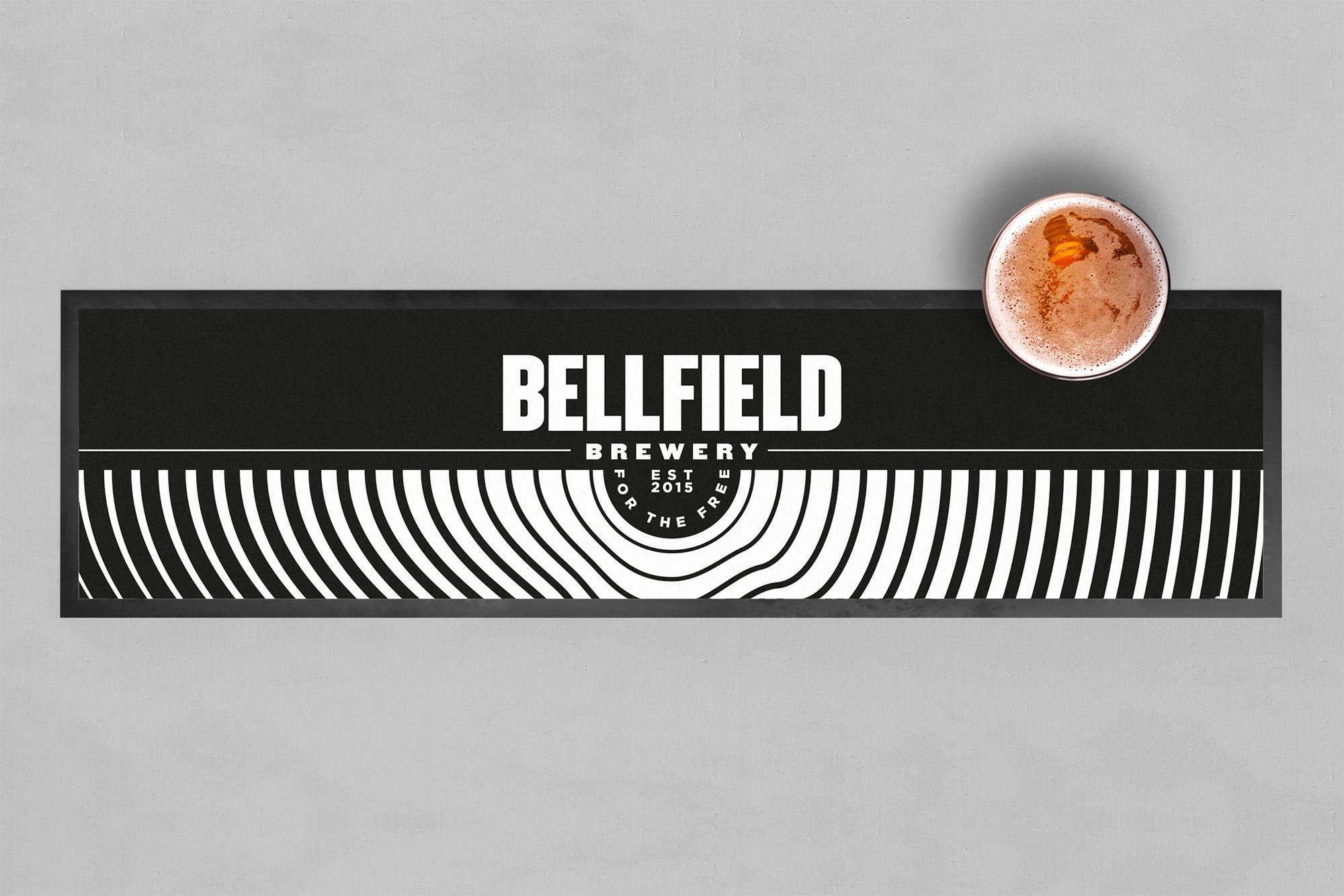
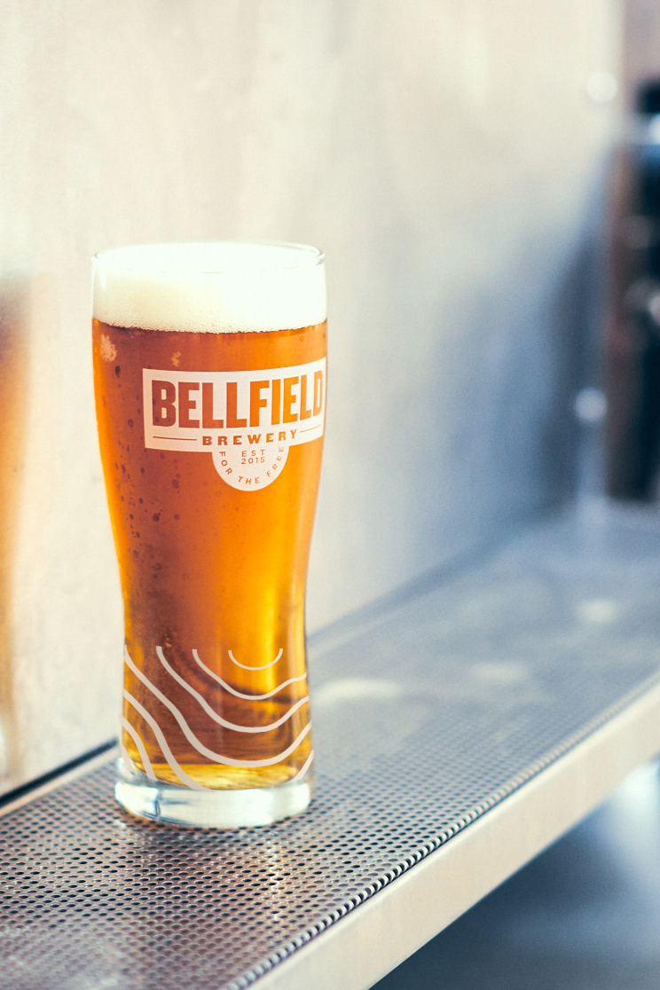
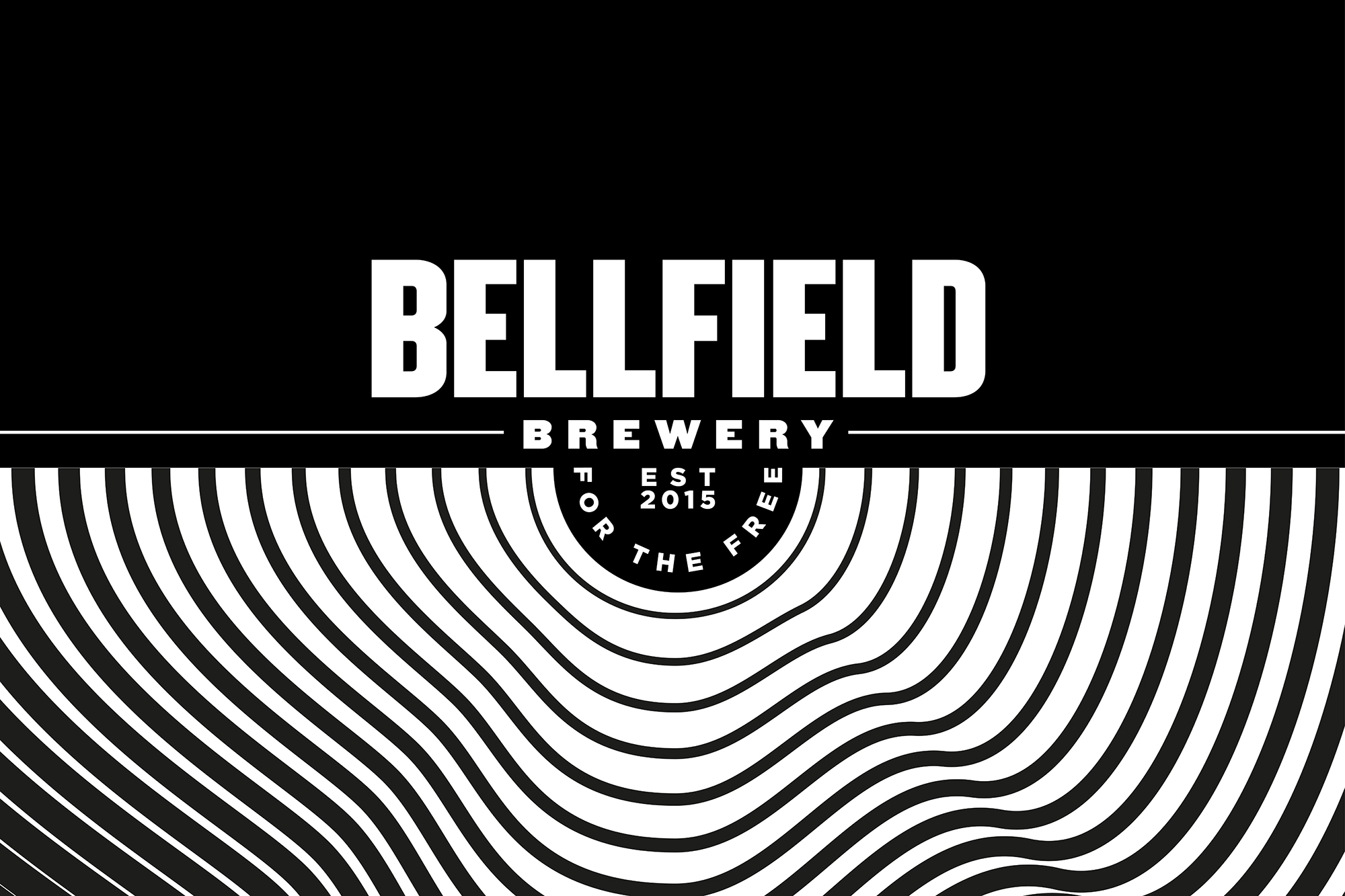
Our new positioning ‘Bellfield Brewery: For the Free’ turned their beer’s gluten absence into an attitude which could apply to everyone. A revolutionary rebrand followed. Instead of opting for a literal ‘bell’ we focussed on the ‘clapper’ (yes, that’s what the inside part of a bell is called, we didn’t know either). This forms a strong, industrial wordmark from which bold patterns resonate out.
CREDIT
- Agency/Creative: Thirst Craft
- Article Title: Rebranding Bellfield Brewery to Resonate With the Masses Created by Thirst Craft
- Organisation/Entity: Agency, Published Commercial Design
- Project Type: Packaging
- Agency/Creative Country: United Kingdom
- Market Region: Europe
- Project Deliverables: Brand Identity, Brand Strategy, Branding, Packaging Design, Rebranding
- Format: Can
- Substrate: Metal


