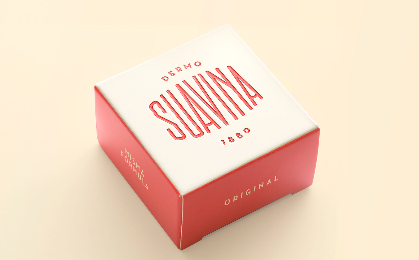
Lavernia & Cienfuegos – Suavina
“Design of the pot and graphics for lip protector. Laboratorios Calduch.
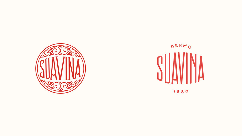
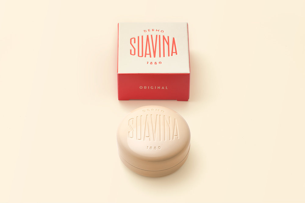
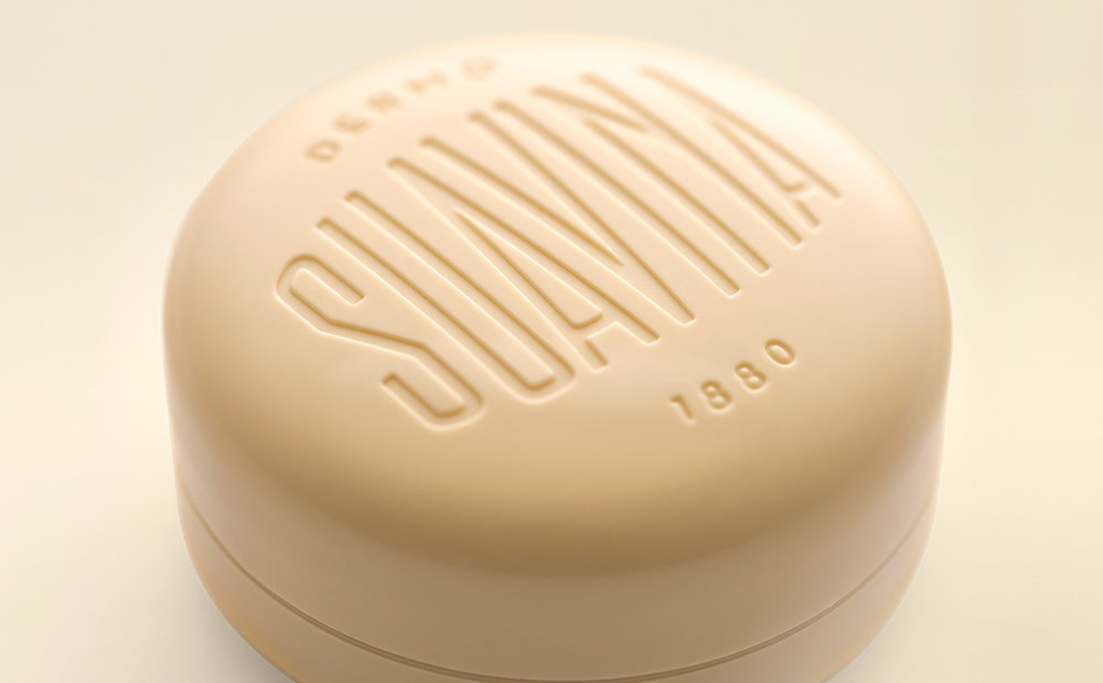
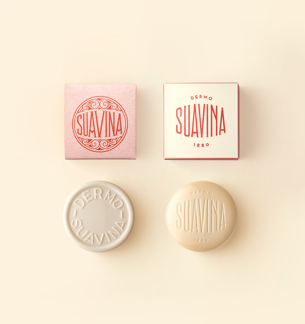
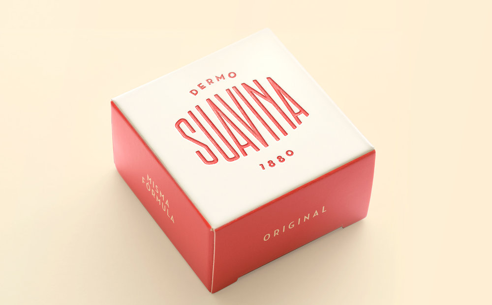
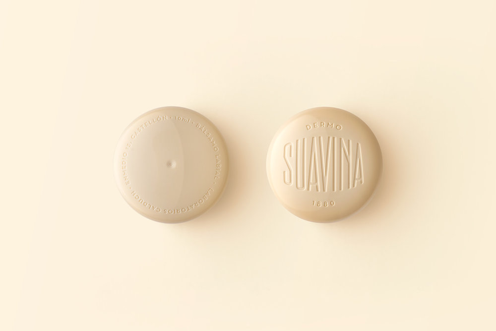
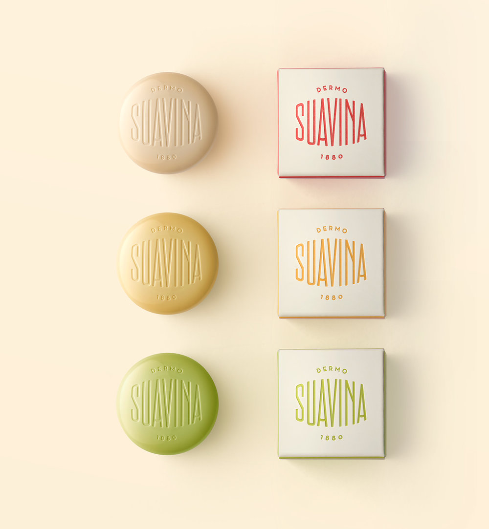
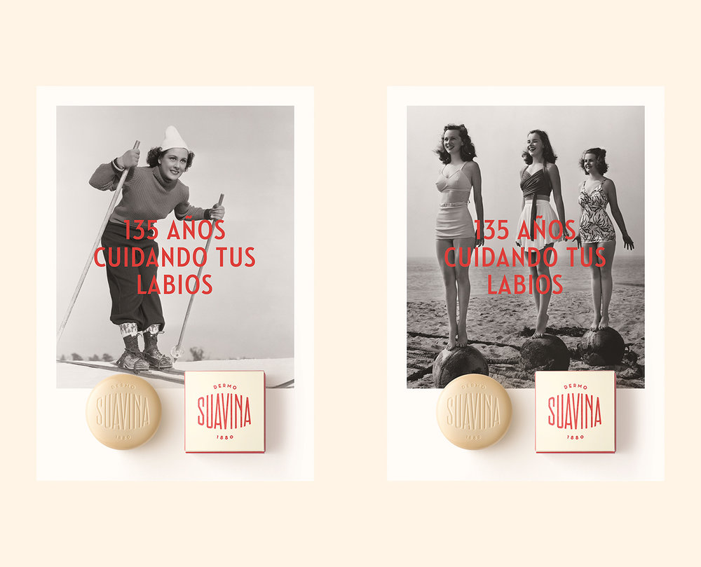
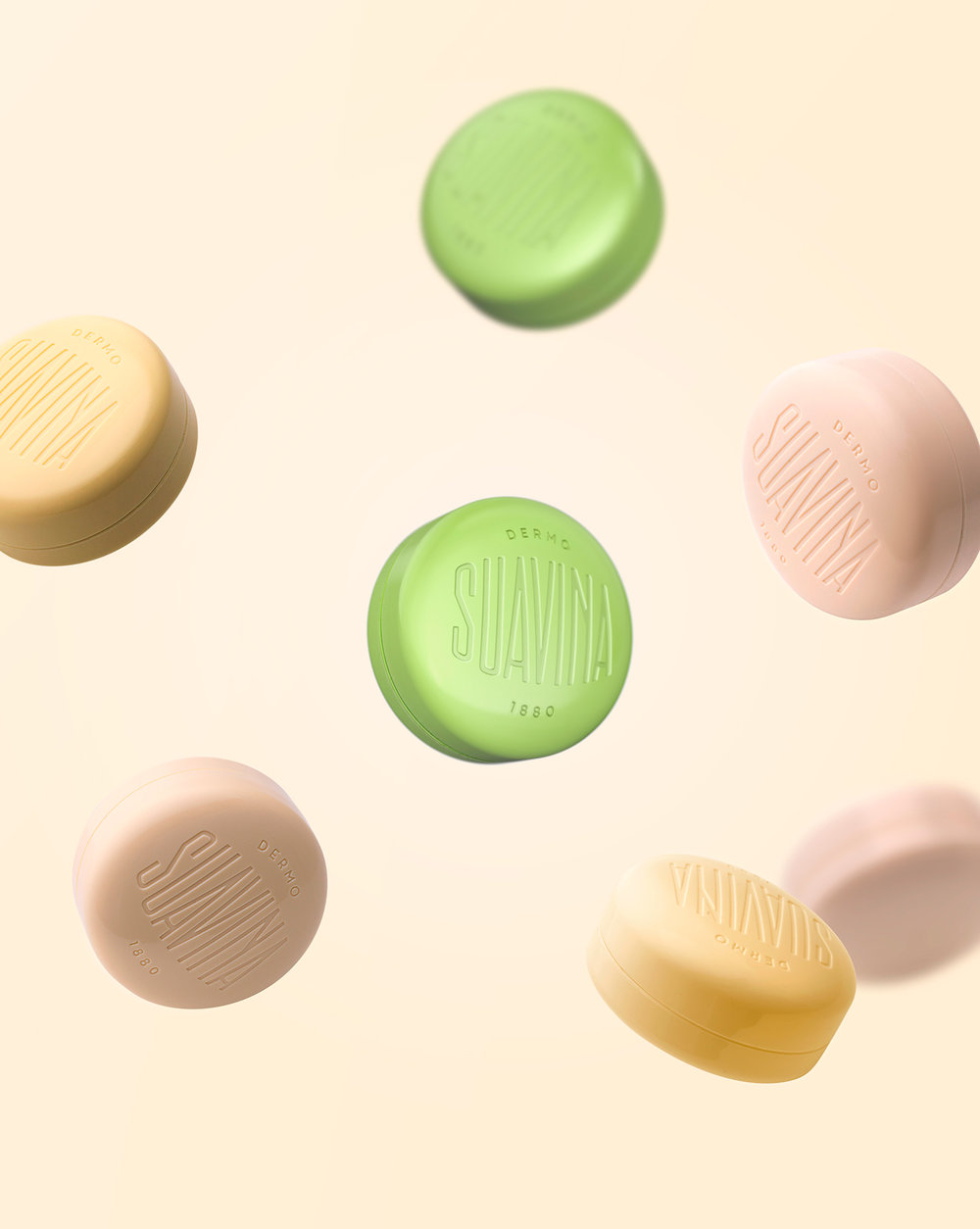
Suavina is a lip protector with a lot of history behind, “135 years taking care of your lips”, as their baseline put it. The design reflects a classic product imagery, following the main brief requirement. The packaging design of the lip cream container is a redesign, a updated version of the container they have been using for many years. The surface has been curved and the edges has been rounded to bring the smoothness effect that this type of product requires. The lid shows the brand, which was redesigned from the original brand. It also includes the word “demo”, and the date of foundation of the brand: 1880. The design solution itself seeks to convey both tradition and modernity through elements such a classic typographic composition, Sans Serif fonts, and debossed letters.
To read about this project in Spanish please go to / Para leer sobre este proyecto en español por favor pulsa en el siguiente link:
http://lavernia-cienfuegos.com/es/trabajo/suavina ”
CREDIT
- Agency/Creative: Lavernia & Cienfuegos
- Article Title: Rebranding and Packaging Design of Spanish Lip Cream Brand
- Project Type: Packaging
- Agency/Creative Country: Spain
- Format: Box
- Substrate: Pulp Carton


