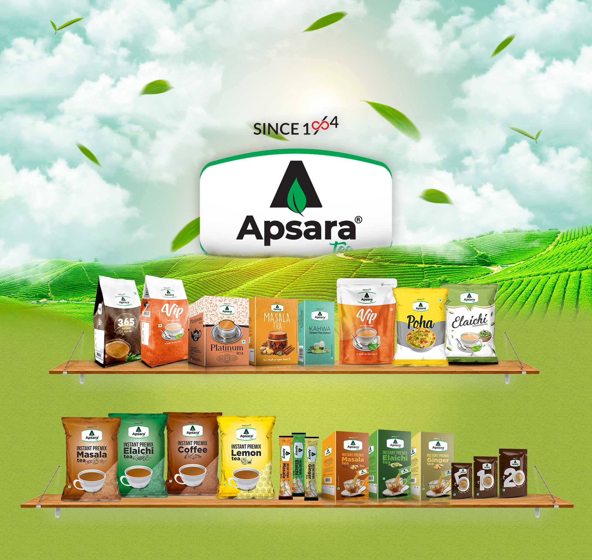
Apsara Tea has been established in India since 1946 and now they want to expand reach in modern trade space, so the challenge was to revamp the traditional identity and give it a modern look and feel.
Branding: We played around the icon “A” and tea leaves and integrated both together to give minimalist yet elegant logo identity. We even fixed certain guidelines for colour, measurement and placement of their logo on packaging, collaterals and digital media.
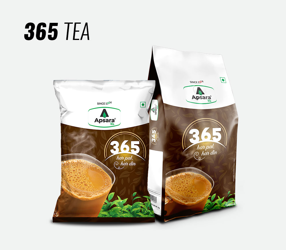
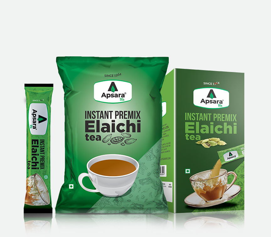
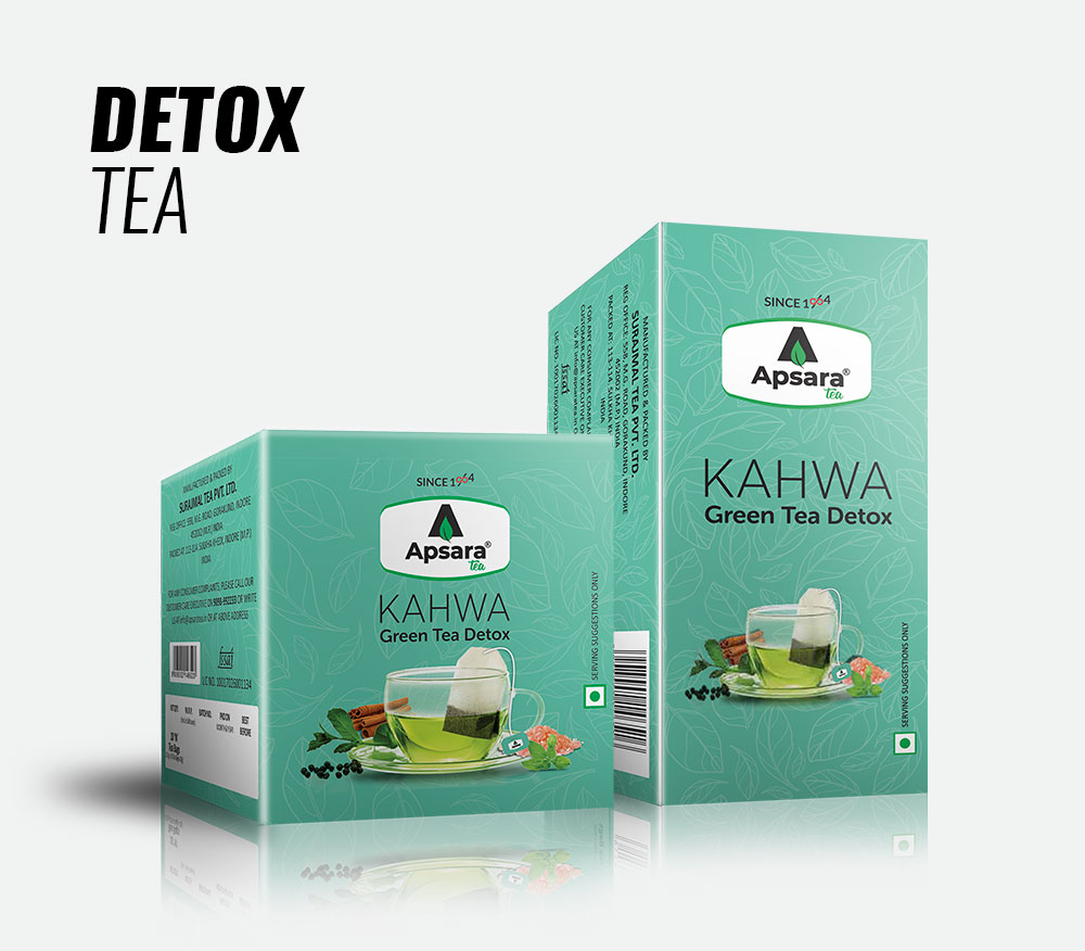
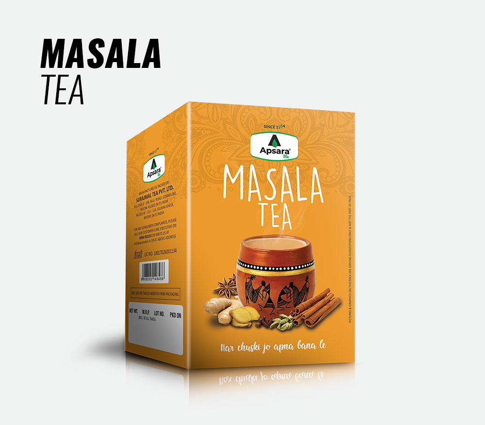
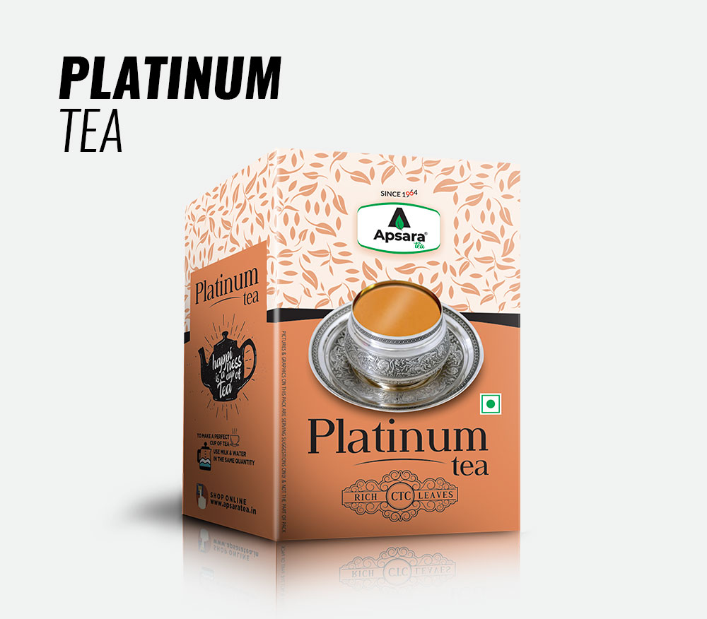
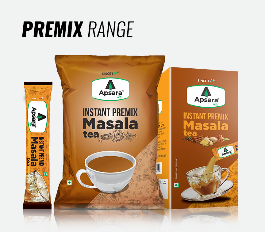
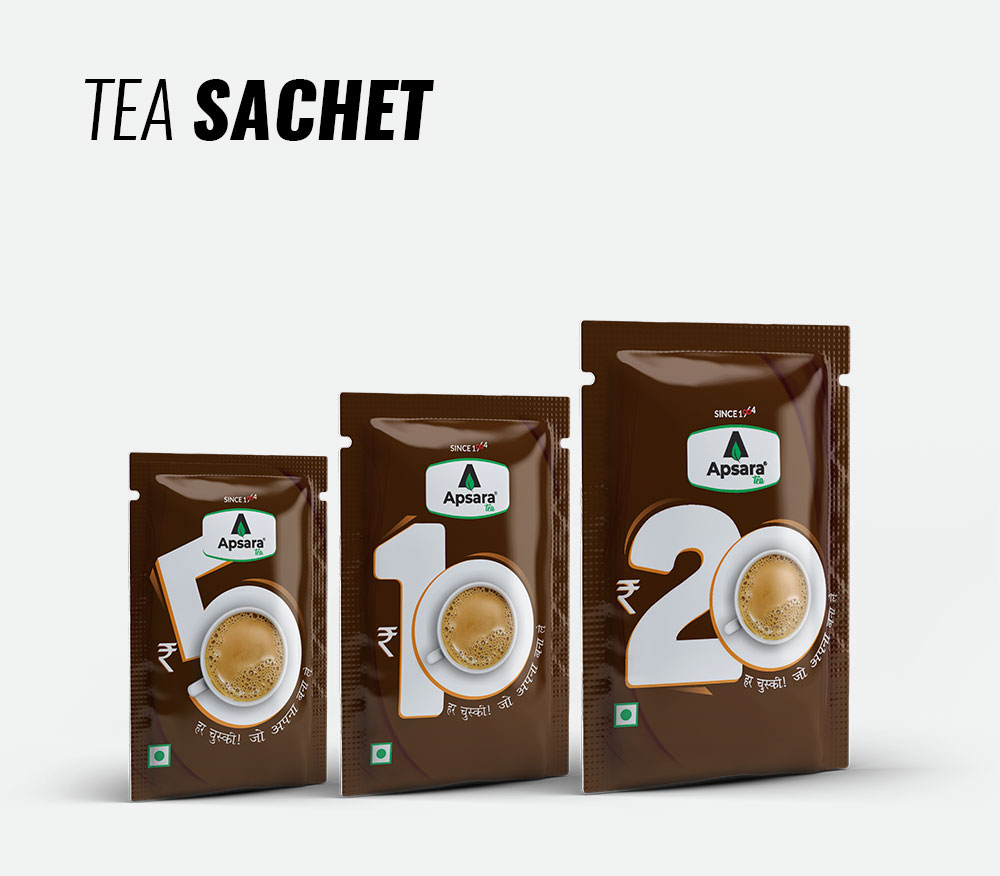
Packaging: We deep-dived on research with their competitors on placement and look and feel on product shelves. Built a strategy to give them fair competition, highlighted the value proposition of products and made it stand out from the sheep.

CREDIT
- Agency/Creative: At Glint Branding
- Article Title: Rebranding and Packaging Design for Apsara Tea, Created by At Glint Branding
- Organisation/Entity: Agency, Published Commercial Design
- Project Type: Identity
- Agency/Creative Country: India
- Market Region: Asia
- Project Deliverables: Brand Experience, Brand Redesign, Brand Strategy, Packaging Design, Product Naming, Rebranding, Research, Tone of Voice
- Industry: Food/Beverage
- Keywords: tea, branding, packaging, design
FEEDBACK
Relevance: Solution/idea in relation to brand, product or service
Implementation: Attention, detailing and finishing of final solution
Presentation: Text, visualisation and quality of the presentation


