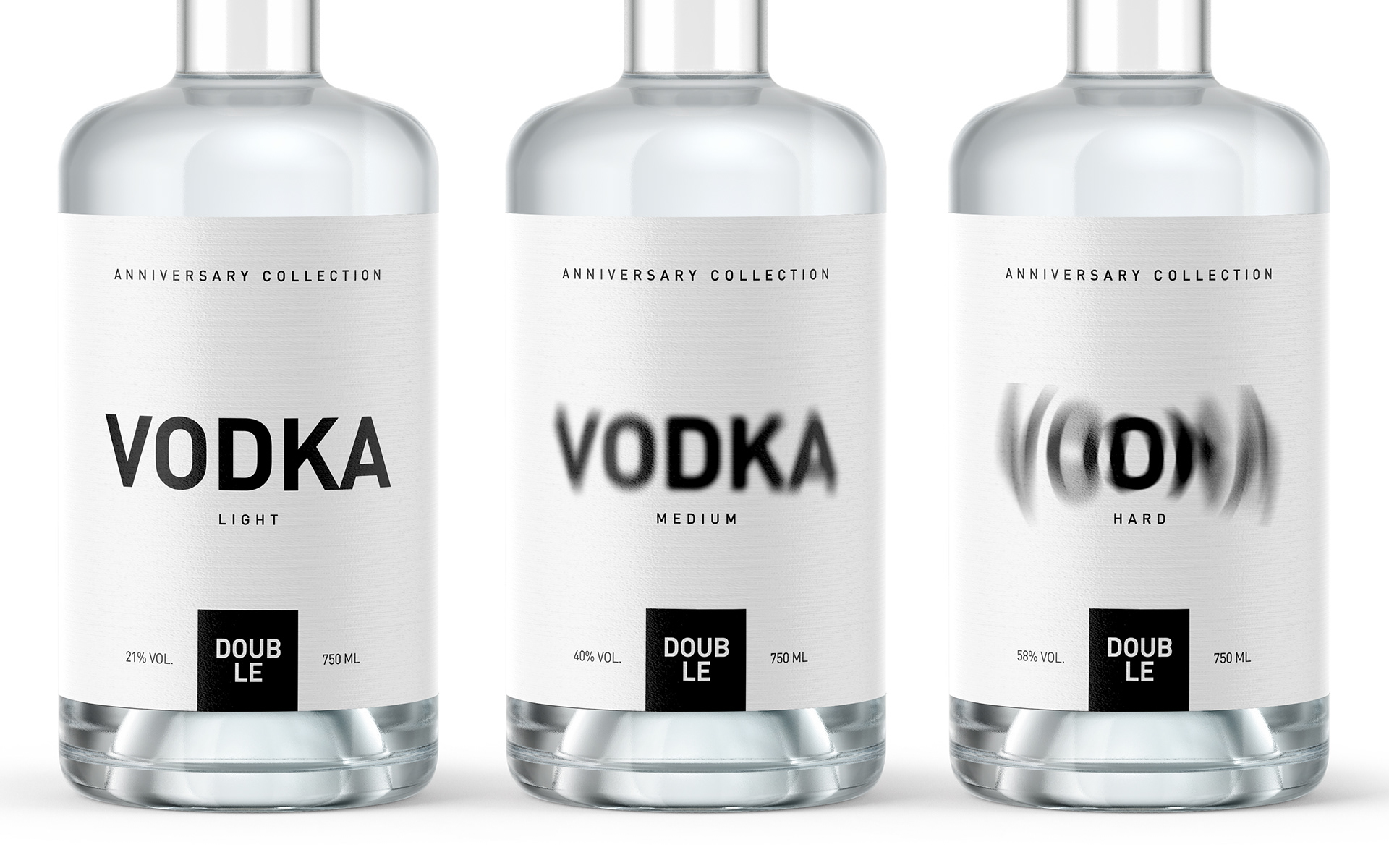
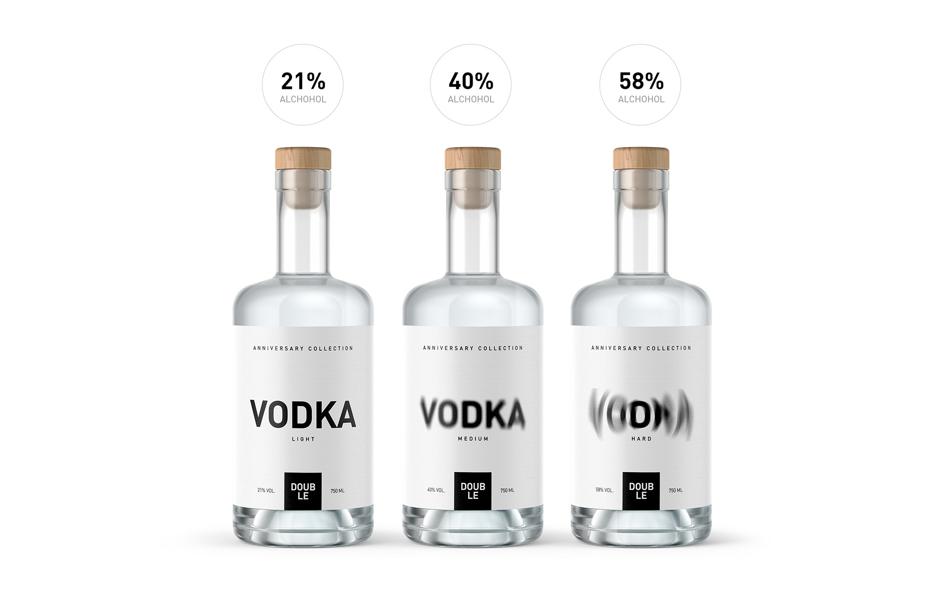
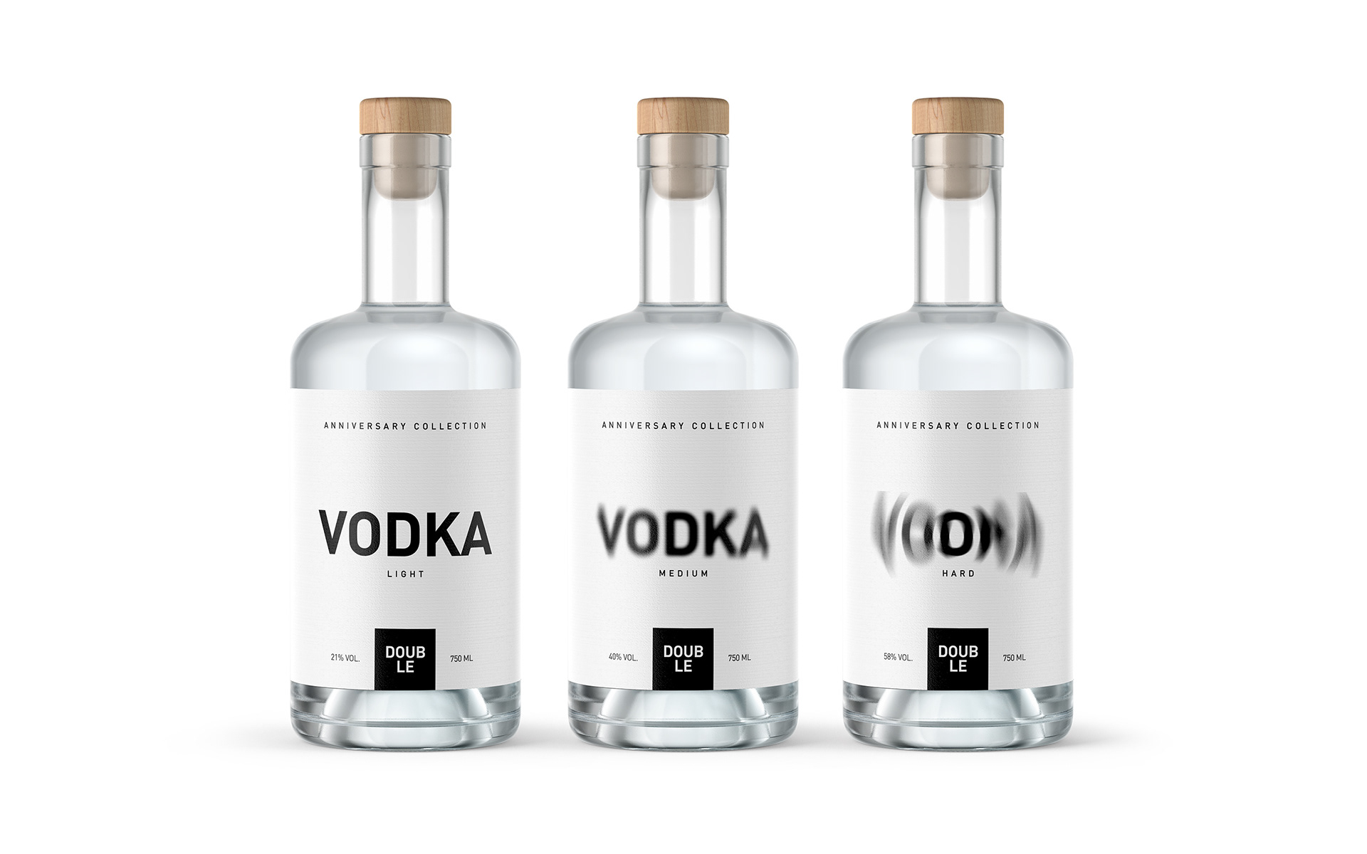
A solution designed to ease the degree of intoxication. No need to read the details. The packaging tells you the degree of blurriness your eyes see when you drink it. Alcoholic beverages should be of minimal design because people already think that the label is misleading. This label simply gives you a choice as to how much you want to get drunk and choose how much you want to get drunk.


CREDIT
- Agency/Creative: Rahim Ismayil Design
- Article Title: Rahim Ismayil Design Concept for Double Vodka Anniversary Collection
- Organisation/Entity: Agency, Non Published Concept Design
- Project Type: Packaging
- Agency/Creative Country: Azerbaijan
- Market Region: Global
- Project Deliverables: Brand Strategy, Branding, Graphic Design, Packaging Design
- Format: Bottle
- Substrate: Glass, Glass Bottle
FEEDBACK
Relevance: Solution/idea in relation to brand, product or service
Implementation: Attention, detailing and finishing of final solution
Presentation: Text, visualisation and quality of the presentation


