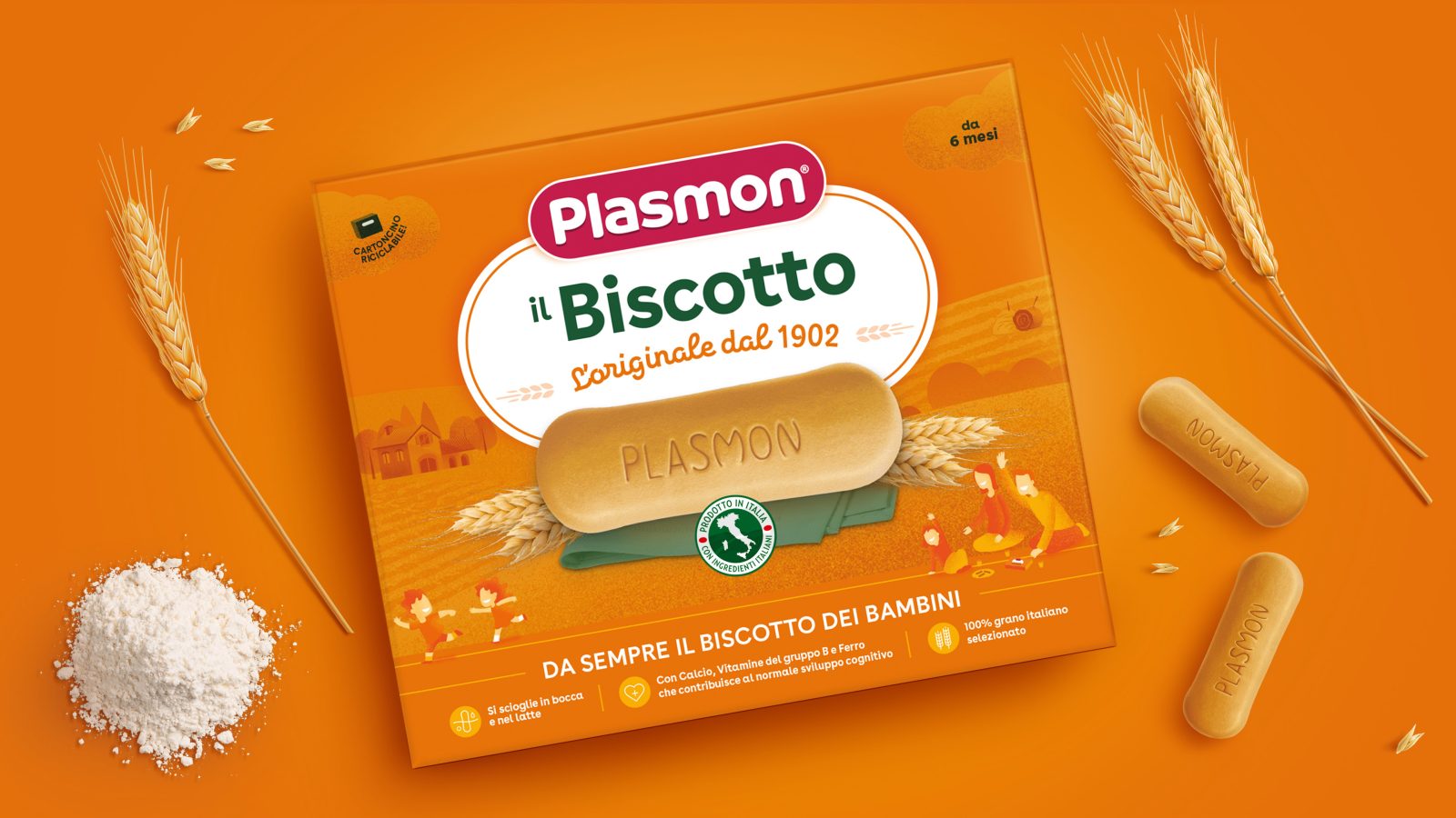
Total rebranding and new packaging revamp
Plasmon, the baby-food Icon-Brand for the present and future of Italy.
Design Group Italia and Kraft Heinz have worked together to define Plasmon’s new long-term journey, with a strategy targeted to reposition the brand since 120 years from its birth.
The plan has provided for a rationalization of the product portfolio, composed of more than 200 SKU’s and a subsequent offering portfolio redefinition according to three different and complementary platforms, with evolving looks&feels:
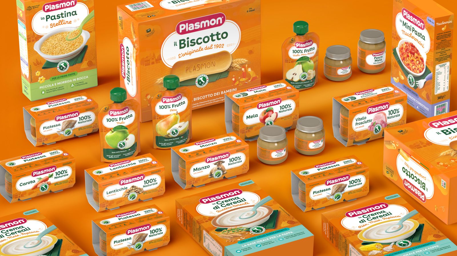
Origin Matters: the core platform, composed by 80% of Plasmon’s products, which includes the entire weaning range (baby-food; desserts; small pasta; mushes; smoothies; biscuits).
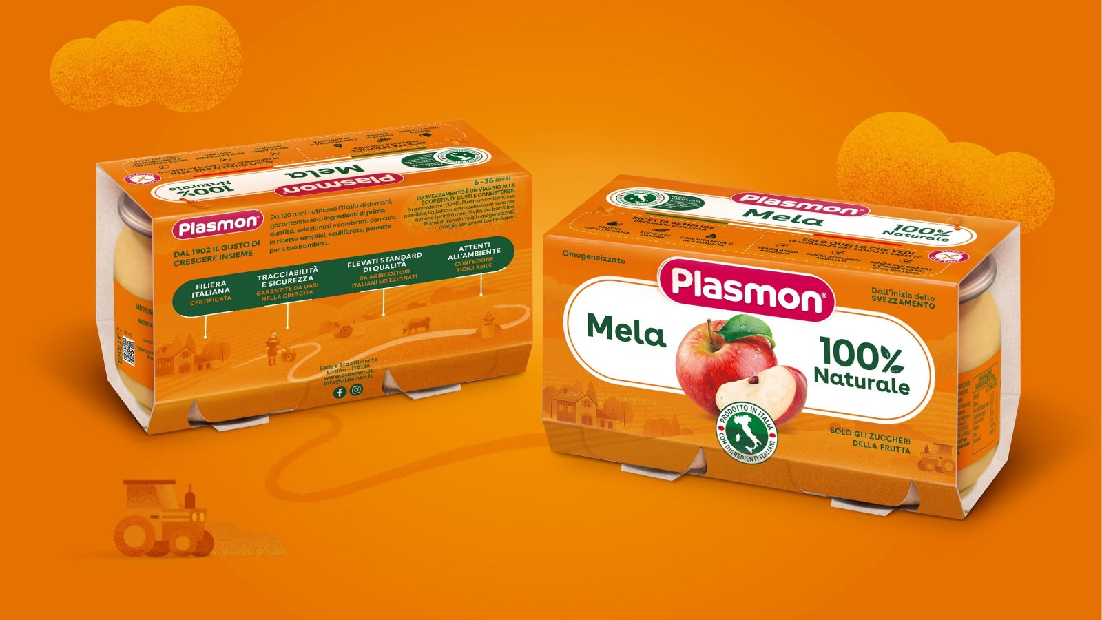
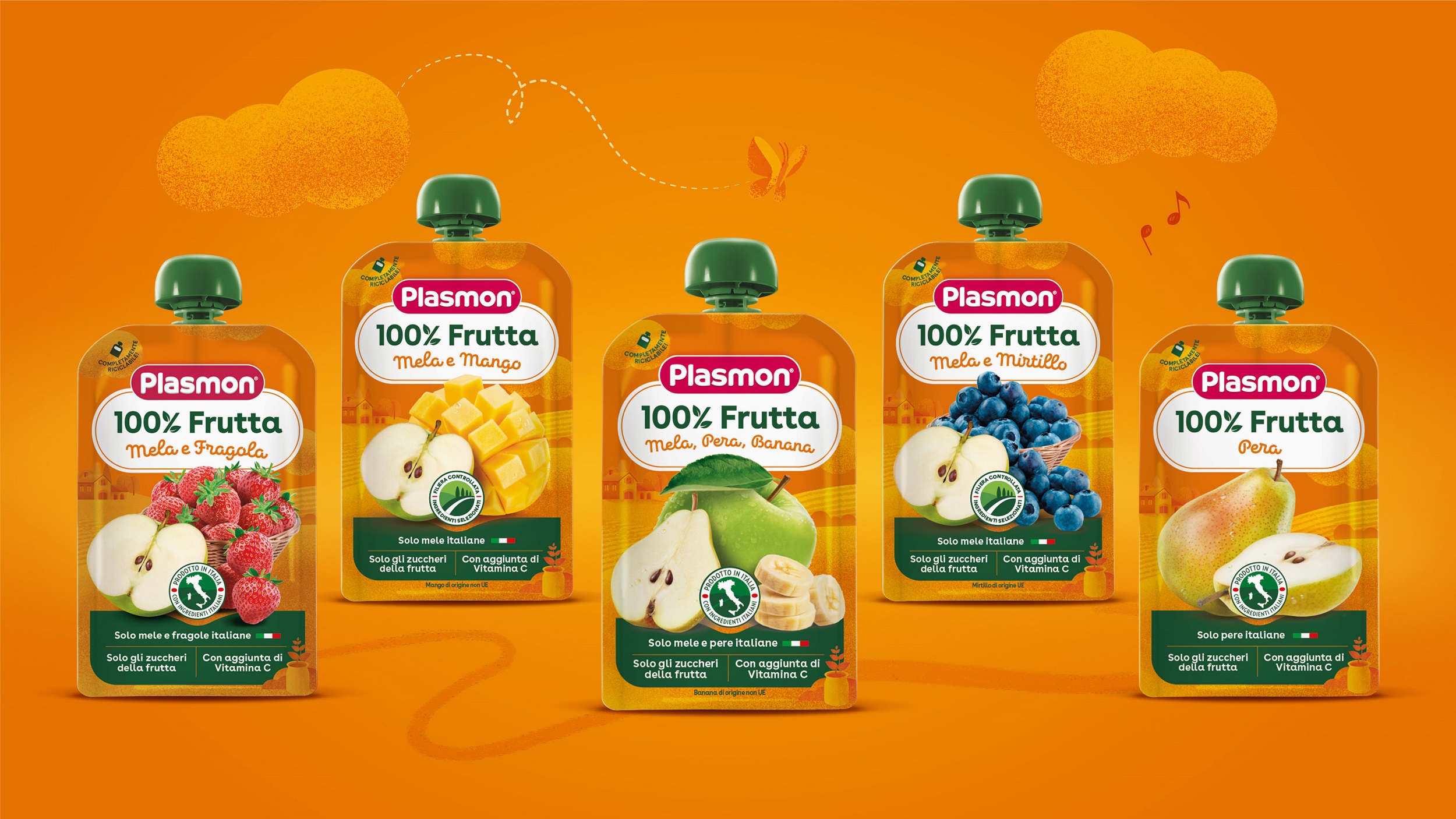
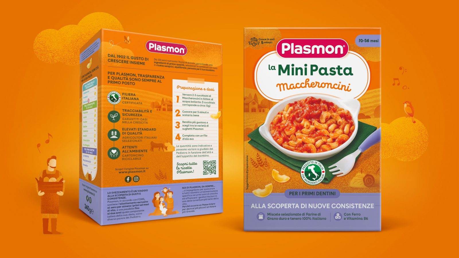
A crosswise rebranding, aimed to evolve Plasmon’s positioning towards a proposition that talks about the Italian, transparent supply chain “Filiera” (the only one in the baby-food sector, certified MIPAAF, Italian Ministry of Agriculture & Nutrition), the exclusive selection of 100% natural ingredients and actively supports a balanced, healthy nutrition.
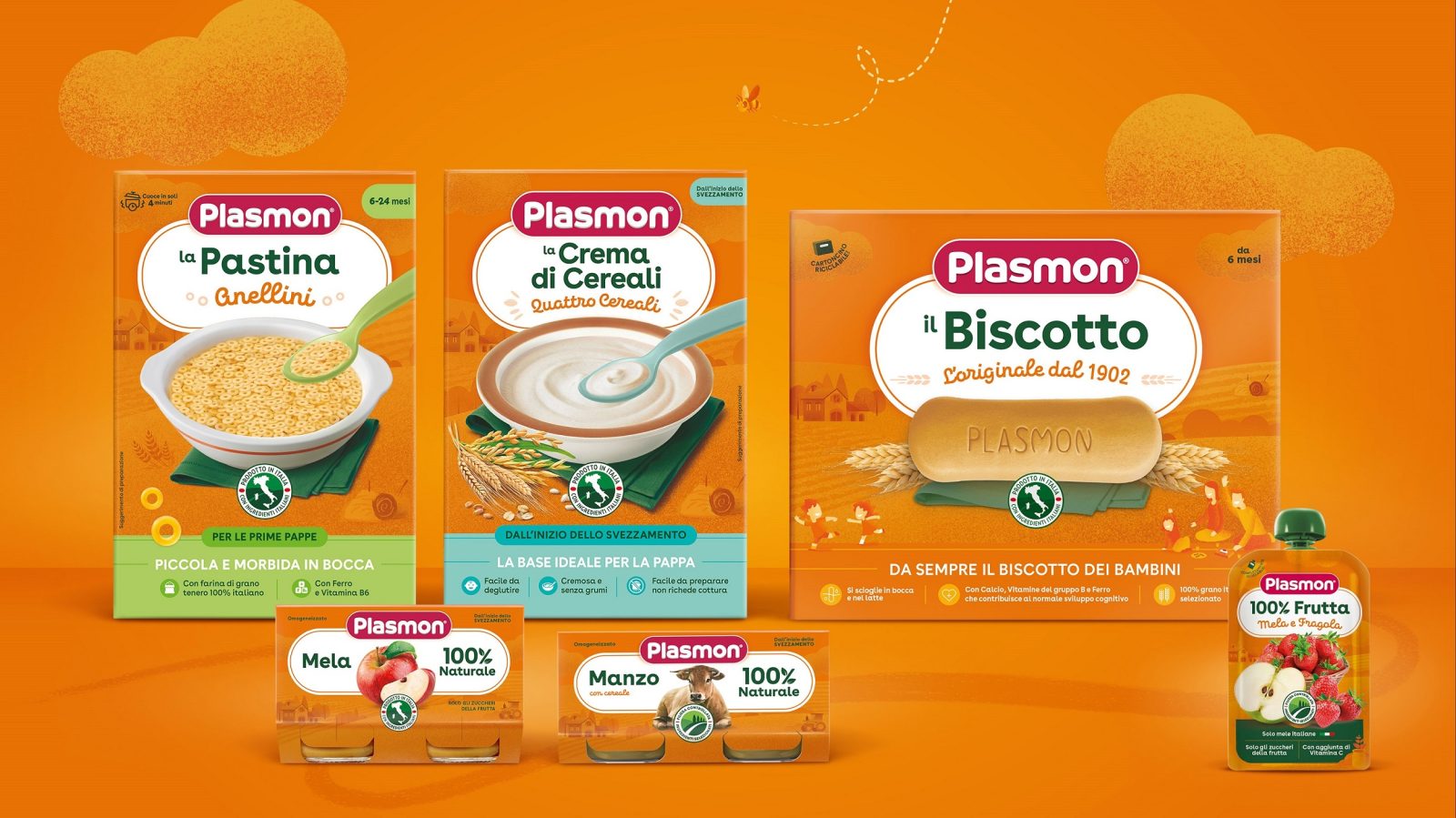
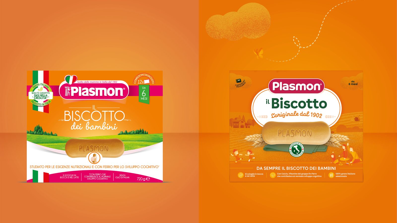
Design Group Italia has redesigned Plasmon’s core packaging identity and restructured the system to make it hierarchically rational and accessible; flexible and easily adaptable on several formats; memorable and of great visual impact, inspired by the brand values in its key elements:
A. Central branding area to define the product, category and facilitate the content legibility
B. key-visuals devised to drive appetite appeal, naturality and freshness
The total rebranding has also addressed the key Plasmon’s design equities with:
A new logo, eased in its secondary elements (elimination of serifs; pictograms; devices; over-structures) and simplified in its typography, which capitalizes on the historic biscuit-shaped device (iconic Plasmon product) and the magenta colour, re-interpreted in a fresh and contemporary look, to bring it closer to the new generation of parents
An orange brand colour, re-calibrated and evolved in terms of shade and tone, to create a natural, reliable and defensible perception
A line illustrated landscape, owned by Plasmon, to identify the Italian supply chain consistently on the entire visual system
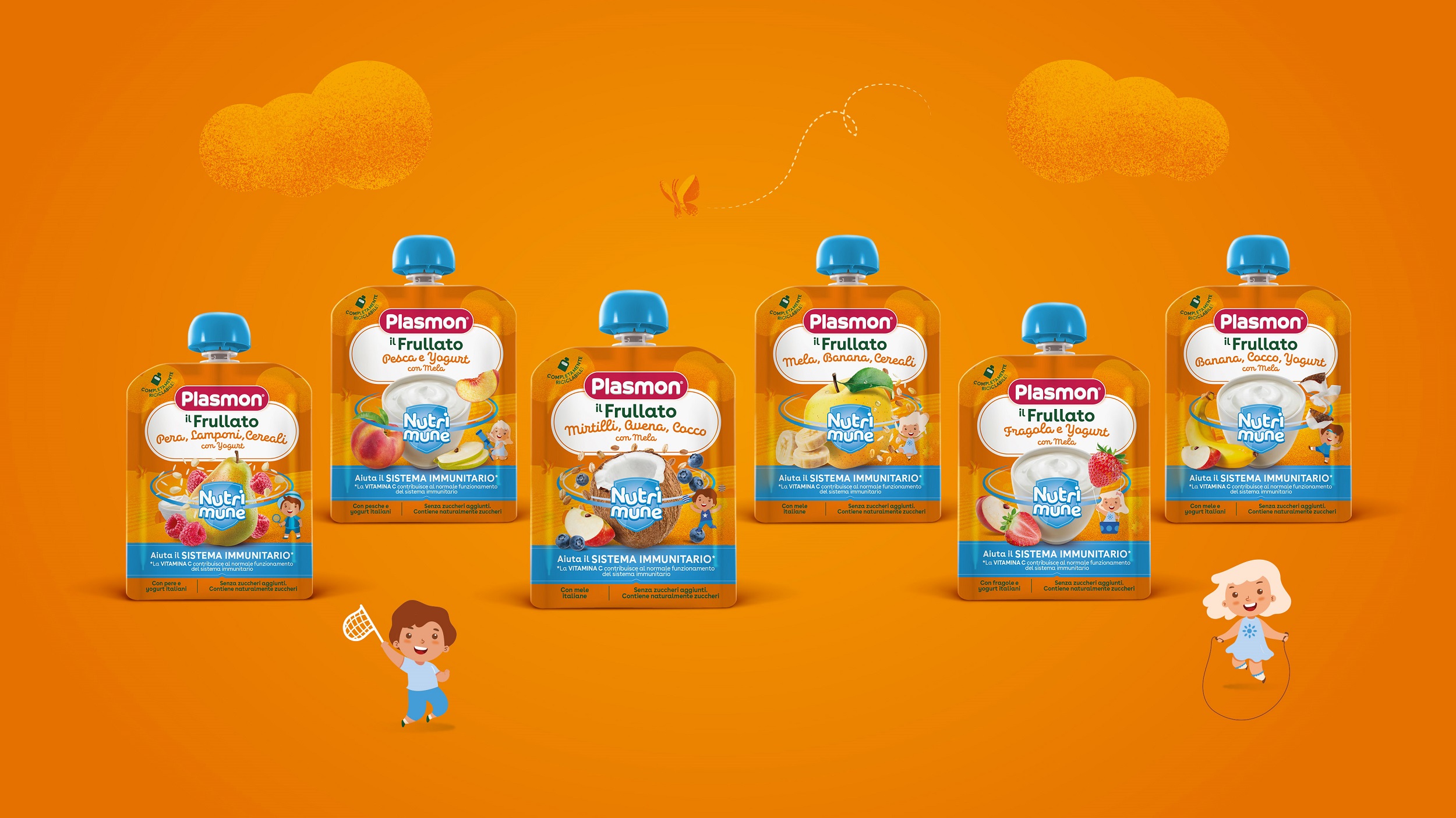
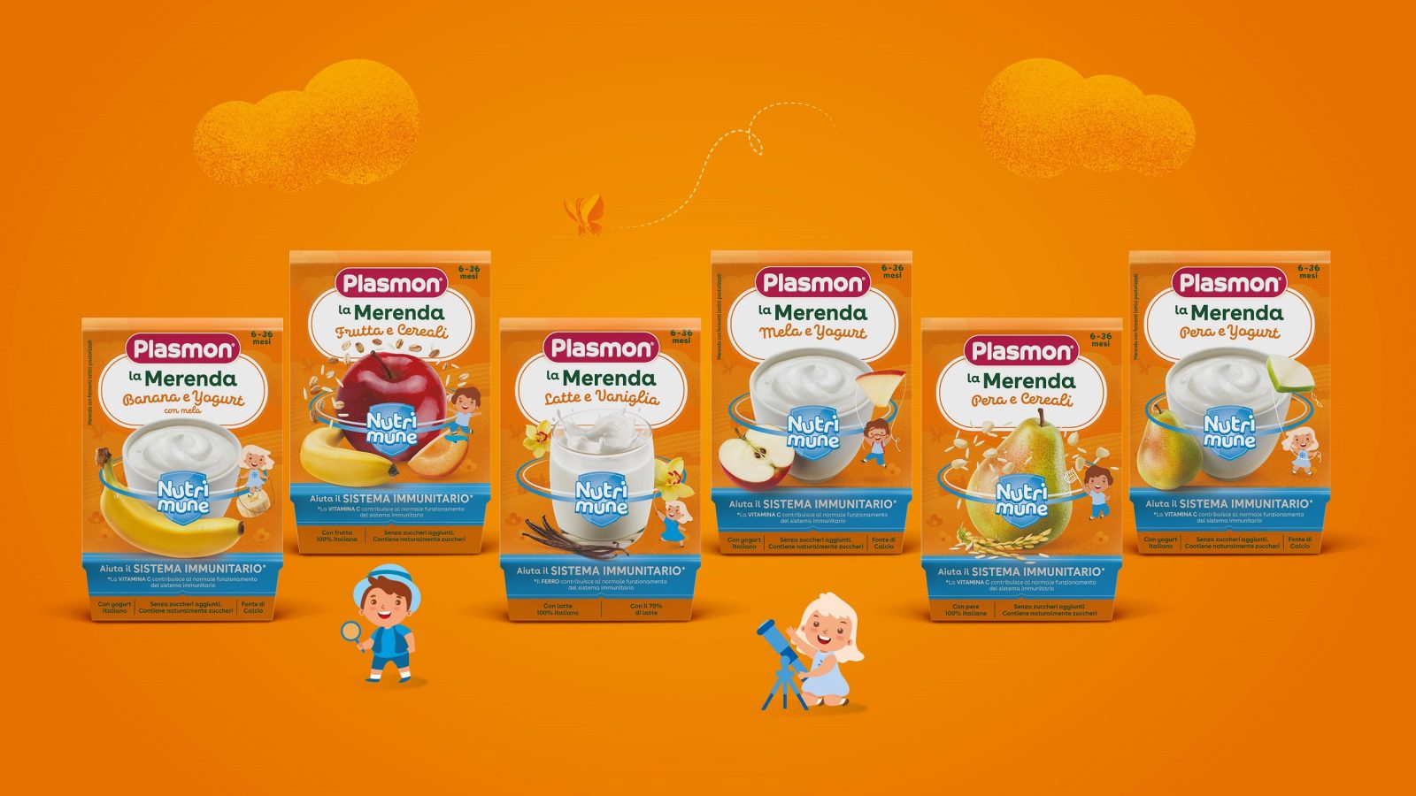
Nutrition Matters: the functional platform composed of the exclusive patented products Nutri-Mune, formulated to help smallest children’s immunity system.
From a sub-brand with a scientific and paramedical look&feel, Nutri-Mune has been repositioned as a sub-range of products with an extra functional boost. A natural “good science” in line with Plasmon’s mother brand values.
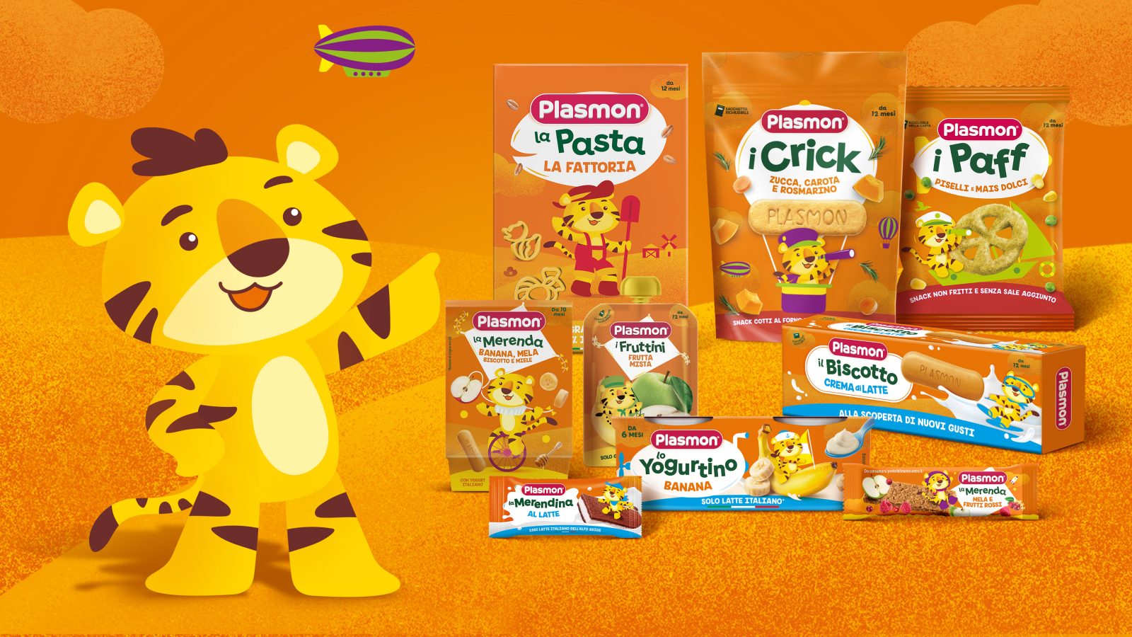
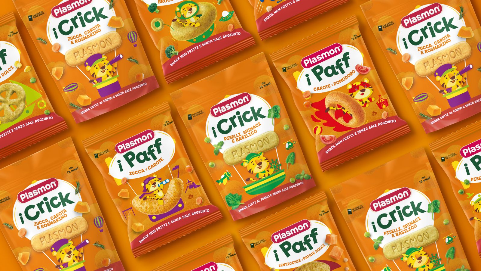
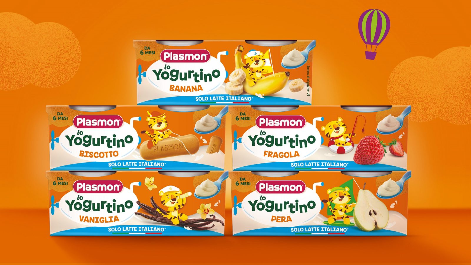
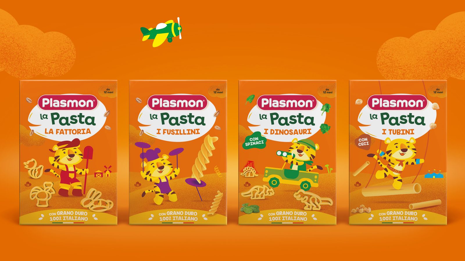
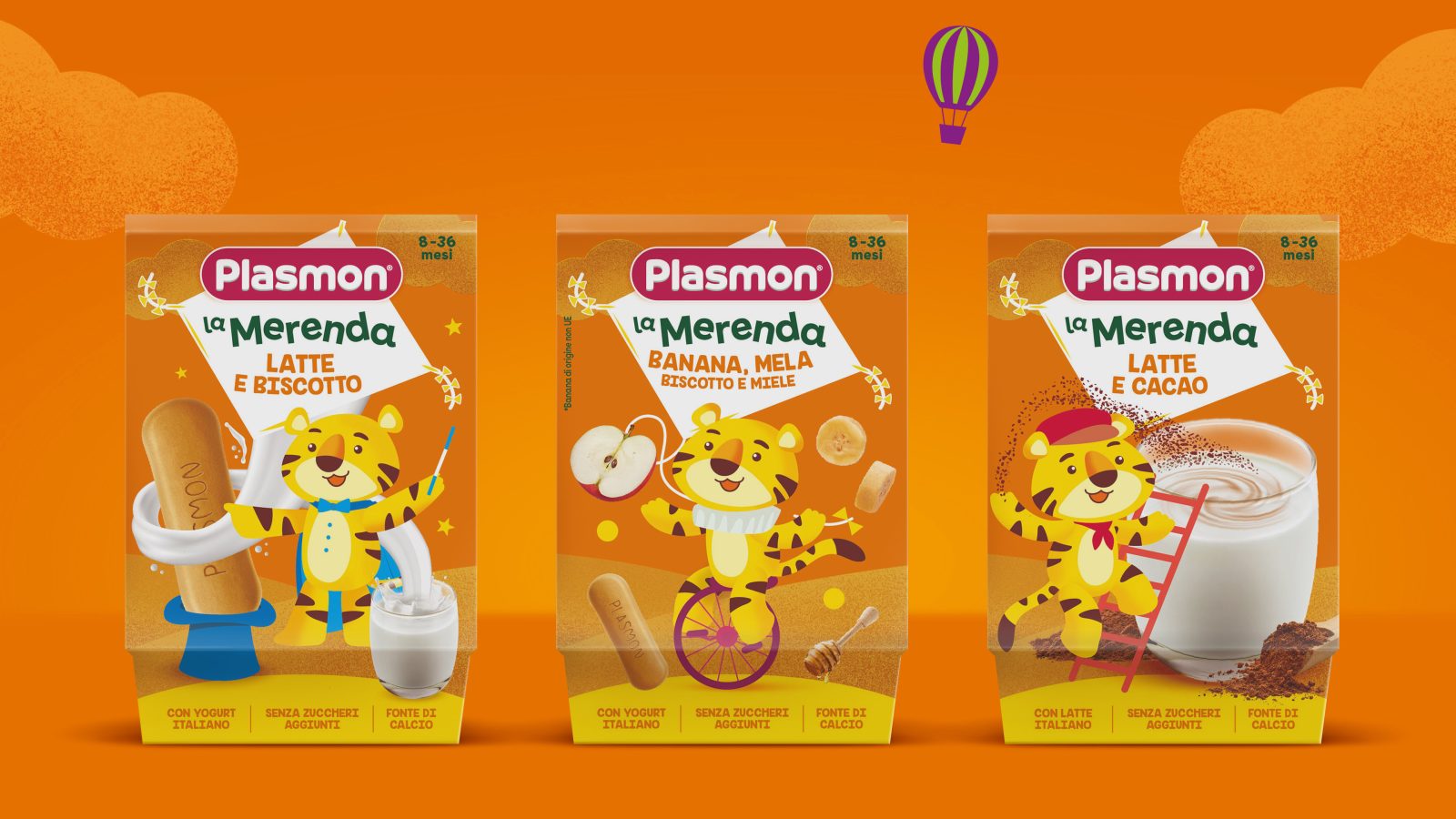
Discovery Matters: the up-aging platform that leads toddlers since 10 to 36 months towards new tastes and consistencies (snacks; biscuits; yogurts; desserts; NPDs) with a new hero-character: Trotto il Tigrotto, the funny and surprising little tiger who engages children to take on a discovery adventure on every pack.
CREDIT
- Agency/Creative: design Group Italia , kraft Heinz
- Article Title: Plasmon Packaging Redesign
- Organisation/Entity: Agency
- Project Type: Identity, Packaging
- Project Status: Published
- Agency/Creative Country: Italy
- Agency/Creative City: Milano
- Industry: Food/Beverage
- Keywords: WBDS Agency Design Awards 2022/23
-
Credits:
Head of Marketing Kraft Heinz: Francesco Meschieri
Brand Design Director Design Group Italia: Michele Favaretto
Senior Brand Strategist Project Manager Design Group Italia: Simone Pase
Senior Graphic Designer Design Group Italia: Mila Belloni
Senior Graphic Designer Design Group Italia: Ahmad Qatato
Marketing Manager Kraft Heinz: Sheila Bagattini


