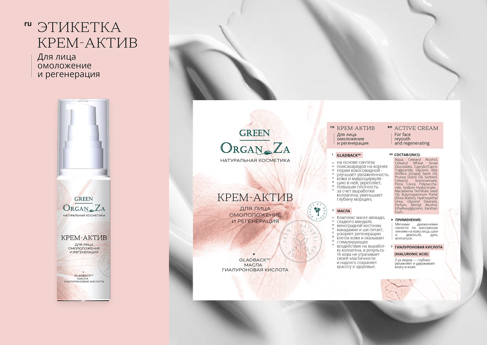
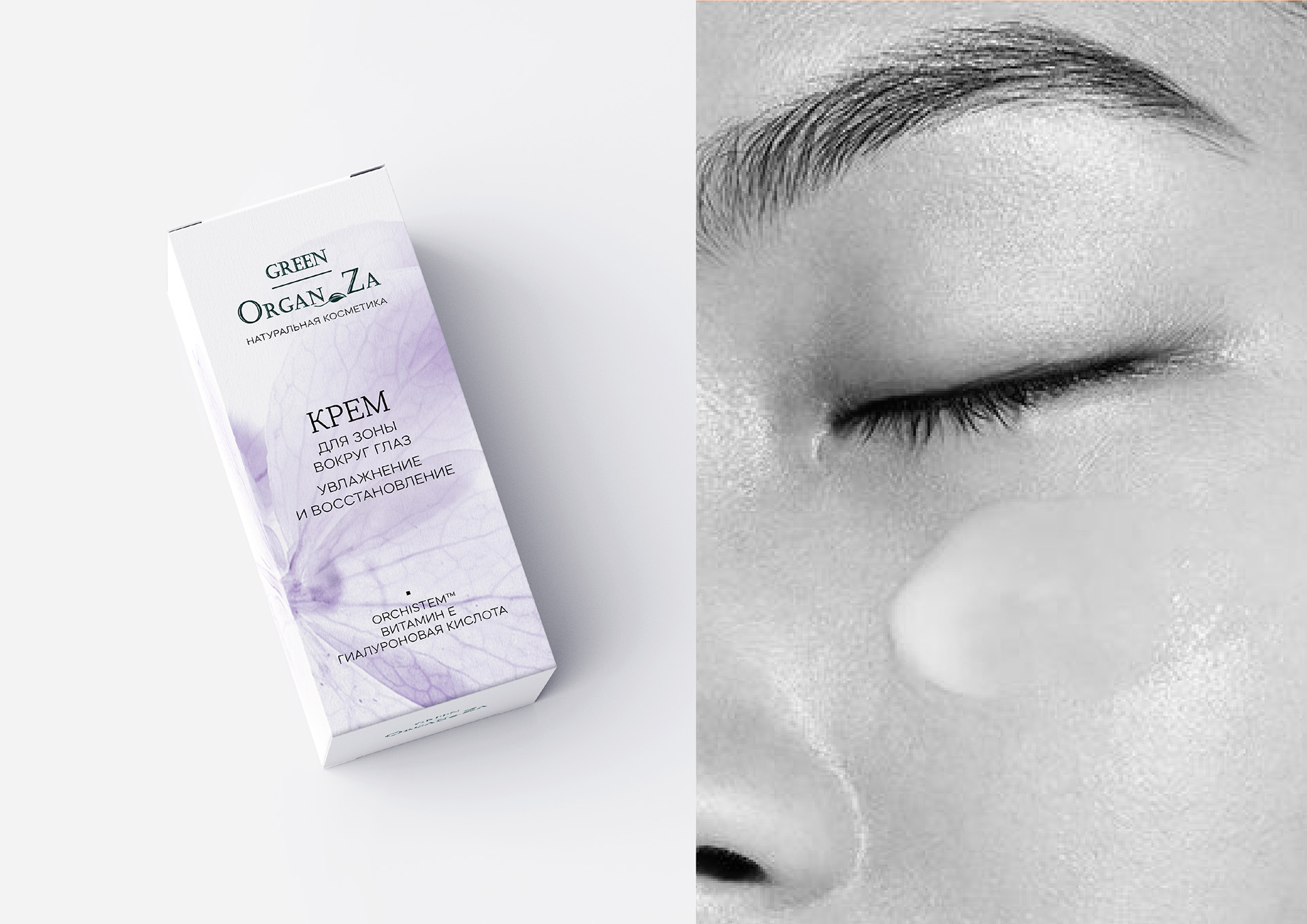
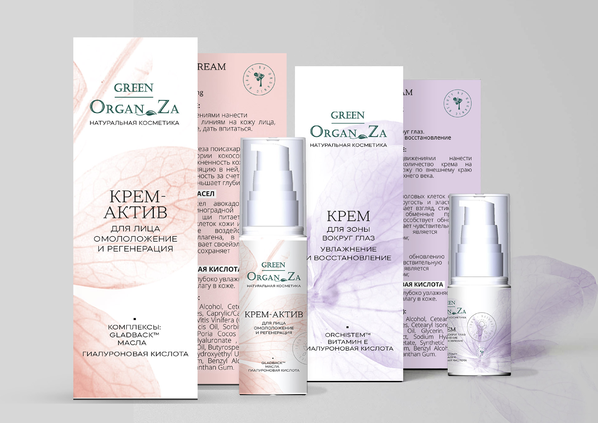
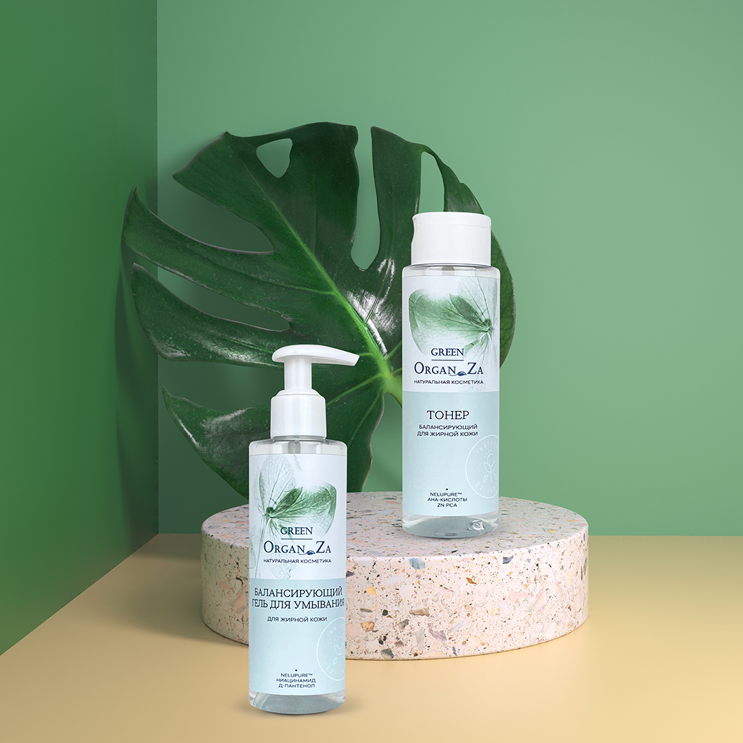
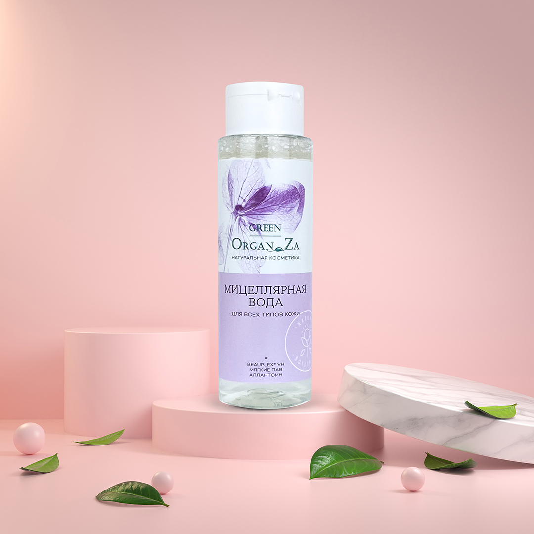
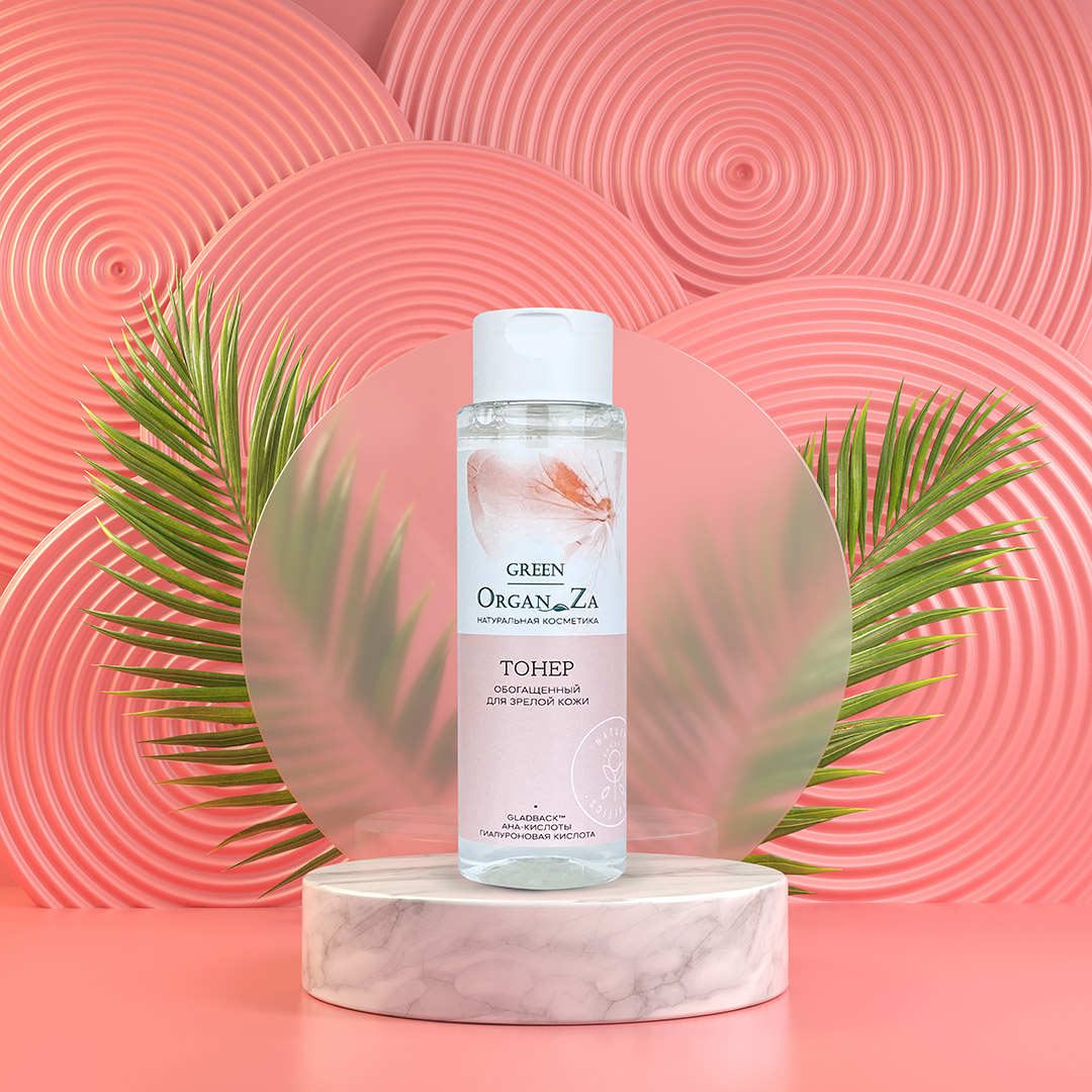
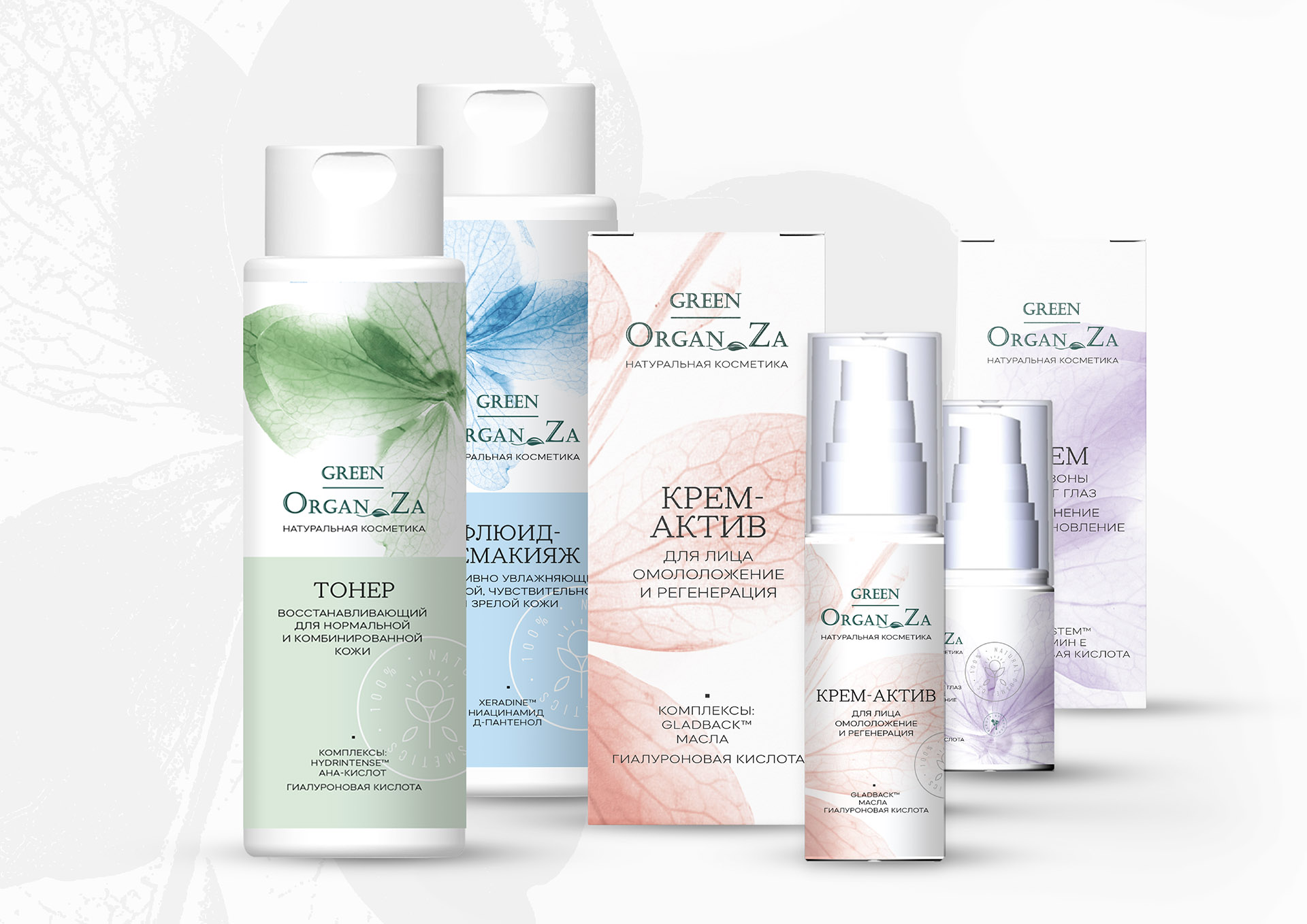
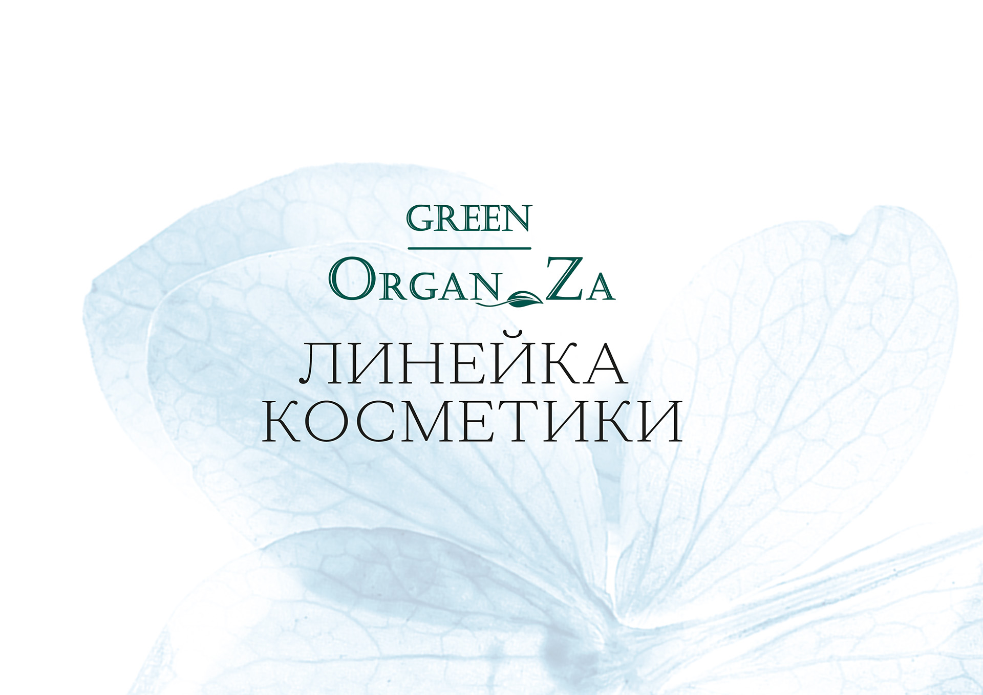
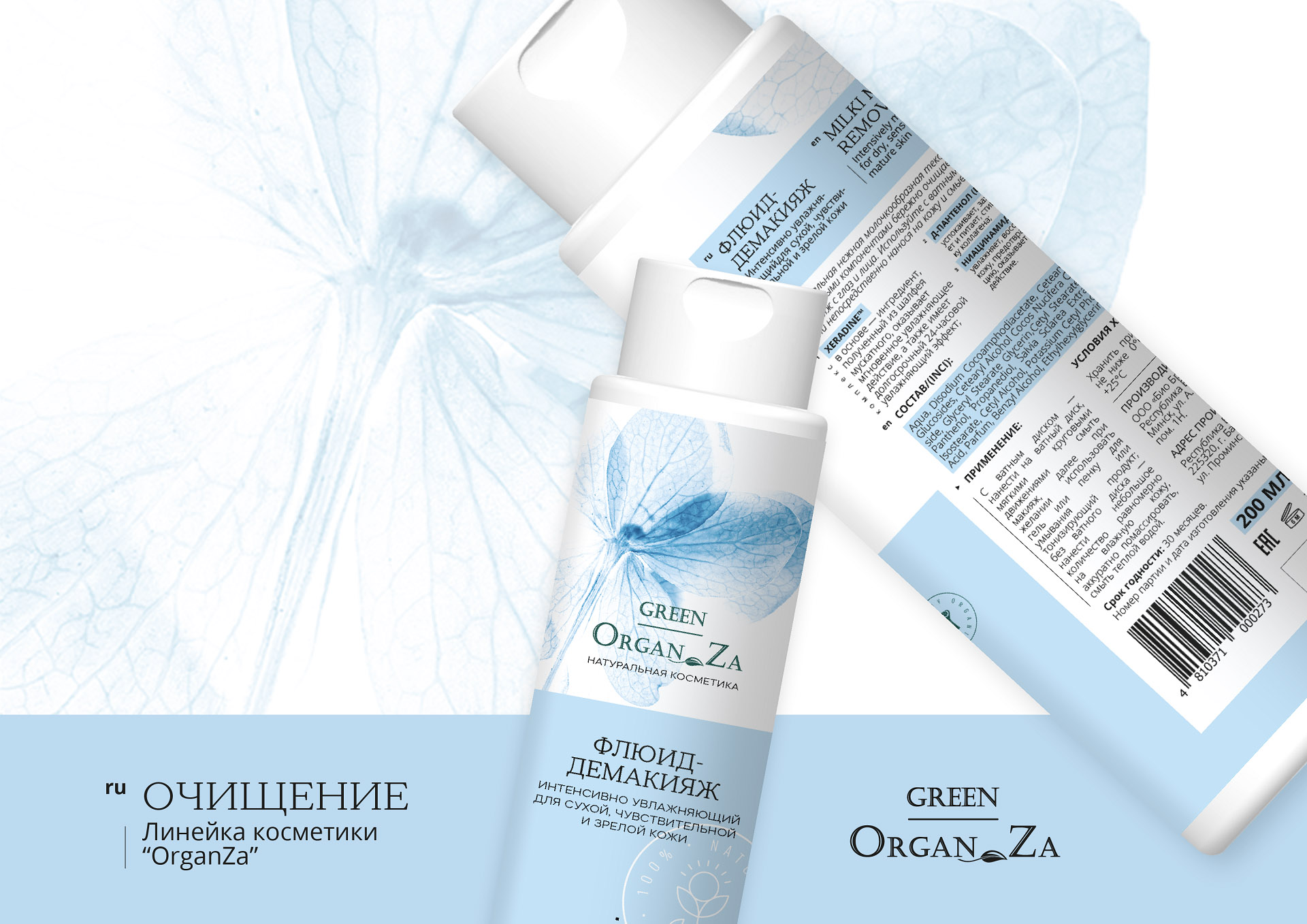
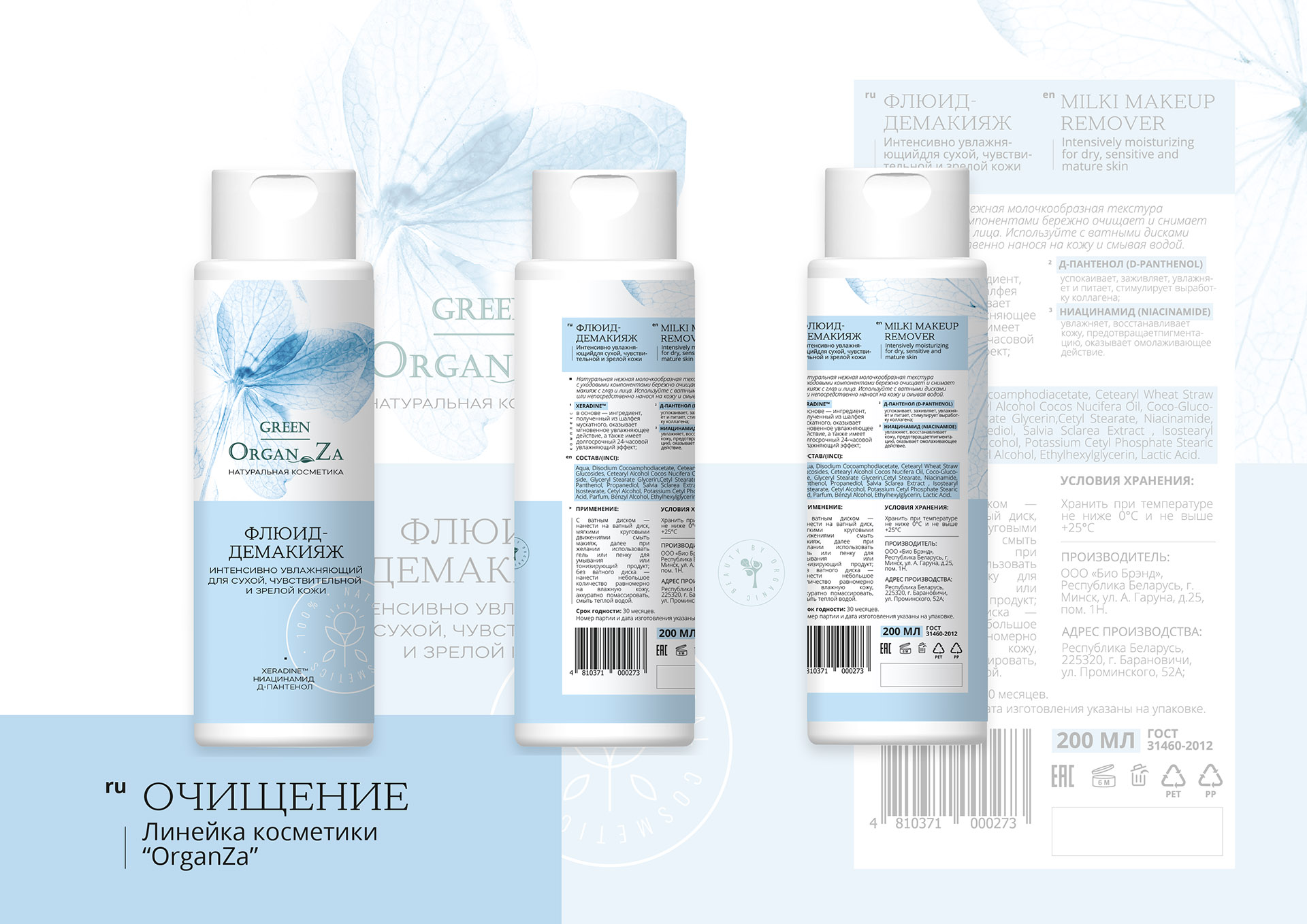
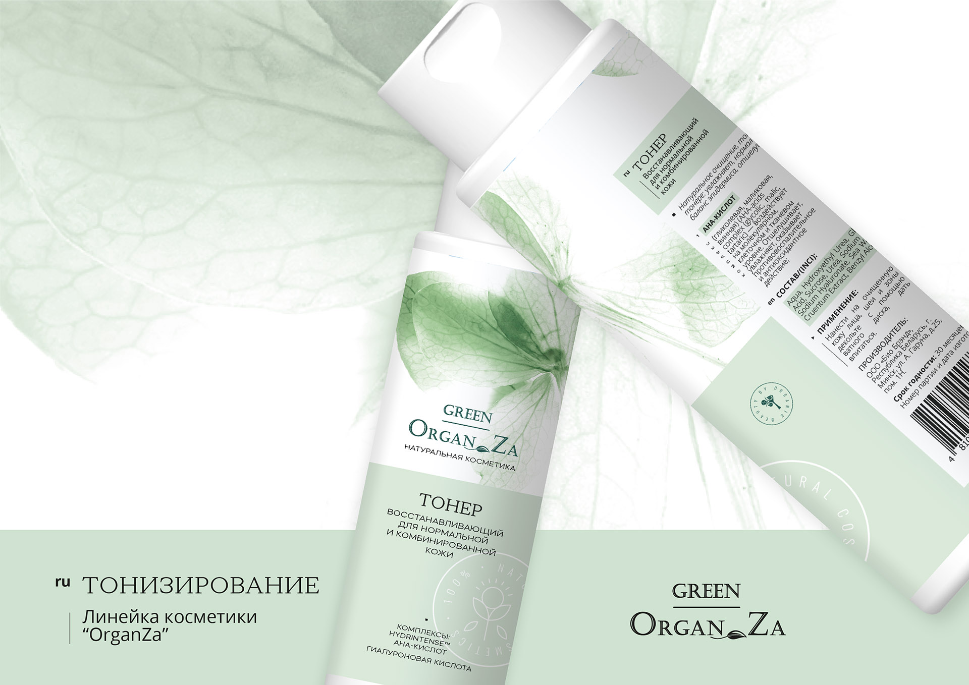
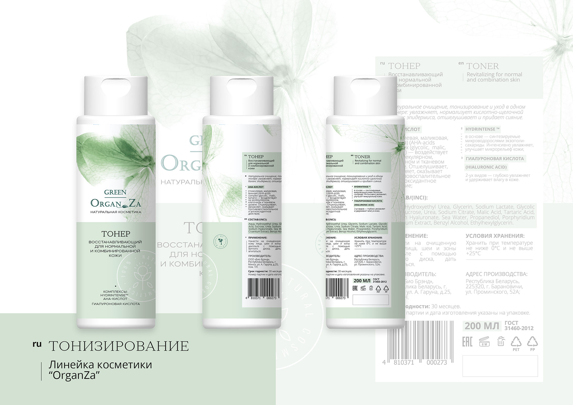
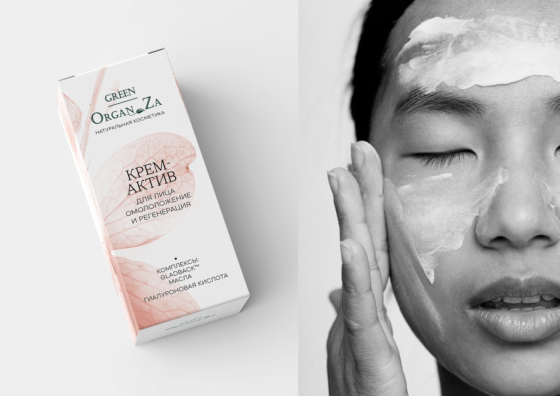
Our task was to develop packaging design for natural cosmetics and to reflect the mood of organic and natural. The main accent in the design is the graphic macrofacture, recognisable on the shelf and creating a gentle and natural image, which emphasizes the organic composition of the products. The color palette is soft and pastel, including green, blue, pink, lilac and reddish shades. They combine the whole concept and at the same time distinguish the products from each other. The principle of their division is the subcategories “purification”, “toning” and “cream group”, which we emphasised with different colours. General mood of the package turned out to be laconic and easy, first of all, due to the macro-planning of plant images, which translate the organic and natural sense. This is reflected in the font in which we used elegant antique type, which happens to go very nicely with the font logo.
CREDIT
- Agency/Creative: Moloko Creative Design Agency
- Article Title: Packaging Design For The Cosmetics Green OrganZa by Moloko Creative
- Organisation/Entity: Agency, Published Commercial Design
- Project Type: Identity
- Agency/Creative Country: Belarus
- Market Region: Europe
- Project Deliverables: Graphic Design, Packaging Design, Tone of Voice
- Industry: Health Care
- Keywords: Cosmetics, natural cosmetics, cosmetic packaging, packaging, package design


