Cia. de Mezcales Feroz is a small artisanal mezcal distribution company that carefully selects small batches of different agave distillates from various regions in México and markets them under the Mezcales Feroz brand.
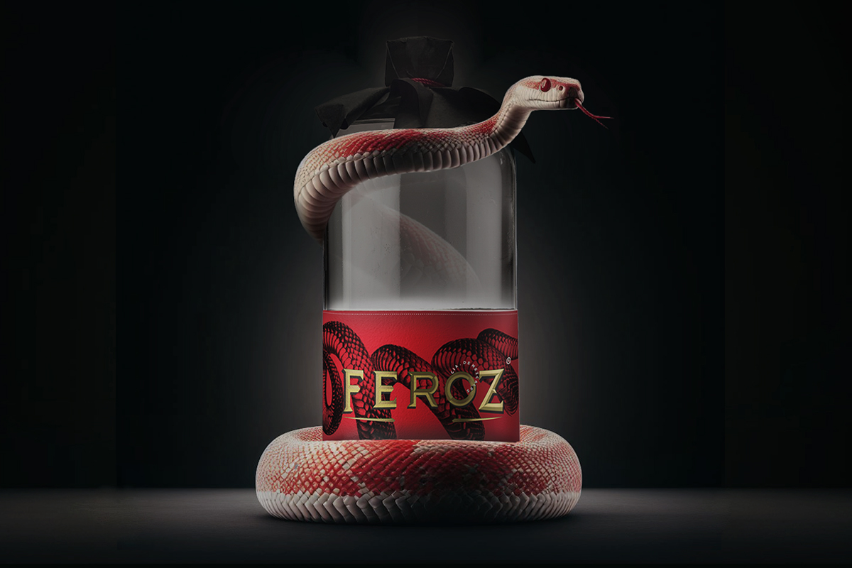
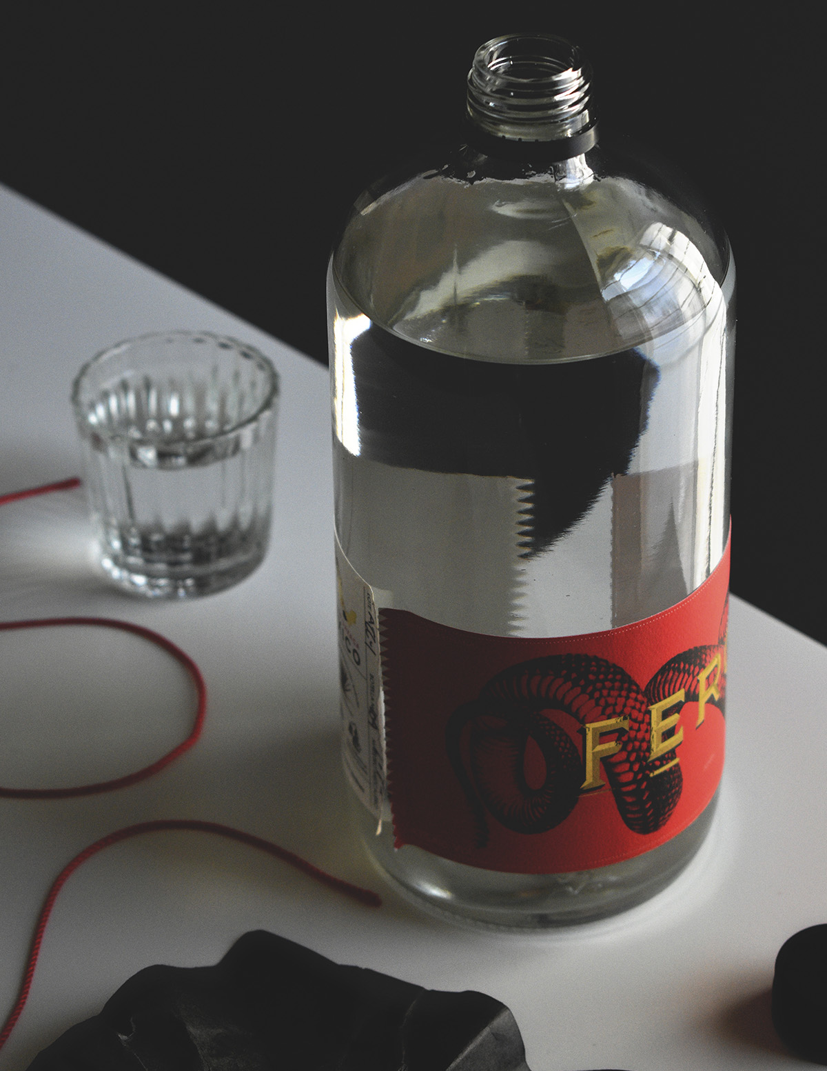
We designed the packaging for the first destillate of the collection a Mezcal Joven from Oaxaca. with clear guidelines: The packaging must reflect the artisanal side of mezcal production, it must be easily recognizable at the point of sale, it must be able to adapt to more products (over time, more distillates will be added to the brand’s offering) and finally the budget for this First stage of manufacturing was very limited.
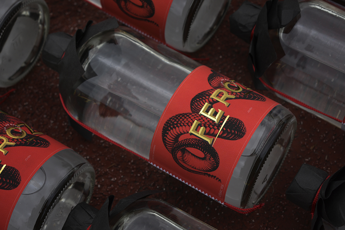
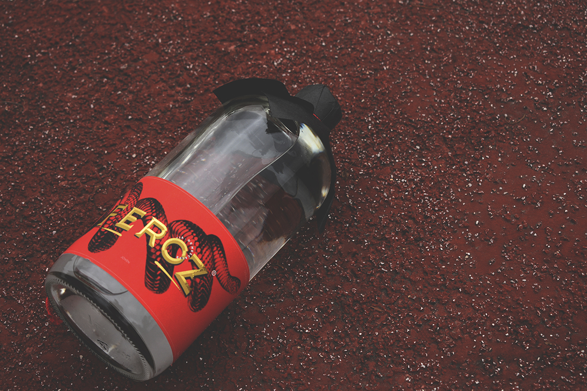
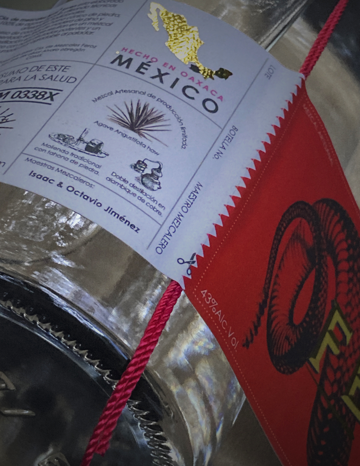
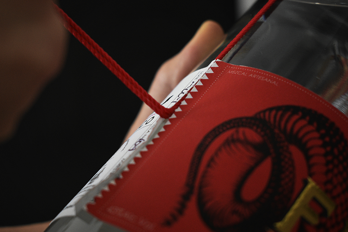
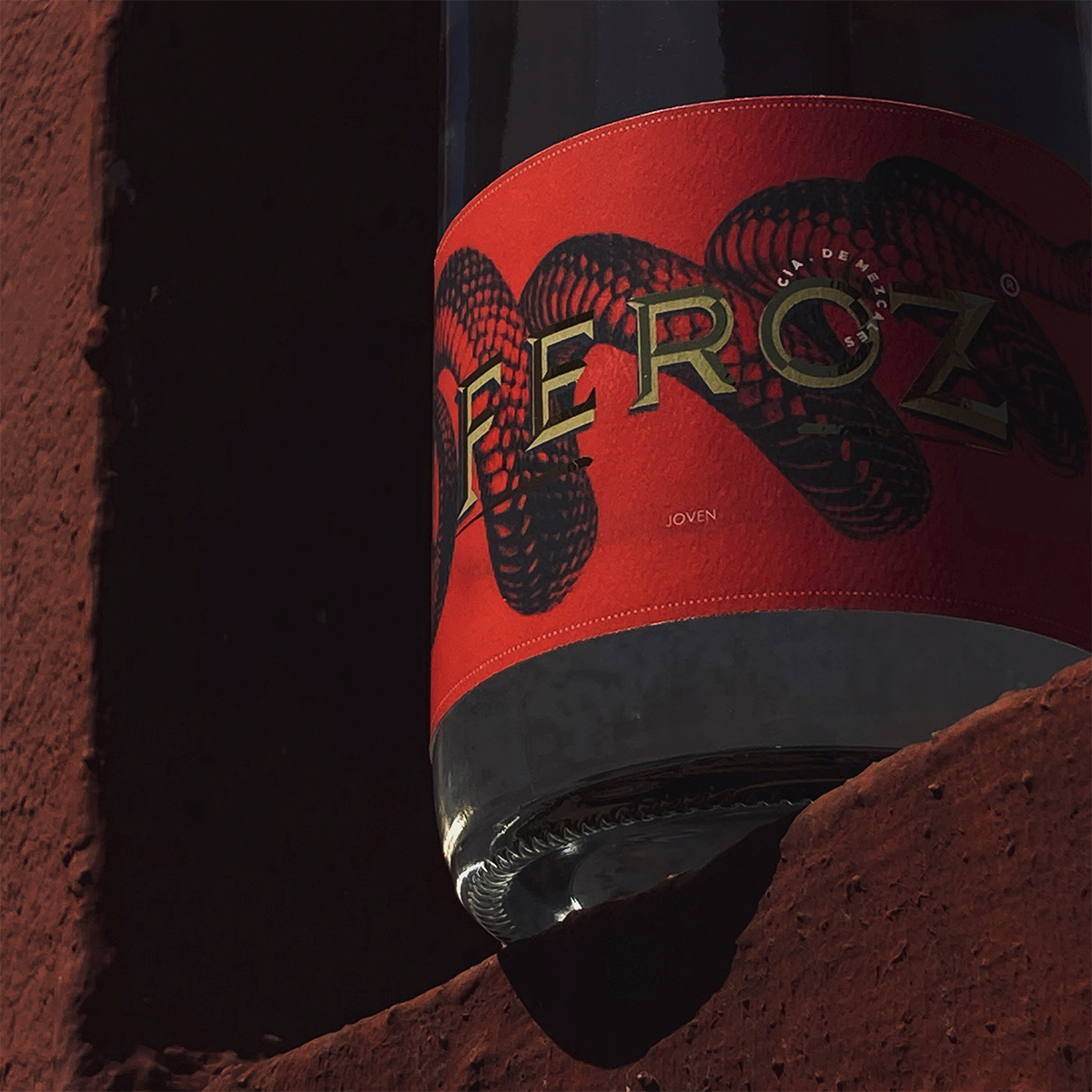
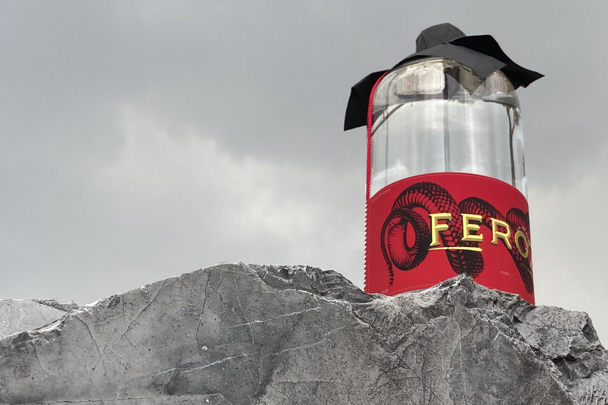
We had to be very creative to be able to reach a result that reflected the quality of the product and the attention to detail that is necessary to manufacture a very high-quality distillate whose manufacturing process continues to be manual labor in many of its stages, including the bottling. Our proposal was to minimize the elements that make up the packaging, we used an open-market economical bottle which is produced by different manufacturers to guarantee its availability in the market and we focused on 2 main elements: label and lid. We decided to use a single label that surrounds almost the entire bottle instead of the traditional 2 or 3 (on the front, back and neck of the bottle), designating most of the budget in this piece that serves as an element that contains the entire bottle legal information and product characteristics. Paying special attention to the texture of the paper and special finishes to highlight important areas of communication.
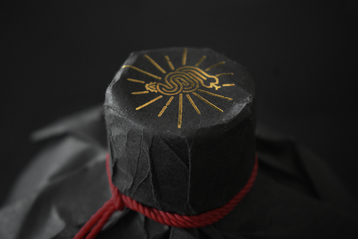
In this case, the selected bottle uses a screw cap which is not very attractive nor does it reflect the quality of the product it contains. So we hide the cap with a “seal” of black paper and gold foil applications, tied with a red cord that is fixed in position with the label itself. This solved the issue of the lid aesthetics and helped us keep packaging elements to a minimum while adding an experience to the opening process. This action generates a feeling of discovery and achievement for first-time consumers.
CREDIT
- Agency/Creative: Estudio äco
- Article Title: Packaging Design for Artisanal Mezcal Cia. de Mezcales Feroz
- Organisation/Entity: Agency
- Project Type: Packaging
- Project Status: Published
- Agency/Creative Country: Mexico
- Agency/Creative City: Ciudad de México
- Market Region: North America
- Project Deliverables: 2D Design, 3D Modelling
- Format: Bottle
- Industry: Food/Beverage
- Keywords: Mezcal, México, feroz, oaxaca
-
Credits:
creative director: max almeida


