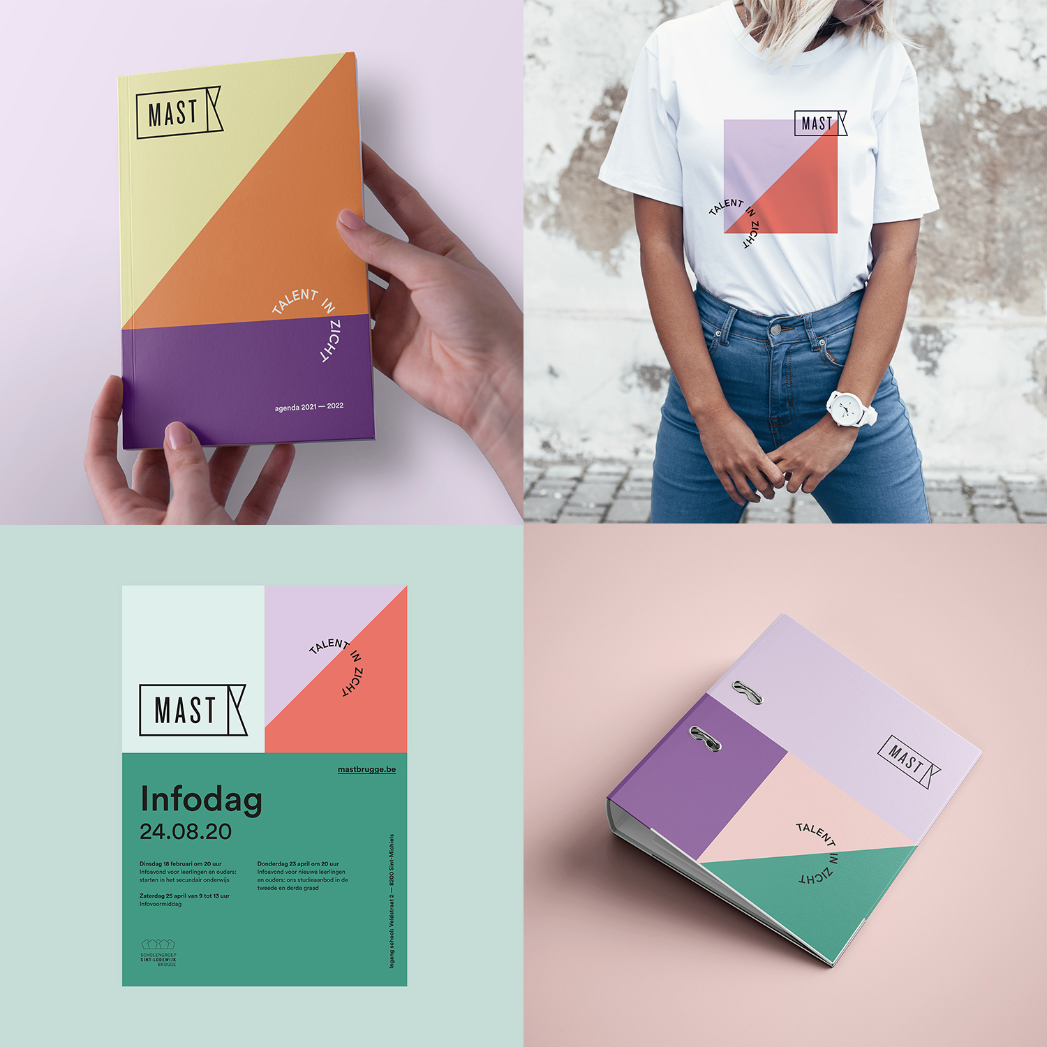
Mast is a high school in Bruges. Two schools from Bruges merge together and become one school. Mast stands for progress in your own development and seeking for yourself as a person.
Target audience: Teenagers between 12 and 20 years old.
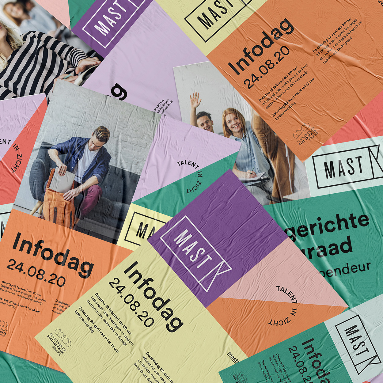
Briefing: Schools in Belgium usually have an old-fashioned look and feel. Many schools also do not have the budget to tackle such matters as a new fresh branding. Which means that the identity for schools are sometimes from 10 to 20 years ago. Teenagers are on instagram, tiktok, facebook etc. so today the branding must be more playful and fresher for the youngsters. The intention was to make the design in such a way that the school gets a trendy look. In this way they want to make the students feel at home in their own world.
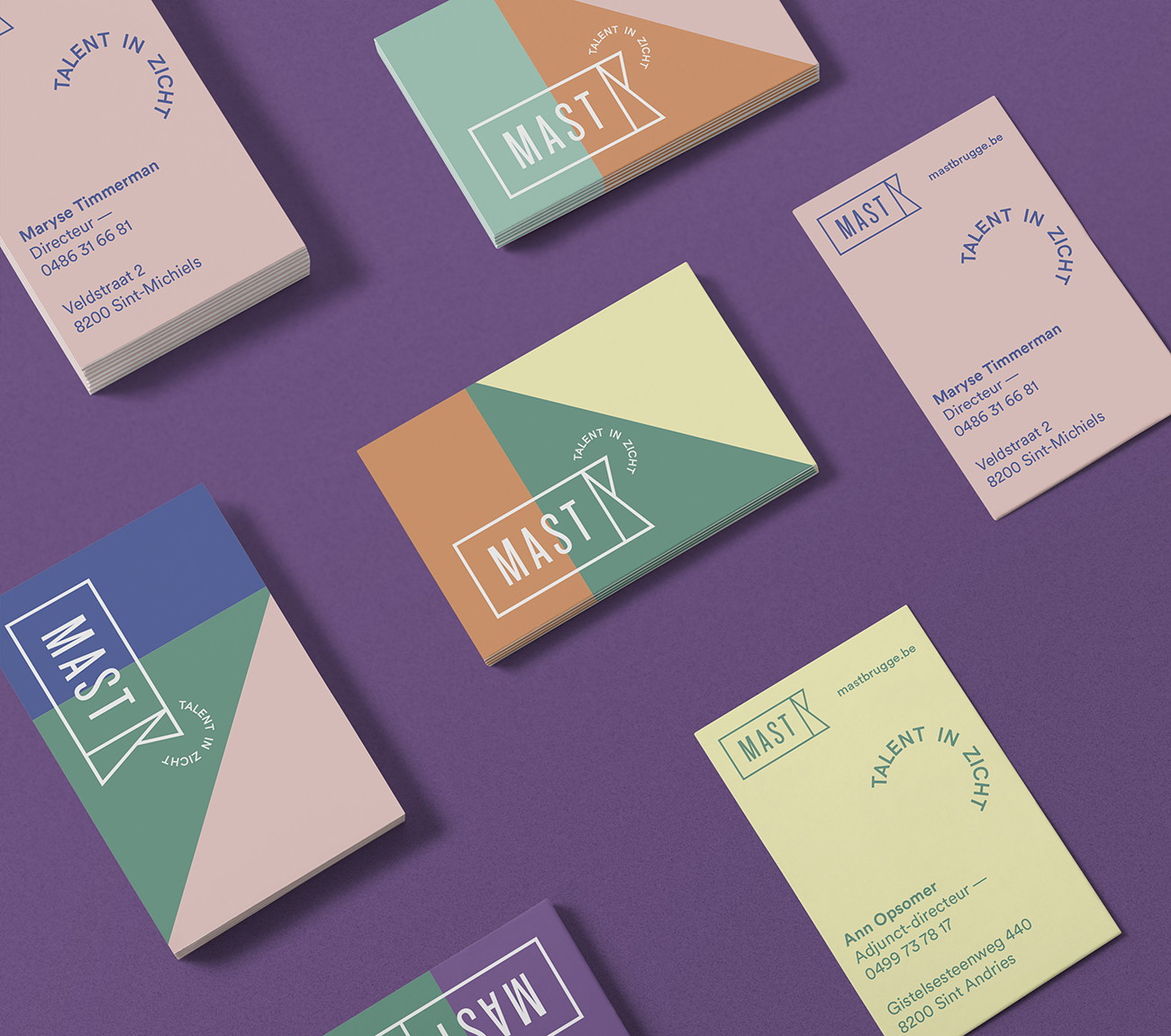
The new design: The name Mast refers to a mast from a boat. Progress, development, seeking for yourself …
We chose for designing an interpretation from a mast into the logo with a beautiful strong font (Knockout font).
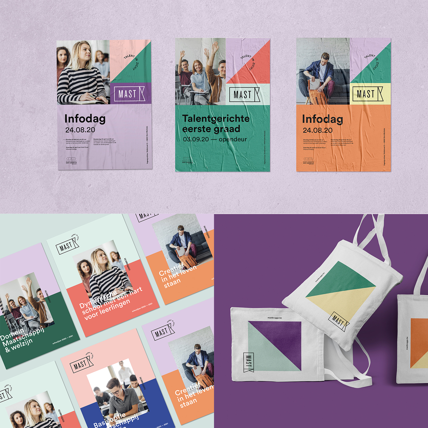
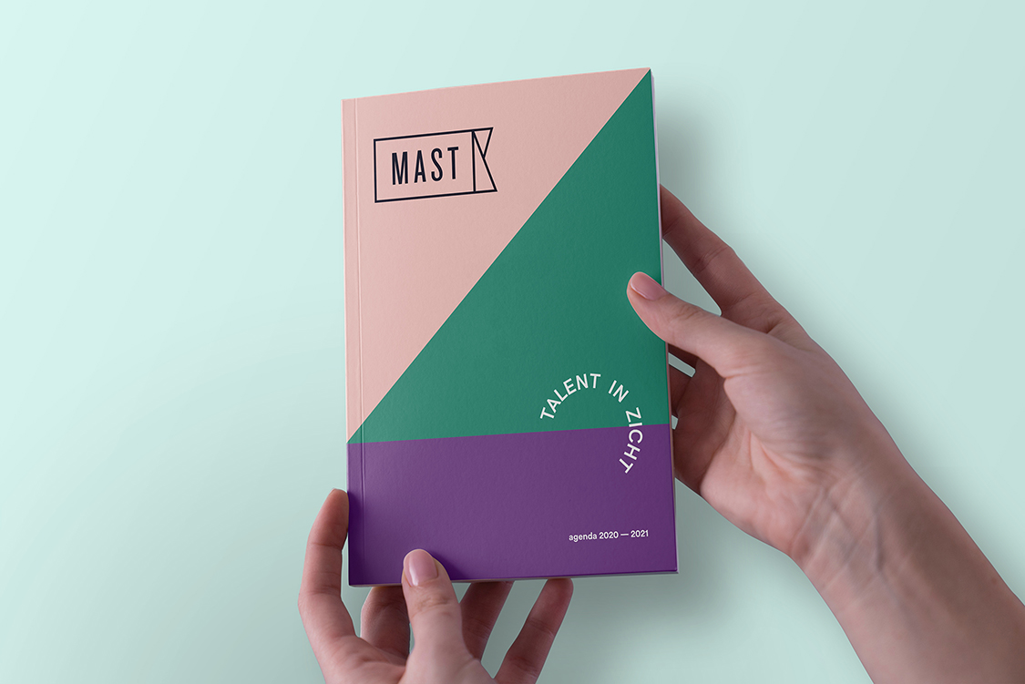
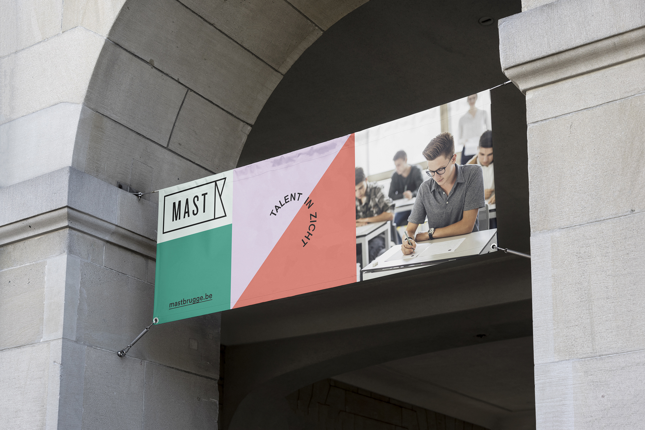
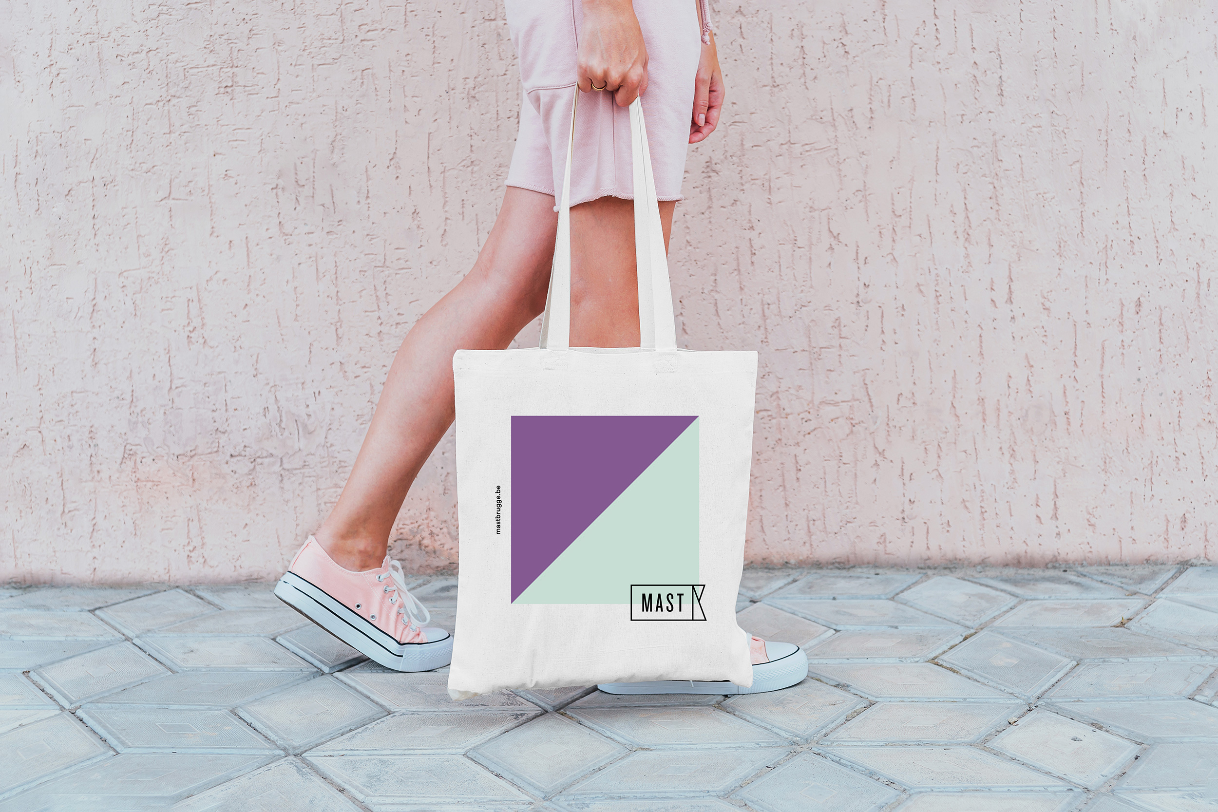
We wanted to make something clean, fresh and easy to use for the client. Such as, an easy way to change their posters, banners, cards … Playing with colors so every item can be different but the shape and structure stays the same. In that way it gives you a fun atmosphere as being a secondary school.
CREDIT
- Agency/Creative: Oswalt
- Article Title: Oswalt Creates a New Branding For a Highschool Called MAST
- Organisation/Entity: Agency, Published Commercial Design
- Project Type: Identity
- Agency/Creative Country: Belgium
- Market Region: Europe
- Project Deliverables: Brand Advertising, Brand Architecture, Brand Creation, Brand Experience, Brand Guidelines, Brand Identity, Brand Naming, Brand Redesign, Brand Strategy, Brand World, Branding, Graphic Design, Rebranding
- Industry: Education
- Keywords: branding, logodesign, posters, pantone, colorful, graphicdesign, identity, brochures, posters, cleandesign, highschool, logodesigner #logoinspirations


