The Cedev Kosher Wine House (www.kosher-wine.eu) is a leading supplier of kosher wine in retail and Horeca market sectors in Europe. This company has approached us many times for the design of wines and sparkling wines it sells in Europe.
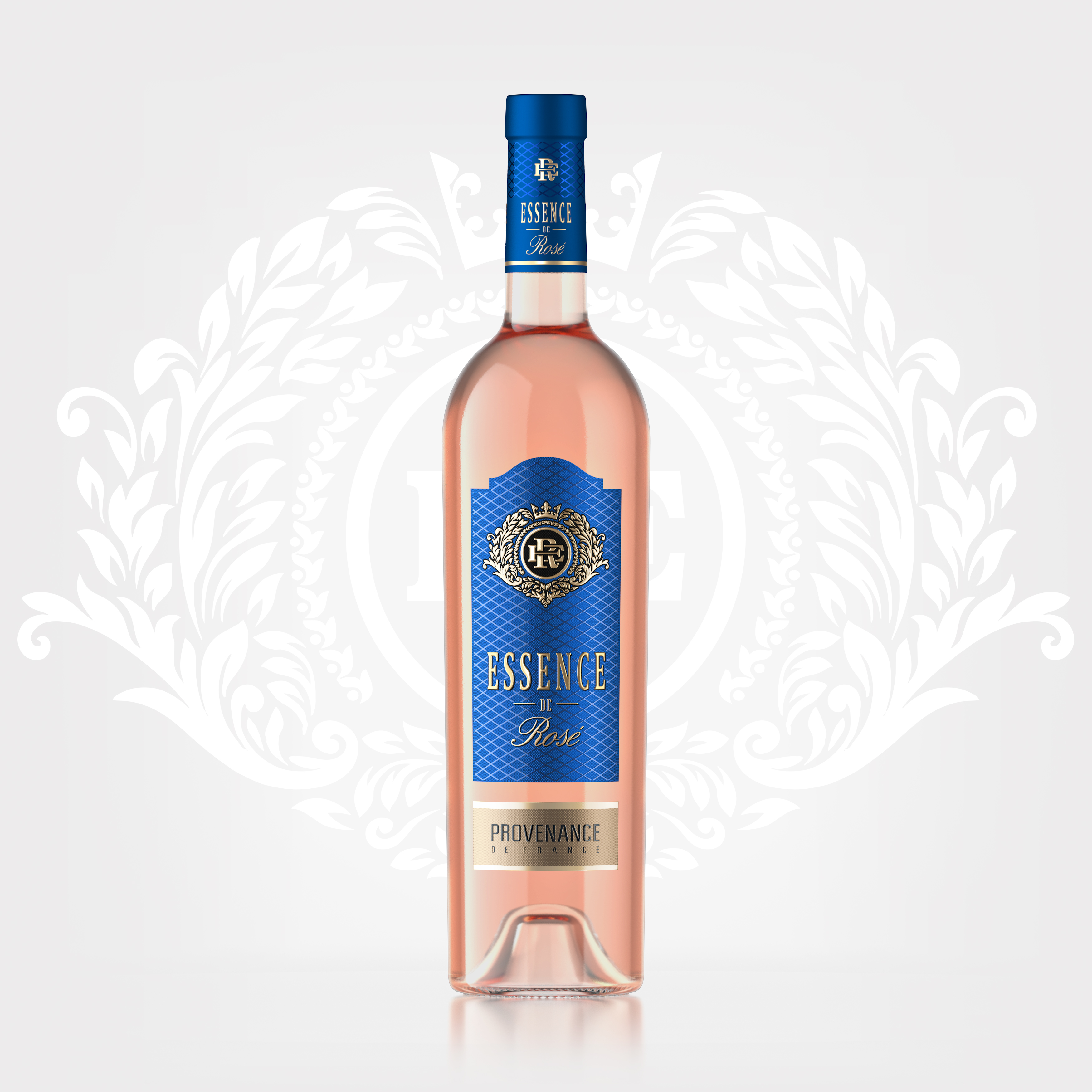
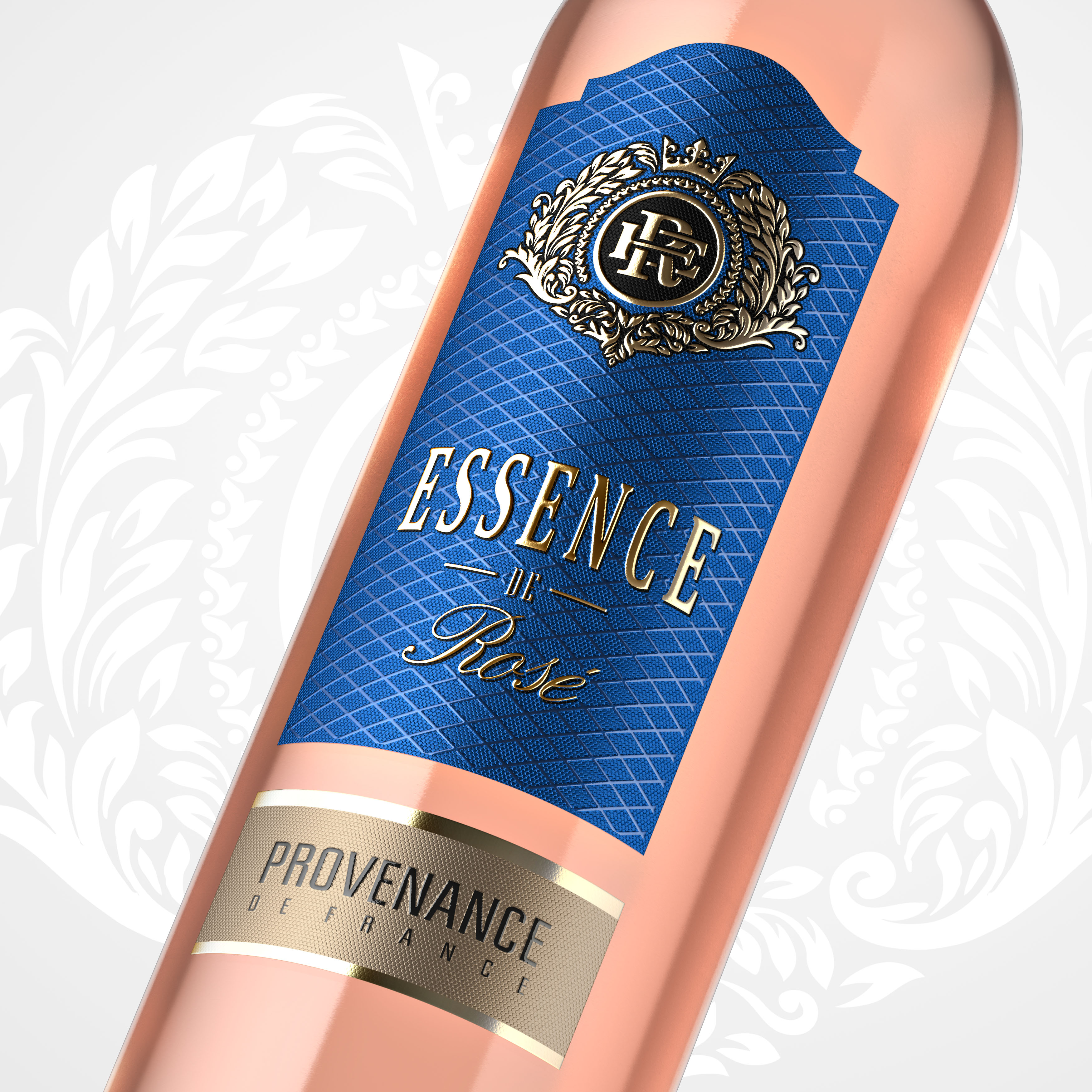
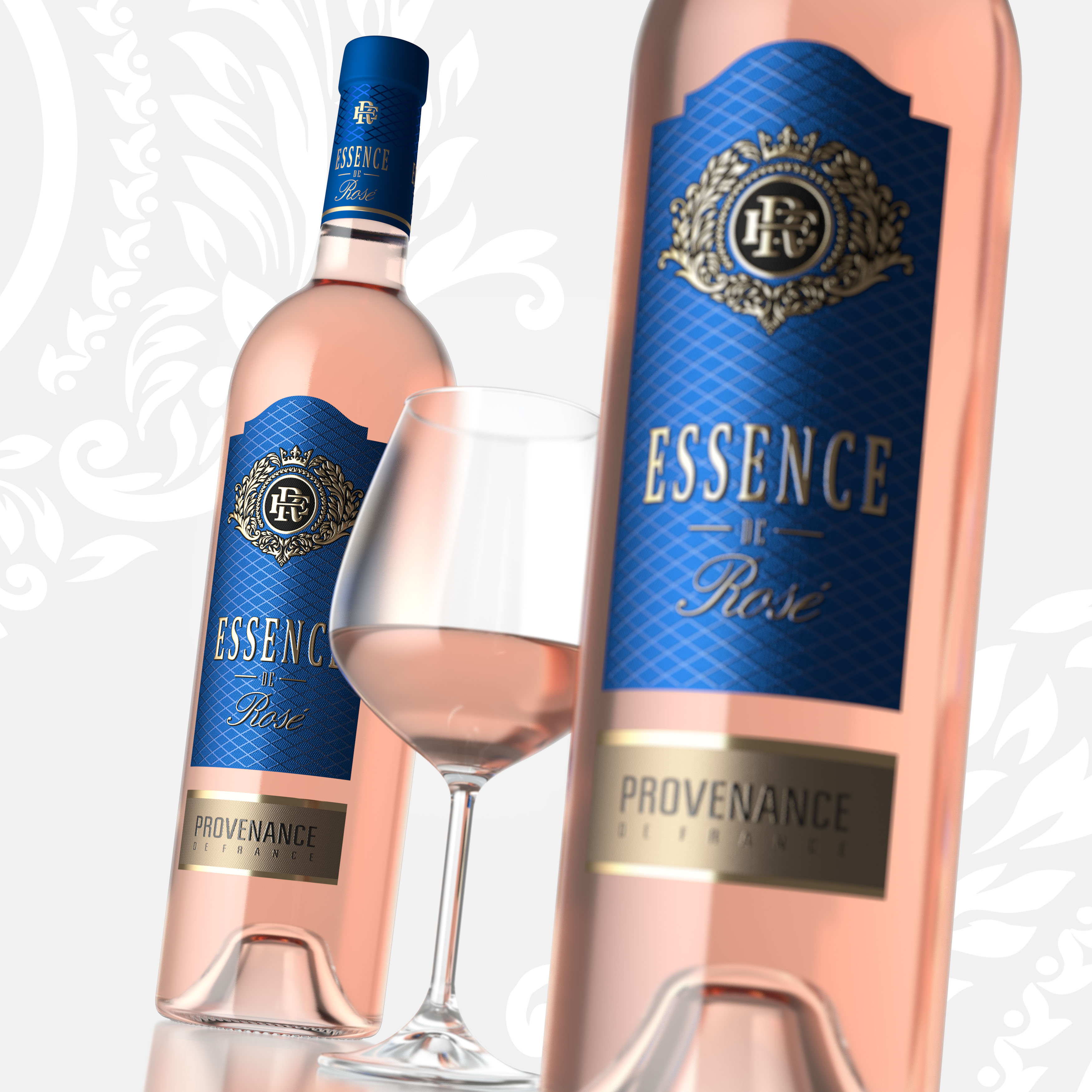
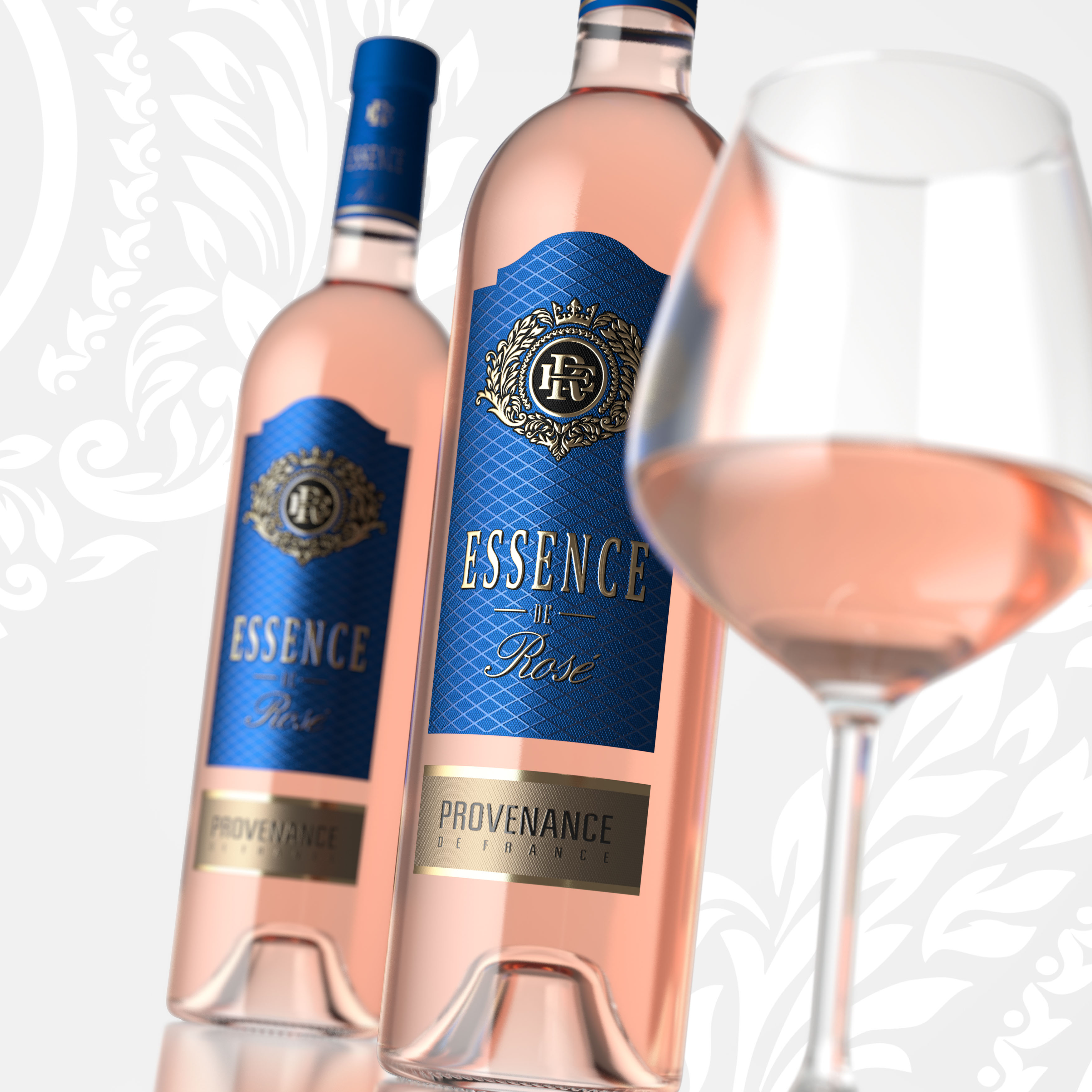
This time they turned to us seeking a complex branding for a French pink wine under the Essense De Rose brand. Initially, we were given several design requirements and restrictions. We were instructed that the label background should be blue, and the label itself, narrowly shaped. The rest was left to us, including what should the brand’s symbol be, or how should the design and its contents appear. Only one thing had to persist, namely the aristocratic European style, elegance, softness, and femininity; however, at the same time, the branding should come across as respectable and iconic. On a separate note, we were asked to pay special attention to the use of various tactile printing techniques. We have fulfilled all the tasks attached to this project. First of all, we turned to the stylistics and graphics of monograms; we also studied coats of arms of the French nobility. We borrowed the rich floral motifs of ancient coats of arms but cast aside such symbols of French authorities as lilies, lions or medieval weapons. In the end, we decided on an elegant, aesthetically pleasing solution for the brand’s symbol.
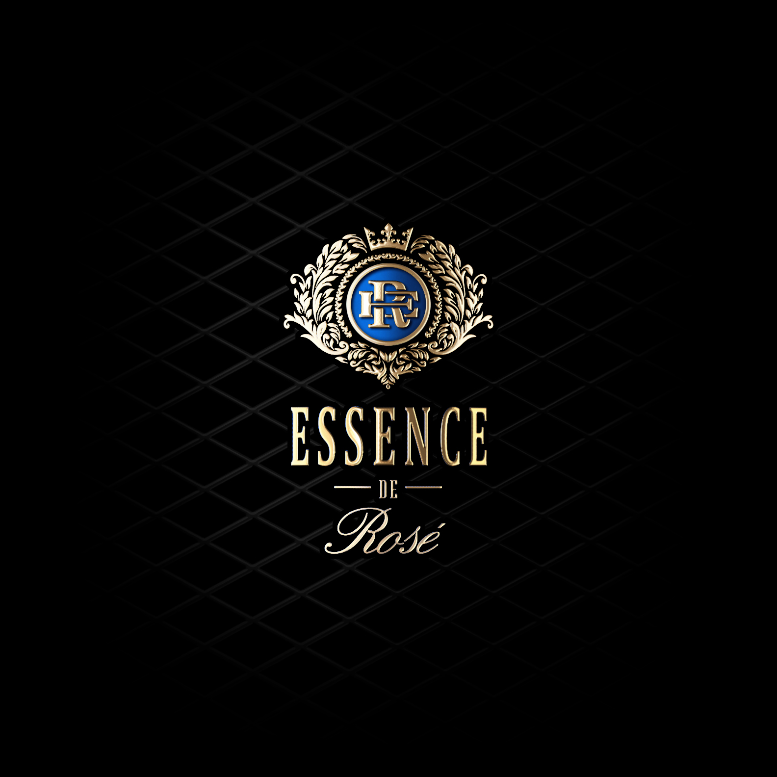
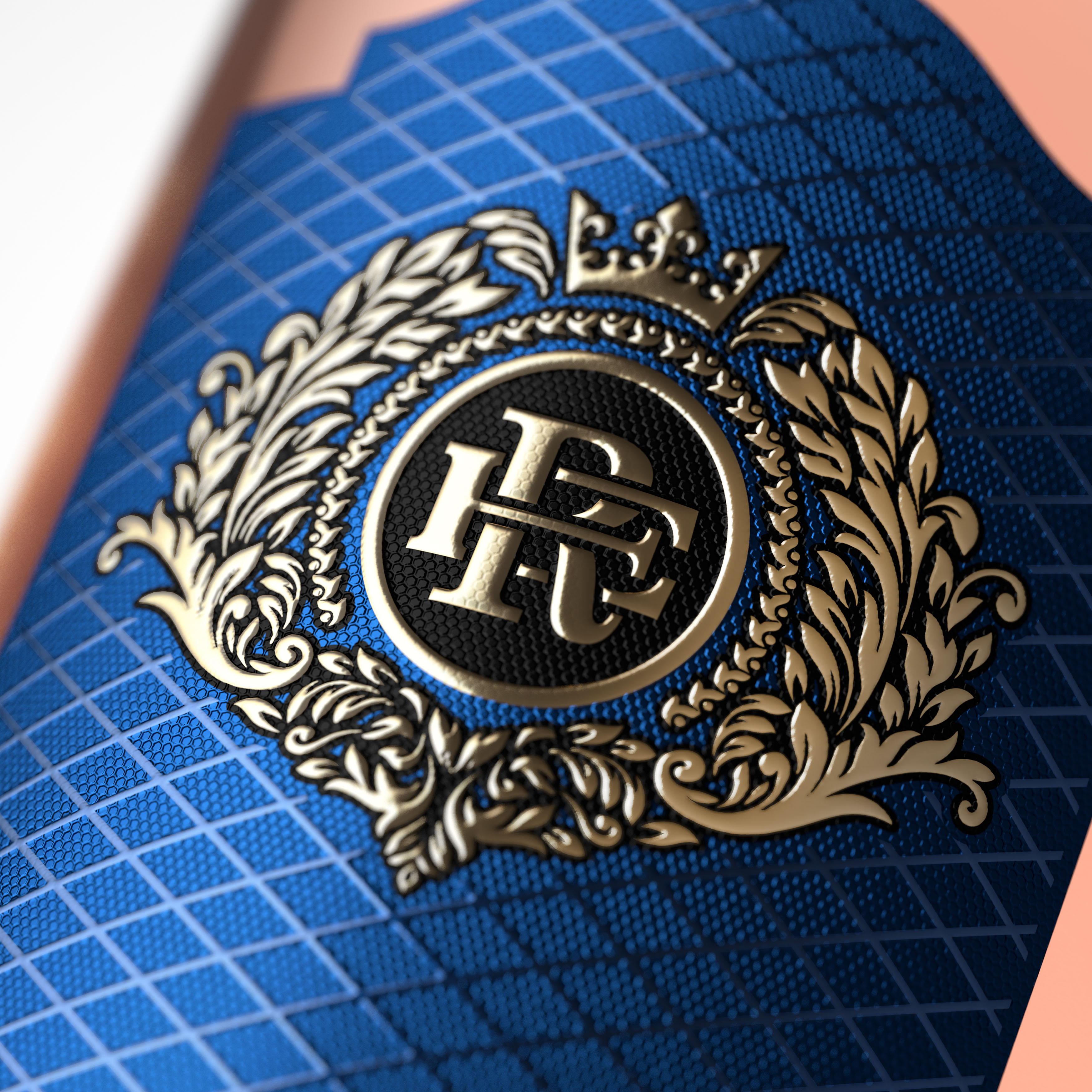
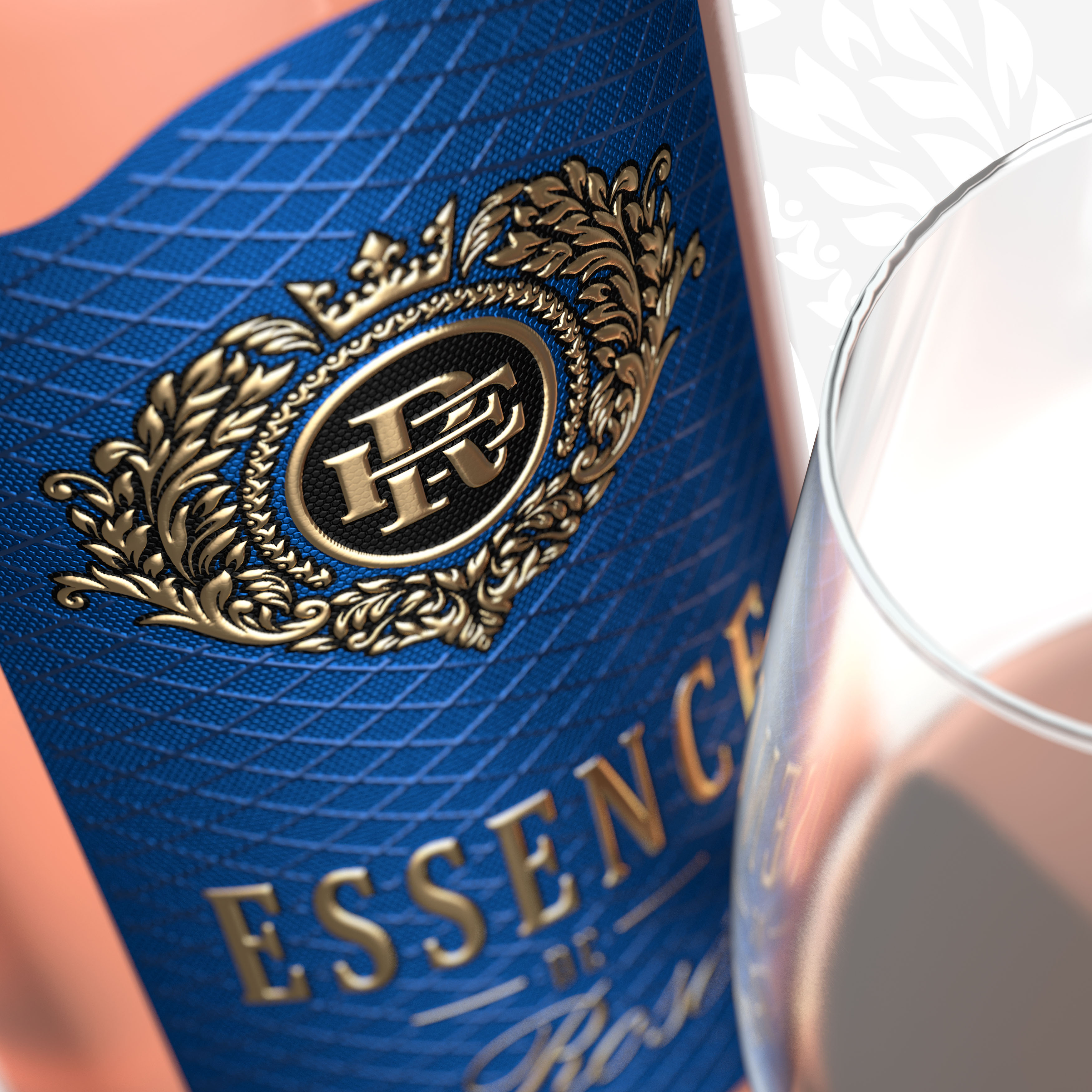
This solution came in the form of a coat of arms with a rich floral overtone, topped with a crown; the center is occupied by a monogram composed of intertwining letters E and R, the initials of the Essense De Rose brand.
The design is predominantly austere and European in style. It brings to mind such concepts as restraint, respectability, and high product quality. Through the use of high-gloss tactile material, we imparted a glamorous note to the design, something that is vital for a truly feminine product. We have specified the use of pearlescent textured paper in the design; thanks to it, the label takes on a pleasant glow, while the intense blue color used on the label becomes truly glossy, which is instrumental for the entire project.
CREDIT
- Agency/Creative: SHUMI LOVE DESIGN (TM) Branding Agency
- Article Title: Original french rose
- Organisation/Entity: Agency, Published Commercial Design
- Project Type: Packaging
- Agency/Creative Country: Moldova
- Market Region: Europe
- Project Deliverables: Brand Creation, Brand Strategy, Branding, Identity System, Packaging Design
- Format: Bottle
- Substrate: Glass Bottle, Pulp Paper


