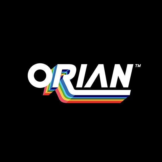
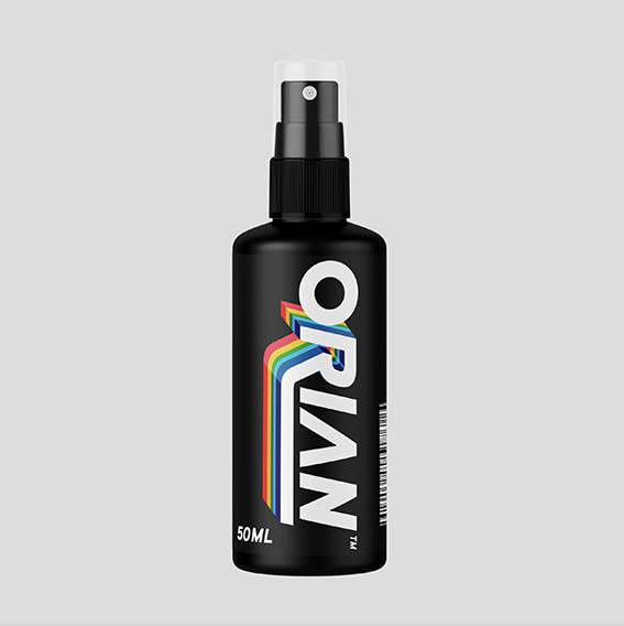
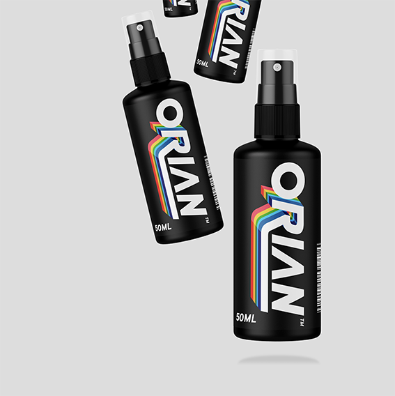
Orian is a retro 80’s inspired design for the purpose of haircare, often these heavy somewhat masculine and clinical/technical brand designs are on products that are gender specific but making gender neutral haircare that would speak to all sexes was the aim.


CREDIT
- Agency/Creative: candy brophy creative
- Article Title: Orian Hair Care Branding and Logo Design
- Organisation/Entity: Agency, Non Published Concept Design
- Project Type: Identity
- Agency/Creative Country: Australia
- Market Region: Asia
- Project Deliverables: Brand Architecture, Brand Identity, Brand Naming, Branding
- Industry: Health Care
- Keywords: haircare, branding, retro, logodesign
FEEDBACK
Relevance: Solution/idea in relation to brand, product or service
Implementation: Attention, detailing and finishing of final solution
Presentation: Text, visualisation and quality of the presentation


