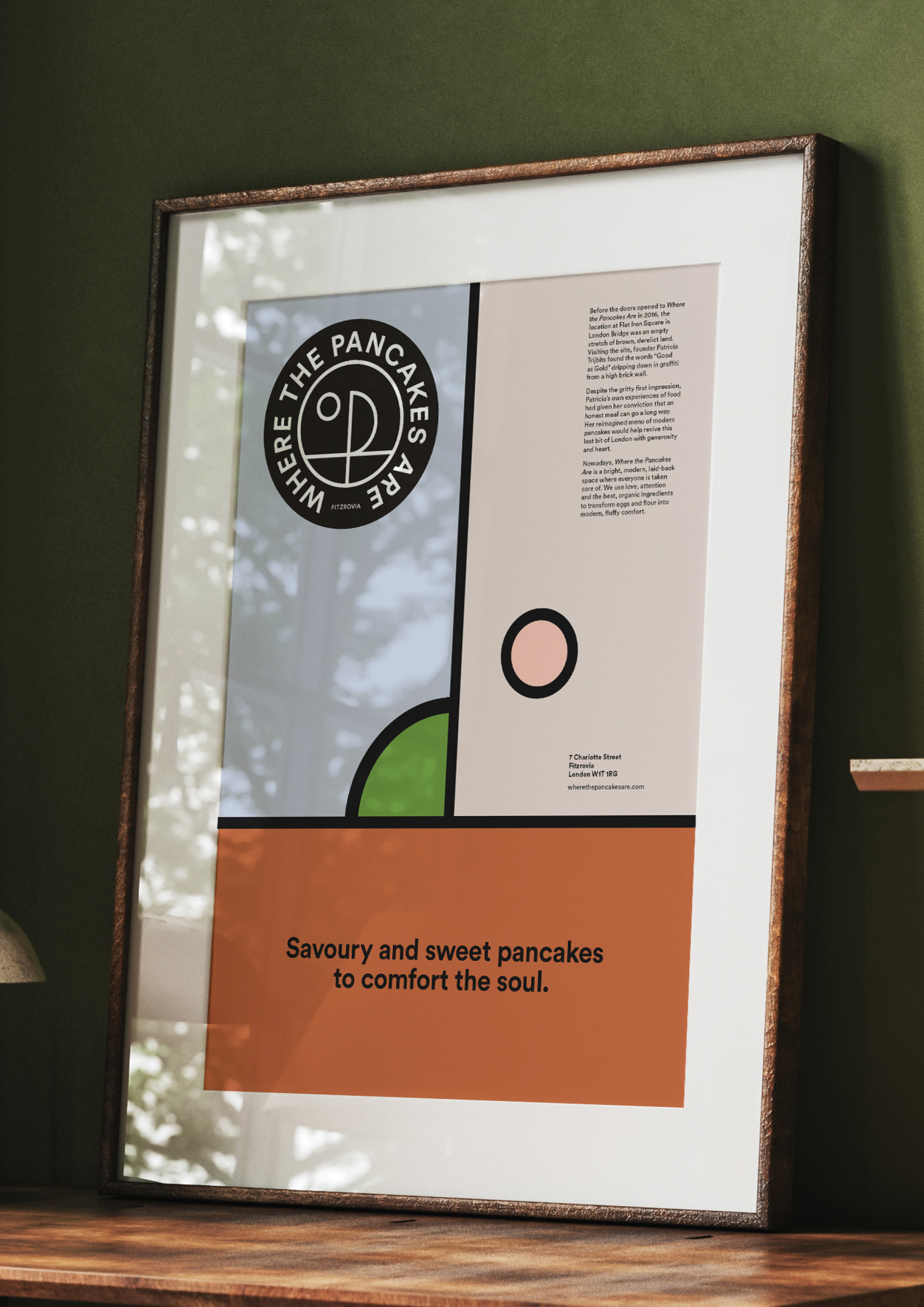
Savoury and sweet pancakes to comfort the soul.
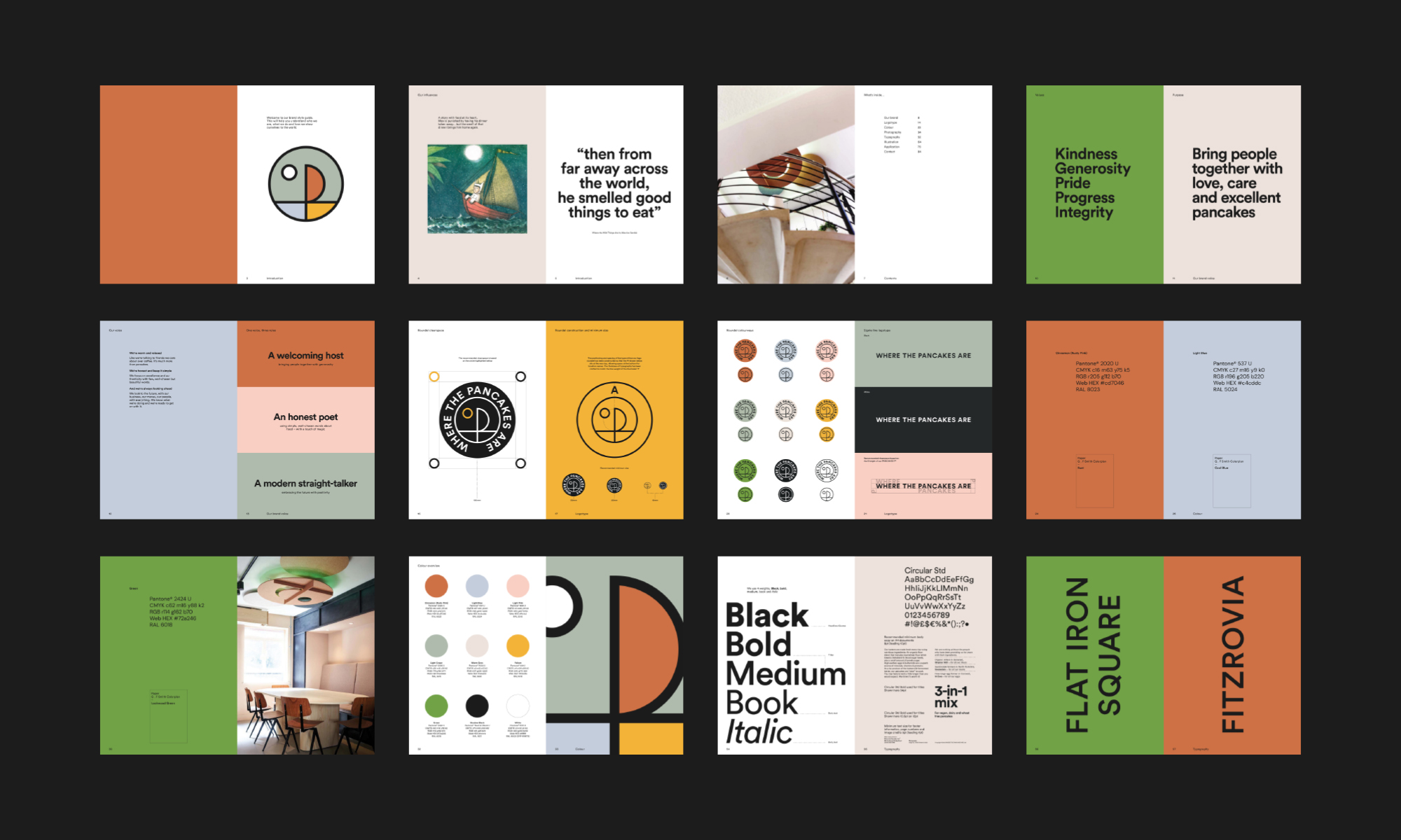
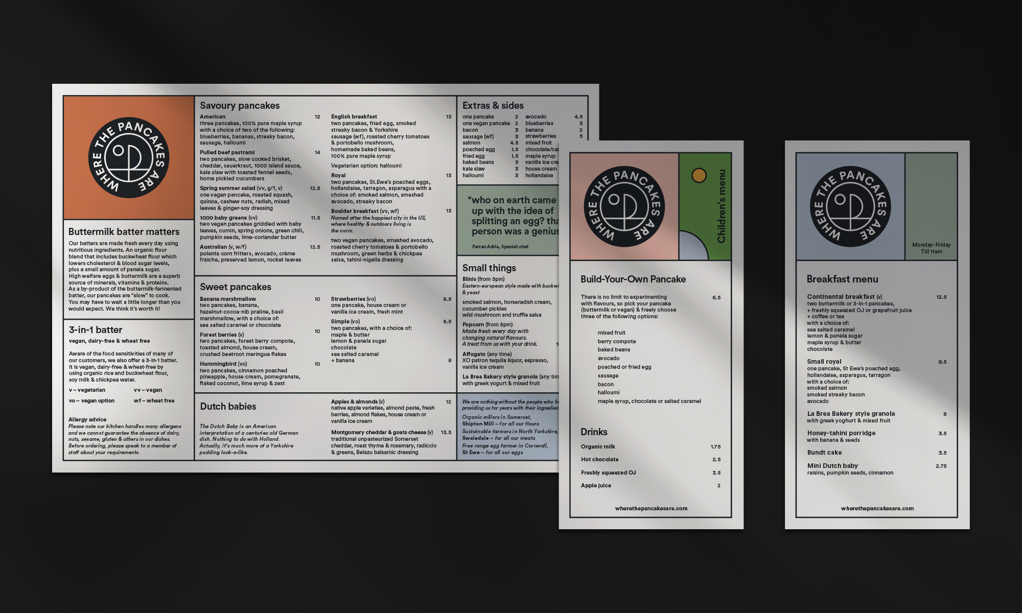
We created a new visual identity for WTPA, working closely with the founder and the architect’s team at Overtreders W.
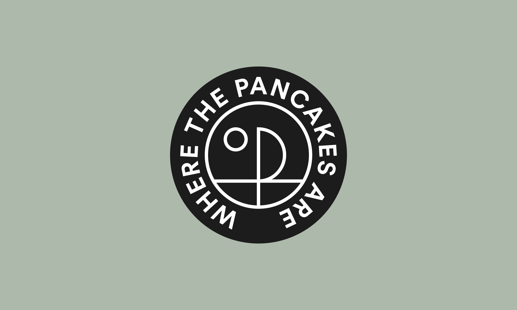
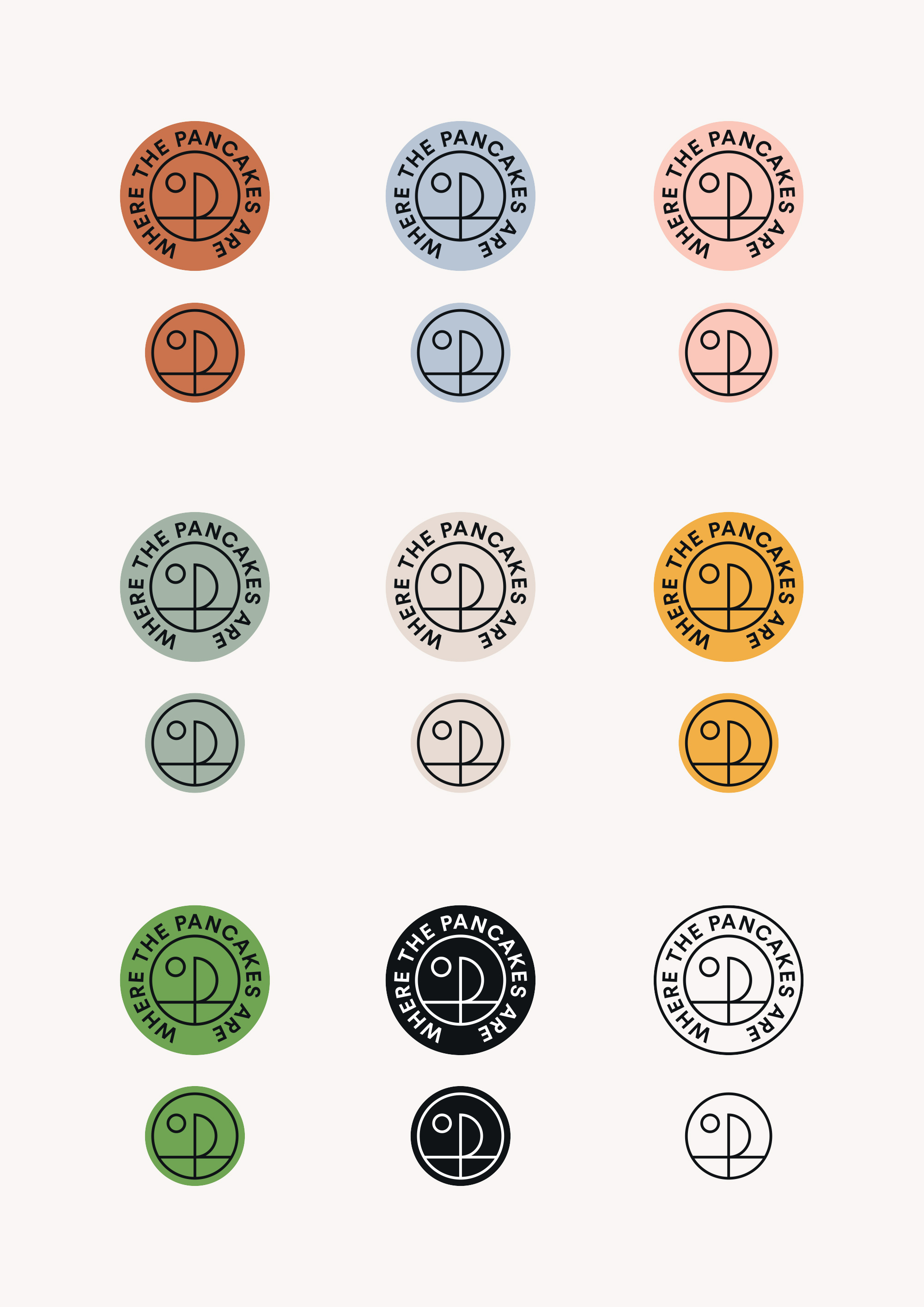
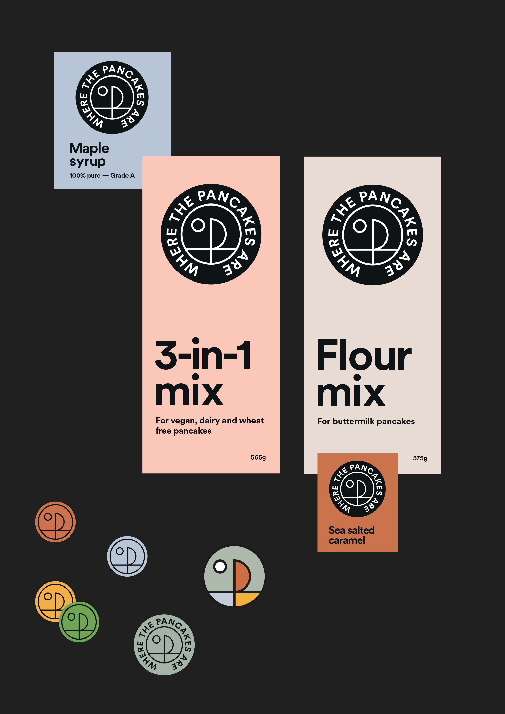
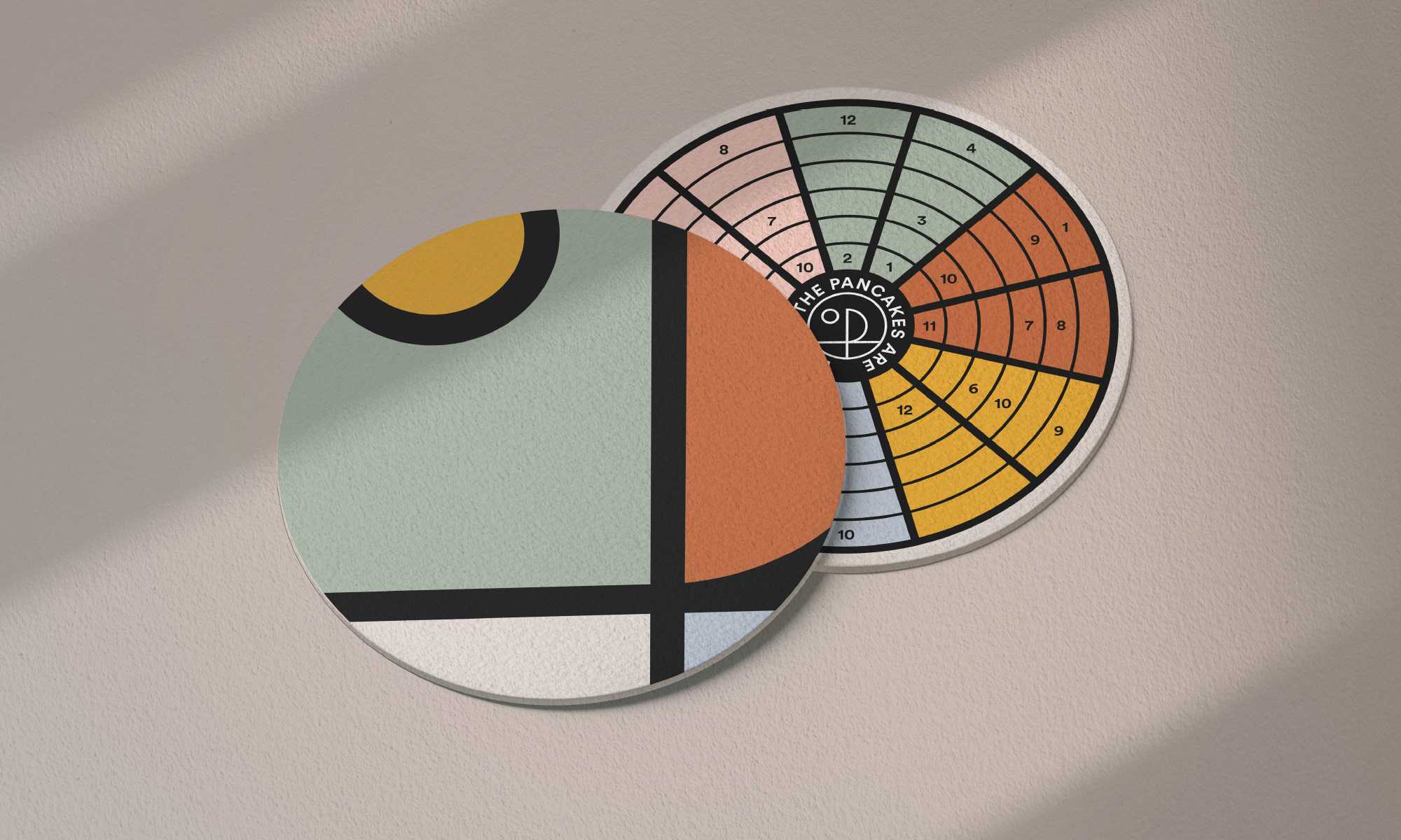
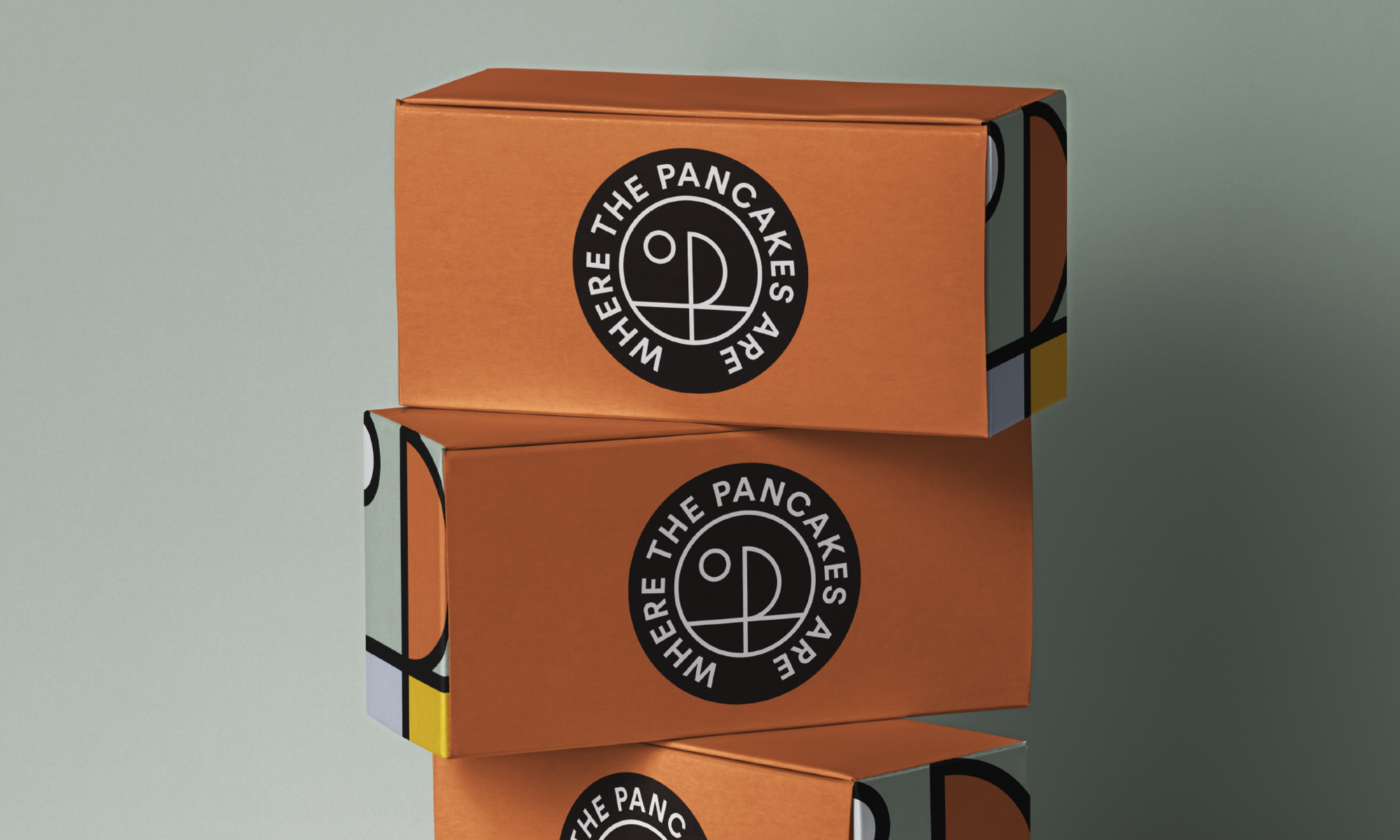
The overarching aim was for WTPA to have a clear identity that brings together its beliefs, its products and all the people that the company connects with. To be recognisable and truthful. To be adaptable and playful. We give no prizes for guessing where the name derived from. We explored the book for its adventure, taking particular joy from the boat scene. This was a starting point for a ‘P’ that forms the centre of the roundel. A simple, timeless stamp that can be applied with ease across restaurants, retail and social.
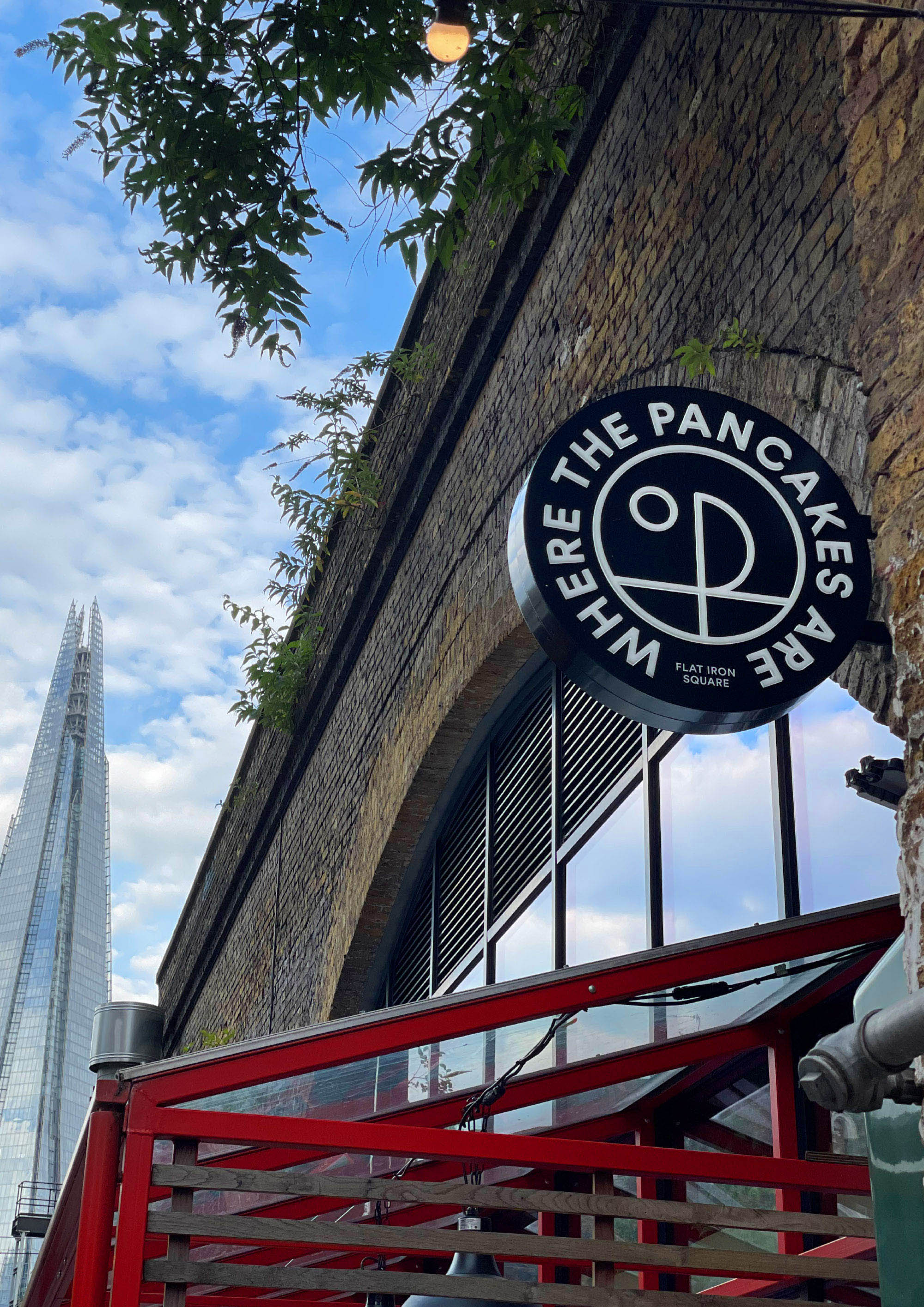
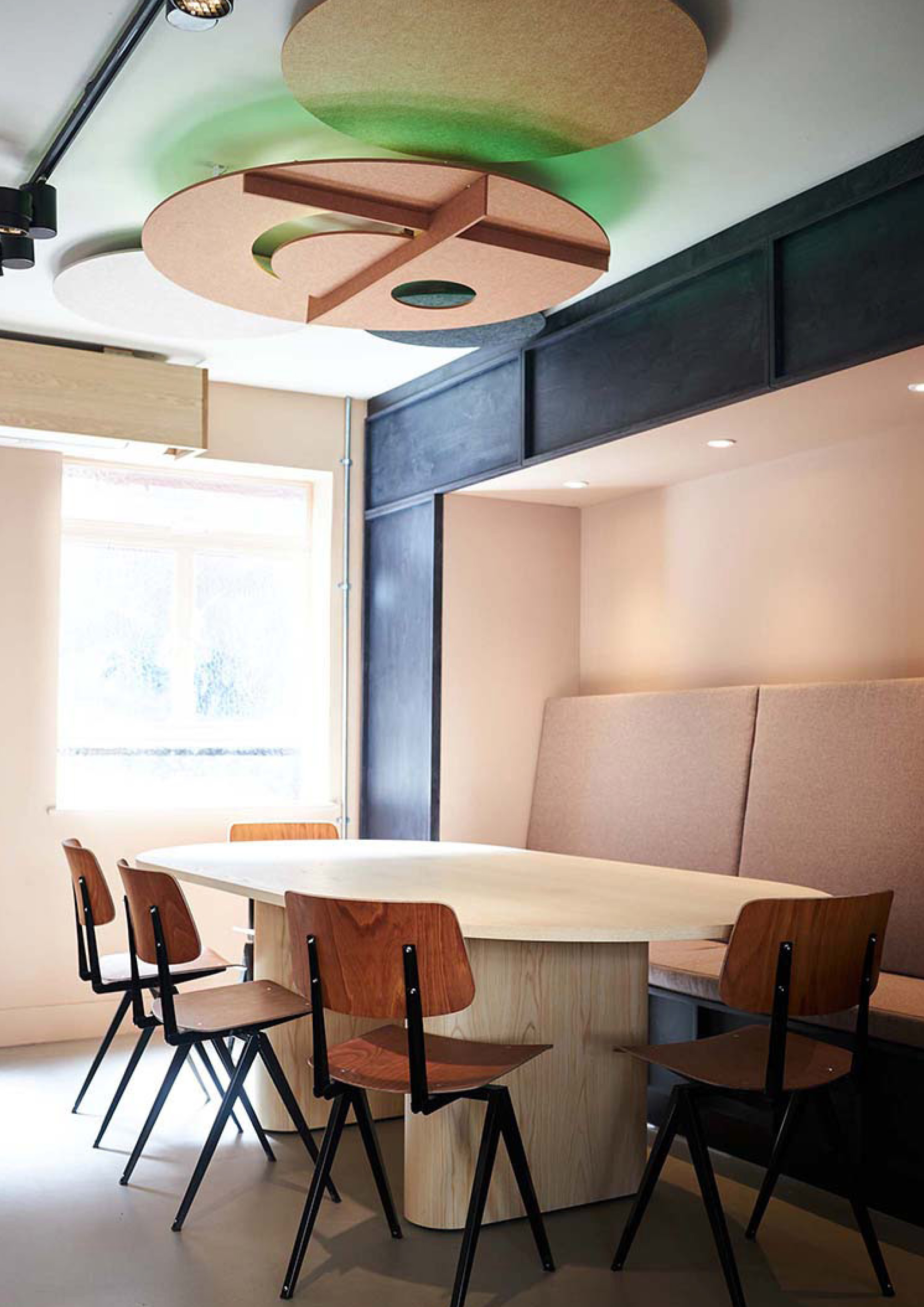
The logo was then beautifully applied to the ceilings of the new Fitzrovia restaurant. The colours and shapes seamlessly work throughout both locations including the first one situated in London Bridge under the arches at Flat Iron Square
Where the Pancakes Are started out in 2015 with the single purpose to become the No.1 destination for pancakes. At the beginning of 2021, they can modestly say that’s the case.
The story of Where the pancakes are is really the story of why good simple food matters.
There really is no other food that so purely nourishes people, physically and emotionally – yet is so underrated.
“Growing up in Holland – with a mother who was a fishmonger – fresh and healthy eating was always center-stage with weekly deliveries of still-live fish making its way onto our plates almost daily. The soaring highlight of my childhood was our regular family outing to a local pancake restaurant – a dark, buzzing place in a small provincial town where the passionate owner had multiple pans going at the same time, baking large steaming hot Dutch pancakes with aged gouda and bacon or apples and raisins. People from miles away would travel here for a simple honest meal with a cold glass of lager – it’s still around and as busy as ever.” – Patricia Trijbits – Founder of Where the Pancakes Are
CREDIT
- Agency/Creative: NotOnSunday
- Article Title: NotOnSunday Design Brand and Packaging Design for Where The Pancakes Are
- Organisation/Entity: Agency
- Project Type: Identity
- Project Status: Published
- Agency/Creative Country: United Kingdom
- Agency/Creative City: London
- Market Region: Europe
- Project Deliverables: Art Direction, Brand Architecture, Brand Creation, Brand Design, Brand Guidelines, Brand Identity, Brand Redesign, Brand Strategy, Branding, Creative Direction, Design, Food Photography, Graphic Design, Identity System, Logo Design, Packaging Design, Rebranding
- Industry: Hospitality
- Keywords: Food, Drink, Branding, Restaurant Branding, Identity, Design, Logo Design, Identity Design, Packaging Design
-
Credits:
Creative Director: Mike Willows
Creative Director: Trev Townsend


