Symbolic Design – Syros Winery
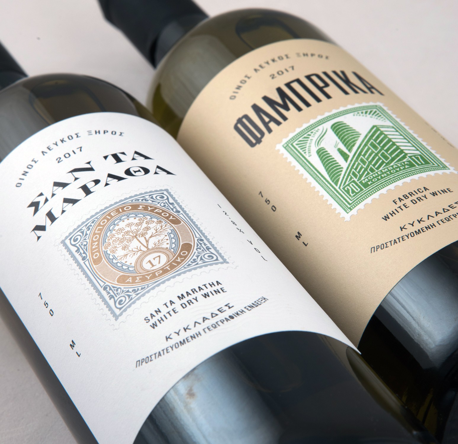
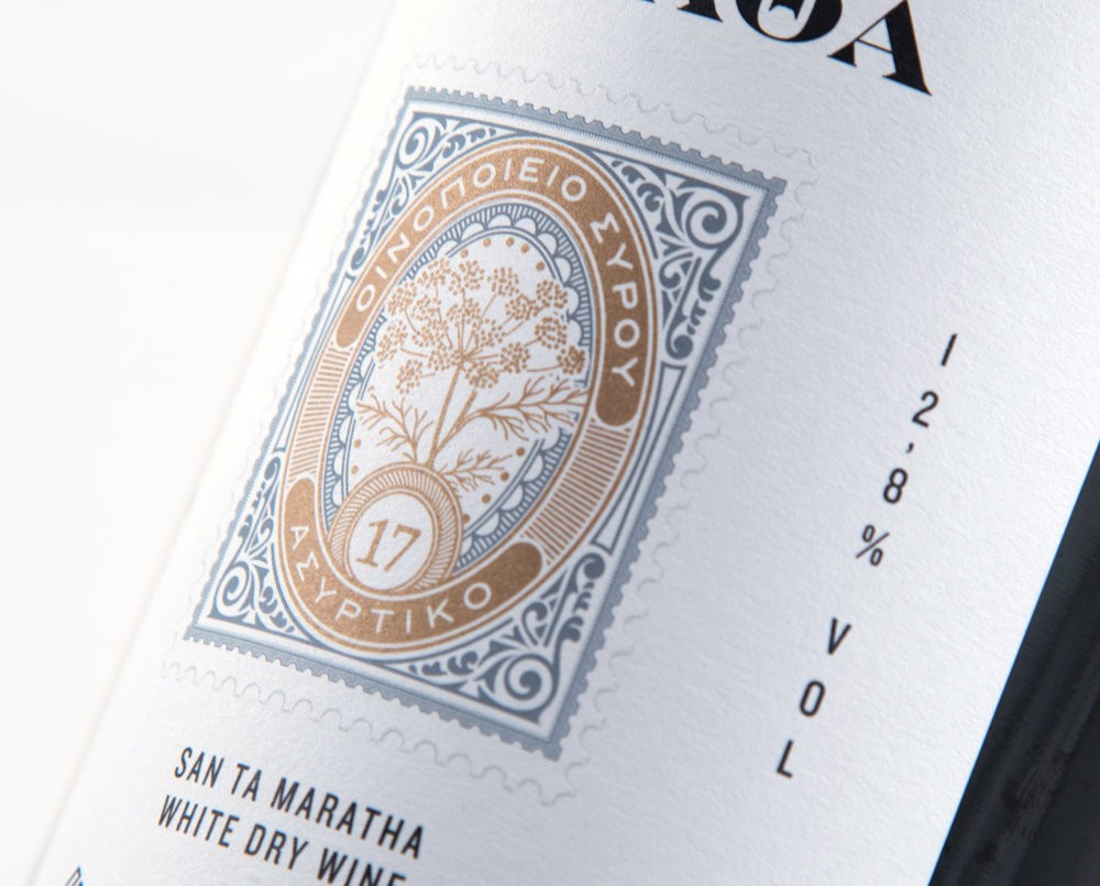
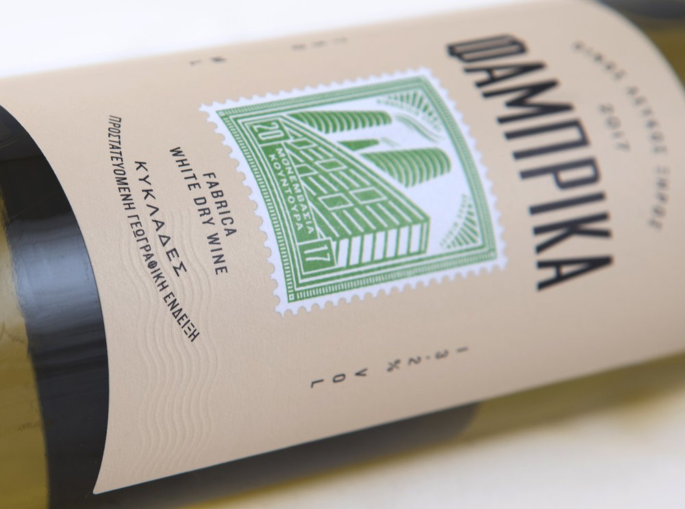
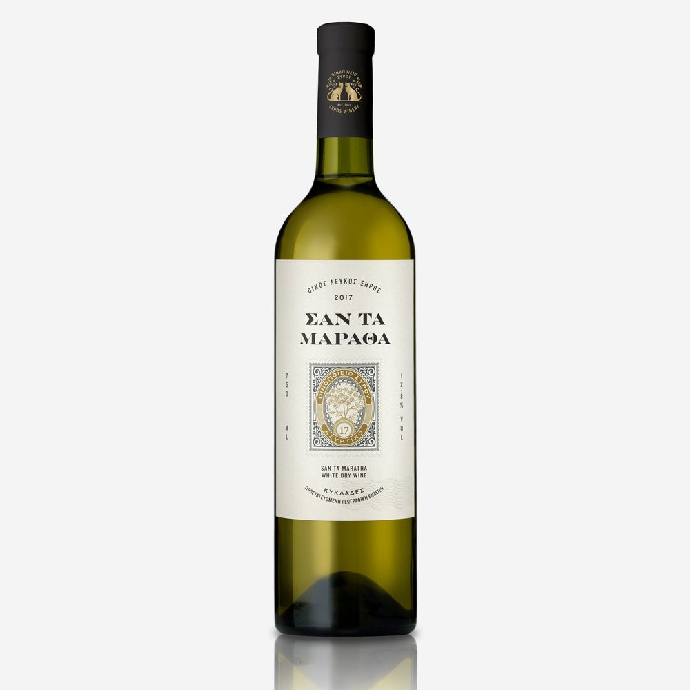
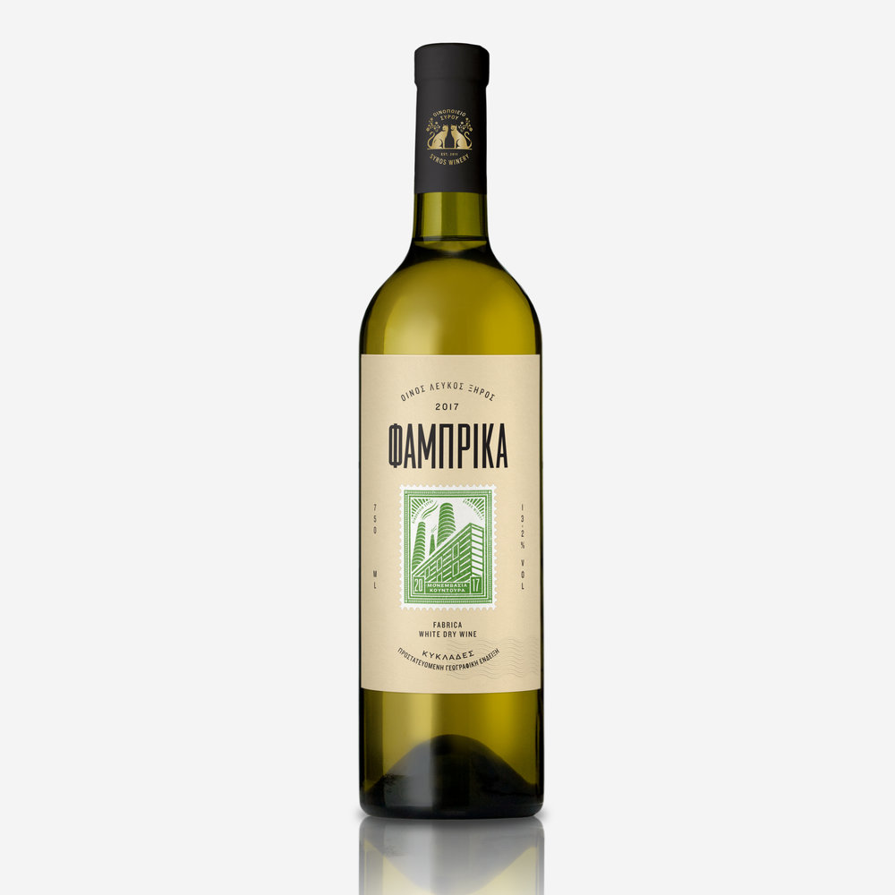
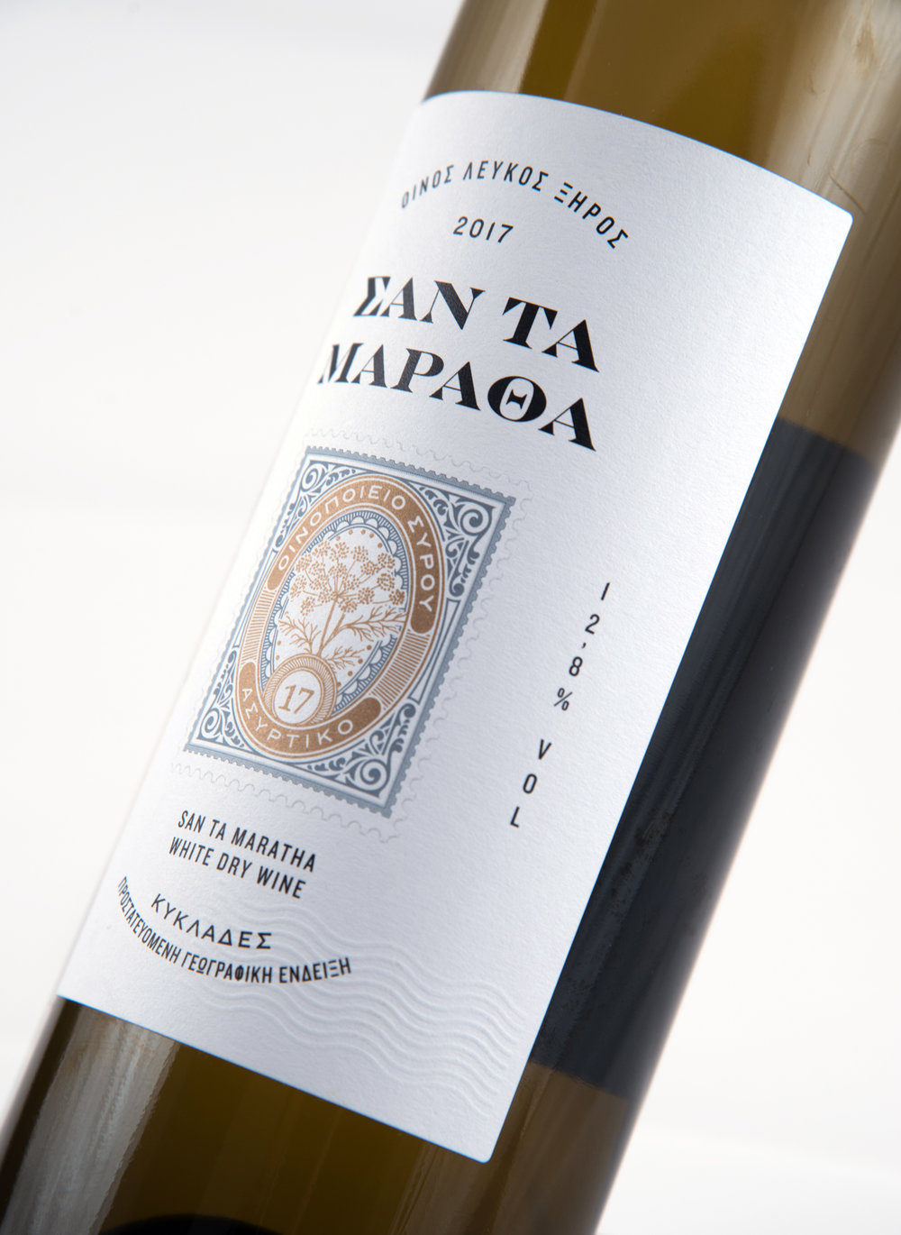
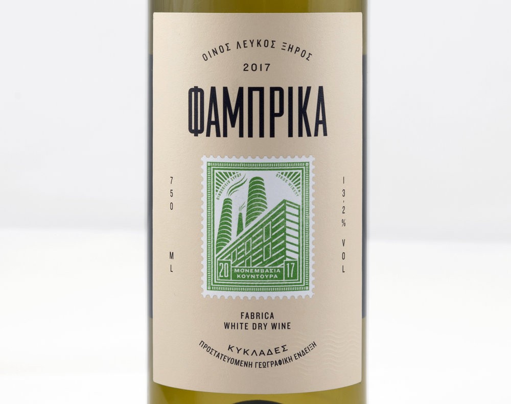
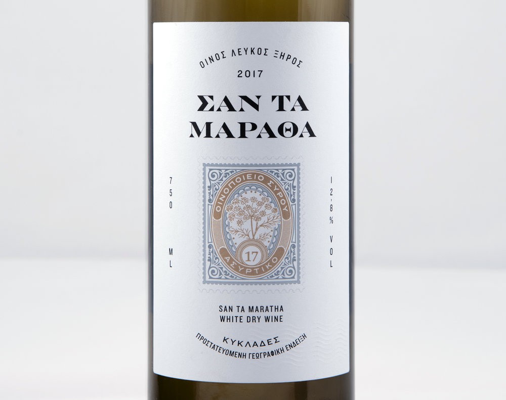
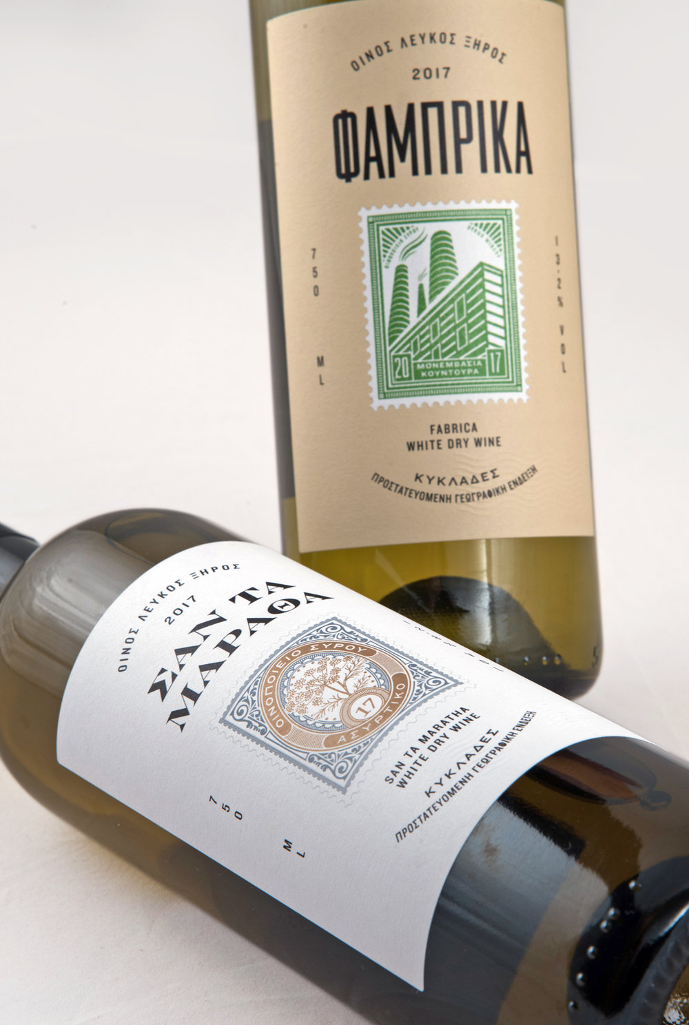
” The objective was to represent a nostalgic feeling of the picturesque Greek island of Syros, while avoiding any Touristic clichés. The branding is inspired by the stray cats which are iconic and numerous on the island. The illustrations on the labels are placed in stamps to suggest the look of old postcards. The one wine, Fabrika, translates from Russian to “factory” and at the same time is the name of a village on the island. The illustration intends to resemble that of vintage soviet designs and stamps. The other wine, San ta maratha, is a local expression, which translated literally from Greek is “like the fennel”, however, has a similar meaning to “long time, no see”. A more traditional approach was taken for the illustration of the fennel on the stamp. The stamps have been embossed to enhance the realistic feel of the label.”

CREDIT
- Agency/Creative: SYMBOLIC DESIGN
- Article Title: Nostalgic Branding and Illustration with Wine Labels that Resemble Greek Stamps and Postcards
- Organisation/Entity: Agency Commercial / Published
- Project Type: Packaging
- Agency/Creative Country: Greece
- Market Region: Europe
- Format: Bottle
- Substrate: Glass


